09-24-2020, 05:51 AM
Hi there! Never thought you were on this forum, kinda surprised. Was interesting to look through those pages and see the progress you made from the moment you started the thread.
|
Walent's sketchbook
|
|
09-24-2020, 05:51 AM
Hi there! Never thought you were on this forum, kinda surprised. Was interesting to look through those pages and see the progress you made from the moment you started the thread.
02-11-2021, 11:00 AM
@one_two: yup, I call this my "secret" sketchbook where I basically post everything I save from working sessions.
- Been a while, felt like coming back to fill a few more pages here. I feel like I passed a threshold in my artistic development perhaps also one regarding my mindset, which is important, so now I feel a lot more prepared to achieve my highest goal. A few years ago I rarely found myself interested in anything regarding clothing or armor design, nor drapery, so every time I studied that, I approached it like you would approach a still life - you know, measuring, simplifying but taking it for what it is and not trying to understand the things hiding behind or the way stuff is connected, the layering of things. Nowadays it's the opposite, I find myself hunting for reference and a lot of time I'm amazed to see how I remember certain design elements that I only saw once but never studied, so I can instantly apply them to my sketches, which I think is an indicator of interest. I don't know what happened and why did it take so much time but well, I'm here, that's what's important. I also know how important keeping a healthy mindset is to an aspiring artist, so I found out that pushing yourself too much can sometimes hurt more than help. So this year I decided I'm gonna do more sketching from imagination and less studying. 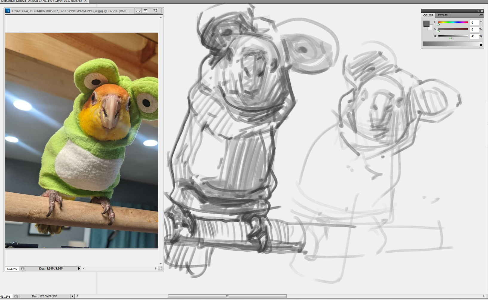 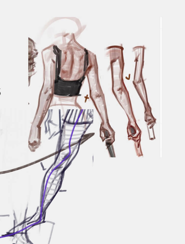 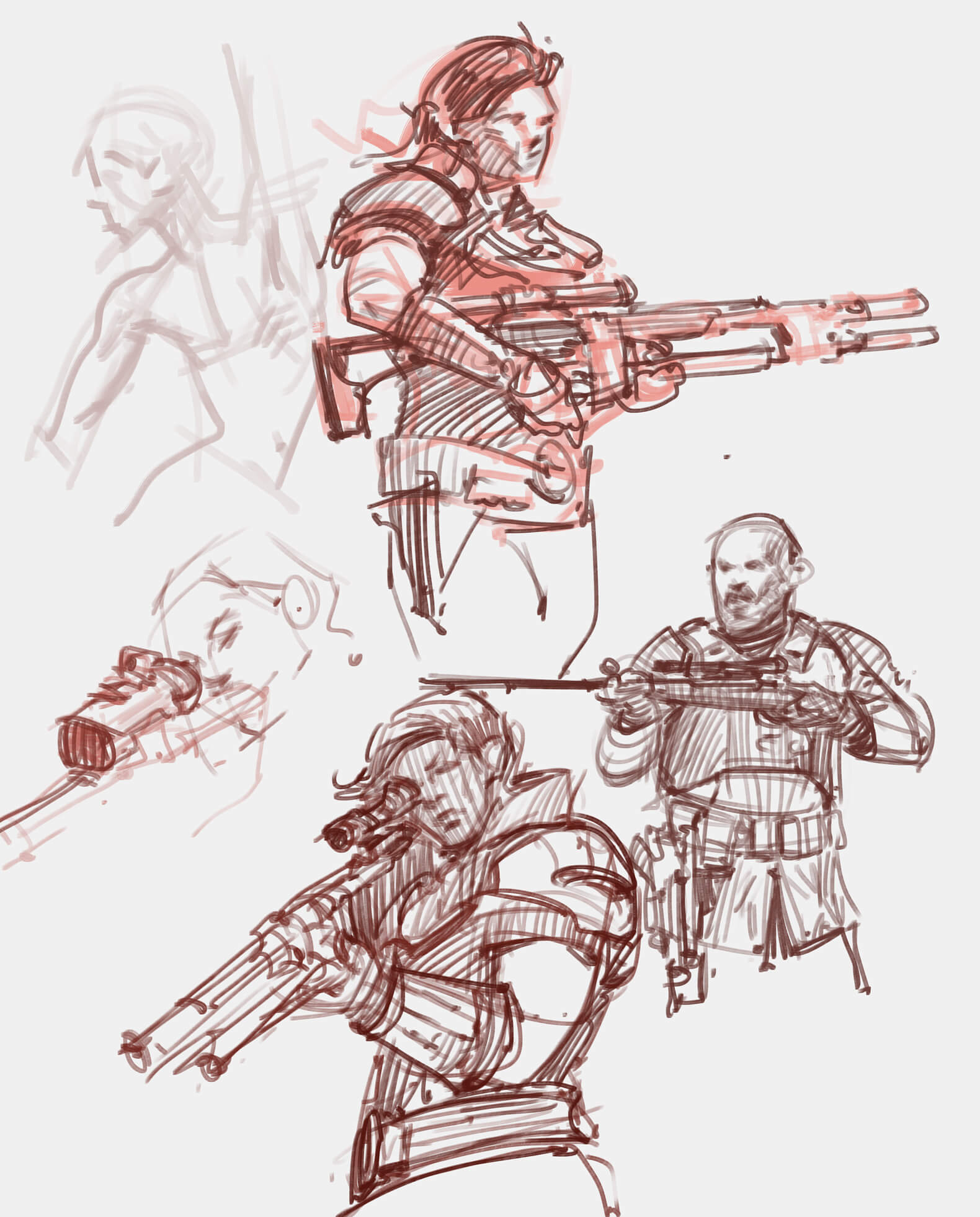 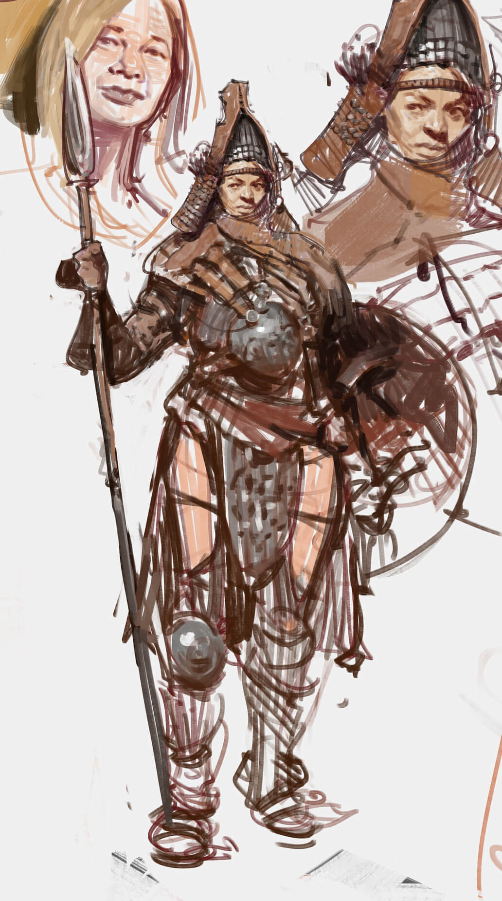 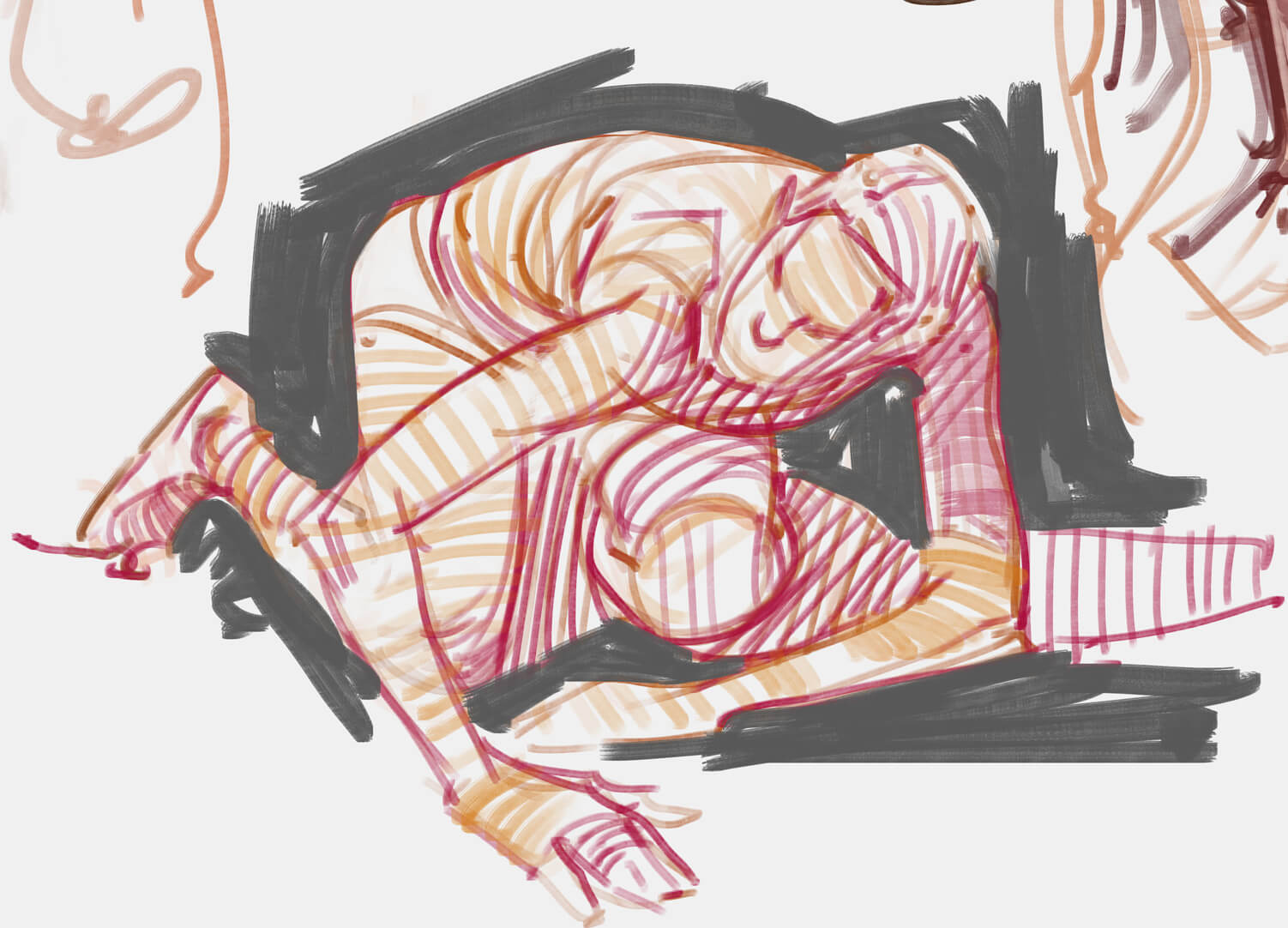 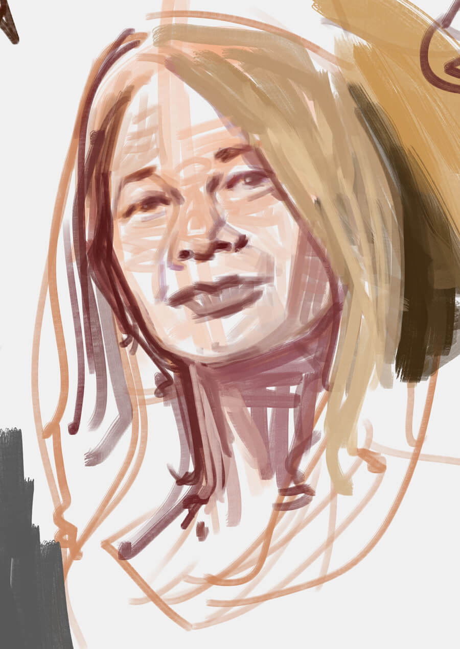 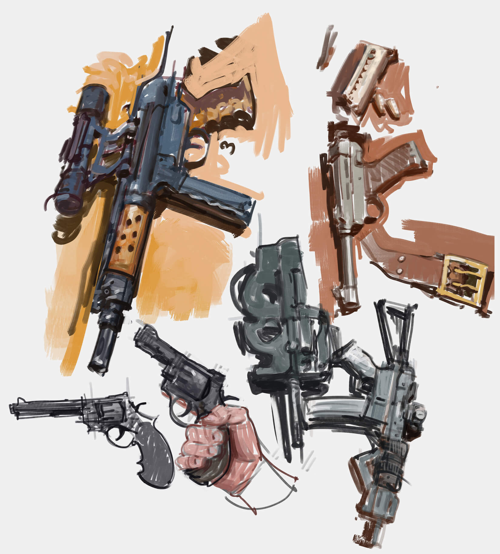 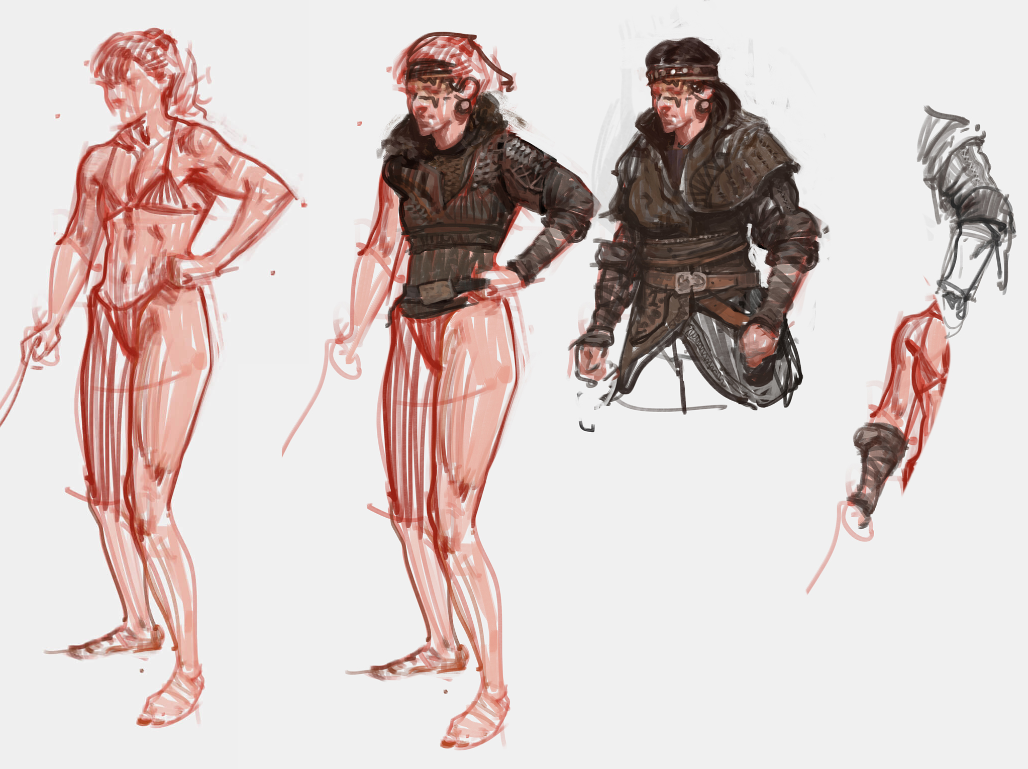 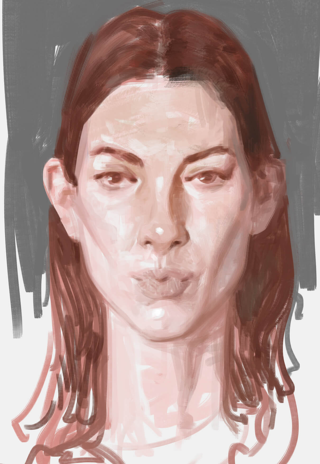 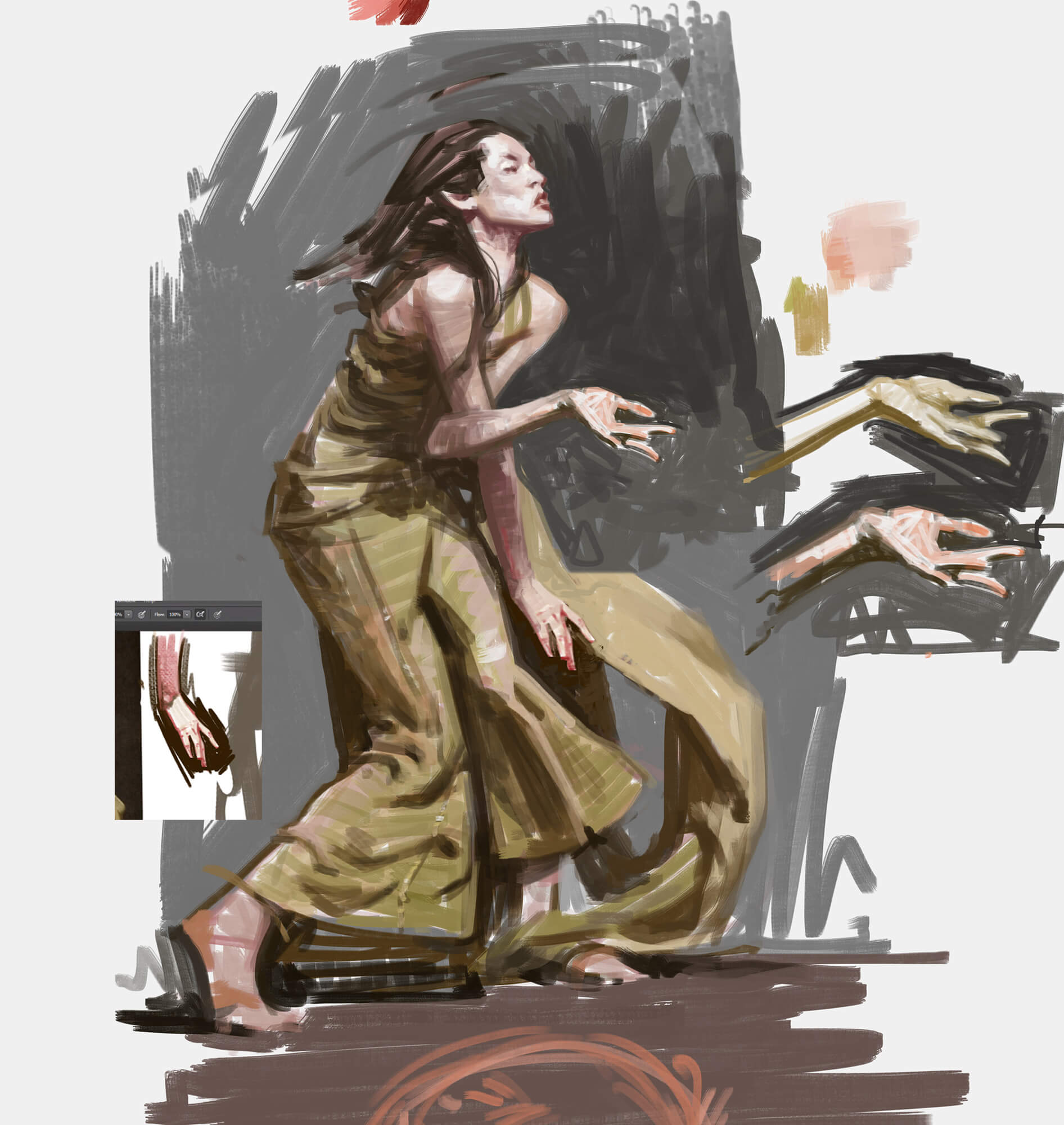 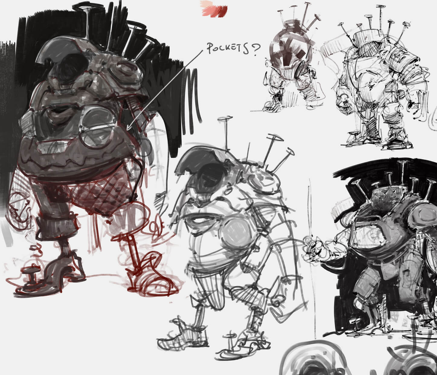 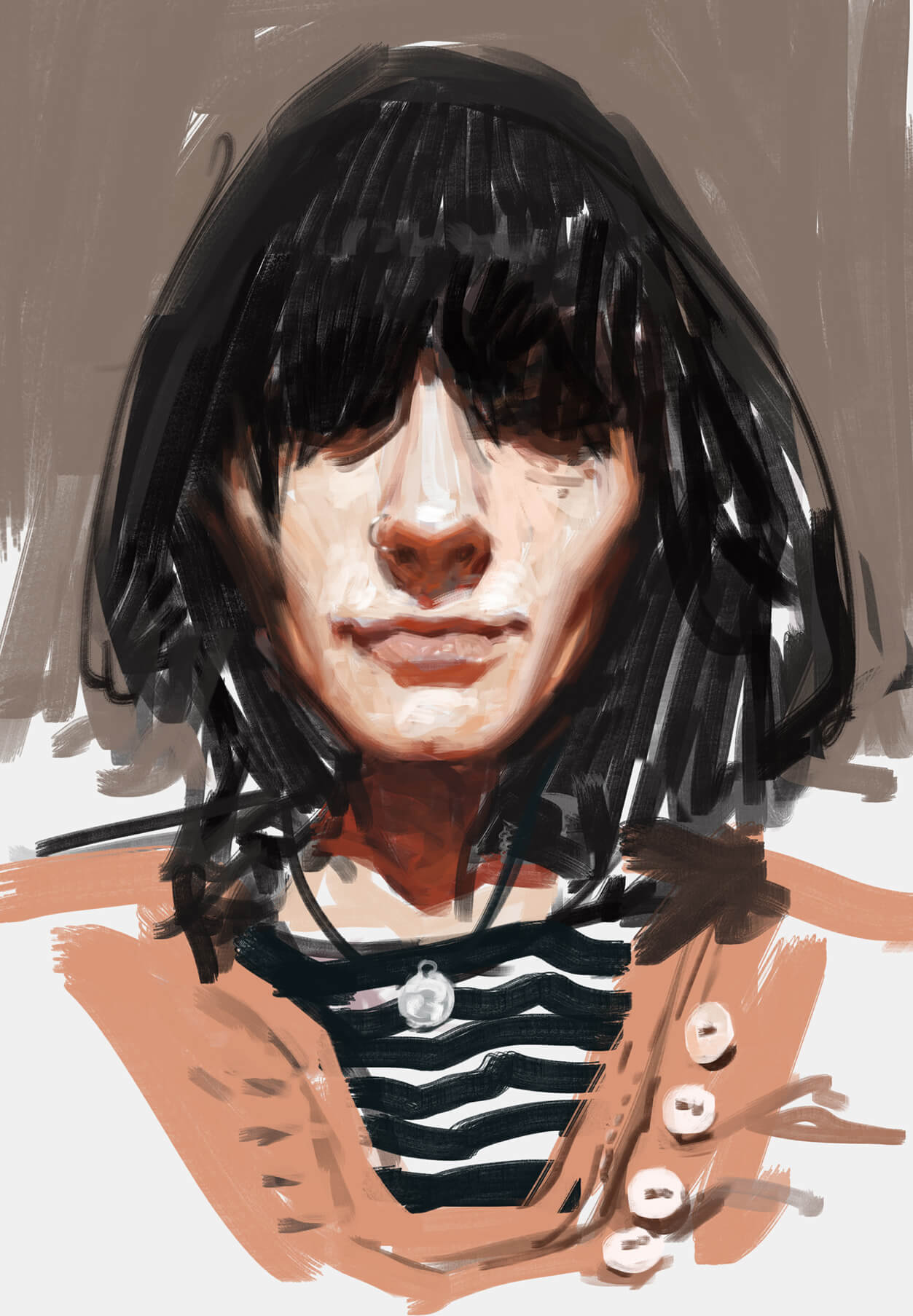 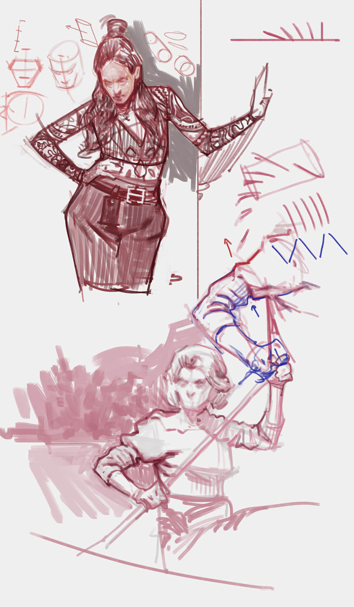 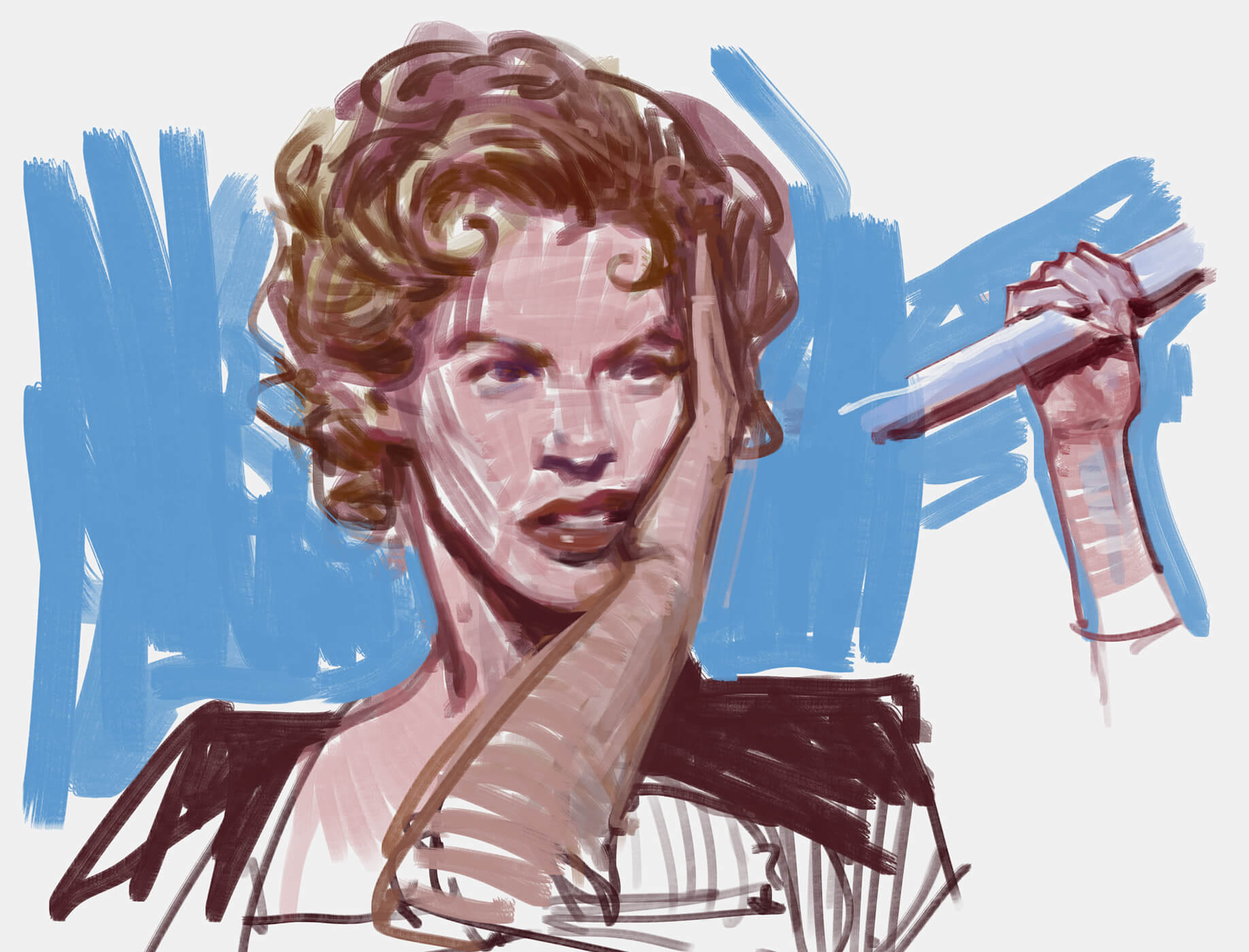 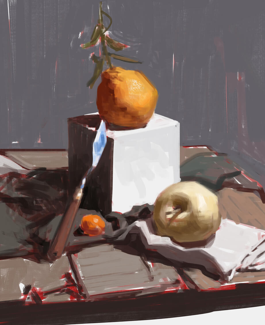 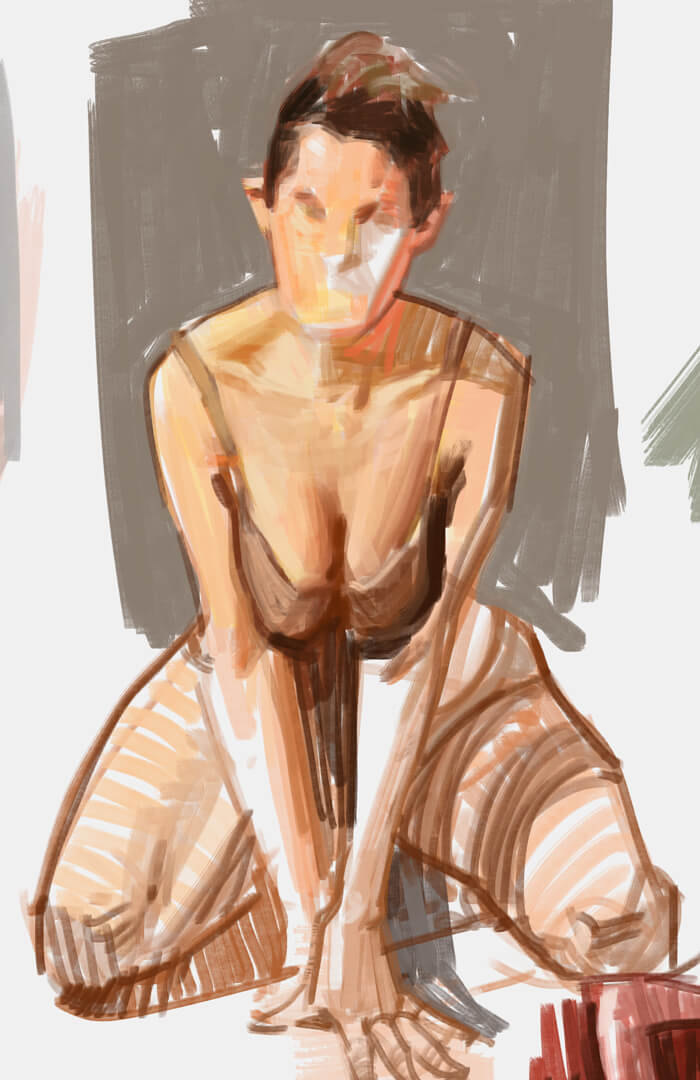 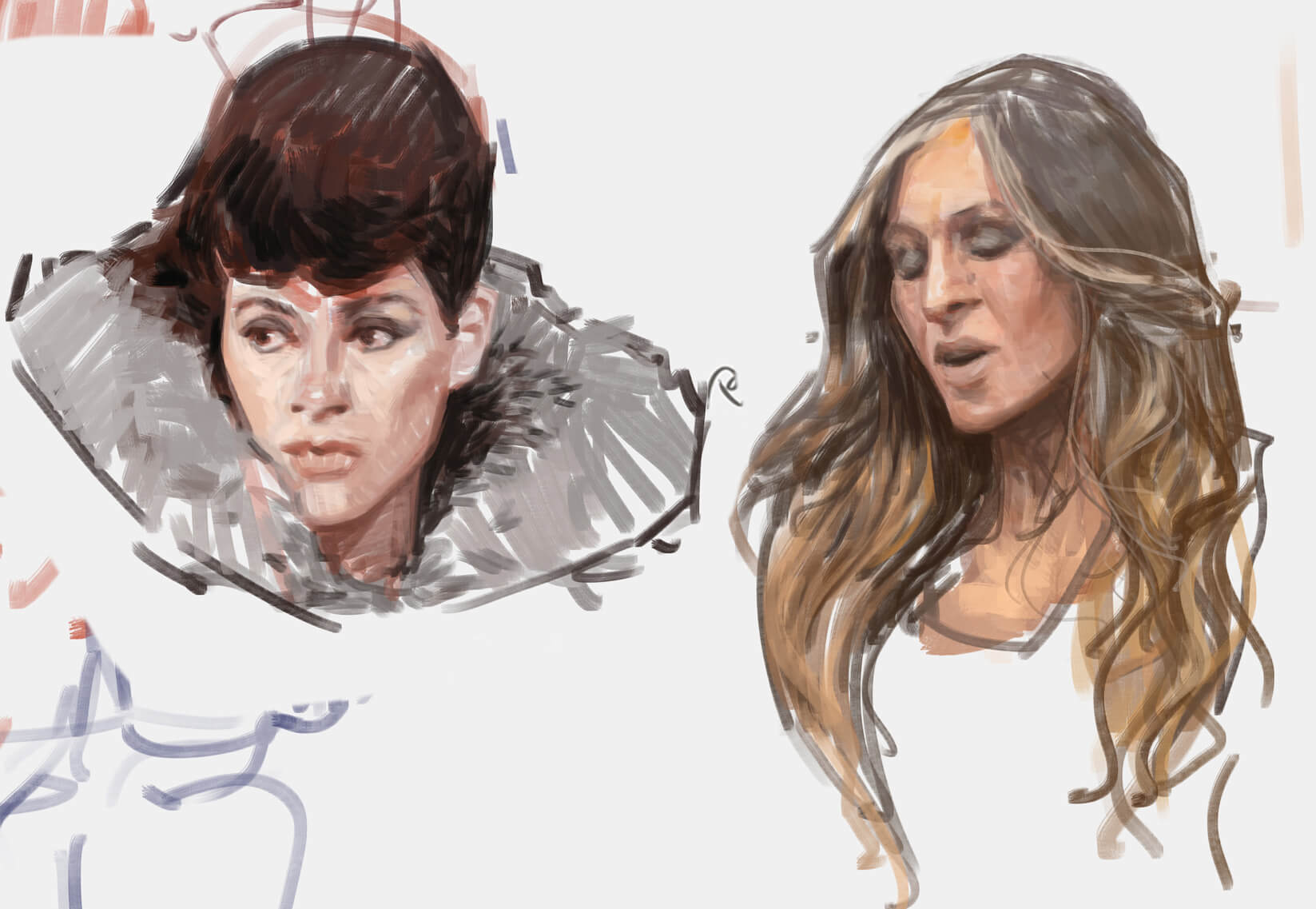 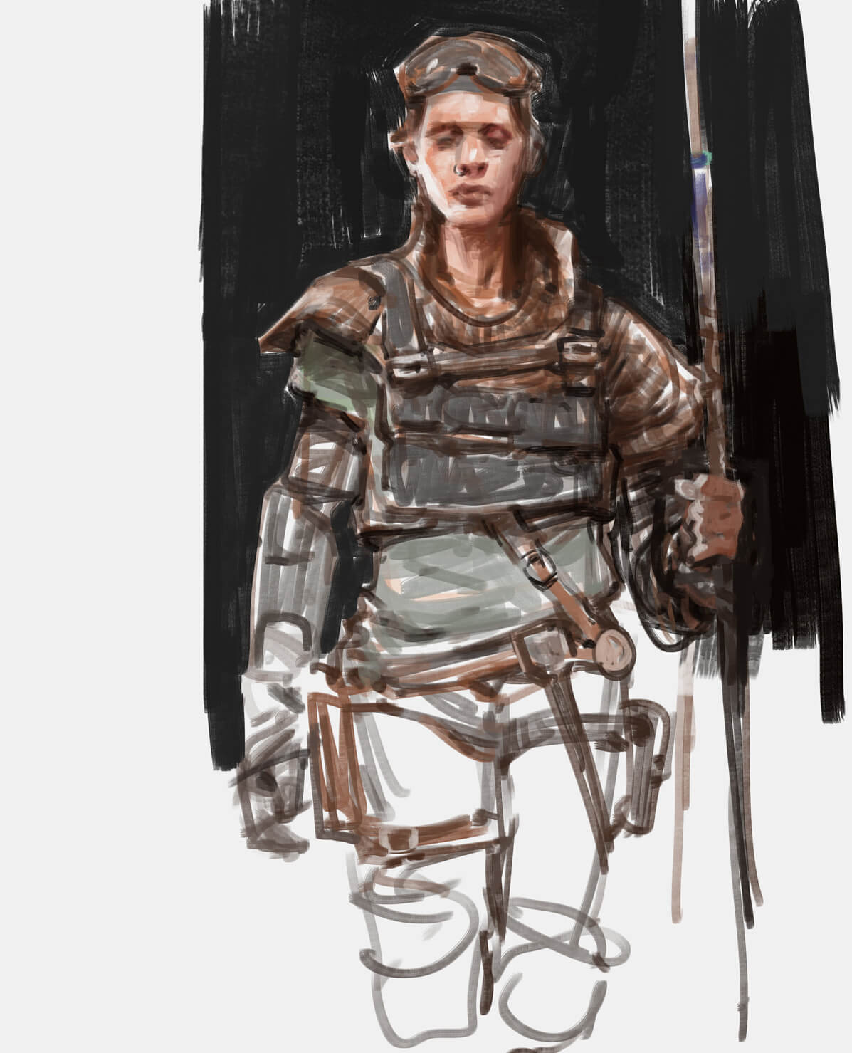 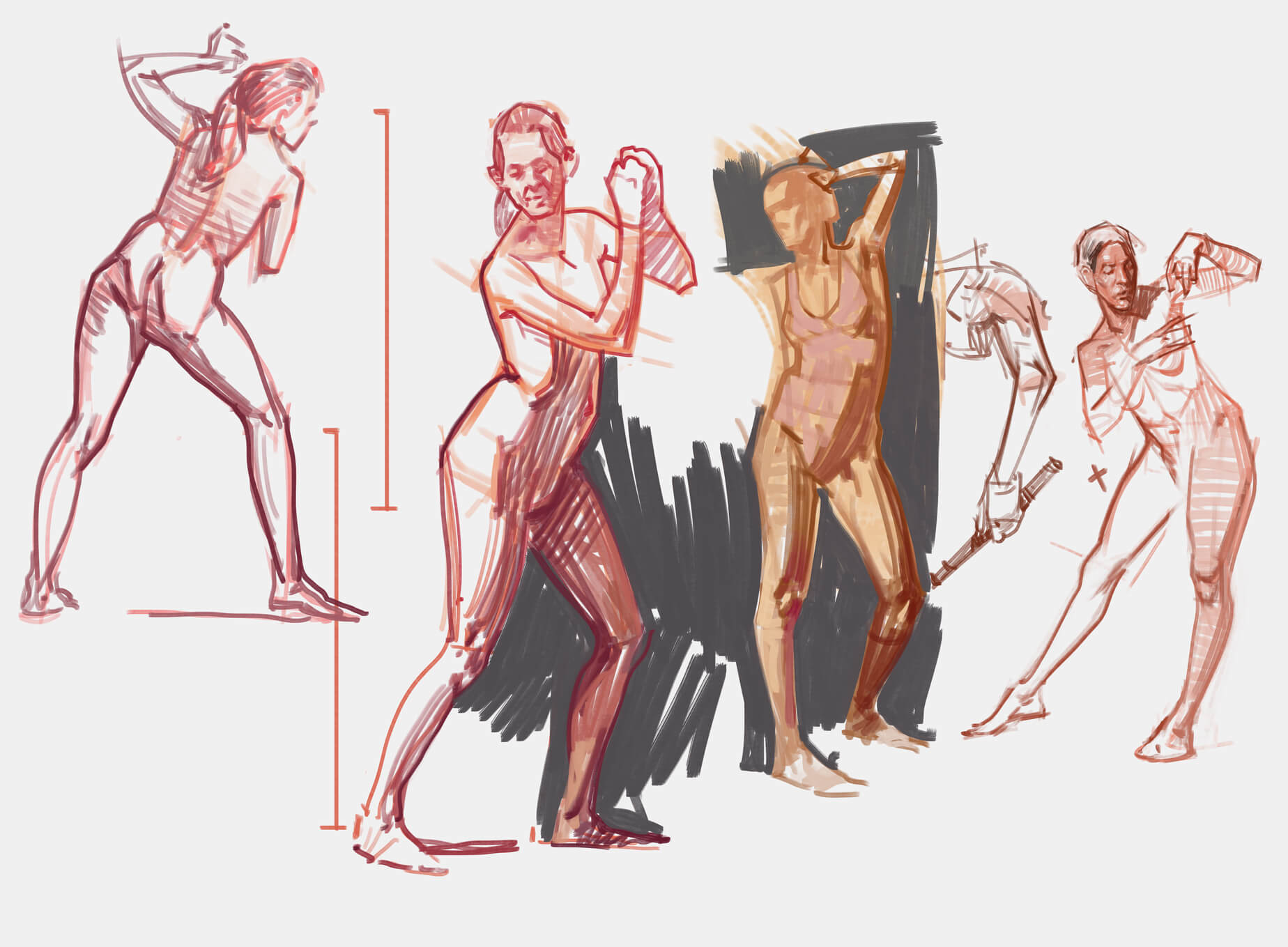 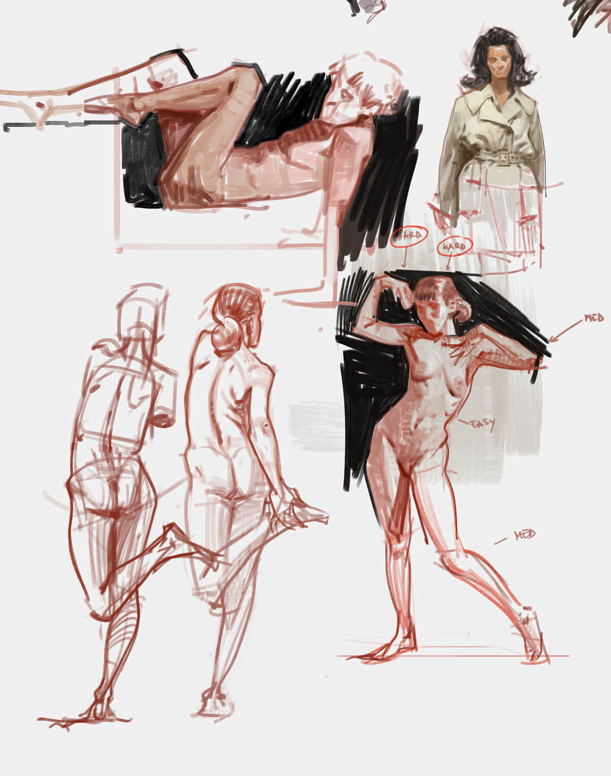 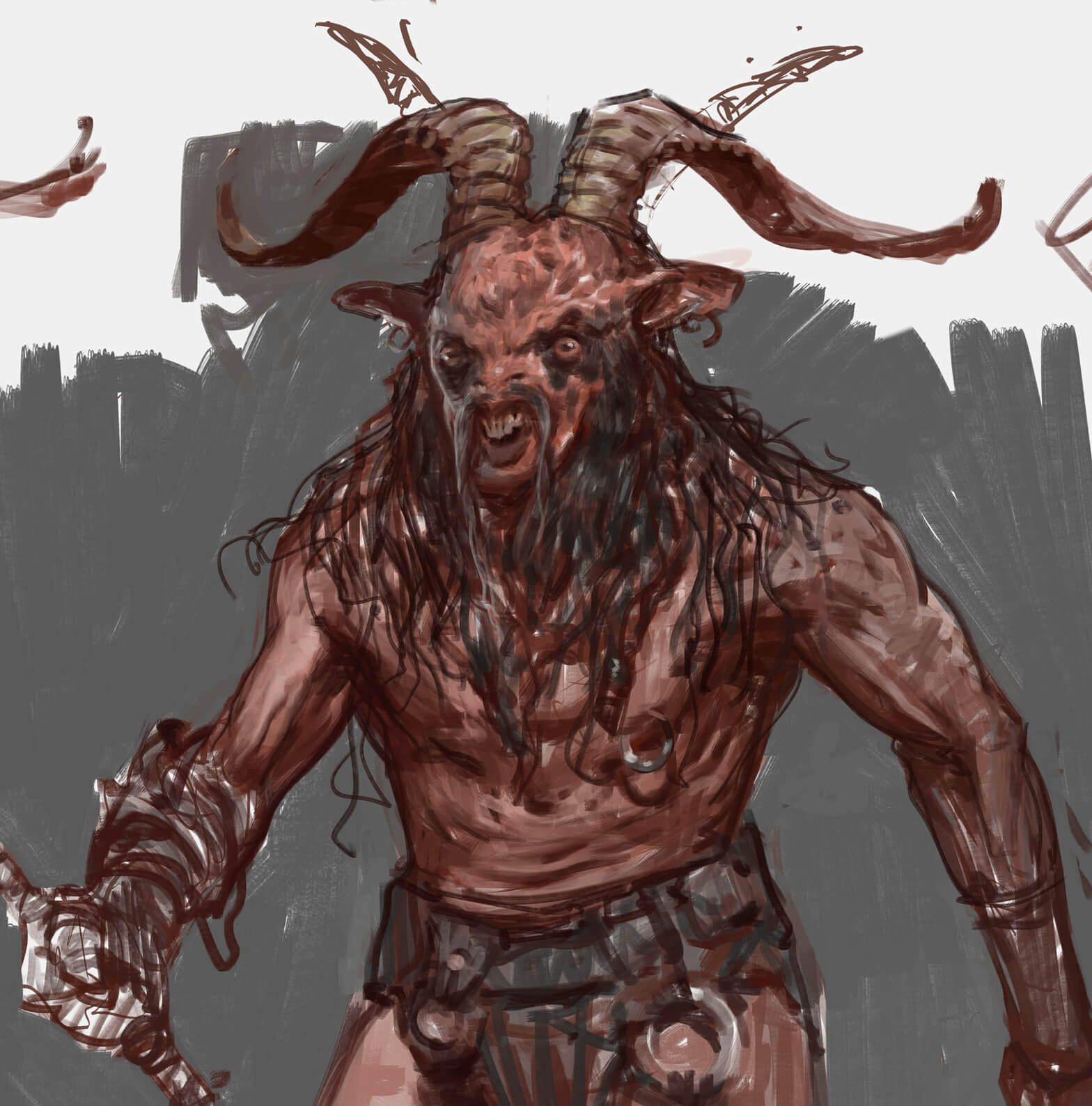 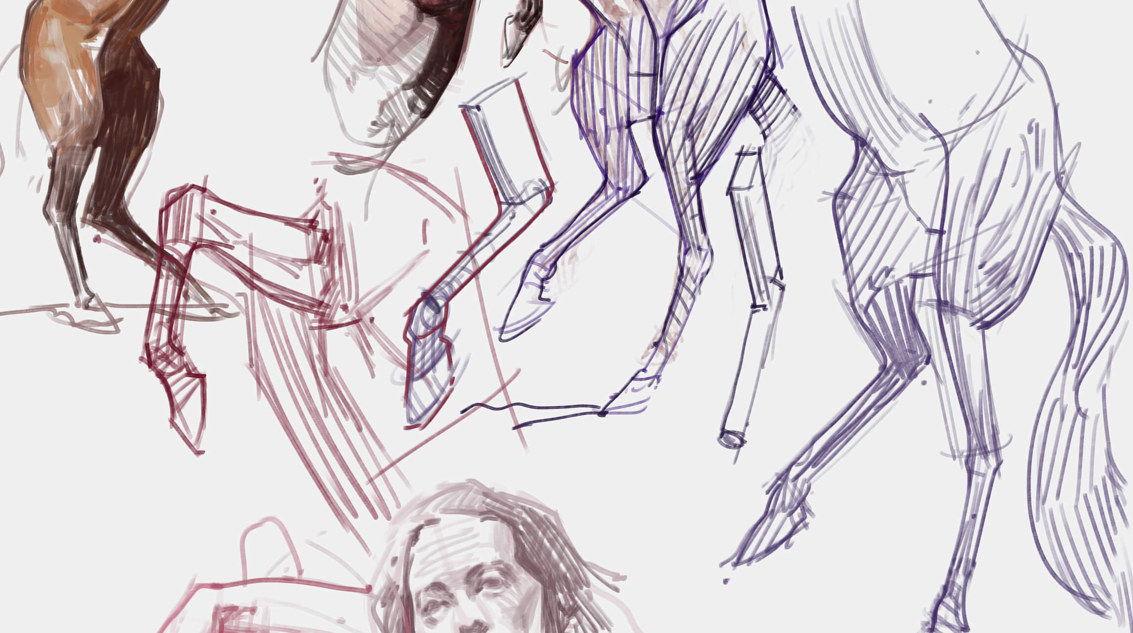 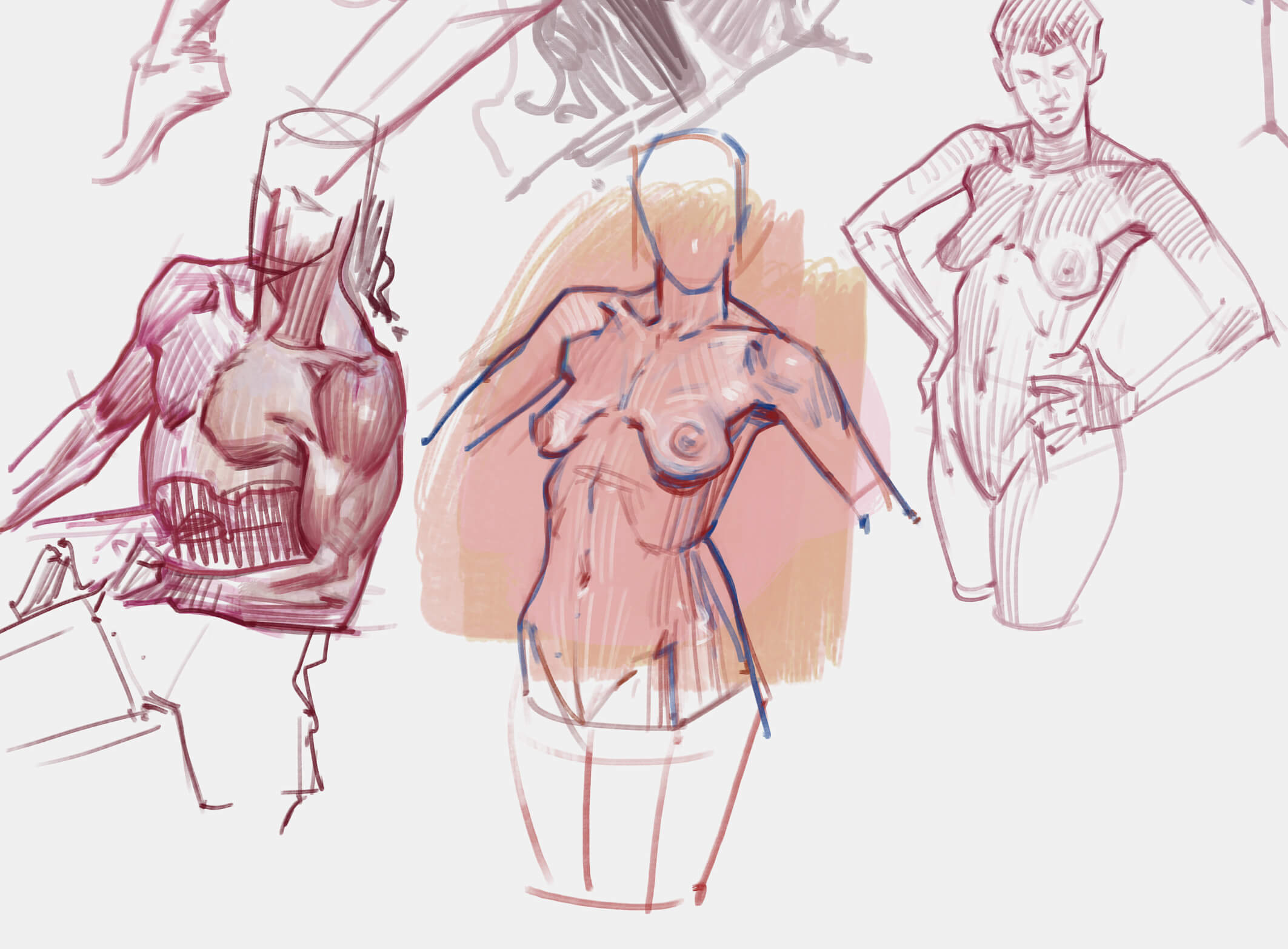 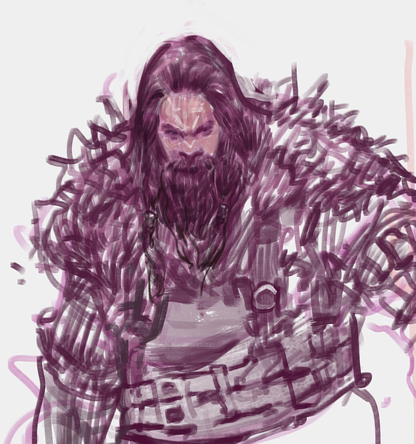 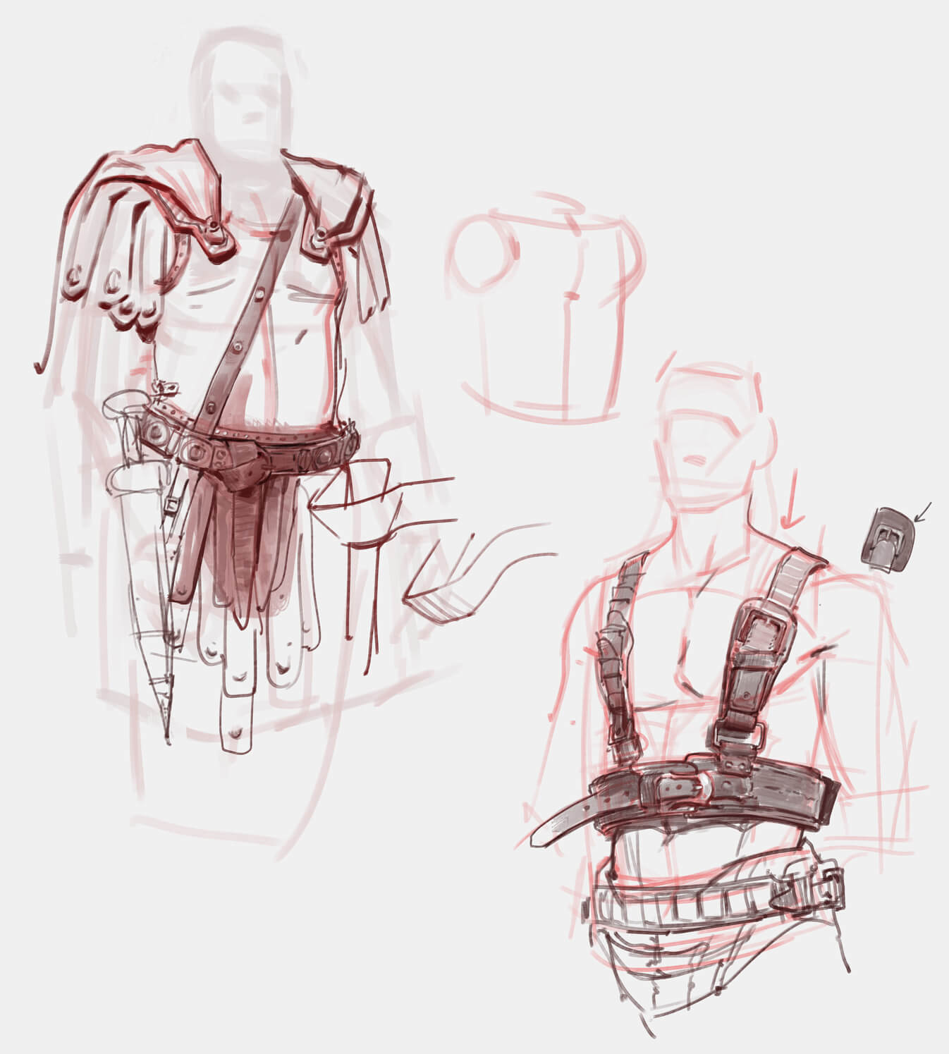 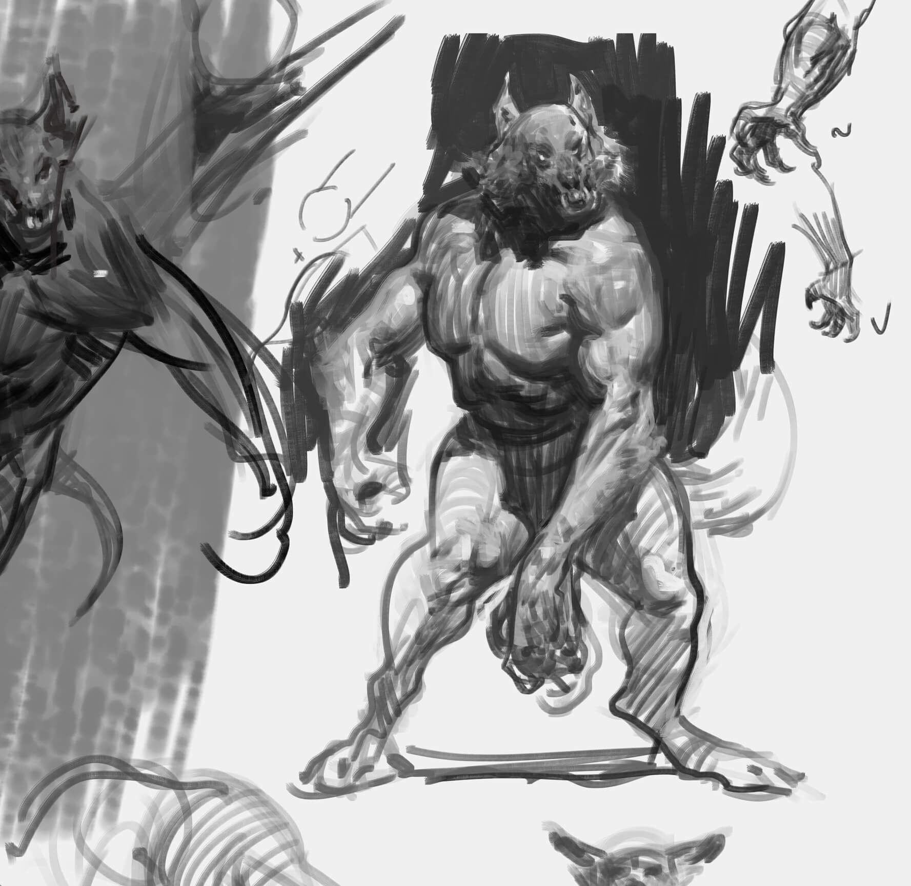 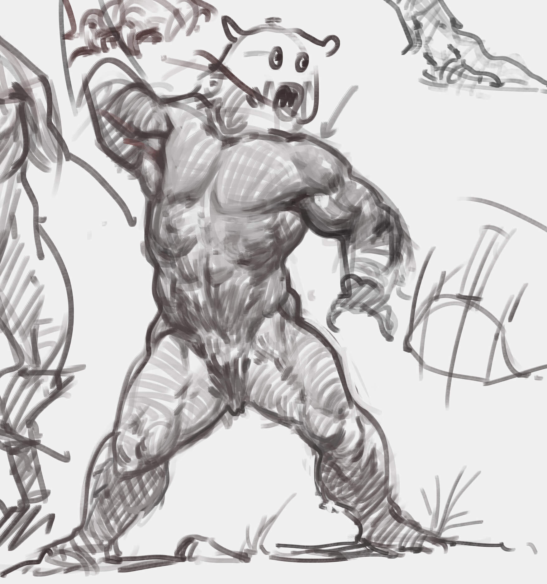 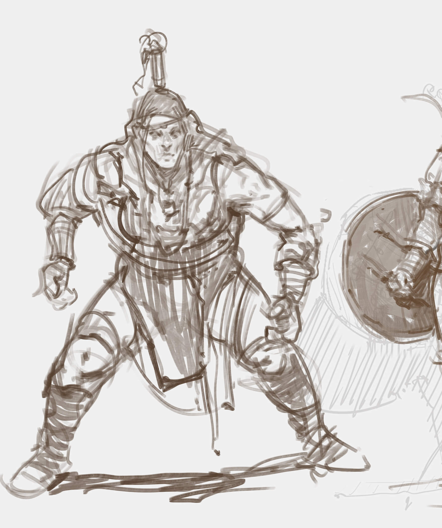 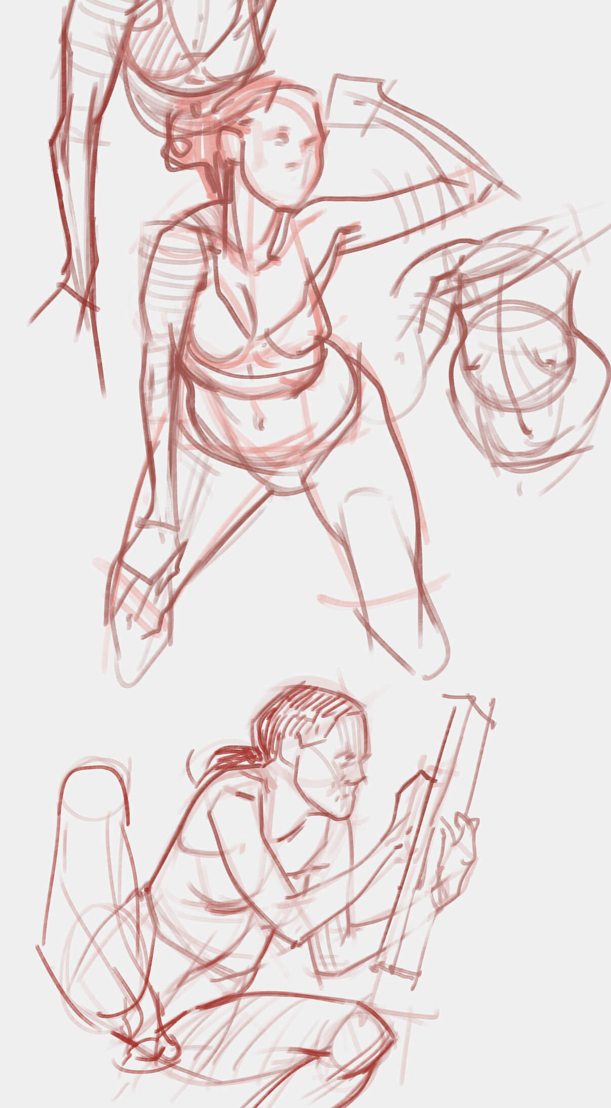 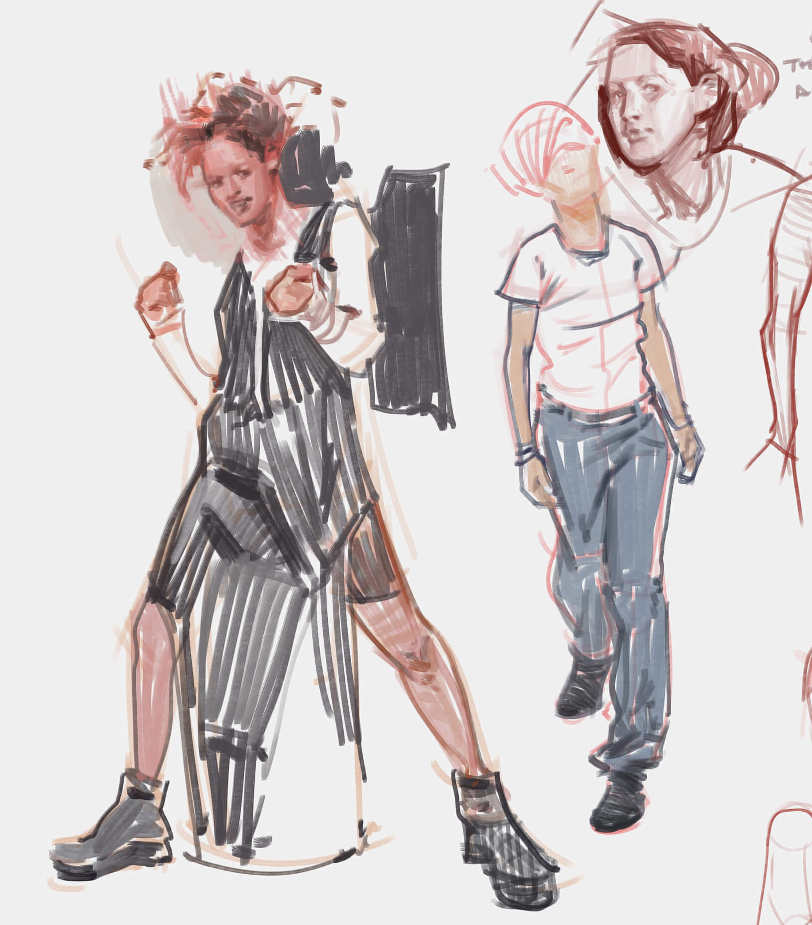 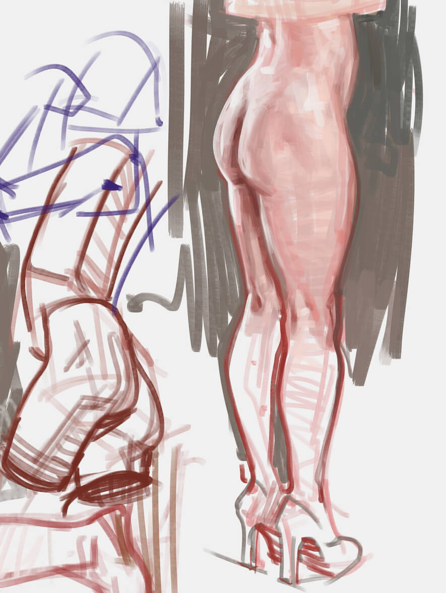 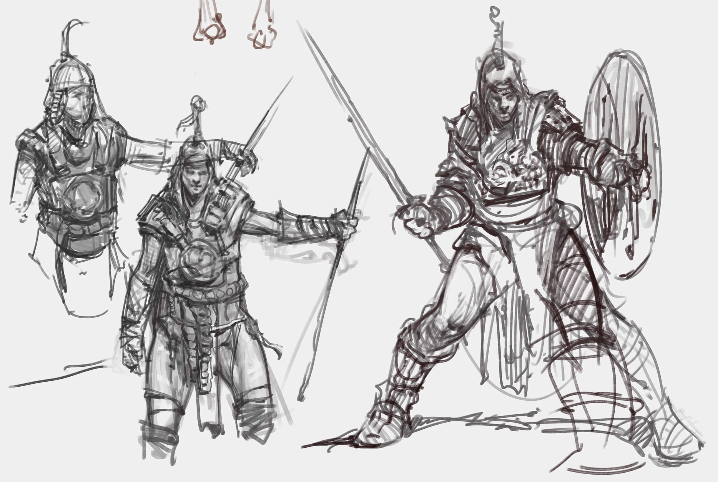 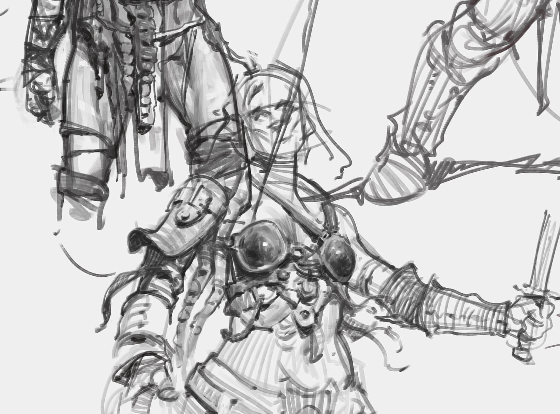 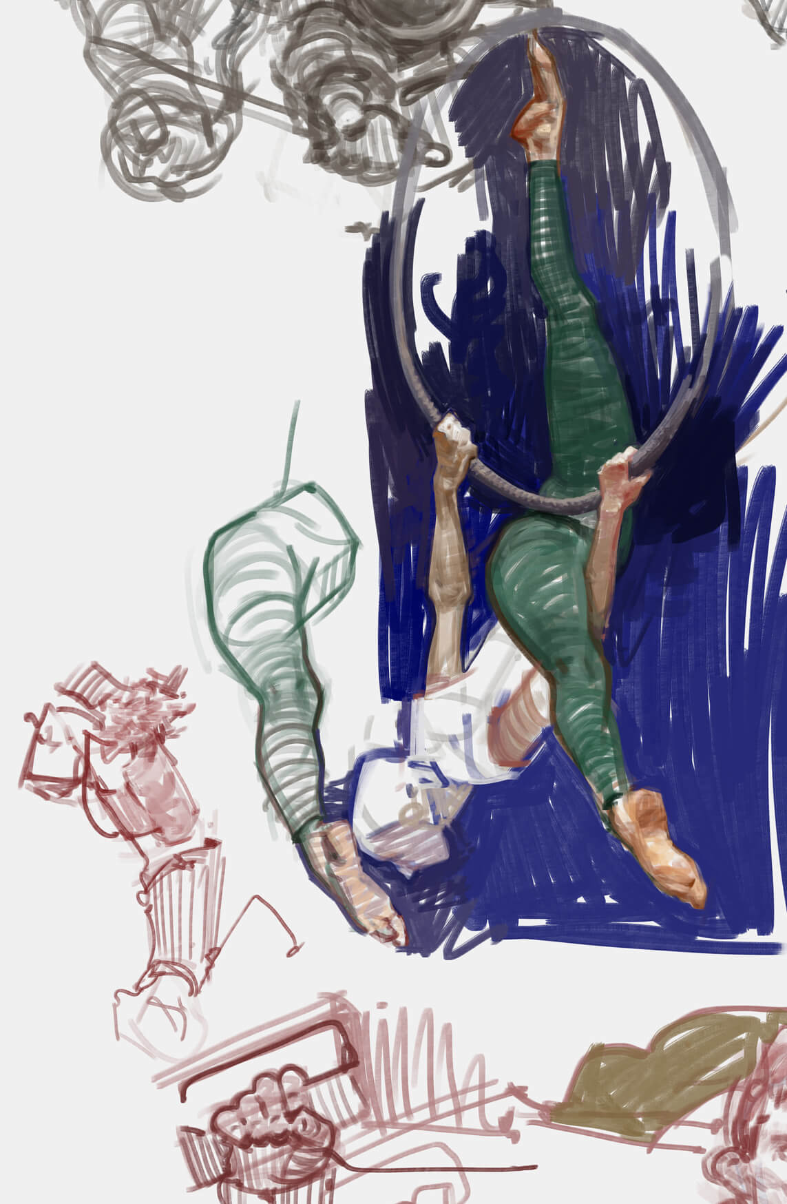 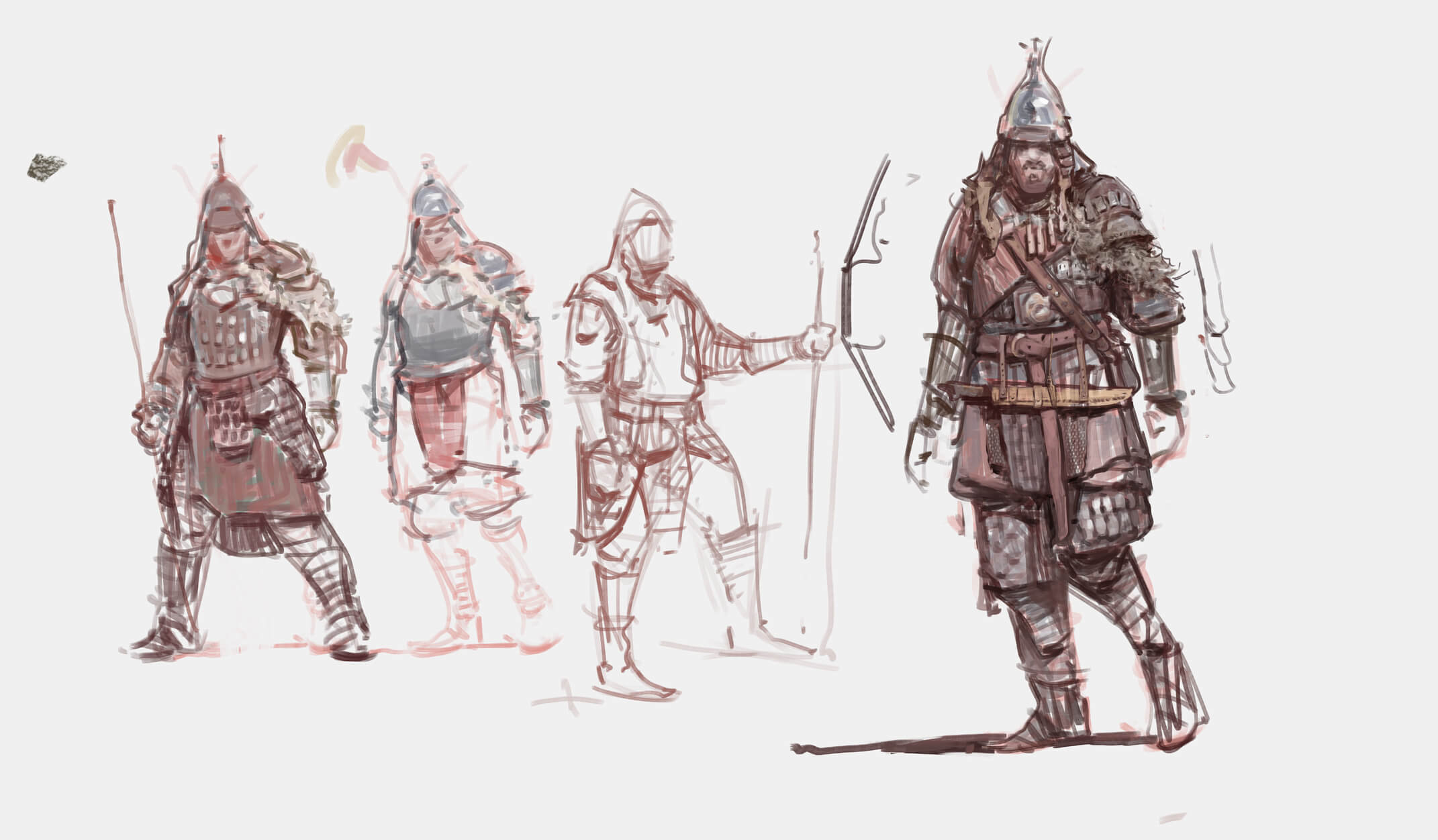 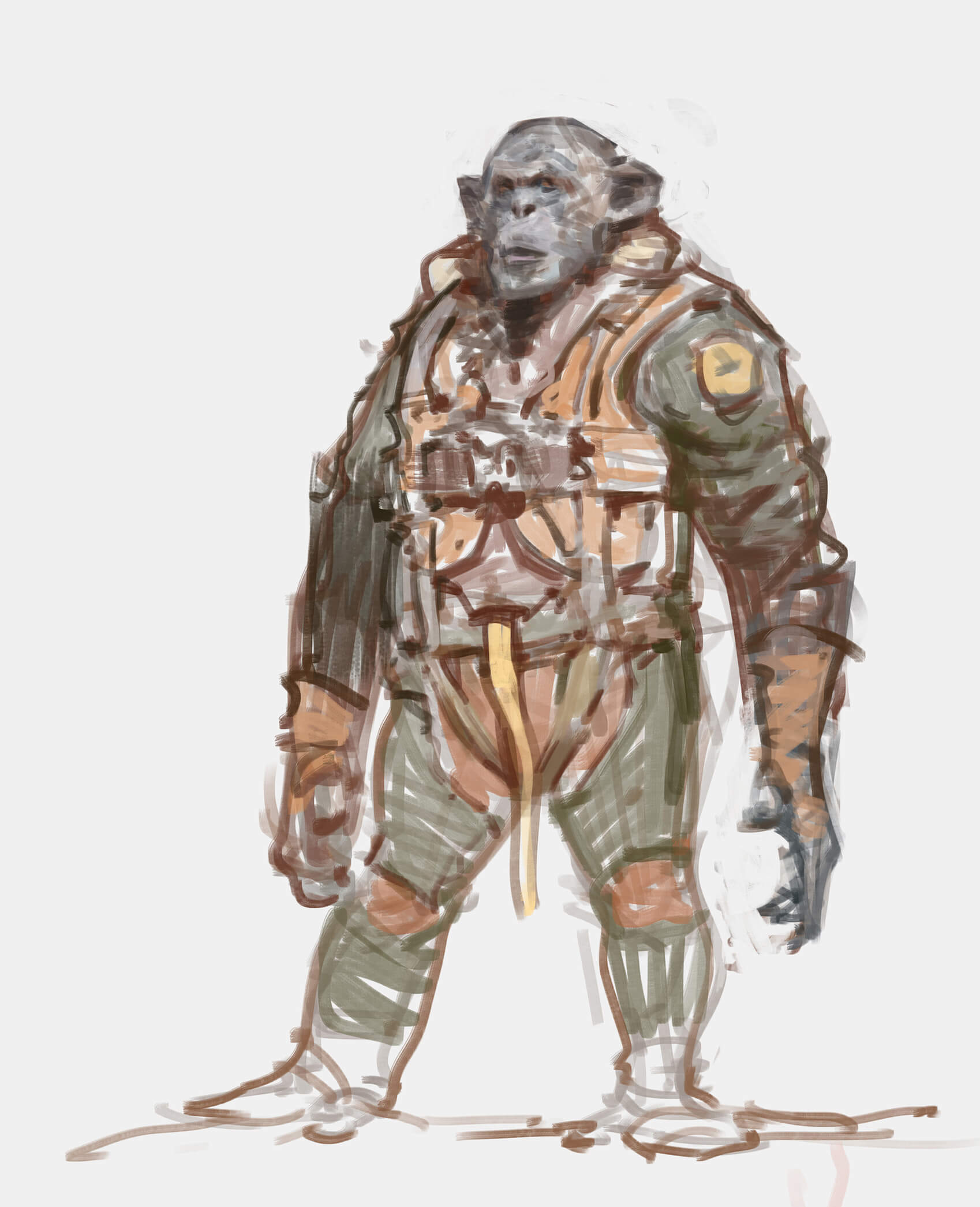 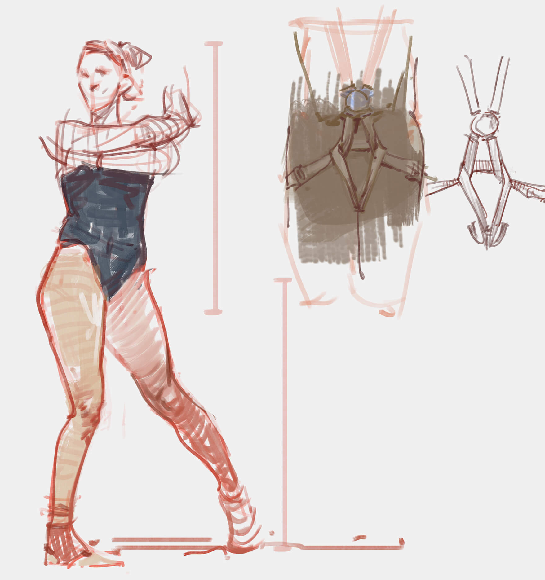 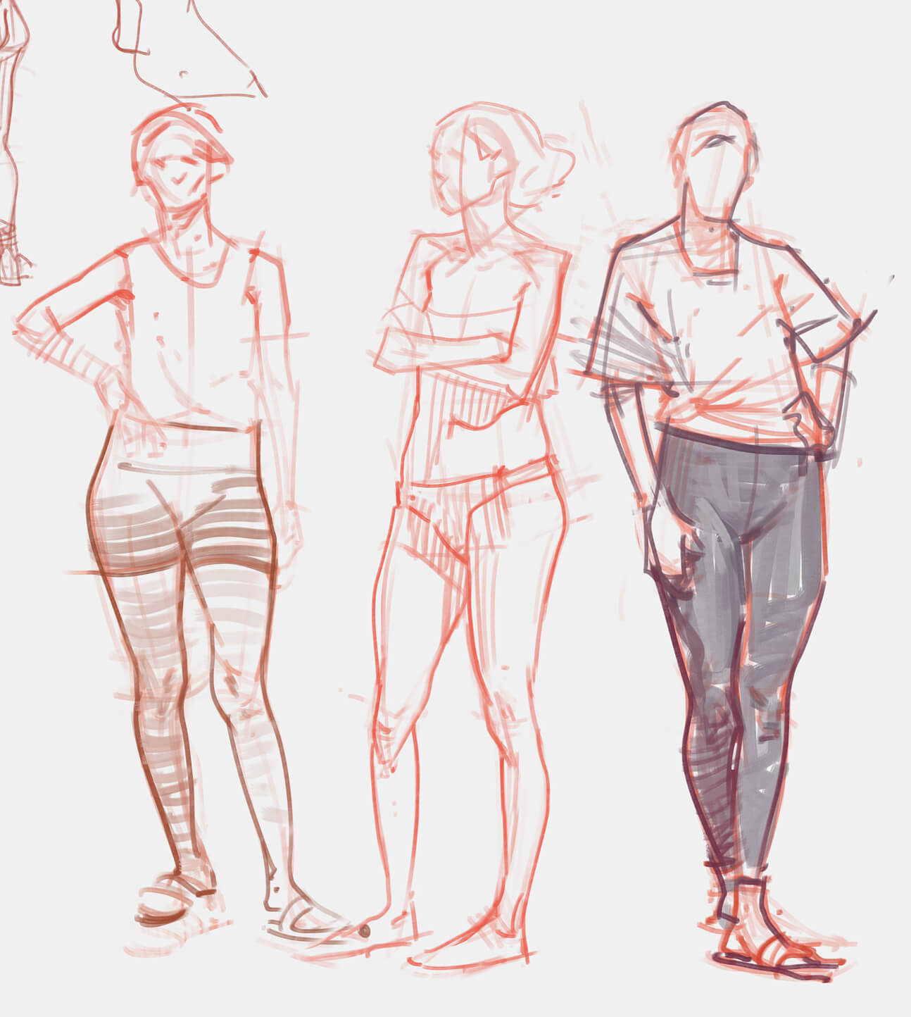 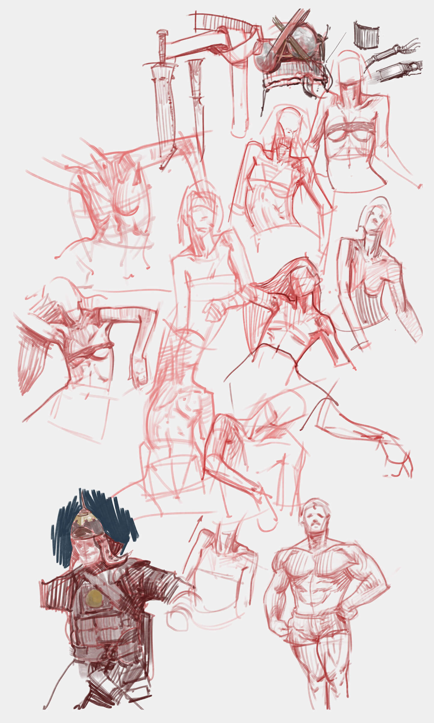 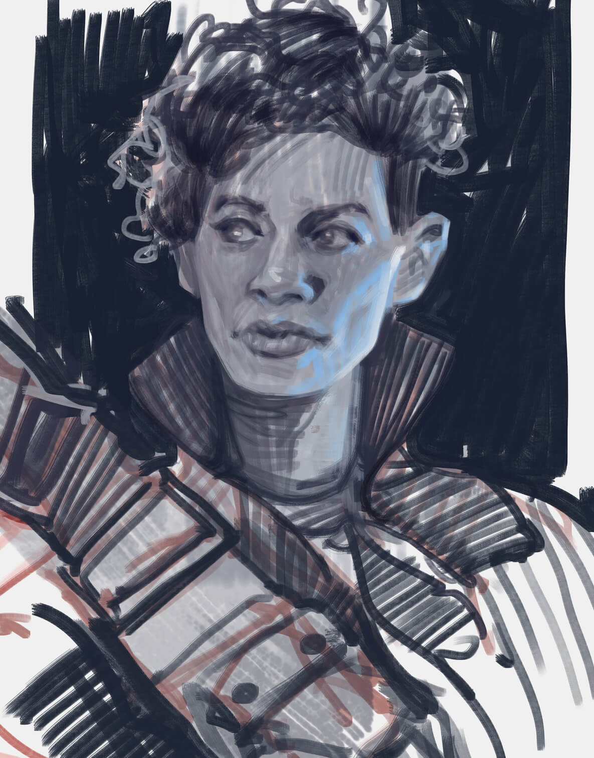 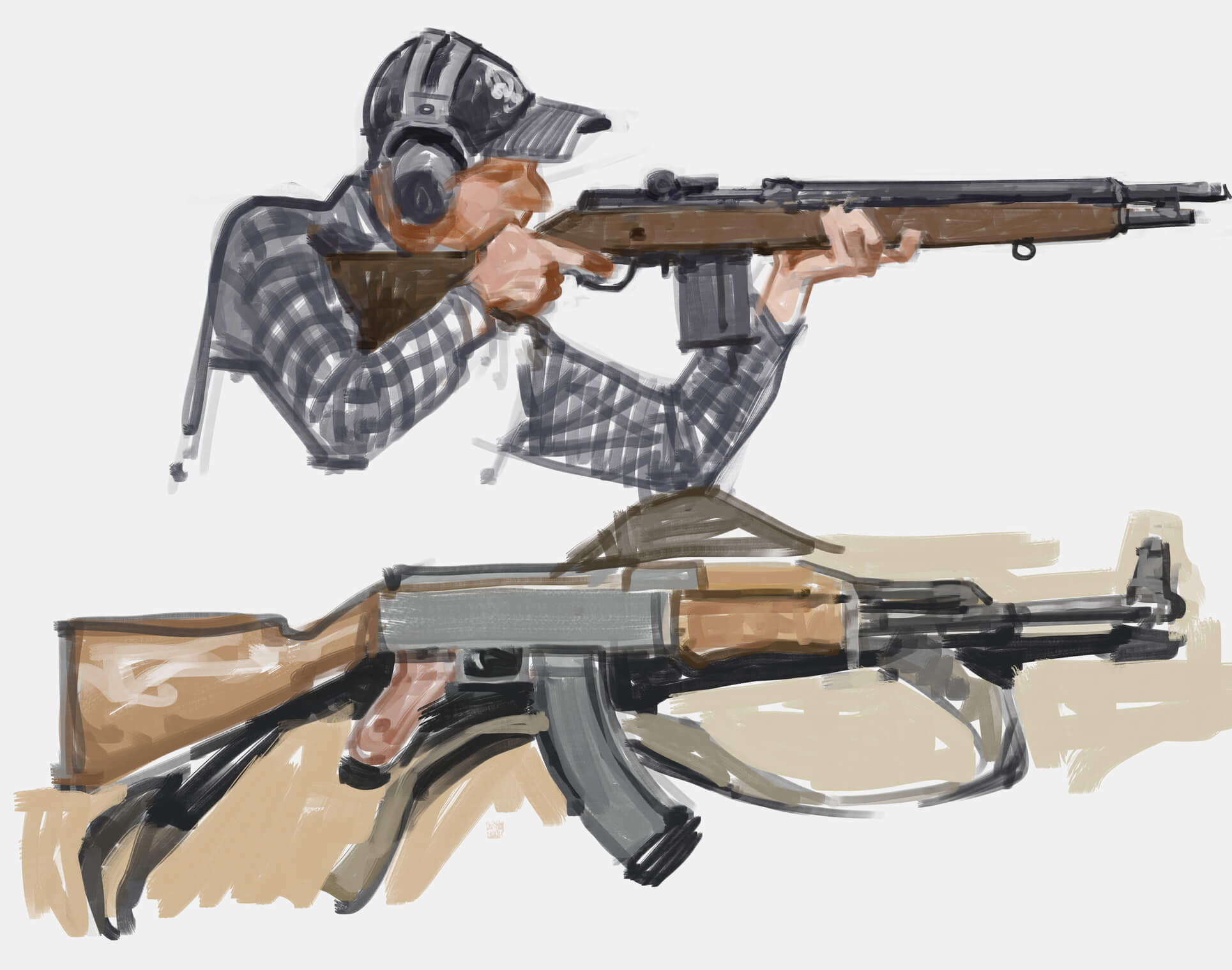 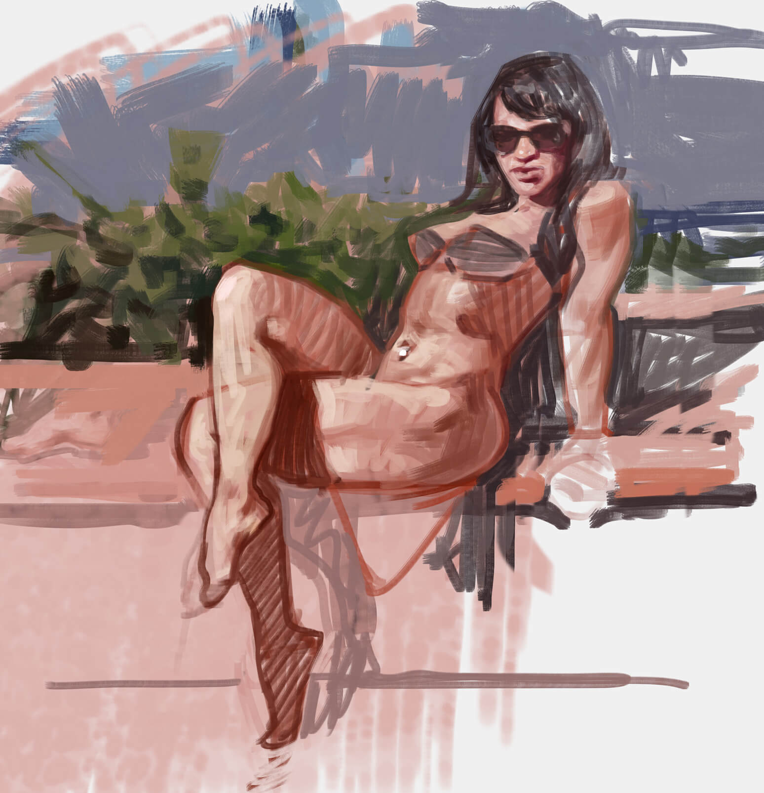 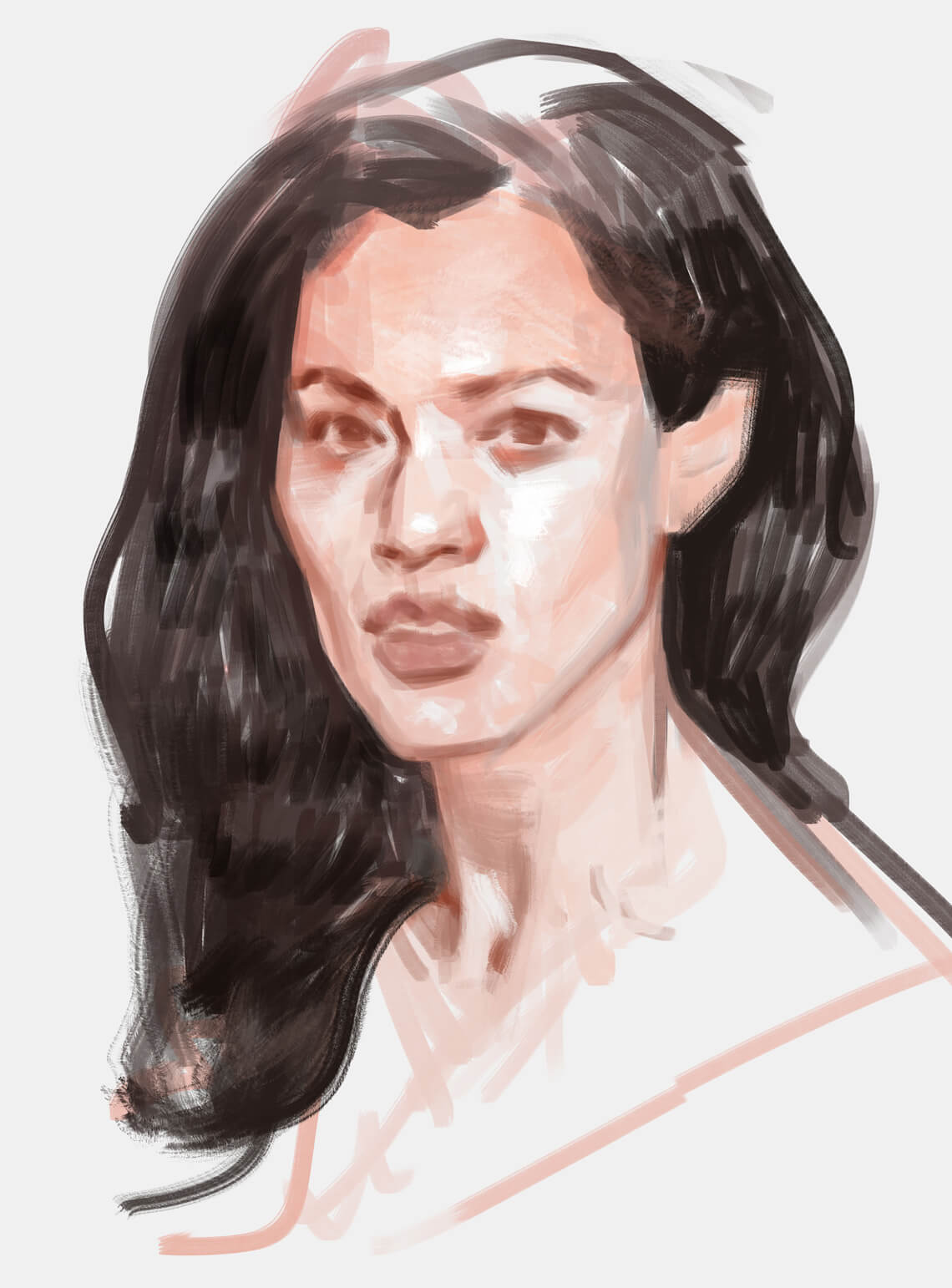 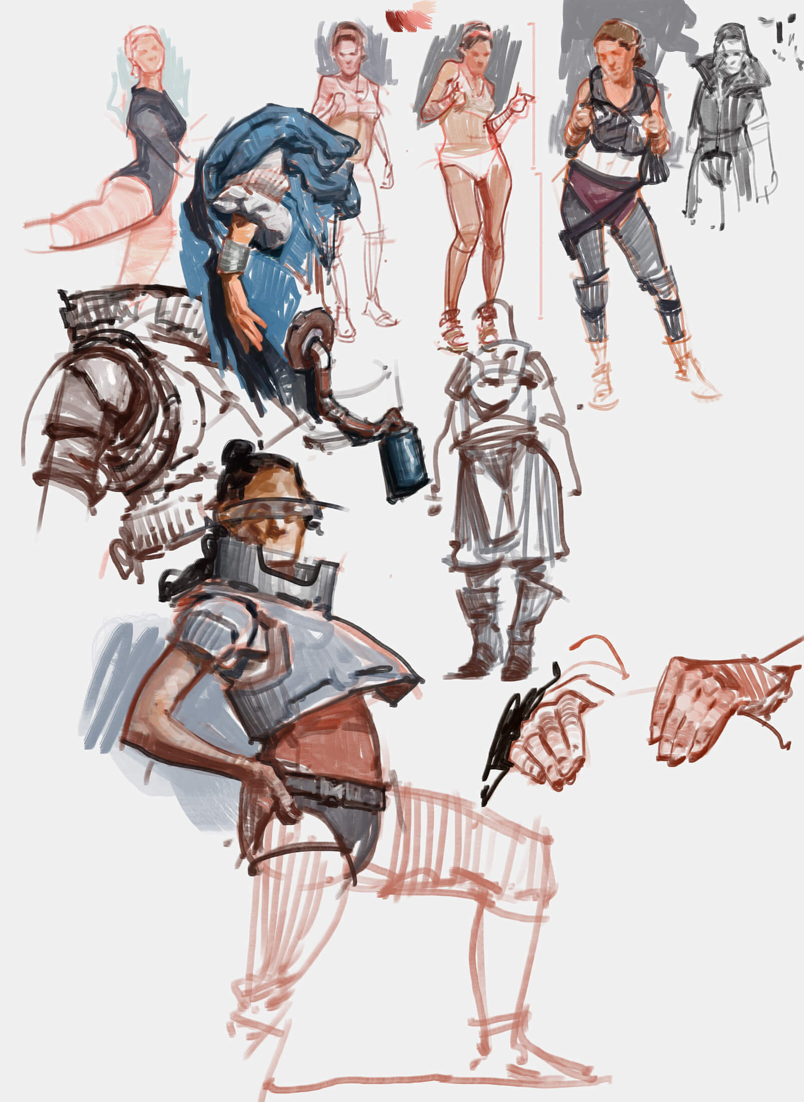 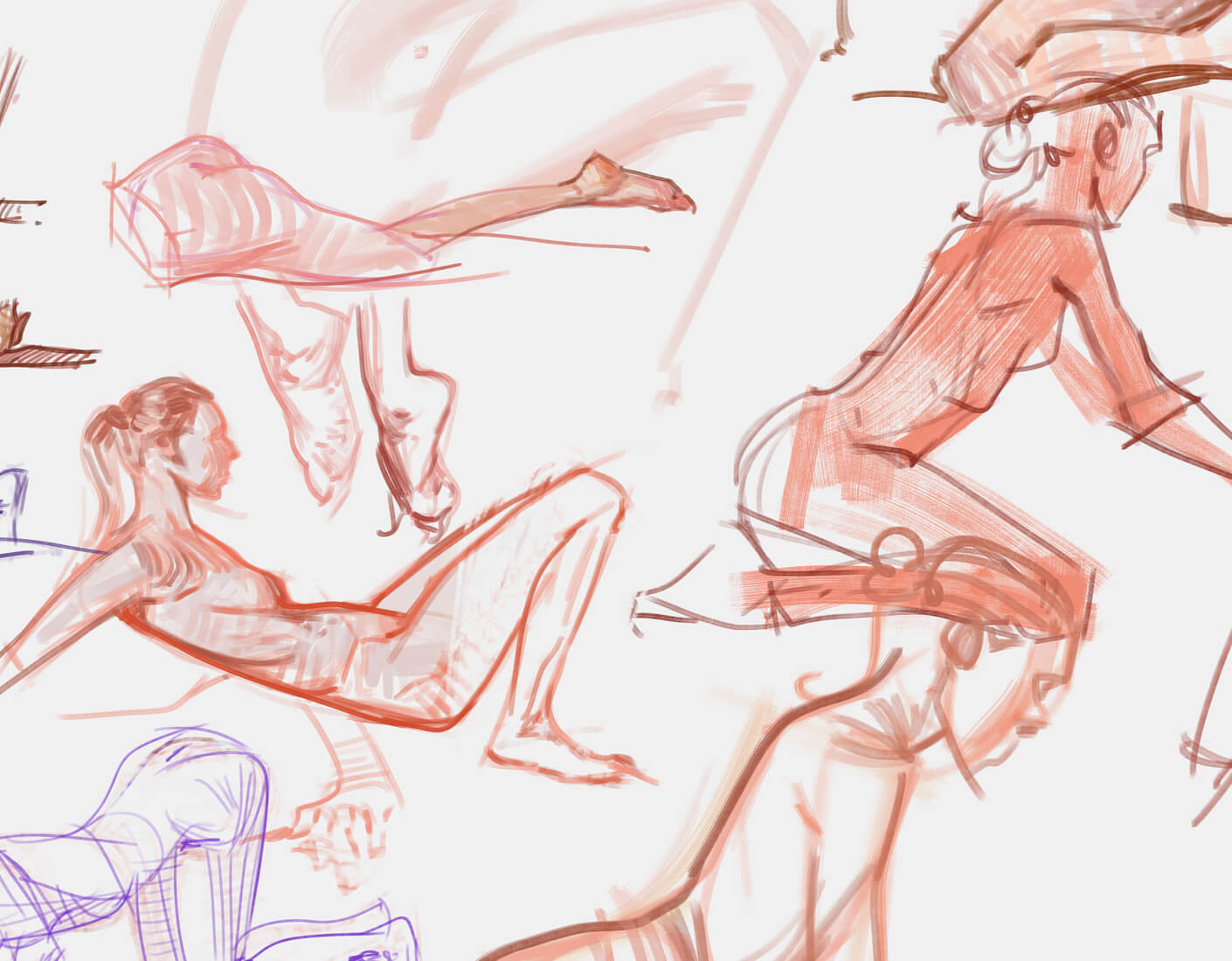 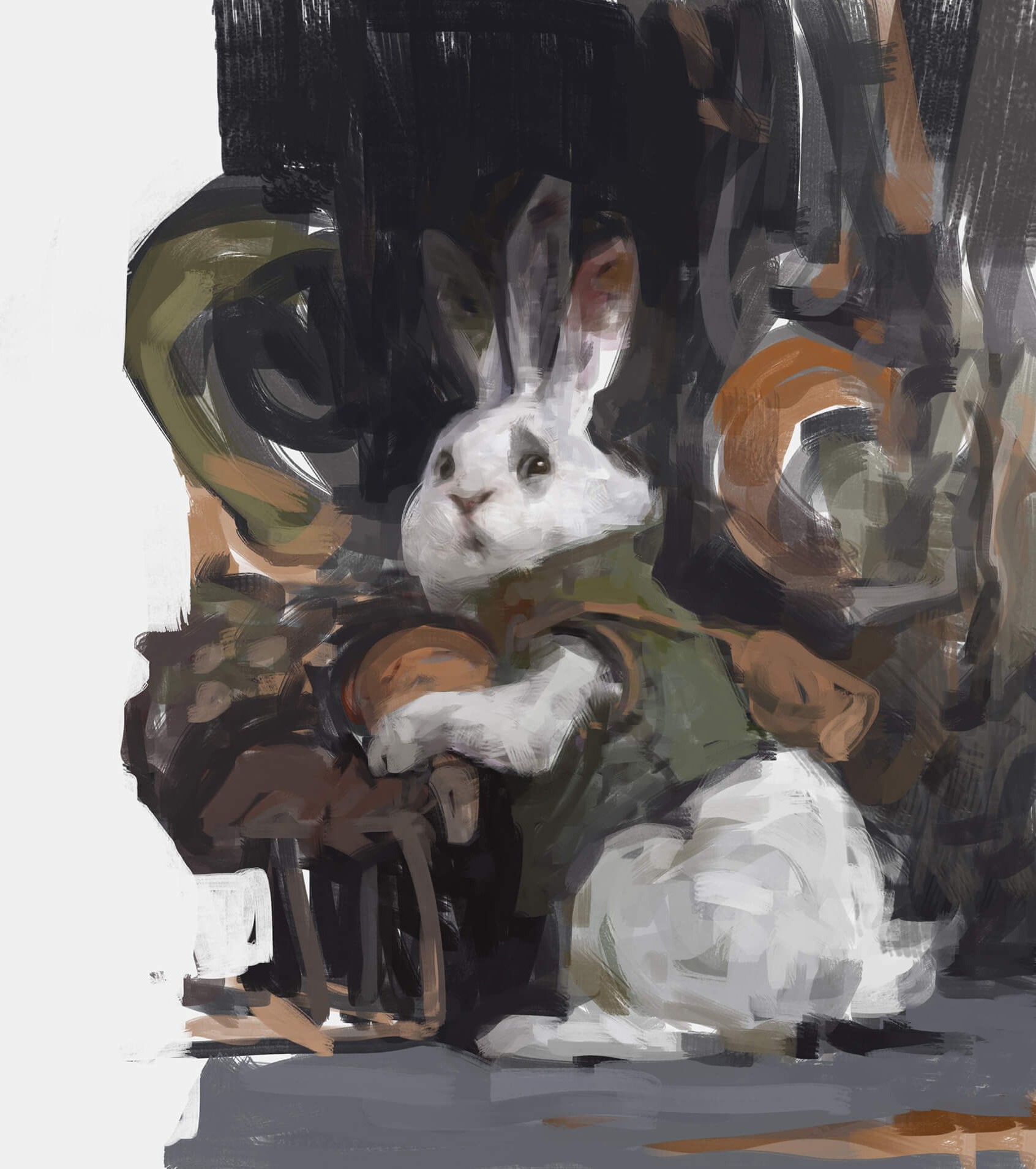 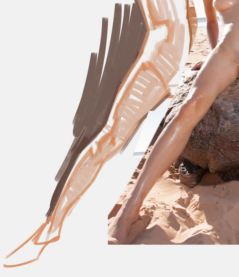 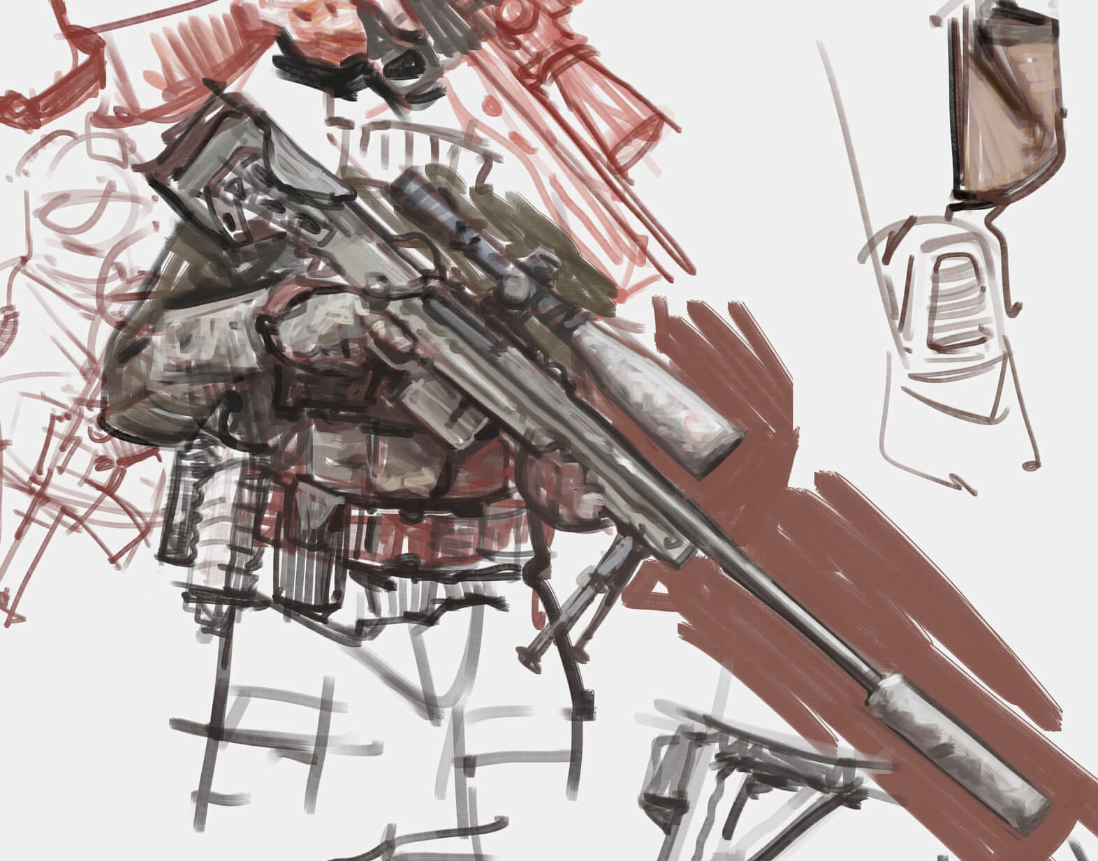
02-11-2021, 11:20 AM
Wow! Your style of sketching is really attractive to me. I always have thought that in order to get strong form and lighting to read, you need unified masses, which means flat with no holes. And that the result would be confusing if less solid. But your paintings always have these large hatched lines or broken colors. If anything your work is stronger for it!
Maybe it just captures the strongest ideas of things.
02-11-2021, 03:47 PM
Great work walent! You have a very dynamic sense of sketching and the life and energy really comes through in your character designs!
I think that you have reached a very important stage of enlightenment in your studying. It's important to maintain a malleable brain as an artist and always be able to step back and re-think the way you are working. I found that once I dropped "my way" and "my style" of working, I really started to make better progress in my art.
02-11-2021, 08:10 PM
I cannot express in words how much I like your sketches. The way you design really solid and interesting shapes, but not making them flat is amazing.
"I also know how important keeping a healthy mindset is to an aspiring artist, so I found out that pushing yourself too much can sometimes hurt more than help." Had a very similar mindset shift on that a year ago myself, couldn't agree more. I am reminded of the saying that when in a rowboat, you have to turn your back to where you're going in order to get there! "No man is more unhappy than he who never faces adversity. For he is not permitted to prove himself." - Seneca
02-16-2021, 05:43 AM
Great stuff here ! solid shapes and volume ! one thing to say would be maybe to play more with the saturation of your colors ! you are quite most of the time using the same desaturation all over your painting and it'd be great to experiment a bit with your colors ! keep it up !
02-16-2021, 06:26 AM
What great about the approch in here is that you give great care to setting yourself to have a clear wrapping of you form this in return help you construct your light and shadow.Great technique keep up the work you seem to be a great inspiration for other.
02-24-2021, 10:46 AM
(02-11-2021, 11:20 AM)JosephCow Wrote: Wow! Your style of sketching is really attractive to me. I always have thought that in order to get strong form and lighting to read, you need unified masses, which means flat with no holes. And that the result would be confusing if less solid. But your paintings always have these large hatched lines or broken colors. If anything your work is stronger for it! That's a good point actually. It's something that comes naturally to me, never deeply thought about it. I remember Proko invited an artist who said never leave holes in your painting, it looks unfinished and clumsy. Sure, it depends on the style, I mean maybe you wanna check Leyendecker. For me, I think what makes it work is that the big strokes you see have a unified value and they also show form most of the times, thus making it easier to understand what you look at and I get away with the empty spaces left behind. (02-11-2021, 03:47 PM)Zorrentos Wrote: Great work walent! You have a very dynamic sense of sketching and the life and energy really comes through in your character designs! Thanks! I agree that trying new things is good but dropping your way entirely, doesn't that make you lose your identity as an artist as well? Isn't it better to just add new stuff to "your way"? (02-11-2021, 08:10 PM)gerbenpasjes Wrote: I cannot express in words how much I like your sketches. The way you design really solid and interesting shapes, but not making them flat is amazing. Thanks! The rowboat is an interesting analogy (02-16-2021, 05:43 AM)wld.89 Wrote: Great stuff here ! solid shapes and volume ! one thing to say would be maybe to play more with the saturation of your colors ! you are quite most of the time using the same desaturation all over your painting and it'd be great to experiment a bit with your colors ! keep it up ! Thanks! Yeah, I agree on the color side, I never got to focus entirely on color because it always felt natural and I never saw any big problems there, while other areas still need a lot more work, like posing, composition and design. (02-16-2021, 06:26 AM)darktiste Wrote: What great about the approch in here is that you give create care to setting yourself to have a clear wrapping of you form this in return help you construct your light and shadow.Great technique keep up the work you seem to be a great inspiration for other. Thanks! - 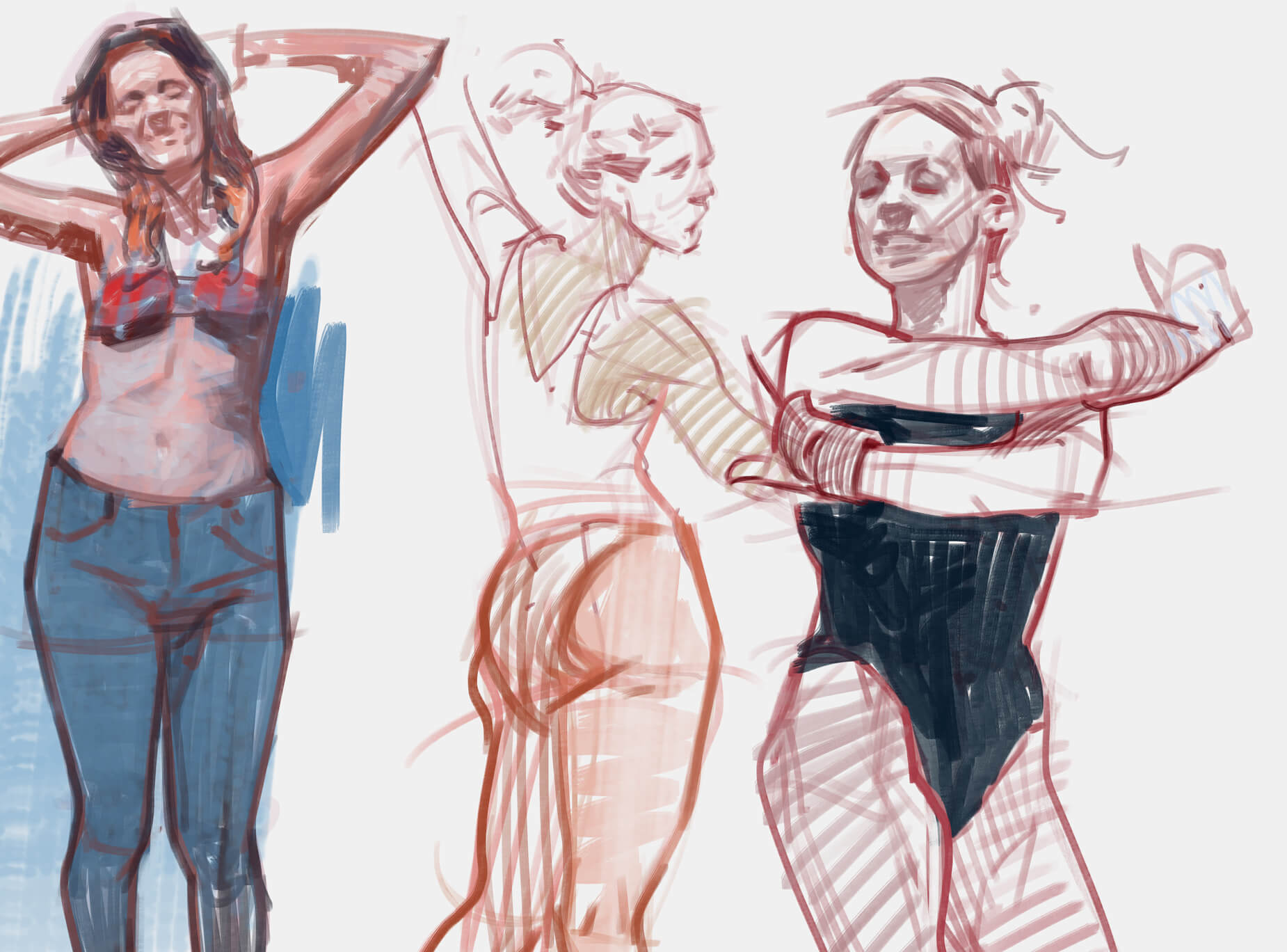 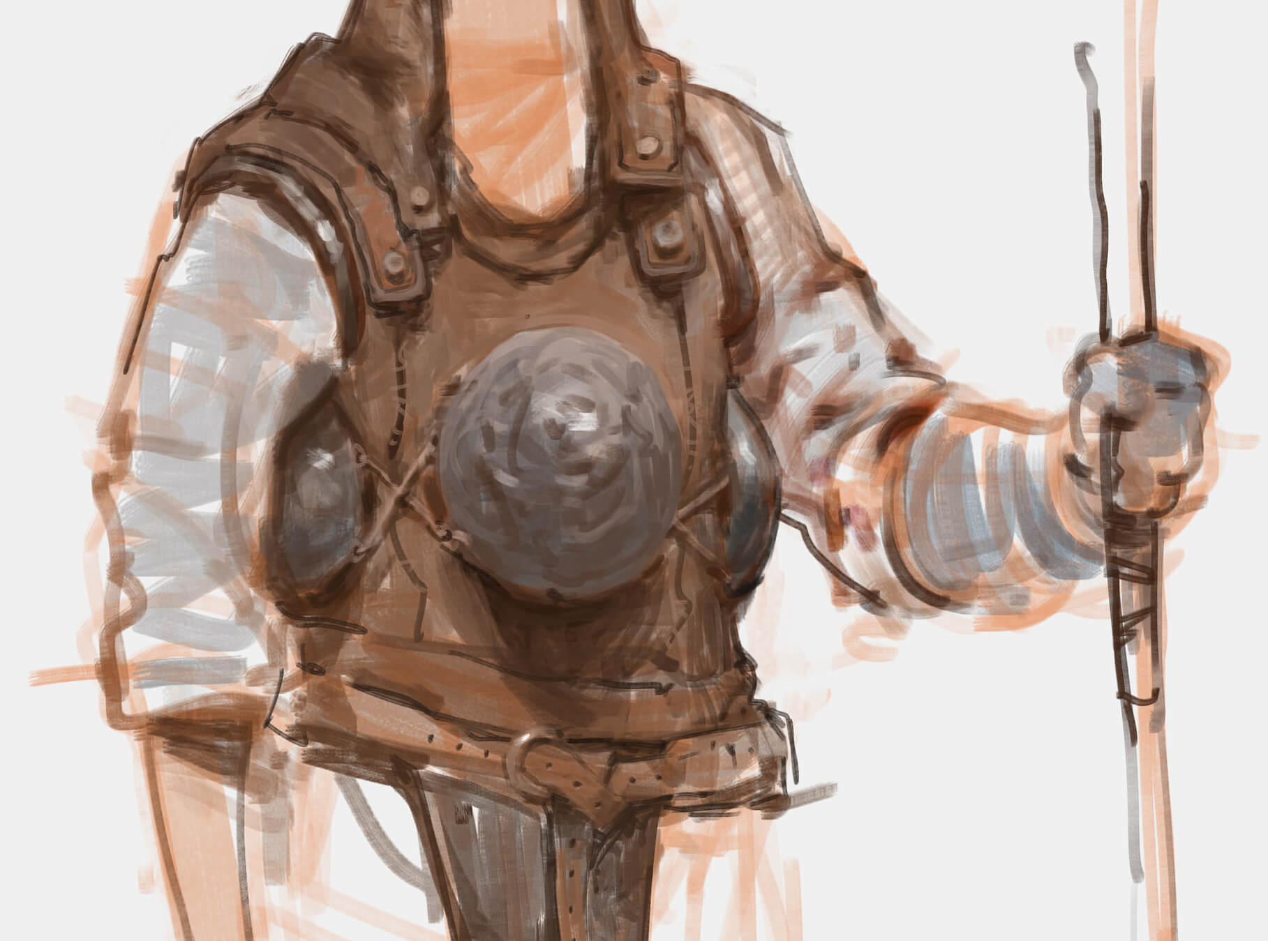 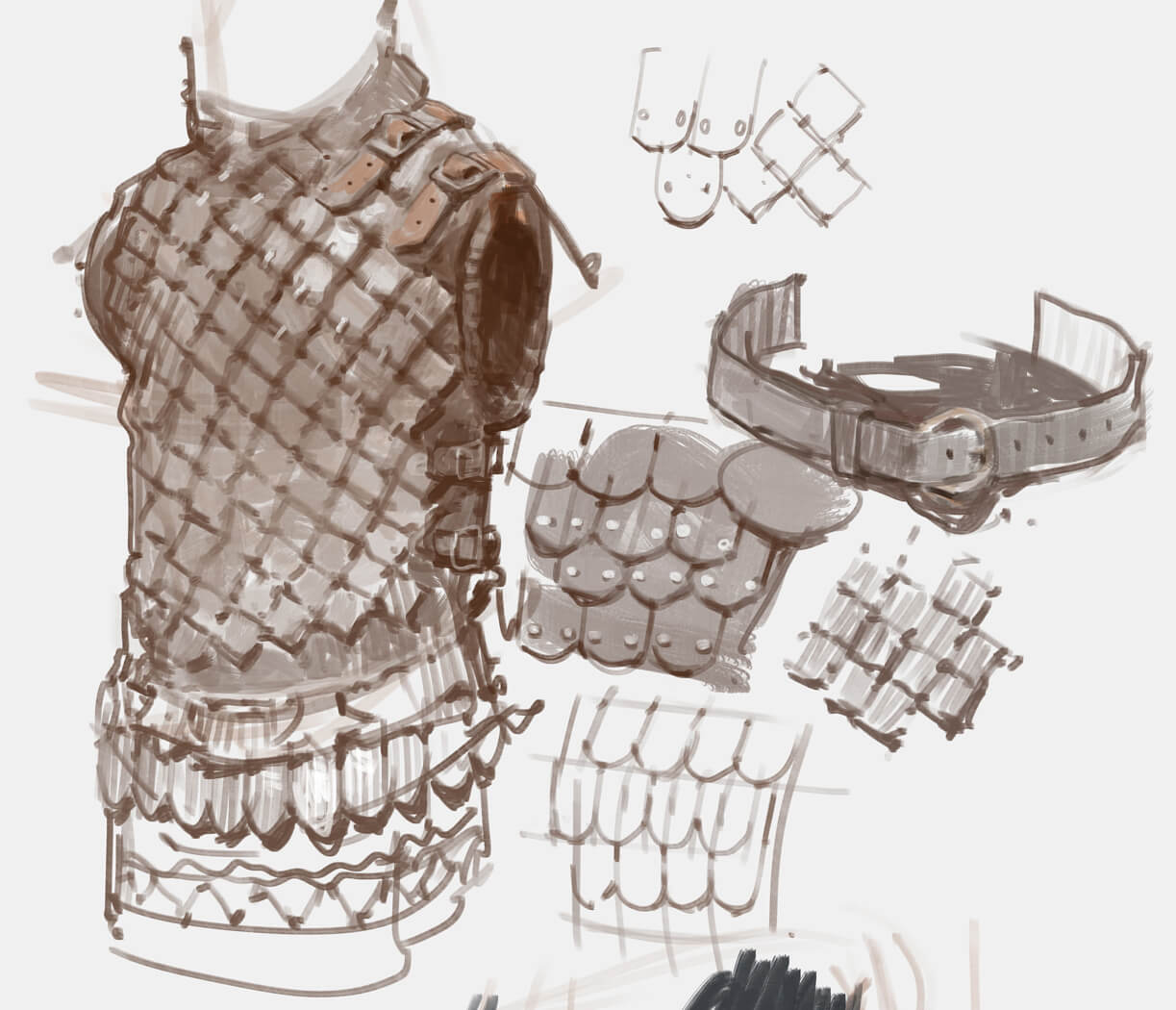 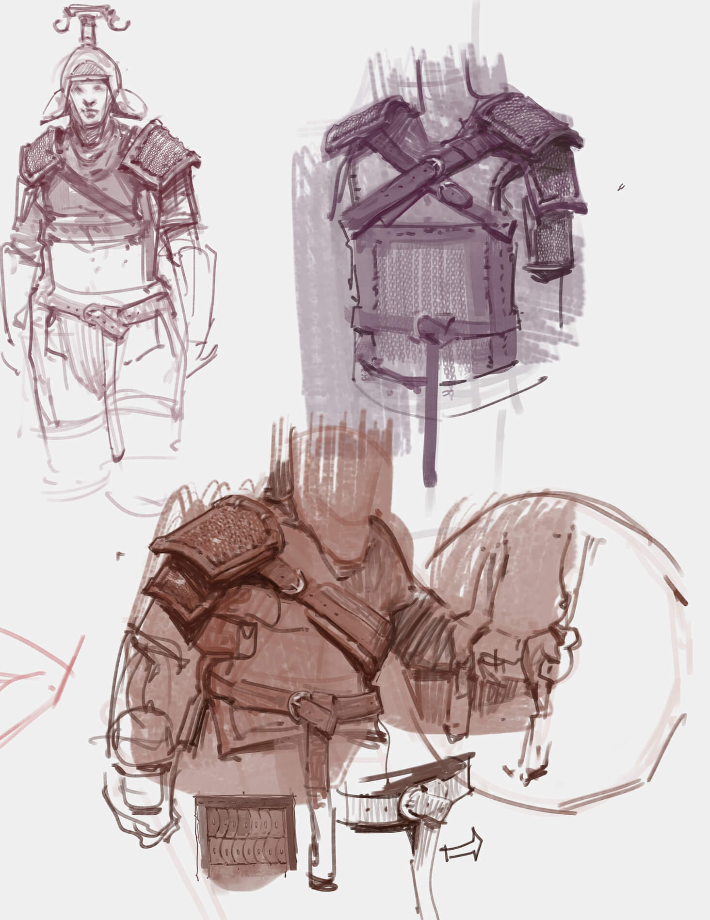 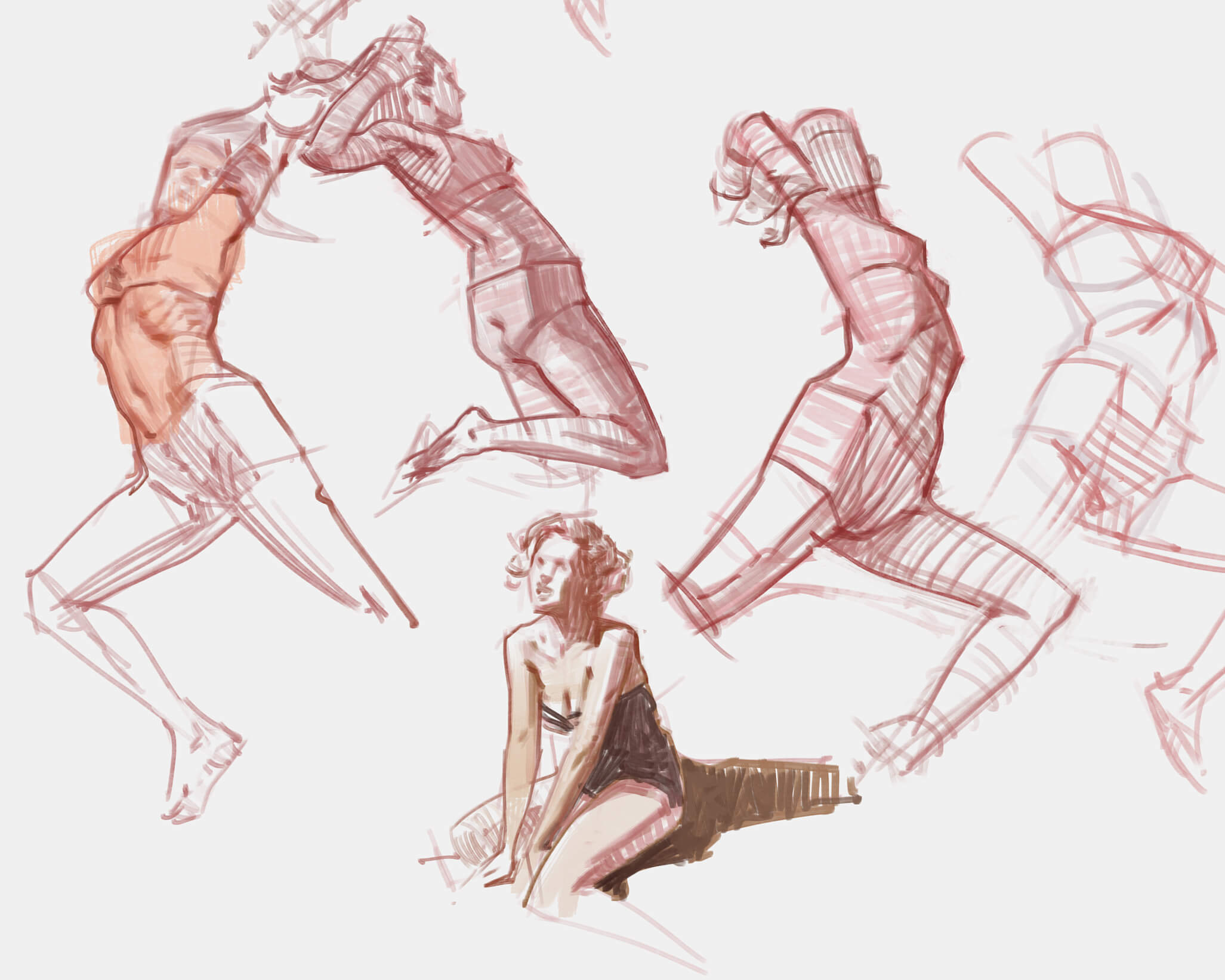 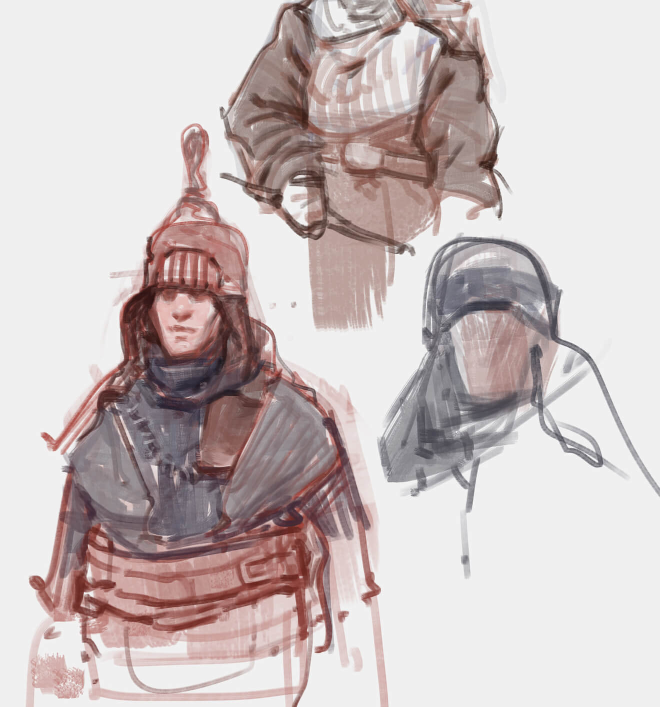 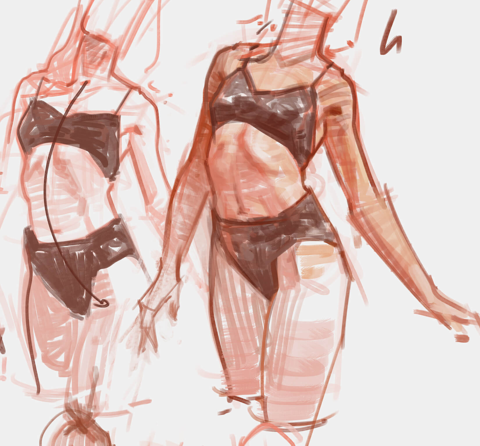 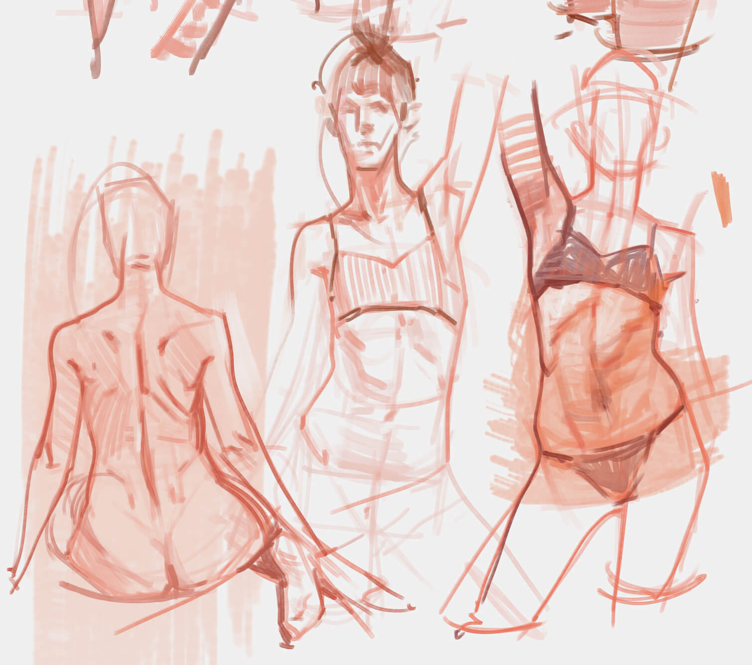 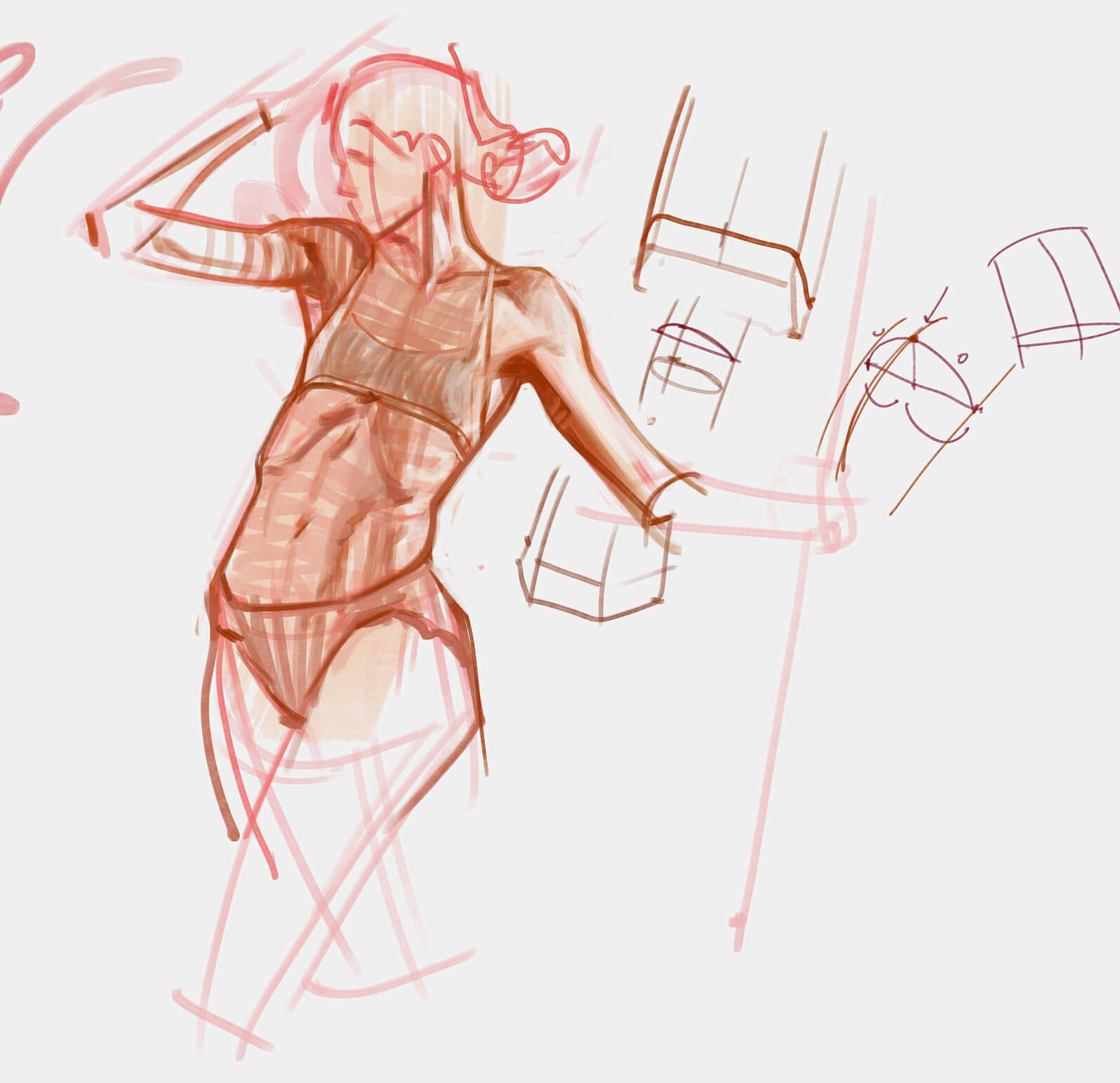 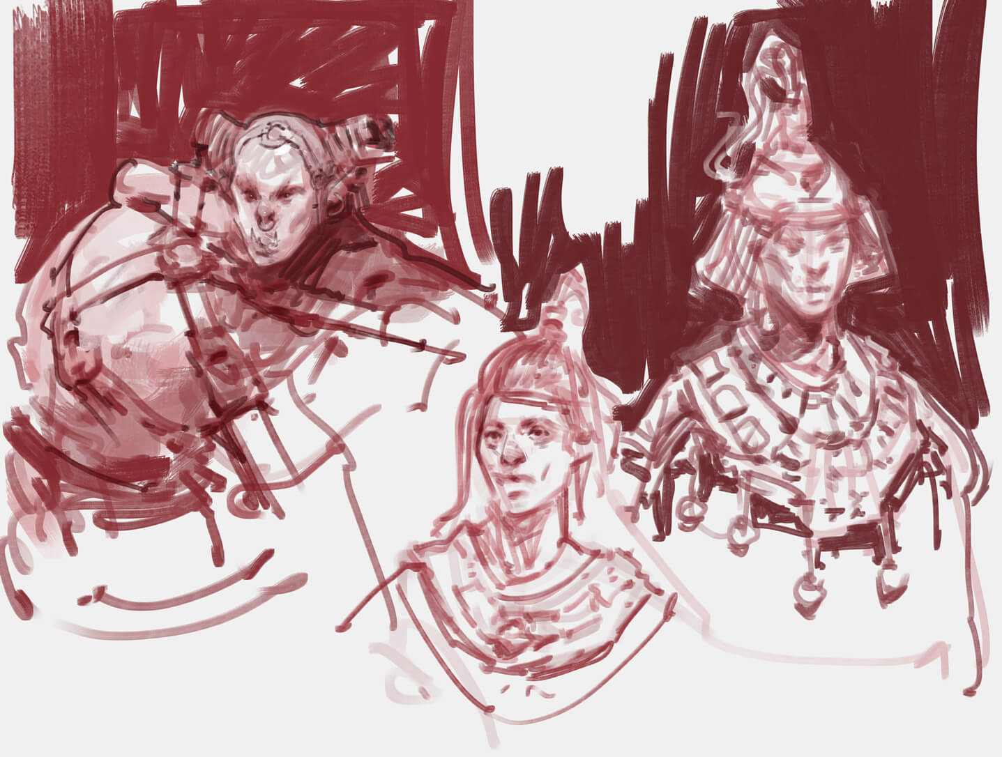 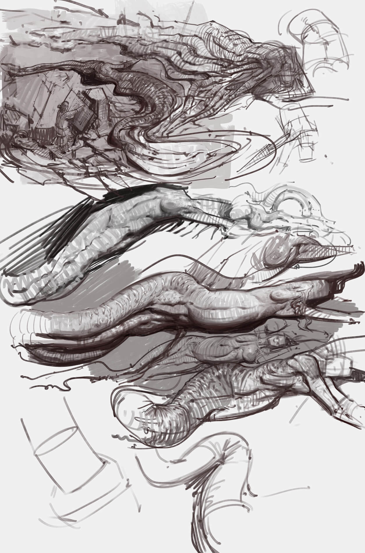 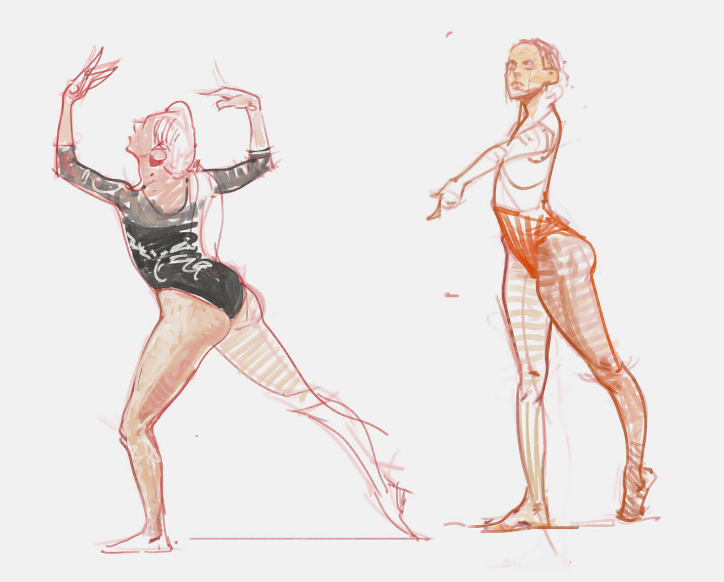
02-24-2021, 11:56 AM
"For me, I think what makes it work is that the big strokes you see have a unified value and they also show form most of the times, thus making it easier to understand what you look at and I get away with the empty spaces left behind."
Yeah that must be it. When you squint you do include all the pertinent value information. What's amazing is how far apart the hatching can be and still communicate a field of color. Love the armor sketches and mermaids by the way. The mermaids look so epic. At first I didn't really see what they were, it just read as a big form like a tree branch, but with really powerful rhythm. Do you think you will expand upon those sketches?
02-24-2021, 01:05 PM
Love the armor designs and figure drawings . Do you use reference for the figures or are some of them from imagination ? You have great understanding of form, everything feels "solid", and the brushstroke style you have is really cool. I still don't really have a defined style so I keep switching between different ones all the time
02-25-2021, 09:35 AM
These environment paintings are sick!! That's the level I wish to get one day
 . I love that sketchy look. I like how you convey the form with lines over the surface (i've read that in Vilppu's book but seeing it in application is great!)on your figure drawing/paintings. . I love that sketchy look. I like how you convey the form with lines over the surface (i've read that in Vilppu's book but seeing it in application is great!)on your figure drawing/paintings.Are these from imagination??!
03-25-2021, 12:58 AM
(02-24-2021, 11:56 AM)JosephCow Wrote: Love the armor sketches and mermaids by the way. The mermaids look so epic. At first I didn't really see what they were, it just read as a big form like a tree branch, but with really powerful rhythm. Do you think you will expand upon those sketches? Thanks! Yeah, will probably create a whole series at some point. (02-24-2021, 01:05 PM)Skeffin Wrote: Love the armor designs and figure drawings . Do you use reference for the figures or are some of them from imagination ? You have great understanding of form, everything feels "solid", and the brushstroke style you have is really cool. I still don't really have a defined style so I keep switching between different ones all the time Thanks! Some are from imagination, mostly the character stuff like the centaurs and mermaids. The other studies related to figure drawing are from ref. Yeah, the style will stick eventually, I'd say keep exploring don't stress too much over it. (02-25-2021, 09:35 AM)Kassatay Wrote: These environment paintings are sick!! That's the level I wish to get one day Thanks! Again, the figures are from reference, but the armor designs and character/creature designs are mostly from the imagination, sometimes trying to remember what I previously studied - Today I feel very pleased with the result of one of my portraits, I managed to create likeness with good, simplified shape structure and minimal brushwork. That was one of my bigger goals. Onto some design goals now. 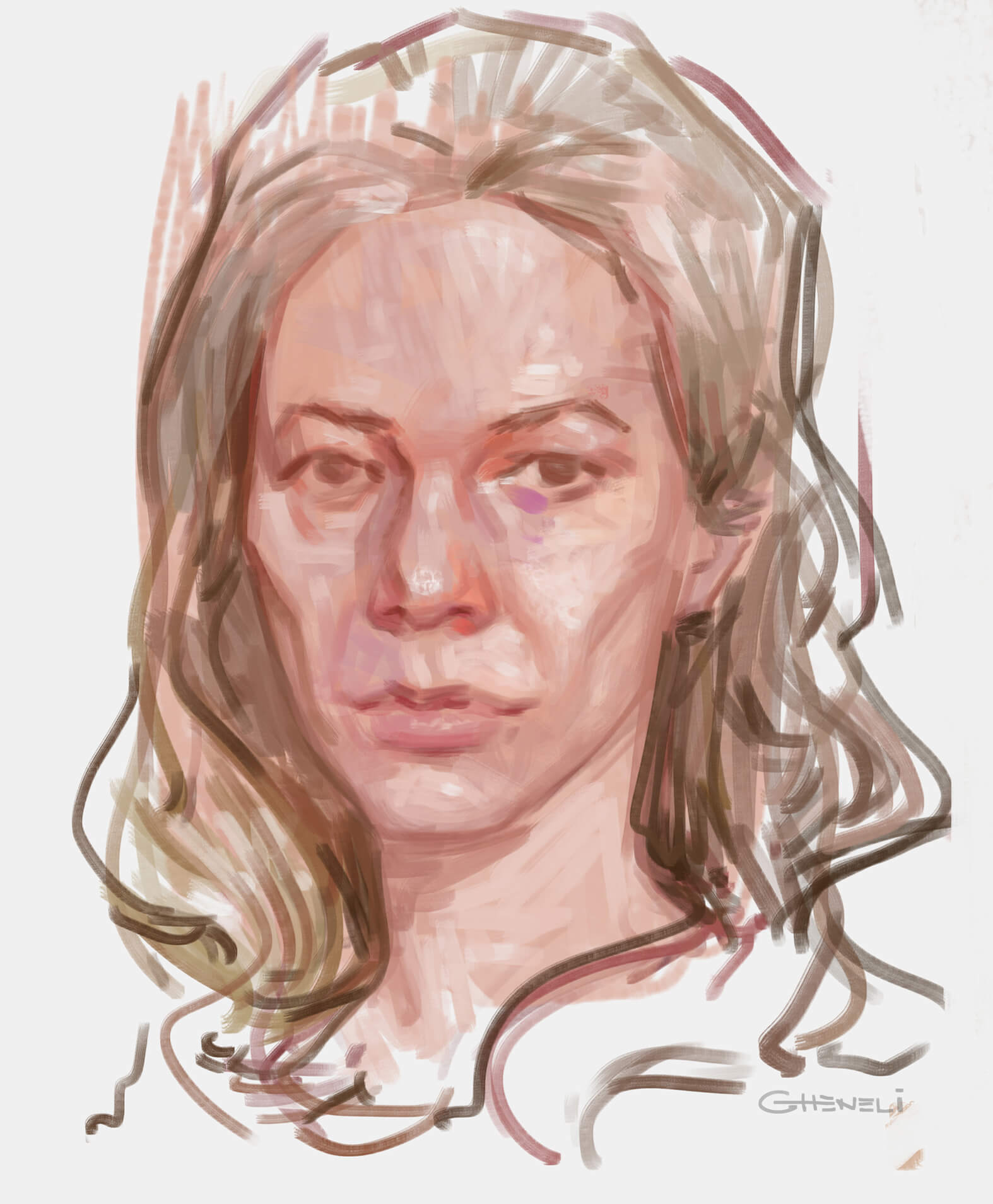 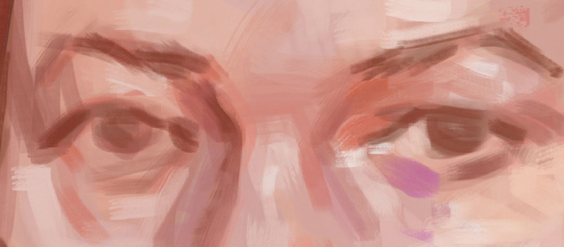 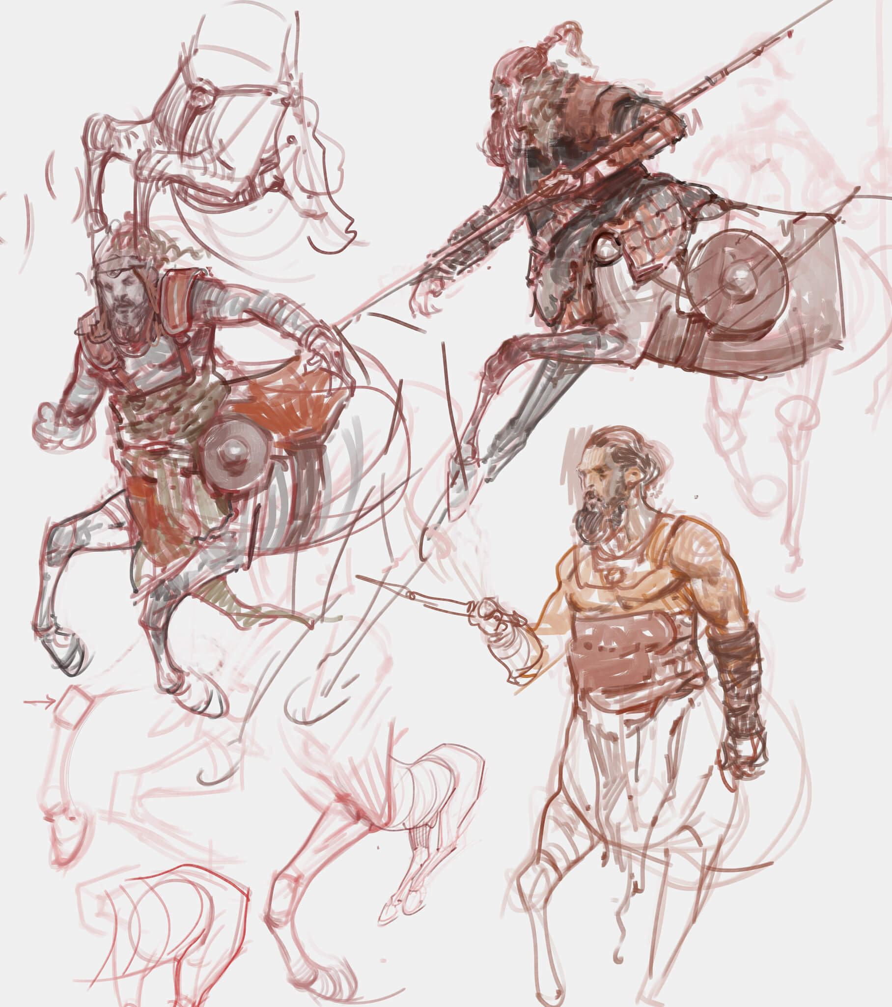 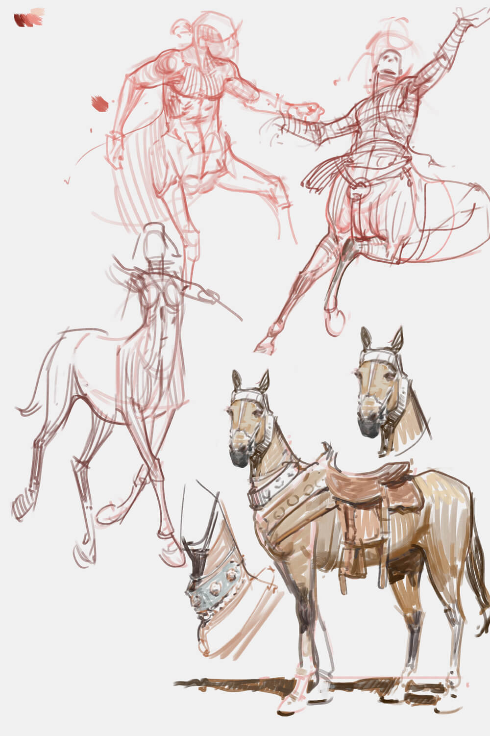 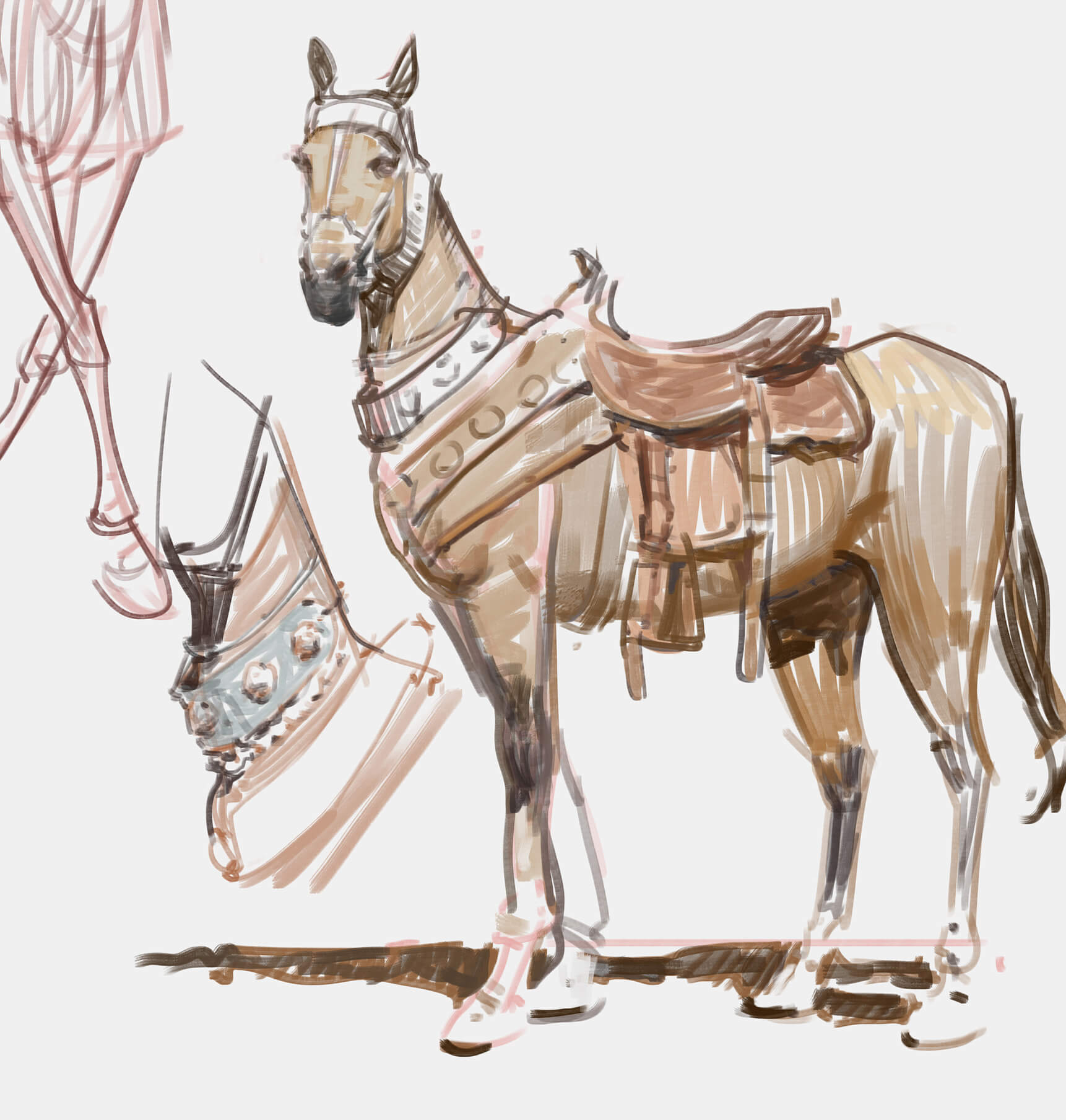 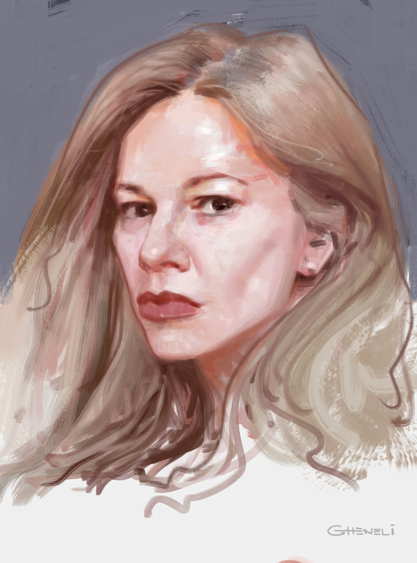 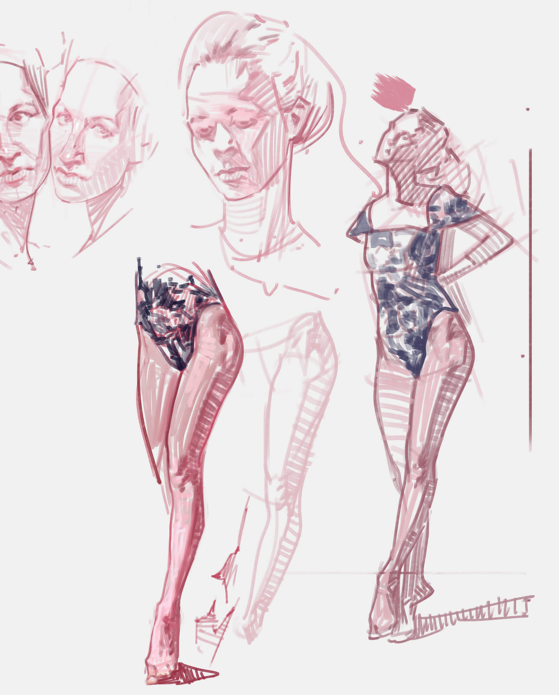 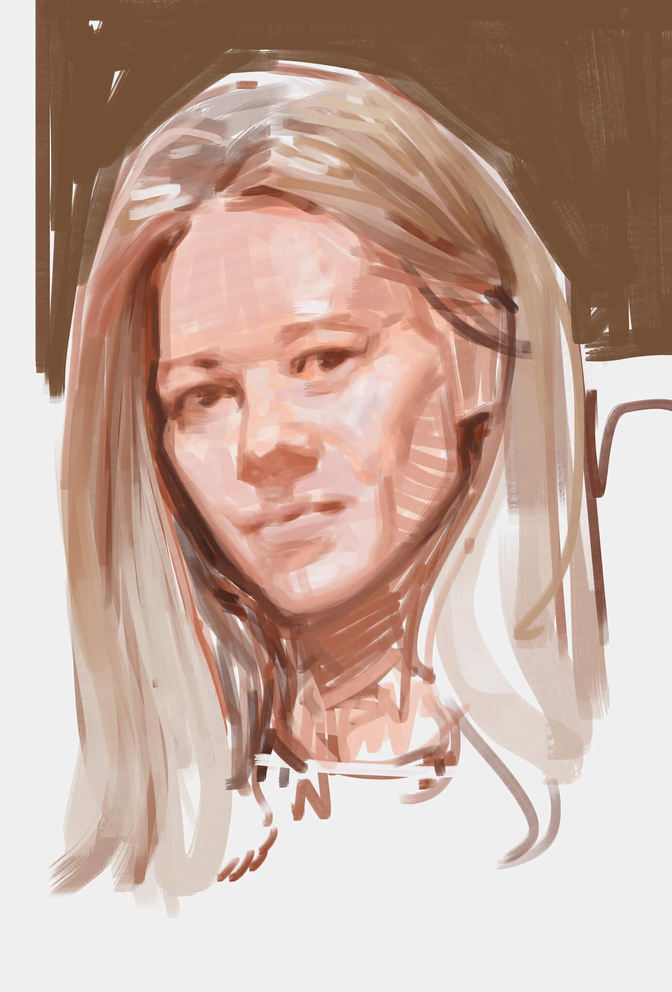 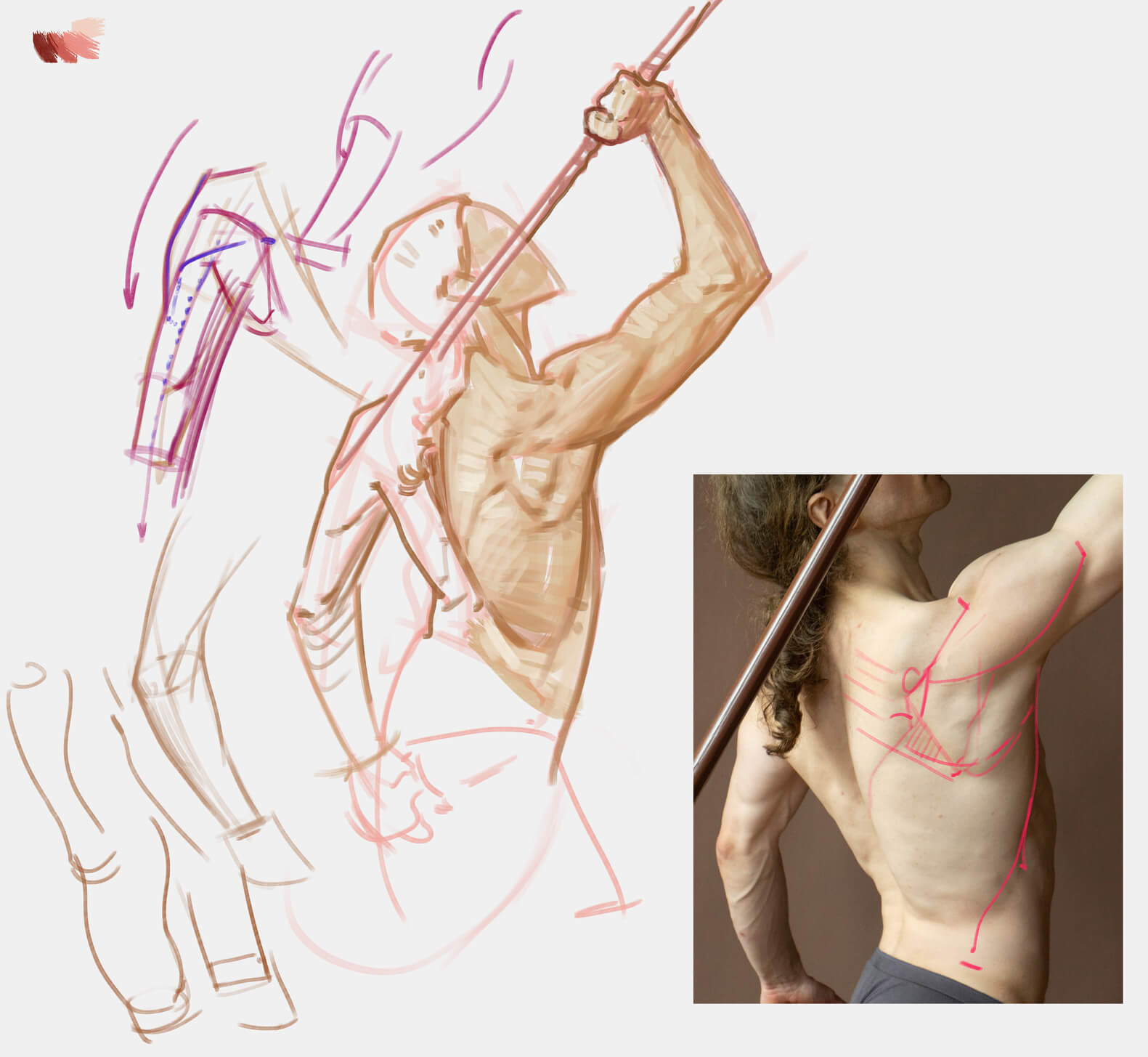 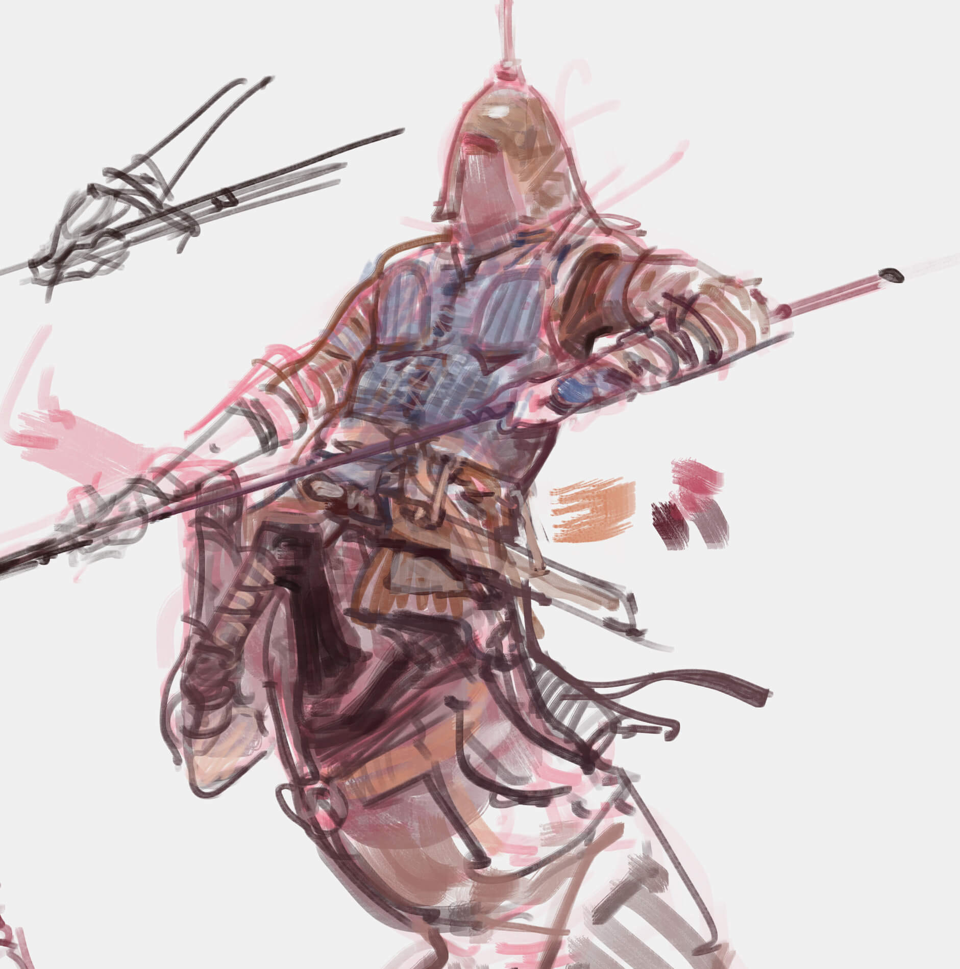 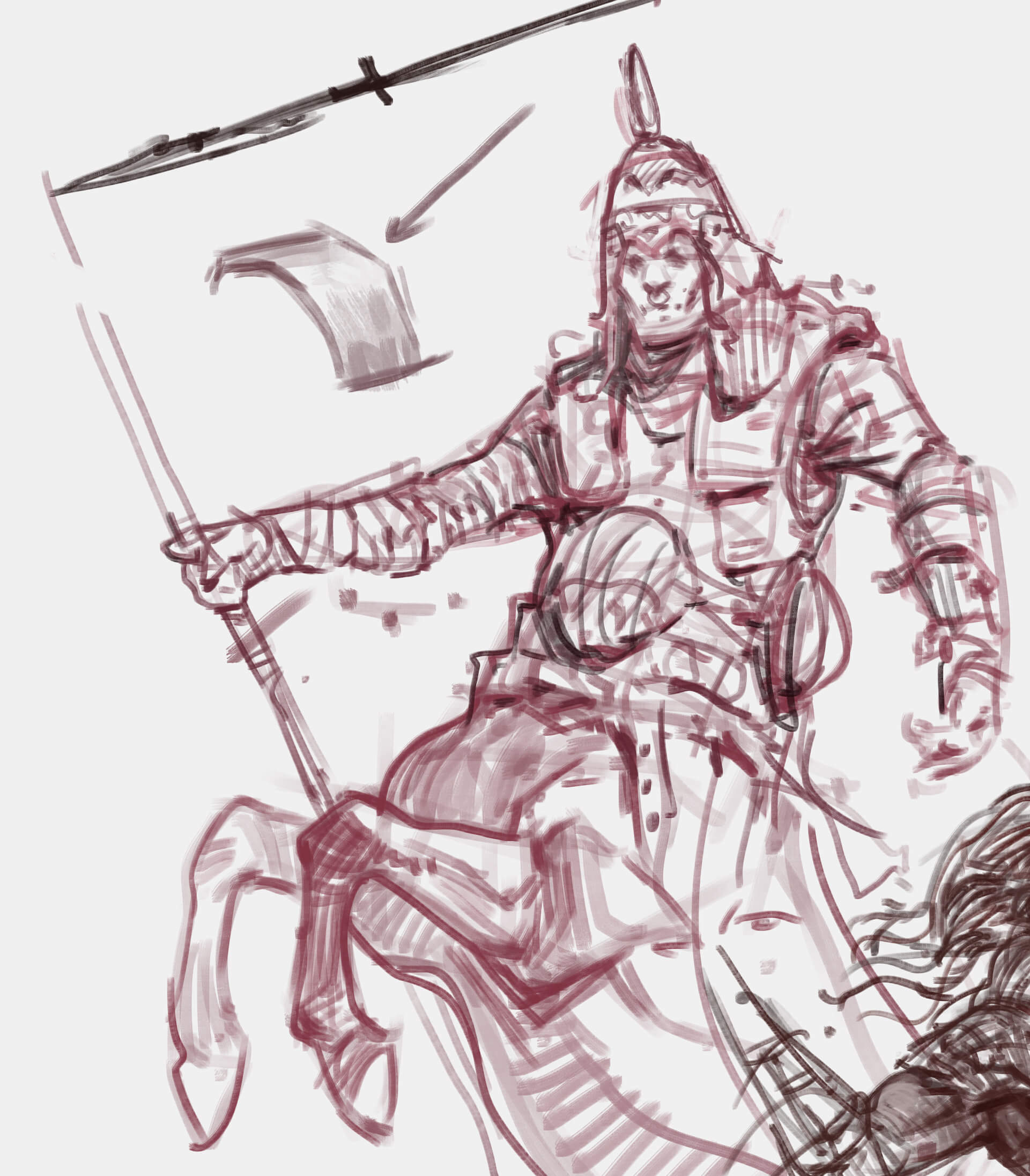 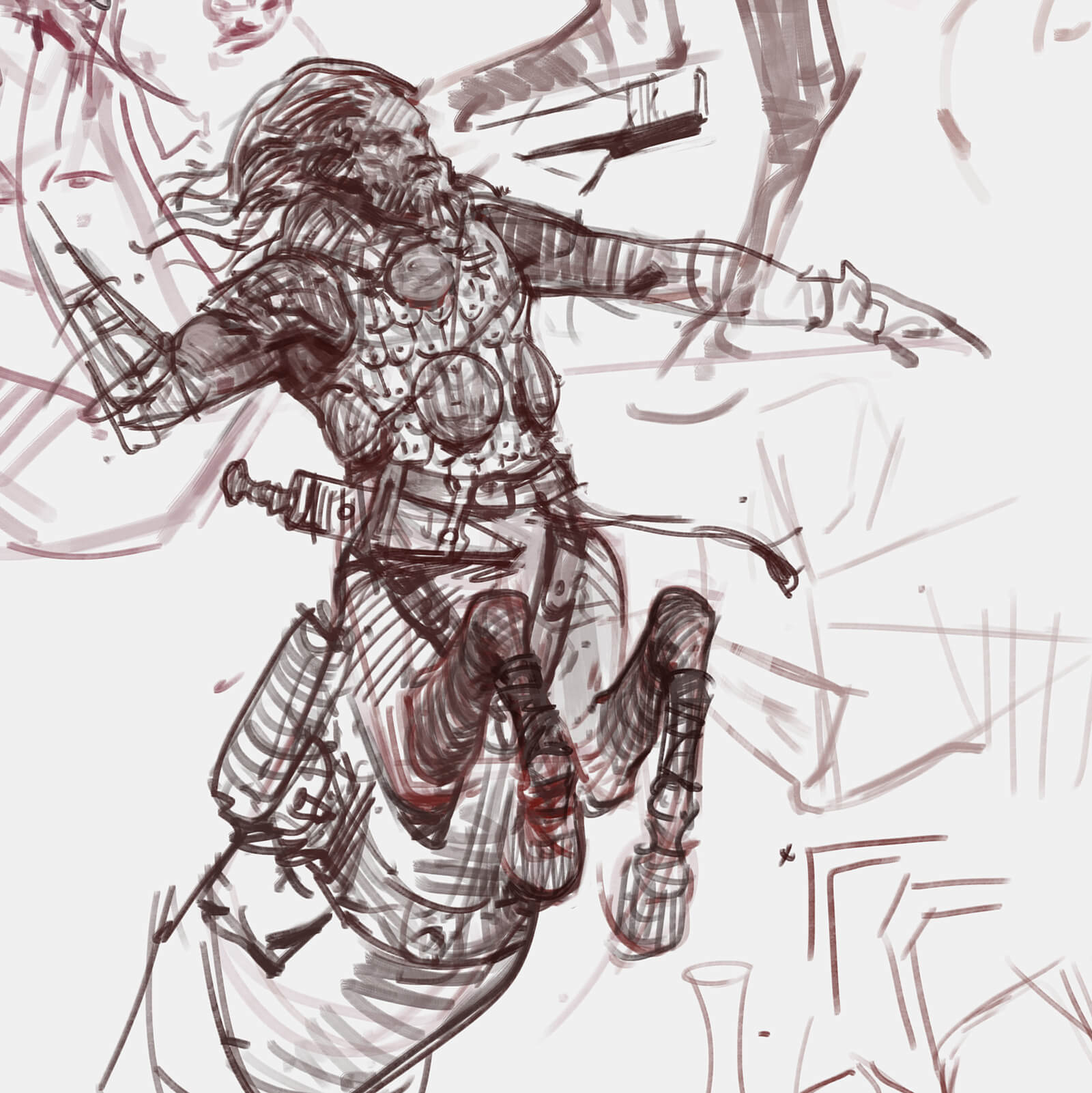 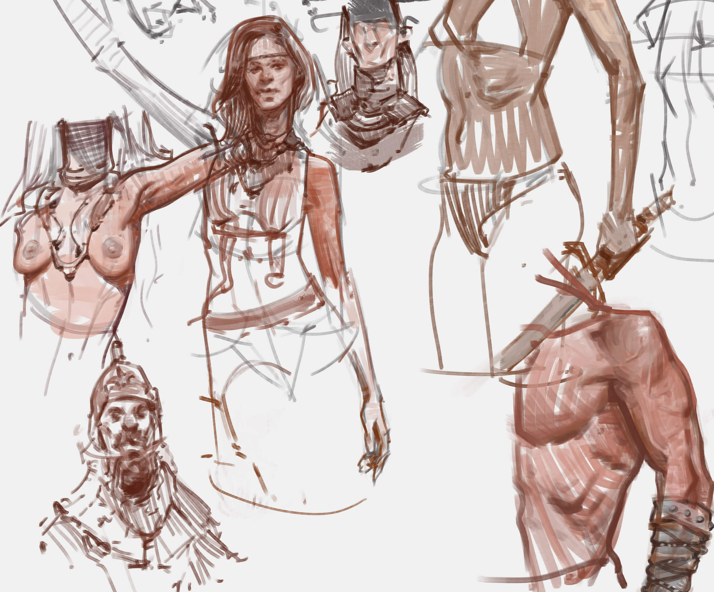 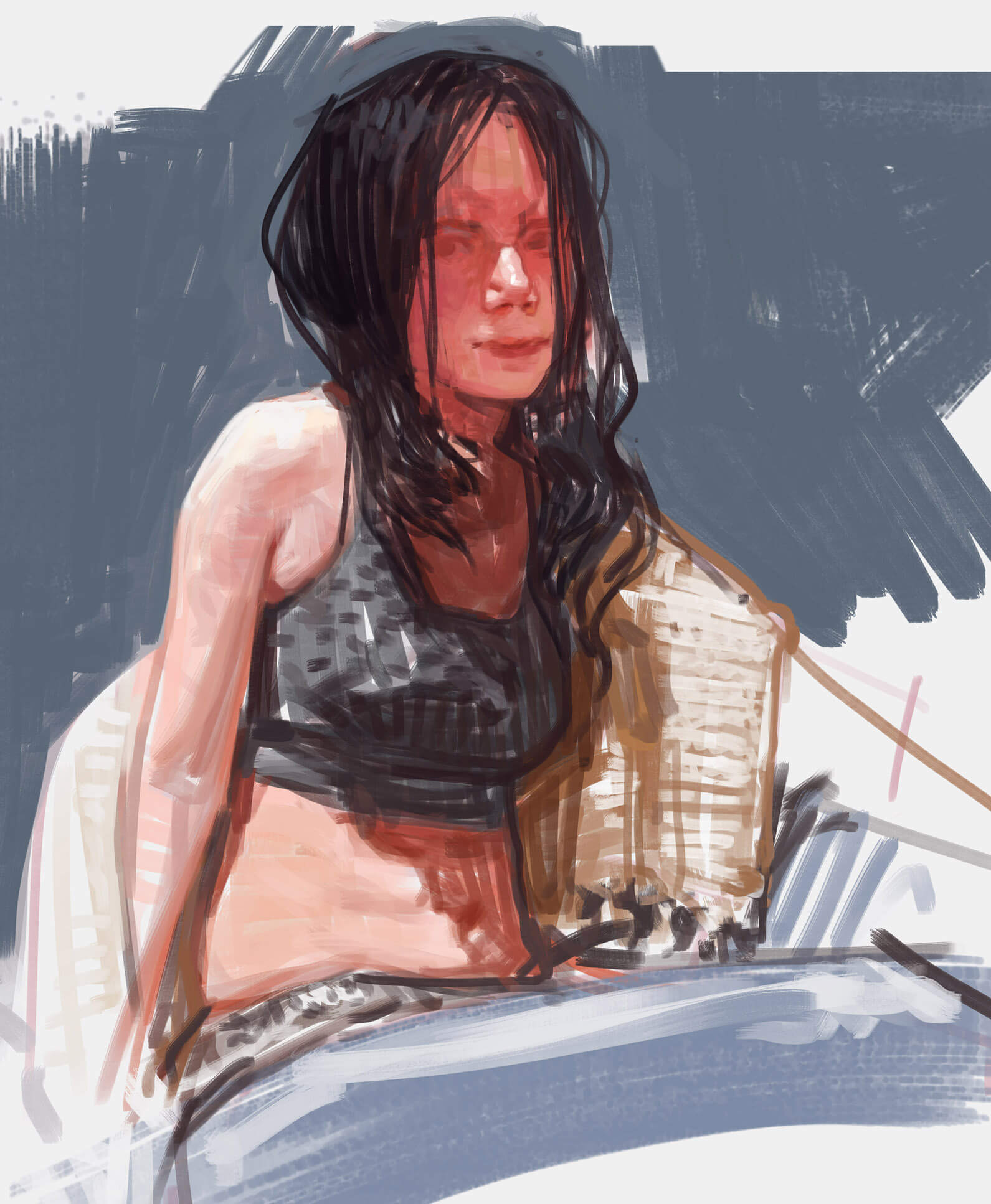 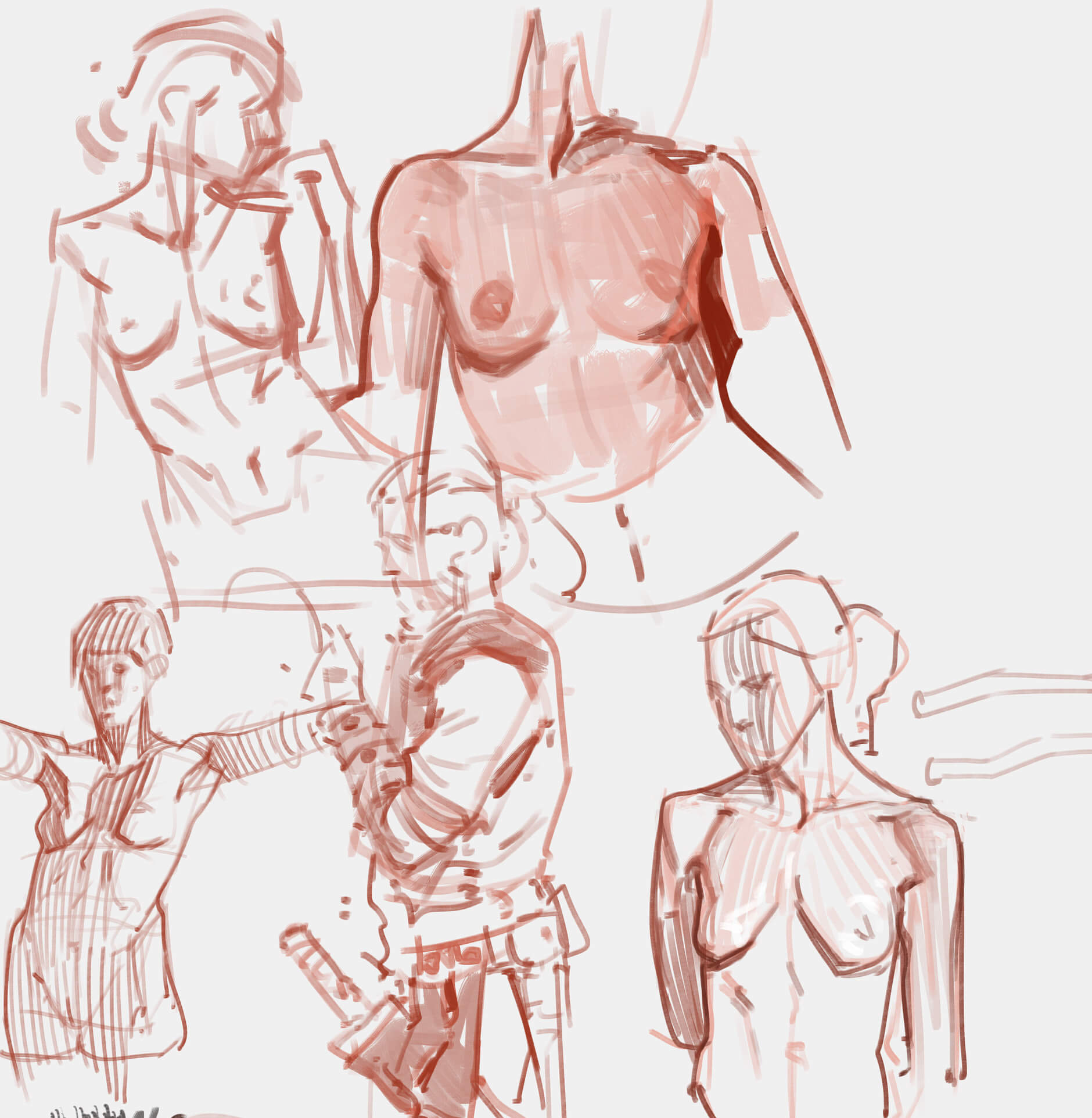 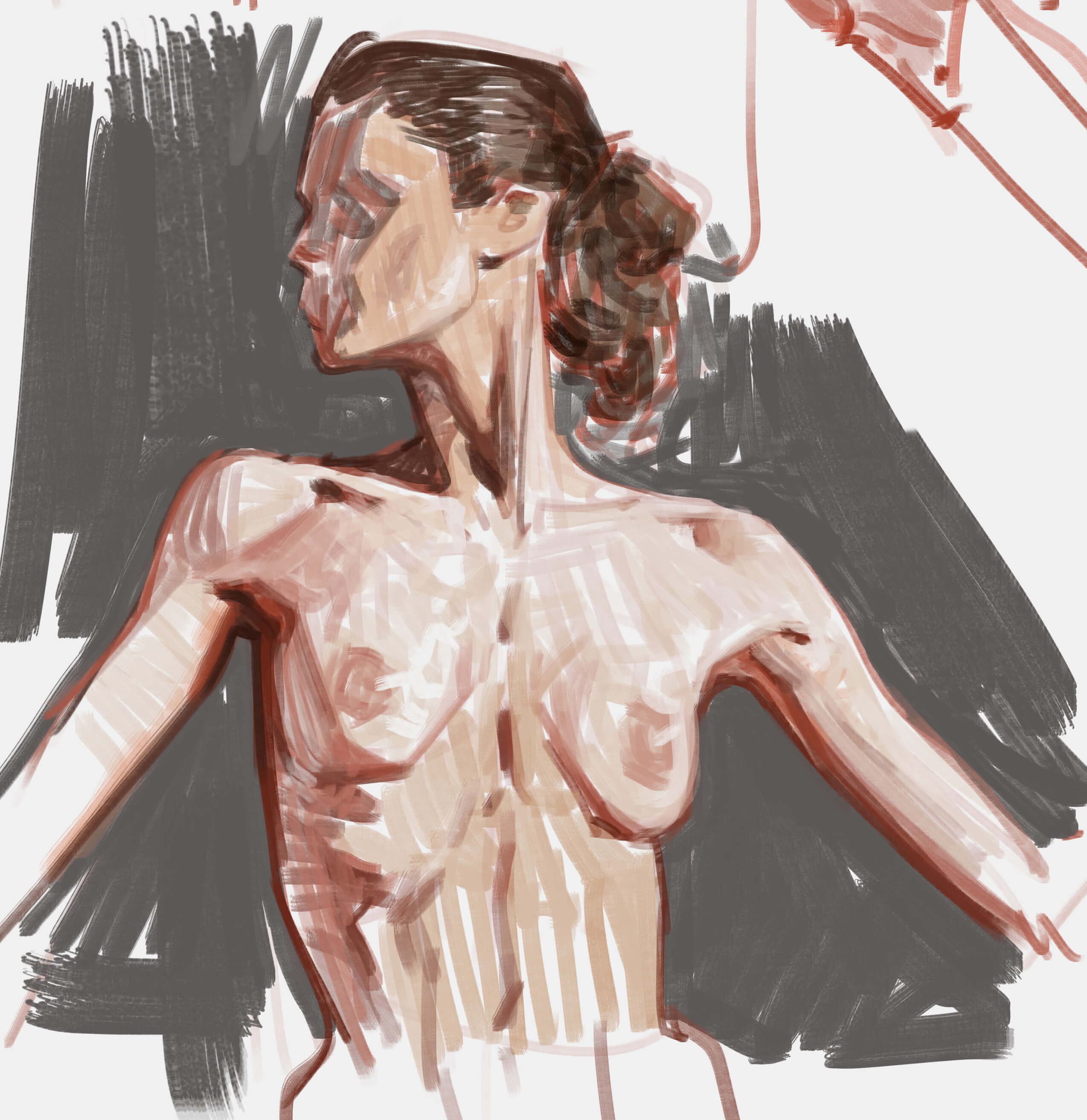 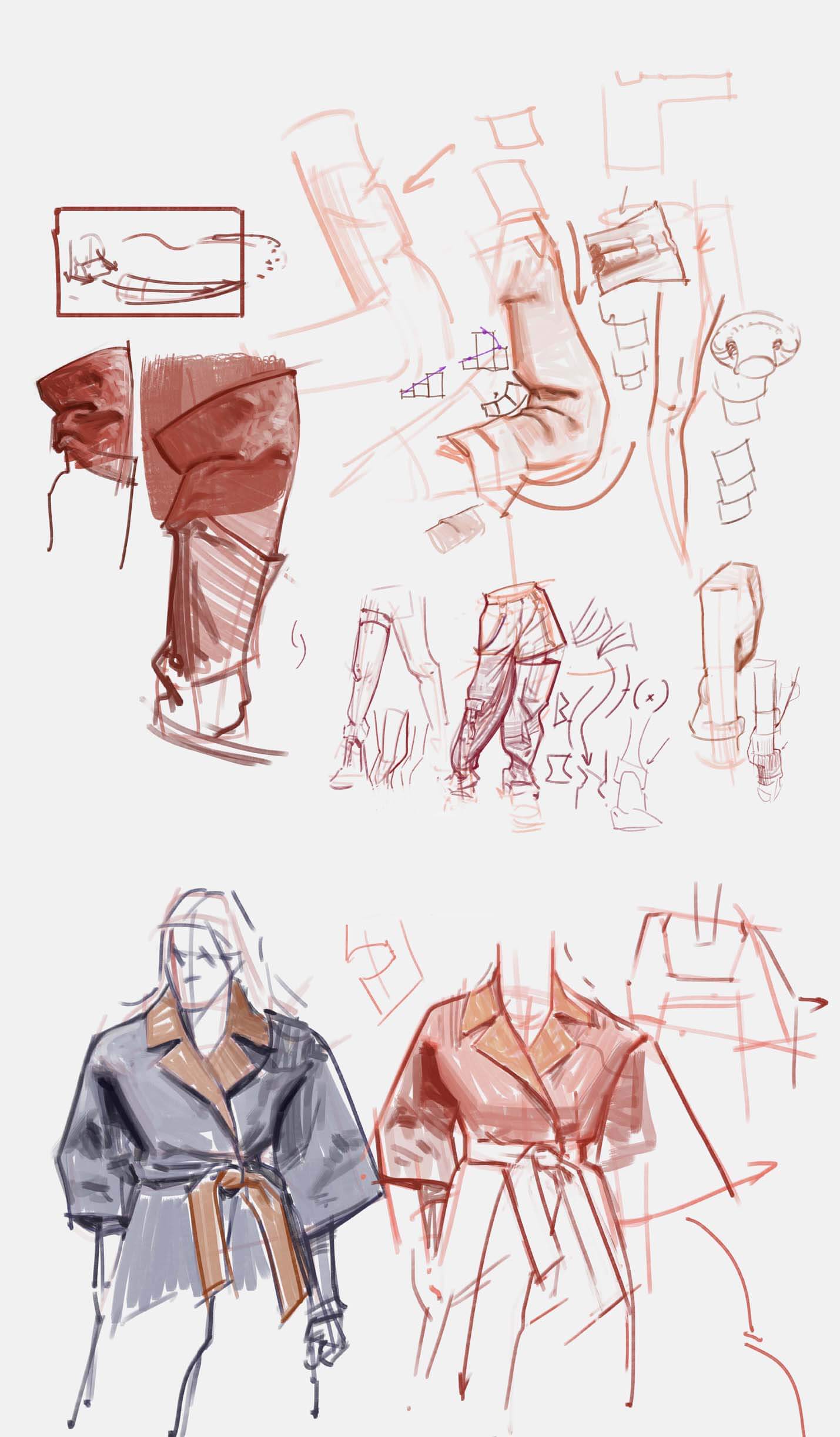 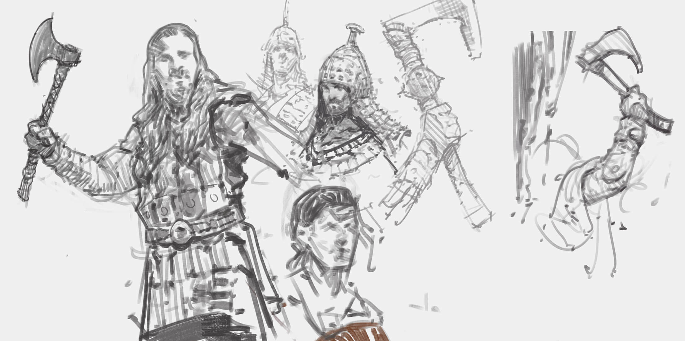 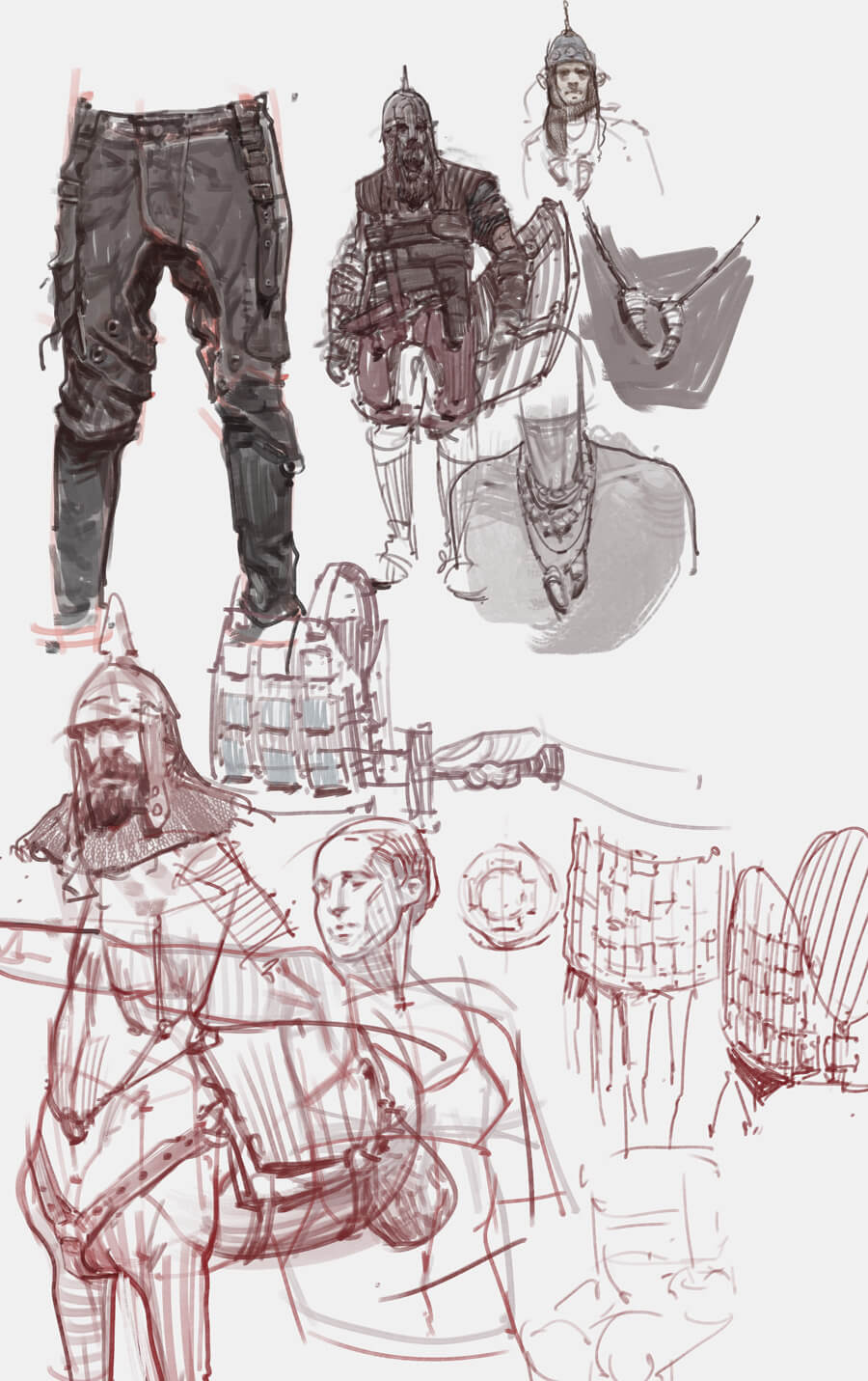 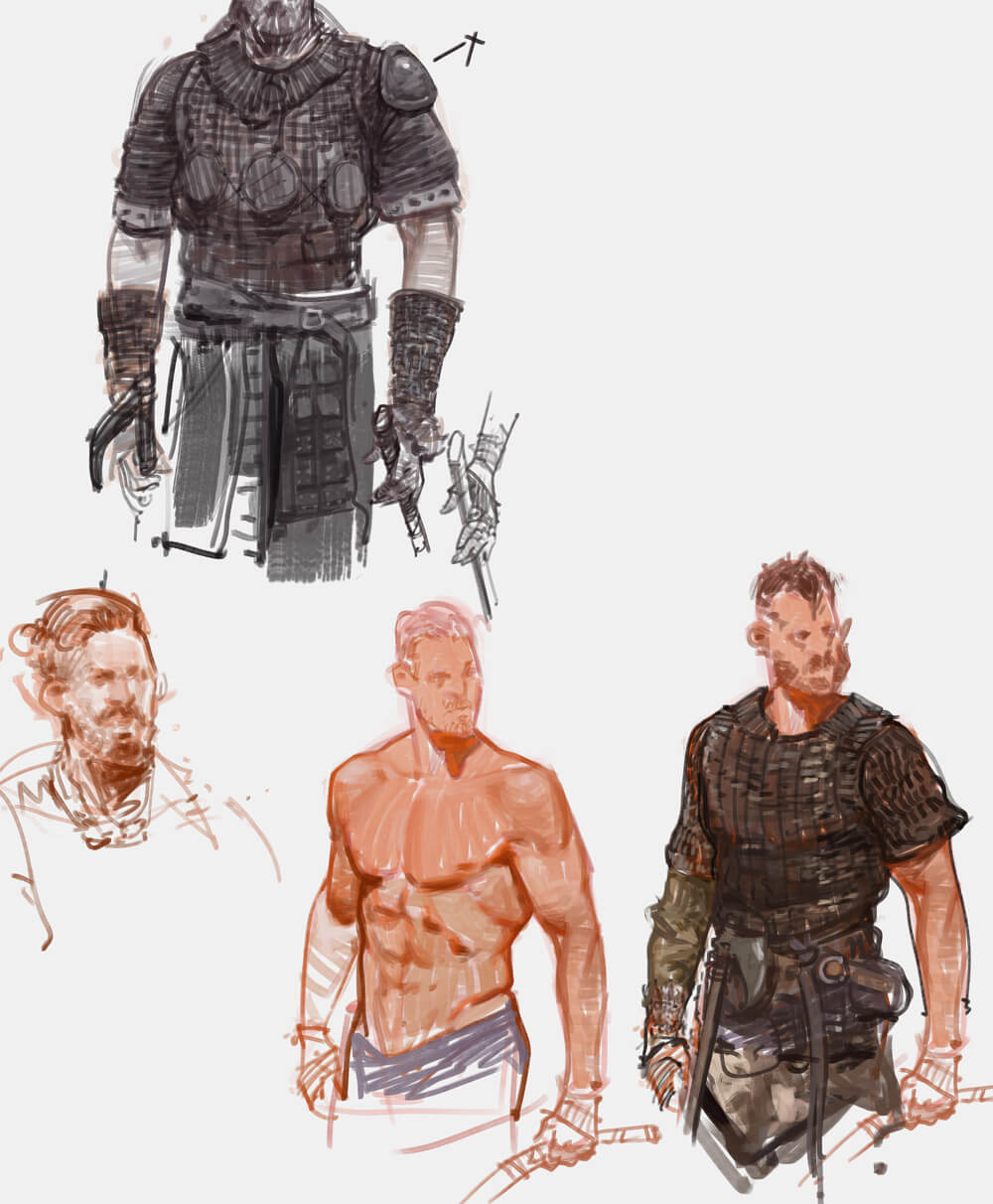 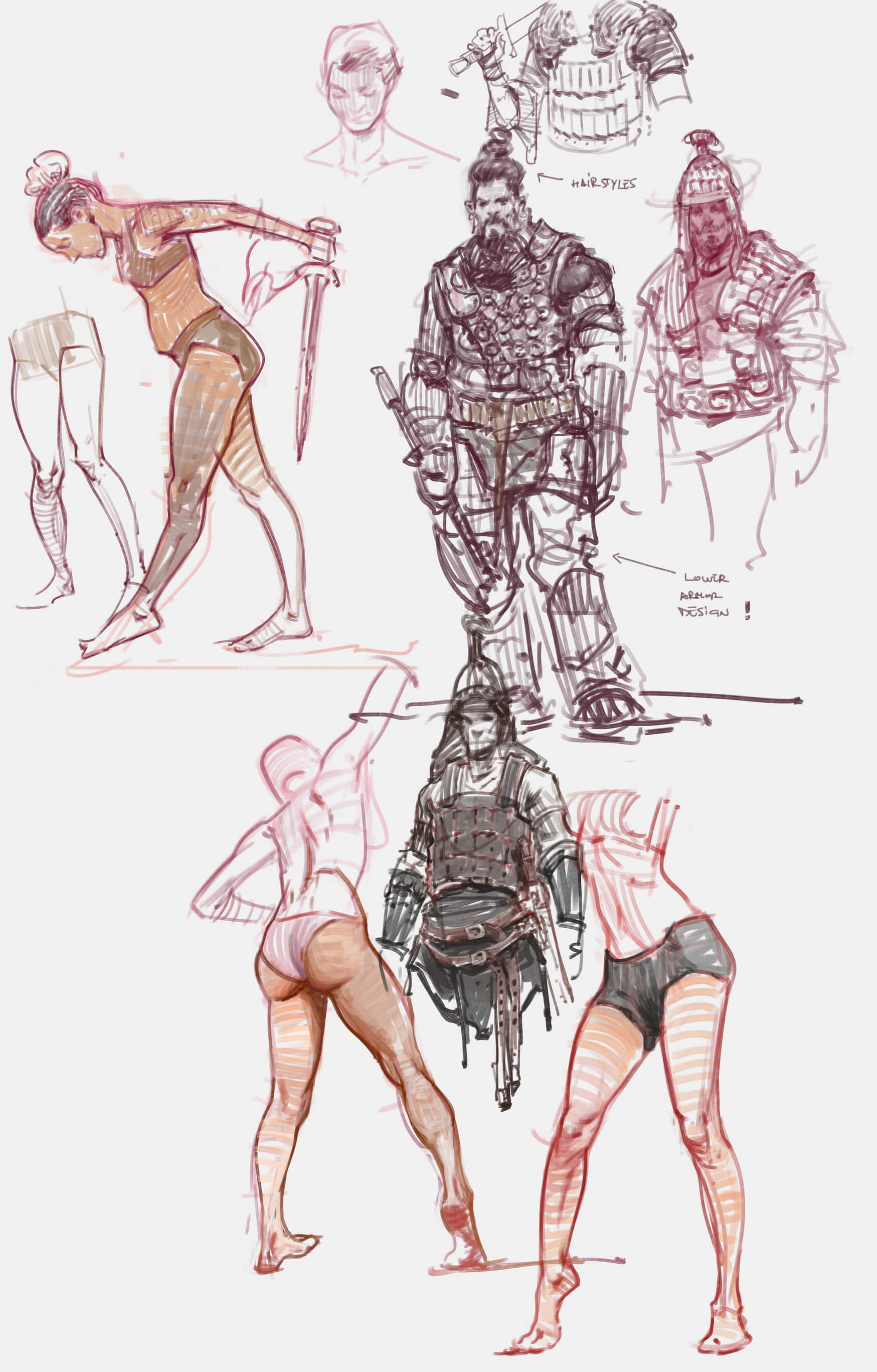 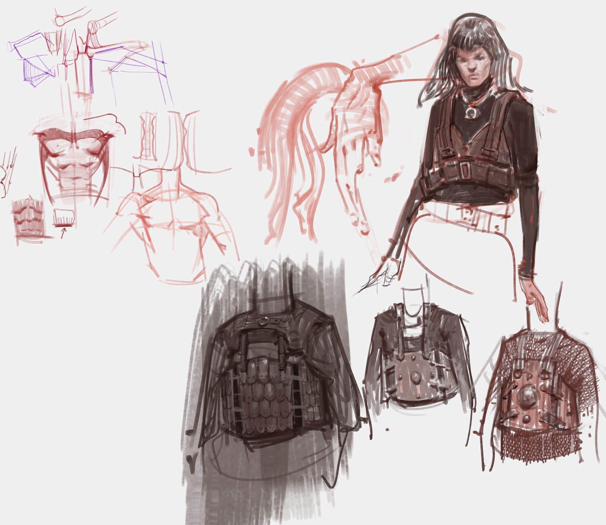 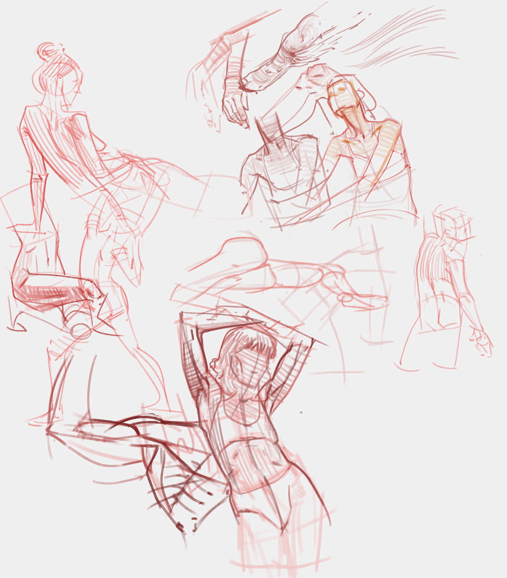 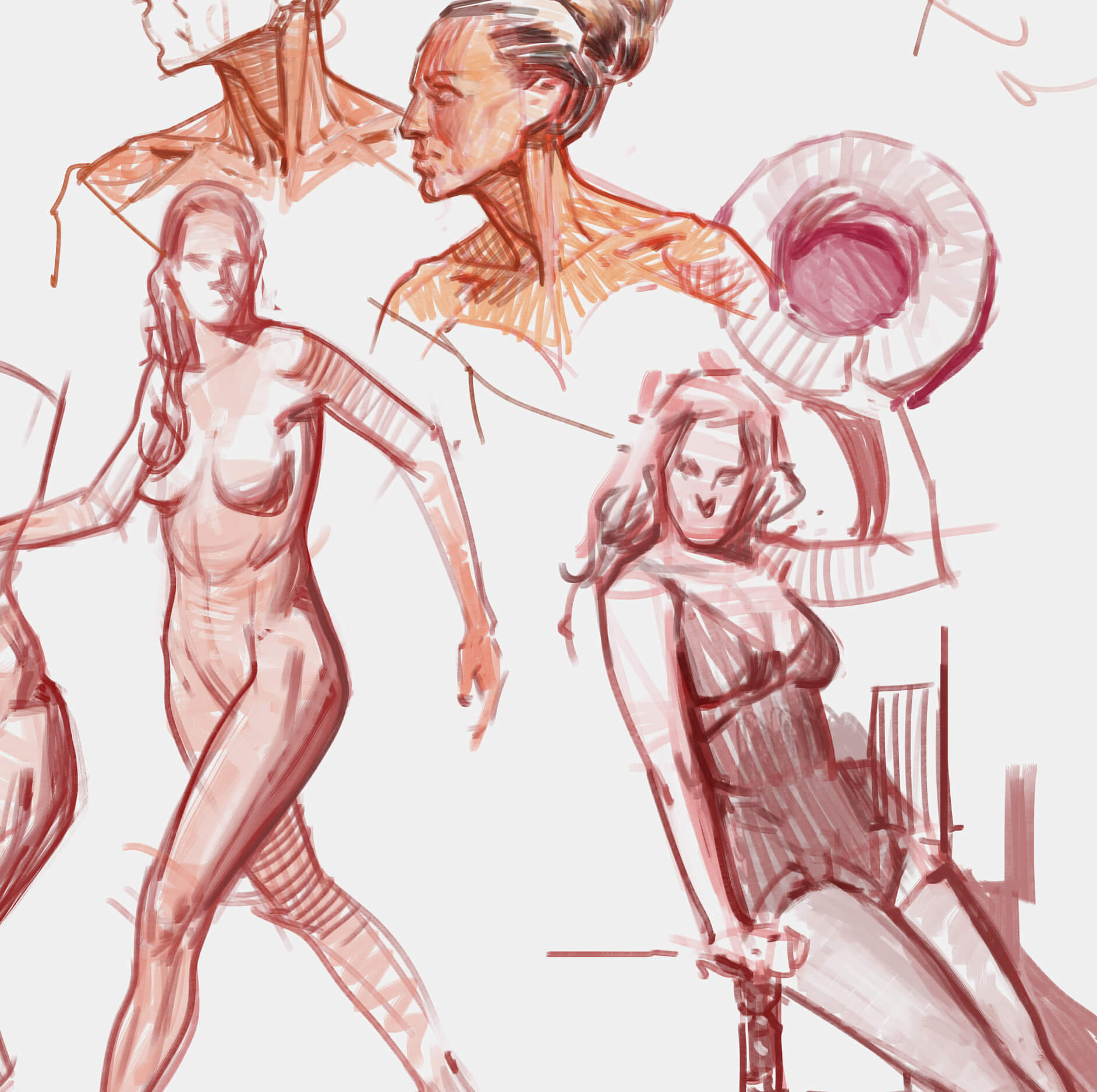 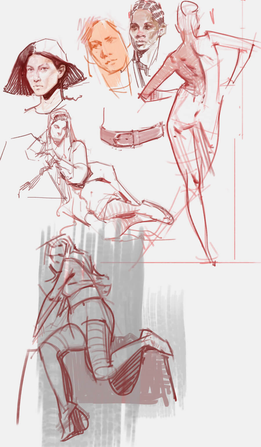 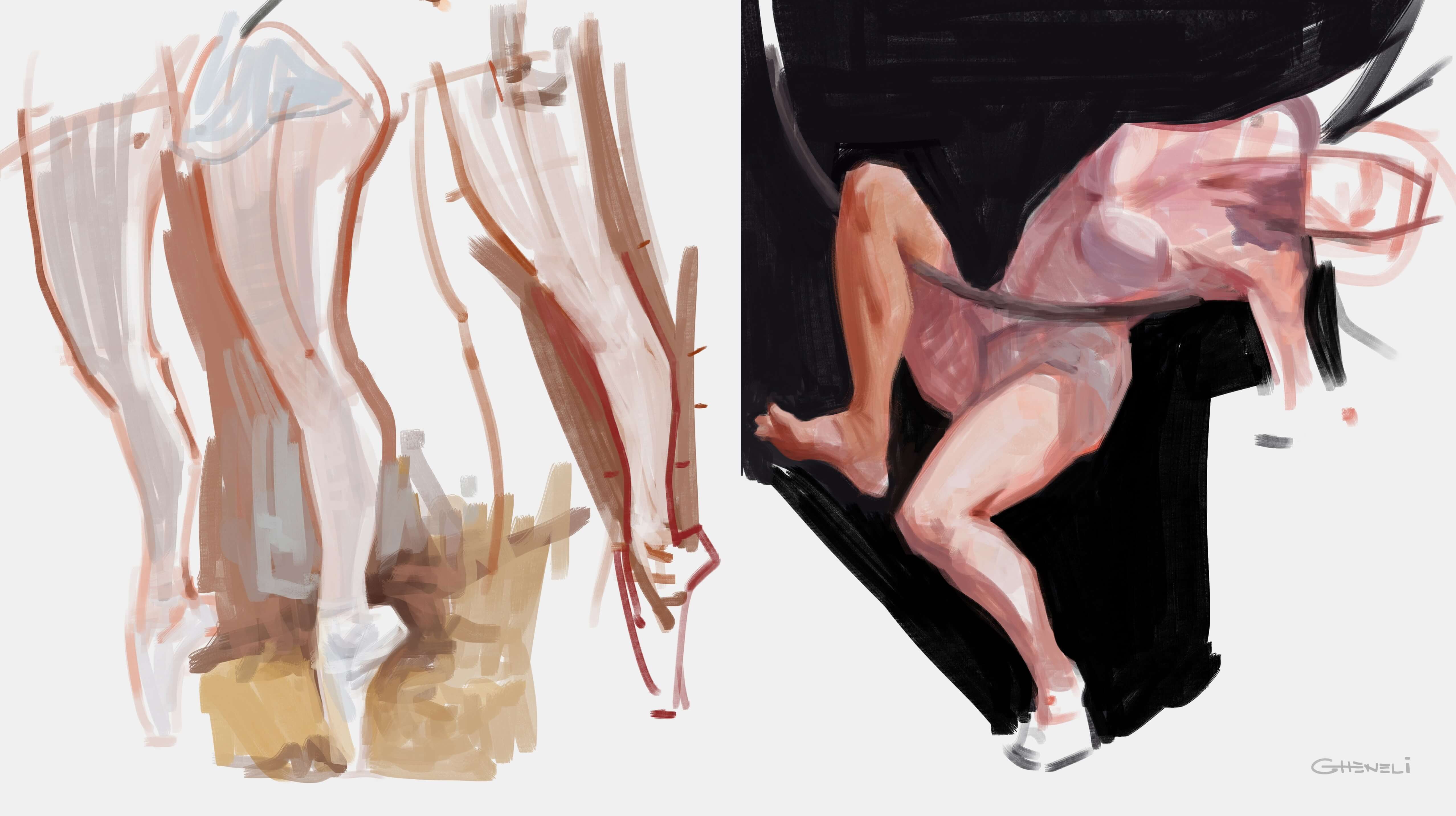 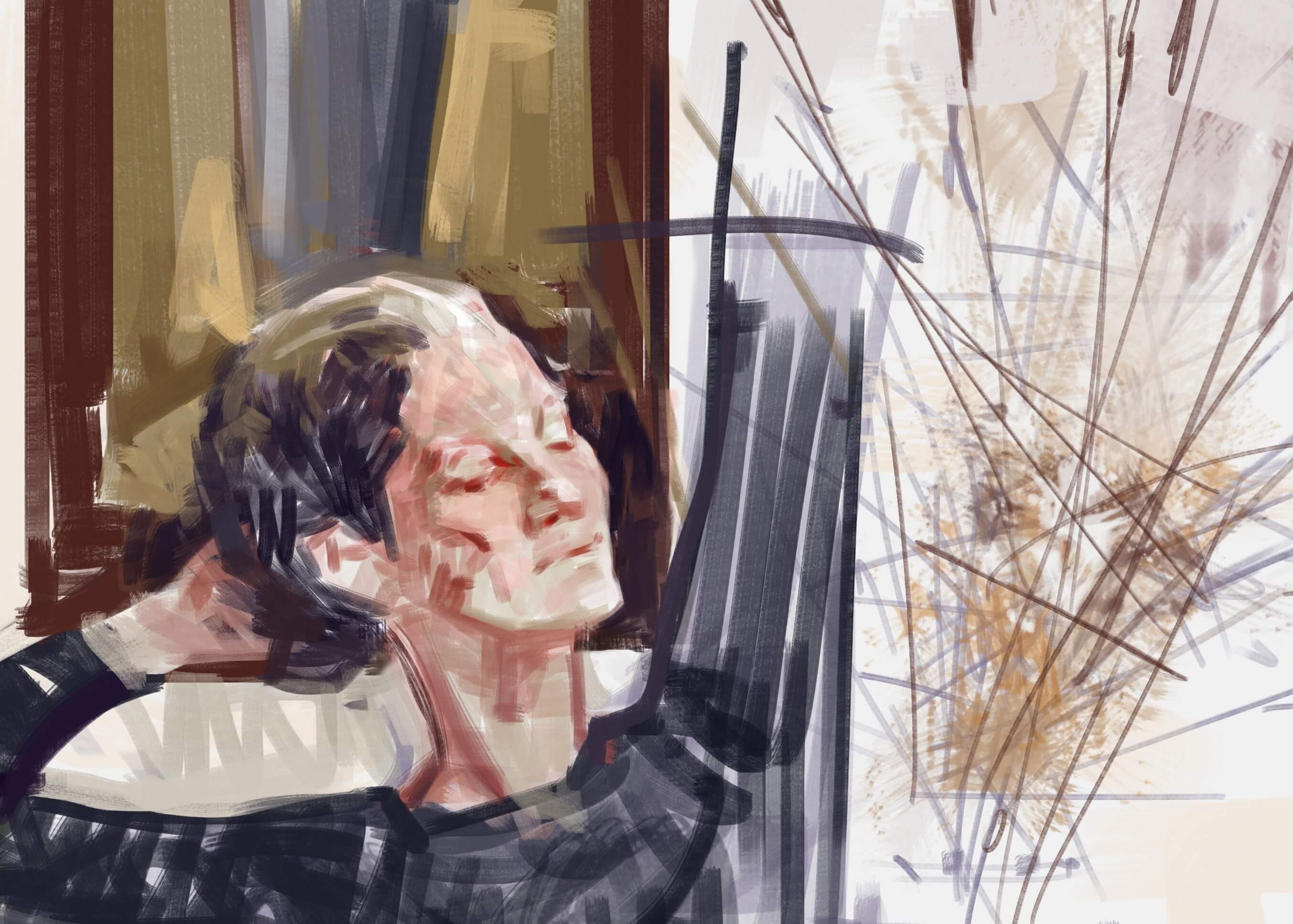 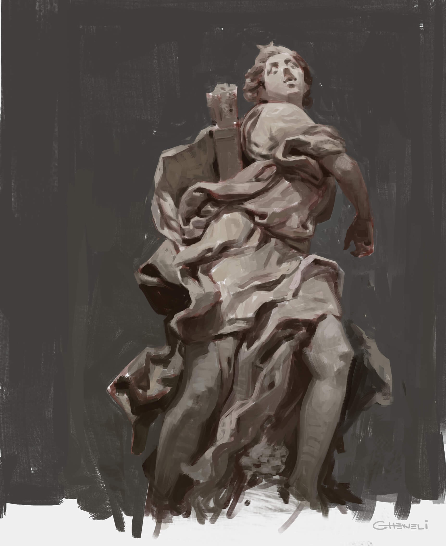
04-14-2021, 08:12 AM
(03-25-2021, 01:19 AM)Mariyan-Hristov Wrote: Hey man ! I always loved your work ! I watched all of your tutorials (even the ones you removed) , just saw that you have "figure drawing analysis" , which I'm gonna buy very soon. Just want to thank you for being so informative in you lessons, they are one of my all time favorites when it comes to learning how to draw the human body ! Thanks man, really happy to hear that! Hope that last video was helpful Can't remember exactly what courses Steve has, watched them years ago, but I know all of them are worth watching at least once. You can get so much out of them. Nowadays I see him talking more than actually drawing, he's trying to focus on teaching some ideas about art, rather than actual techniques. Other than Steve, I can recommend Proko. He's not the best at drawing tbh, but he's a good teacher Maybe Hampton for simplified anatomy, but I don't really agree with everything he teaches - that's why one of my goals is to one day record my own simplified anatomy course Scott Eaton has the most amazing anatomy course I've ever seen in terms of details - meant for 3d artists - but it's information oriented, you get analysis of muscles, tracing anatomy over photos and such, but not so much on how to actually draw them. This one might seem weird as a recommendation for figure drawing, but I notice a lot of people have problems not with the placement of muscles but with the rendition of the form and the related shapes, doing proper symmetries in space, finding correct midpoints and so on, basically constructing objects in space; for that I strongly recommend Scott Robertson's book on how to draw - doing the exercises in there and then coming back to figure drawing and trying to eyeball everything will suddenly become so much easier. Also, you can check old anatomy books from Bammes (shows how to draw anatomy) or Goldfinger (just anatomy analysis) 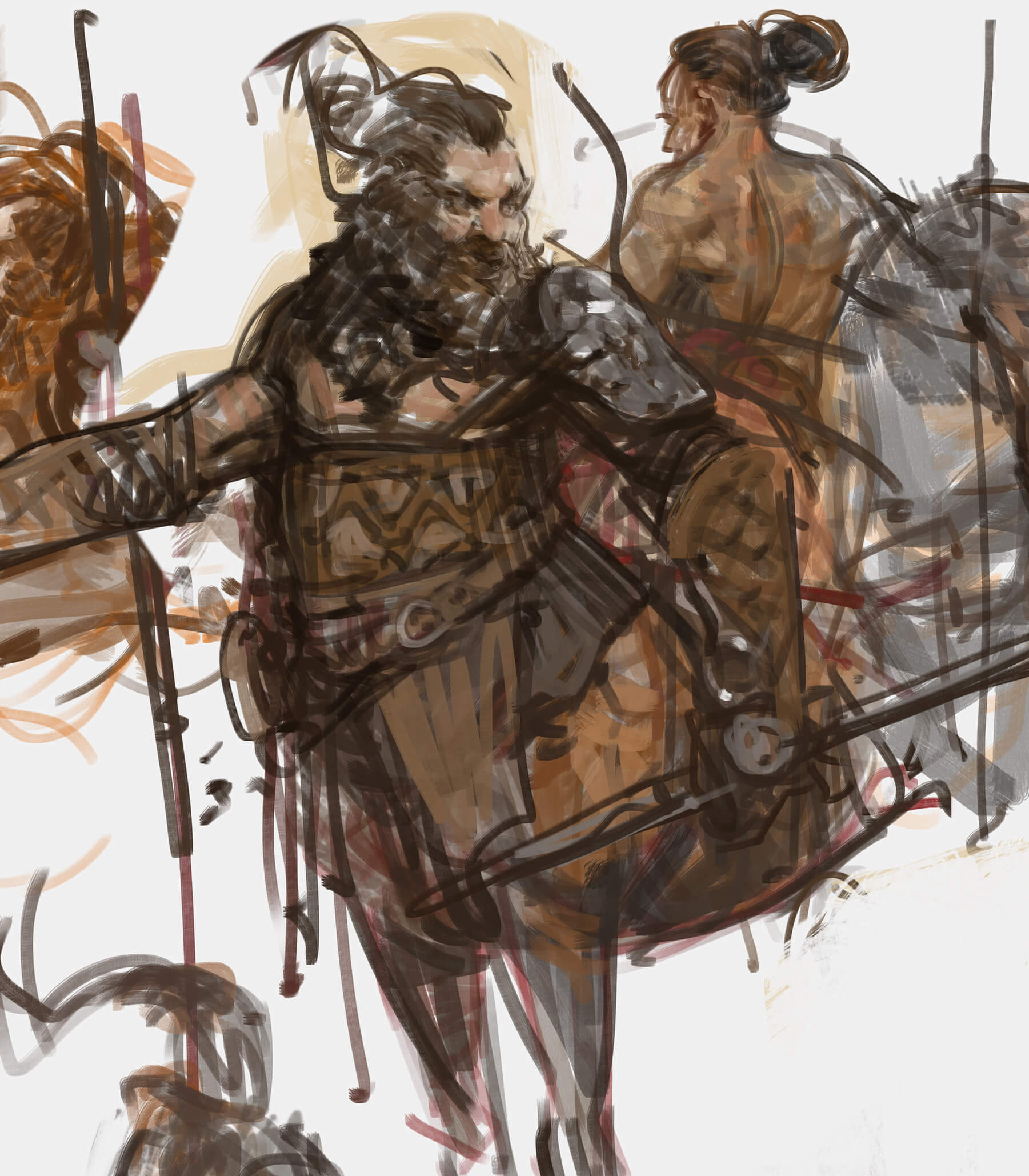 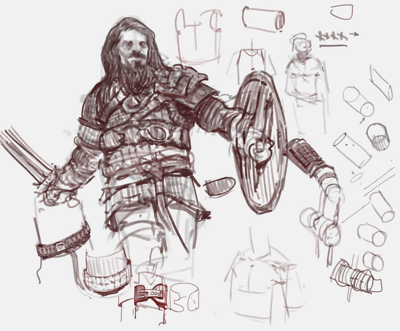 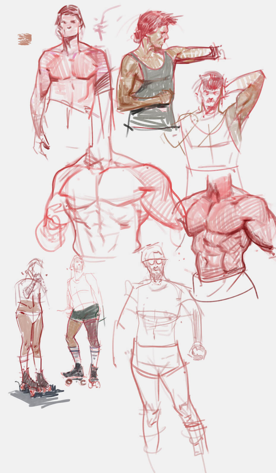 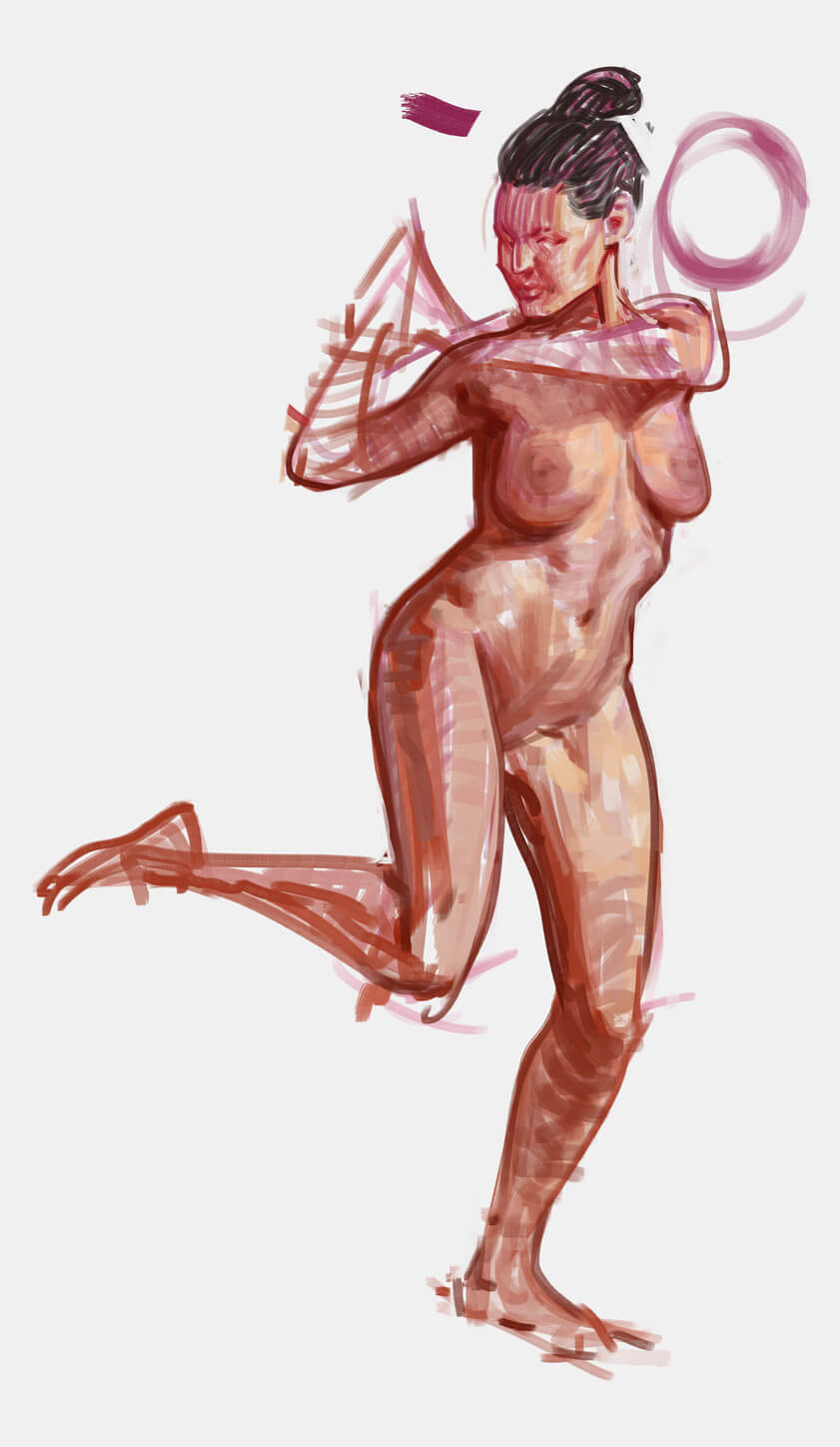 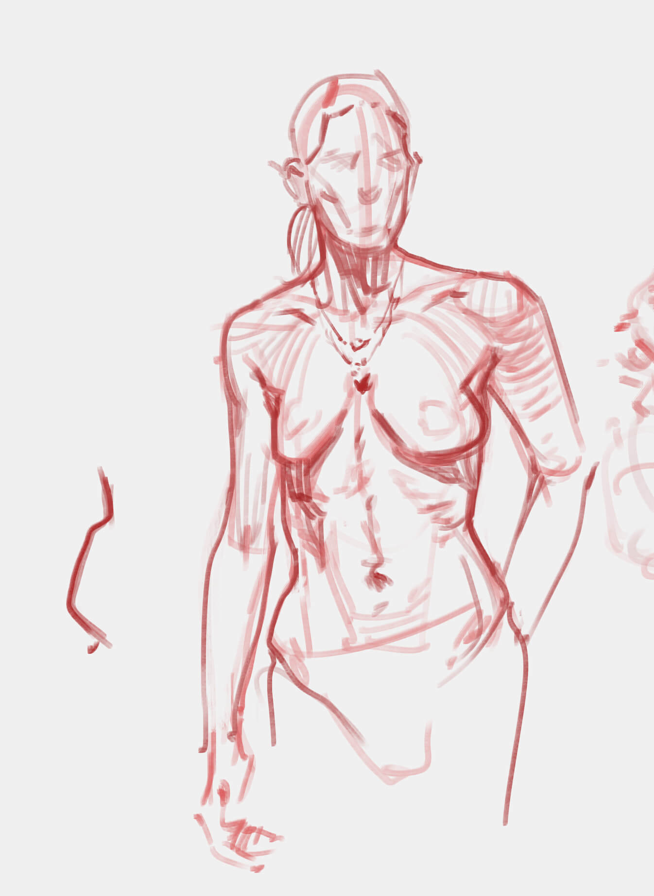 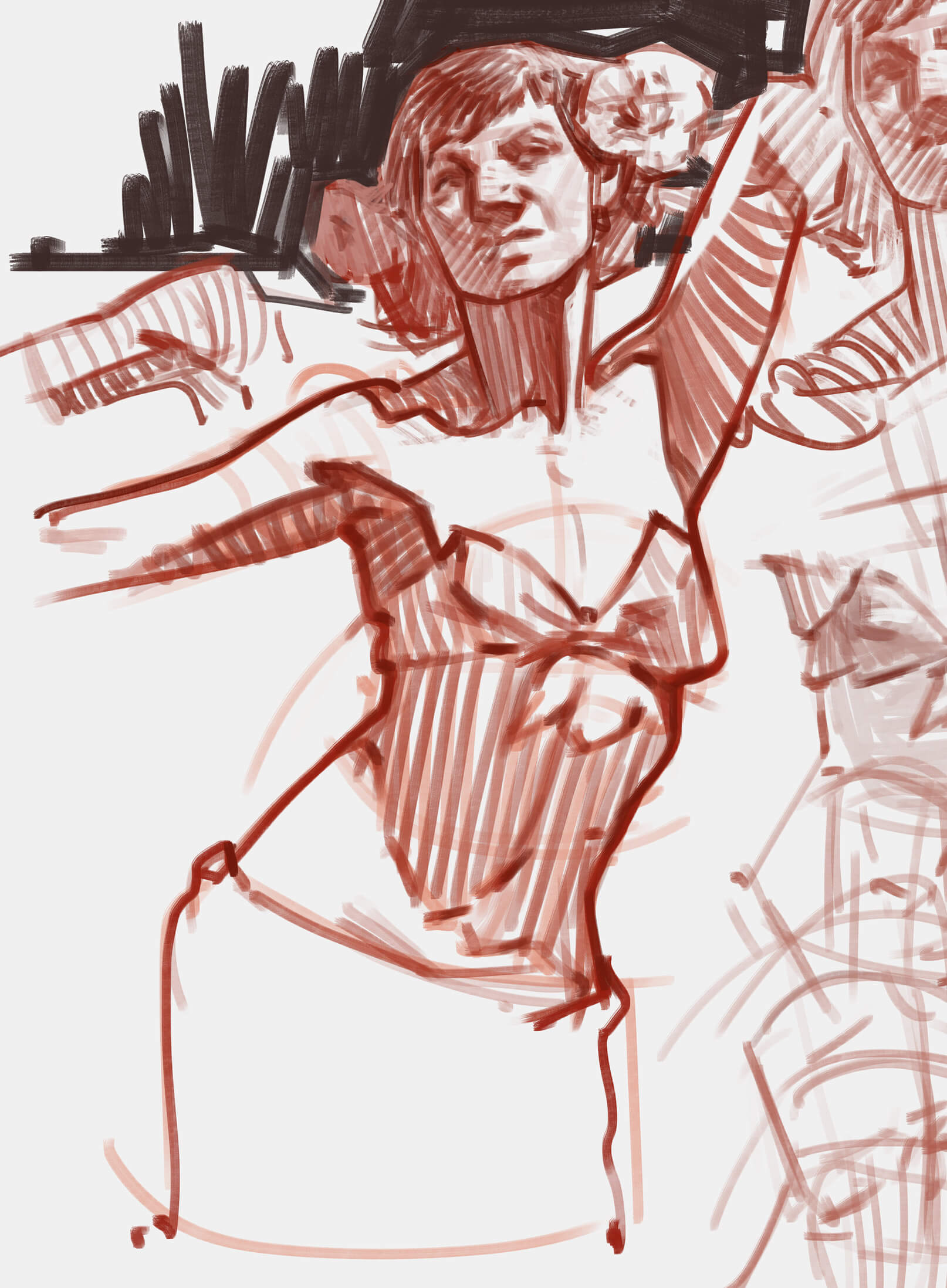 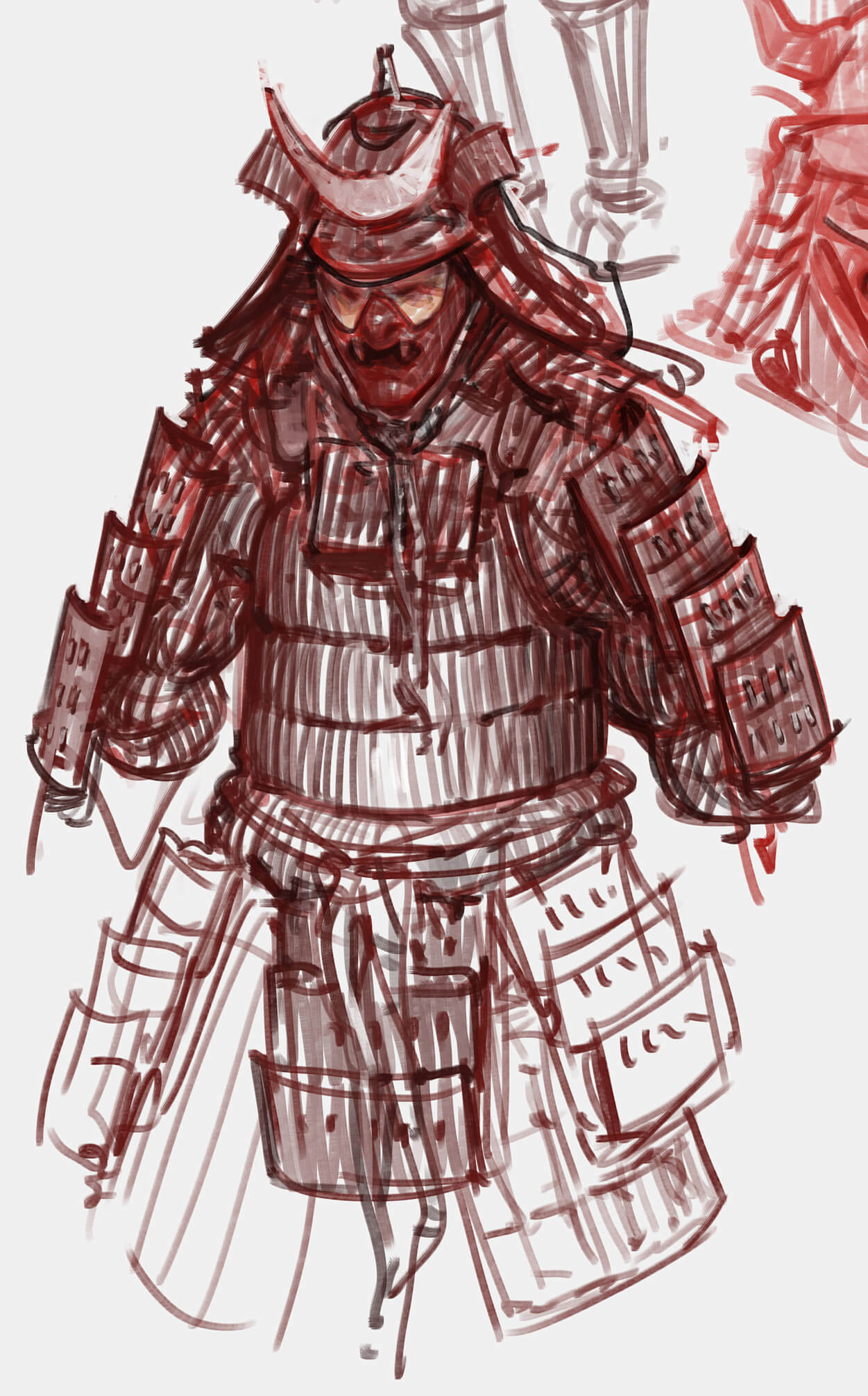 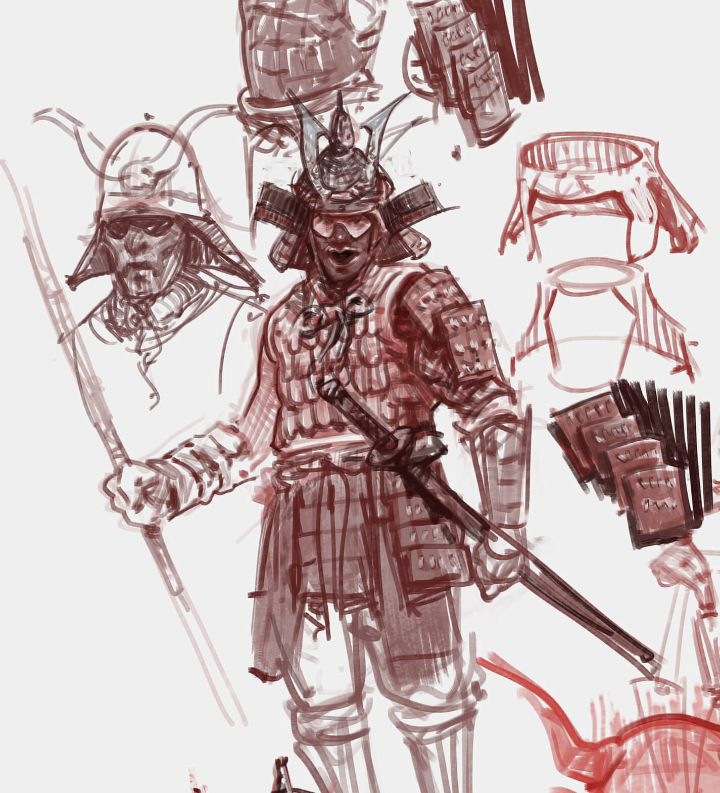 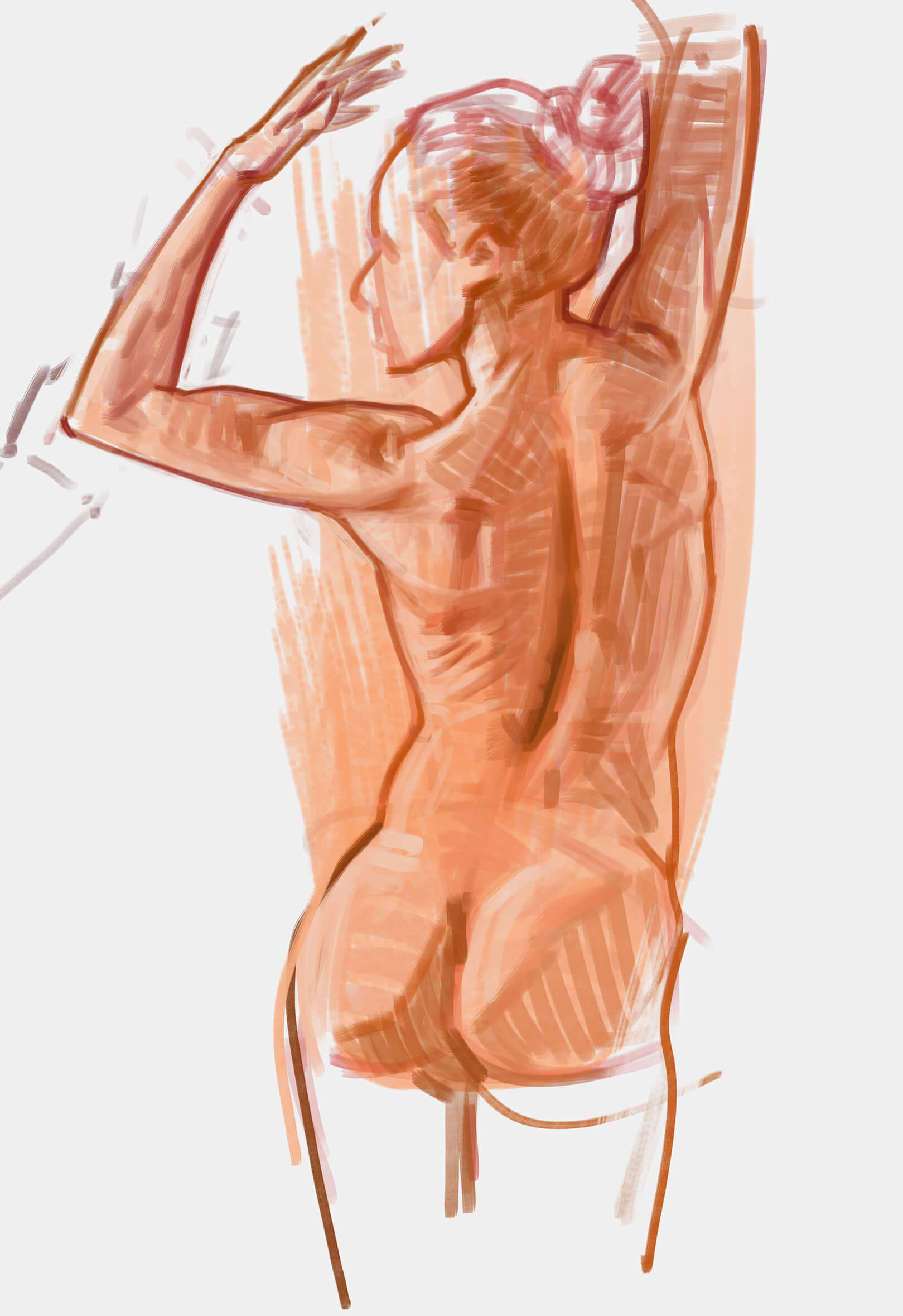 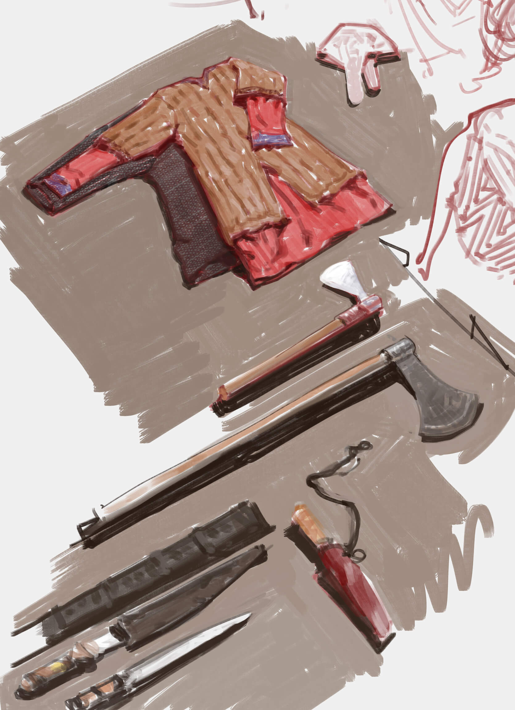 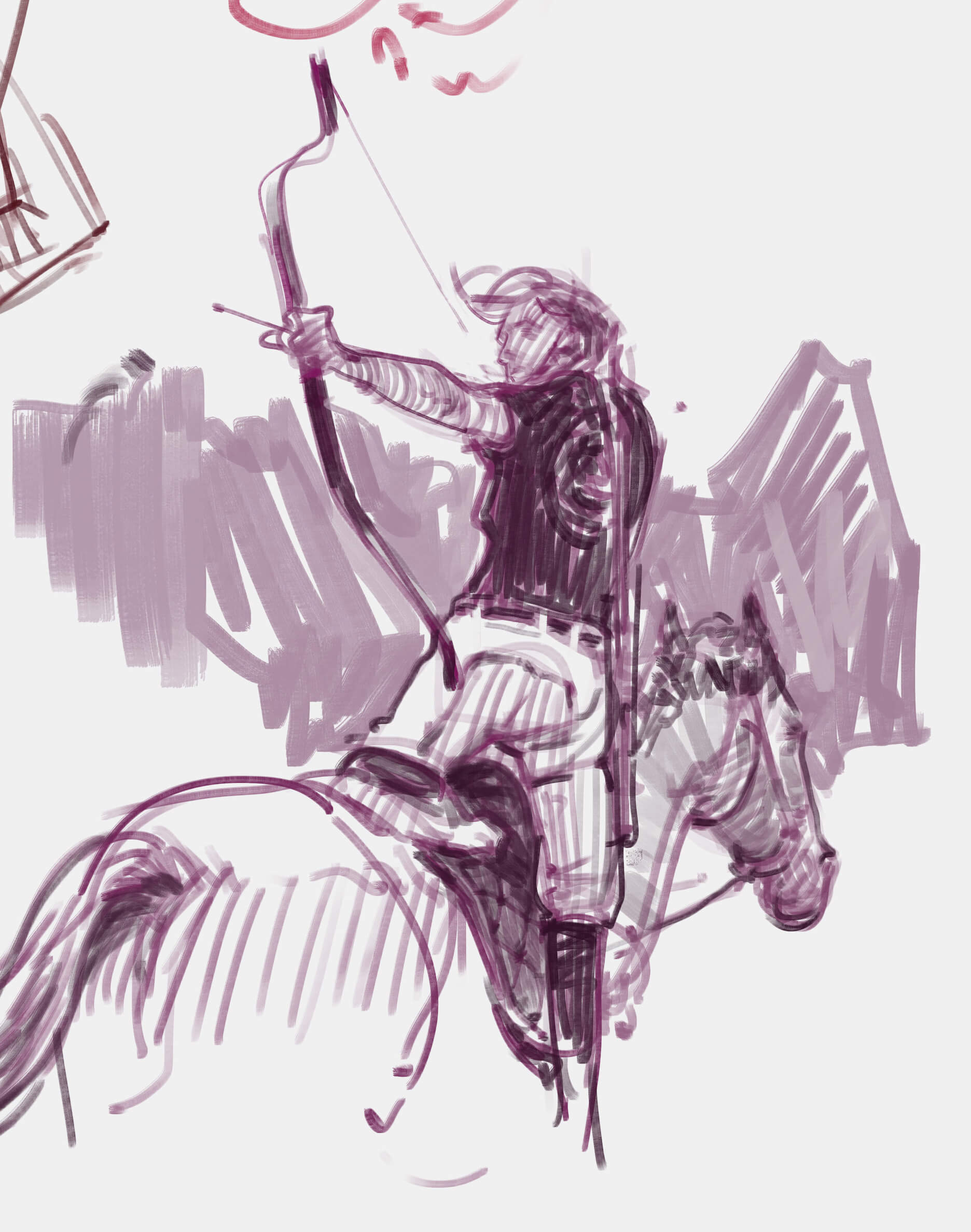 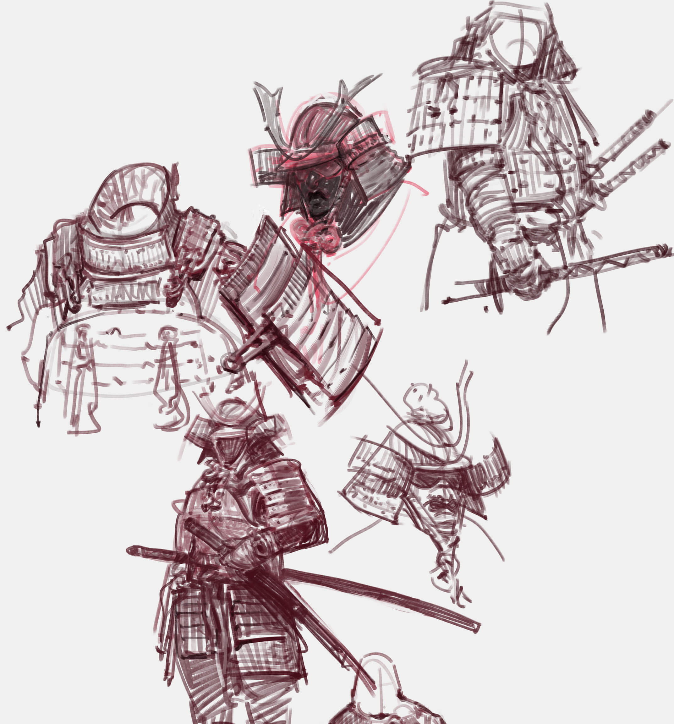 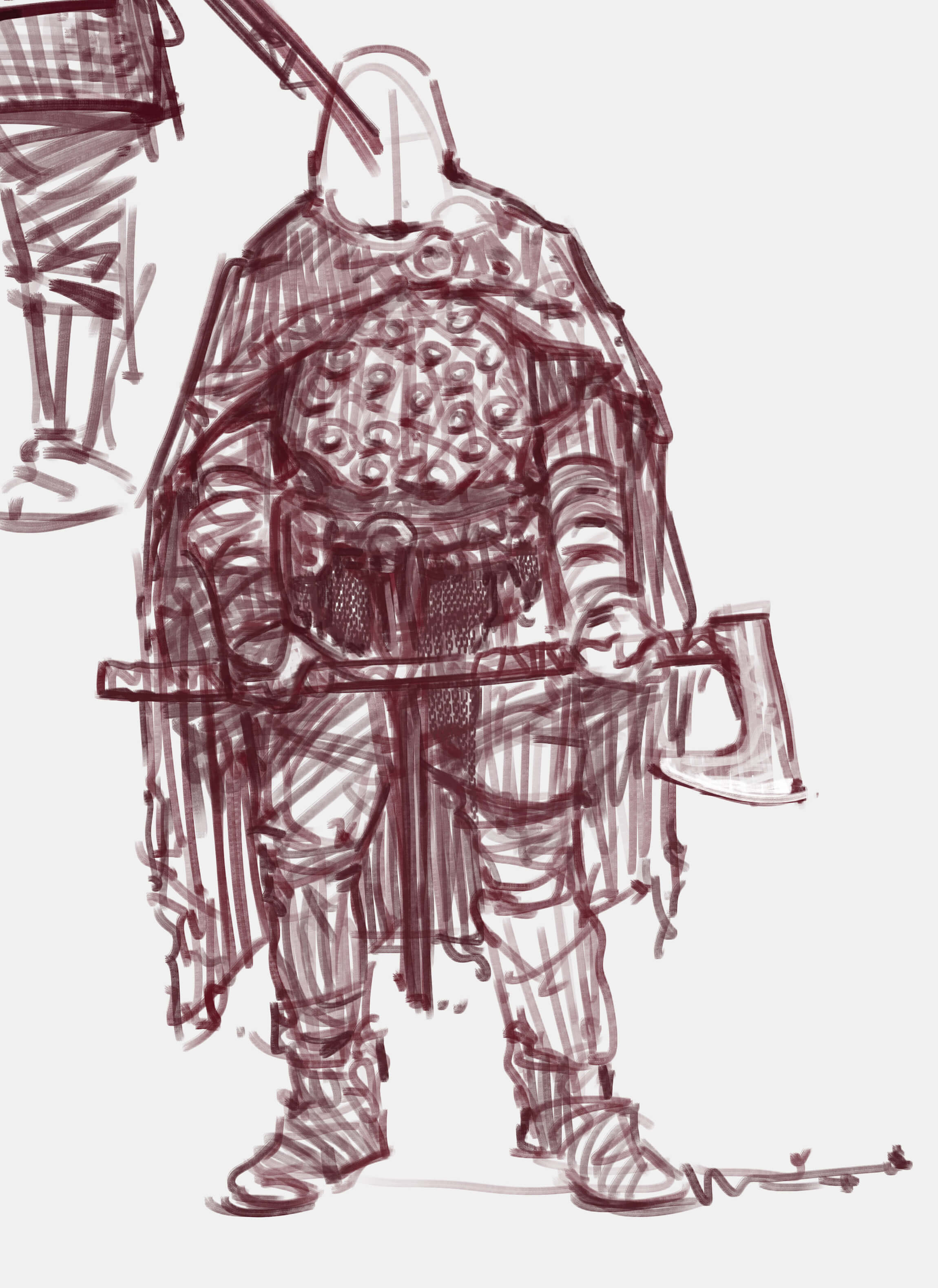 Feel free to share this last image if you think anyone else will find it useful, for now it's just one imagine, but I'm working on creating a whole video based on this concept 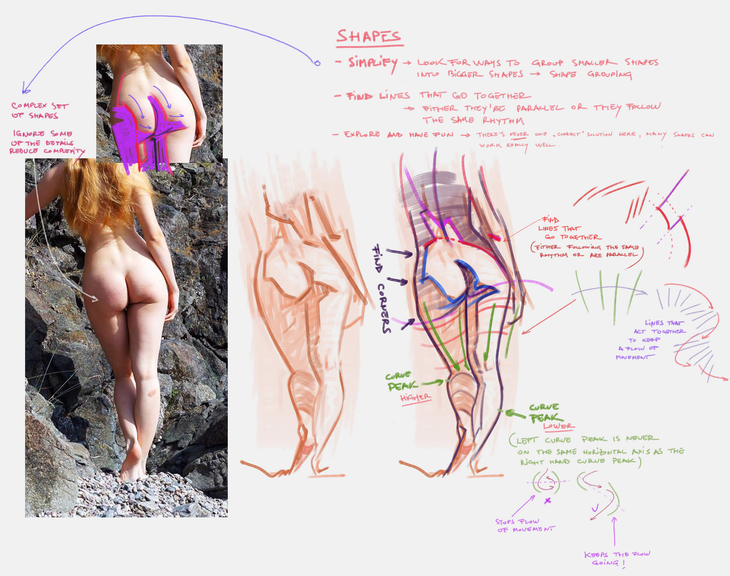
04-25-2021, 07:52 AM
There's some pretty impressive progress between first and the last pages in sketchbook. I love this Leyendecker resembling rendering and solid form.
I'll keep an eye on this thread. I might learn a thing or two :). Cheers. |
|
« Next Oldest | Next Newest »
|