Posts: 60
Threads: 2
Joined: Nov 2020
Reputation:
4
(01-15-2021, 12:52 PM)chubby_cat Wrote: Hey Max
Really digging your evil dude - his expression is great and those hands are bloody brilliant. Just be careful of small anatomy things that throw the image off. For example, the back of his skull/neck. Follow your eyes from his occipital and notice how it's not connected to the back of the neck in anyway? It kinda looks like his neck sits in his jaw, making the back of his skull protrude out and giving him a floating mandible
Looking forward to seeing your clothing designs next! Thank you for your kind words and your feedback.
Your'e totally right with the neck thing. I think I need to take a step back from my paintings more often. Once I get into finishing the piece, I actually stop seeing small failures like the one you just listed for example.
Thanks again and cheers man :)
-------------------------------------------------------
SKETCHBOOK // INSTAGRAM // WEBSITE
-------------------------------------------------------
"Losing all hope was freedom."
Posts: 60
Threads: 2
Joined: Nov 2020
Reputation:
4
Went into some environmental stuff again. Personally, I think they're equally as fun as characters and I got really comfortable with environmental storytelling on this one. Felt a lot of value/composition studies finally paying off in this one as well.
So I'll be doing more of these, also because they offer a really strong way of refreshing my head and not burning out completely on painting/studying characterportraits 24/7.
Keep in mind that this is just the first 2 hours of progress, so there are still a handful things I need to finish properly/adjust and I'll be continuing this thing tomorrow.
Cheers to you guys :)

-------------------------------------------------------
SKETCHBOOK // INSTAGRAM // WEBSITE
-------------------------------------------------------
"Losing all hope was freedom."
Posts: 3,343
Threads: 37
Joined: Aug 2013
Reputation:
234
Hi have your heard of the term atmospheric perspective?
Here something for you if you didn't if not might be a good to revise anyways.
https://www.youtube.com/watch?v=QLyTscNo3RU
Posts: 60
Threads: 2
Joined: Nov 2020
Reputation:
4
(01-22-2021, 05:37 AM)darktiste Wrote: Hi have your heard of the term atmospheric perspective?
Here something for you if you didn't if not might be a good to revise anyways.
https://www.youtube.com/watch?v=QLyTscNo3RU Thanks for the reply. Sure I know the term :).
But maybe I'm not getting the critique right, what exactly is your point?
-------------------------------------------------------
SKETCHBOOK // INSTAGRAM // WEBSITE
-------------------------------------------------------
"Losing all hope was freedom."
Posts: 460
Threads: 10
Joined: Mar 2016
Reputation:
64
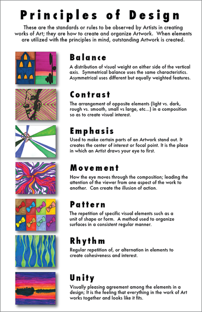
I think the atmospheric perspective comes through nicely from what I can see. One little checklist I like to keep in mind when I'm designing compositions is this one:

I think you are on a really good track with this image! Would be cool to see you push it to color! Keep up the good work!
Posts: 60
Threads: 2
Joined: Nov 2020
Reputation:
4
(01-22-2021, 03:48 PM)Zorrentos Wrote: I think the atmospheric perspective comes through nicely from what I can see. One little checklist I like to keep in mind when I'm designing compositions is this one:
I think you are on a really good track with this image! Would be cool to see you push it to color! Keep up the good work! Thank you!
I might keep that little checklist of yours for my next pieces haha
Cheers .)
-------------------------------------------------------
SKETCHBOOK // INSTAGRAM // WEBSITE
-------------------------------------------------------
"Losing all hope was freedom."
Posts: 60
Threads: 2
Joined: Nov 2020
Reputation:
4
Two finished scenes/environments I did over the course of this week.
Getting into these more deeply was really out of my comfort zone,
and also just really new and scary to me, but also - as I already said earlier - tons of fun.
Also with these two pieces this week, it was almost as if you could just feel the learning curve really accelerating.
Anyway, as someone who tends to really overwork these things, I tried to limit my rendering to a certain degree.
So in the end, the Silent Hill/Stranger Things-like piece took around 2 hours and the Friendly Robot piece took 4-5 hours.
Everyone take care :)
Max


-------------------------------------------------------
SKETCHBOOK // INSTAGRAM // WEBSITE
-------------------------------------------------------
"Losing all hope was freedom."
Posts: 60
Threads: 2
Joined: Nov 2020
Reputation:
4
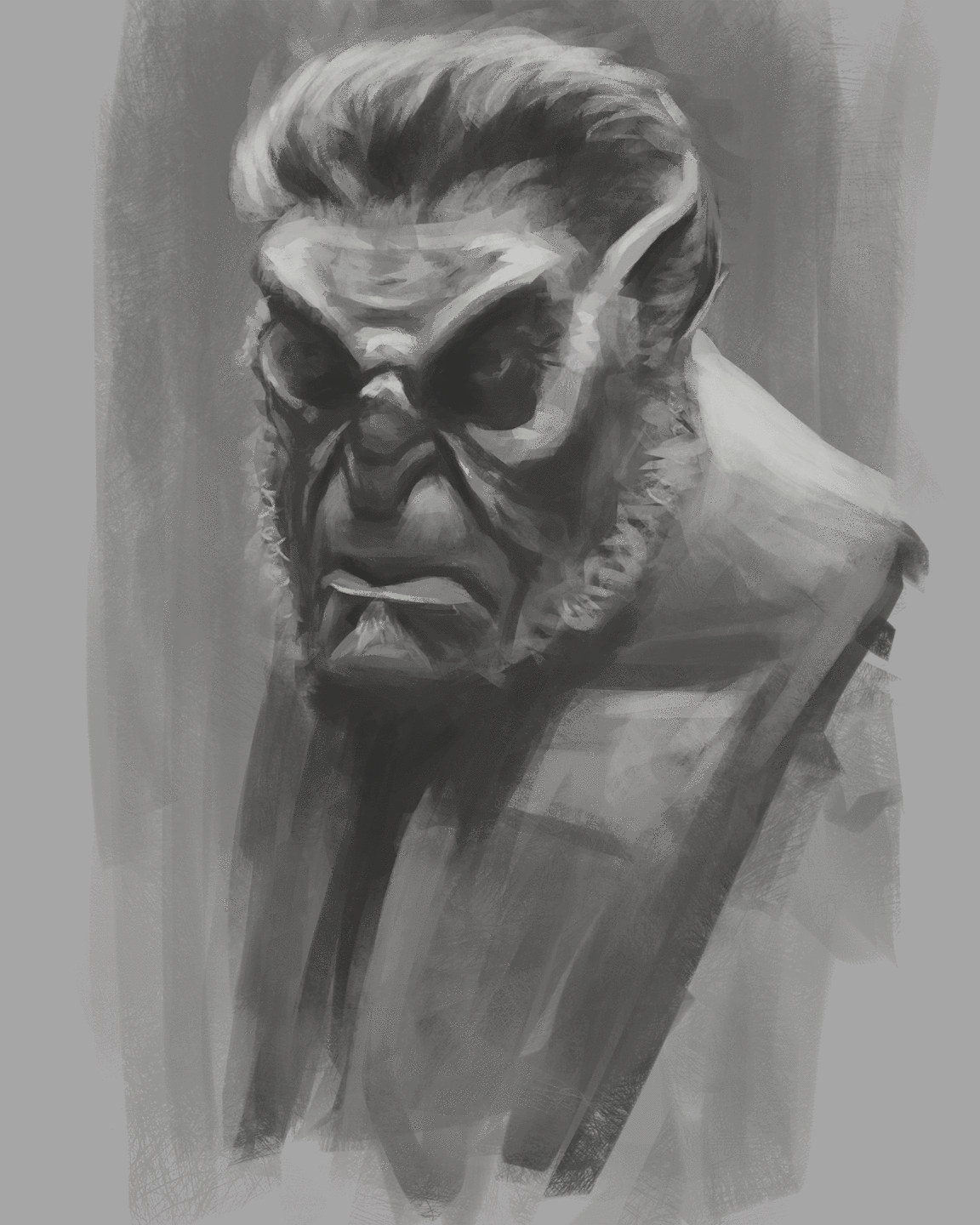
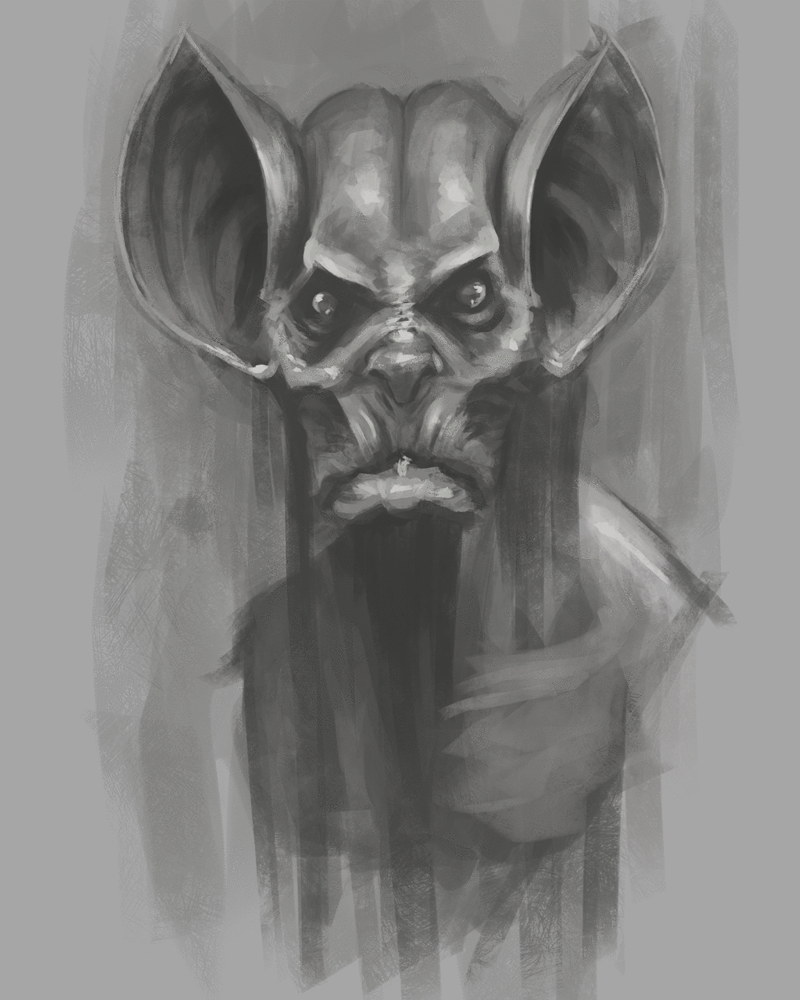
Two quick 15-20 minute warm-up creature-sketches I thought I'd put up here just to keep the sketchbook going. :)
Cheers, Max


-------------------------------------------------------
SKETCHBOOK // INSTAGRAM // WEBSITE
-------------------------------------------------------
"Losing all hope was freedom."
Posts: 60
Threads: 2
Joined: Nov 2020
Reputation:
4
Another quick 20 minute evening sketch of a viking-like dude for warming up.
As someone who tends to overwork a large amount of portraits in the end,
I'm starting to feel really comfortable with this more sketchy approach.
Cheers to everyone.
Max.

-------------------------------------------------------
SKETCHBOOK // INSTAGRAM // WEBSITE
-------------------------------------------------------
"Losing all hope was freedom."
Posts: 60
Threads: 2
Joined: Nov 2020
Reputation:
4
Just took an old sketch I found and made it into a finished thing. Still wanted to keep it kinda sketchy and not overwork it.
At first she was something like a cyberpunk-ish girl, then went full on Geisha with this, finally ended up making her something like a goddess.
But still- why not give her a kevlar-sci fi-breastplate-armour thingy. Don't know, seemed cool :D
At least she's bulletproof now.
Cheers to everybody :)

-------------------------------------------------------
SKETCHBOOK // INSTAGRAM // WEBSITE
-------------------------------------------------------
"Losing all hope was freedom."
Posts: 60
Threads: 2
Joined: Nov 2020
Reputation:
4
A quick Cyberdude-ish sketch to loosen up a bit :)

-------------------------------------------------------
SKETCHBOOK // INSTAGRAM // WEBSITE
-------------------------------------------------------
"Losing all hope was freedom."
Posts: 460
Threads: 10
Joined: Mar 2016
Reputation:
64
The last sketch is looking quite good! One idea for a future exercise would be to try and slow down and make a very careful Black and White painting where you really try and render the materials, volume, and edges well planned out. Sketches are great, but doing real, carefully thought out illustrations are the real challenge!
Posts: 60
Threads: 2
Joined: Nov 2020
Reputation:
4
Decided to do a little sketch tonight and went for a more winter knight dude after a short break from doing character stuff.
This ended up beeing a fun study on how to simplify some strokes and paint more with texture.
Also I liked your point on the other (very messy, I must admit) sketch @zorrentos and I kept that in mind while doing this.
Obviously focused on the face more but I might push this further and flesh out/change up some more stuff, but felt alright to save and close this thing for now.

-------------------------------------------------------
SKETCHBOOK // INSTAGRAM // WEBSITE
-------------------------------------------------------
"Losing all hope was freedom."
Posts: 460
Threads: 10
Joined: Mar 2016
Reputation:
64
Great work! The materials read very well and the sense of volume in the face comes through great! I would consider adding a bit more blur to the snow to give some nice visual interest to it and also add a bit of contrast to the static shape of the character, but other than that, I can't think of anything to criticize :)
Posts: 60
Threads: 2
Joined: Nov 2020
Reputation:
4
Thanks for the input man!
Yeah I'm already changing up his pose, felt really lazy afterwards.
Right now I'm giving him a spear that he's carrying on his shoulder.
Let's see where this goes :)
-------------------------------------------------------
SKETCHBOOK // INSTAGRAM // WEBSITE
-------------------------------------------------------
"Losing all hope was freedom."
Posts: 1,424
Threads: 12
Joined: Dec 2015
Reputation:
139
Hey mixedmax! Loving your stuff man - your paintings have such great "attitude" - also your eye constructions have moved up a level! Nice work!
And I think you won that Underwater Assassins CHOW? Deservedly so - congrats and great work!
“Today, give a stranger one of your smiles. It might be the only sunshine he sees all day.” -- H. Jackson Brown Jr.
CD Sketchbook
Posts: 60
Threads: 2
Joined: Nov 2020
Reputation:
4
(02-22-2021, 08:34 AM)Artloader Wrote: Hey mixedmax! Loving your stuff man - your paintings have such great "attitude" - also your eye constructions have moved up a level! Nice work!
And I think you won that Underwater Assassins CHOW? Deservedly so - congrats and great work! Aw thanks man,
well after all I'm someone who's never really satisfied with the paintings I make,
so hearing kind stuff like that really really makes my day!
Cheers!
-------------------------------------------------------
SKETCHBOOK // INSTAGRAM // WEBSITE
-------------------------------------------------------
"Losing all hope was freedom."
Posts: 60
Threads: 2
Joined: Nov 2020
Reputation:
4
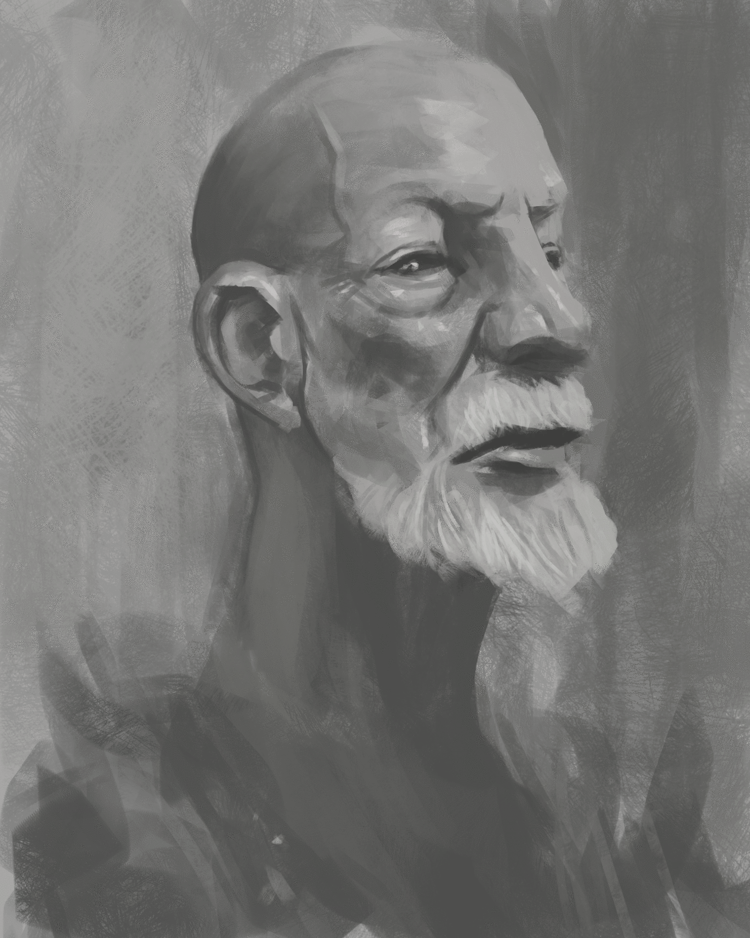
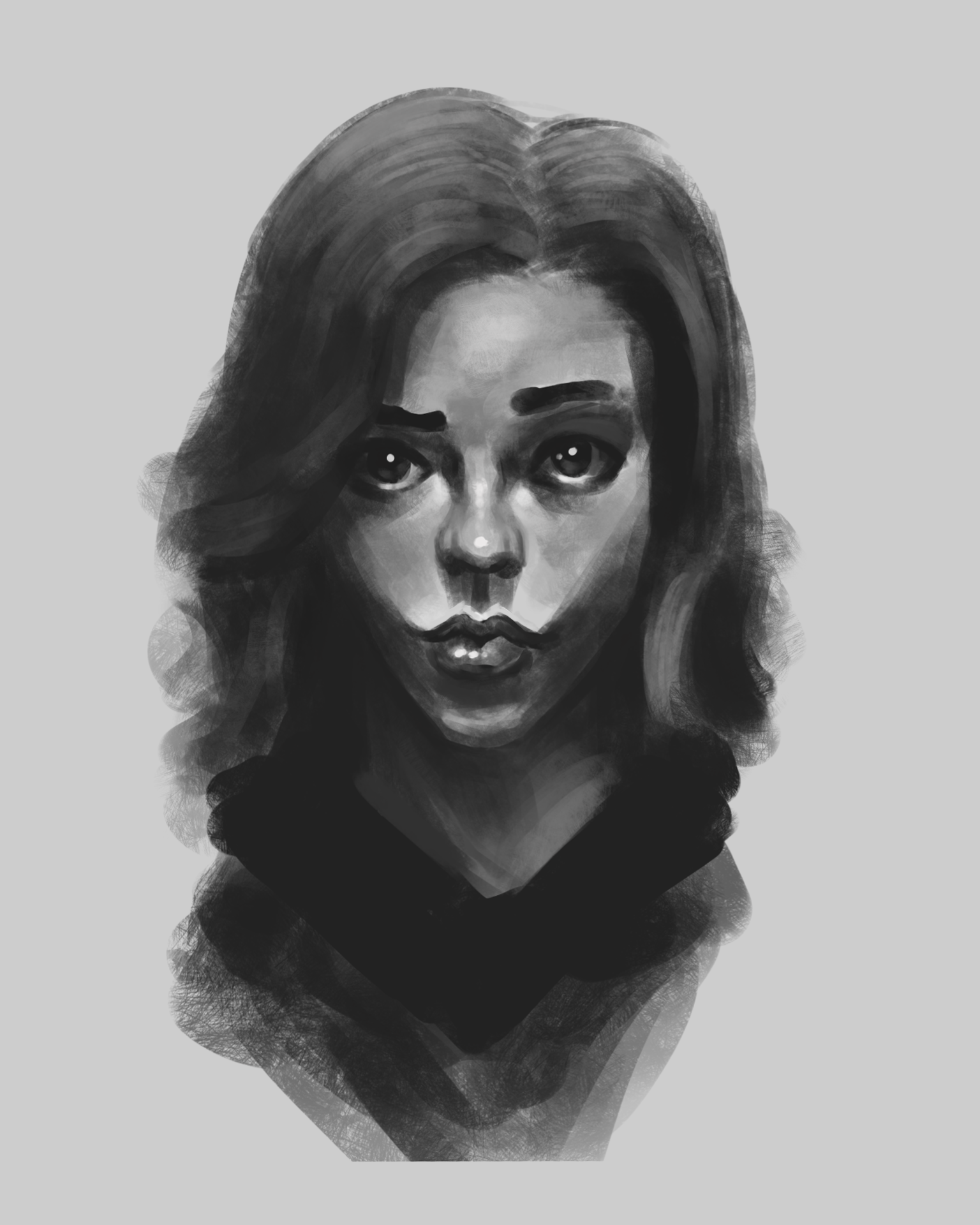
Two short and quick head sketches from last night and this morning as a little study.
Also took the opportunity to simplify my brushstrokes with these sketches,
instead of falling in to my old habits of using random messy brushstrokes everywhere.


-------------------------------------------------------
SKETCHBOOK // INSTAGRAM // WEBSITE
-------------------------------------------------------
"Losing all hope was freedom."
Posts: 30
Threads: 0
Joined: Jan 2017
Reputation:
4
I really like look how dark and rough your are pieces are, yet also how the expressions are so point! If you have troubles finishing pieces maybe just concentrate on rendering the faces a bit more first and leave the rest rough as it is. I think this way it would really highlight your strength even more without taking away from the rest - if that makes sense.
Keep up the great work! :)
Posts: 60
Threads: 2
Joined: Nov 2020
Reputation:
4
(02-23-2021, 10:16 PM)Kaiko Wrote: I really like look how dark and rough your are pieces are, yet also how the expressions are so point! If you have troubles finishing pieces maybe just concentrate on rendering the faces a bit more first and leave the rest rough as it is. I think this way it would really highlight your strength even more without taking away from the rest - if that makes sense.
Keep up the great work! :) Yeah totally makes sense, depends on the piece though. WHen it comes to that more sketchy approach, your'e totally right :)
Thanks a lot!
-------------------------------------------------------
SKETCHBOOK // INSTAGRAM // WEBSITE
-------------------------------------------------------
"Losing all hope was freedom."
|


