John's Thread (Used to be super active! Still the longest thread name ever in CD)
You hit the nail on that one, eventually we will all have to play the game, whichever it is at the time, and I'll eventually will, for learning I wish there were more platforms you can go to tho, I guess they are but as with anything, is best to monetize it if you do so. Ha. So true, ha, people in face to face are usually more coy and not as open, and writing a comment sometimes there's lashing out and other stuff to filter, but I mean, I think I got used to that, I just focus on the content not as much the voice, also reading something, is your inner voice most of the time who has to make sense of it and who puts the tone. Not always, but yeah, there's plenty of miscommunication I feel due to that. Can't see the face on the other end, can't emphasize or know if they are friendly joking or actually want to murder you lol.

Oh boy ha ha ha! That comic strip reaction made me chuckle madly! The one about the brushes, I think I get what he's saying though, a hard and a soft one covers most of your bases, I'm personally a fan more and more of the smudge and a hard one, rather than a soft one, but shush! don't tell anyone... Smudge gets no love.

The katana girl action is awesome, although what is she cutting? My favourite panels for composition and pose are the 1st and the 5th one, 5th specially for the turning of the head and all reads epic, the last one I had a bit of trouble seeing that it was her torso, although it made sense since it follows the same camera placement for a bit at least I thought it was a leg and a foot. Nothing some color would fix though, or tones. Alternatively you could show the hand a bit more on that one, fingers or so. The one I see most trouble is the 4th one, mainly it feels you change her body proportions too much? Didn't feel consistent as there (I feel her shoulders are narrower now than before, not as wide, compared with the head). The line quality is great.

What do you usually do for prints? I honestly have never done such a thing so I'm not sure I can be of any help, but either try for what was more successful before to you or, something completely new.
Reply
lol man my bad i don't correct myself that much when i write stuff.

My Sketchbook

Perfection is unmeasurable therefor it impossible to reach it.
Reply
Hey John. Glad to see you back here and going to a con (how exciting!). If you're looking for suggestions for prints - you can always sell your soul and do some fanart (: Half-joking-half-not lmao, sometimes a balance of fanart and original seems to work to pull people in. Otherwise, see if you can get a list of what other artists are going (even better if you can find repeat artists that go every year), research and see what they are peddling. Might give you some inspiration for prints or an idea if there's a common theme people are doing.

I think the main thing is to have fun and enjoy the prints you are making. People can sense when art doesn't have any passion behind it, so just have fun and make what you want to make.

Already crossing my fingers for a successful con for you, and welcome back!
Reply
Rotohail - The sketch thing. I kinda understand the execution darktiste wants me to do. But meh. No offense to him, but it feels like I'm being told what to do by a person who's horrible at math when I'm trying to figure out rocket propulsion.

(Then again, my math isn't exactly as sound as I'd like it to be, metaphorically speaking. Just to be fair.)

I guess I failed to provide a little bit of context. When I did that thing, I was playing around with this clip studio brush, thinking it could be that one brush that could do everything when I want something fast. But, as painstakingly obvious to everyone, either my technique is shite or I need to play around with the millions of brushes Clip studio has to offer.

The girl should be cutting a ceiling mounted turret from the previous page (which I didn't provide the page for here). Yes, there are proportion issues. But that's just me hoping readers won't mistake that person for another character. I've been notorious for taking forever doing comic pages. I swear to god it bothers me, but not as much these days. Heard some comic veteran saying that the purpose of the work should serve the story. Everything is secondary. There are a lot of comic book artists who's infinitely better with their artistic foundation, but couldn't tell as interesting of a story than artists who'd risk to break rules.

I'm going to catch a lot of shit saying this. Sean Gordon Murphy's (Batman's White Knight) layouts are more fun to read than George Perez's (Crisis) layouts. I love them both. Both are great storytellers. But I just prefer how the former tells the story than the latter.
I believe Hiroya Oku (Gantz) has sound anatomy compared to a lot of manga artists out there. But, I would much rather read Ogure Ito's (Airgear) stuff even though there are times you catch him trying to wing it.

Not that I'm stating those as an excuse to not improve my foundations. It's just that this is a long winded answer to say, yes, you are correct. I know it still sucks, but at the same time, I am also trying to improve this craft whether its composition, anatomy, perspective, storytelling, and etc...

But, regardless, I still appreciate people pointing out my horrible panels.

Con prints.. I did illustration prints of existing comic book IPs. Some of the development I had help here on this thread (Josie and the Pussycats and the Batman piece).

darktiste - >:)

chubby_cat - I really appreciate your comment. When I read your thoughts on this, it's gave me a nice perspective on how to approach on what I should be working on. I'm still planning, but I go back to your comment whenever I get too lost in my own thoughts and just overthinking it. Thanks!

---

Obligatory post that I'm still doing something:
[Image: N62xNic.jpg]

If you are reading this, I most likely just gave you a crappy crit! What I'm basically trying to say is, don't give up!  
----
IG: @thatpuddinhead
Reply
John! Good to see you're still alive dude :).

Love seeing you do comic stuff man, you put me to shame - I've been threatening to do a comic for years but still have nothing to show for it!

Go kick some ass at this comicon you've signed up for! Not literally though - don't go beating someone up - that's bad for your your rep.

“Today, give a stranger one of your smiles. It might be the only sunshine he sees all day.” -- H. Jackson Brown Jr.

CD Sketchbook


Reply
Thank you for posting a comic page. It would help to see a sequence of pages for the context but you explained it in the next post. The regular grid layout is a bit risky but it works well for this action. It would be even more effective in a slide show comic. Will you add any speech balloons or sound effects?

Reply
Artloader - The convention plans didn't push through! Super flu season railroaded future plans!
Leo Ki - Yes I did put balloons up like how a typical comic should read. I didn't know where to go with the story, so I decided to put it on hold! It's more fun to build lore than to make stories!

---

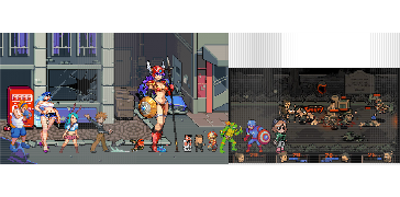
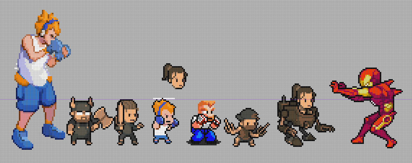
Concepts for a game! Trying to build a beat 'em up dating sim, but it would be difficult to market that to the general public!

[Image: A3D4Ezx.jpeg]
[Image: i6Gbtn4.jpeg][Image: 2GURgl2.jpeg]
[Image: nVNKZ1k.jpeg]
[Image: Mt2Obd5.png]


Shelfing this one. Good practice to know how it feels to create assets for a game!

If you are reading this, I most likely just gave you a crappy crit! What I'm basically trying to say is, don't give up!  
----
IG: @thatpuddinhead
Reply
Hey John! Cool to see a new post from you again! Those concepts are gorgeous! I really like the vibe of the game you've been working on! Reminds me a lot of old SNES beat-em-ups! Let me know if you ever publish it!

Reply
Hello!
You got me curious to check your game! I skimmed through the portfolio as well, impressive stuff.

I used to do a lot of pixel art animation so this is really interesting to me to look at.

I can't really comment on the art itself but if I do have a suggestion for the game: avoid mixing pixel art with non-pixel art. This might be my own personal preference however but in the end it ends up being detrimental to the overall result. It clashes with the constraints of pixel art (especially when it comes to palette restrictions). Considering you already have the drawings done, you could pixel them.

EDIT: For the pixel art, I'd add a color to shade the face, it'd still be color limited which wouldn't hinder animation too much I don't think.
Reply
What the? How come you haven't posted for so long John?? How're you doing nowadays?

Good to see you (virtually)!

Sorry that the comiccon thing fell through - hopefully there will more opportunities for you with stuff this year though :).

I'm loving the dating beatem-up concepts!

Post some more dude!

“Today, give a stranger one of your smiles. It might be the only sunshine he sees all day.” -- H. Jackson Brown Jr.

CD Sketchbook


Reply
Well I'm sold on your game concept! Haha. Loving the concepts for it too, they are really fun and charming. Since you're shelfing the idea are you planning on creating something else?

Also sorry to hear about comic con falling through. You could always try selling prints online if you wanted to go down that path? Inprnt seems good for that

Anyway, welcome back John! Good to see you around again :)
Reply
Welcome back! Great game art, if a dating sim where the characters are WW2 tanks can work... no reason a beat 'em up dating sim wouldn't take off ^^

Comic book creator
Sketchbook
Instagram
Abandoned Hideout Discord Server
Discord: JonR#4453
Reply


Forum Jump:


Users browsing this thread: 76 Guest(s)