Hey!
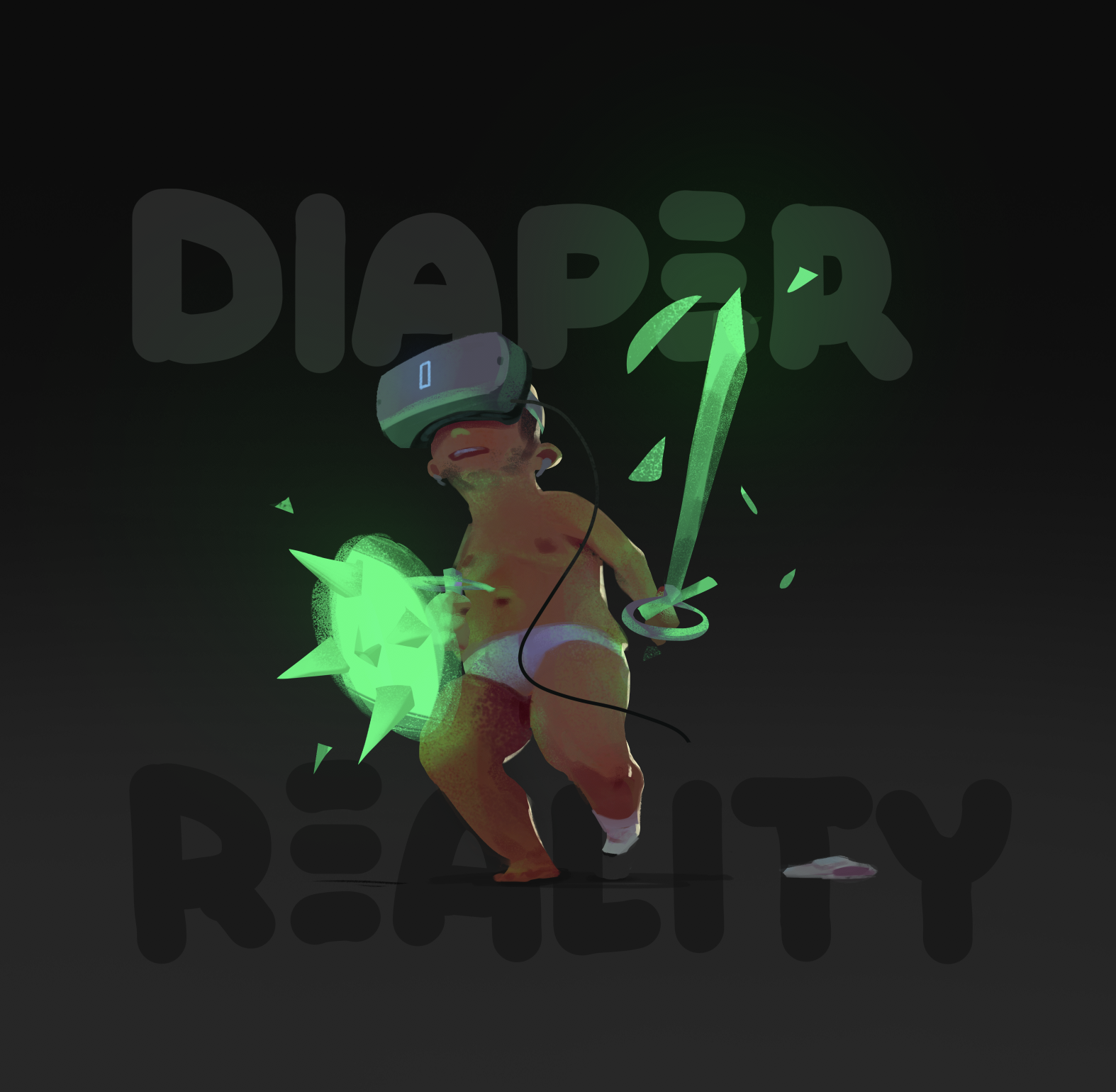
I painted this weird VR-themed character, but some things about it feel kinda off. I.e. the way the green light casts from the virtual sword+shield onto his skin- maybe some parts of his skin are too saturated?? idk. Could his pose be made more clear and easy to read?
Any anatomy tips would be super appreciated too... or really anything you might see that can make the image better/more effective! (maybe with exception of the type haha, just ignore that)
Thanks for looking y'all!

Sketchbook: http://crimsondaggers.com/forum/thread-8823.html


