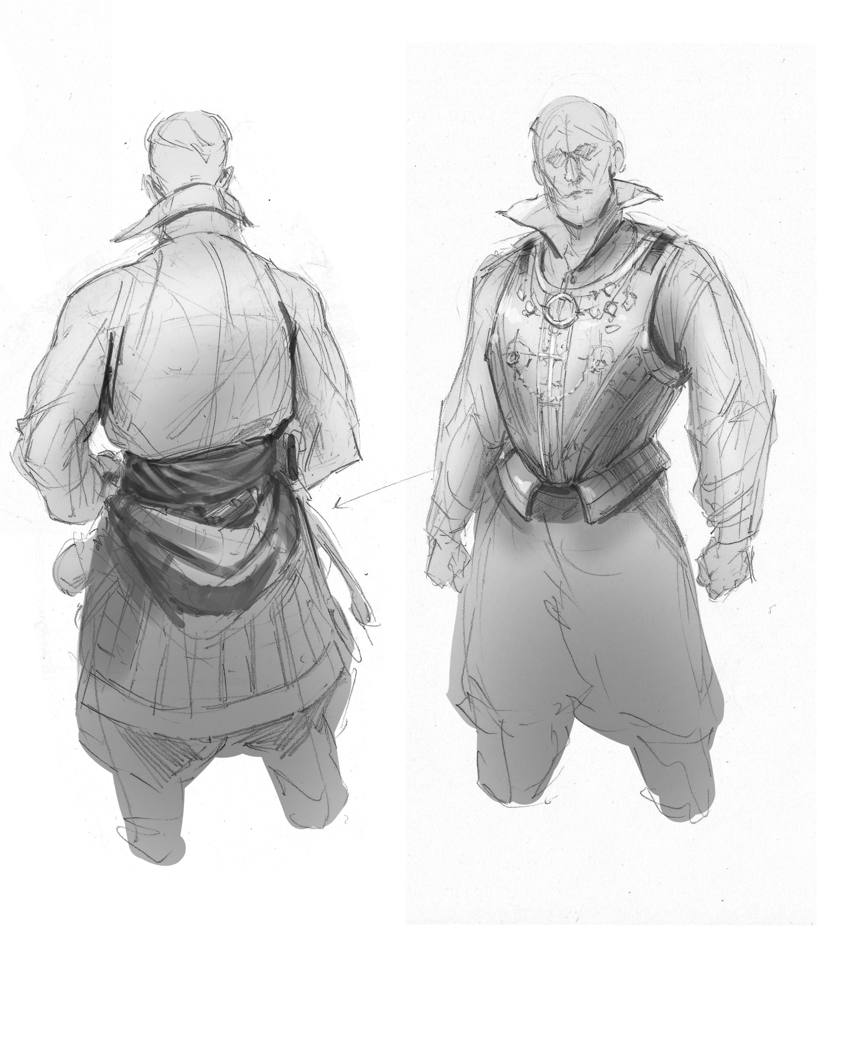
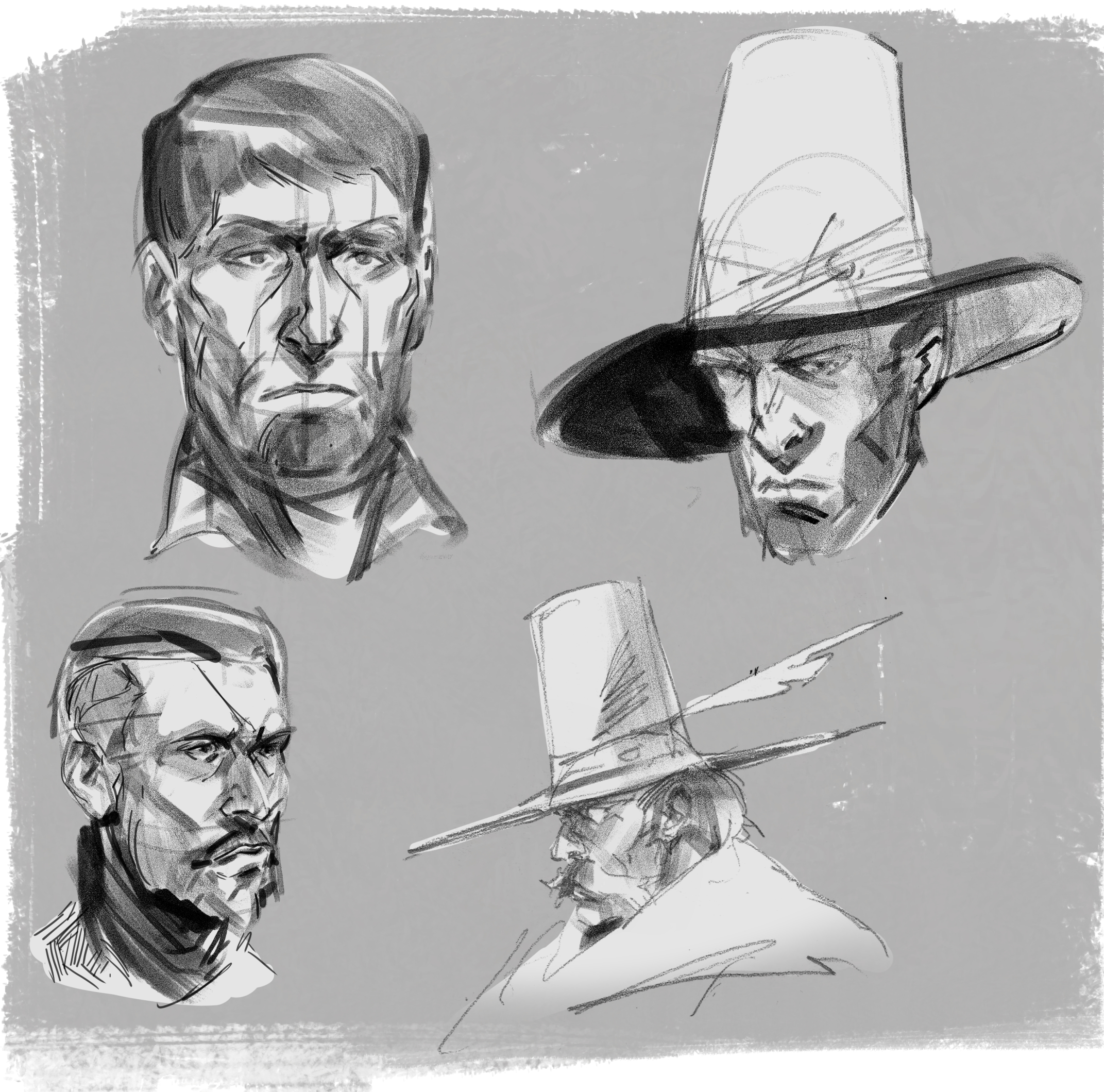
Anton's paper stack
#1
Photo 
Hello everyone! 

I'm Anton, a concept artist from Finland. I work professionally at an indie studio and also do freelance. I'm really keen to improve my skills though since starting working I've felt a decrease in quality and motivation. The thing I struggle the most with is painting.

I hope I can get my ass kicked with some critique and get me back on the grind! So feel free to give any feedback on my work :) 

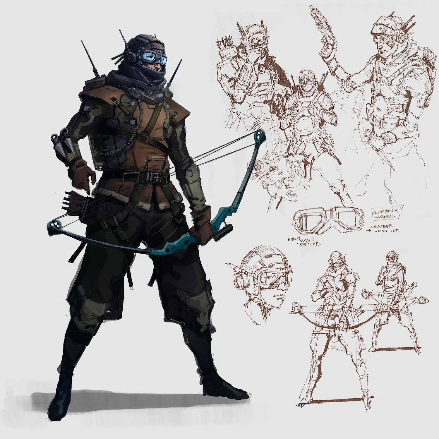
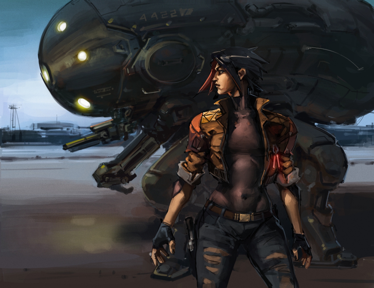
Here's some latest:


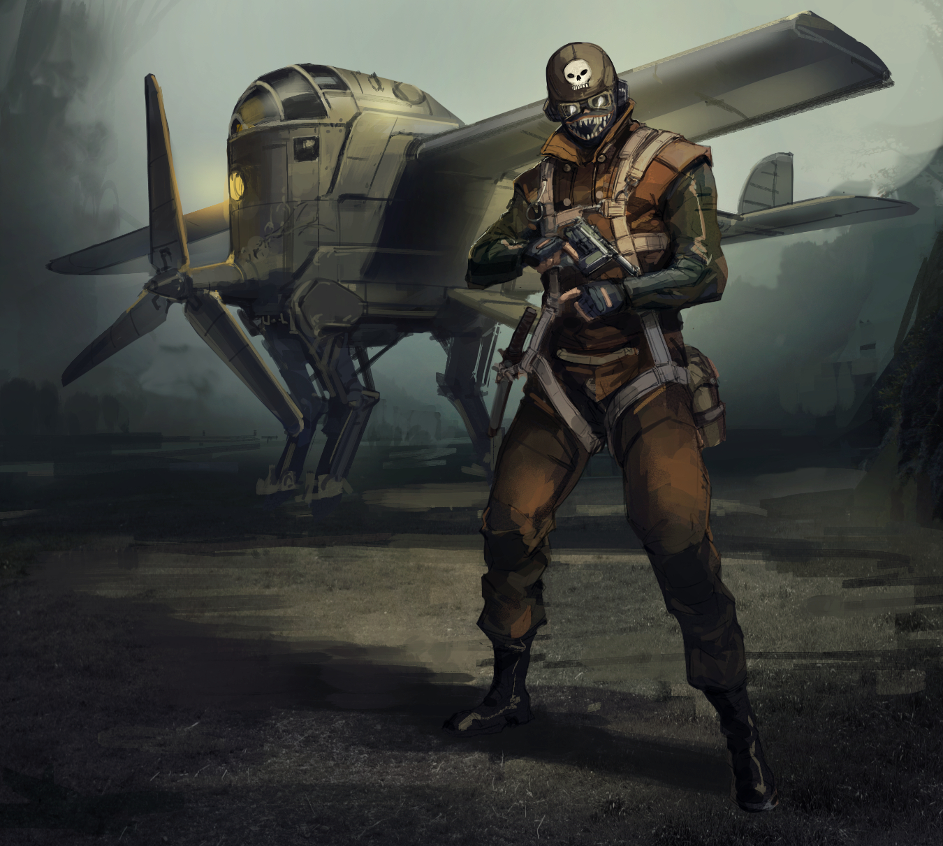
This is still work in progress:
Reply
#2
Welcome to crimson dagger.

Ass kicking you said? That my departement.But i am actually a strong believer in discipline and yes you heard it not motivation discipline.

You say you struggle with painting but that a pretty big statement anything a little more specific?

Any fundamental or art concept you are looking to get better at?

My Sketchbook

Perfection is unmeasurable therefor it impossible to reach it.
Reply
#3
Thank you for welcoming me!

Yes that's good, motivation is futile but but discipline is a constant stream. It's a good question, I think I struggle with mostly value grouping and overall lack of technique, but I know it's impossible to help without any examples haha.

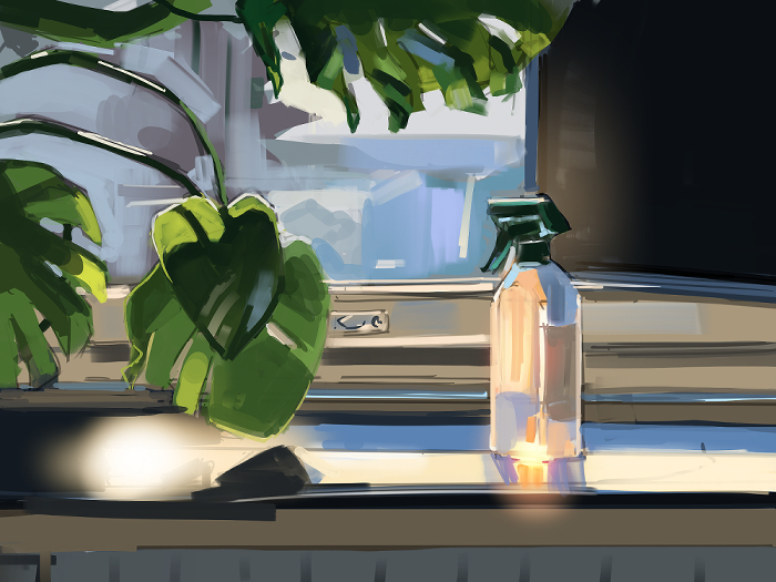
This morning I did a still life after a long time, quite rusty at it.  Often I struggle to see the benefit of doing still lives in other ways than improving technique, but this time I attempted a subject that is quite hard and tried to focus on simplifying the values only to black and white first. I think I over complicated things in the end though


ref


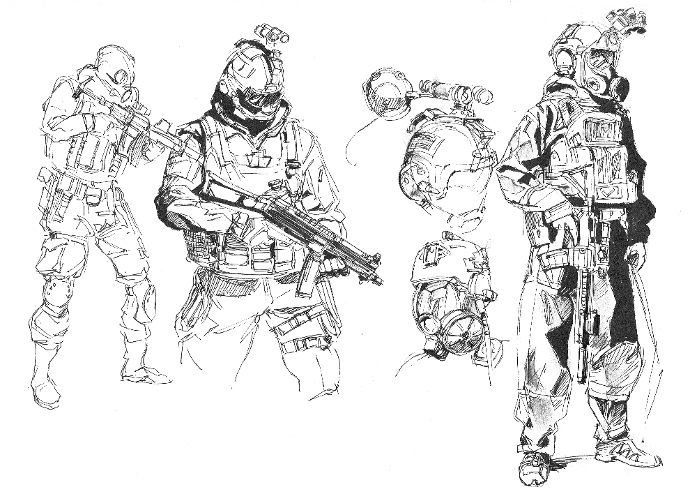
Some other doodles as well

Reply
#4
Hey man,
welcome and cool stuff you've got there already.
I really like those concepts there, especially the second one, with the dude holding the bow.

I also really like the shapes you painted into the bottle there on your still life painting.
Good stuff, keep it up!

-------------------------------------------------------


SKETCHBOOK // INSTAGRAM // WEBSITE


-------------------------------------------------------
"Losing all hope was freedom."
Reply
#5
Very strong work here, you're off to a great start! Loving your character designs as well, very nicely done. As for feedback, your paintings look very solid, but I would tone down the darks a bit, especially towards the background to give it a more 3D look and to emphasize atmospheric perspective a bit further. Keep it up!

Reply
#6
Doing still life is the perfect vessel to focus on specific fundamental it get out of the way the need to be pretty or the need of creativity to a certain degree.It still were job as artist to ''beautify'' i would say unless your an hyper realistic artist which doesn't seem to apply to you personally.


But i think still life might need to be done a little bit more deliberally than let say just observe the room and draw anything.I think it important that atleast the element you want to draw are organize and that you choose the lighting condition.Why it important to organize the element? 

First to learn about composition.Secondo it create a relation in light and shadow between the object which will affect the rendering and the visual important of each object.

Still life are the perfect excuse to study they are boring at time in term of subject matter but rich for those who understand the power to boost were learning and they give us the opportunity to develop a more deliberate way of working.They are amazing for experimenting new medium and new technique.

My Sketchbook

Perfection is unmeasurable therefor it impossible to reach it.
Reply
#7
mixedmax: Thanks a lot dude!

cgmythology: Thank you for the feedback! I will continue on the wip one and will focus on the values more toning down the darks. I had a feeling it's too dark but now I have confirmation.

darktiste: I agree, still life lets you just focus on a specific thing when you don't have to invent anything yourself. I think I do need to be more deliberate with it. With that one I tried to capture the strong sunlight coming from the window. I'll definitely try to do more of them whenever I have the time
Reply
#8
Hi Anton and welcome!

The images in the first post are very, very good. Lotza energy and the character designs & mechs are banging!

No ass-kicking for now - just keep 'em coming

Reply
#9
That doodles reminds me the style like professional sketching. That already pretty impressive to say at least.

---------------------------------------------------------------
Devianart

Sketchbook

Instagram


Cara

Twitter/X

Artstation


Reply
#10
really like the poses and design of these characters. shape design for renderings seem solid and aesthetic.

any tips on where /how you come up with these ideas?
Reply
#11
Jephyr: Thanks a lot! I'll keep them coming for sure

cicakkia: Thank you :) 

handsomekorean: Thank you! I get ideas from just watching a lot of stuff, movies, documentaries. I follow a lot of random pages on instagram about airplanes and cars, photography, animals etc. and sometimes those can spark ideas. I don't actually look at other people's art when I'm drawing so I don't end up copying it. Also music is a big inspiration for me, whenever I listen to music I get these mental images in my mind and sometimes end up drawing them.

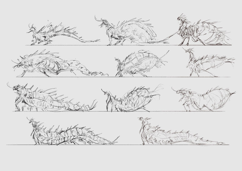
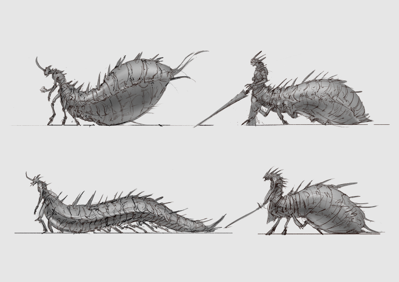
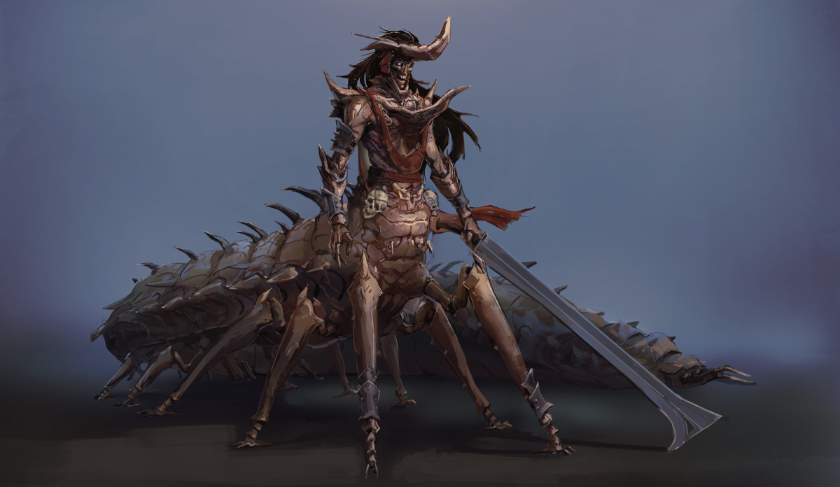
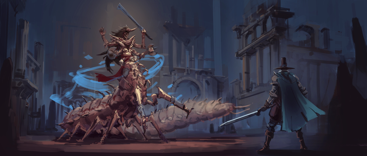
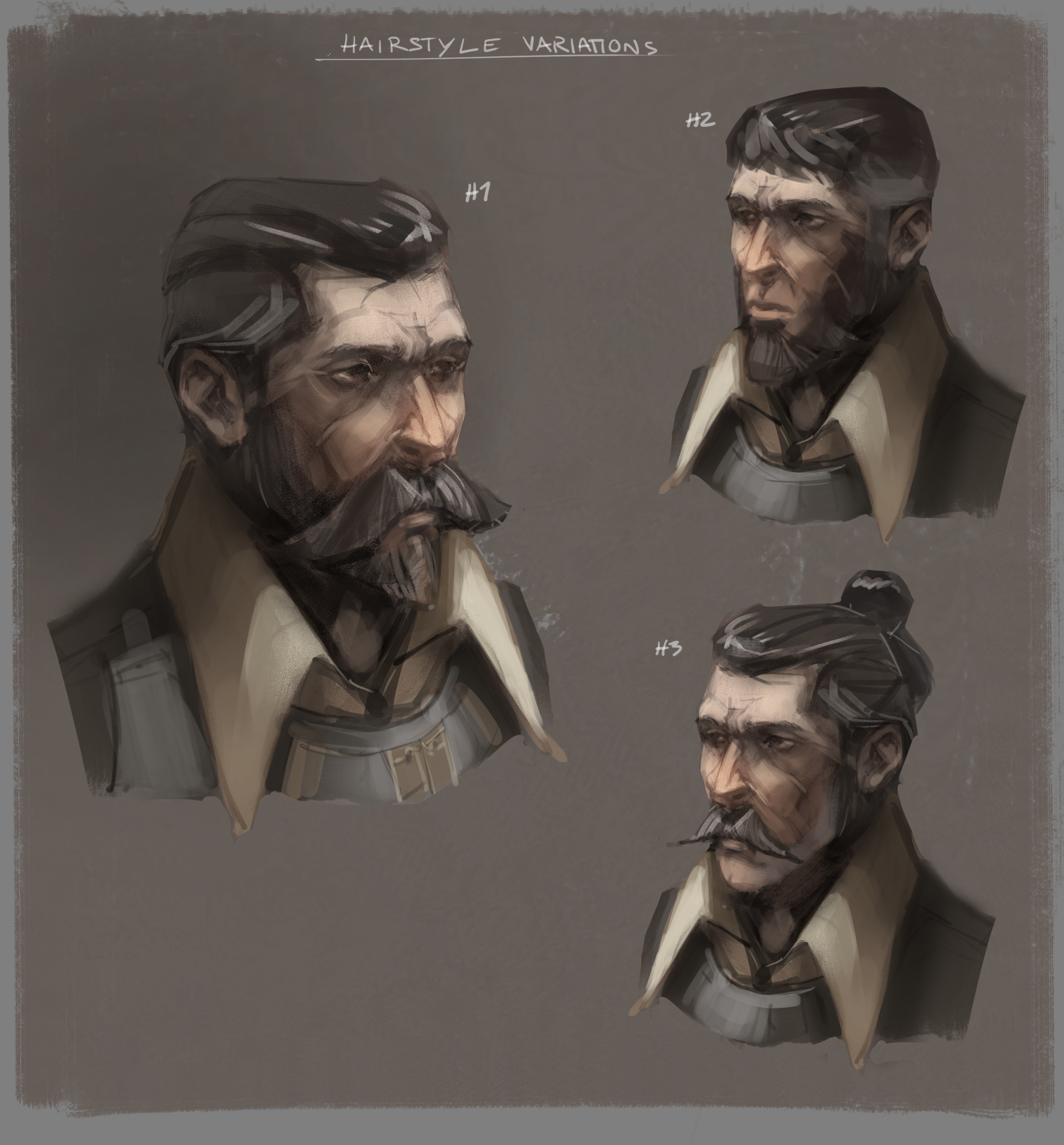
 I better put some more art on here so here's a personal project I've been working on: A fictional world set in around the 16th century, a man specializes in killing all sorts of demons that plague communities and he travels around the world terminating these demons. It would be a dark fantasy rpg shot in 3rd person, with realistic graphics.

thumbs for a demon creature


polished visual (not happy how this turned out, the pose is very very stiff)


Key shot showcasing the demon in action (again not really happy with this, I think I didn't really have a good enough idea what I wanted this to be so when  I continue this project  I will think about it more carefully)


Here is a design for the main character, this is about a year old work.


Reply
#12
Yeah — the dynamics of the second demon pic are a definite improvement (and that background & colors are really cool).  You could continue to push that pose by bending and twisting it's torso more as well.

Also — since I've been thinking about this a lot more for myself lately so I'll add that the guy in the foreground could have more of a reaction/hero pose: ie wider stance, cape more wind blown, sword more at the ready.

A small nit — but because I'm becoming more aware of that kind of stuff for my own images I thought I'd share my thoughts.

Otherwise, I really like your style and characters like the guy in the pic with the weapon studies.  Really awesome!

Reply
#13
Impressive amount of preliminary work for your keyshot with the demon! Even though I prefer the straight-up character concept you did of it, I've got to say the final image also came out quite nice!

Reply


Forum Jump:


Users browsing this thread: 7 Guest(s)