07-27-2022, 03:08 AM
Nice update, loving your style as always. Great color choices as well, fits the subject matter quite well while also looking very natural. Keep it up!
|
Look what the Sonoran wind just blew in!
|
|
07-27-2022, 03:08 AM
Nice update, loving your style as always. Great color choices as well, fits the subject matter quite well while also looking very natural. Keep it up!
08-07-2022, 06:29 PM
Thanks so much George. I've been side-tracked with a couple of projects (I unfortunately can't share) but have been working on the Chicken King as I have time.
It's been fun — but now I understand Disney's Bill Peet yelling "NO MORE DUCKS" one day and storming out after he'd been doing hundreds of duck 'key-frames' for an animation he was assigned to do. He sheepishly went in to pick up his stuff the next day figuring he'd been fired — and he found a letter on his desk promoting him! The 'squeaky wheel' — perhaps? I've only done a handful of chickens compared to that but STILL..... : ) Anyway — hope to be able to post that or something else new soon. Ciao bella CD!
08-16-2022, 01:15 PM
Hello People of Earth, Visitors and OTHERS!
Progress on my Chicken King Panel has completely stopped due to other projects — but today when I had a moment I did another LAY-OUT Test — just taking a screen grab straight outa Krita of various pics placed in their appropriate order. Eventually, they'll all be combined into one long image — and I think some characters may over-lap on some of the panels. I have tons to do to the backgrounds, and adding word balloons and and some ending text to the last image — but I was happy see it close to how it will look in time (Gw). 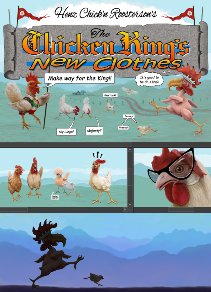 ----------------- I used to dig out the ol' pencils and sketchbook and scribble away almost every day — but lately have been concentrating on digital painting. Thankfully I still manage to find time to sketch a little from once in a while. Here are some newer sketches I plan to digitally paint eventually.  ^^^ Have been wanting to illustrate a Jester poem for ages and did this quick concept sketch with that in mind! 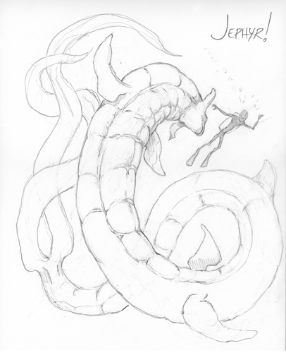 ^^^ I sure end up doing a lot of sea creatures considering I live in the desert. Maybe thinking about all that water is wishful thinking on 114 degree days...... Thanks for sch'toppin' by!
08-28-2022, 02:53 AM
Hello earthings (and 'others')
Finally finished the panel thing-ma-bob and BTW - It's HUGE: 33 x 65" or so and was interesting to do for sure. Might eventually illustrate this prolog — but only time will tell on that.... 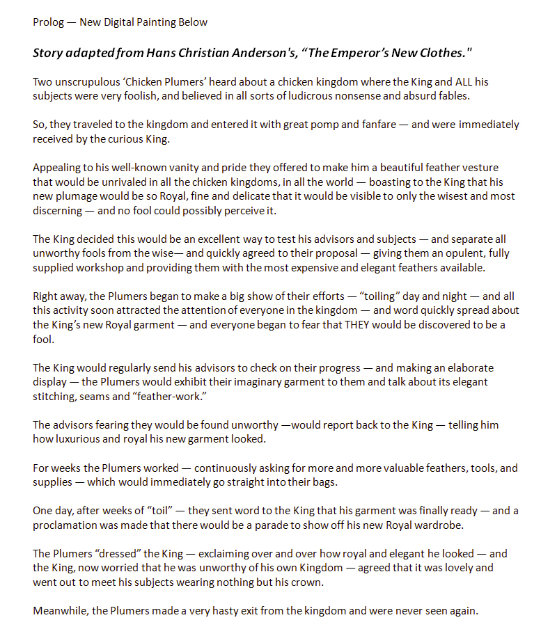 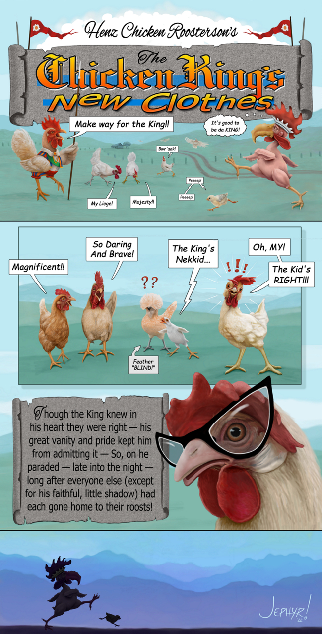 And the original sketch says I: 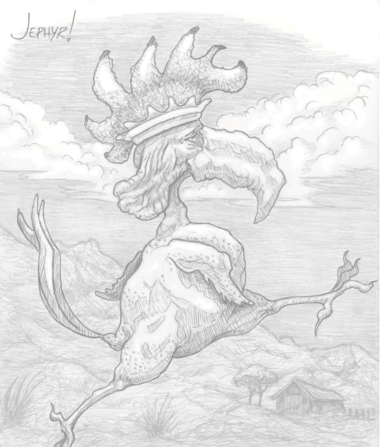 Ciao Daggers — Cya again soon I hope
08-30-2022, 03:29 AM
Nice updates, loving that sketch as well, just very solid linework with great line weight and hatching. Keep it up!
08-31-2022, 03:30 PM
Thanks so much George — I appreciate you stopping by and offering some encouraging words.
I used to sketch all the time and do kinda miss being able to do it more these days. ---------------- Had sum more modern problems to deal with (always seems the case — eh?) Had my refrigerator go out right after I bought a bunch of expensive groceries. Fortunately I noticed it right away and called a repair company. They said they'd send somebody out immediately but that I should pack the freezer and fridge with as much dry ice as I could. I did but had no idea how expensive that stuff is — not to mention the gas I burned up getting it. The repair guy (also CRAZY expensive) couldn't get it running and said he'd come back the next day and try another part he didn't have with him. Then when he came back THAT part didn't work. So I rushed out and bought a new fridge (CRAZY EXPENSIVE) and hadta pay a rush delivery charge to get it here fast. Anyway it was a time consuming, did I mention expensive, hair-raising 2 days — but I did save a lot of food that coulda spoiled — and on top of all that — STILL have managed to get some painting in — and in fact have two new pics in the pipe-line I hope to share here soon. ------------------ Thanks again George! Ciao Daggers!
09-27-2022, 05:33 AM
Greetings fellow earthlings, humanoids and hybrids!
Today's digital painting was done over an image I posted on my first page here on CD back in 2019 when I was primarily working with 'real world' media. I thought this would be an easy clean-up job but then ended up reworking almost everything extensively. 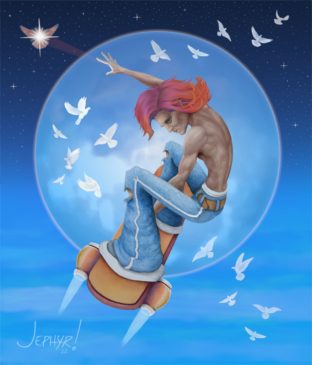 Here's a little closer view 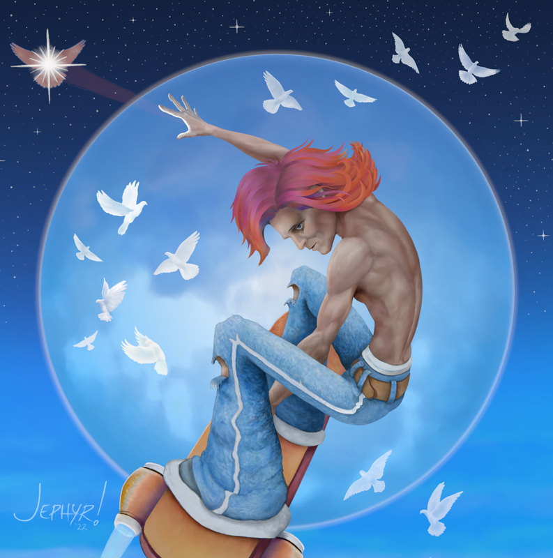 And the original 'Strato' - Looking at it now I think it looks pretty horrible but will share the original to remind myself how much difference a few years can make. Hope I can look back on today's pic in a few years and feel the same way.  Here's some 'works in progress' in various stages of completion. Hope I can post one or more polished up all purty soon. 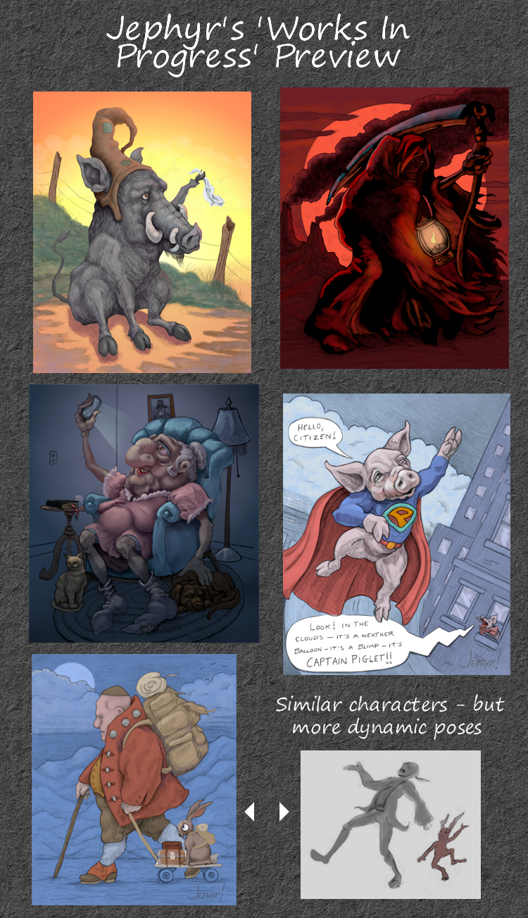 Thanks fer lookin' in Ciao Daggers.....
09-27-2022, 06:06 AM
Lot of WIP i think reducing the number of different WIP could help you push your project to a new level.I also notice most of the work leak space depth i gave you a few advice on that so i suggest you take a look back perhaps if you feel like that something you want to address.I know that keeping object in proportion can be a pain but it just make thing just a little bit more believable rather that graphical it depend what you are after.
I have to say i am hype for the grim reaper good timing for halloween.
09-27-2022, 06:22 AM
(09-27-2022, 06:06 AM)darktiste Wrote: Lot of WIP i think reducing the number of different WIP could help you push your project to a new level.I also notice most of the work leak space depth i gave you a few advice on that so i suggest you take a look back perhaps if you feel like that something you want to address.I know that keeping object in proportion can be a pain but it just make thing just a little bit more believable rather that graphical it depend what you are after. Hi Dark, I'm still lurking here and saw your comment. Having all those WIPs is just the way I tend to work. IMO it keeps things fresh — because as I start to burn out on one image — I open old ones and get inspired to work on one. But I ALWAYS have the goal of finishing as many as I possible. Although, of course, I do admit that many times I'll simply abandon an image and completely loose any interest in finishing it. I do recall your advice about depth and haven't been ignoring it. Right now I'm just concentrating on digitally painting a huge back-log of old sketches — and most of those were done prior to 2019. The thumbnail of the more 'dynamic' characters at the bottom has that in mind and is a variation of the more static image to its left. I do take your advice to heart and the REAPER dood uses a LOT of your suggestions from the 'Home Coming' painting on the previous page — as I'm pushing the lighting and values as you suggested for that one. I do hope I can finish it for Halloweenie! I'm so glad you like our creepy fren'. Thanks as always Dark!
09-27-2022, 10:10 AM
cool! your rendering skills have definitely leveled up, the back on the skater dude is looking great! Excited to see some of those WIPs finished. If I could suggest one thing, generally I enjoy seeing a strong effect of light and shadow where things really feel like light of a certain color is hitting them, or that things are really in shadow. It adds a lot of mood to pieces. Your WIPs have a lot of different, fun lighting situations, but there's definitely more that could be done to push the lighting further so the warthog piece really reads as sunset, or the grim reaper piece really feels like lantern light for example.
Would just be nice to see you push that since I think you favor more general, diffused lighting for characters.
09-28-2022, 06:00 AM
(09-27-2022, 10:10 AM)JosephCow Wrote: cool! your rendering skills have definitely leveled up, the back on the skater dude is looking great! Excited to see some of those WIPs finished. If I could suggest one thing, generally I enjoy seeing a strong effect of light and shadow where things really feel like light of a certain color is hitting them, or that things are really in shadow. It adds a lot of mood to pieces. Your WIPs have a lot of different, fun lighting situations, but there's definitely more that could be done to push the lighting further so the warthog piece really reads as sunset, or the grim reaper piece really feels like lantern light for example. Thank you so much!! You are so right — I do tend to go with diffused lighting a lot. Though, as I mentioned to Dark I do take all criticism and suggestions to heart — and even if it doesn't show up in each next piece I always have it in the back of my mind. So I will continue to push value and lighting and HOPE that will become evident down the road with future work I post. In fact, Dark's and your comment have lit a fire under me to finish the Reaper piece asap — and I plan to push the values and lighting as much as possible on it and the warthog etc. BTW — it's very helpful to consider how you put it "effect of light and shadow where things really feel like light of a certain color is hitting them." That helps me process the concept! Thanks again! ------------------- So I'm going add a link to a video I did last year and never posted here before. Krita has an feature to time-lapse capture each session automatically in their current version. Please let me know if I should do more of this kind of thing (because it'll take some hard-drive space and time to edit it together). This one is just 1-2 second fades between images (more of a flip-book so to speak) rather than a time-lapse and FWI the music is loud so adjust yer volume thingy: https://www.bitchute.com/video/2Abc6r1kEABP/ Oh — and is there a way to embed Bitchute videos on CD. I've tried a dozen different ways and no luck.....
09-28-2022, 08:55 AM
Yeah for sure. Let me know if you want feedback on the lighting at all when you work it up.
Also how did I not know about the recorder feature in Krita? That's super cool! I will definitely try that out next time I start a painting for sure. I also have no clue how to embed stuff either, I've tried once and it didn't work. I think there's a bunch of stuff on this forum that are broken tbh
09-29-2022, 01:30 PM
(09-28-2022, 08:55 AM)JosephCow Wrote: Yeah for sure. Let me know if you want feedback on the lighting at all when you work it up. Thanks for that kind offer! I'll gladly take any feedback you're willing to give. Although sometimes it's hard to have an idea what needs work when you've been staring at a painting for hours — so feel free to add whatever you think would help make a better piece. ---------------------- I've watched some videos about Krita's time lapse feature but haven't tried it out yet. I understand it only records the image (so no tool bars or color palettes etc). One cool feature though (I think) is that it doesn't change the image as you zoom in and out — so apparently it's a nice steady capture of the full image as you paint. I've used external capture software and end up having to edit out all those in and out zooms to save a viewers eyes — and I've missed sections because I forgot to start it or end up with huge video files because I forgot to shut it off. So that it's all automated once you set it up is very cool IMO. ------------------ Thanks again!
09-30-2022, 06:44 AM
So I'm trying out the most recent Krita update and am not sure I like it as well.
Right out of the gate I noticed it loads way more slowly, and images take longer to open, and is a bit glitch-y-er. For example, I tried the rotate tool and could see it's handles moving but the image underneath it didn't change until I hit enter. That's BAD. Making edits and changes takes WAY longer. Move a layer node, change it's opacity or turn it off — and a task bar comes up to show the progress. ie 33% done, 67%, 78%, and so on. It's way slower than my last version. Also I was trying to resize the layers palette and could find the 'grab' handles. I'd hover over an edge and it would blink on for a split second and then disappear. Worse for me — is that they took away the single click function to return your image to 0 degrees. It's now a wheel and you have to be very careful to get it to zero or hold the shift key. Either way — it's an extra step I don't like when it used to be soooo simple. I may reinstall the older version but that one doesn't have the time-lapse feature — so I may play around with that first and try to get used to this version first. [/complaining]
10-05-2022, 11:35 PM
Really solid updates here, you've been very productive! Great improvement on the guy with the skateboard, excellent style there! Your WIP images look very promising as well. Only suggestion is to push the values and contrast a bit further, but that's more of a personal preference than anything. Looking forward to seeing how they progress!
Thanks so much CG. I appreciate the feedback.
I pushed the values a bit on Strato — hope you and/or the forum will let me know if this is an improvement. 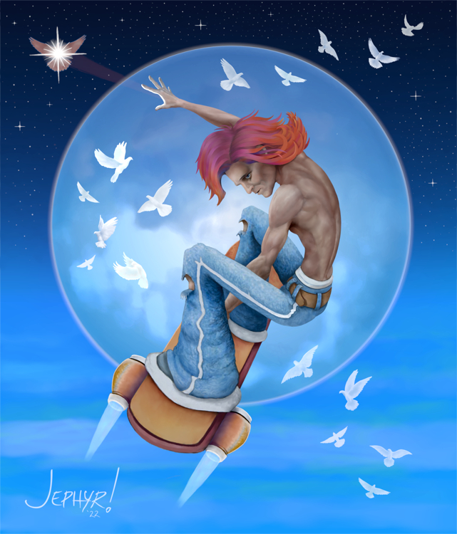 I put some finishing touches on my reaper pic — but it looks HORRIBLE on this computer I'm uploading from. I'll check it on another couple of monitors when I have some time and hope it looks more like the original monitors I painted on. It's supposed to be red to yellowish hues but on this PC it looks overly VIOLET and lost almost ALL of the yellow and orange hues and the touches of blues.  ------------------- As mentioned before, I've been messing around with Krita's new 5.1.0 update. The problems I mentioned above are still an issue but I figured out the time-lapse tool and REALLY like that. And I used Krita's animation to edit it AND discovered there is a new TWEENING tool which it didn't have before. There's already a new 5.1.1 update that addressed the slow loading but I haven't heard anything about all the SLOW "updating" it has to do when you move a node or change it's opacity etc. REALLY slows things down as you paint — especially like I use it when I want to quickly compare opacities on a layers or move things up and down. It becomes a HUGE problem because it goes through the updating process and won't let you cancel until it finishes. Then you gotta repeat that process for 'UNDO' — and POOF — there just went a minute or two you coulda used for painting. Anywho — I did this silly little pic as I was testing the time-lapse feature. I was in a pretty good mood when I was coming up with this on the fly. I'm still messing with time-lapse — so i I finish this pic I'll post the final pic and video. 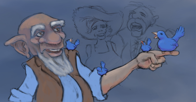 That is all. Carry on CD.
10-25-2022, 12:01 PM
You seem to be into monochromatic color scheme atleast recently but you manage to keep your work fair contrast that interesting.I think the only thing i don't really like is how you tend in the last two two first piece of this post to put a full figure at the center of the composition which make it hard to establish a view hierachy i would say it bit to predictable and central which leave me with a sense of thing being to orderly and in a way which can take away from something you want to be dynamic.You have alot of element that imply movement yet putting the figure in the center seem to make it static. Did you check my sketchbook i did some environnement study where i took note on how to imply movement in a composition.It start around here in my sketchbook if your interested. http://crimsondaggers.com/forum/thread-3...ge-11.html and finish around page 13
10-27-2022, 08:23 AM
Thanks for commenting Dark
I DO like monochromatic schemes although the reaper dood leans more towards an analogous color scheme centered on reds to yellows — And while I did use purples and blues, I see now, they were blended into more of a red/violet range. Stato, the rocket-skateboard dood, is more of a split complementary scheme. I did look at your pages and invite you to use the same analysis on my images. I don't always do it well — but I 'point' a viewers eye around my work. It should be very evident in 'Enchiridion' — the pic with the war horses on page 4. On to centering images: As mentioned before I'm utilizing older sketchbook drawings (from 2019 and MUCH older) for many of my current digital paintings. Those sketches were limited by the size of my sketchbook — though I often expand the edges while painting to allow some breathing room — but otherwise I generally stay true to the original sketch. The other thing is that if you study stuff from the golden age of illustration all the way up to this forum, ArtStation, NewGrounds, CGSociety, Krita's galleries on their site and their reddit — centering of character(s) is generally the rule rather than the exception. I do think there is merit on thinking about that though — so I'll be considering that for future projects. ------------------------ Your comment inspired me to try out some monochromatic ideas for the Reaper — plus I realized I forgot to add the original sketch to my post about it. ------------------------ When I'm sketching — I'm usually out at some coffee house etc — and I often start with a scribble and just let my imagination loose. I musta been in a 'Goofy' mood the day I scrawled the Reaper dood because of its 'Goofy' face. But I don't try to self edit too much knowing I'm just getting the idea down — and even way back then planned on painting my sketches eventually and adjusting things like that.  Black and White:  Sepia:  Blue-ish  And green-sh — which I think is kinda appropriately creepy color 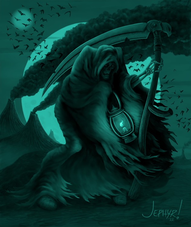 Weirdly - Monochromatic red doesn't work well at ALL. ---------------------------------------- I normally don't do holiday themes — but hope you like my 2022 Halloween offering. <Cue echo-y creepy laugh)
10-27-2022, 03:47 PM
The Grim Reaper piece is absolutely stunning, love the linework and your use of values. I feel the simple grayscale versions works best because it compliments the subject matter incredibly well. Keep up the great work!
11-30-2022, 11:30 AM
Thanks so much George. I really appreciate that — especially that I finally got some better values.
I used to watch a lot of old B&W horror movies — so I kinda like that one too. Thanks again! --------------------------- So here's todays' digital painting — on the last day of November here in the desert. It started out as a sketch I drew eons ago — and tried at least once before to polish it up. I did a bunch of variations and created the ornamental lattice heart in Inkscape — so I was working on character development, pushing color and lighting, and vector shapes and path to object stuff. In no particular order here are 6 variations and the original sketch from back when I was an art baby: 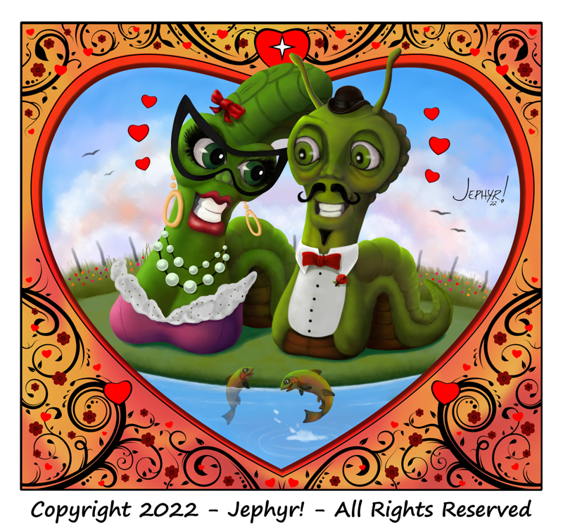 Same — but with a sunset sky:  Two more without a background to the lattice:  and sunset sky: 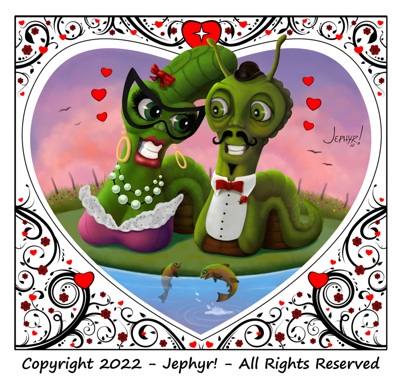 And the last two with just the characters and heart background: 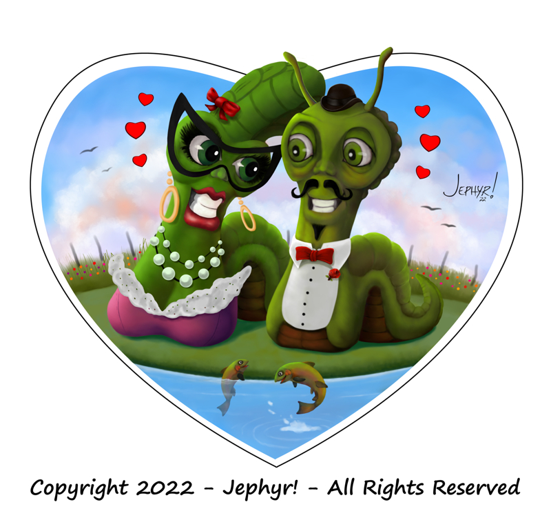 and sunset: 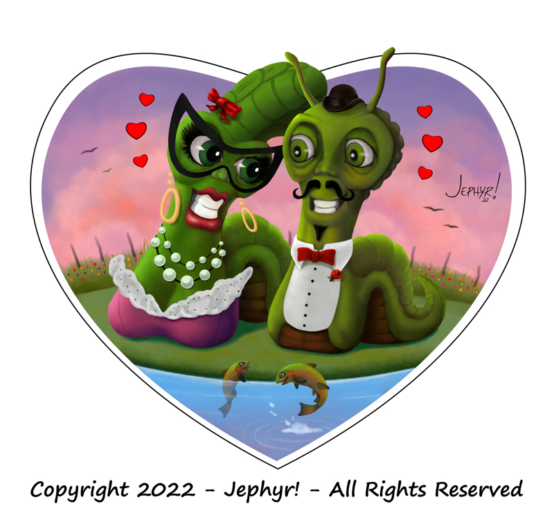 and the ANCIENT original 'sketch' — oh! The HORRORS!: 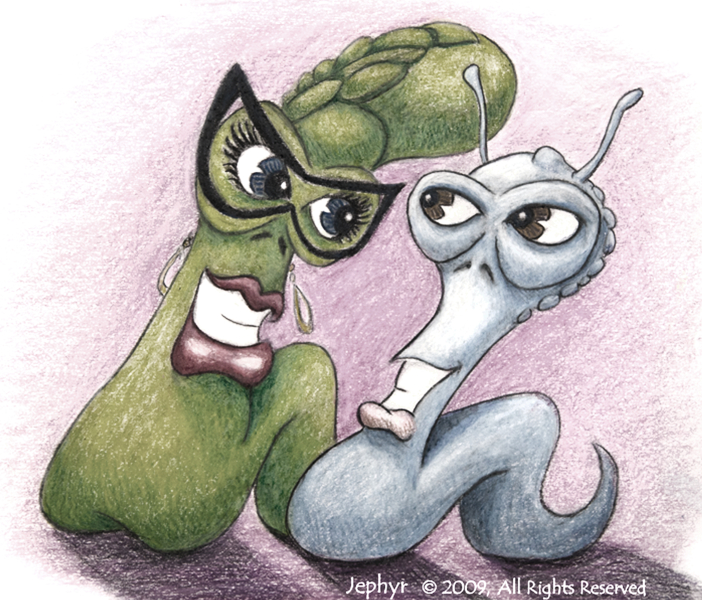 Thanks for havin' a look at my SB |
|
« Next Oldest | Next Newest »
|