10-09-2015, 01:58 PM
Alrighty Top Cat, firstly, take a breather - inhale, exhale. Getting better at art is all about getting frustrated, seriously. If you're not feeling uncomfortable like you are right now with these landscape thumbnails, well, you're not thinking/pushing yourself hard enough. Right now, you're working outside your comfort zone and you're not used to it, so every part of your being is trying to retreat, but don't give in-!!
What lurch was saying about readability is true. When you have too many breaks in values, the piece on a whole can somewhat look messy and in turn make it hard to read. Now, here's the thing. You have 4 values to work with using those copics. That's all you need to make incrediballs images. But you need to use them wisely and make every stroke count, just like in a painting. Don't just move your arm/hand in a sporadic movement when shading form in; by doing doing this, you're not actually communicating what the shape is that you've drawn - give every shape a little TLC, because they're all unique to these:
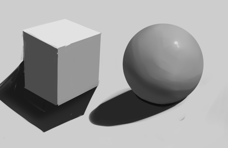
Now, you wouldn't believe how long it took for my to render that sphere... and I am still unhappy with the result. So, I'm trying to show you that you should take time making a brushstroke or a mark on paper -- really try and follow the form. Wrap around shapes. You wouldn't believe how much this'll help your drawing out.
I know this sounds tedious and probably boring, but if you think about this when drawing, things will become easier. For example, by adding those two simple shapes together and playing around - you can create rocks/mountains/whatever
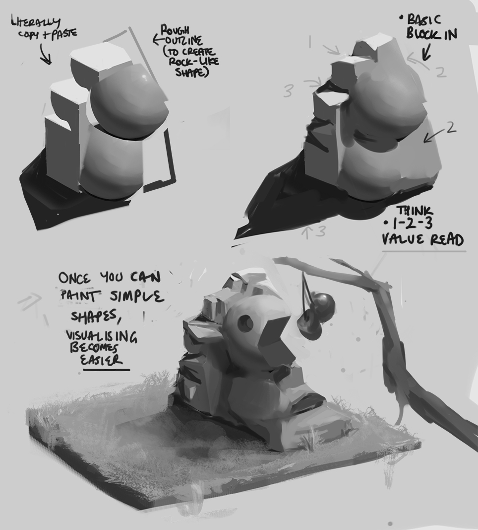
Again, this took me a while but I'm trying to explain that understanding these things take time. Don't be afraid to take your time and try to understand what you're doing. Now the final rendered rock-thing "Pacman Rock" still has that 1-2-3 read with the values, but I thought about light intensity, so that may change the high value of white on the top facing rocks. If you don't know about it yet, there's a book called Color and Light by James Gurney, it's a goldmine and I recommend you check it out because he does a hella better job at explaining thing than I could.
But basically what I'm trying to get at with this paintover is: you need to think about all objects, even people in this way. Wrap your lines/brushstokes/marks around form to help describe it better. You only need to use 1-4 values max in the beginning stages of creating an image, once you have the sketch made with forms reading well (like number 2 of the painting thing I did), you can go in and render more minute details, adding in the full value range if you want.
So work from big to small shapes. Get the big picture down, then think simple values, then expand on this. Now, I know you're not a digital painter, so this may not relate, however, I'll talk about it anyway: it's like when you're working on a painting digitally - you wouldn't start by being zoomed in and working on the canvas zoomed in from the get-go. You would instead work from a canvas size similar to a thumbnail to get the "big picture" down first, get the composition looking right (which you can do easily by contrast of shapes btw :D shape language and negative space are really important in creating interesting designs, I'd recommend looking into this, it'll help you out a lot with these assignments), and then zoom in gradually as you add more detail, etc.
I hope this helps you in some way, I'm terribad at explaining things... so I apologise for that. But yeah, anything's possible, Top Cat - just gotta change your mindset and adjust to each problem that is thrown your way.
Keep at itttt-!! <3
What lurch was saying about readability is true. When you have too many breaks in values, the piece on a whole can somewhat look messy and in turn make it hard to read. Now, here's the thing. You have 4 values to work with using those copics. That's all you need to make incrediballs images. But you need to use them wisely and make every stroke count, just like in a painting. Don't just move your arm/hand in a sporadic movement when shading form in; by doing doing this, you're not actually communicating what the shape is that you've drawn - give every shape a little TLC, because they're all unique to these:

Now, you wouldn't believe how long it took for my to render that sphere... and I am still unhappy with the result. So, I'm trying to show you that you should take time making a brushstroke or a mark on paper -- really try and follow the form. Wrap around shapes. You wouldn't believe how much this'll help your drawing out.
I know this sounds tedious and probably boring, but if you think about this when drawing, things will become easier. For example, by adding those two simple shapes together and playing around - you can create rocks/mountains/whatever

Again, this took me a while but I'm trying to explain that understanding these things take time. Don't be afraid to take your time and try to understand what you're doing. Now the final rendered rock-thing "Pacman Rock" still has that 1-2-3 read with the values, but I thought about light intensity, so that may change the high value of white on the top facing rocks. If you don't know about it yet, there's a book called Color and Light by James Gurney, it's a goldmine and I recommend you check it out because he does a hella better job at explaining thing than I could.
But basically what I'm trying to get at with this paintover is: you need to think about all objects, even people in this way. Wrap your lines/brushstokes/marks around form to help describe it better. You only need to use 1-4 values max in the beginning stages of creating an image, once you have the sketch made with forms reading well (like number 2 of the painting thing I did), you can go in and render more minute details, adding in the full value range if you want.
So work from big to small shapes. Get the big picture down, then think simple values, then expand on this. Now, I know you're not a digital painter, so this may not relate, however, I'll talk about it anyway: it's like when you're working on a painting digitally - you wouldn't start by being zoomed in and working on the canvas zoomed in from the get-go. You would instead work from a canvas size similar to a thumbnail to get the "big picture" down first, get the composition looking right (which you can do easily by contrast of shapes btw :D shape language and negative space are really important in creating interesting designs, I'd recommend looking into this, it'll help you out a lot with these assignments), and then zoom in gradually as you add more detail, etc.
I hope this helps you in some way, I'm terribad at explaining things... so I apologise for that. But yeah, anything's possible, Top Cat - just gotta change your mindset and adjust to each problem that is thrown your way.
Keep at itttt-!! <3
sketchbook | pg 52
"Not a single thing in this world isn't in the process of becoming something else."
I'll be back - it's an odyssey, after all
"Not a single thing in this world isn't in the process of becoming something else."
I'll be back - it's an odyssey, after all


![[Image: oct_16_15_6_by_punk_a_cat-d9d9iza.jpg]](http://img09.deviantart.net/9422/i/2015/289/c/9/oct_16_15_6_by_punk_a_cat-d9d9iza.jpg)
![[Image: oct_16_15_5_by_punk_a_cat-d9d9j34.jpg]](http://img08.deviantart.net/d5b0/i/2015/289/4/0/oct_16_15_5_by_punk_a_cat-d9d9j34.jpg)
![[Image: oct_16_15_4_by_punk_a_cat-d9d9j5l.jpg]](http://img00.deviantart.net/43d4/i/2015/289/f/2/oct_16_15_4_by_punk_a_cat-d9d9j5l.jpg)
![[Image: oct_16_15_3_by_punk_a_cat-d9d9jap.jpg]](http://img08.deviantart.net/93b2/i/2015/289/8/c/oct_16_15_3_by_punk_a_cat-d9d9jap.jpg)
![[Image: oct_16_15_2_by_punk_a_cat-d9d9jfm.jpg]](http://img05.deviantart.net/fffc/i/2015/289/9/f/oct_16_15_2_by_punk_a_cat-d9d9jfm.jpg)
![[Image: oct_16_15_1_by_punk_a_cat-d9d9jjn.jpg]](http://pre07.deviantart.net/a448/th/pre/i/2015/289/1/3/oct_16_15_1_by_punk_a_cat-d9d9jjn.jpg)
![[Image: ham_garden_by_punk_a_cat-d9d9hhb.jpg]](http://img11.deviantart.net/9987/i/2015/289/b/a/ham_garden_by_punk_a_cat-d9d9hhb.jpg)



![[Image: icegif-802.gif]](https://www.icegif.com/wp-content/uploads/icegif-802.gif)