Posts: 6
Threads: 1
Joined: Dec 2022
Reputation:
2
Those studies somehow manage to look loose and effortless yet super polished at the same time
Also nice to see you having fun with characters and creating some scenes with a story
Good stuff, keep going :)
Posts: 201
Threads: 3
Joined: Jan 2021
Reputation:
3
(02-25-2024, 08:11 PM)cgmythology Wrote: Nice updates, really impressive amount of studies and you're figure work is solid. Keep it up!
Thanks for taking a look, CG!
(02-27-2024, 04:55 AM)ohnooo Wrote: Those studies somehow manage to look loose and effortless yet super polished at the same time
Also nice to see you having fun with characters and creating some scenes with a story
Good stuff, keep going :)
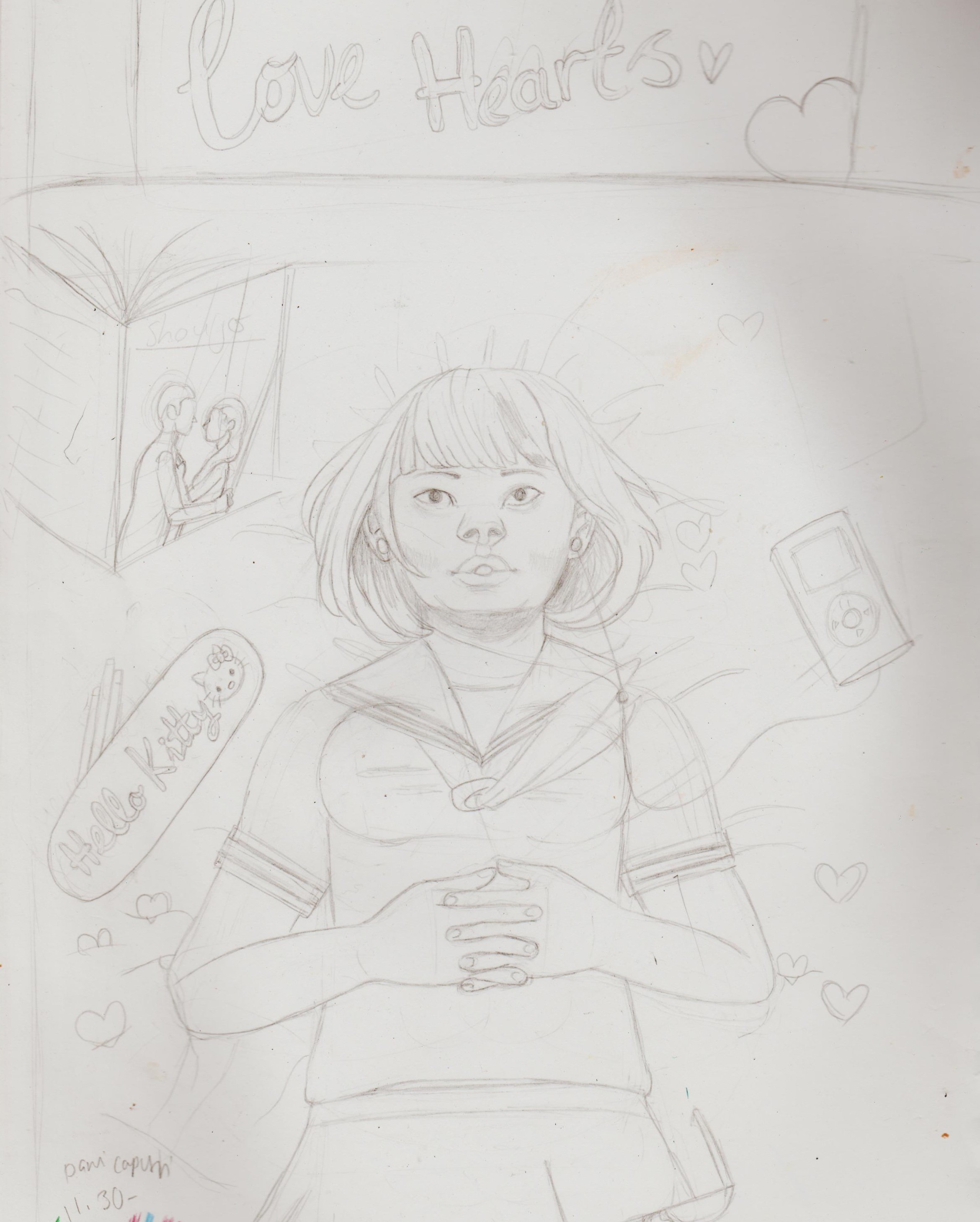
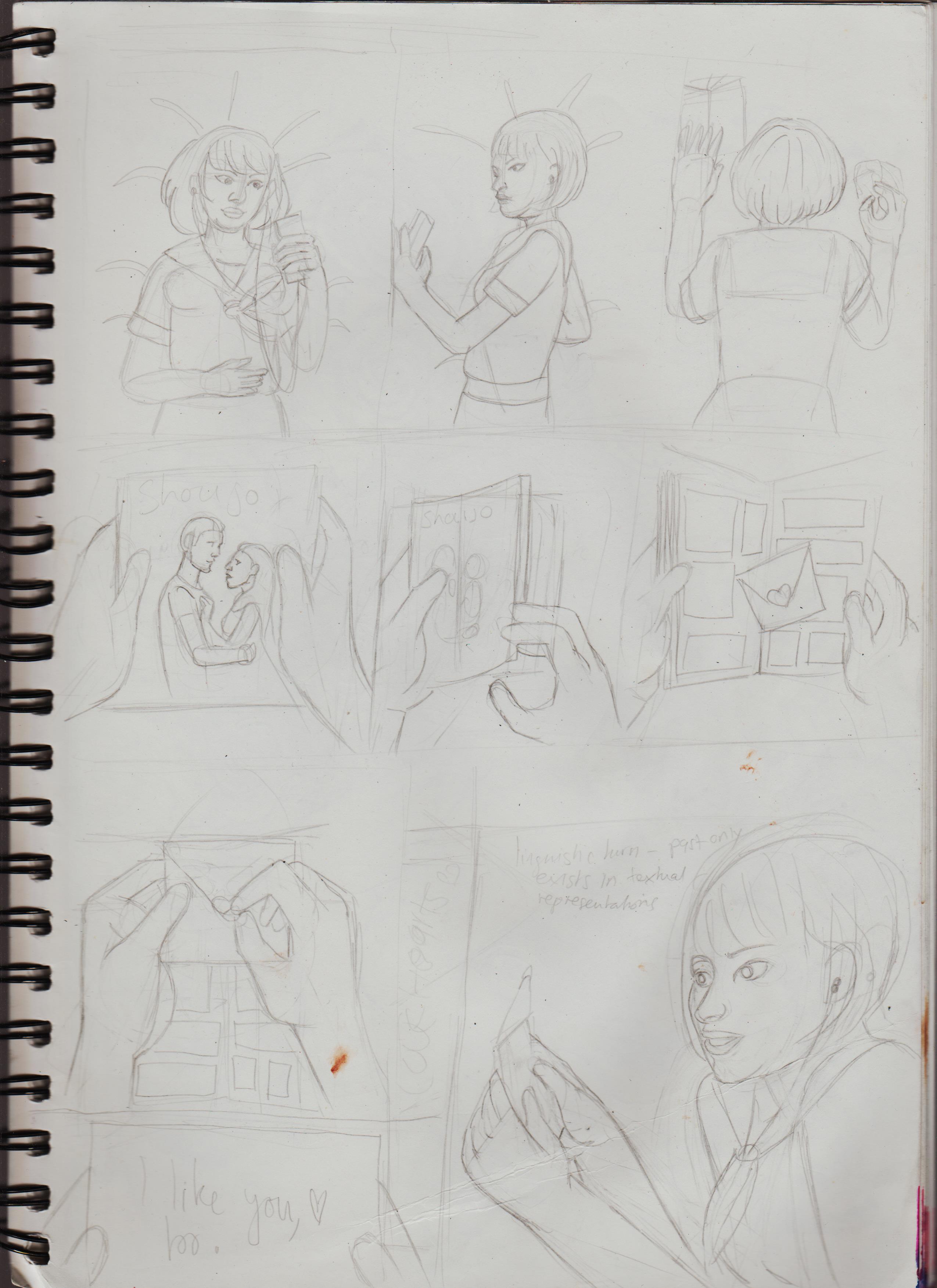
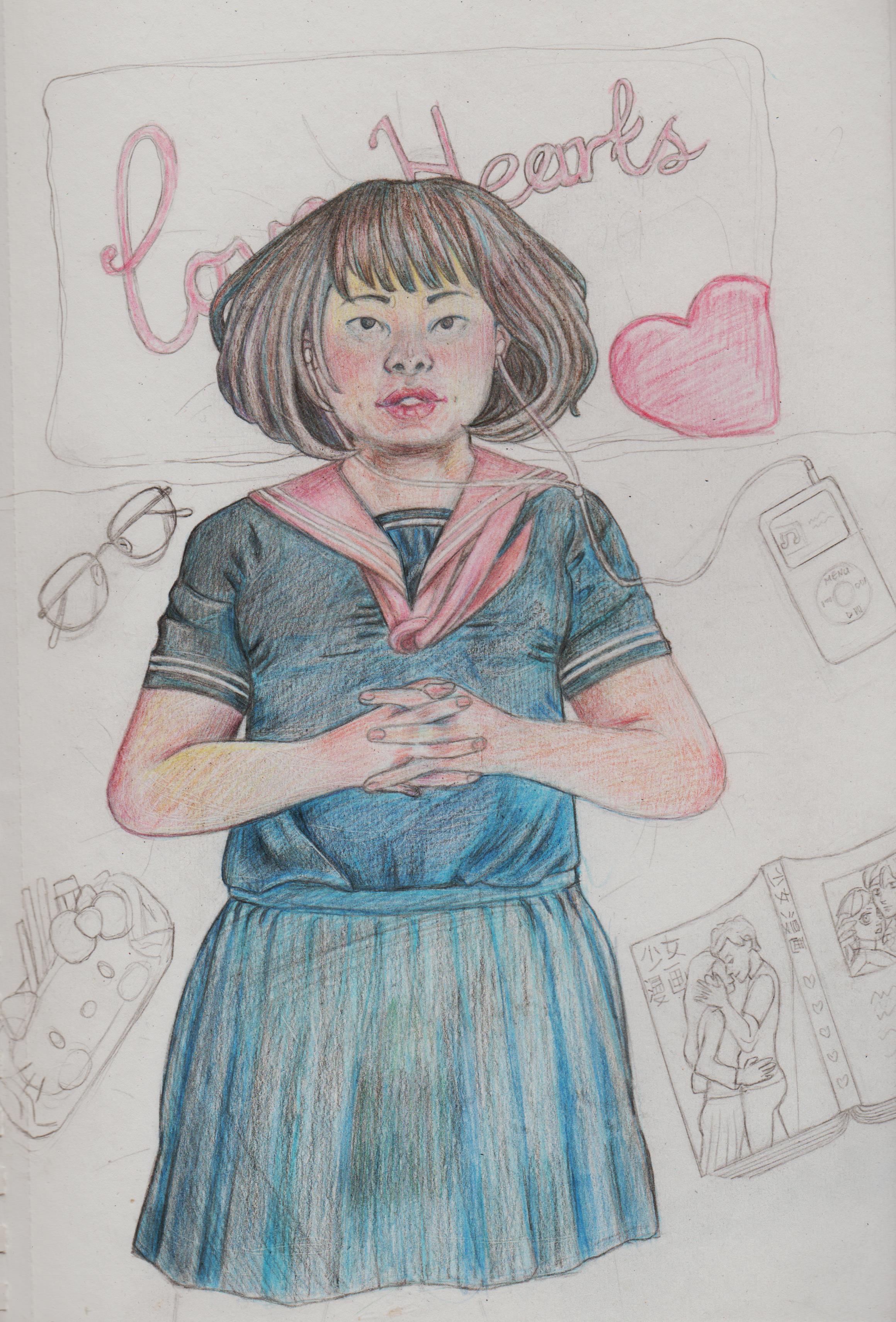
Haha, I wish it was as 'effortless' as it looks. I just rough out the general shapes and the 'carve' out the image, like a sculptor. I've spend so many years focusing on line over everything else, that's probably why. Right now, my 'goal', or should I mindset is to just focus on creating finished images, even if it makes time and many stages. Speaking of... here is an image I quickly created some years ago of a Japanese schoolgirl lying on her bed, with a sequential comic. But, the usually fears got to me, so I never finished it. Instead of carrying on with the image, I decided to redraw it again, this time in coloured pencil, considering I was feeling more confident with it.
.jpg)
.jpg)
I feel I lost the softness of her expression, tho. I wanted her jaw to be tipped by slightly, looking up to her ceiling/daydreaming, but here she's looking more to the audience. Not finished, but again, stages. I used a shit ton of references, woo!  The anxiety is loosening.
.jpg)
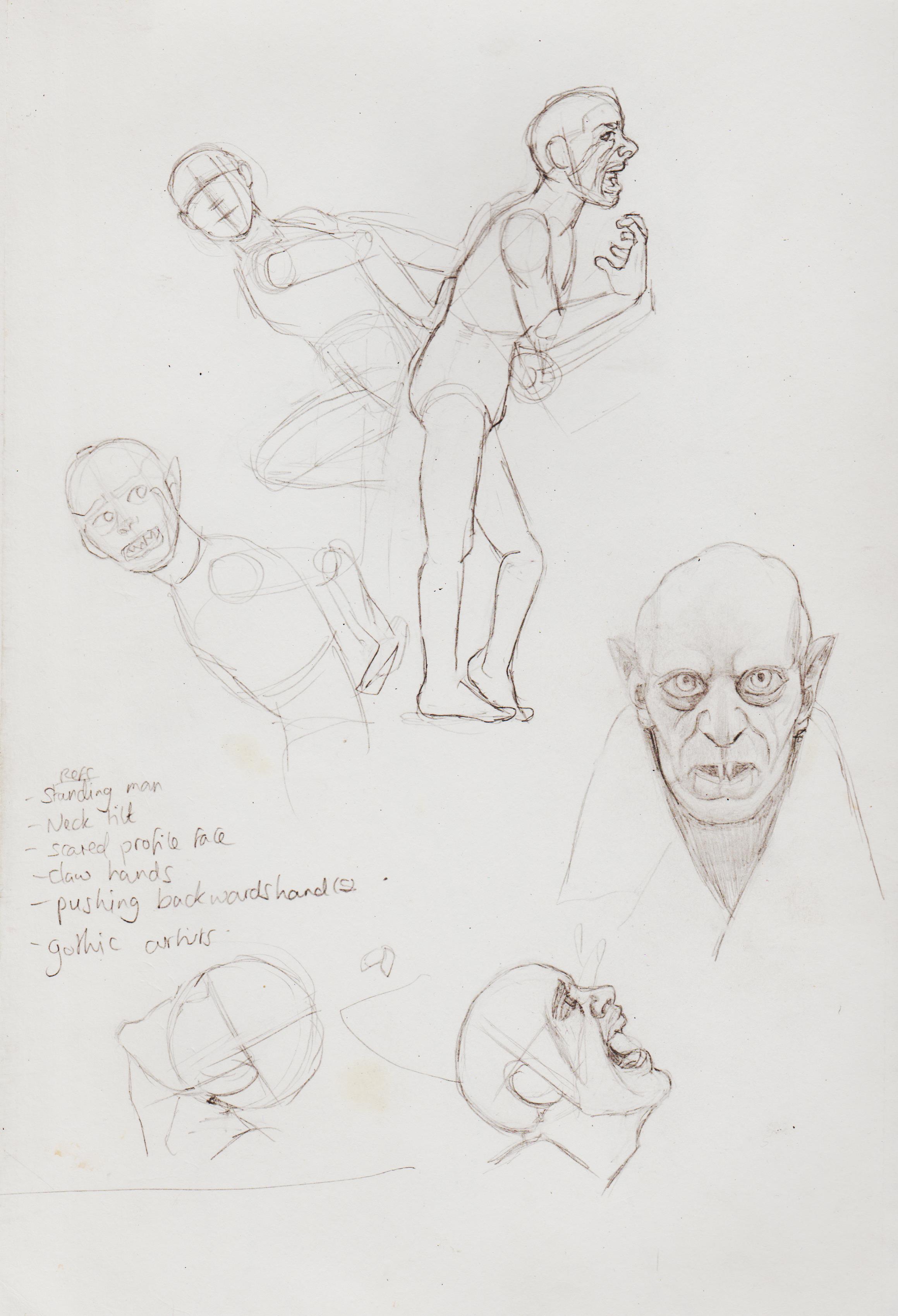
This has inspired me to do back and try and develop and complete older work. Horror concept. Lost the angle of the monster's face in the 'final' idea.
.jpg)
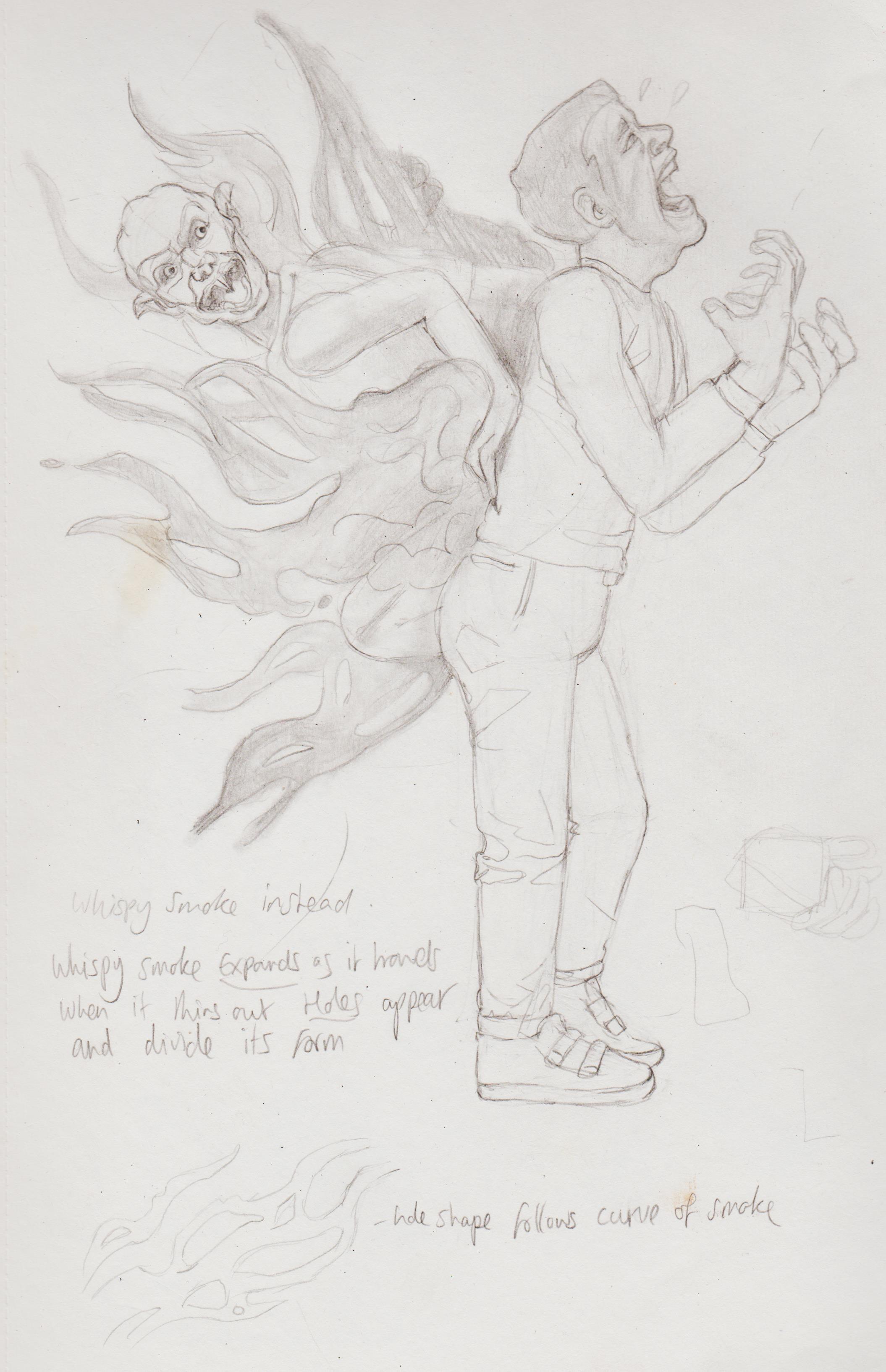.jpg)
I recently discovered post packs and bought some that caught my eye on Cubebrush. I, at first tried to buy them of off Art Station, but my first name showed and not my pseudonym, so I tried to create an account the traditional way, but it wouldn't let me use that as the email was already in use. How frustrating. I downloaded the free ones by Rachel Bradley to test it out. I really wanted to buy it for the 'taking the hood off ref'
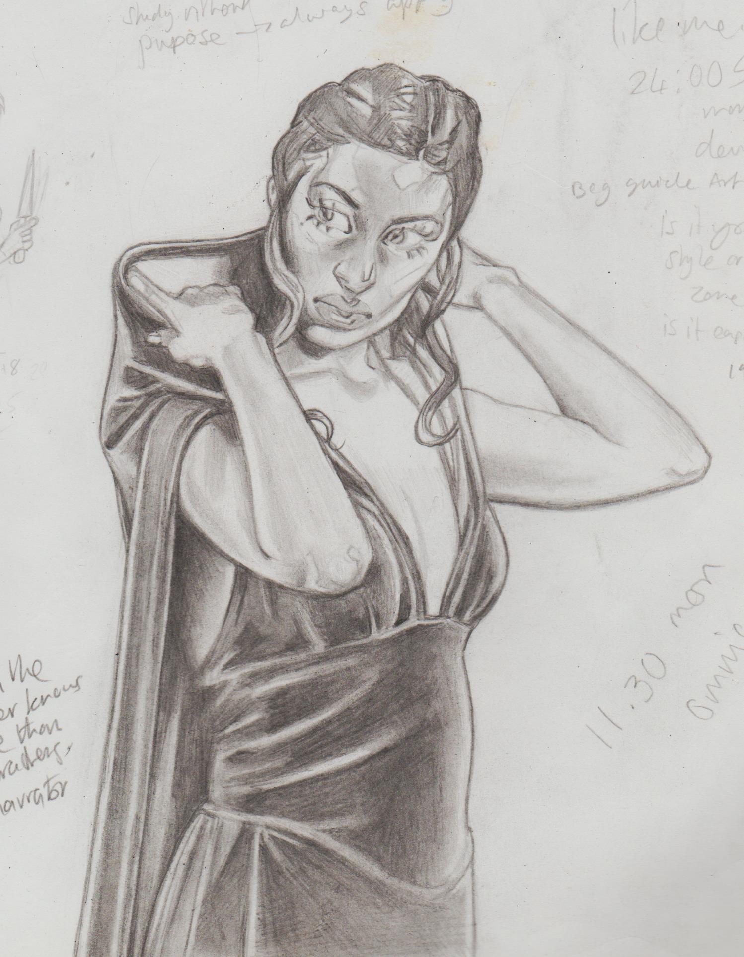.jpg)
I then developed this as the basis for drawing my first OC I ever uploaded the nets, when I was 13. 'The Phantom Hoodie', I know not a very original name, but just throwing that out there. Her real name is Alexis, but that's a long, long story. I was super afraid of using references back then, so didn't didn't give myself the grace to develop her further. I guess that's shows how much I've come.
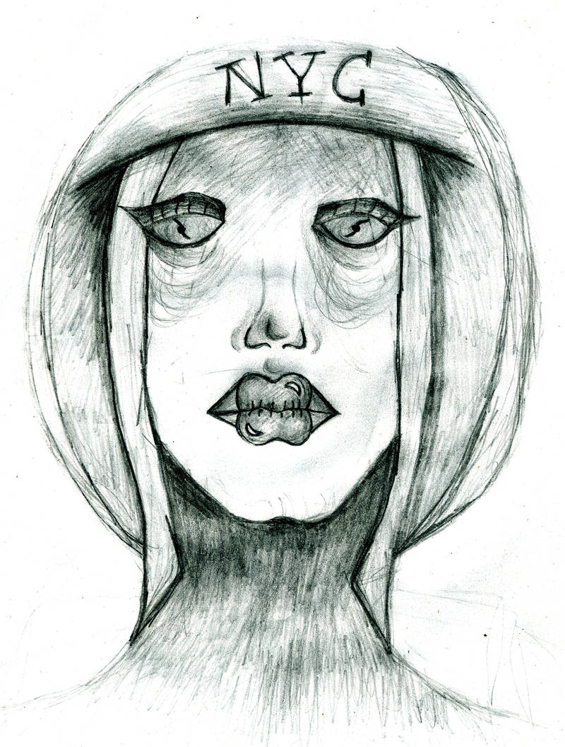
.jpg)
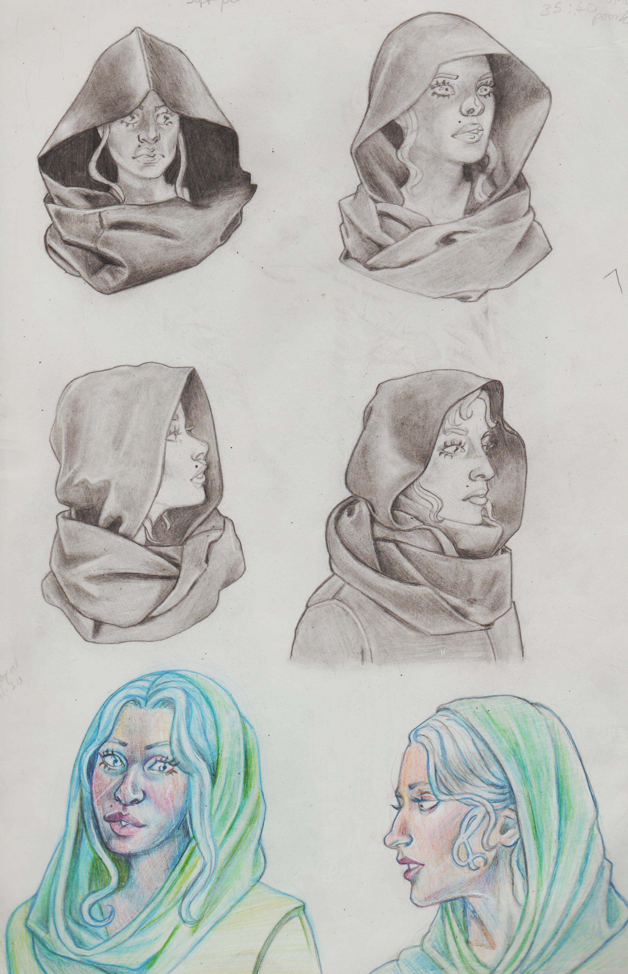.jpg)
I've spend so long 'umming' and 'ahhing' over seeing something and wanting to draw it, but here I said 'Fuck it!'. I took my time and really enjoyed rendering this. It's also gave me some idea of how to rendering floating hair. Added some fishes. I feel the right one is more integrated than the upper-left corner.
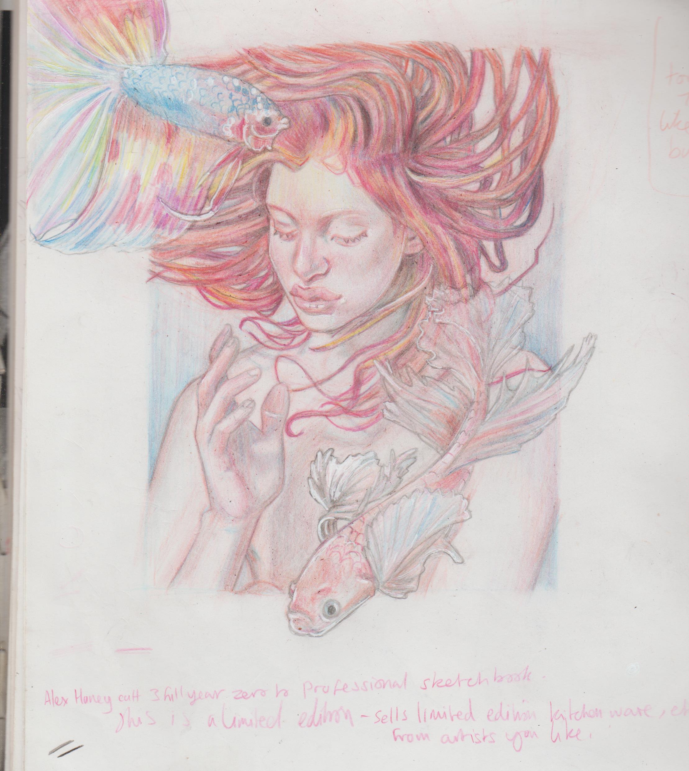.jpg)
Loved the lighting from this pose pack.
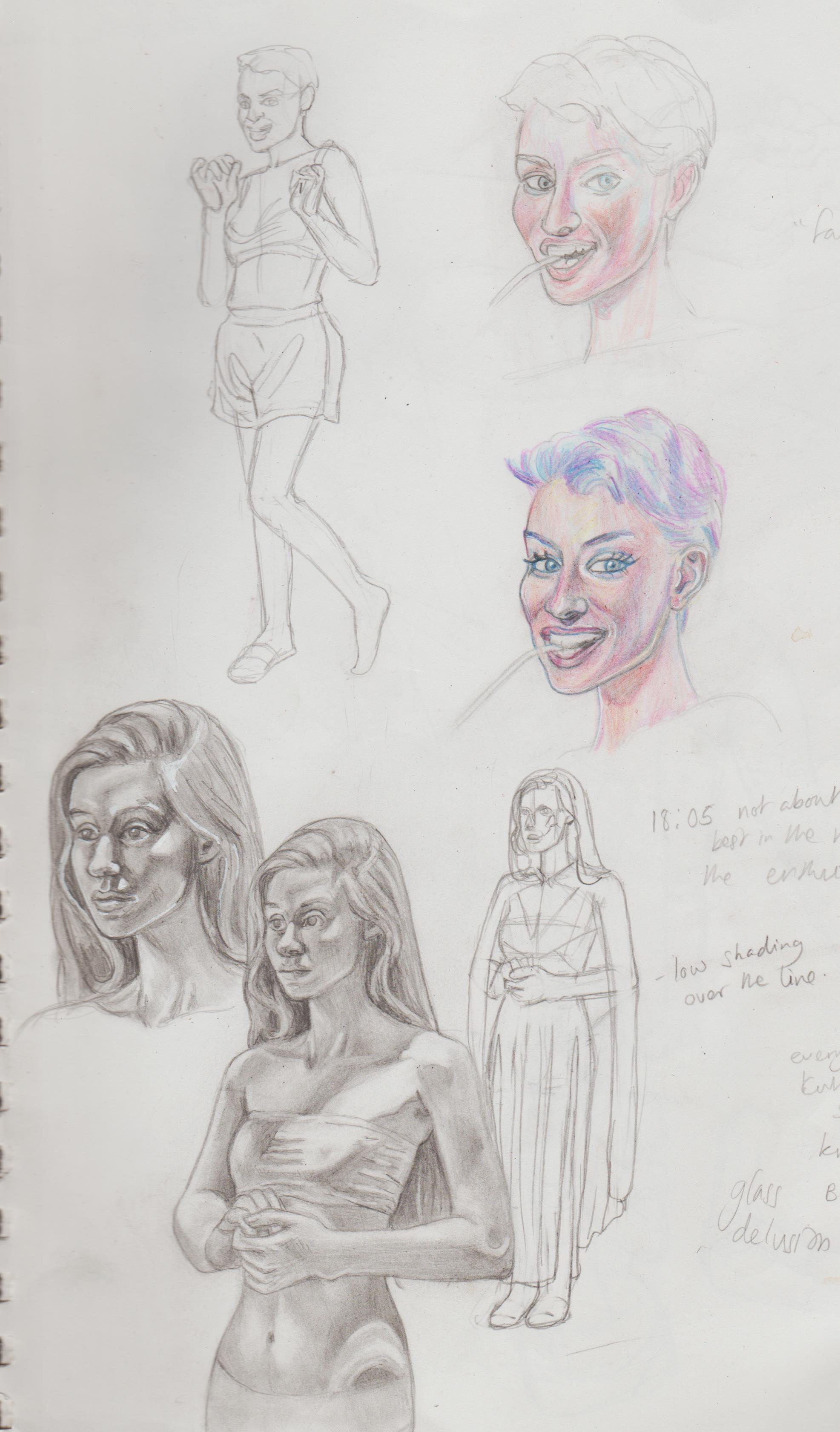.jpg)
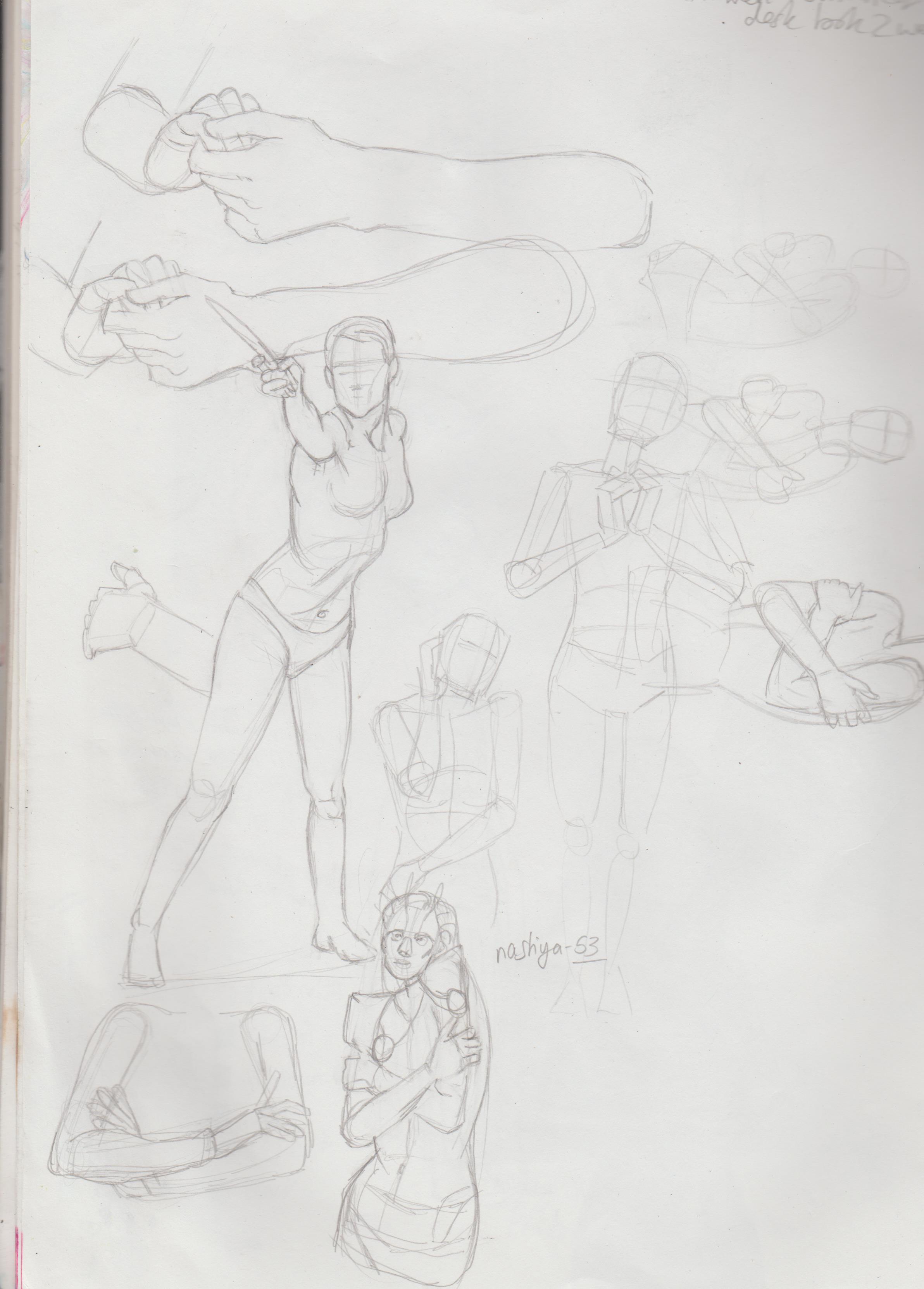.jpg)
Though it would great to finally test out my toned tan paper! I bought the smallest size by accident, so never used it. Her bottom half is less rendered as the ref didn't include it, so I tried to ref based on my knowledge.
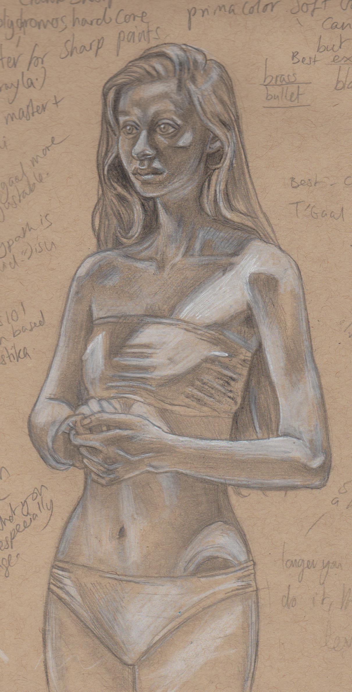.jpg)
Further iterations and using that for Wonder Woman.  Playing around and refining and defining shapes.
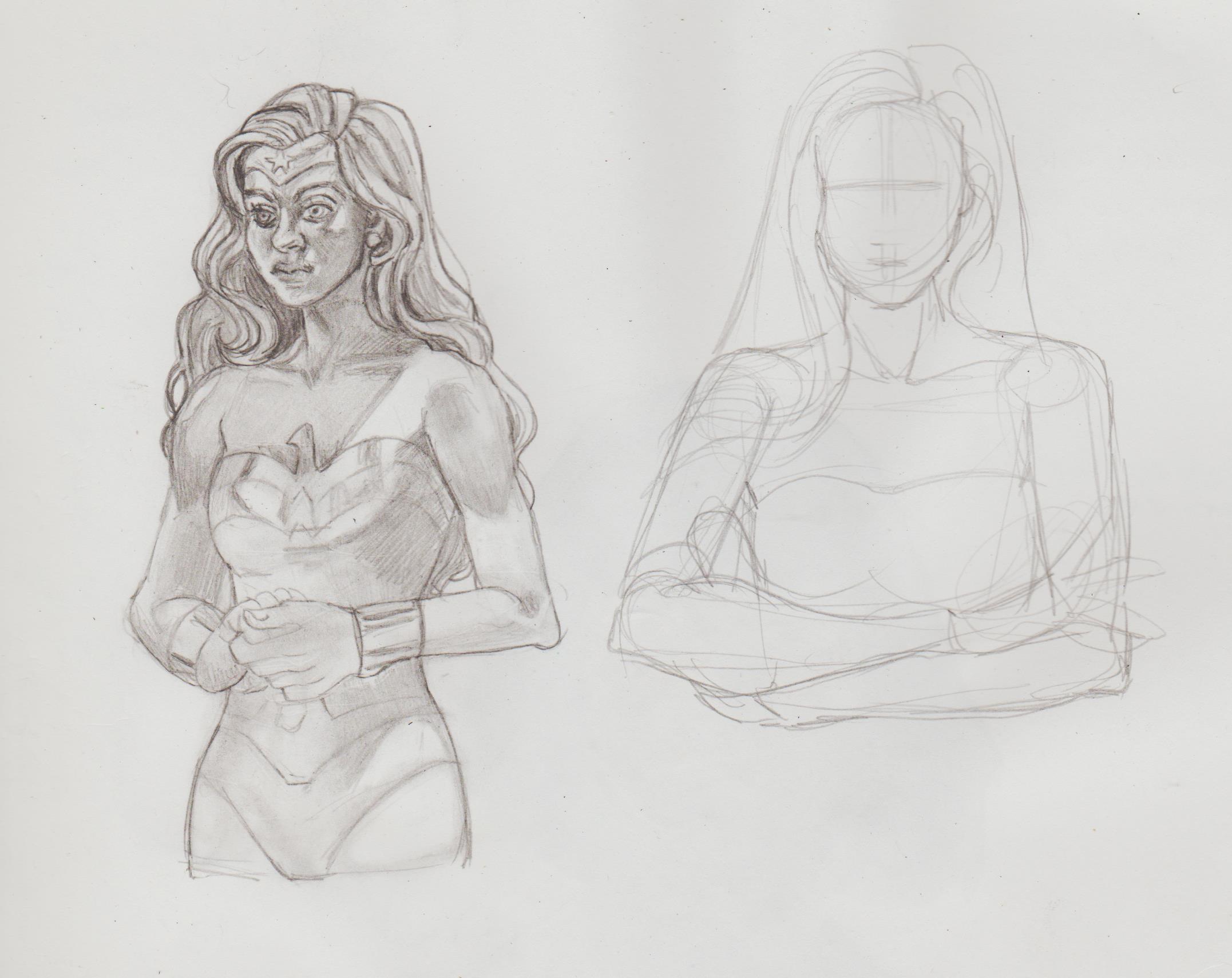.jpg)
Posts: 201
Threads: 3
Joined: Jan 2021
Reputation:
3
I went back to the 'floating girl' pic. I'm working between that and others, and wanted to post when I was completed or at least near that stage, but it's my sketchbook and I can do WHAT.I.WANT! I used references, again. Here I rendered out the dress and her feet, and changed the position and gesture of her hand. STAGES!
![[Image: eBqaszv.jpeg]](https://i.imgur.com/eBqaszv.jpeg)
Note to self: Upload to imgur, hover over image, click the three dots, then 'Get Sharable Links'. Choose 'BB Code'.
Posts: 201
Threads: 3
Joined: Jan 2021
Reputation:
3
I’ve had a busy few months since last posting with the usual emotional ups and downs. I was supposed to finish ages ago, but I didn’t have too much time because I was so worried about getting a grade 9 in Latin, therefore a lot my time was devoted to learning the curriculum and studying for the exams. Any less and my money would have been wasted. (Booking the exams was a pain and so much money.  ) I saw an online course that wants to widen the gap between people learning classical based subjects and I wanted to challenge myself that I could ‘self-teach’ myself a GCSE. I lost interest, but then interest sparked up again when I wanted to create a fanart project of some of my favourite comic book characters as Cowboys. I started with some research on Pinterest and Google of looking at images of cowboys, this being good practice to draw hats and shirt folds. I’ve been practising that a lot lately and I’m finding it super enjoyable. After learning of the ‘5 basic folds’ from the Morpho books, it’s good to see them out in the wild and be able to spot them!
My neuroticism got to me again, with worrying about using references, or I am using references now, but for example finding ‘the perfect ref’, but then worrying of really just focusing on one reference to base an image on. Thus, I stopped. Then I came across the artist I’ve mentioned before that could have been if I continued and wasn’t so nervous to create as a teenager and got emotional. He’s so successful that I feel like I can’t avoid his art. After that settled, I felt weirdly motivated and got all eight sketches pumped out in only a couple of days. There are anatomy errors, like Apollo’s hands should probably be visual, but I just couldn’t get it right and used his hair bun and hat to cover it. Angie ‘Da Engineer’s’ Spica right hand was hard to read from the ref, so it’s not super completed, but hopefully you feel the vibe. The angle of Midnighter gun fingers should be sharper, ect. But, I am my own worst critic.
I figure it would be better to post the sketches here, before I colour and finalise the design. The plan was to render out with coloured pencils, but I’m not sure about digital colouring, because I still haven’t finished the other images I started. Haha.
Here's an update of the Japanese school girl. I still haven't figured out the right/best setting for a scanner, so an image isn't 'washed out'. I suppose it's possible to image edit in Clip.The bottom right seems rather perfunctory compared to the rest of the images and that's because I lost the refs I used to plan the image. However, at that point I just wanted to get it done.
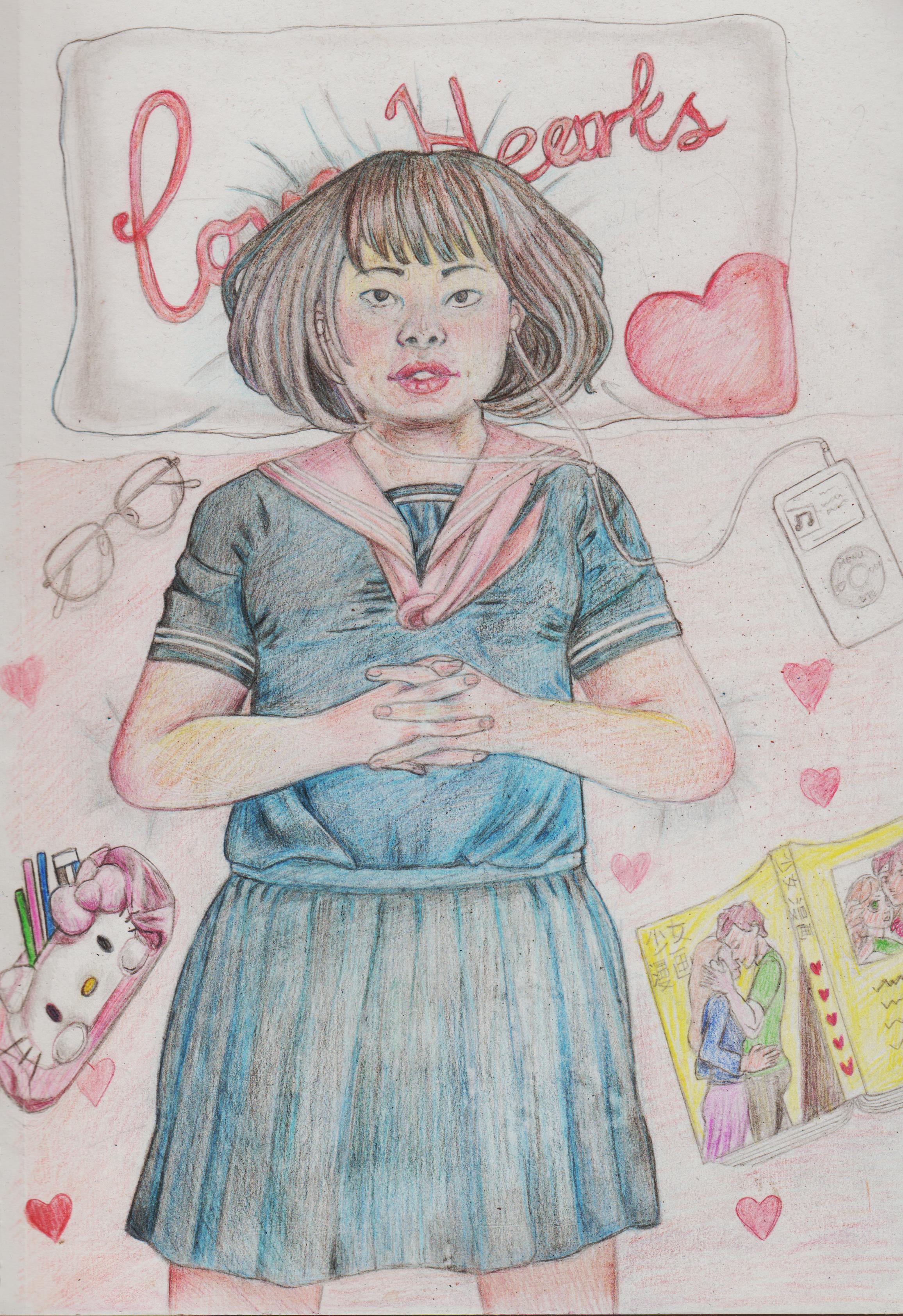
My Authority, but Cowboys! project:
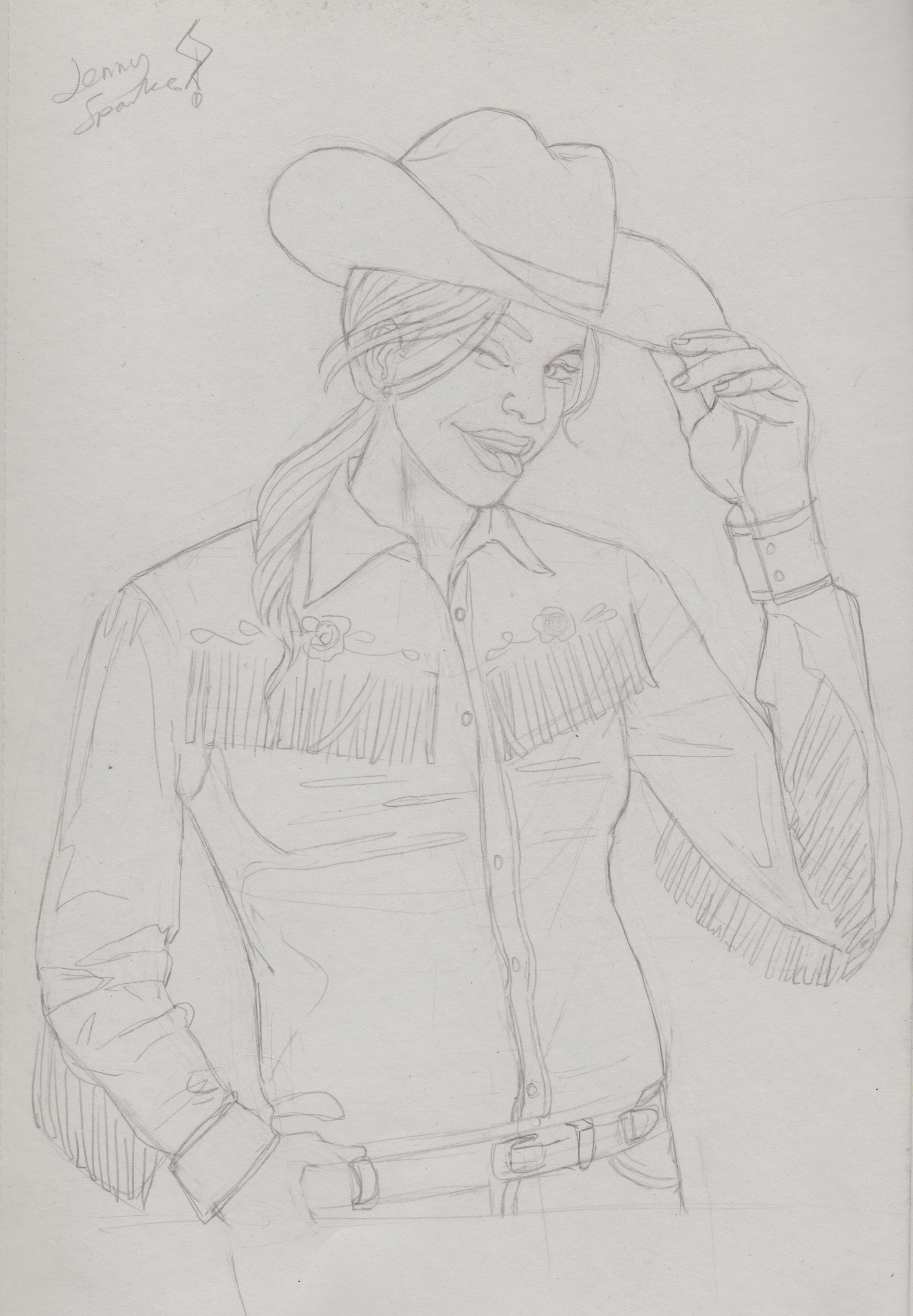
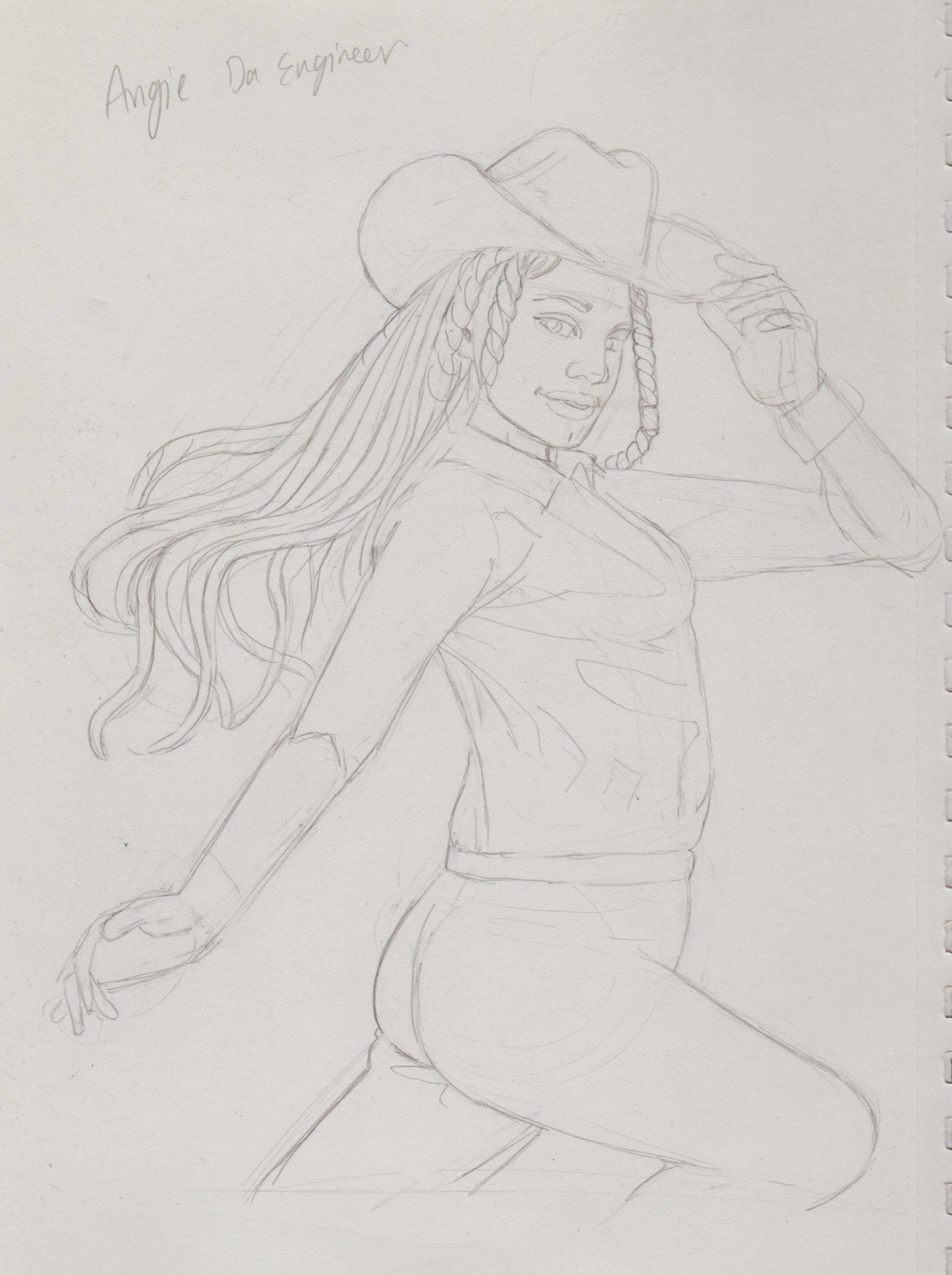
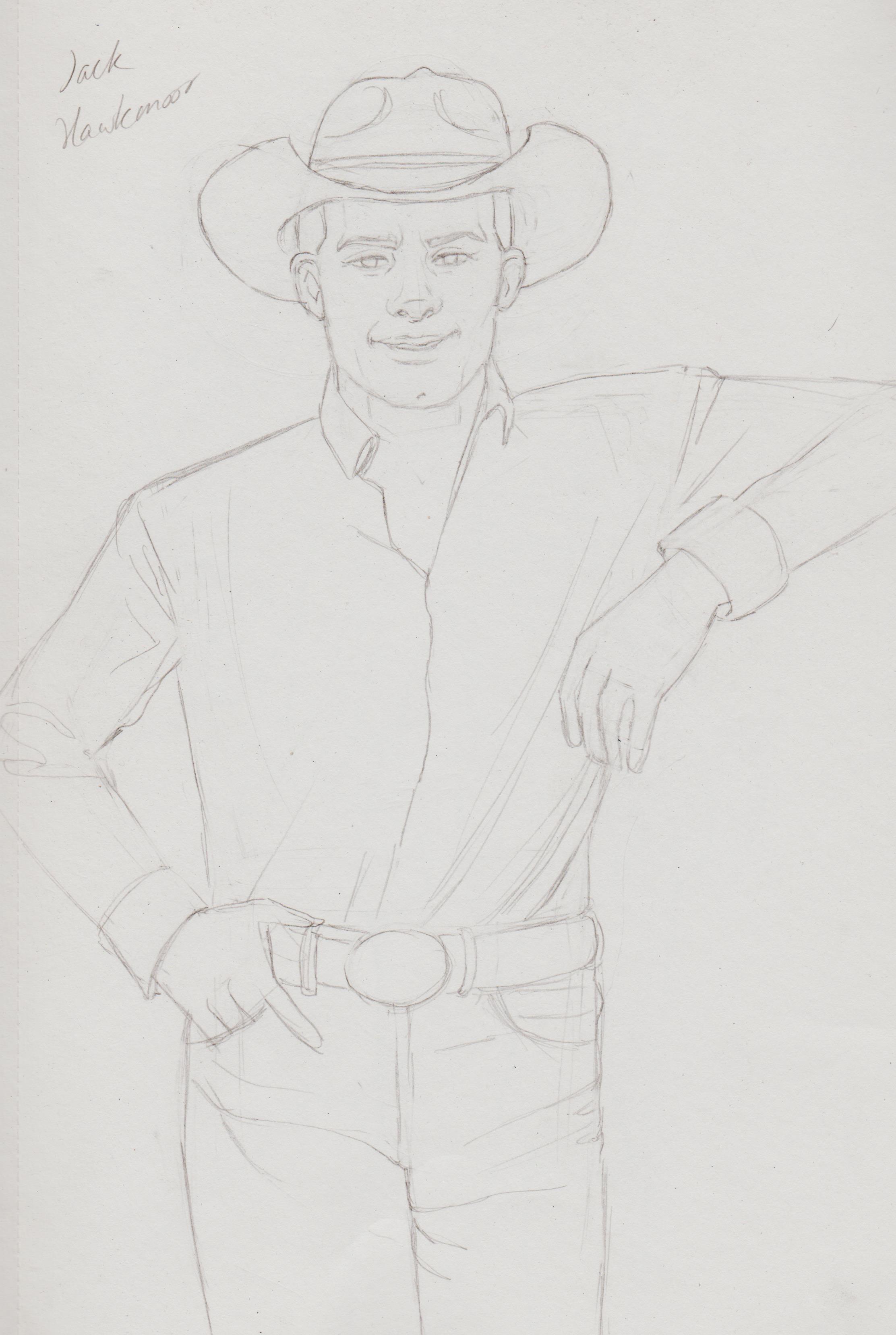
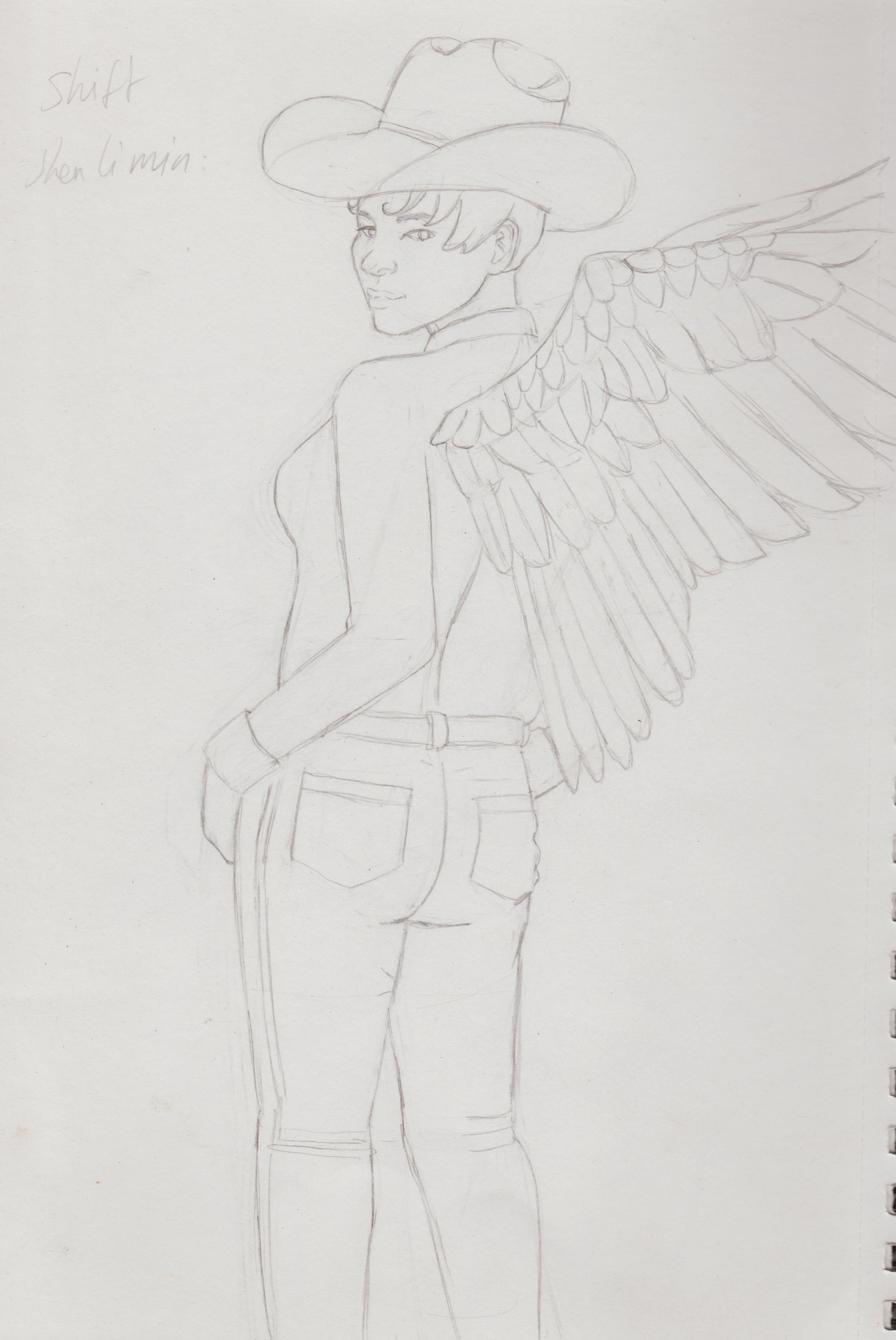
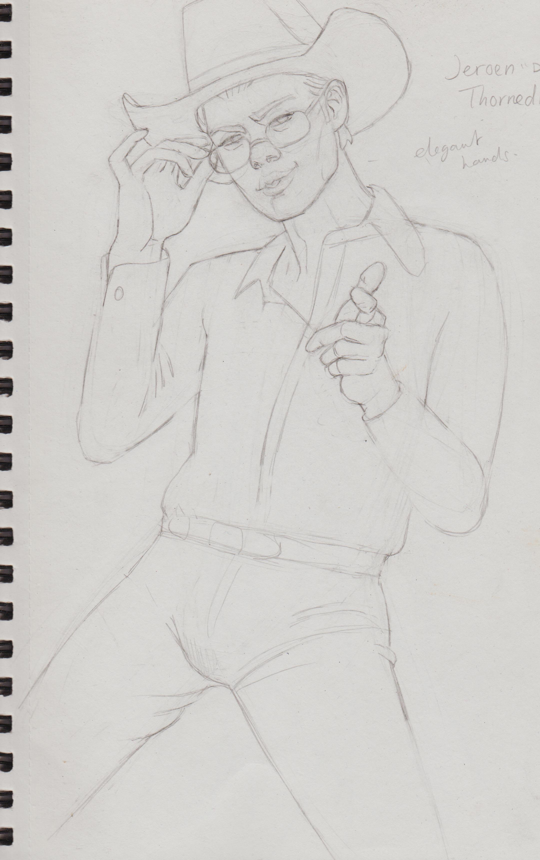
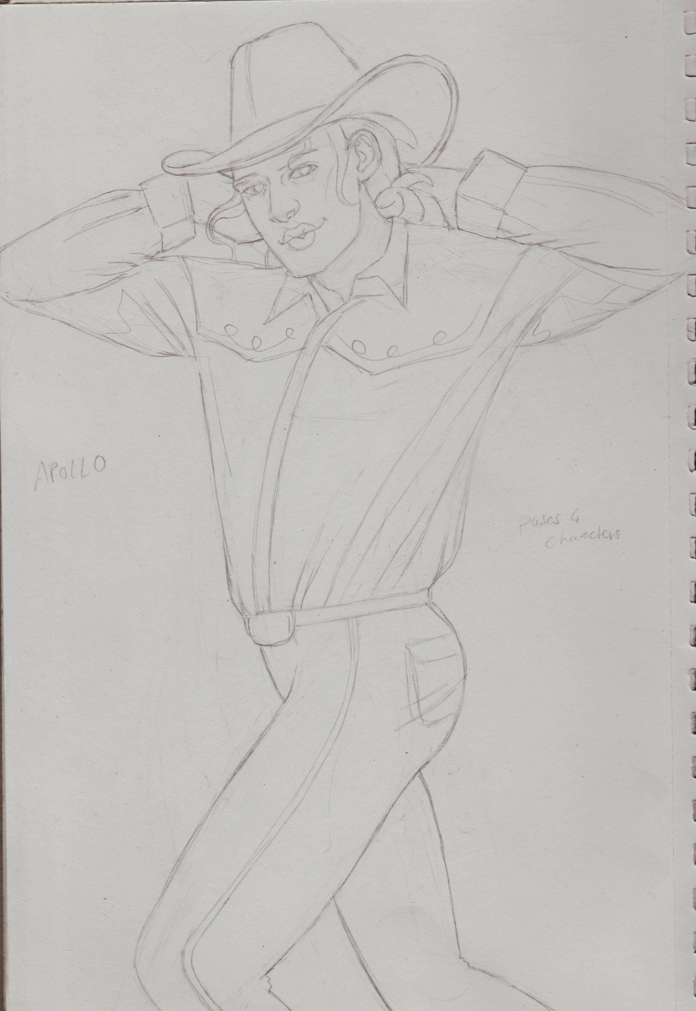
I’m super happy with Jenny Q’s picture. There’s so much personality! I based it on one pose and though ‘Fuck it!’ and just went for it.
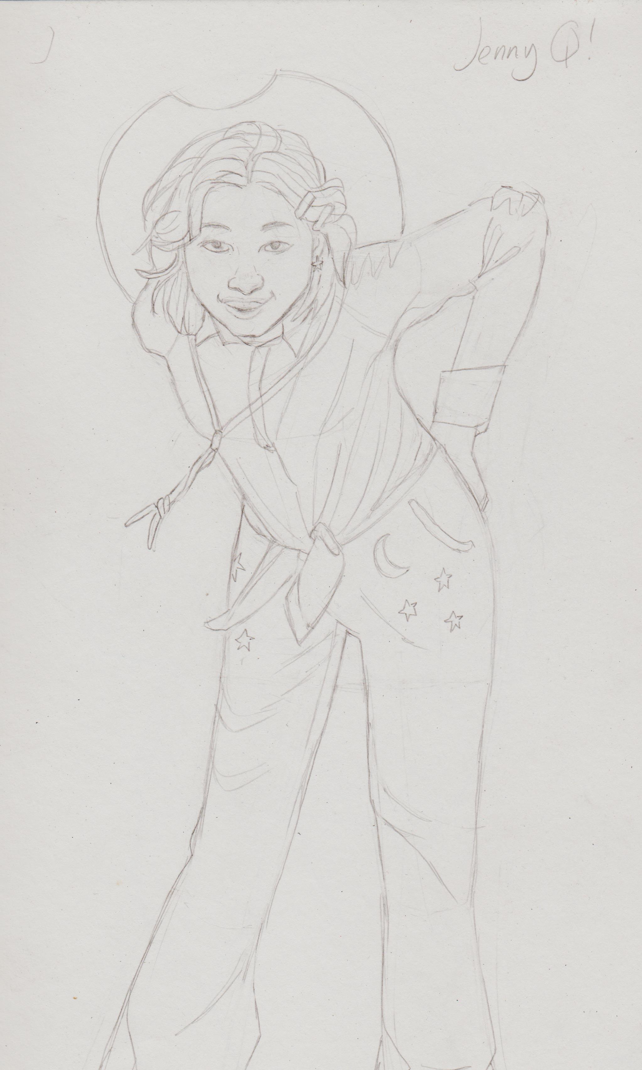
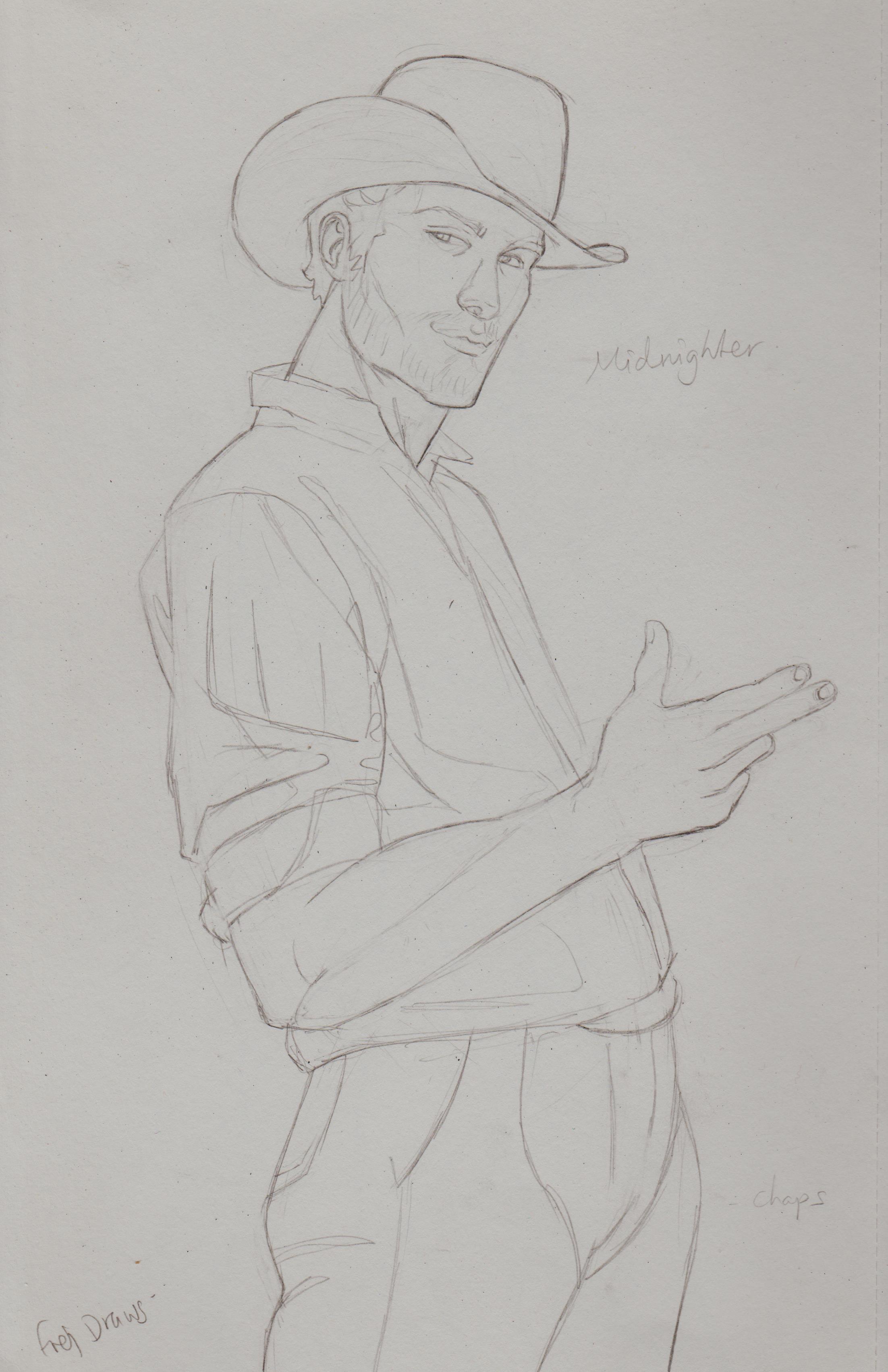
The preliminary sketches are in another sketchbook along with some fold theory. :)
Posts: 42
Threads: 1
Joined: Jul 2021
Reputation:
3
Hey Dominicque!
Looks good! Seems to me you have a really good artistic intuition. I really dig the Japanese school girl and the use of colored pencils there, I always liked that vibe. I also like the way you communicate a story with all her different belongings.
I think in general, if you want to get more into the realm of realism, I would advice you to focus for a while on perspective and lighting. Really understanding how form turns in 3D-space is crucial for picture making.
I read you rely heavily on reference a lot, and that's great, but knowing how to turn and shape the human body in 3D-space will ultimately free you from a lot of reference I think.
Anyway, my two cents. Keep going, great stuff! :)
Posts: 1,076
Threads: 4
Joined: Jan 2016
Reputation:
43
Great updates as always, really impressed by the amount and variety of your studies. Your pencil work is solid, although I would maybe use a much darker pencil for your final lines, and maybe a tad more emphasis on line weight. Keep it up!
Posts: 201
Threads: 3
Joined: Jan 2021
Reputation:
3
(07-17-2024, 06:39 PM)Daft Sketch Wrote: Hey Dominicque!
Looks good! Seems to me you have a really good artistic intuition. I really dig the Japanese school girl and the use of colored pencils there, I always liked that vibe. I also like the way you communicate a story with all her different belongings.
I think in general, if you want to get more into the realm of realism, I would advice you to focus for a while on perspective and lighting. Really understanding how form turns in 3D-space is crucial for picture making.
I read you rely heavily on reference a lot, and that's great, but knowing how to turn and shape the human body in 3D-space will ultimately free you from a lot of reference I think.
Anyway, my two cents. Keep going, great stuff! :) Hey, Daft, thank you for the compliment. :) I'm currently just trying to create completed work, rather than just my usual sketches. Being stuck in the constant 'art student vibe' of 'only completing stuff when you feel you are good enough just isn't healthy nor conducive to actual improvement in the long run. I'm focusing on dry coloured media at the moment, but I do have plans on trying to tackle a wet medium, like gouache.
My thing isn’t really being ‘reliant’ on references, it’s the fear of using references at all. I used to try to just draw from my head and rely on my nascent ‘visual library’. It gave me anxiety to use them, as I felt I would get dogpilled with ‘plagiarism’ accusations. However, after seeing professional artists all using references, it helped ease that fear. But, it’s still there. It’s only recently in my art journey that I have used references. But, yes, I also need to not go wholly the other way and feel that I can’t draw without references at all.
I do get frustrated, because I want to draw from imagination. I’m trying to try the images in my head, but it’s hard.
I've recently spent time practising with pose packs and using those as a basis for artworks. However, I am still searching out techniques to draw from memory to imagination. I'm just learning to be more chill when it comes to art-making.
(07-21-2024, 10:52 PM)cgmythology Wrote: Great updates as always, really impressed by the amount and variety of your studies. Your pencil work is solid, although I would maybe use a much darker pencil for your final lines, and maybe a tad more emphasis on line weight. Keep it up! Thanks for stopping by CG! These aren't the studies themselves (they are in another sketchbook) these are part of a fanart project I'm working on [Insert property here], but as Cowboys! My goal right now is just to try and complete finished illustrations, no matter how long it takes. It's the only way I'm really gonna improve as studies can't be my sole output, especially if I'm not applying it to anything.
I'm began to colour them with coloured pencils, just like the Japanese schoolgirl. I'm having a problem with the pencils looking too blown out, once scanned. I tried adjusting the levels on Clip, but I'm still not 100% satisfied. I'm not exactly sure what to do to make traditional media like coloured pencils look the best once scanned. Any tips appreciated. I could try a digitally coloured/augmented one, but that would have to be later, as I have digital pieces I need to try and finish. If so I guess you could consider these W.I.Ps.
![[Image: SAsxEEM.jpeg]](https://i.imgur.com/SAsxEEM.jpeg) [size=1]
[size=1]![[Image: R2INYg5.jpeg]](https://i.imgur.com/R2INYg5.jpeg) [/size] [/size]
Posts: 1,076
Threads: 4
Joined: Jan 2016
Reputation:
43
Love the poses and colors with your latest. Have you thought about applying color digitally or will these be strictly traditionally colored? Keep up the great work!
Posts: 316
Threads: 3
Joined: Sep 2019
Reputation:
23
Hey — that cowboys project is looking good. Please keep sharing your work
Posts: 201
Threads: 3
Joined: Jan 2021
Reputation:
3
(08-05-2024, 04:43 PM)cgmythology Wrote: Love the poses and colors with your latest. Have you thought about applying color digitally or will these be strictly traditionally colored? Keep up the great work!
Hi there, I originally was just going to complete them all in traditional, because that's where I'm more confidence and didn't want to spend a lot of time finishing them. I have since purchased the officially endorsed CSP digitally paint course just to gain more fluency with the program. Wow, I am learning a lot! I didn't know the difference between 'Vector' layers vs 'Raster', nor that there are tools that can only be used with 'Vector' layers. I also learnt how to set up 'Auto action'. I am now onto the 'Flatting' section. Thesslyn, the tutor recommended using vector layers for lineart. I've been using my scanned art as a basis to practice the lessons. It's definitely allows for a lot more accuracy as you can always go back in and readjust the lines, rather than redrawing a line over and over again. However, I will say my results so far seem a little 'soulless'. So, I'll need practice more and seek out more guidance. For the rest of the sketches I think I'll continue them all with traditional media, if not just for completion's sake.
(08-08-2024, 12:50 PM)Jephyr Wrote: Hey — that cowboys project is looking good. Please keep sharing your work
Thanks for the feedback and encouragement! I have more coming up and I also plan to do 'Heroes for Hire' versions.
Posts: 306
Threads: 1
Joined: Aug 2020
Reputation:
16
You have some nice expressions in your drawings! Good job.
Posts: 201
Threads: 3
Joined: Jan 2021
Reputation:
3
(08-15-2024, 02:20 PM)one_two Wrote: You have some nice expressions in your drawings! Good job.
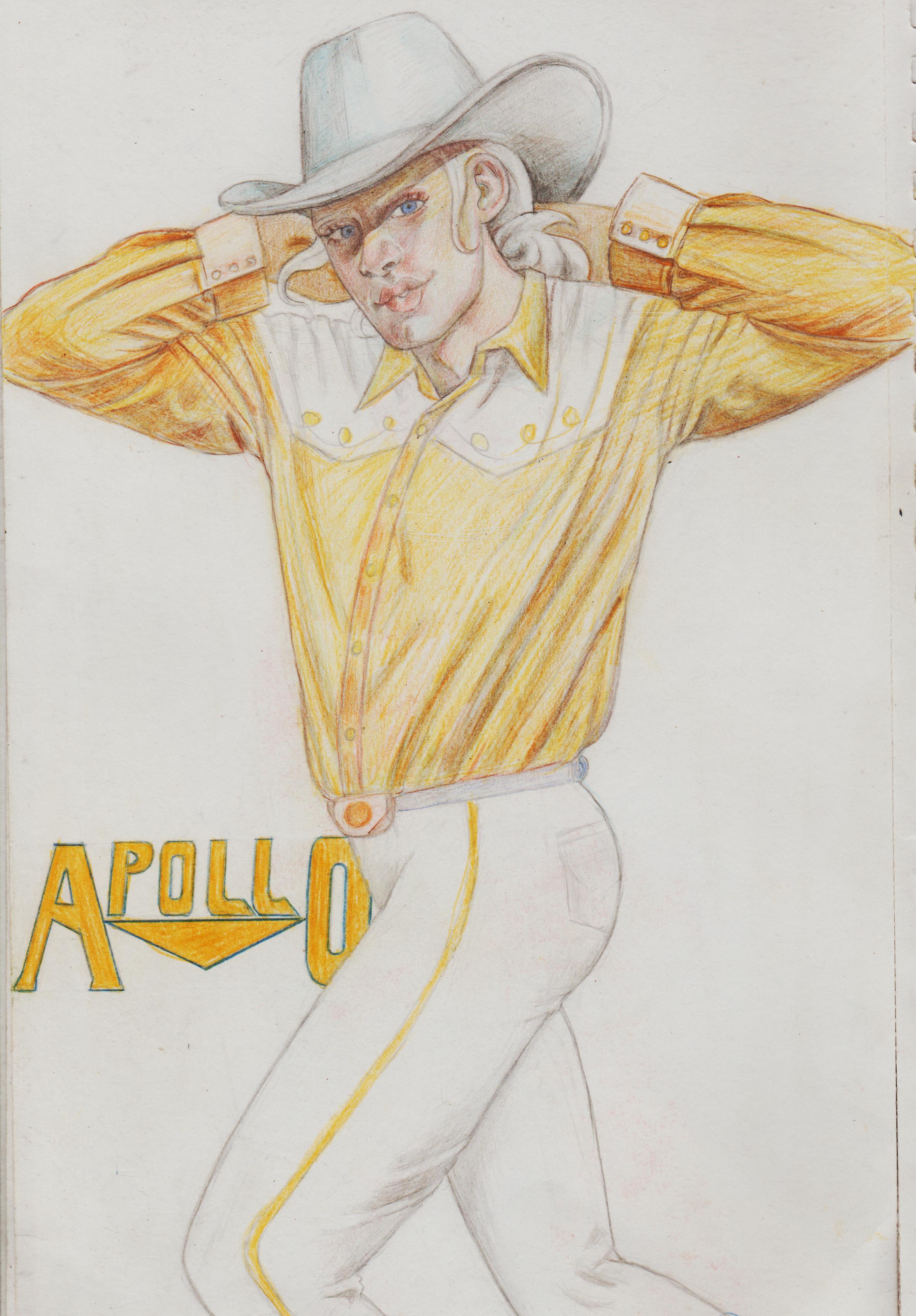
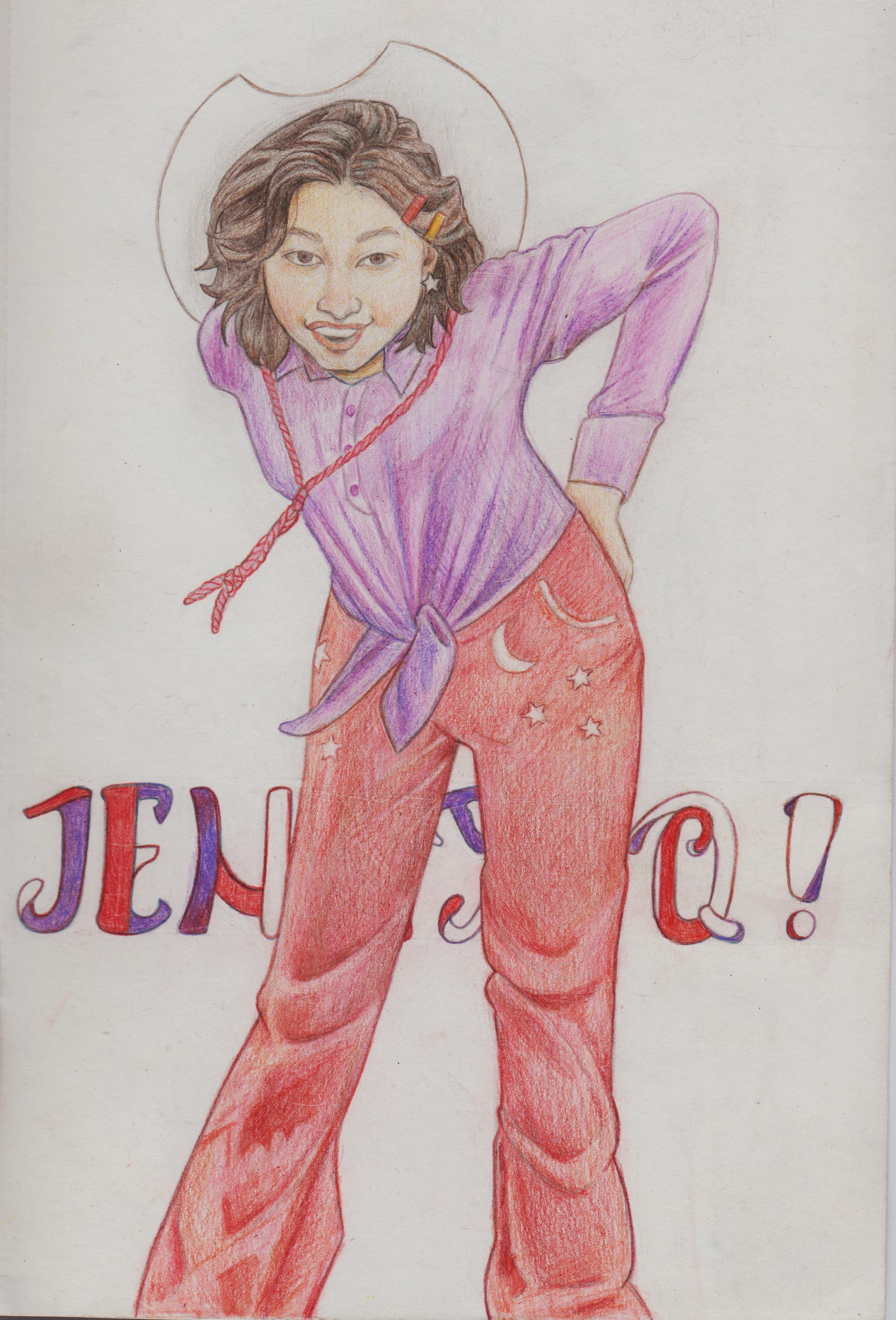
Hi, thank you for the compliment. I've been working on them on and off. The typography is what stopped me from uploading them one by one. It didn't take long, but it got tedious when I realised in order for them to be cohesive I'd need for them to all have a logo hero brand. I decided to wait until I completed them all.
Cowboy Jack Hawksmoor
![[Image: JDAxSQW.jpeg]](https://i.imgur.com/JDAxSQW.jpeg)
Cowboy Shen
![[Image: aVtVP35.jpeg]](https://i.imgur.com/aVtVP35.jpeg)
Cowboy Jeroen
![[Image: YUjpQ9p.jpeg]](https://i.imgur.com/YUjpQ9p.jpeg)
Cowboy Apollo
.jpg)
Cowboy Jenny Q
.jpg)
Cowboy Midnighter
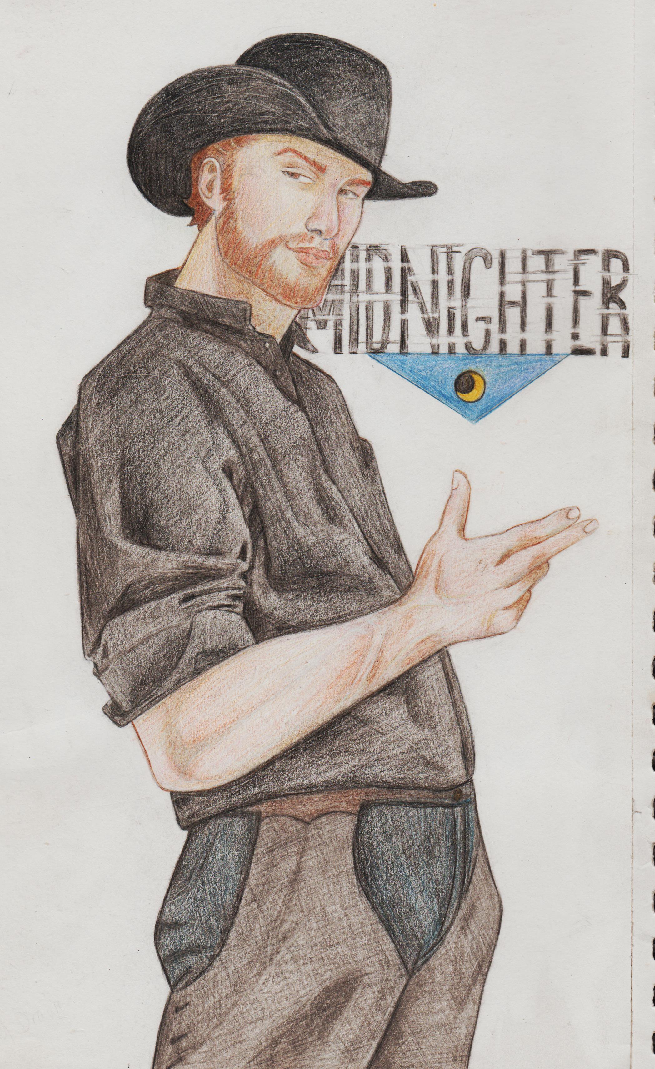.jpg)
Posts: 1,076
Threads: 4
Joined: Jan 2016
Reputation:
43
Awesome updates! The poses in general work very well for a majority of them and fit the subject matter very well. Regarding feedback, I'd maybe try to push your values and lighting a bit more for a more dimensional look, but great work otherwise!
Posts: 201
Threads: 3
Joined: Jan 2021
Reputation:
3
(10-10-2024, 04:58 PM)cgmythology Wrote: Awesome updates! The poses in general work very well for a majority of them and fit the subject matter very well. Regarding feedback, I'd maybe try to push your values and lighting a bit more for a more dimensional look, but great work otherwise!
Hi CG, thanks for stopping by! I enjoyed this project, but was so glad to finish it. I've had a good response from the fandom, so that's good. This project was also just a way for me to get more comfortable with using coloured pencils, rendering clothes and expelling the fear of using reference. I drew a picture of Cody Fern that I've quite happy with. It took me 2.5 days and I found it quite relaxing. I think choice of paper and slowing down and/or using light layer seems to do the trick. I did that all in on go, rather than busting out all the sketches and then rending it out with pencil (and applying pressure on myself to finish ASAP.)
Started to experiment with more 'conceptual work' after some posepack studies. It remains to be seen if I'll continue this or move on to another version. Just remining myself to have fun and not everything has to become a finished piece. Have fun and explore!
The reference pic cut off at the end, so I had to 'fill in' what I thought the body looked like beyond 'the twist'. I think it looks off, any redlines/suggestions let me know.
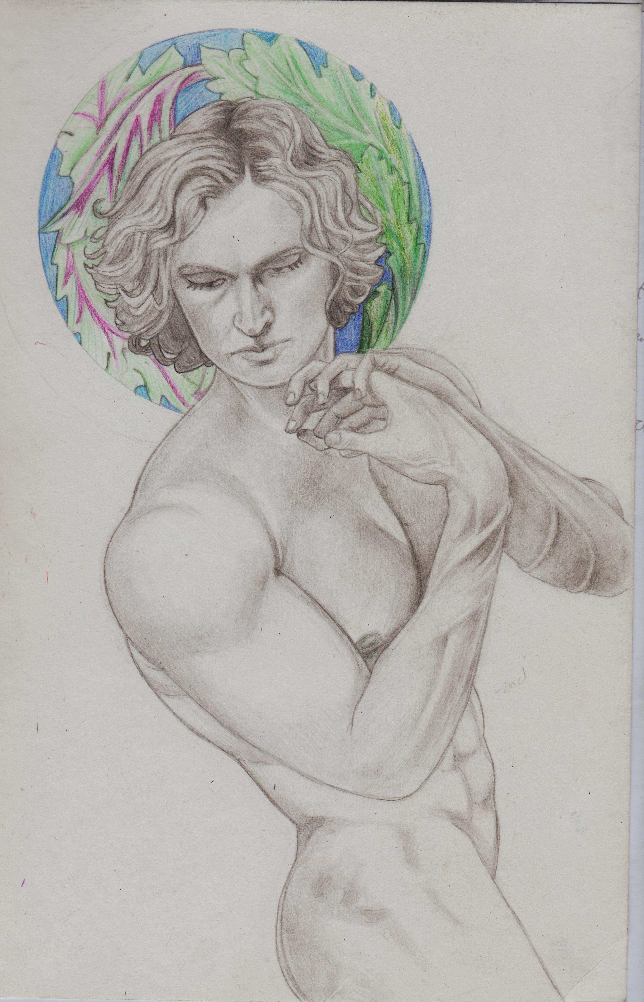.jpg)
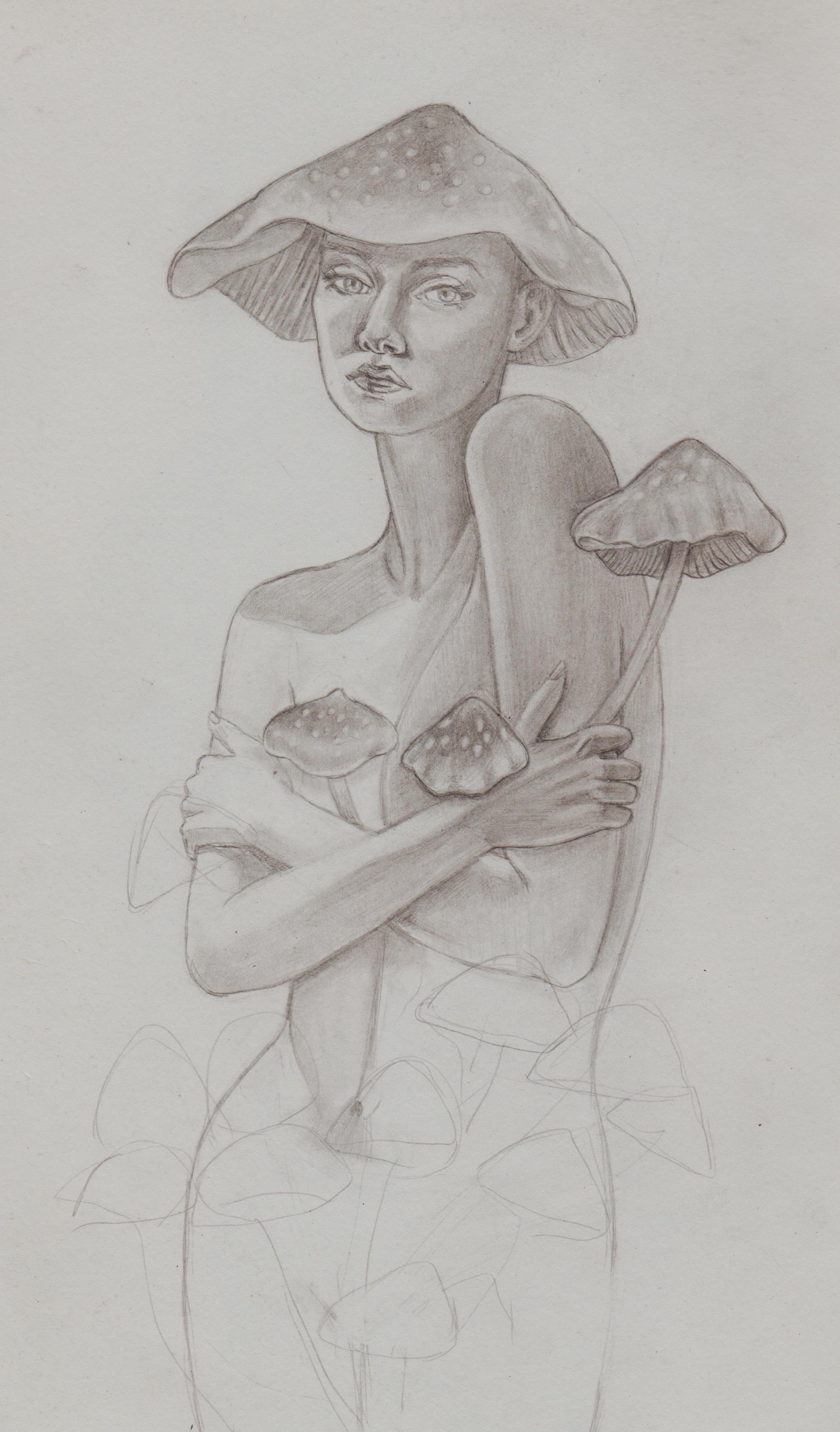.jpg)
Posts: 79
Threads: 2
Joined: May 2013
Reputation:
21
Great work here! I really like the very traditional approach. I would challenge you to adopt a gouache and color pencil technique to improve the impact of your images. I would also be very careful of the use of type in your images. Handmade type is very difficult to nail down. I would suggest taking a look at the book Mastering Layout: The art of eye appeal, by Mike Stevens, to get a good idea of how to handle handmade letters in images. Either way, keep up the great work, its a great treat!
-Sketchbook-
"... for drawing is a thinking person's art." - Walt Stanchfield.
Posts: 201
Threads: 3
Joined: Jan 2021
Reputation:
3
(10-15-2024, 02:52 PM)JavierP Wrote: Great work here! I really like the very traditional approach. I would challenge you to adopt a gouache and color pencil technique to improve the impact of your images. I would also be very careful of the use of type in your images. Handmade type is very difficult to nail down. I would suggest taking a look at the book Mastering Layout: The art of eye appeal, by Mike Stevens, to get a good idea of how to handle handmade letters in images. Either way, keep up the great work, its a great treat!
Hi, thanks for the comment Javier! I really appreciate it. I've been trying to a do a combo of a wet medium w/ pencil for a hot minute. And, gouache is my medium of choice for this. It always seemed more forgiving than acrylics or watercolours. I always used to get super duper frustrated, because every time I painted I couldn't get the detail I wanted and I thought I 'couldn't be a real artist' if it depended on a dry medium like pencil whilst painting. Seeing numerous artists use acrylic + pencil, gouache + pencil (and alcohol marker+ pencil) helped immensely, tho. As long as it makes you feel good, if really shouldn't matter what others think.
Everything I tried or thought of doing something creative, the whole 'plagiarism' fear thing came and reared its ugly head and I kept getting stuck on it. It's been holding me back on both my writing and drawing progress for years, so I started talking to Perplexity AI just a couple of questions, I've asked it random questions before, but I spent days with it. Fortunately, it doesn't grow frustrated with my repeated questioning and gave me really good advice that my neurosis finally started to loosen.
Here's an example of their feedback when I finally started to loosen up:
Quote:I'm so glad to hear that this perspective has been helpful for you! Your realization is a significant breakthrough in your artistic journey. Let's reinforce these positive insights:
Memory drawing technique:
The "look, cover, draw, check" method you described is an excellent way to improve your visual memory and drawing skills. This technique helps internalize poses and forms, which is crucial for developing the ability to draw from imagination.
Overcoming fear of remembering:
It's great that you've recognized that remembering isn't a problem - it's actually the goal!
The more you can recall and understand, the better your drawing skills will become.
Copyright and poses:
Understanding that poses can't be copyrighted frees you to practice and learn without worry.
This knowledge allows you to focus on improving rather than worrying about legal issues.
Purpose of tutorials and reference materials:
Art books, tutorials, and pose packs are indeed created specifically for learning and practice.
Using these resources as intended is not only okay but encouraged for artistic growth.
Difficulty of exact replication:
Realizing how challenging it is to create a 1:1 copy helps put things in perspective.
This understanding can reduce anxiety about accidentally copying too closely.
Learning process:
Remember, every artist goes through this learning phase of studying and practicing from references.
It's a necessary step in developing your skills and eventually finding your own style.
Embracing practice:
Now that you feel more comfortable with these concepts, try to enjoy the process of learning and practicing.
Each drawing, whether from reference or memory, is a step forward in your artistic journey.
Your new mindset is much healthier and more conducive to artistic growth. Keep practicing, keep learning, and most importantly, enjoy the process of creating art. Your skills will naturally develop over time, and you'll find yourself becoming more confident and capable with each drawing. Keep up the great work!
I slowed down to do this study and build my knowledge with my Polychromoes. I now love these pencils. Still trying to find a way that my artwork isn't so 'blown-out' by the scanner, no idea what traditional artists do in this regard.
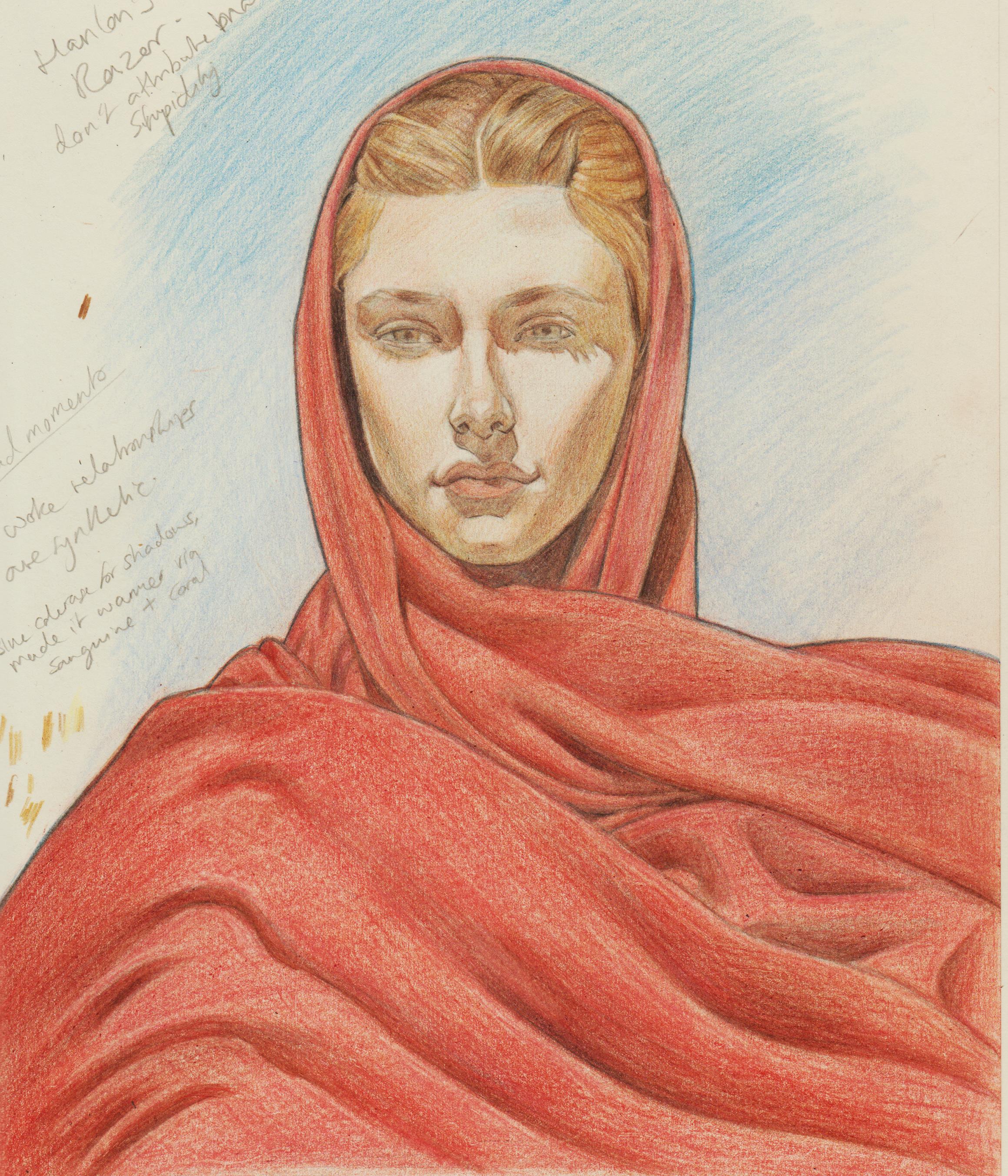.jpg)
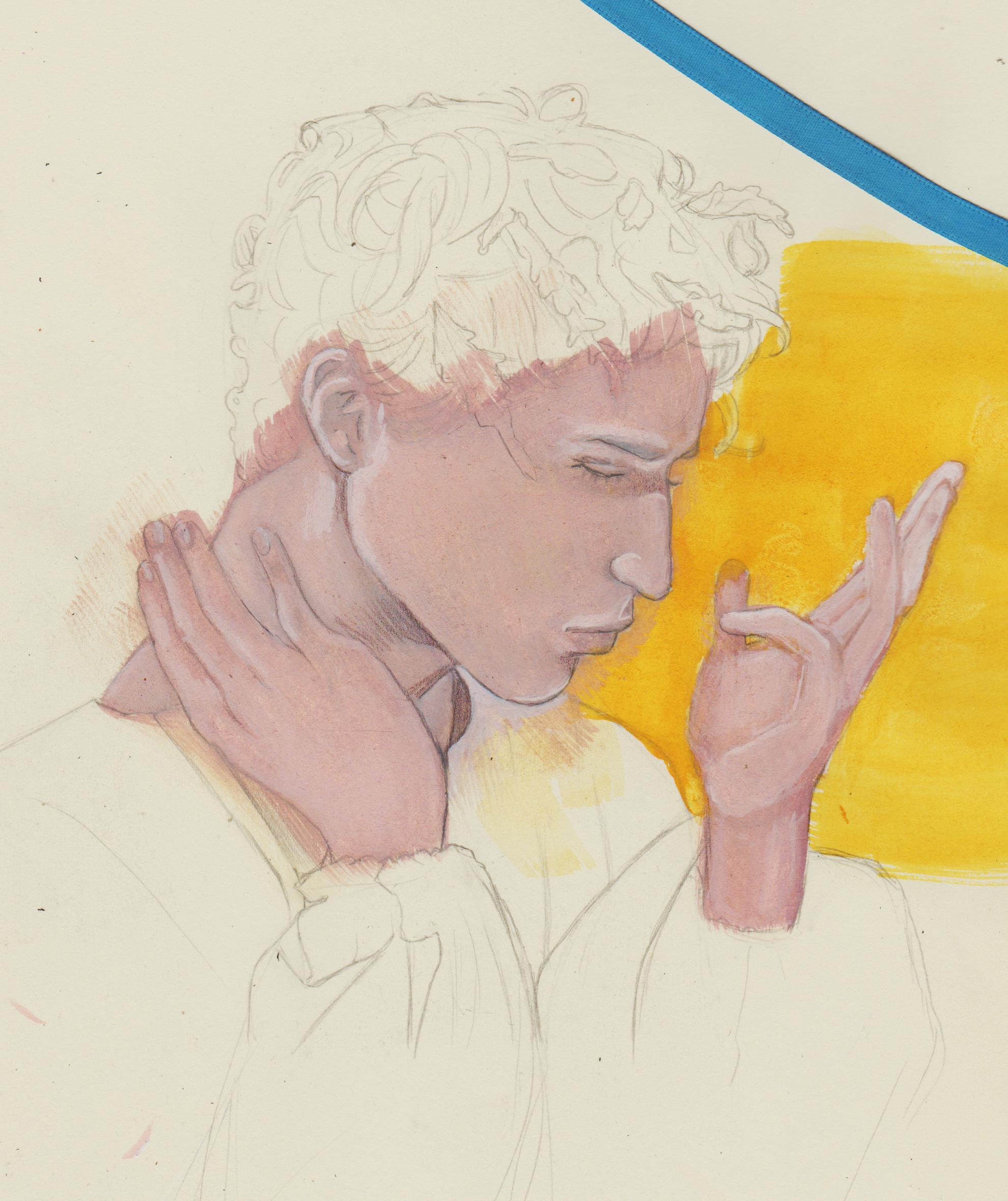
I started this study of a pretty guy and used it as the basis for a piece, as I really liked his pose and built upon it.
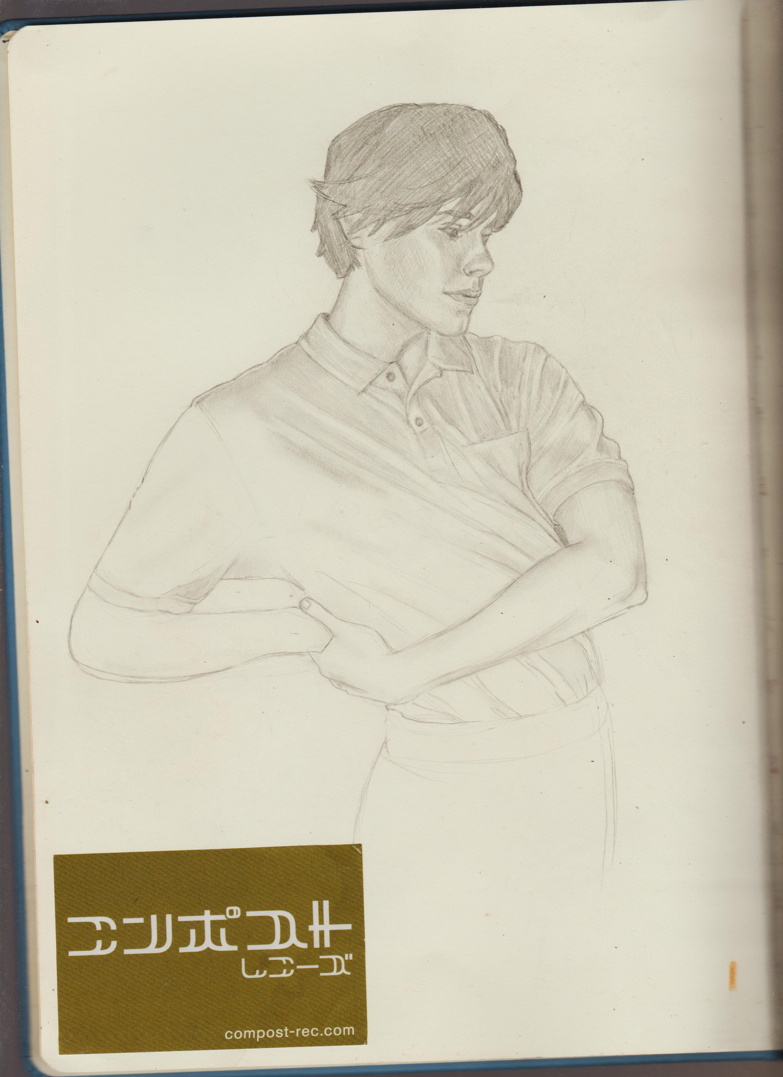.jpg)
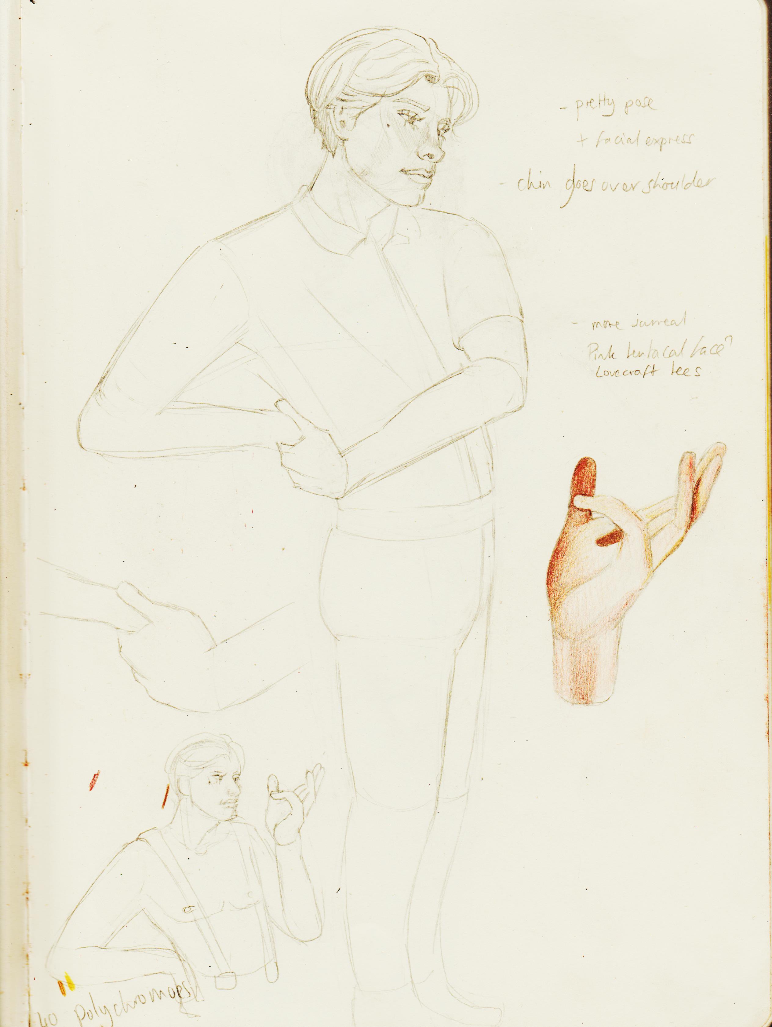.jpg)
My mimeboy. <3 I referenced several things and didn't worry, so that was nice!
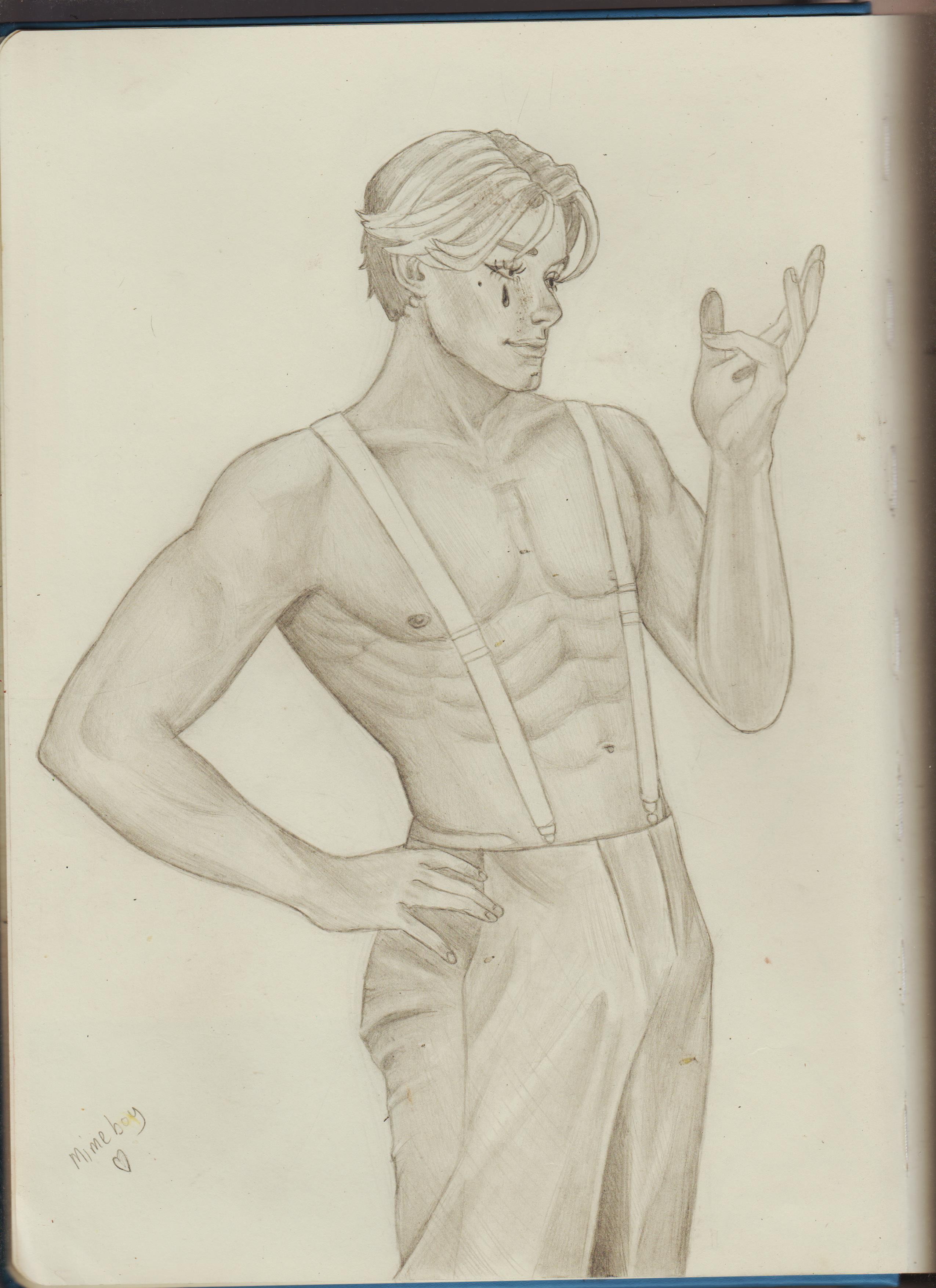.jpg)
I tried markers+pencils and gouache+coloured pencils, the plan was to go back to these. Haha, we'll see.
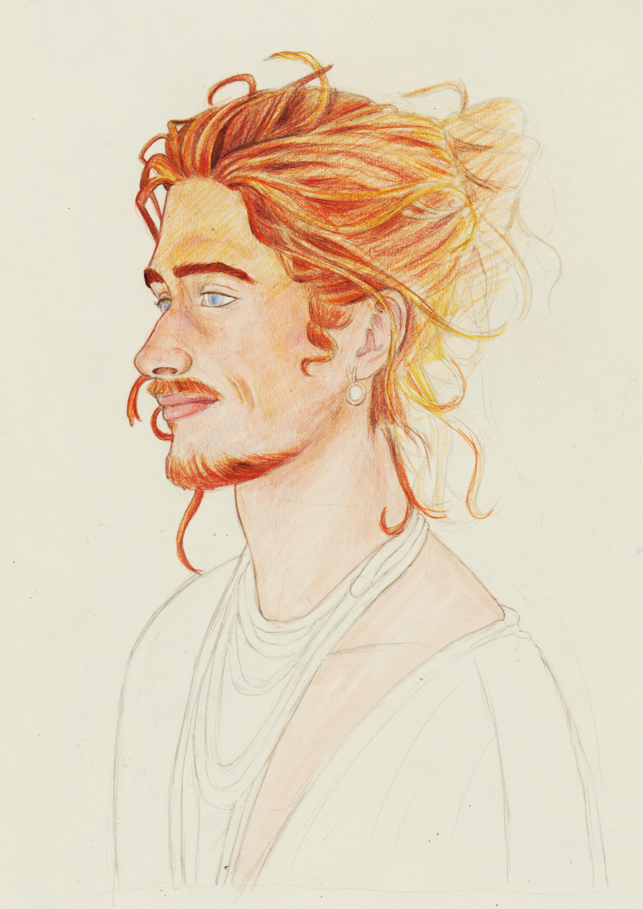.jpg)
.jpg)
Posts: 201
Threads: 3
Joined: Jan 2021
Reputation:
3
Fashion/pose studies and trying to turn her into a dude. I've found the more I chill out when drawing the more my rendering style seems similar to the Wes Burt/El Coro concept art style I've been coveting, since 4EVA.
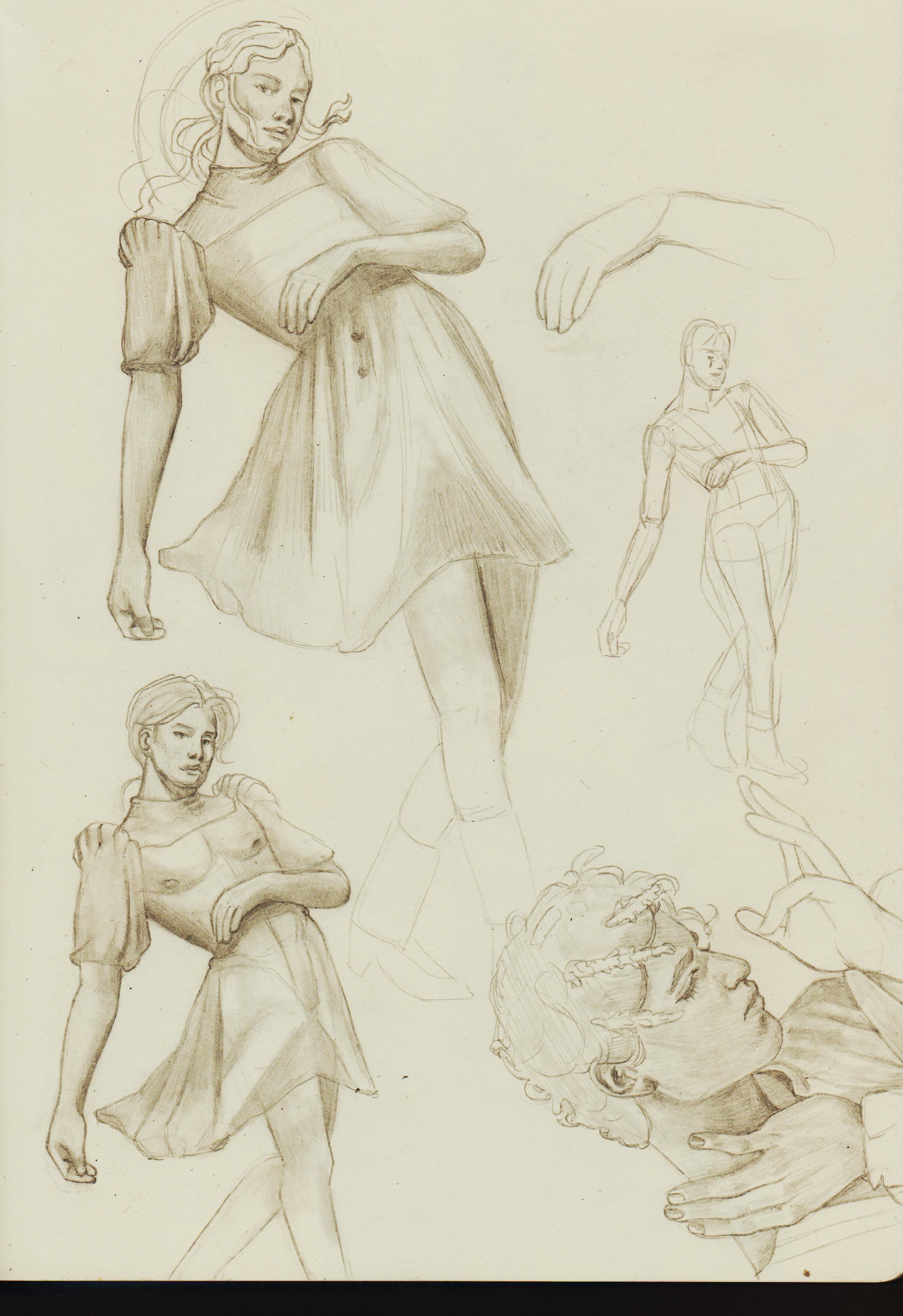.jpg)
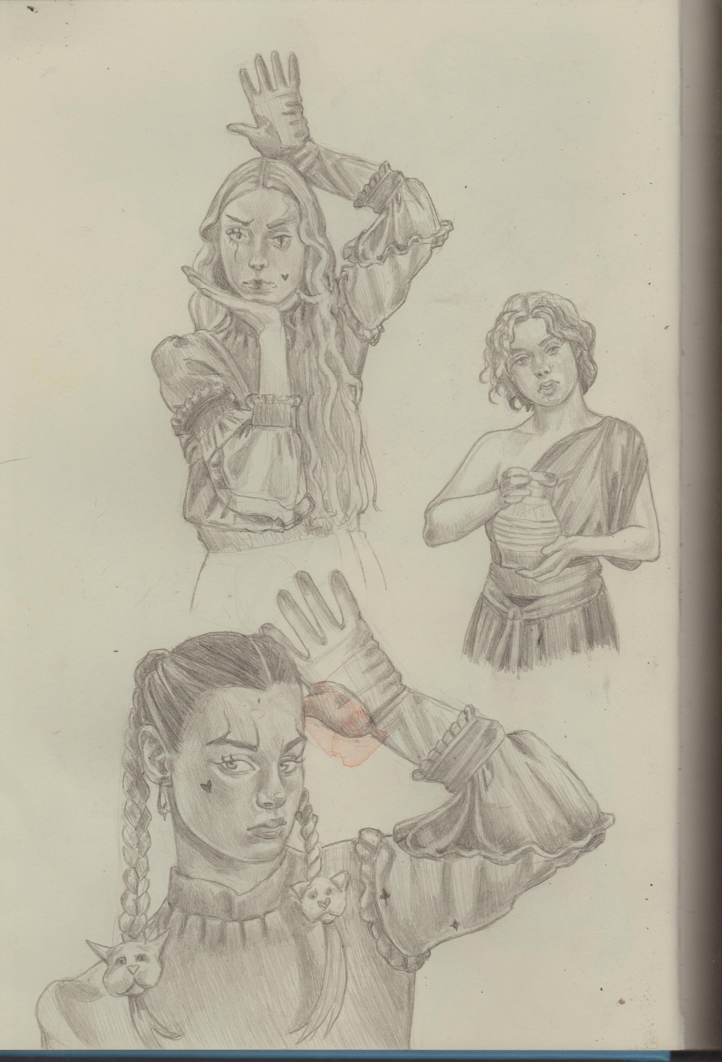.jpg)
.jpg)
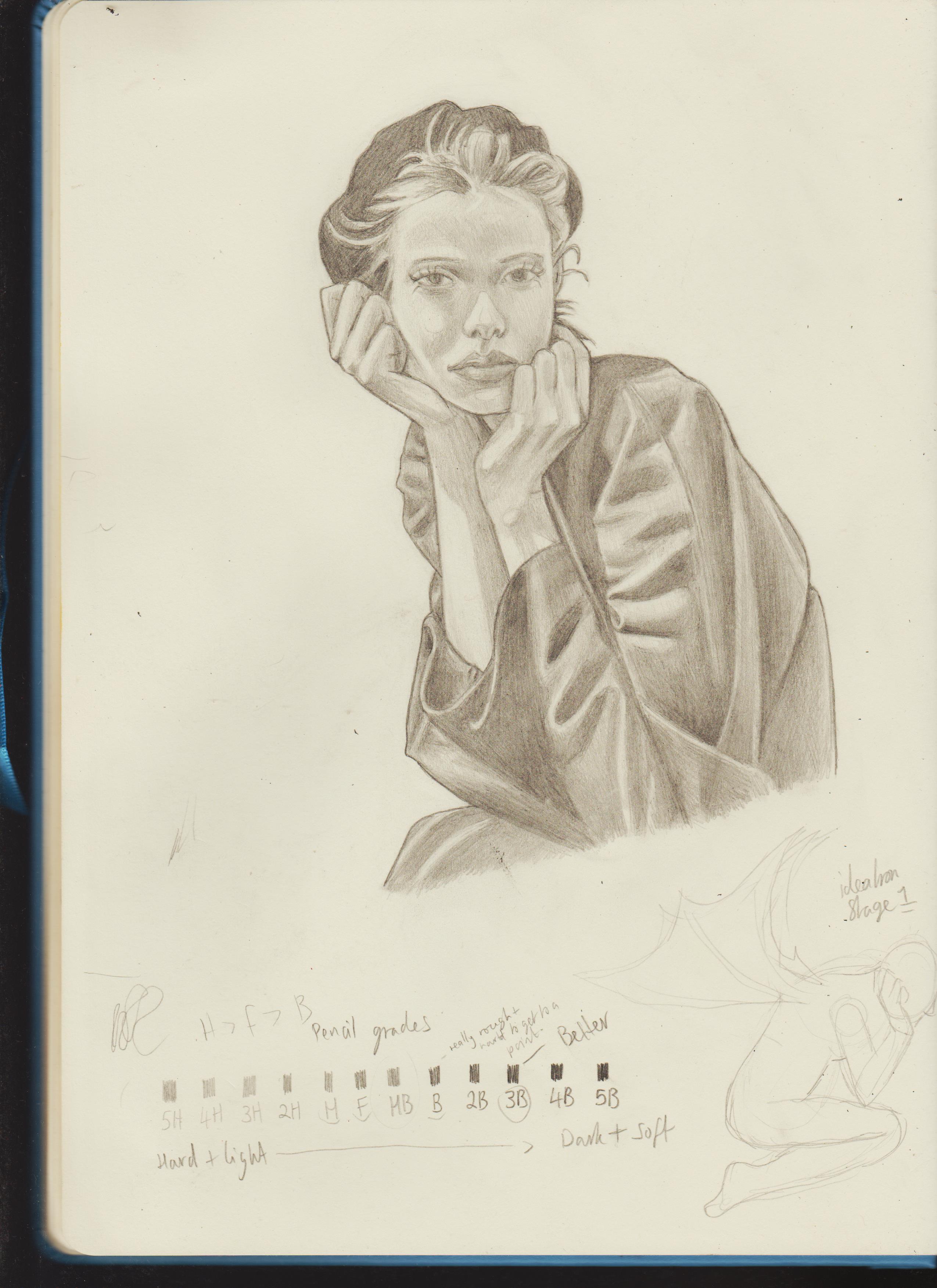
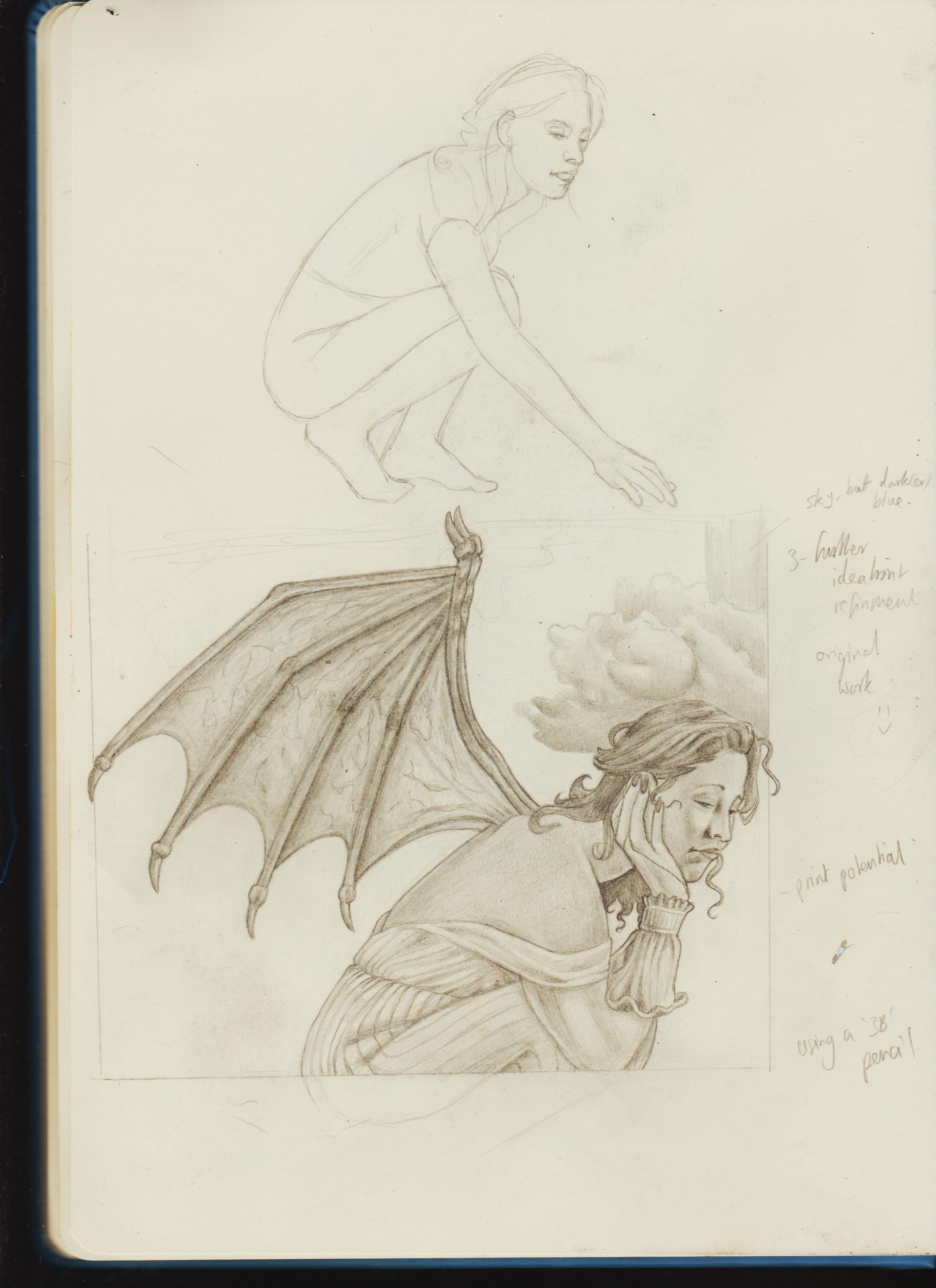
I like what Lexity said about breaking the creation process into two or more, which I expanded: 1)Ideation 2)Experimentation 3) Finalisation. This is so I don't put giant pressure on myself to see it 'right' straight away, then become completely discouraged when that (evitability) doesn't happen.
You can see the first part in the bottom right-rand corner. I've had the idea for some time now to draw a woman with bat-type wings with the camera slightly off-centre of where she is. Perhaps the idea for a larger piece or maybe even for a print. The 'ideation' stage had the typical warts of 'not looking good' AKA what I'd imaged in my head. However, it allowed me to loosen and I used my previous studies to inform the piece, e.g- the pose of the hand with the fingers folded like the model. I also used other references and took what I wanted from these like a Magpie would!
This is the result and I'm so happy with it! It was supposed to be stage 2, and I guess it still can be, but I really took my time with this learning what I needed to and rendering it out. I really want to try the Zapata course to level up my rendering skills even more. 
.jpg)
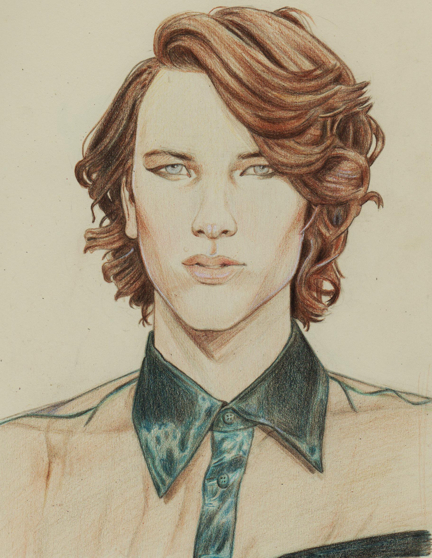
Decided to draw Cody Fern, because I think he's one of the most beautiful men on the planet and Pinterest just reminded me so. I spent my time on this to and slowed down. I now know I really like rending out with a HB, the pumping up the dark values with at least a 2B, then even more with a Black Polychromo. Then White highlights if I feel like it (and can get the pen to work.  )
.jpg)
This took me 2.5 days #flowstate. I think I was pretty successful in capturing the properties of the fabric.
.jpg)
Posts: 1,076
Threads: 4
Joined: Jan 2016
Reputation:
43
Excellent updates! Your values in particular look solid and the figure work is getting better and better, keep it up!
Posts: 79
Threads: 2
Joined: May 2013
Reputation:
21
Hey Dominicque! Really great updates! Keep it up! Don't worry so much about what other people do, or don't do. Follow your own heart and do what works best for you. The only advice I have is to keep those pencils razor sharp at all times. It helps to keep shading dense and really reduces the blown-out textured look when scanned because you can really get into the texture of the paper for great coverage with a fine point. Color pencil is a slower medium, but very satisfying and rewarding! Don't give up on it, you're doing great!
-Sketchbook-
"... for drawing is a thinking person's art." - Walt Stanchfield.
Posts: 201
Threads: 3
Joined: Jan 2021
Reputation:
3
(11-08-2024, 02:49 AM)cgmythology Wrote: Excellent updates! Your values in particular look solid and the figure work is getting better and better, keep it up! Hi CG, thanks for the encouragement. I posted previous work on an honest cheap sketchbook and I try to rend the same way I've done lately on the newer sketchbook onto that and it was actually pretty hard I wonder if that's why?
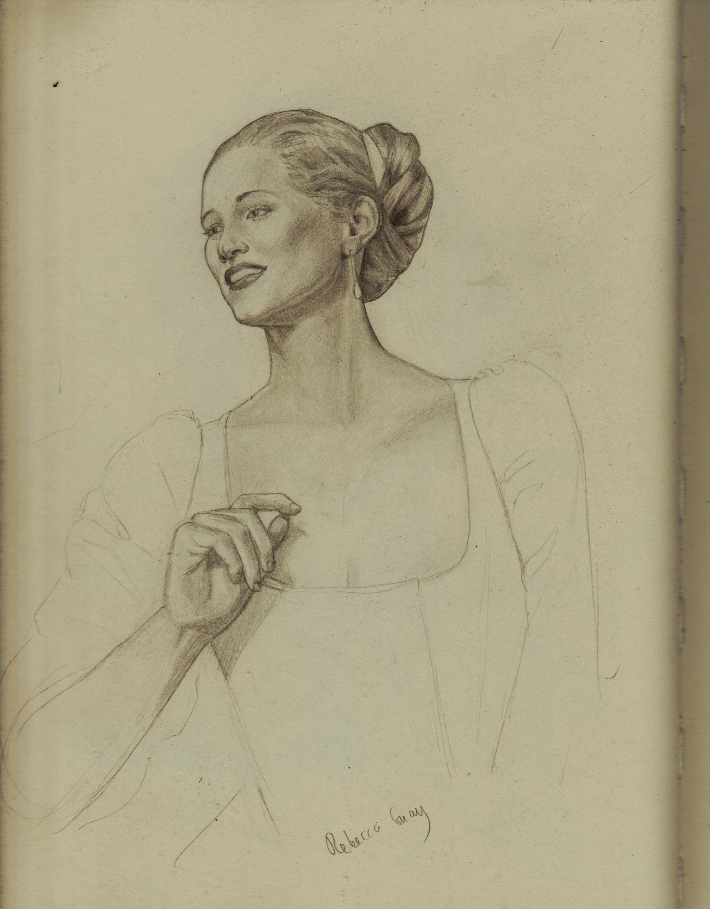
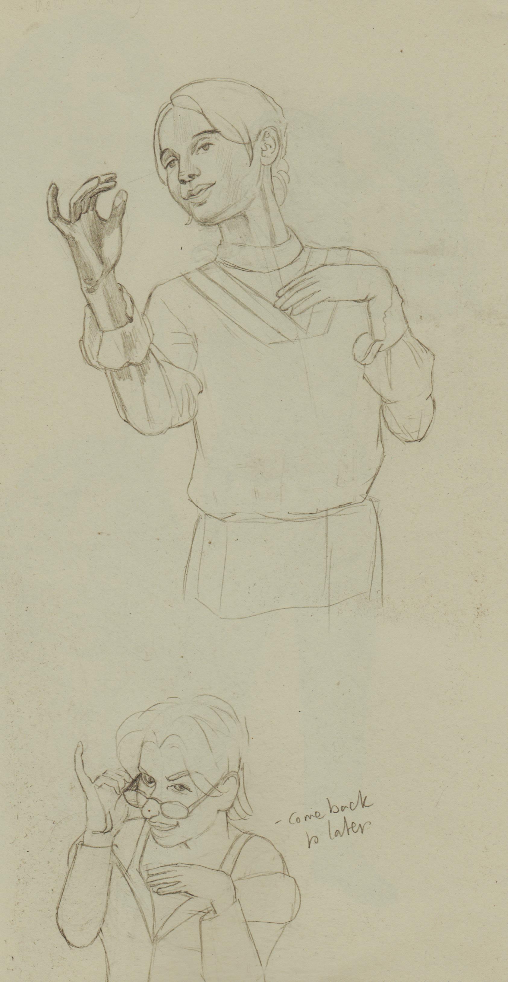
Tried to draw what I liked from this pose, but then got frustrated it didn't look like the reference. Guess I'm swinging the other way, now.
.jpg)
.jpg)
(11-15-2024, 02:06 PM)JavierP Wrote: Hey Dominicque! Really great updates! Keep it up! Don't worry so much about what other people do, or don't do. Follow your own heart and do what works best for you. The only advice I have is to keep those pencils razor sharp at all times. It helps to keep shading dense and really reduces the blown-out textured look when scanned because you can really get into the texture of the paper for great coverage with a fine point. Color pencil is a slower medium, but very satisfying and rewarding! Don't give up on it, you're doing great! Thanks, Javier! I really appreciate your positive feedback about my latest work. I've been enjoying Polychromos and am trying to learn more about (coloured) pencil processes. I'm attempting to draw for myself, but after years of avoiding what I want due to fear of criticism, I find it really hard to create a delineation in my mind.
I'm trying to find a happy equilibrium with art-making, but it's honestly difficult. Most of the time, I just end up feeling depressed. I drew the last illustration when I was in a more positive mindset, but now I'm feeling down again. I'm focusing on what I want, but after all these years of not prioritizing my interests, even drawing or writing about what I genuinely care about now feels like a chore. I don't feel good enough or believe that I should have been good enough ages ago, which leads me to pick out my flaws and rush through my work.
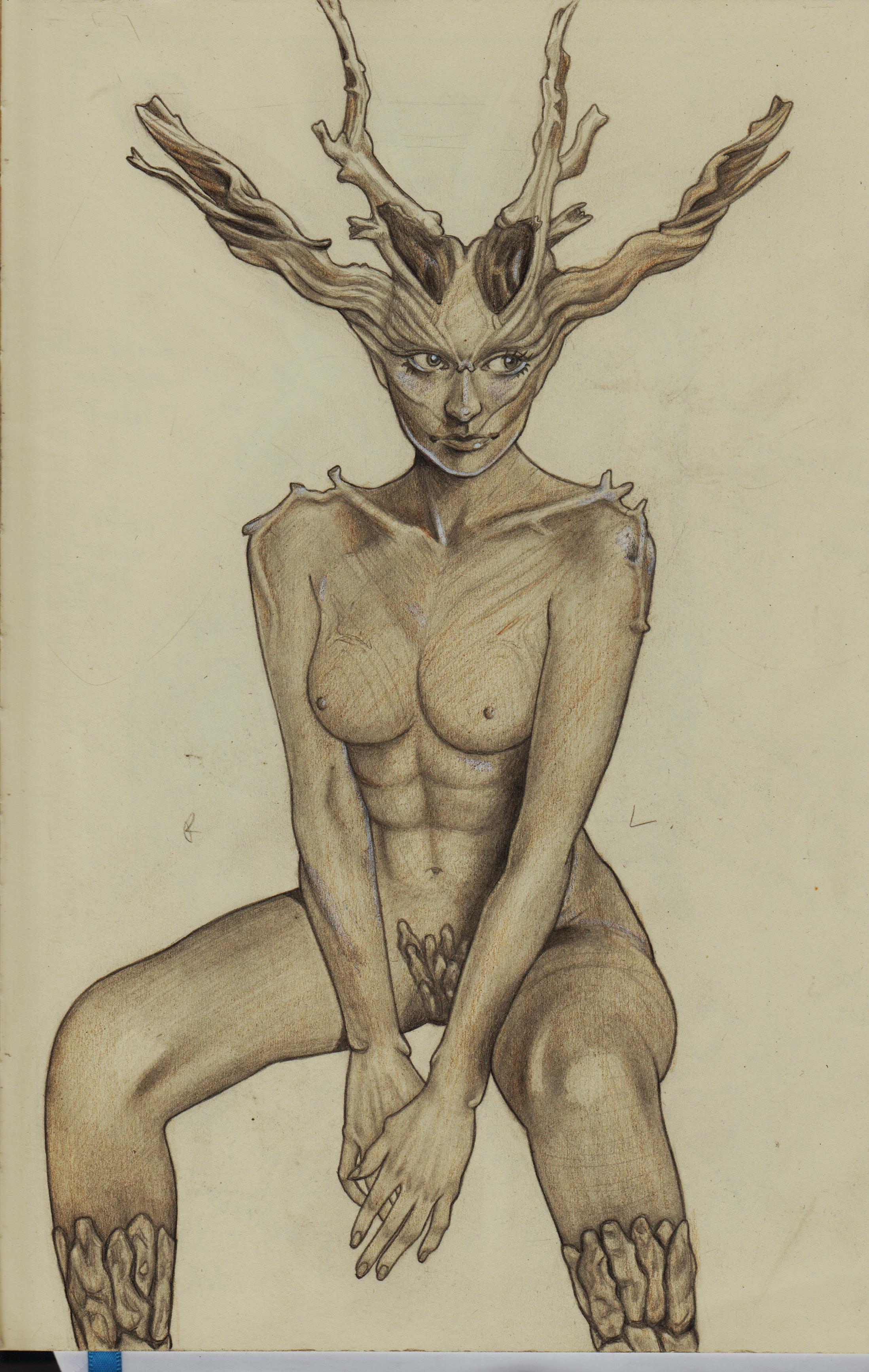
I guess that's why I panic and think it takes "so long," as if it's a reflection of my skill or worth as a person. I just feel like a failure. I drew the tree girl in a much more relaxed mindset, but I've felt in a funk again, which is why I didn't post. It's so hard to buckle down and concentrate because I keep asking myself, "What's the point in all this?" Sorry to be such a bummer.
Being critical of your work can be a virtue during the editing and finalization stages, but not during the initial stages and first iterations.
Beginning character design, I guess. Just saw a woman dressed similar and thought it looked cool.
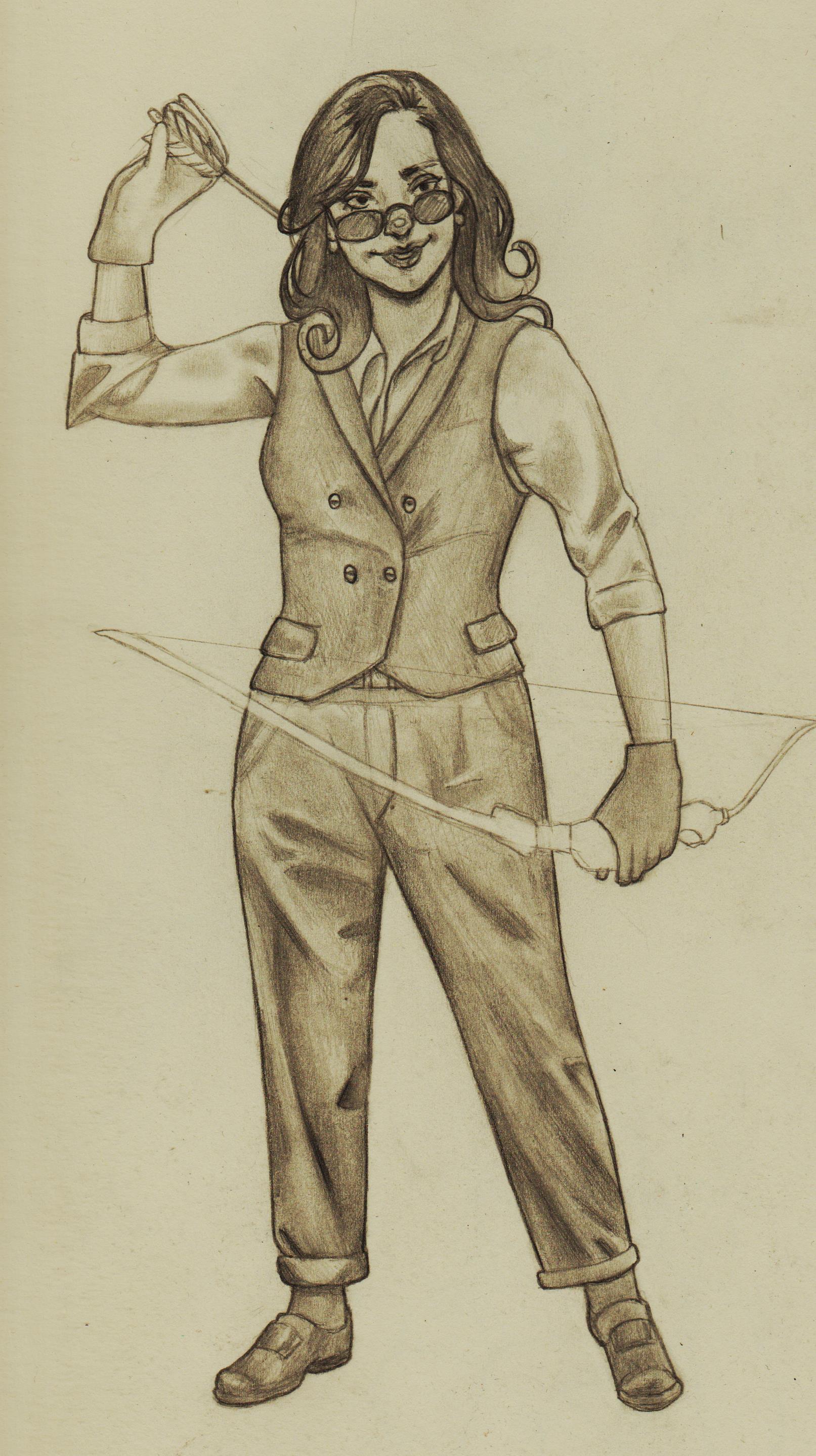.jpg)
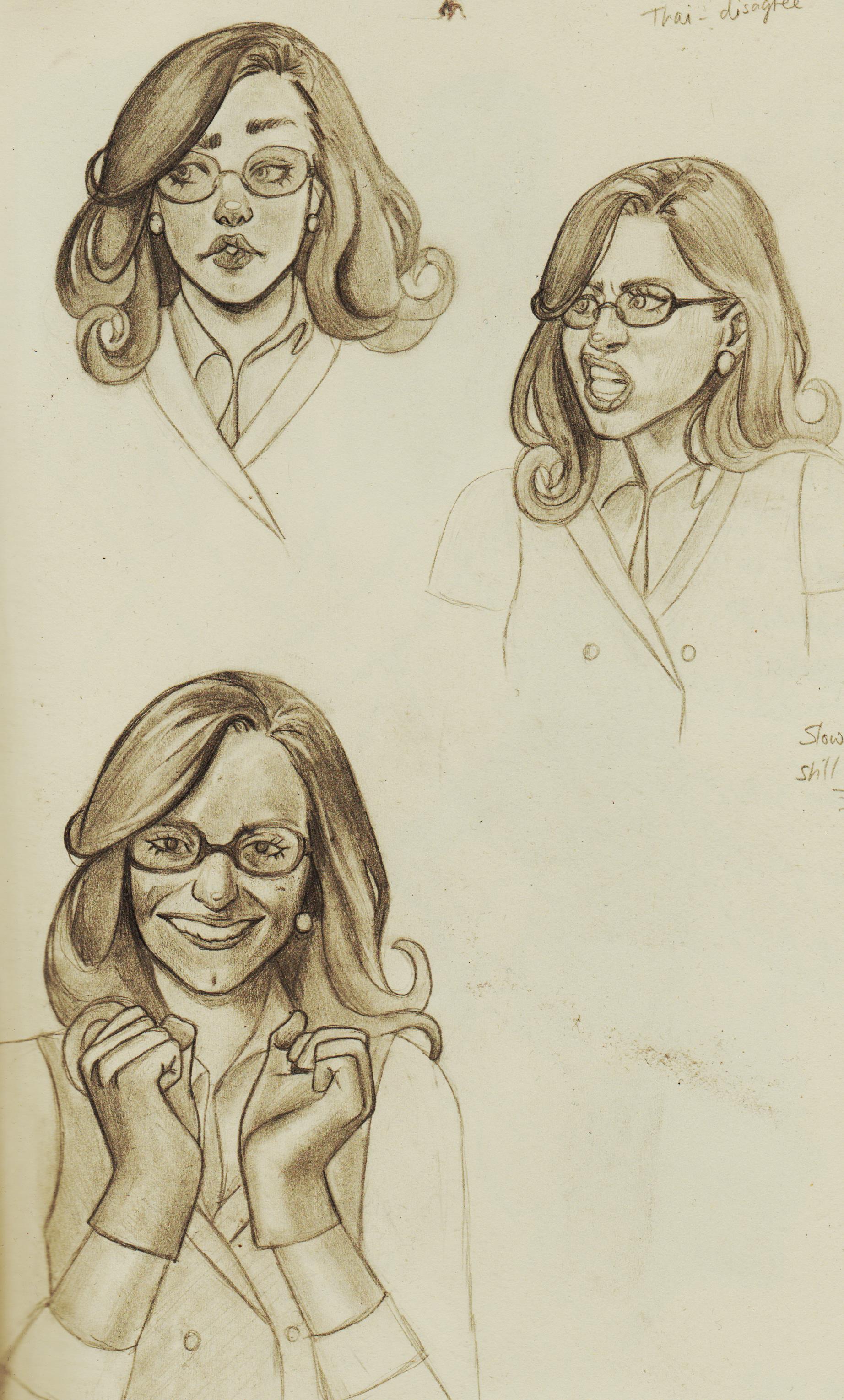.jpg)
Using pose refs, again:
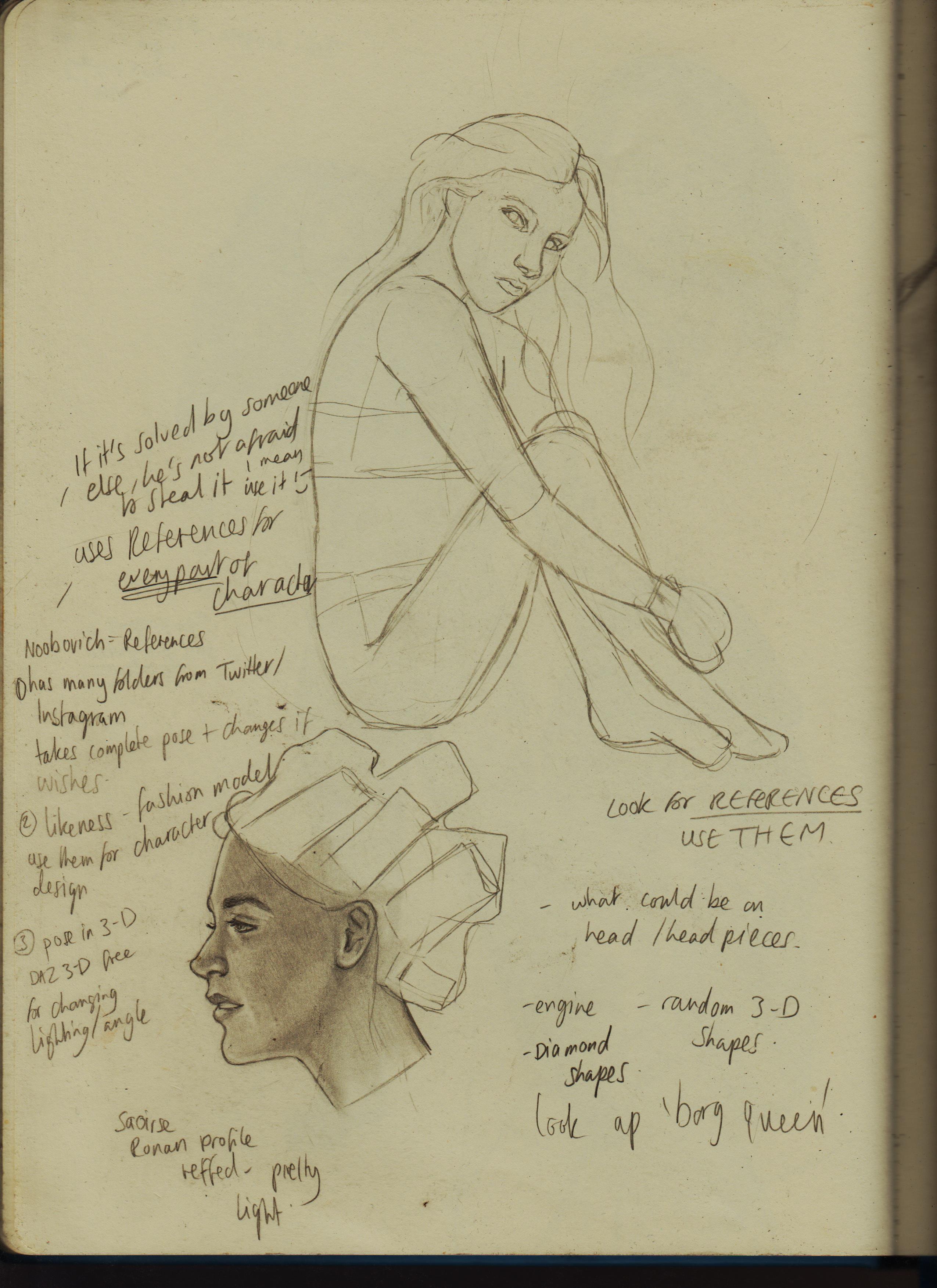.jpg)
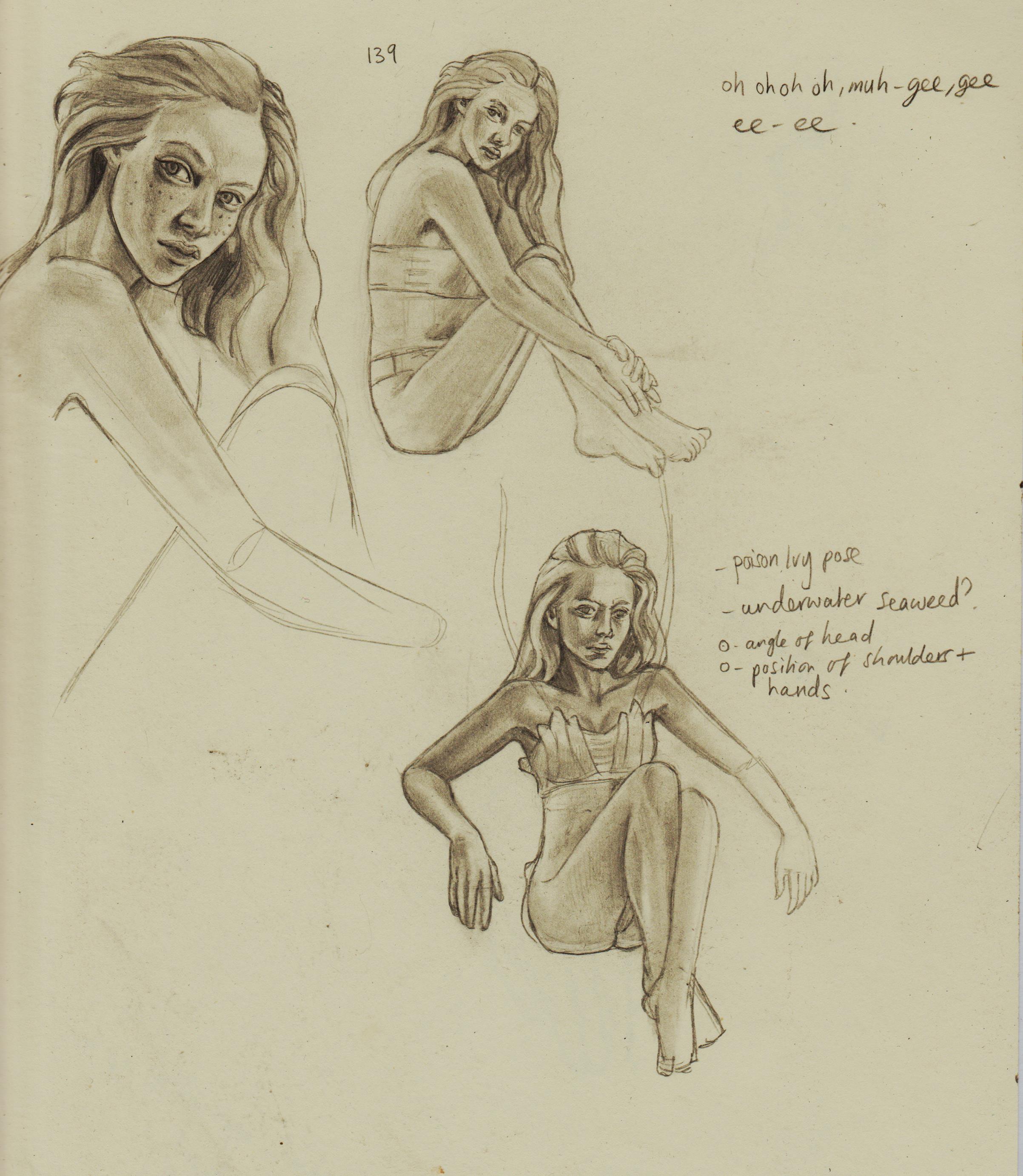.jpg)
My first full illustration using pose refs and other references, where I was planning out a thumb and drew a full version. 660+ Female Concept Art Poses from Grafit Studio. Saw the pose and the image of a 'tree girl' started forming in my mind. I went and found the perfect tree to ref. I want to have no worry nor guilt related to using any sort of ref in the future.
I'm kind of locking down the way I like to render with pencil: lighter values, then dark, pump up values with a Black pencil, because even a 9B is just a very dark grey and use highlights when appropriate.
.jpg)
|


.jpg)
.jpg)
 The anxiety is loosening.
 .jpg)
.jpg)
.jpg)
.jpg)

.jpg)
.jpg)
.jpg)
.jpg)
.jpg)
.jpg)
.jpg)
![[Image: eBqaszv.jpeg]](https://i.imgur.com/eBqaszv.jpeg)
 ) I saw an online course that wants to widen the gap between people learning classical based subjects and I wanted to challenge myself that I could ‘self-teach’ myself a GCSE. I lost interest, but then interest sparked up again when I wanted to create a fanart project of some of my favourite comic book characters as Cowboys. I started with some research on Pinterest and Google of looking at images of cowboys, this being good practice to draw hats and shirt folds. I’ve been practising that a lot lately and I’m finding it super enjoyable. After learning of the ‘5 basic folds’ from the Morpho books, it’s good to see them out in the wild and be able to spot them!


![[Image: SAsxEEM.jpeg]](https://i.imgur.com/SAsxEEM.jpeg)
![[Image: R2INYg5.jpeg]](https://i.imgur.com/R2INYg5.jpeg)

![[Image: JDAxSQW.jpeg]](https://i.imgur.com/JDAxSQW.jpeg)
![[Image: aVtVP35.jpeg]](https://i.imgur.com/aVtVP35.jpeg)
![[Image: YUjpQ9p.jpeg]](https://i.imgur.com/YUjpQ9p.jpeg)
.jpg)
.jpg)
.jpg)
.jpg)
.jpg)
.jpg)
.jpg)
.jpg)
.jpg)
.jpg)
.jpg)
.jpg)
.jpg)
.jpg)

.jpg)
 )
) .jpg)
.jpg)
.jpg)
.jpg)
.jpg)
.jpg)
.jpg)
.jpg)
.jpg)