Posts: 12
Threads: 1
Joined: Mar 2013
Reputation:
0
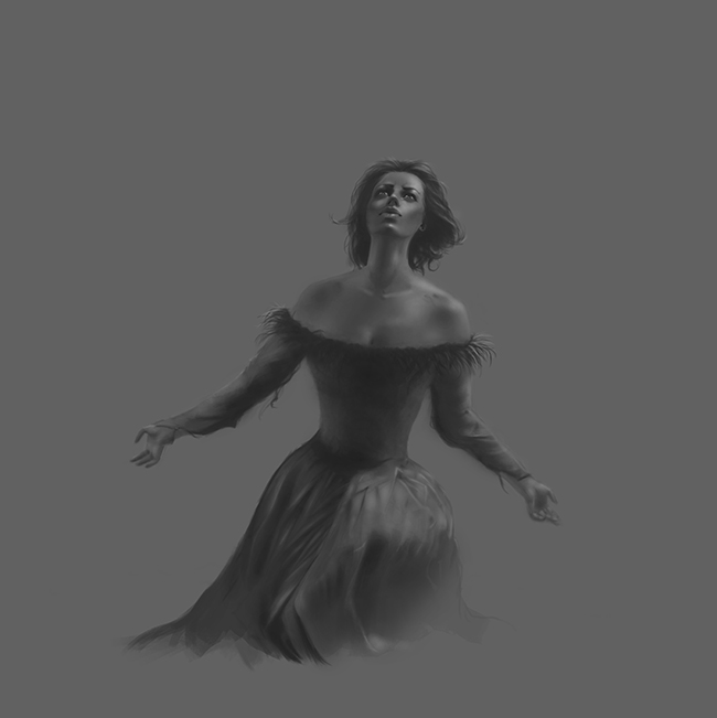
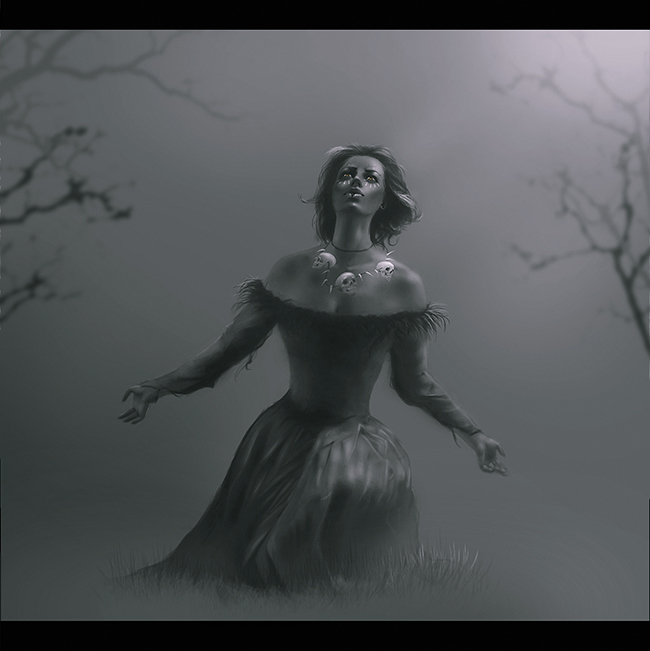
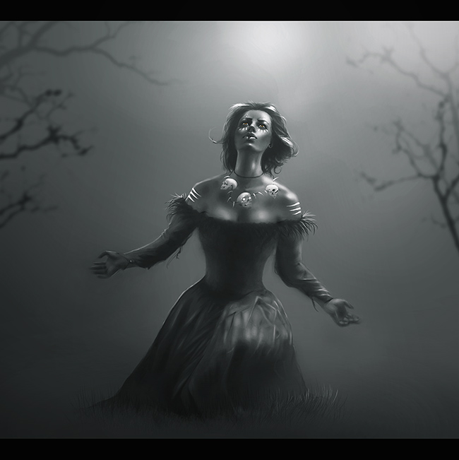
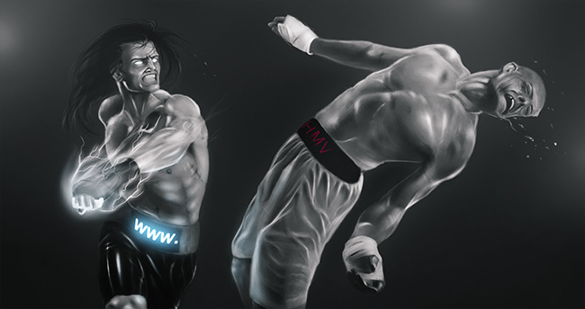
It´s starting cool, I love how you handle yor values, not just in this one but in many others, one thing I think would benefit the piece is increasing the size of the skirt just creat more balance.
Posts: 36
Threads: 3
Joined: May 2012
Reputation:
0
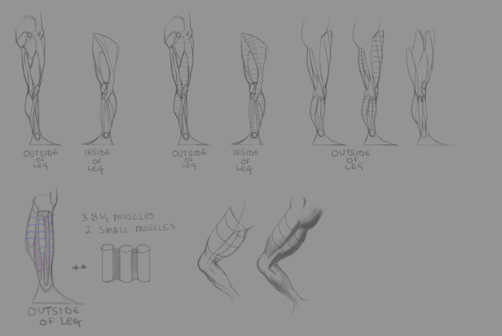
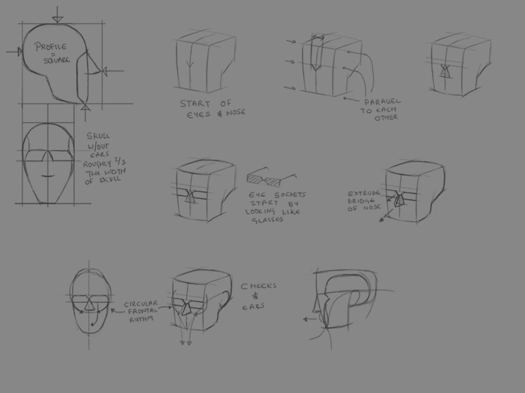
Great studies, but don't forget to apply them!
Applying after a study will make you learn a ton more than just doing the study.
Posts: 155
Threads: 3
Joined: Feb 2012
Reputation:
3
Really cool sketchbook, by looking at your studies I see you have a clear understanding what to study to improve. Try not to neglect the background so much, but other than that you are on the right direction!
Posts: 22
Threads: 2
Joined: Mar 2013
Reputation:
1
I love those animals. Great job getting those darks in there on that last post. The way you draw kind of reminds me of drawings in toned notebooks, with the paper for the mid tones and the highlights put in manually instead of erased out from the white of the paper.
Posts: 903
Threads: 54
Joined: Feb 2012
Reputation:
18
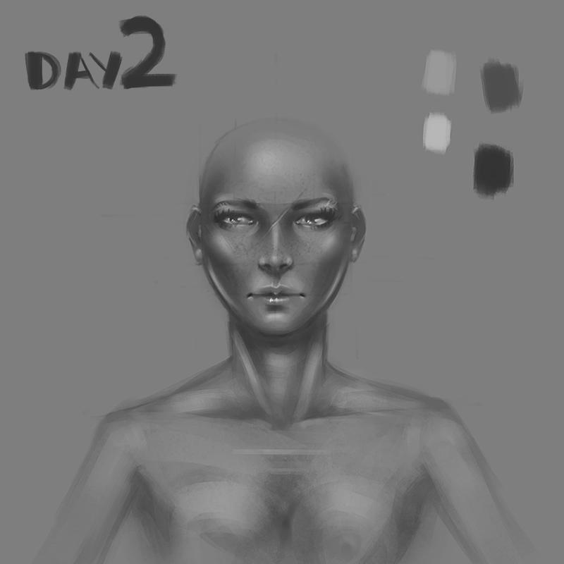
Nice studies man. Keep it up, the faces look like they are improving. Don't forget to paint the head at different angles, you'll give yourself a migraine from the straight on angle and all that symmetry :)







![[Image: PhakiOv.jpg]](http://i.imgur.com/PhakiOv.jpg)
![[Image: 2romwth.jpg]](http://i.imgur.com/2romwth.jpg)
![[Image: Ae1PMAu.jpg]](http://i.imgur.com/Ae1PMAu.jpg)
![[Image: IvbH7zp.jpg]](http://i.imgur.com/IvbH7zp.jpg)
![[Image: YbR0jtw.jpg]](http://i.imgur.com/YbR0jtw.jpg)
![[Image: W3LtGK8.jpg]](http://i.imgur.com/W3LtGK8.jpg)
![[Image: VzktSCR.jpg]](http://i.imgur.com/VzktSCR.jpg)
![[Image: I2qB5q2.jpg]](http://i.imgur.com/I2qB5q2.jpg)
![[Image: ldlqLO4.jpg]](http://i.imgur.com/ldlqLO4.jpg)
![[Image: LH5iDIw.jpg]](http://i.imgur.com/LH5iDIw.jpg)
![[Image: jgXoy3q.jpg]](http://i.imgur.com/jgXoy3q.jpg)
![[Image: FoWNAsQ.jpg]](http://i.imgur.com/FoWNAsQ.jpg)
![[Image: 86Q3IRr.jpg]](http://i.imgur.com/86Q3IRr.jpg)
![[Image: zUm3ZNG.jpg]](http://i.imgur.com/zUm3ZNG.jpg)
![[Image: jq2jdd.jpg]](http://i44.tinypic.com/jq2jdd.jpg)
![[Image: 5o93b.jpg]](http://i40.tinypic.com/5o93b.jpg)
![[Image: 6hrIvYA.jpg]](http://i.imgur.com/6hrIvYA.jpg)
![[Image: NZK8KYq.jpg]](http://i.imgur.com/NZK8KYq.jpg)
![[Image: lrlNyKs.jpg]](http://i.imgur.com/lrlNyKs.jpg)