06-07-2013, 09:03 AM
Good work buddy. Really cool narrative stuff going on in your finished work.
|
Blewzen's sketchbook
|
|
06-07-2013, 09:03 AM
Good work buddy. Really cool narrative stuff going on in your finished work.
06-22-2013, 08:06 AM
Studies that I did a while ago, some quick some less quick
![[Image: crocodileksullstudy.jpg]](https://2.bp.blogspot.com/-bduuoIIiY18/UbIUmTgGHGI/AAAAAAAAAUw/e1PBV7G4K3U/s1600/crocodileksullstudy.jpg) ![[Image: foliagestudy.jpg]](https://4.bp.blogspot.com/-5m1V00KHNqQ/UbIUn9mOYaI/AAAAAAAAAVA/eBu3JVWdE7g/s1600/foliagestudy.jpg) ![[Image: junglestudy.jpg]](https://2.bp.blogspot.com/-a45mm6Gg-G0/UbIUnowmU_I/AAAAAAAAAU8/V0819wMBB1Q/s1600/junglestudy.jpg) test light on the study ![[Image: junglelightexperiment.jpg]](https://1.bp.blogspot.com/-u0sv7jtf12w/UbIUl8OHHOI/AAAAAAAAAU0/y1oXjikwAww/s1600/junglelightexperiment.jpg) I had a period of drawing almost nothing the past weeks and also having kinda lack of motivation, but well, I did this knight and I like it in someway, i guess im feeling better lately. :0 So well any crit or comment is welcome. 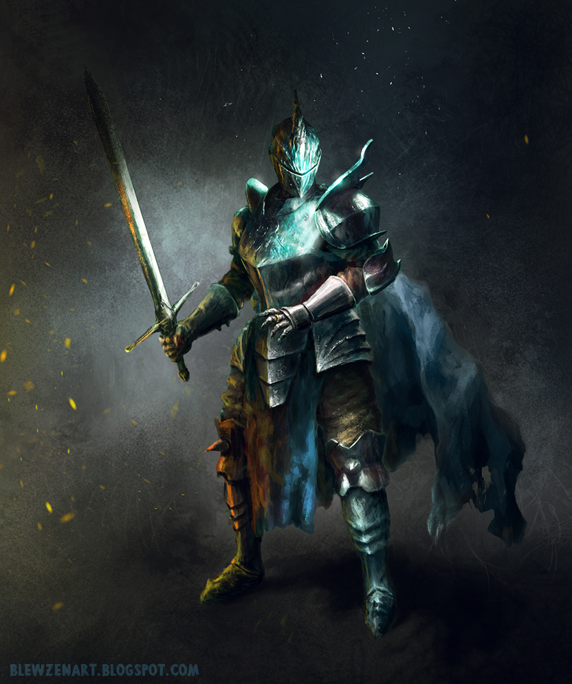
06-22-2013, 08:30 AM
Really love that knight at the bottom! The colors look other worldly, like he came from a different plane of existence.
_________________________________________________________________________
The best time to plant a tree was 20 years ago. The second best time is now. -Chinese proverb Sketchbook
06-23-2013, 11:40 PM
I like the two different light situations on the forest study, creates a completely different mood!
The knight is looking amazing!
06-27-2013, 08:52 AM
worked on some landscapes thumbnails, probably I will take 1 and make it illustration
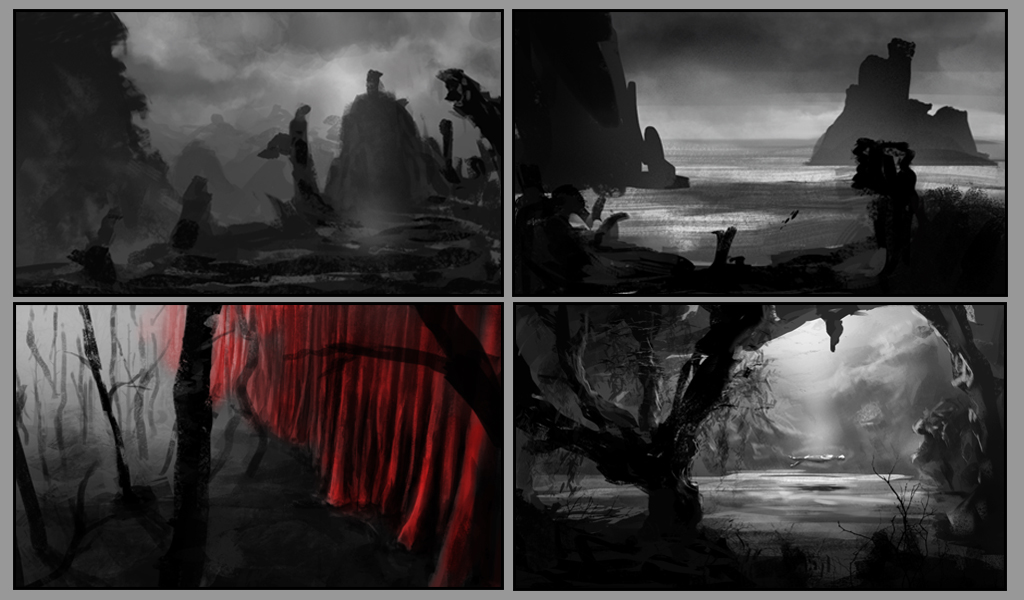 also some quick random poses 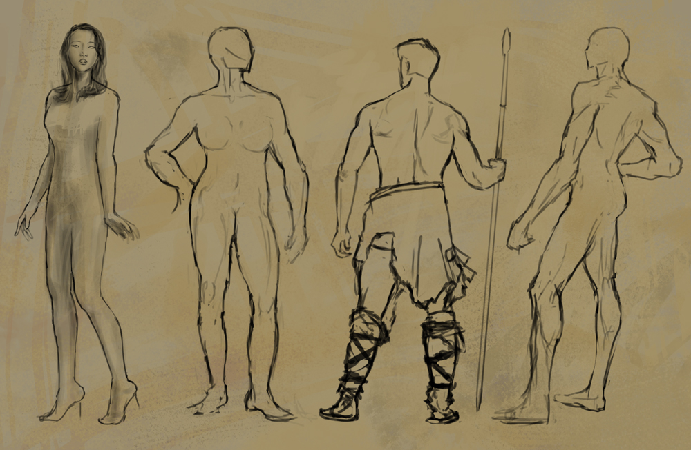
07-12-2013, 10:45 PM
hey man, sorry for taking so long to reply here. i've not been active on the forums..
super nice work on those last comps and figures, you've got a lot going here, you can use this! the knight pic is awesome. real nice vibe. my crit, the colours look a little saturated in some areas, a bit "candy-like", the cape is a little defuse and hard to make out its shape. real nice work on the texturing and design!
08-02-2013, 09:05 PM
Thanks alot aks9, ive been trying to work my colors better...
Really long time since my last post but anyway i tried to focus on improving so no time for sketchbooks. I worked on my summer pitch and also some landscapes and in between i had some shit freelance work that im not happy with so im not gonna post it lol, also working in summer is hell, still waiting to get my AC fixed D: So here's my project for the summer pitch called "SCIONS" worked alot on the story but I need time for more concepts, click here for more information SCIONS 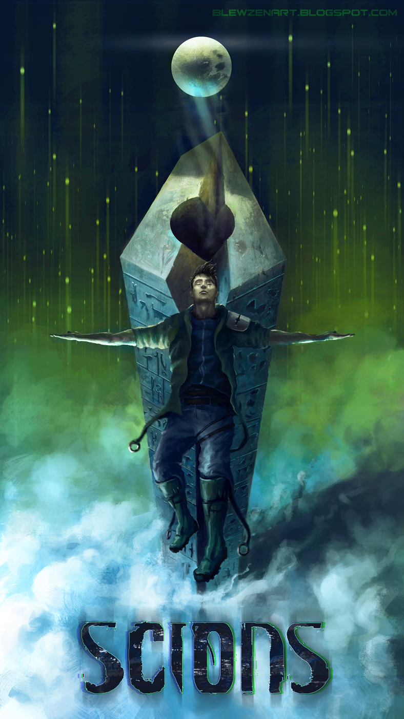 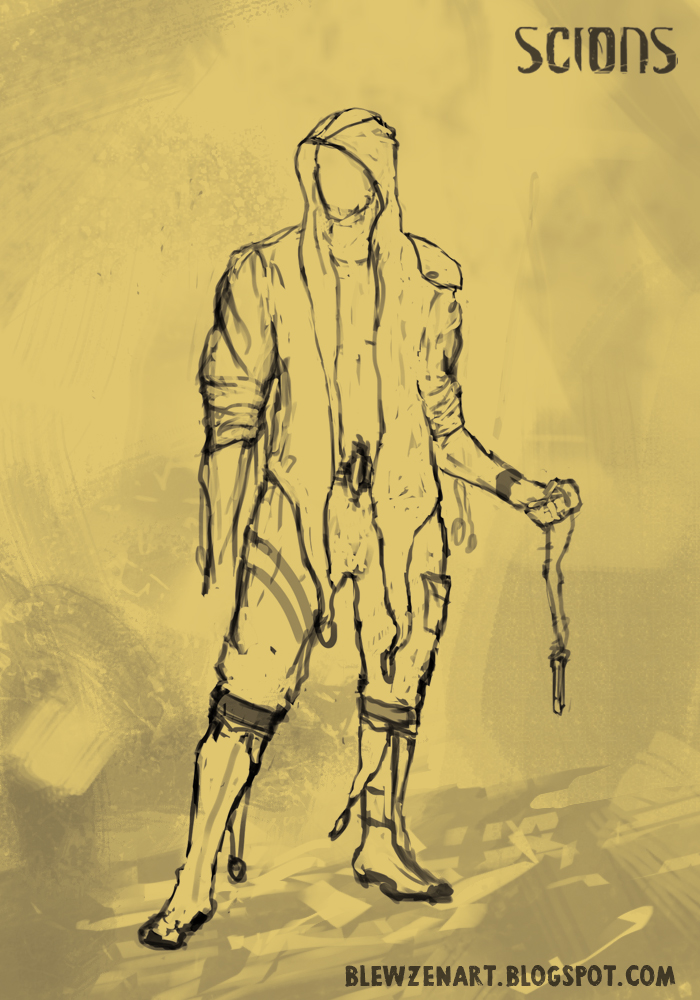 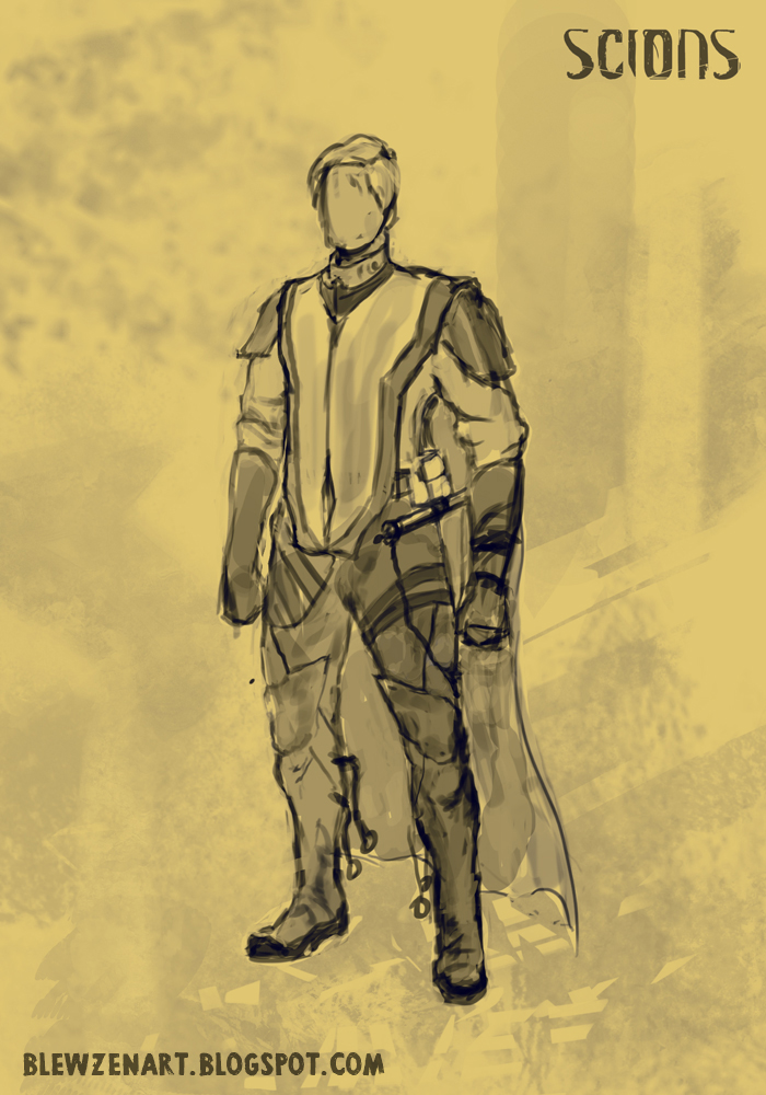 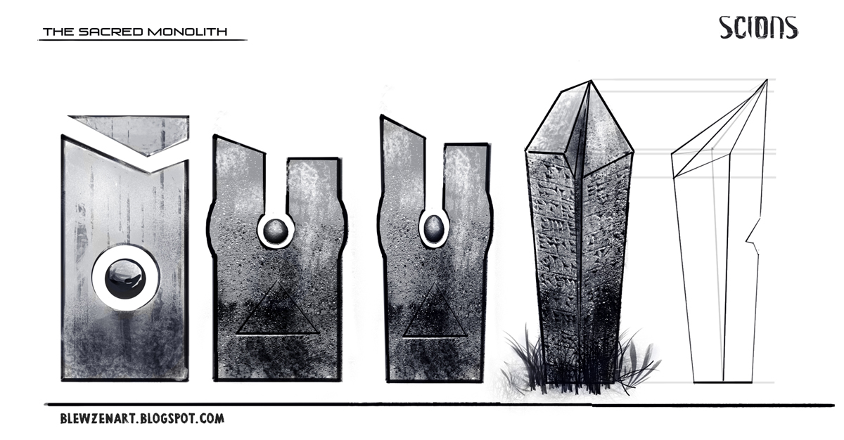 Playing randomly with shapes this came out and i just worked it till i felt finished, about 4 days working on it. Process on my cghub 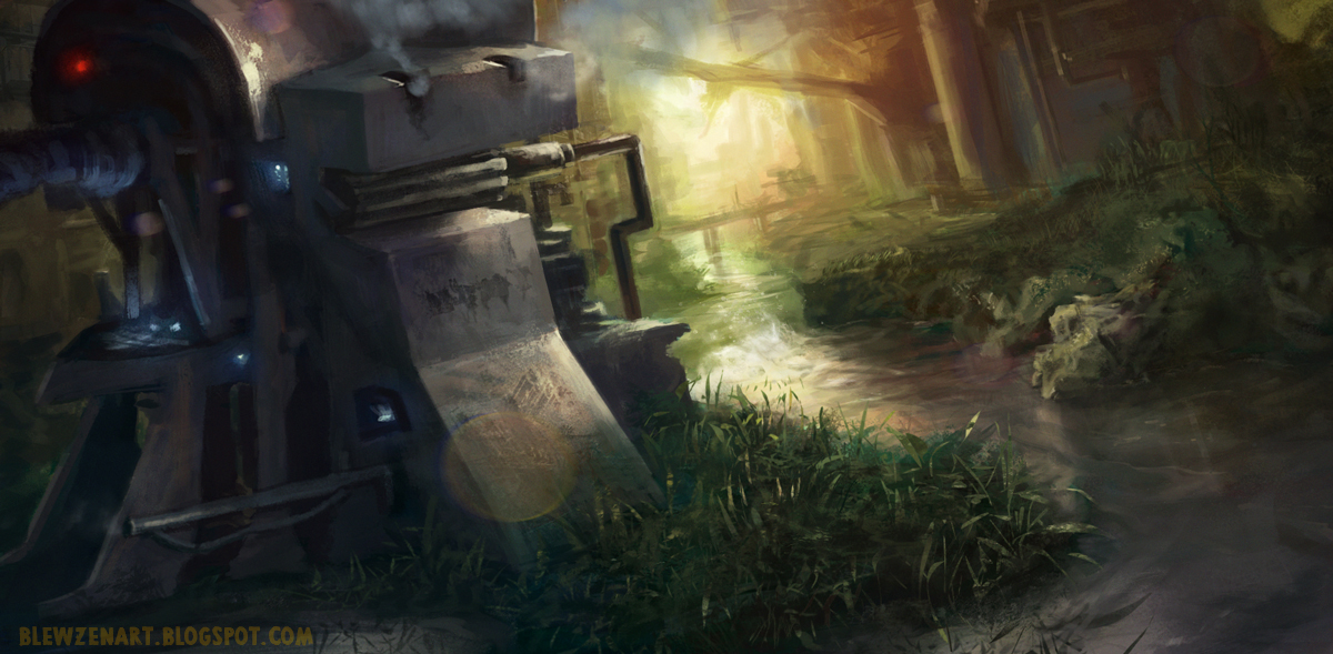 And quick landscape i did weeks ago, hating the colors on it but I kind of like the concept. 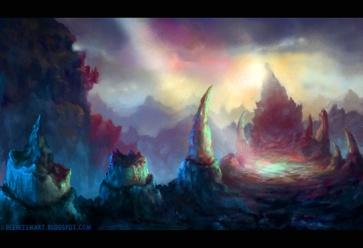
09-27-2013, 01:15 AM
Oooh, that Scions IP looks awesome. I love how it really seems to have story and depth to it, not just pretty illustrations.
And I do like the colors of the last piece, the cyan/blue and pinkish goes well together imho :)
09-27-2013, 12:52 PM
The Scions piece looks fantastic, and I really like the shape of the monolith. Such a basic form, yet really unique and striking.
_________________________________________________________________________
The best time to plant a tree was 20 years ago. The second best time is now. -Chinese proverb Sketchbook
10-04-2013, 05:55 AM
Thanks lyraina and tygerson i really appreciate it, i really want to work more on Scions but right now i need money so im busy with freelance work :0
Lazyness kills me all the time when is about to update things, but i want to stop it so hopefully i will update this more often... These are things I've done since last time I updated my sb, some freelance work and a personal sketch of an undead shaman. ![[Image: hR02qTm.jpg]](http://i.imgur.com/hR02qTm.jpg) ![[Image: 6QxaYxx.jpg]](http://i.imgur.com/6QxaYxx.jpg) ![[Image: JSWKMqv.jpg]](http://i.imgur.com/JSWKMqv.jpg) ![[Image: 5AGLtG5.jpg]](http://i.imgur.com/5AGLtG5.jpg) ![[Image: whawJRd.jpg]](http://i.imgur.com/whawJRd.jpg)
10-04-2013, 08:17 AM
Hey man!
Really nice update there. That demon knight with all the floating heads is looking totally rocking. I'd love to see him in an illustration standing before his lich army :P Also like the designs in post #27, they look really grounded yet imaginative. Your IP sounds interesting, are you going to continue on it though? Since it seems like a while ago since you updated!
10-04-2013, 04:44 PM
Nice stuff you have here, mate. Your latest skeletor like dude concept looks really good. Love the coulours and the design of his staff. Small piece of advice. When you design a costume try to think how all the elements are attached. His shoulder pads would fell off right now. Side of that. Awesome stuff, keep rockin'
10-11-2013, 02:08 PM
Just an awesome set of faces/masks in that last set! I like the one with all the heads swirling around.
The figure in the battle scene looks really cool! I like the costume, and how you have the arrows drawing the eye to him. One minor thing. The hand in the lower right draws a lot of attention away from the main guy. Also, perhaps if the sky was a little brighter behind him, he'd separate a little more from the background--like how your guy with all the masks around is sort of silhouetted against the background.
_________________________________________________________________________
The best time to plant a tree was 20 years ago. The second best time is now. -Chinese proverb Sketchbook
10-20-2013, 12:58 AM
@Bjulvar: Thanks mate! I'm glad you find my IP interesting, I would love to continue with it but i want to think more before putting a lot designs out, I feel like I should give it certain of style to make it more iconic or something? Well ill be trying things out and sketching in my freetime so i will post those on here.
@Ramalooke: Thanks for your advice, it's true but since is an sketch for now ill just leave it like that hehe im lazy D: @Tygerson: I could blur that hand a bit but for some reason didnt think about it, good point! and for the light in the backgound i didnt want it to force it alot i felt if its night it shouldnt be so much bright? anyway thanks! I finished a freelance piece and finally I had time to do some studies and landscape. Tried to limit the time to 2 hours for the landscape, I felt so free not worrying about refining and stuff :) 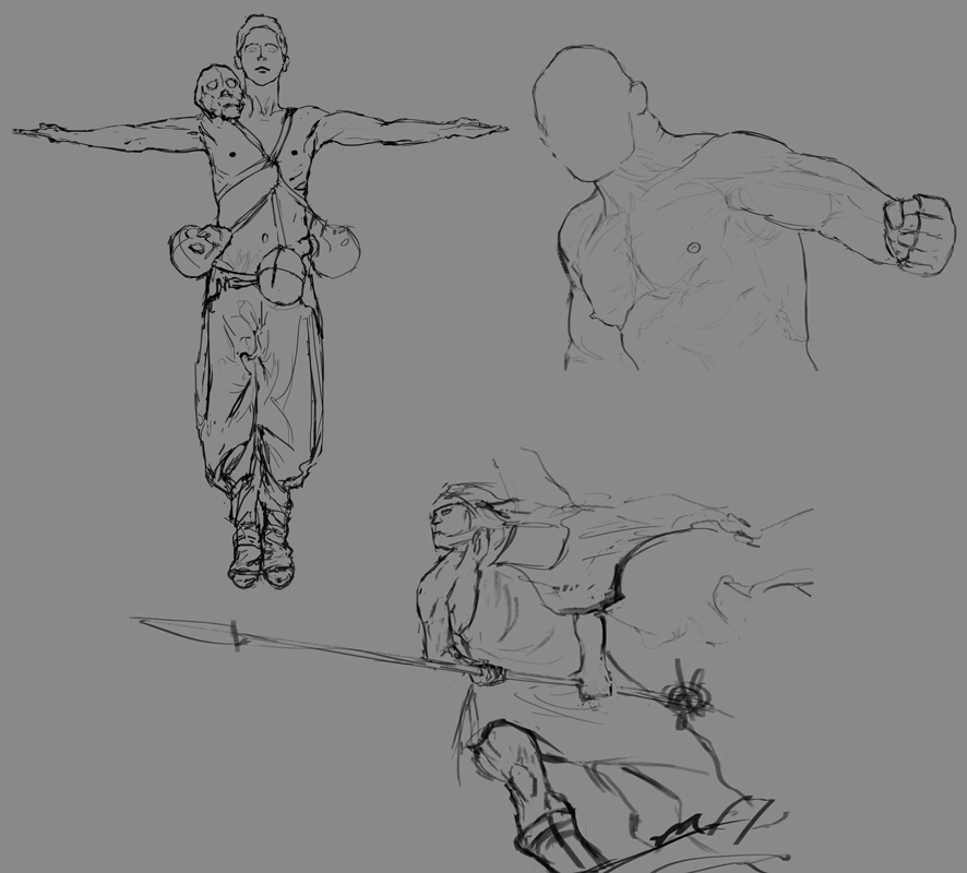 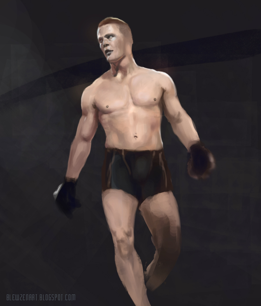 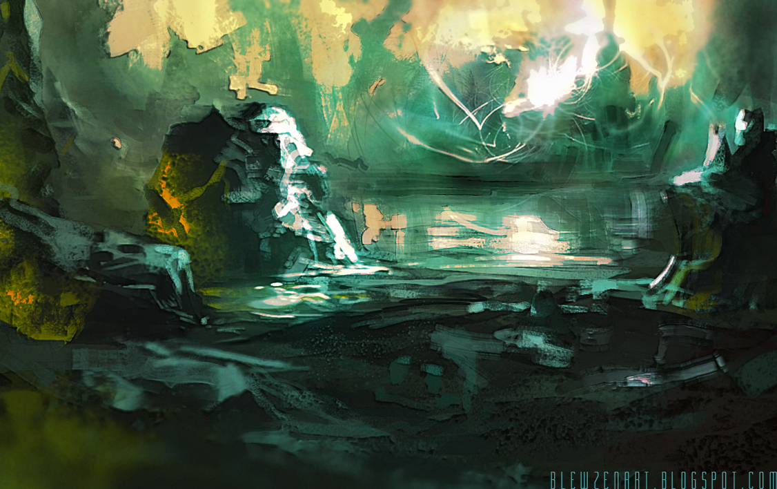
10-20-2013, 08:46 AM
i like this last two hours enviro, very lovecraftian, i always liked that side of your work.
But the second dude in armor (the purple one with the shields? of colors around him) is by far the best, or at least my favourite piece here. Keep going man, and keep this updated :)
"Stand tall, and shake the Heavens!"
Tumblr for my comic!: http://rainfallcomic.tumblr.com/ Sketchbook: http://crimsondaggers.com/forum/thread-1227.html Facebook: http://www.facebook.com/eduardogarayart Deviantart: http://eduardogaray.deviantart.com/
10-21-2013, 11:55 PM
You're making some great progress with these last posts! Those two B&W illustrations and the undead shaman are very cool :D P.S. I think the sketchbook link in your signature is broken D: It goes to a 404 for me.
10-22-2013, 06:01 AM
Whoa, the level up in this page alone is crraaaaazy-!
Excellent update, Blewzen. I love the colour and design in your work - your freelance pieces are excellent! Looking forward to updateeess
sketchbook | pg 52
"Not a single thing in this world isn't in the process of becoming something else." I'll be back - it's an odyssey, after all
10-22-2013, 07:09 AM
Wow you've got a great sense for values and colors! It's really nice to see how you used both in your artwork so far! Though it might be a good idea, if you put some time into some figure studies. I think, especially proportions seem to be a bit off sometimes.
Keep up that great work! :)
10-24-2013, 08:29 PM
@eduardogaray: Thanks a lot, I tried my best to make that armor guy look shiny!
@chromatinker: Thanks for coming by my sb and also for telling me about the signature, now is fixed :) @smrrfette: Sweet words, thanks! I still find my work far from what i want, color is still weakness for me, but im trying to make it better 0: @mat04art: Yeah I need to study more on anatomy, color and stuff indeed. Thanks for your advice :) One more freelance piece, client said the girl in the first pic needed to be changed, because mainly looked like whore and it needed boobs xD so second pic is the final. 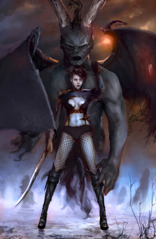 ![[Image: cyWNUM6.jpg]](http://i.imgur.com/cyWNUM6.jpg) And wip done in about 6 hours, trying to speed up my work and create something "cool" in less time also starting with color from the first. 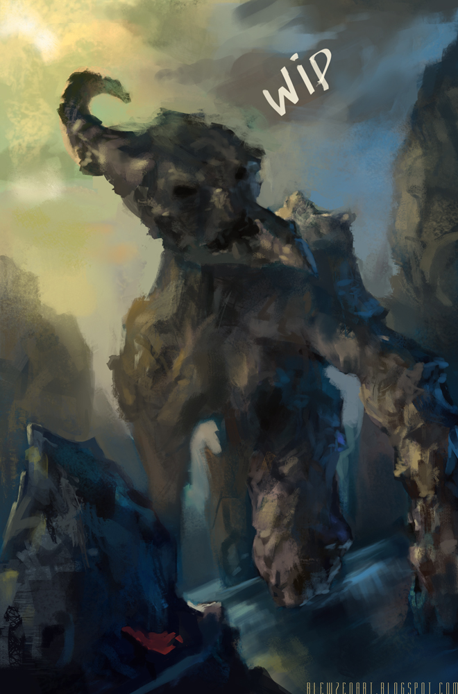
10-25-2013, 03:12 AM
Hey, love this golem dude wip, can't wait to see it done ;)
|
|
« Next Oldest | Next Newest »
|