Posts: 161
Threads: 0
Joined: Aug 2013
Reputation:
9
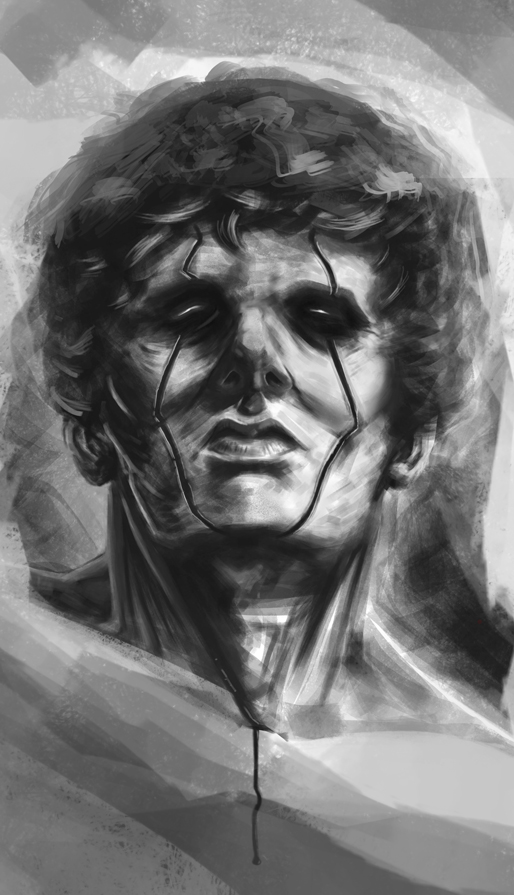
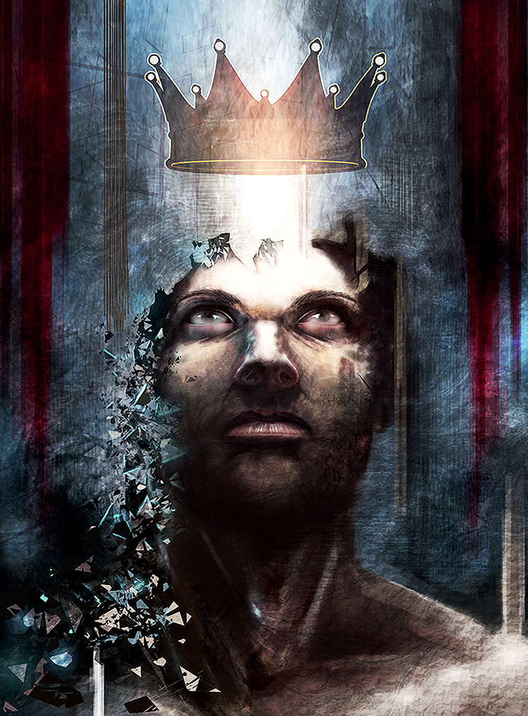
Looks pretty cool so far, I would bring it all down a little on the canvas so his head isn't cut off at the top. Also, His eyes don't seem to have the same perspective as his nose and chin do. I would either make them look like they are pointing upwards or downwards, because right now they are kind of just looking straight (which might be fine if it was a square canvas).
Some harsher/darker shadows might be nice along with some brighter rim lighting. if your painting in black and white it is important to accentuate the lights and darks because there is no color to break things apart.
Hope that helps.
Posts: 32
Threads: 4
Joined: Oct 2012
Reputation:
0
Thanks JJ ! Something looked odd and I think it might be the eyes.
Thanks a lot for the return !
Posts: 266
Threads: 28
Joined: Sep 2012
Reputation:
13
Your lighting is off a tad, but it's easily fixed by working on a face study with the right lighting.
Also you are dipping to black too often and it is flattening your image.
Posts: 32
Threads: 4
Joined: Oct 2012
Reputation:
0
Thanks Mike ! Much Appreciated ! I'll try to fix that
Posts: 360
Threads: 10
Joined: May 2013
Reputation:
5
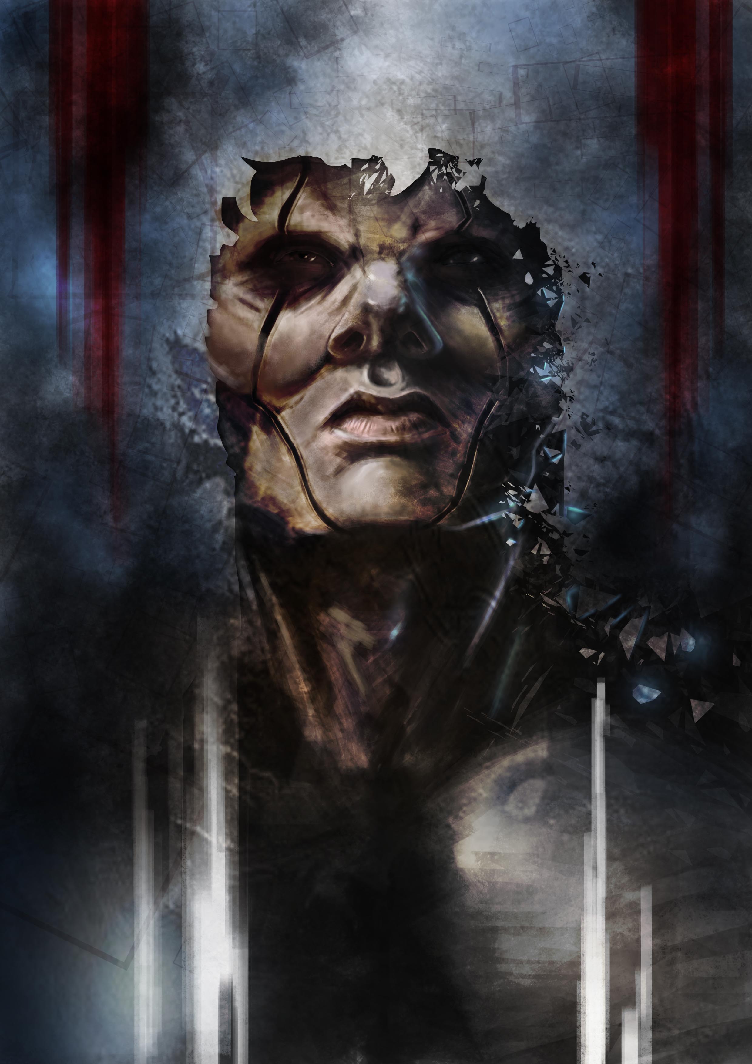
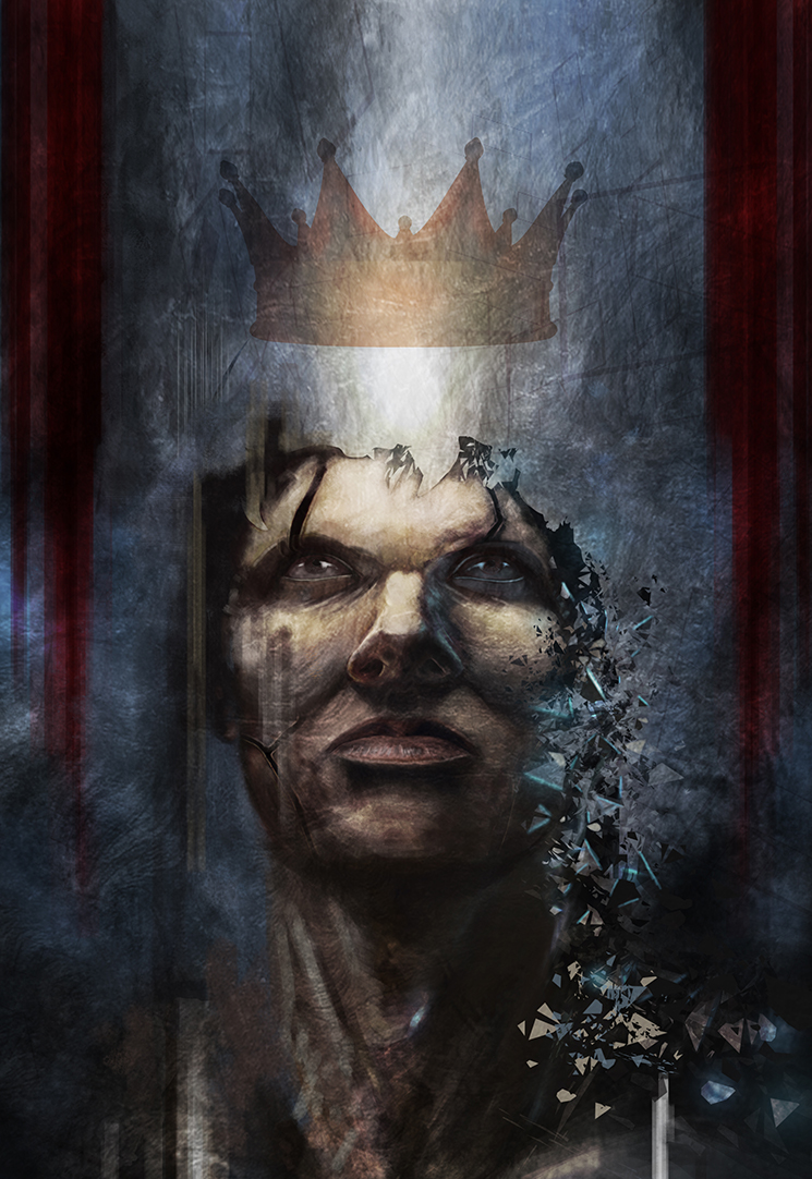
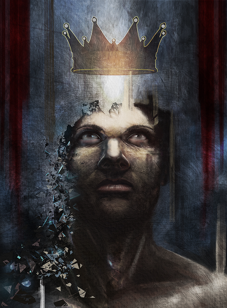
Whoa! The first and the last one look like they were done by different artistis. Congrats on the HUGE level up on this work, Lloyken.
Meybe the nose could be fixed? I think it doesn't match the rest of the face.
Posts: 32
Threads: 4
Joined: Oct 2012
Reputation:
0
Thanx Rognoll !
I struggle with the nose from the beginning... I'll refine that tomorrow !
Posts: 905
Threads: 39
Joined: Sep 2013
Reputation:
51
Yeah, seeing the first one then this one is just impressive, and makes me happy for you and want to paint something too! Good job man!
Posts: 32
Threads: 4
Joined: Oct 2012
Reputation:
0
Thanks a lot Meat ! Your answer really made my day ! See you soon for a new painting !


