Flo's sketchbook
Hi everyone,

here is the newest character art for the card game, name is Goaliath.

I still feel like I don't have too much a grasp of values, colors (especially color temperatures) and edges. But also I don't know where to start. If any of you guys have time, please help me see my short comings. I really want to improve in the limited time I have next to working full - time.

Cheers,
Flo


Attached Files Image(s)


Please help me getting better by checking out my sketchbook

HOMEPAGE http://floart.weebly.com
Reply
quick film study :)


Attached Files Image(s)


Please help me getting better by checking out my sketchbook

HOMEPAGE http://floart.weebly.com
Reply
a perspective study about unparallel planes and a workflow study inspired by http://texahol.blogspot.de/2013/05/some-...about.html


And some stuff from work


Please help me getting better by checking out my sketchbook

HOMEPAGE http://floart.weebly.com
Reply
mo' pics.

a bot sketch, a livestudy of a wooden maniquin and some mutated dude.

c n c always welcome.

Cheerio


Attached Files Image(s)


Please help me getting better by checking out my sketchbook

HOMEPAGE http://floart.weebly.com
Reply
Hey guys,

this is what I worked on the last few days. Hope you like it.

Cheers,
Flo


Attached Files Image(s)


Please help me getting better by checking out my sketchbook

HOMEPAGE http://floart.weebly.com
Reply
shroomutant


Attached Files Image(s)


Please help me getting better by checking out my sketchbook

HOMEPAGE http://floart.weebly.com
Reply
I did a armor study and then redid it after a day from memory. this is what came out. I thought the design was a bit boring plus I couldn't remember a lot of it, so I decided to add some interest.

the study from ref is saved on another pc, so I can't show it.

Here's the original: http://www.holidaycheck.de/data/urlaubsb...057265.jpg

Cheers,
Flo


Attached Files Image(s)


Please help me getting better by checking out my sketchbook

HOMEPAGE http://floart.weebly.com
Reply
1,5 h lion study for the next character card


Attached Files Image(s)


Please help me getting better by checking out my sketchbook

HOMEPAGE http://floart.weebly.com
Reply
study from memory


Attached Files Image(s)


Please help me getting better by checking out my sketchbook

HOMEPAGE http://floart.weebly.com
Reply
Man. That mannequin still life study is sick! ;D
Would love to see you apply that kind of texture detail and edge control to a personal piece, go apply them studies!

Reply
Hey Adzerak.

Thanks a lot, nice to hear. I learned a lot from that study, but since then I didn't paint anything with the same level of finish. The way I handled edges in that is something I do more now in every piece.

Btw looked through your deviantart account. I really like it man, nice lighting you got going on. Your pencils are really solid.

I still struggle a lot with getting the right tones and lines with pencils to give it a feeling of solidity.

Left: Study from photo and some stuff... Right: from memory

Cheers,
Flo


Attached Files Image(s)


Please help me getting better by checking out my sketchbook

HOMEPAGE http://floart.weebly.com
Reply
The new character card.

Leo Kahn is also a goaly with the ability to enhance the moral by roaring.
As usual: Lines by Lena Kuschke, painting by me.

Painting so much long fur is very meditative.

Cheers,
Flo


Attached Files Image(s)


Please help me getting better by checking out my sketchbook

HOMEPAGE http://floart.weebly.com
Reply
It is Michelangelo's 450th day of death, so I thought it only right to do a quick study of his David.


Attached Files Image(s)


Please help me getting better by checking out my sketchbook

HOMEPAGE http://floart.weebly.com
Reply
Hey everybody,

I think I found a new way to do studies more efficiently. Where I before put the reference image next to mine so that I could see it while doing the study, I tried this time to hide it and only take a look at it to know what to draw next. In effect I zoomed close to my picture and when I didn't know what or how to paint something, I panned the camera to the reference, took a look, tried to remember the thing and went back to my painting. That way I was forced to mentally say stuff like: "the wrinkles on the frogs shoulders are bigger than on his stomach".

Also it helped me to make it my version. I looked at a special spot, had an idea how to paint that and tried it. After a while I went back and compared. The whole time in between I didn't have the reference image telling me that I am doing good or bad. I just did what I thought was working and compared the result.

Maybe it is something worth trying for you too?

If you do I would love to hear if it did something new for you.

roughly 2 h for the frog

Cheers,
Flo


Attached Files Image(s)


Please help me getting better by checking out my sketchbook

HOMEPAGE http://floart.weebly.com
Reply
2 30 min Rembrandt Color Studies. Left the original --- middel from reference, with the above mentioned technique --- right from imagination. I am not too happy with the result, it is too saturated, but I learned a lot from it.

And a very stylized portrait of Brönsted, a famous chemist.


Attached Files Image(s)


Please help me getting better by checking out my sketchbook

HOMEPAGE http://floart.weebly.com
Reply
Nice studies! David and the Frog are specially nice. Rock on!

Reply
A big /agree with Ursula here, those two studies look real jummy!
Keep going at it with the face studies, skin's really hard so I guess squinting helps a lot so you can identify the biggest shifts in value, saturation and hue in the face early on and block them in.

Oh, yea... Forgot I even linked to my DA here xD there's a lot more of sketches in my sketchbook tho, so peek in sometime if you feel the urge to give some crits :)

Reply
Dude, that latest sculpt study and the frog are really sharp and a huge jump forward. Keep pushing in whichever direction your heading mate because it's really paying off.

All the best mate.

Reply
Hey guys,

@ Ursula: Thanks a lot :)

@ Adzerak: thanks for the nice words. And as for squinting, I use it but not always. Lucky for me I have glasses so when I want to see blurry I can just take them off ^^

When I am done here I will have a look in your sb :)

@ Warburton: thanks for the encouraging words. Between the lines of your words is actually something really interesting, namely "whichever direction you are heading for". I know lately I have been absent and that is due to me working full time, having a personal project (computer game, if anybody wants to playtest it ;) and having freelance work (the card game).

If I would have been without work, I would have catered my skillset more towards working for Magic / Applibot / etc. At first I felt bad about doing 40 h weeks of not strictly painting / designing and there are days where it is not easy to justify the detour for myself.

But I organized a weekly study session at my office and I learned so much by preparing the learnings for my coworkers. So there is some learning at work and the frog is something I had to paint for my work. I guess what I want to say is: even when you are not on the path you sought out for yourself in the first place, it is still possible to stay close to it and grow.

But the long term goal is still working freelance and I will get the sooner or later :)

That's what I did the last days:

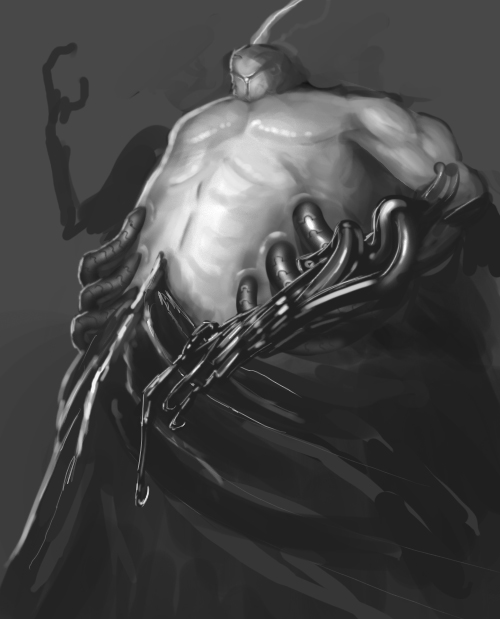
A quick sketch to warm up ca 30 min.


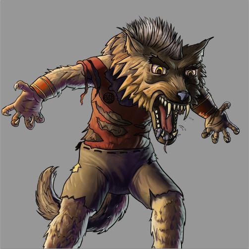
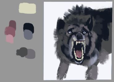
Rotkärtchen: the big bad wolf

Lineart by Lena Kuschke
Colors by me
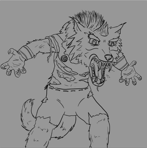


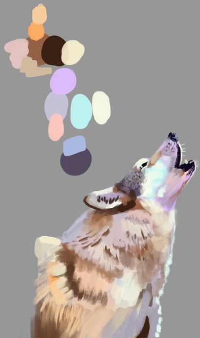
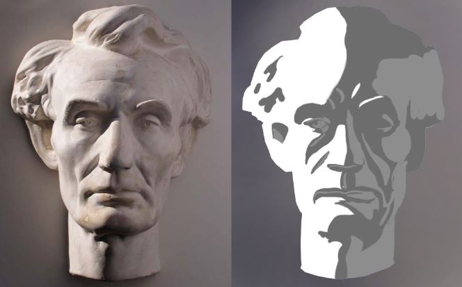
These are the studies I did for the card art. 2 color- and fur-studies and a lighting study of a side-lighting from James Gurneys book "Color and Light"


This will be the next card: Orza Reckenhauer.

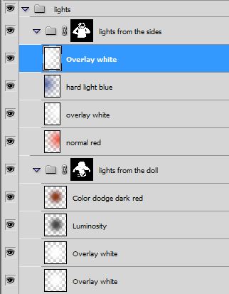
To be honest I had some trouble with the lighting in the Rotkärtchen - piece, so this time wanted to use a different approach. First I put in all the colors I wanted in the piece on seperate layers.
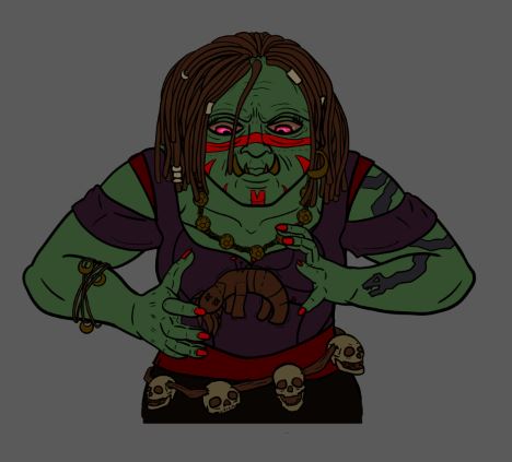


Then I used the Gradient tool with a single color in the circular mode (example of the effect).



With that I dropped in 2 colored lightsources from the sides and another one from the middle like in this image:

[Image: fortune-teller.jpg]

This is how I arranged my layers:


This is the result, after masking out planes where the different lights don't fall on.
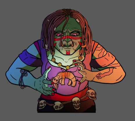


The next steps will be adding textures and rendering out the forms more.

I hope this made sense and maybe even helped somebody. :)

Cheers,
Flo


Please help me getting better by checking out my sketchbook

HOMEPAGE http://floart.weebly.com
Reply
Fruitstudy 1,5 h :)

foto by Flowerstock
http://flowerpowerstock.deviantart.com/g...1?offset=0


Attached Files Image(s)


Please help me getting better by checking out my sketchbook

HOMEPAGE http://floart.weebly.com
Reply


Forum Jump:


Users browsing this thread: 295 Guest(s)