Posts: 848
Threads: 20
Joined: Jan 2012
Reputation:
29
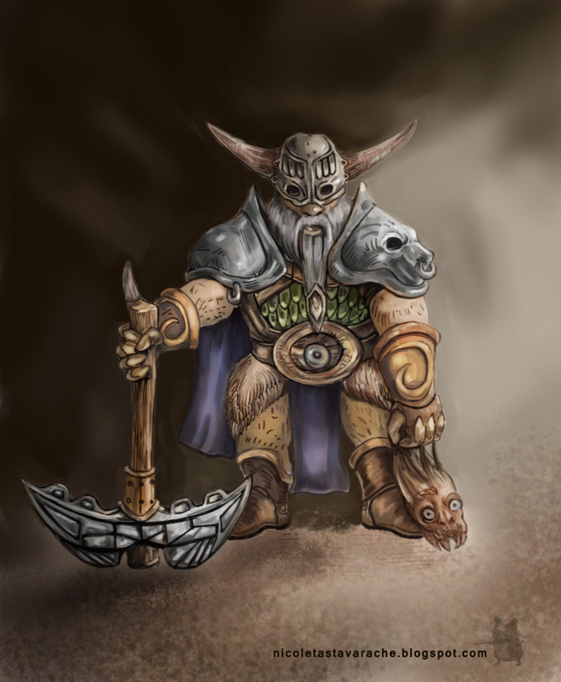
Nice job. With character sketches, especially ones with more of a simple background it can be very beneficial to block in the horizon line first, even if it is just to create the background with. Like the ground on your dwarf, you could have transformed the texture to recede back in perspective and it would have instantly created more depth.
Really good idea to do a daily sketch though. I like the texture on the axe handle, had a very nice table top rpg feel to it. Keep up the good work :)
Posts: 850
Threads: 4
Joined: Mar 2013
Reputation:
21
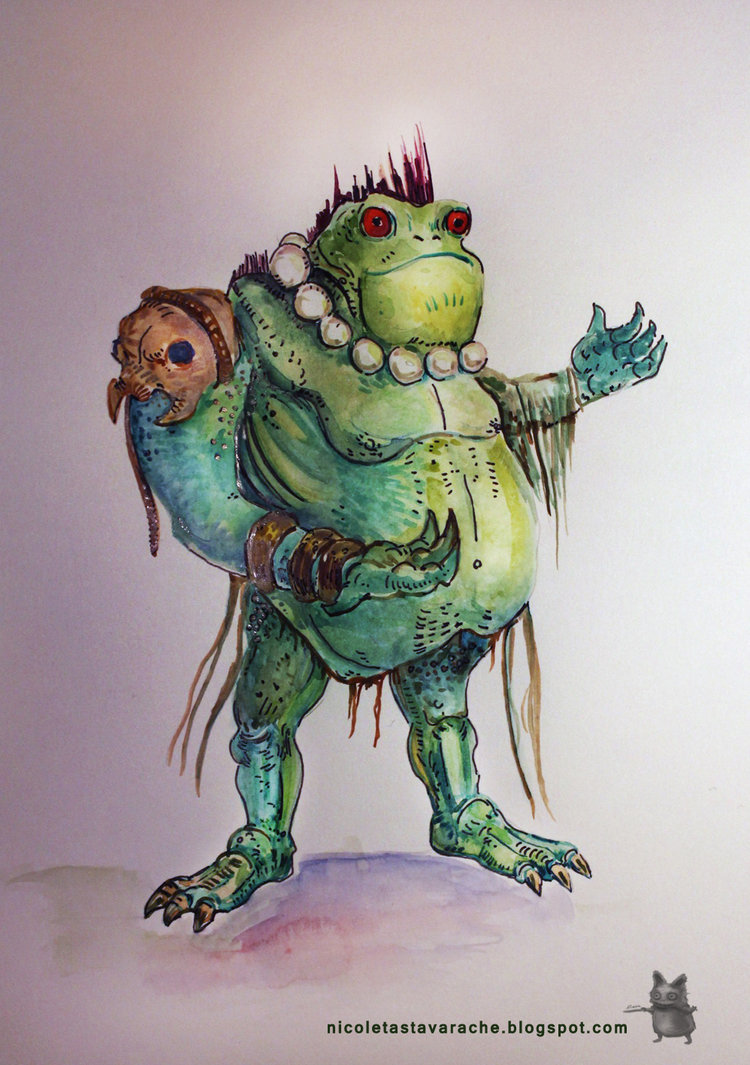
Nice idea, doing a daily sketch, influenced by your mood! Love that first one especially :)
And yes, it can be really overwhelming to learn all those concepts you mentioned at once. But that's exactly what studies are for - pick one topic you want to improve on, and see what you can do to get better at just that... than apply the new learnt knowledge in a painting, trying to get just that area right (whatever it may be - values, a certain rendering style, etc). If repeated over and over again, it will become second nature and you won't have to think as much when painting something.
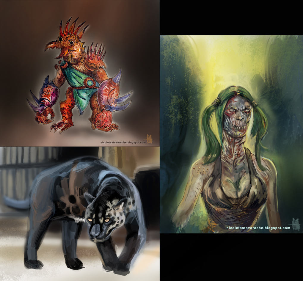
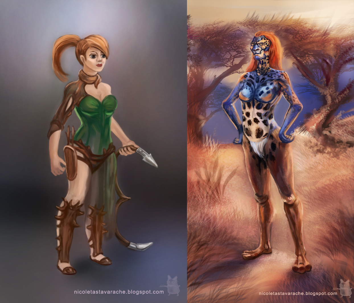
The panther is cool!
Posts: 45
Threads: 2
Joined: Mar 2014
Reputation:
0
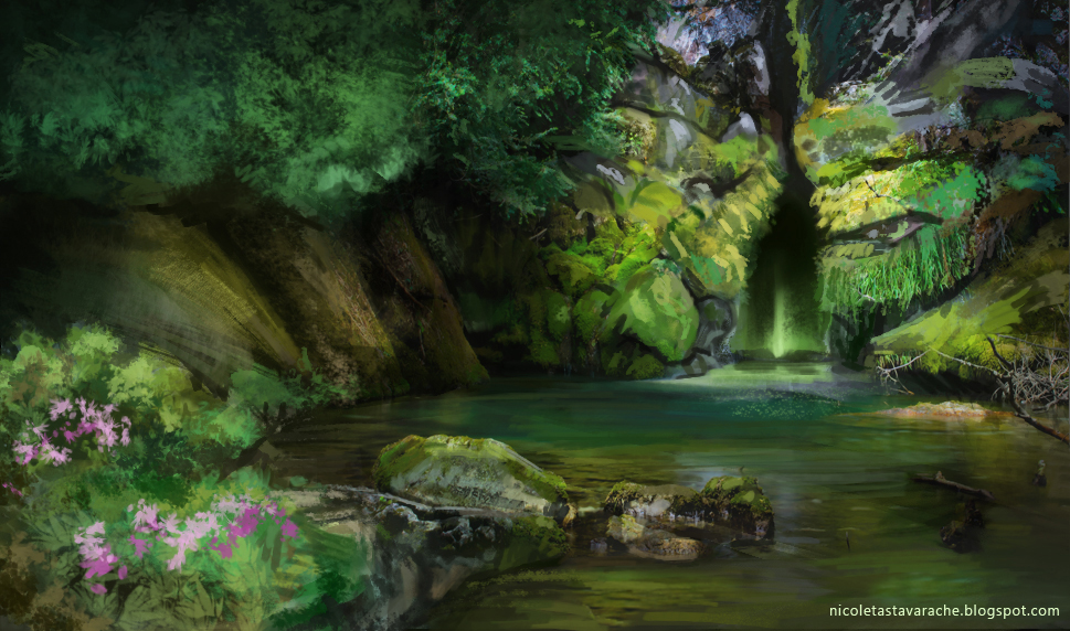
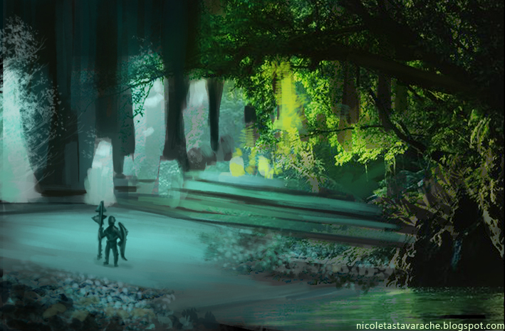
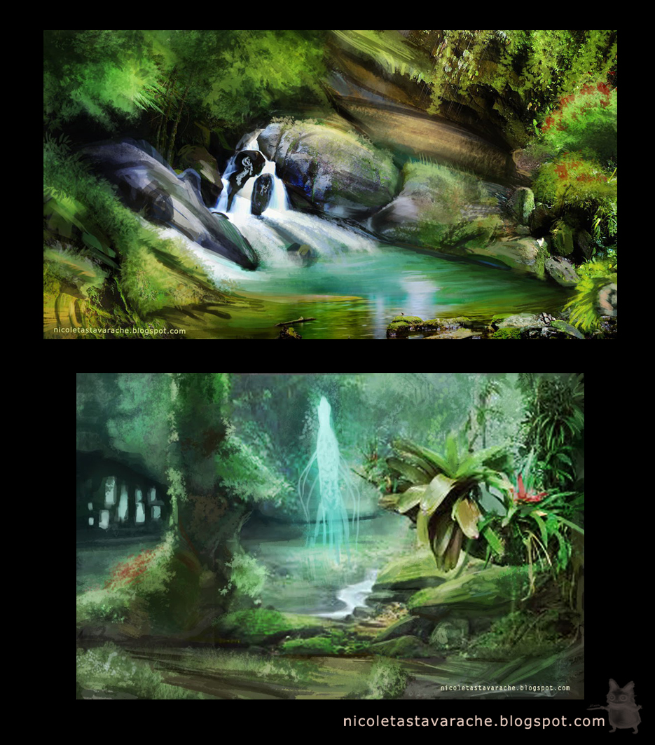
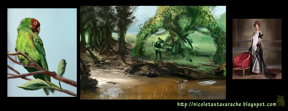
Those landscapes are so dreamy. It feels like you're in a fairytale when you look at them. Absolutely love them!
Posts: 850
Threads: 4
Joined: Mar 2013
Reputation:
21
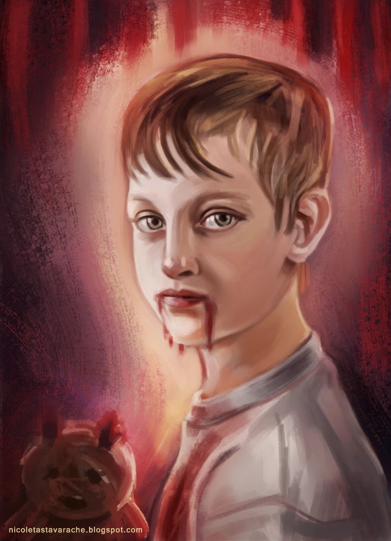
Creepy kid is creepy >_<
The forest looks a bit cluttered - so much saturation and detail going on everywhere! But the entwined roots are lovely :)
Posts: 848
Threads: 20
Joined: Jan 2012
Reputation:
29
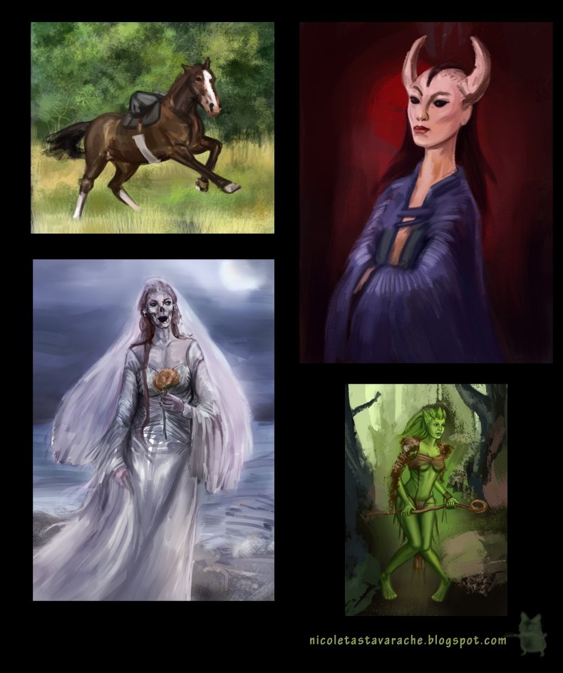
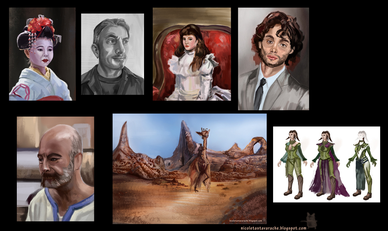
Been a while since I popped in here, and I must say I am shocked by how much you have improved in that time. Its almost like a completely different artist. Your rendering of eyes have improved tenfold. You still are a bit weak on your values though inj your imaginative work. Compare the zombie piece for example to the master study you did in this last post and take note of how dark the eyes are on the face, how the hair frames the face with a darker value and then the wall is lit to make a gradation of light so that it reads dark-light-dark-light. Keep this in mind when you work on your pieces from your head and nothing will stop you :D Keep killing it Nika!
Posts: 1,118
Threads: 12
Joined: Nov 2013
Reputation:
63
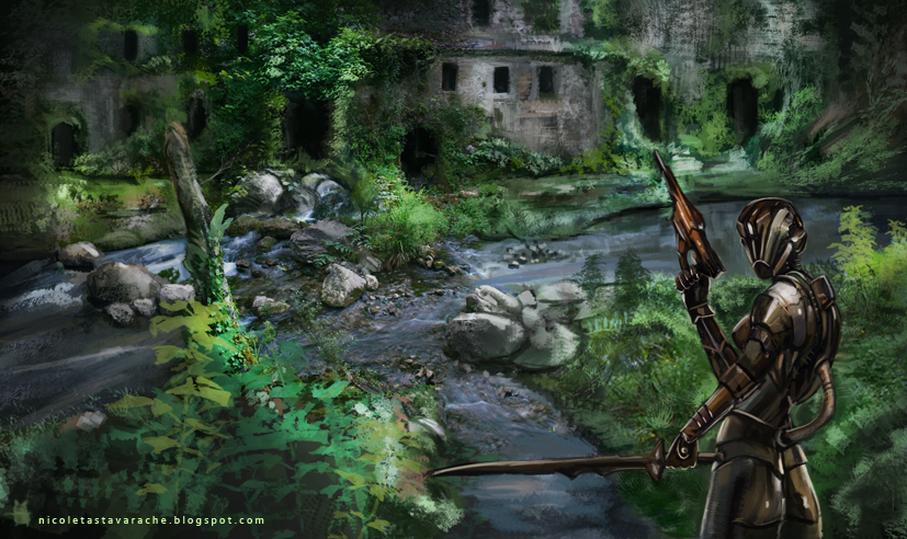
The placement of the arms in the last piece is some what confusing at first glance. I couldnt tell at first if the arm with the gun was in front or back. Id move one of the arms so the elbows arnt both lined up. The character design looks good though.
