marty's art addiction
#1
huh hello guys my name is martin i come from italy and i'm TOTALLY ADDICTED FOR ART.
i won't lie to you i'm a lazy f**k, i will do my best to keep this updated, but seriously, i spend to much time painting/playing guitar/cooking :D but i really want to be a part of you crazy artists around here! sorry for my italian... here is something, hope it uploads well.Bomb

Reply
#2
hey! i was getting crazy with zbrush lately, i won't upload anything cuz it look like...huh.. >.<
b...but here is something enjoy!


study
[Image: nYd1hzd.jpg?1]
sketch :3
[Image: ZQQDfhb.jpg]
[Image: dzdwtk7.jpg]
Reply
#3
Addicted to art you say? Sounds good to me!
Looking good so far :)

Keep it up and keep posssstiiingg

sketchbook | pg 52
"Not a single thing in this world isn't in the process of becoming something else."
I'll be back - it's an odyssey, after all
Reply
#4
(06-25-2014, 07:38 AM)smrrfette Wrote: Addicted to art you say? Sounds good to me!
Looking good so far :)

Keep it up and keep posssstiiingg

haha yes i wish i could do that all day not worring about being human!
Reply
#5
Off to a good start here. More please. :)

Reply
#6
some sketches i will paint tonight maybe! i will try to bring life to them cuz they look dead......
also i'm not feeling very well mentally i think i need a good spycho haha :c

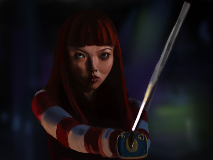
kill la kill - ryuko! huh about the sword... i know it looks weird i will try to fix that <..<
[Image: 1la9kSt.jpg?1]

futuristic hong kong maybe ? i dunno haha composition to cut...
[Image: SYVYe2T.jpg?1]
alien forest or sort of the comp here looks very claustrophobic i need to read something more about it next time
[Image: lp47nGK.jpg?1]
will upload some painting tonight maybe ciao :3
Reply
#7
Really like your environment sketches there, the style and feel of the shapes you use in your designs is rather distinctive. The layering in the future Hong Kong works well, so it has more depth than the forest one. A couple of things might be contributing to that closed in feel - for one the placement of the largest tree in the front kind of blocks the viewer's eye from travelling deeper into the scene. There is also not really a very close foreground - whereas the Hong Kong one has the overlapping bush form, which works with the guy on the balcony to sort of frame things.

Hope that helps, and have fun painting!

Reply
#8
(06-27-2014, 05:49 AM)clockodile Wrote: The layering in the future Hong Kong works well, so it has more depth than the forest one. A couple of things might be contributing to that closed in feel - for one the placement of the largest tree in the front kind of blocks the viewer's eye from travelling deeper into the scene. There is also not really a very close foreground

thank you so much for the crit it helped me understand what was wrong with that!

Reply
#9
hey sorry for the inactivity painting takes my day too often haha
some quick paintings i don't know howmany hours around 3 or 4 each!
[Image: MMKdxmn.jpg?1]
[Image: u57kBCL.jpg?1]
[Image: xkbQoCz.jpg?1]

WIP of "hong kong" i'm loosing my mind over that piece o...o so many details so much still to learn about lighting... but it's quite fun hahaha
[Image: 7ChYXjt.jpg?1]

Reply
#10
haww no matter how much time i put into art it is never enough, it feels like it devour your life o...o

here's some sketches
[Image: iMiNK36.jpg]


[Image: P9M1hns.jpg]


[Image: GsmwF5f.jpg]


finished this one
[Image: RZvYYjJ.jpg]


WIP! i want to achieve a glossy painting style, i love that kind of stuff o.O
[Image: n4IzpzU.jpg]

Reply
#11
Nice stuff man. Keep it up.
Reply
#12
HAI I'M BACK O...O
some stuff from the last week i'm sorry for having abbandoned this thread but i have no excuses!!
i'm addicted to art as i said and sometimes i really lose control of myself haha... hum.

materials
[Image: TJ9aDAl.jpg]

tryning to stylize i dunno looks kinda weird to me but i like were i'm going
[Image: 1Faq8rf.jpg]
[Image: okCKf8M.jpg]

messy charcoal stuff the walking dead and some kawais haha
[Image: Wa4ZJvF.jpg]
[Image: o8veYpL.jpg]


[Image: iBcqN4q.jpg]
my garden life drawn
[Image: j8D3FW5.jpg]

ambient oclusion try i need to finish it i love that stuff you should try it i'll leave you some links!
[Image: Y1DIOl1.jpg]
http://theartcenter.blogspot.com.br/2010...ocess.html
http://theartcenter.blogspot.com.ar/2010...art-2.html

found an emulator and started playning old games like kingdom hearts so i got inspired to draw sora haha i love nomura style so bad!!
[Image: 1sGeSPW.jpg]

Reply


Forum Jump:


Users browsing this thread: 5 Guest(s)