11-23-2014, 03:33 AM
Light studies, sketches and paintovers.
![[Image: qM5PZbh.png]](http://i.imgur.com/qM5PZbh.png)
![[Image: p6738HU.png]](http://i.imgur.com/p6738HU.png)
![[Image: LxTfU4u.png]](http://i.imgur.com/LxTfU4u.png)
![[Image: ggGnm2b.png]](http://i.imgur.com/ggGnm2b.png)
![[Image: b67XfqC.png]](http://i.imgur.com/b67XfqC.png)
![[Image: qM5PZbh.png]](http://i.imgur.com/qM5PZbh.png)
![[Image: p6738HU.png]](http://i.imgur.com/p6738HU.png)
![[Image: LxTfU4u.png]](http://i.imgur.com/LxTfU4u.png)
![[Image: ggGnm2b.png]](http://i.imgur.com/ggGnm2b.png)
![[Image: b67XfqC.png]](http://i.imgur.com/b67XfqC.png)
|
ABANDONED HIDEOUT
|
|
11-23-2014, 06:16 PM
@Gliger Awesome studies! Is the dude with strings personal? ;D
@Paul Kokshin AnnaSophia looks flat compared to your previous stuff. Try checking values using the black saturation layer on top of all layers. I feel like there is not enough value range on her face, some things could be pushed back and forth... Could be because of ref though. Ill suggest to choose refs with nice direct lightening and deep core shadows for the portraits. Its hard to make an interesting looking face when the value is pretty much the same overall Study from yesterday's stream. Want to focus on tutorials and traditional medium this week, so ill brobably stream less hours 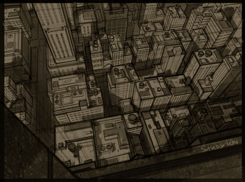
11-23-2014, 07:37 PM
Thanks for the feedback Caisne. I didn't finish it actually, but don't feel like I want to work on it more for now. Maybe will come back to it some time later.
Love the city, looks even better with shadows :D The house at the top of the page looks nice too :)
11-25-2014, 07:05 AM
@Gliger Awesome Studies man! Good to see how you keep in mind the light direction and stuff. Will you finish the guy in the suit? I'd love to see more finished stuff from you, man.
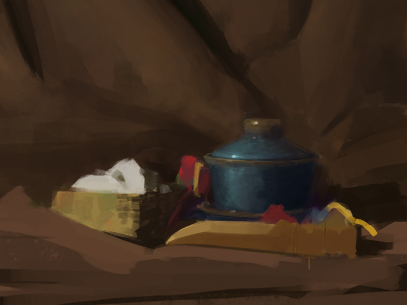
Getting into color. Comes out awful. still life from today, going to watch some tutorials to get fundamentals and color theory into my head. 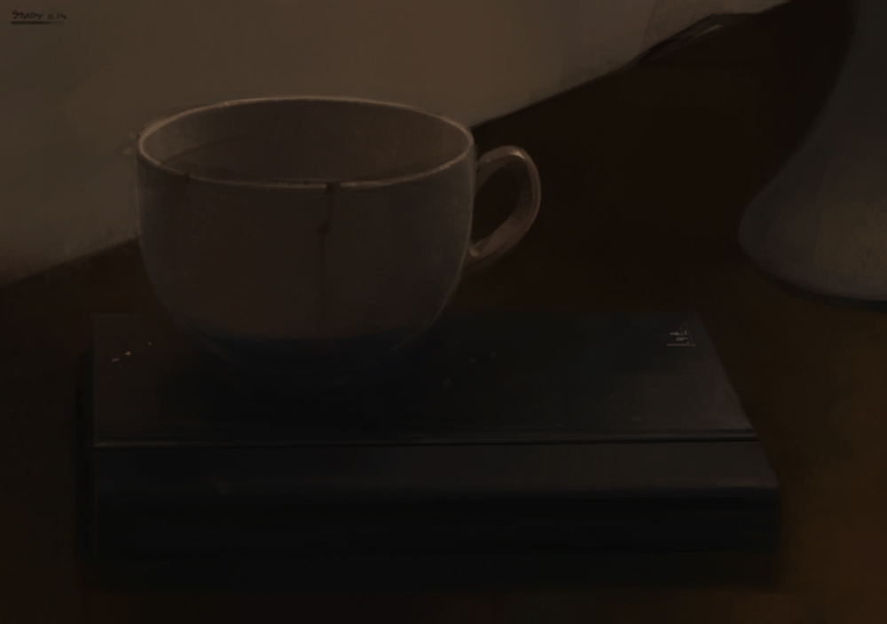
11-26-2014, 06:30 AM
@Chrome Good to see your back, friend. Nice Study, I'm not sure if the Reference looks exactly the same but in any case, you should use Atmospheric perspective to trick the viewer eye that there one objects are closer, and other are further from us. http://en.wikipedia.org/wiki/Aerial_perspective
Also Value wise... The value of the building is pretty much the same. It could be just bad ref really. When looking for ref, try to pick an image with nice contrasts, shadow, verity of value, shapes etc. Today Still Life. Need crits guys. 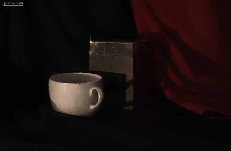
11-26-2014, 07:40 AM
@Caisne I can't really crit much without a reference picture, I mean I can crit the rendering (edges, simplification etc.) and I can guess stuff such as, I haven't really ever seen a cup with such low specular reflection, generally I can see the handle reflected on the cup itself, specially with a dark surrounding.
About the rendering, I would pay extra attention at the focal points of the image, for me it's the edge of the cup and the specular highlight in the box, create extra definition by using sharp clean edges and extra detail in those zones. I guess you purposefully decided not to use it, but some blur as the eye moves from the focal point can help you create that contrast too. The fabric feels kinda flat, you can suggest strong form even if you lose the details, the airbrush might be the answer. Btw: on the shadow that the cup casts on the box, are you sure it was that dark in the middle? a white object should bounce a lot of light. Take all of this with a grain of salt, most of it is just guessing, and I'm always wrong, but I hope I helped you at least a bit . This mornings stuff, Netero and a bunch of light studies from imagination. ![[Image: LEcv47I.png]](http://i.imgur.com/LEcv47I.png) I mentioned to Paul that I needed a reset from all the studying, so I decided to work again on my IP thingy. ![[Image: QaFmYhU.png]](http://i.imgur.com/QaFmYhU.png)
11-27-2014, 10:12 AM
@Gliger, thx for the awesome crit man. you point out things i really wasn't aware of! Like the specular reflection on the cup. I see that it fells totally matte now, when its really reflective and shiny.
Awesome job with that character sketches man. Especially i love the colored one. And it shows that you worked on ears recently @Caisne yeah, agree i tent to go too black. Need to do something about it. Still life from today. No color pick no CTRL-Z fuck saved with all that coffee shit. facepalm it's written wrong 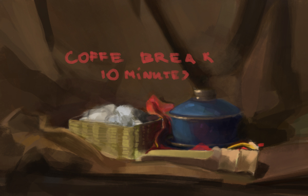
11-28-2014, 07:19 AM
Morning color study. Still using color picker and ctrl+z doesn't help too much.
 Also joined AJ's WHAS challenge. So gonna be doing lots of sketchbooky stuff. 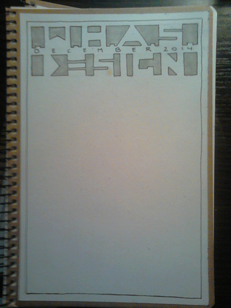 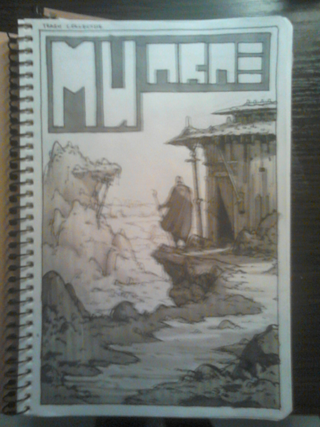 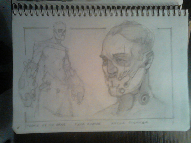 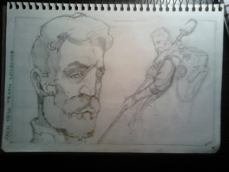
11-30-2014, 10:32 PM
@Paul Kokshin thx man! Love your style searching stuff. I personally like the Leslie on the right more. No just 'cause I love more realistic stuff, but this thing looks really unique. Like edge control and using blur to get focus, realistic rendering with somehow cartoony proportions. Theres not too much stuff like this around. But I feel like her chin is a little to far left on the picture. Feels like it too protruded Check that.
Shit I was doing in a Hideout lately. The Scribe Gave me the hardest time. i started this guy over two times and spend two days working on him. damn. 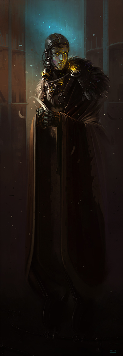 And one more environment for the WHAS challenge
12-02-2014, 10:48 PM
@Caisne, oh man, your traditional sketches are amazing, I was watching your livestream earlier and they are jaw-dropping.
Not much, just a page (99.999% from imagination, I think there are 2 sketches from reference), I'll probably upload the rest of the stuff I've been working on when it's finished/the study pages are full like this one. ![[Image: KxzoK5o.png]](http://i.imgur.com/KxzoK5o.png)
12-03-2014, 09:16 AM
@Gliger Nice legs man!
More sketchy stuff. Sorry for the quality guys. 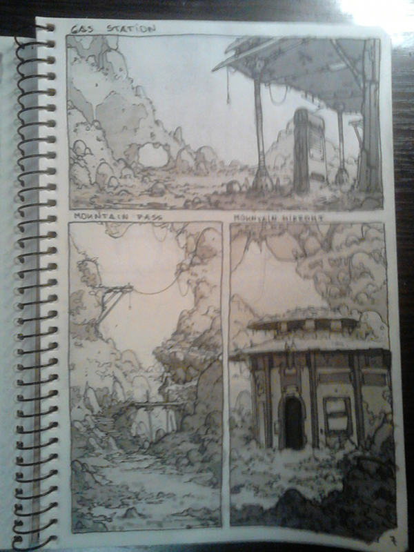 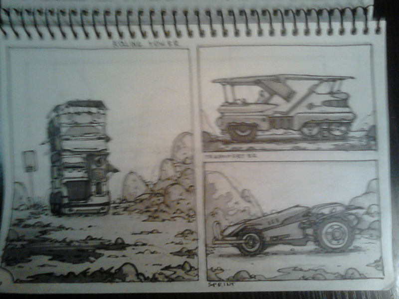 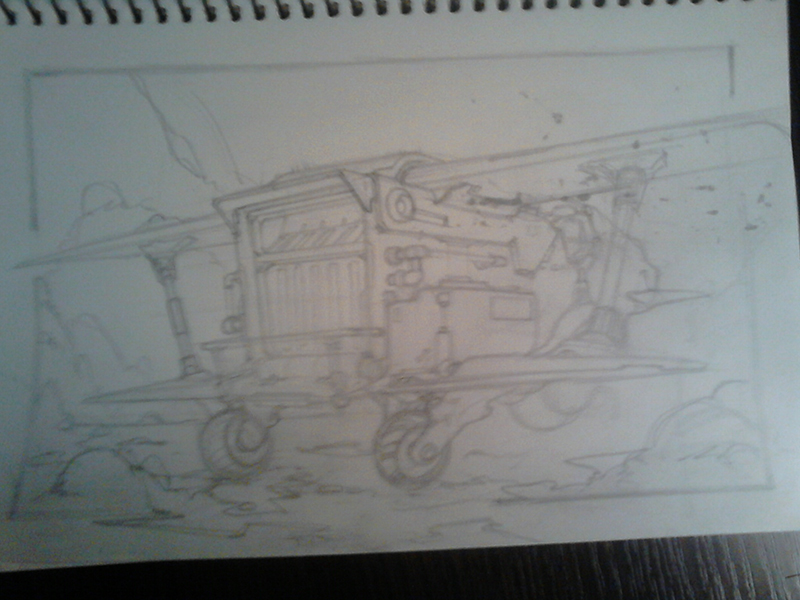
12-07-2014, 04:19 AM
Soo much awesome stuff guys! keep it going.
Im adding study of i dont know what exactly, but when i took the picture i knew i must draw it. @caisne: thanks for the comment.You are absolutely right. Next time i will add more air to it.
12-08-2014, 09:55 AM
@chrome Awesome study man! Love how you blurred the background, it makes the boat ro pop in and focal point.
Sorry for not posting for too long, got my old scanner from my parents place. turned out even worse that my camera phone. at least its not to blurry.
12-11-2014, 06:10 PM
What up folks.. i like to join the pawwrrrrteeee if you dont mind :) i guess ill share a couple things i just did. So im an illustrator right? but like, im taking a zbrush class at school this semester, cause.. zbrush is awesome, and i think combining 2d and 3d can be very beneficial for studying and for image making n shit. So, yea, here are a couple thingis.
![[Image: Guerrero_zps72b26626.jpg]](http://i1345.photobucket.com/albums/p680/jesse_flores5/Guerrero_zps72b26626.jpg) ![[Image: dragon_zps528a4bb6.jpg]](http://i1345.photobucket.com/albums/p680/jesse_flores5/dragon_zps528a4bb6.jpg)
PORTFOLIO http://www.artstation.com/artist/Jeso
Sketchbook: http://crimsondaggers.com/forum/thread-2586.html
12-11-2014, 06:33 PM
Hey guys, I just had a good look at the thread; Fantastic work and dedication! I just wanted to jump in and offer my support. Keep this going!
Also, I am planning to quit my cubicle monkey job at the end of Jan/early Feb next year and attempt to go fully freelance or at least bring the focus back to my art in a more dedicated way. I have lived in fear for almost 4 years even while working on my craft, at times, like crazy, but I have never taken the leap into really making it happen for myself. I don't want to allow myself to do that anymore. I wanted to draw a line in the sand, and commit to the task and do this partly by getting in on the work ethic that you guys have gathered momentum on. I have directed my own work programme so much in isolation in the past, that I think i need the right group to work with to help me not lose focus and I think this group might be it. I have been out of the art practice for a while, trying to live my life and regain balance, and now having sorted some shit out, it's time to refocus on it again properly. So yeah, I'll hope to start posting stuff in the New Year. I hope it is ok, if I also post some client work (not under NDA) that I will be doing starting Jan and get any feedback on that as I do it? Keep on dudes. Also Ihor, Awesome sketches man. To start with though. The only real time I have to do on art is during work meetings recently, so here is the last week's worth. I actually have to discuss "very serious and important" things while doing them......or at least appear to. hehe And I also managed time to sneak in a shit wip for a client. Really hard to work without a calibrated screen so the values and saturation are probably horrendous.  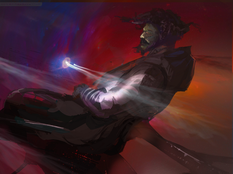
12-12-2014, 04:15 AM
Guys, I can't express how I'm grateful to you, for keep coming and making Abandoned Hideout inhabitant. Its a pleasure for me, and I hope for all of you, to see our little fellowship growing. Ive got a few things on my mind on how we can make our staying inside of a Hideout even more fascinating. I hope ill be able to share this thoughts pretty soon. Thank you for your support. To be honest I never thought it'll came this big when I started the Place.
@Paul Kokshin Thank you man! Actually used a Reference for that Ship, couldn't nail the decent one by myself. Awesome studies, don't you afraid to sketch referencing people in a subway? XD I haven't seen personal stuff from you for a wile man, you should do some more. @Jeso make yourself comfortable, man. Awesome Zbrush work! I see some minor issues with proportions on a character but overall looks great! Please keep posting. @Amit Dutta Its good to have you here man, make yourself comfortable! Nice sketches and the digital piece has an awesome mood. Looking forward for more finished work! Just finished this Spaceship. Took too long. Something is wrong, I fell like with each new work i tent to spend more and more time on it, getting deeper and deeper into the details. I feel like its some kind of OCD or something. I tried to set myself a deadline, yeah. This Spaceship has to bee finished two days ago. Damn.
12-13-2014, 07:45 PM
Hey Caisne, I really like your spaceship, has a cool kind of aggressive vibe to it, me personally, i cant do sci fi stuff for shit. Mainly cause i never do it or study it, and when i try it i just blows. But yea, cool stuff. Hmm for some reason that round thing on the left right corner of the ship pops out, i thing its because its round as opposed to the rest of the space ship is so angular. If i had to give any critique and this is nip picking, it would be to change the design of that rear round thing for something more boxy. But yea, keep up the hard work!
PORTFOLIO http://www.artstation.com/artist/Jeso
Sketchbook: http://crimsondaggers.com/forum/thread-2586.html |
|
« Next Oldest | Next Newest »
|