Posts: 903
Threads: 54
Joined: Feb 2012
Reputation:
18
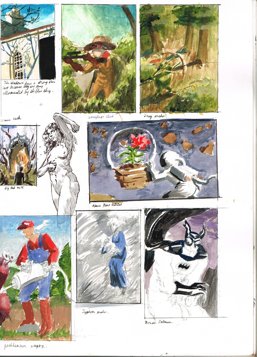
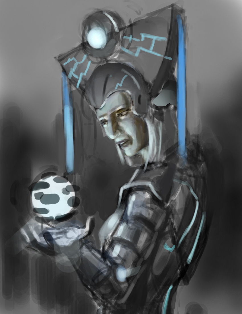
ungh those comps are juicy man. And is that a...robot chicken? :) Poster looks great too. Only nitpick is the space above the scary lady feels a little empty and I think I prefer the thumbnail version in terms of composition; maybe because of her change of pose. Either way, you totally nailed the mood and execution of it. You were going for "creepy as fuck" right?
Posts: 1,118
Threads: 12
Joined: Nov 2013
Reputation:
63
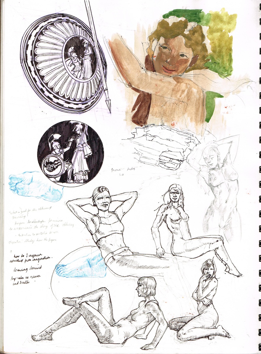
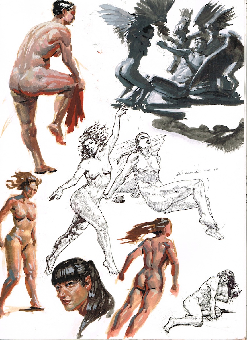
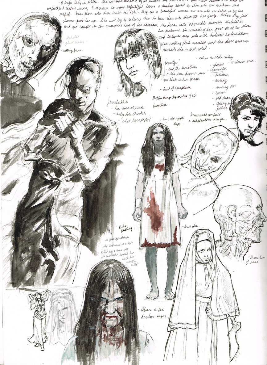
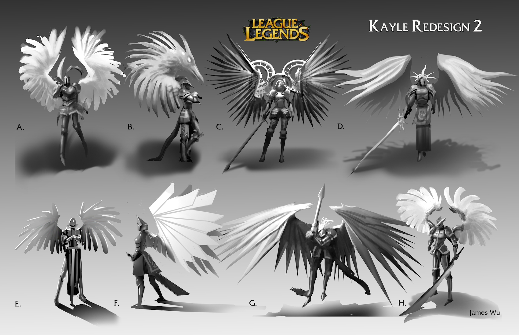
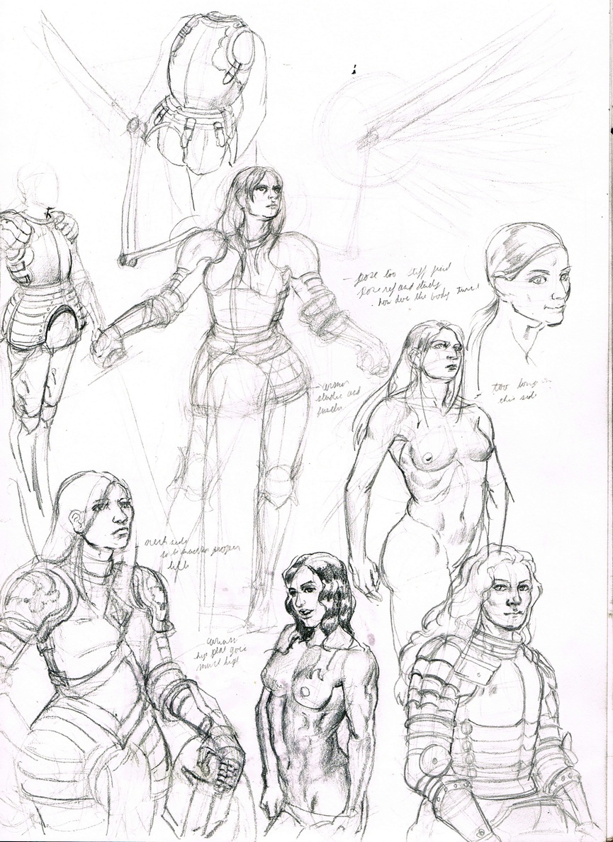
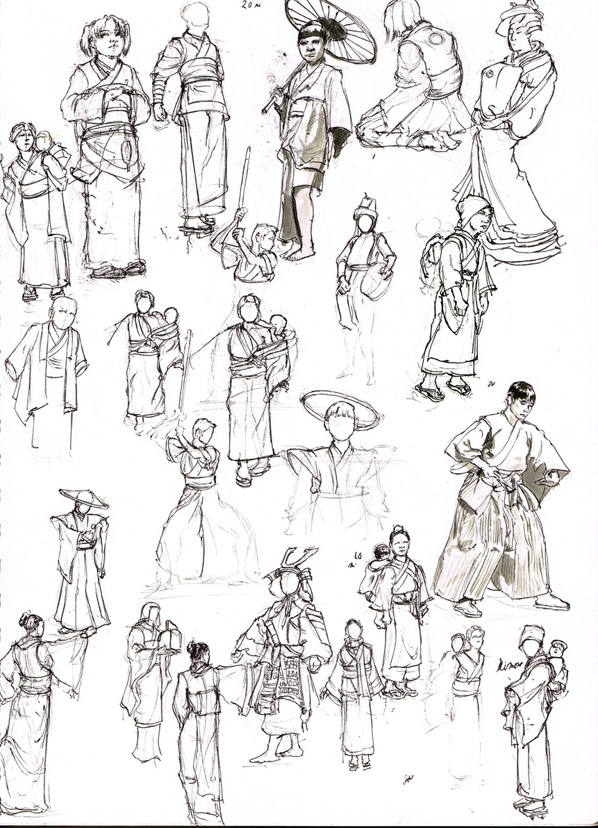
I love your line work. Those lady in white sketches look bad ass too. I have to agree with pnate on the final composition needing some work though.
Posts: 81
Threads: 2
Joined: Jan 2012
Reputation:
3
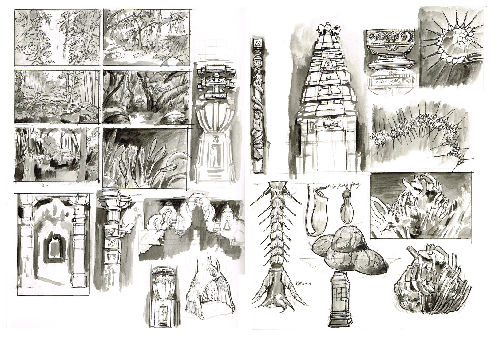
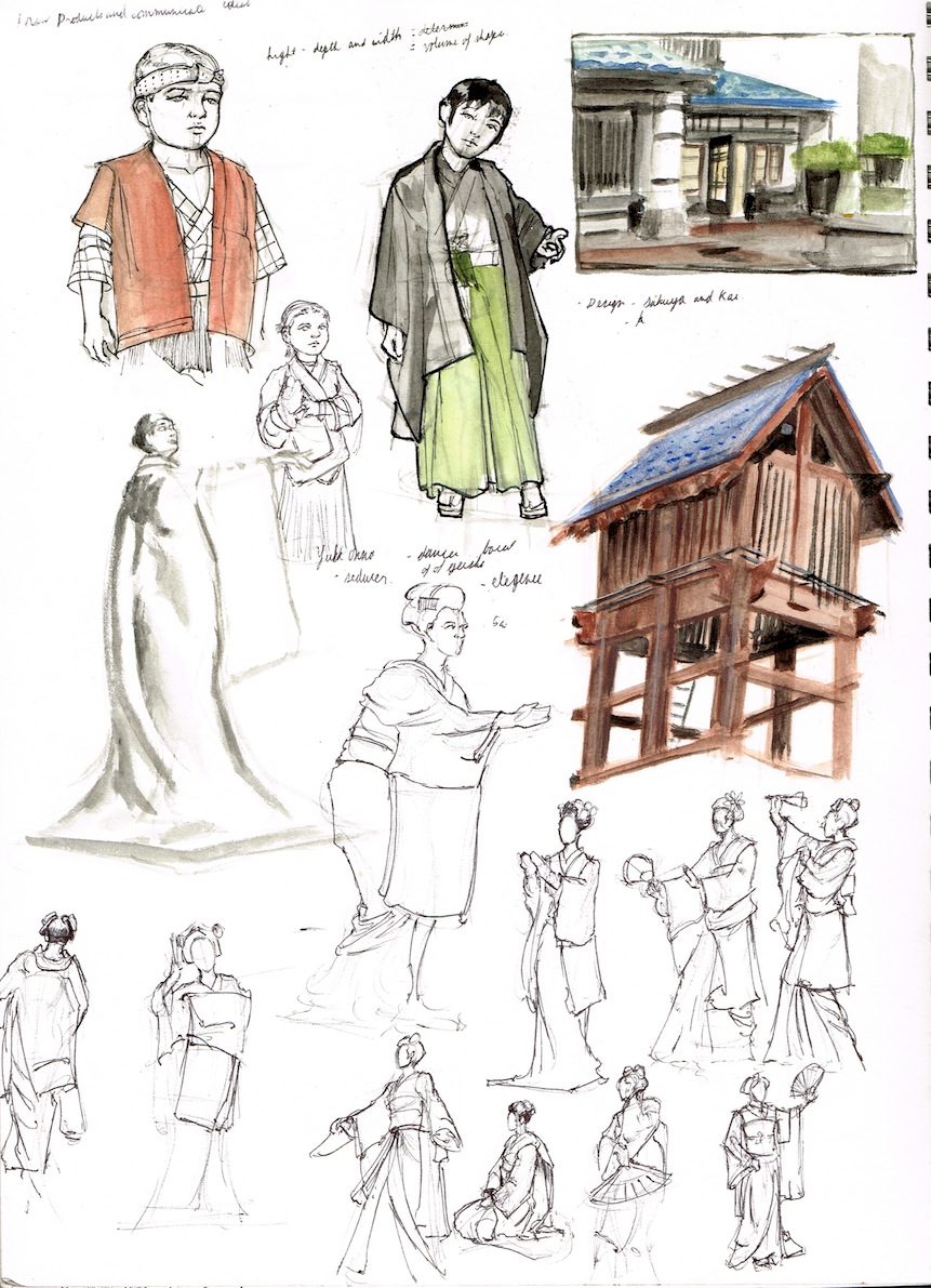
Lovely stuff man! Love the ink!
Posts: 488
Threads: 10
Joined: Jun 2013
Reputation:
38
Solid work dude!
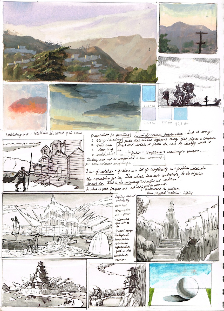
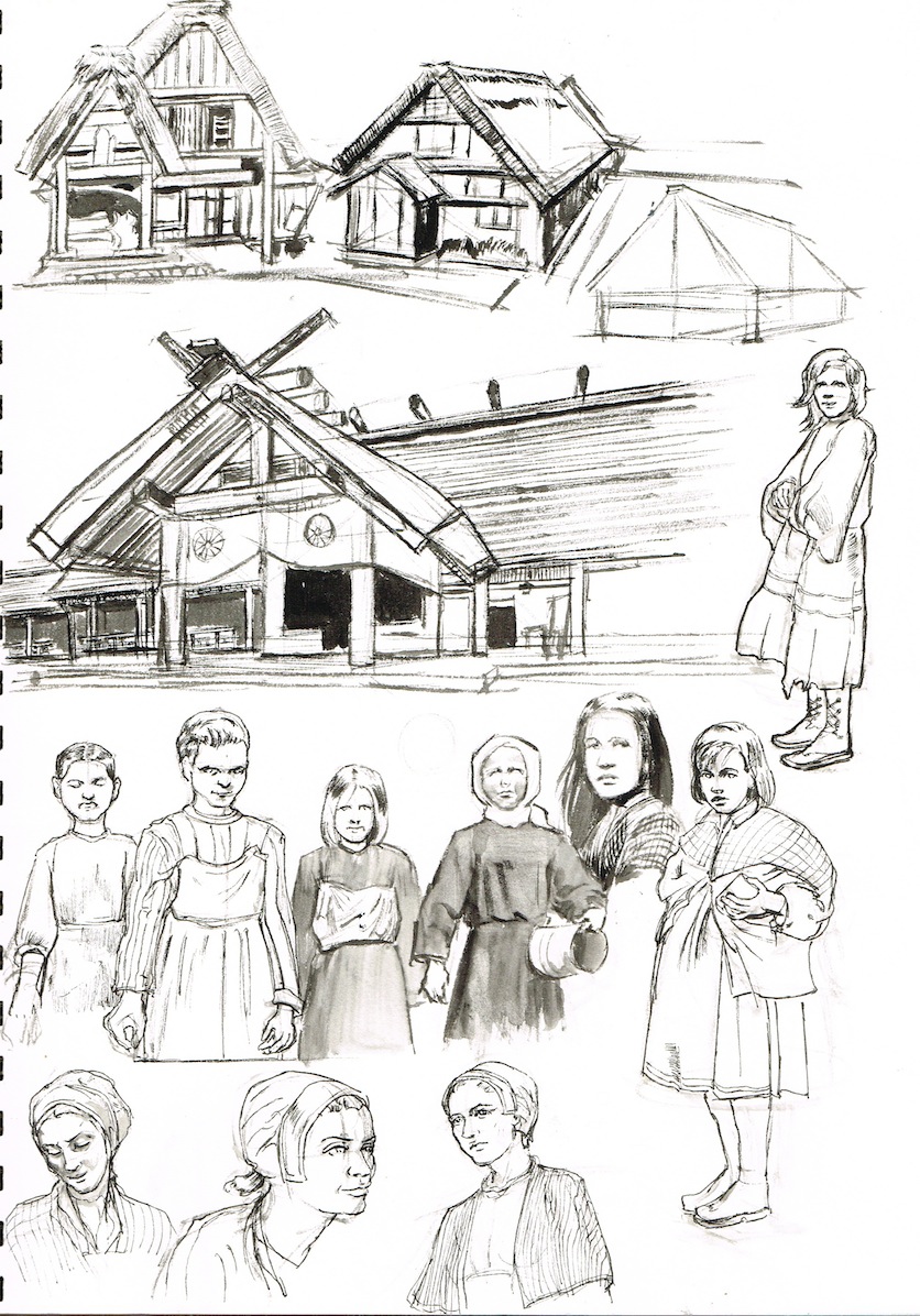
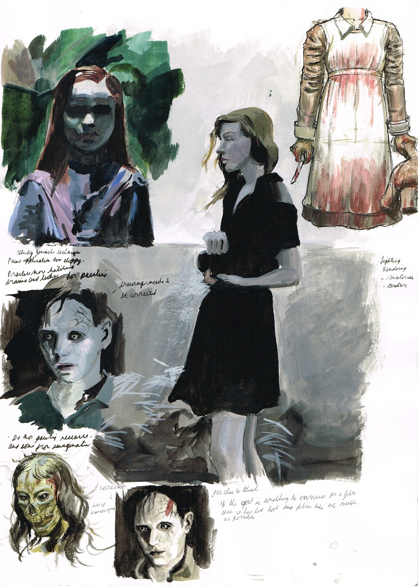
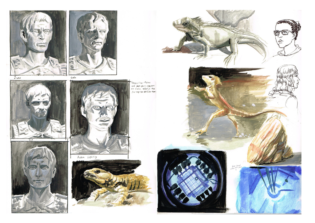
Really like how you layout your study pages!
Drawing out of perspective is like singing out of tune. I'll throw a shoe at you if you do it.
Sketch Book
Posts: 161
Threads: 0
Joined: Aug 2013
Reputation:
9
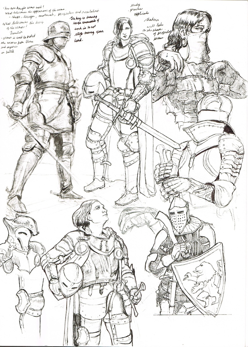
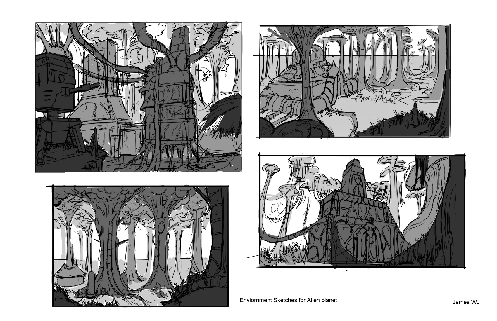
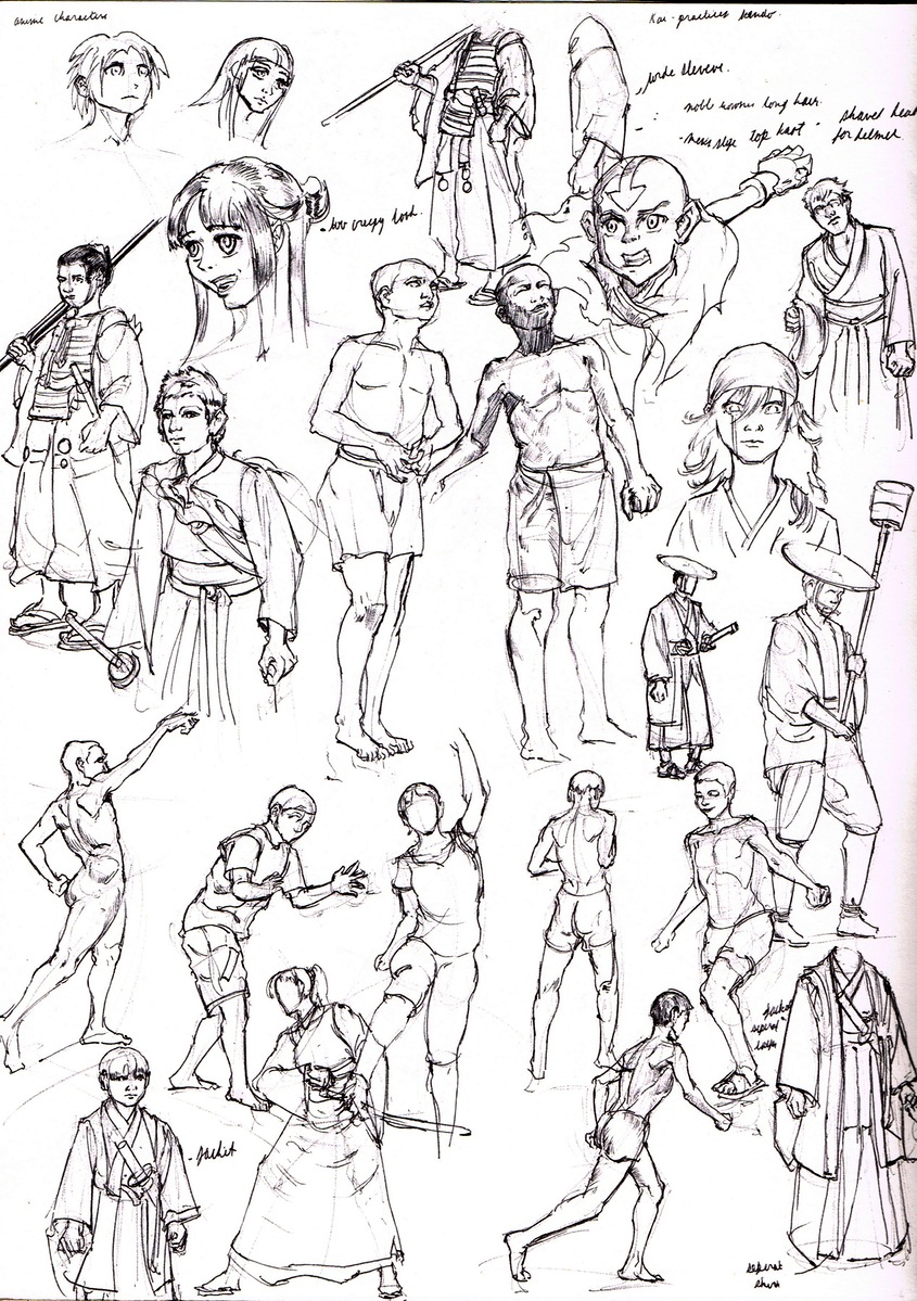
Looking good man, there are some pretty neat designs in here.
I think some gestures could help your work, as I see some stiffness in your characters. Especially when it comes to turning and twisting.
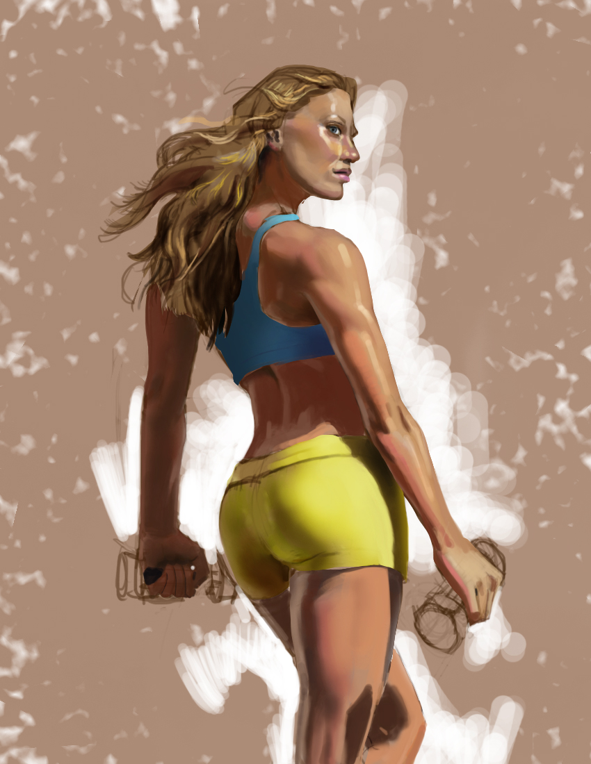
Also, for that contest piece. I think some atmospheric perspective and some softer edges would do it wonders.


