04-21-2015, 04:06 AM
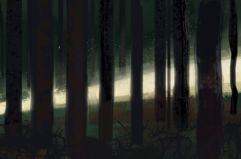
Quick color study from memory, of what the forest looked like a couple of days ago at morning light, with sun hitting the street in a fairly narrow area.

|
Lyraina's sketchbook
|
|
04-21-2015, 04:06 AM
Quick color study from memory, of what the forest looked like a couple of days ago at morning light, with sun hitting the street in a fairly narrow area.

04-22-2015, 07:11 AM
No masterpiece, BUT done plein air while sitting on forest floor.
21.4.2015 - 14.00, sunny, cloudless day - Light and dappled light in forest setting is even more random than anticipated - not just the obvious ones (dappled light on ground), but also the way everything else gets hit (i.e. thin branches) - Forest floor is very diverse - grasses, strawberry plants, branches, old leaves (brown), needle tree branches, various kinds of groundcovering plants, flowers (white), old dead plant stuff sticking from the ground. Denser tree area = less green, more brown. (Might change once blackberry or impatiens plants come back) - Not happy with the colors/greens, but not sure how to do better. There was lots of „green green“ and little „yellow green“. Some shadow colors (i.e. tree trunks) were hard for me to see/determine the right color. 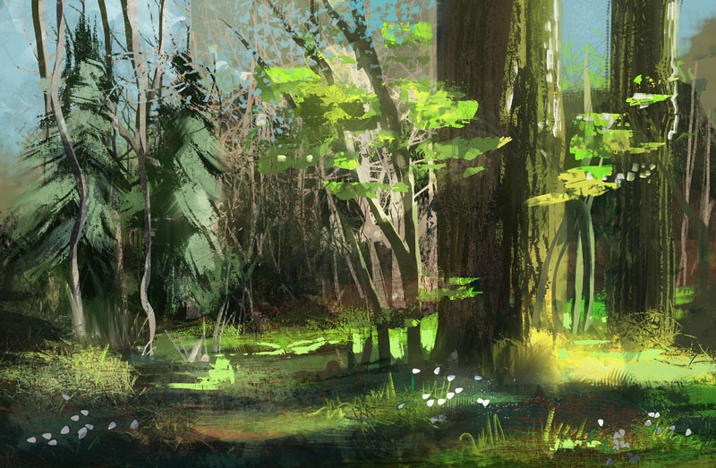 Problems working like this: - Obvious one is not seeing too well on small laptop which is placed on the ground in front of me, with wacom on my lap. I wish I had a bigger screen/newer laptop. But sitting in the shadow at least screen glare was no issue. - Having to move my hand all the way to laptop to switch tools is rather annoying, so I put at least brush and eraser on my wacom keys.
04-22-2015, 11:27 AM
You've began to study light and color from RL! I must dust off my plein air set and stomp out laziness quickly...
04-24-2015, 04:38 PM
How do you get your crisp shapes in your environments and make them look so graphic and readable?
Your work looks awesome by the way.
04-25-2015, 01:28 AM
meat: yes yes, please do, and share what you've learnt! :D
James, I like keeping separate elements on different layers for as long as I can, so I can lock transparency and keep my shapes clean. If you mean the composition thumbnails, the trick is using a hard edged brush with 100% opacity and transfer settings deactivated in brush settings (or any other brush/setting that does not allow much room for transparent, indecisive strokes). I also like using the lasso or polygon lasso tool for extra-crispness :) Sometimes even the shape tool! Forces me to be deliberate about my shapes. Unsuccessfully trying something out: 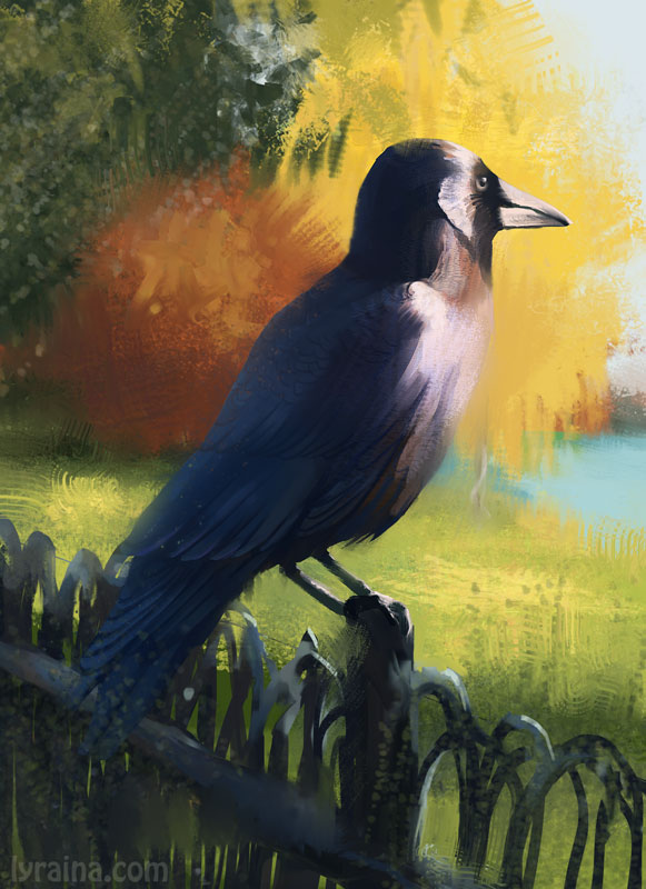
04-25-2015, 07:31 PM
Hah! This keeps getting worse. But I'll be honest here and post the failures as well, not hiding the ugly beginnings :)
22.4.2015 - 12.00, overcast/sunny Observations. - The water was showing a lot of the ground, that would’ve been interesting to pay more attention to while painting. Greenish and brown. Skipped it due to not seeing much on screen and being in a hurry. - Reflection of trees and sky etc in water needs deliberate observation. Easily overseen unless actively looking for it (for visually inattentive persons like myself). This can of course be done/practiced without painting, too. - For greens, see yesterday. Same thing. Not happy with them. Technicalities. - Farmers everywhere + me still being uncomfortable being seen painting + me being lazy to walk far = hard to find good spot to paint. - Sitting in half-shade instead of shadow made screen glare problematic today. Not having a proper place for laptop and myself was rather uncomfortable. Bringing something to sit on might help find suitable siting places on different grounds. If working without a shadow box, sun or half-sun makes no sense, since I saw almost nothing on my screen despite sitting between trees. - Don’t sit down on nettles while painting. Let me repeat that for you… do NOT sit down on nettles. - Need to overcome laziness and get out to catch some morning light! Maybe I can borrow someone’s bike to get to the nice spots quicker. (spent couple of minutes cleaning some edges afterwards, but most is done on location)  (Don't do this.) 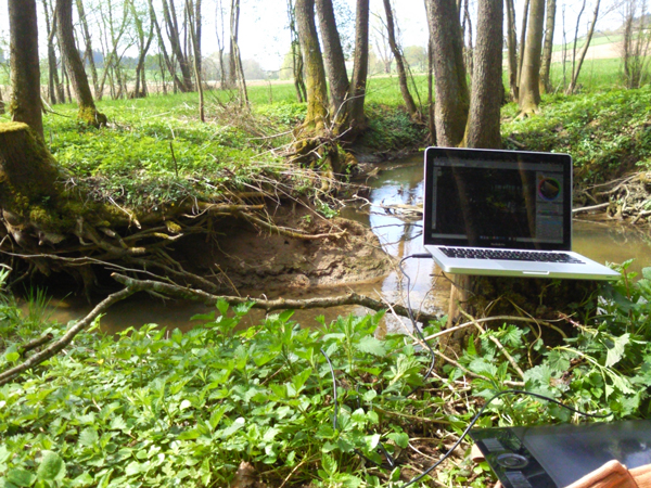 Rushed thumbnails for EoW 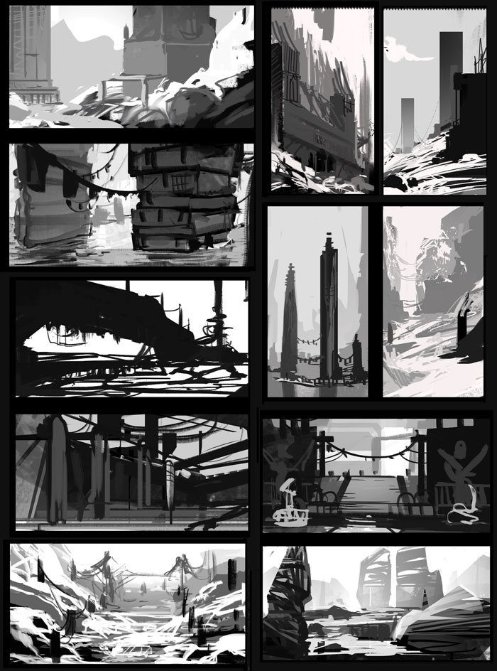
04-25-2015, 11:52 PM
Those plein air paintings are pretty cool despite the technical difficulties you mentioned. I had a Surface Pro2 for a short stint and tried the same thing but the screen glare was too much for me as well as being awful at digital and losing motivation. Had to return the Surface since it wasnt what I expected and was far too expensive to justify. I did have the idea afterwards though that instead of doing day plein air, digital could be used to do night time plein air. Granted that its a clear night with a nice bright moon to light up the environment or you could get some night vision goggles :D Im curious as well if you've done much traditional painting? It might be easier for doing plein air during the day. Sure, mixing paint is a drag if you're new to it but I'll bet you could get the hang of it quick if you stick with it for a bit.
04-26-2015, 08:18 PM
Adam Lina: I’m doing a tiny bit of traditional painting every now and then - have used some watercolors many years ago, and would love to get into oils, but can’t justify the time and money for now to do it more often. The couple of times I am trying, it’s kicking my butt very hard though, and that’s even when I am in my room and „well prepared“ - so I don’t want to use a new medium in a new setting all at once ;) Digital is the tool I’m most used to, so I’d like to use this to get the most (in terms of learning) out of painting from real life colors/mood.
That said, I plan on doing some watercolor plein airs as well, since those pentel water brushes I bought a while back are so fun and easy to use and transport. I just don’t expect to be able to learn much in terms of RL colors and light when using those, since I’ll be challenged by the medium already. Night time plein air is a great idea!! I’ll totally have to try that out when nights will be getting warmer soon. Maybe with campfire, wouldn’t that be nice? The only problem I can see here is that the screen, even on low brightness, will be distracting and blinding, keeping you from really seeing the night colors each time you look at the screen and back into your scene again. The one time I tried something similar (painting what’s outside my window from the inside) that was a real problem, I had to wait a couple of minutes for my eyes to adjust to the darkness again after painting a bit. Some night time light sources (fire, street lamps or a bright moon), might be easier for starting out than darker nights… definitely something to try out! :) Colors for Crimson Revolver: 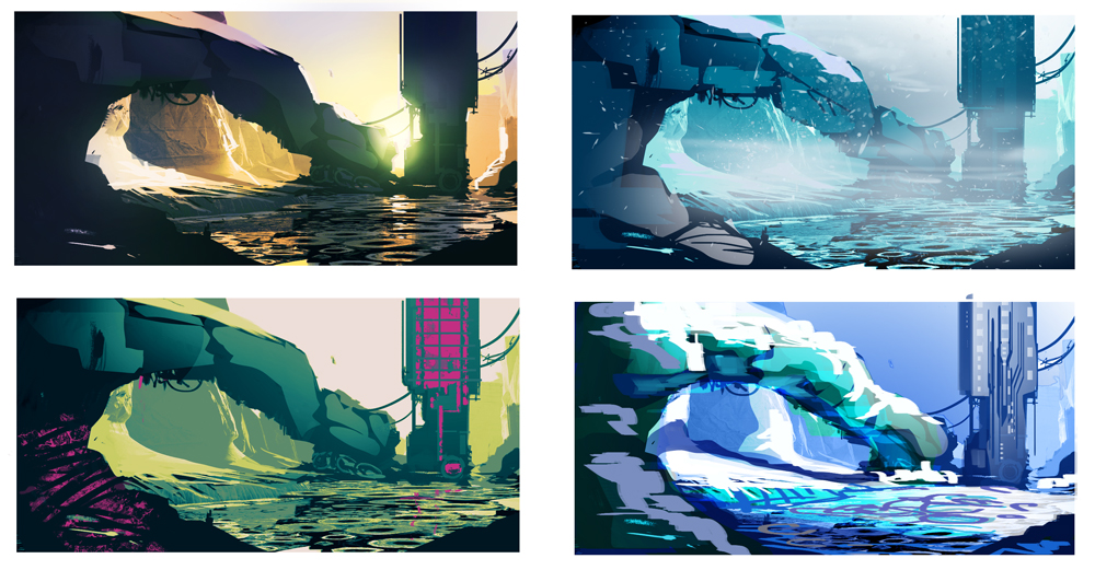
04-26-2015, 08:39 PM
Hat off to you for doing plein air studies, especially with digital. I know I hated hauling around my laptop for plein air, so my respect goes to you for putting in the effort. As for something to sit on - that is very useful indeed, although it means even more equipment to haul out with you. I'd suggest old clothes to sit on, or look into similar: http://www.amazon.com/TravelChair-1389VB...ding+stool
Use umbrella to create shade, or prop up your jacket/shirt with 2 tree branches above your laptop - and paint side ways so your view isn't blocked by the umbrella. ..... Regenschirm!
04-26-2015, 09:30 PM
yeah i commend your persistence on these plen air studies, how much trouble it is to set up , and the process of actually painting it on a sunny day. i might try some , with my samsung Galaxy 10.1 tablet.
whats your overall process in doin this?
04-28-2015, 02:11 AM
Thank you for all the encouragement guys, I appreciate it! If not for the positive reinforcement, I might not have been able to beat laziness today, but I’m glad I did :)
meat: Thank you :) Regenschirm, that’s a good idea indeed! Will have to try. Hanging a jacket didn’t help much last time, and instead just blocked even more of my view… Might even have a stool like that somewhere, but it means being even farther away from my laptop… D: I don’t mind sitting on the ground if it’s not wet… and if there are not too many beetles crawling in my clothes. foxfire, thanks! It really is not that much trouble setting it up, just getting out laptop and tablet and sit down… but does need some shadow to sit in. I have no real process, other than „Find nice spot, sit down, paint what I see“ - mostly starting from the background and working with layers for important / foreground elements so that I can lock transparency and keep it from getting too messy. 27/04/15, 9 am, sunny with humid morning-air. Same spot like #581 (done from memory), but looks... completely different, lol! Still not getting the greens quite right...  
04-29-2015, 10:03 PM
Wow, these studies are really mindblowing! I have so much respect for you going out with your equipment doing these. I really really like the light in the last one. Thanks for sharing your steps and thoughts on it, too! It's really interesting to read and very helpful for someone like me who has no idea of how backgrounds work.
I also like the colour exploration for the crimson revolver. I can't even decide which I like most. Also, thanks again for saying hi at the bookfair! It was nice meeting you there, even if it was short x)
05-03-2015, 06:24 AM
Cyprinus, thank you! :) Was a pleasure meeting you at the fair - sorry for awkwardly interrupting you and your friend talking, but I was very happy to have found you :D
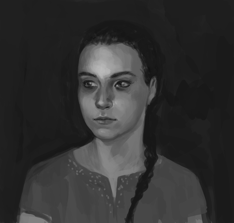
Sketching while skyping with family 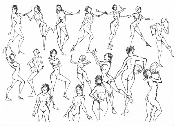  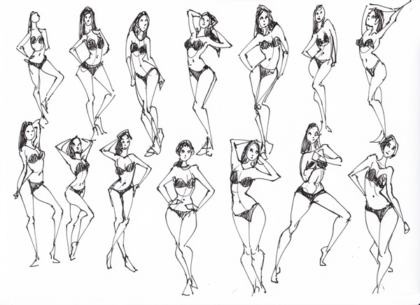 quick composition master study  Looked through old (portrait) images and studies, and was shocked how utterly off almost all of these were in both proportions and color. How can I not see that while painting?! …Makes me want to not even post new stuff so as to not be embarrassed again when looking back. BUT also showed me that I have to mess around less, and study more!!! Crit from present Lyra to past Lyra; many of these still are things I do wrong all the time, but I see it more clearly in my older works: - FFS, make sure you get your proportions right - You're overusing contrast as a cheap trick to make it look better, even when not appropriate - Skintones look dead and grey [still did not find a fix for that] - You may think you know underlying structure of faces, but you really don't. Go study. - Too much timid layering of colors and airbrushy brush strokes makes it look all muddy. Don't hide. Be more bold. Seriously! - NO pure black in faces/skin unless you know what you do - just stop being bad and be good instead no ref doodle 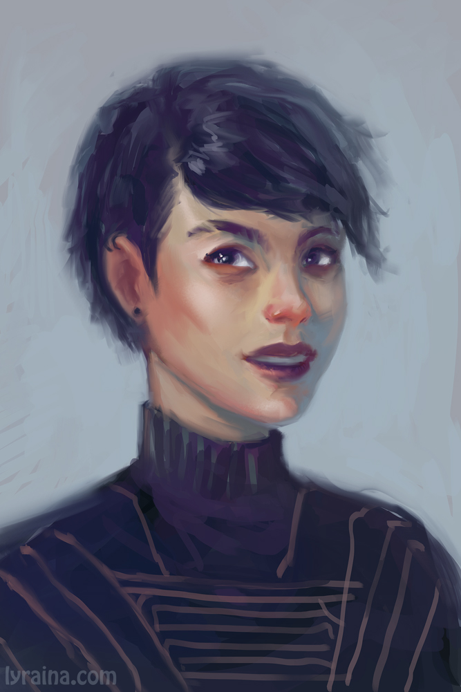
05-04-2015, 08:19 AM
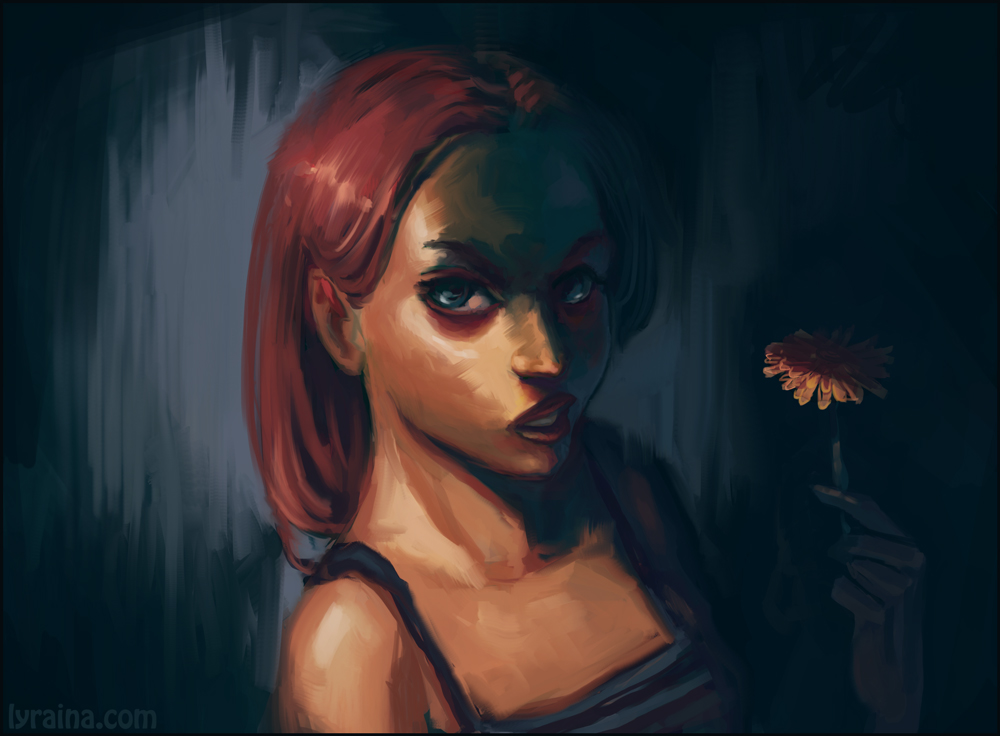
someone picked a wrong flower. or maybe someone wrong picked the right flower?
05-04-2015, 08:14 PM
Ah, don't worry! It wasn't awkward at all and in general at events like this I'm quite used to being interrupted. I hope I didn't give the impression that I felt disturbed or something like that, if it seemed like this it was simply because it's been a difficult convention for me because of the thing with my grandpa. I hope we can meet again for a different occasion! x)
I really like the shapes in your skype sketches! And I totally feel you when it comes to looking at old stuff. I also often think to myself then "Why didn't I see this?" I guess it only shows how much you train your vision along with the skills of your hand though. As far as I can see, I think you know the underlying structures of the face really well already. (I also had a look at some pages back - not too many though, and oh my gosh, that mentorship work you did is really amazing). Cheekbones for example. I find them incredibly hard to paint but I like how you do them! (: For the two pictures above I'd probably say that the eyes are a little off, for the first one it's really hard for me to say what exactly though (not a great help, sorry). In the second one, her right eye is a bit too big I'd say and it doesn't really align with the left one. Take this with a grain of salt though, because I haven't had a look at more realistic anatomy lately, it's just what I feel when I look at it. (At the moment I'm a bit stuck with the flat comic anatomy again orz) Other than that I can only say that I really dig the colours in both portraits! I especially like the light in the last one. I'm sure that you'll rock those portraits in no time, seeing how fast you pick up on things and you already have a really good base! x)
05-07-2015, 05:04 AM
Cyprinus, it would be nice indeed to meet again :) Thanks for all the kind words! And thanks for the feedback - good catch, eye placement is always a struggle for me, not sure why. Need more practice and studies ;) Thank you!
-- If I want to be an environment artist I need to get over my issues with perspective and anything manmade/hard surface. So, for now just some more experimenting in those areas, from photo ref. 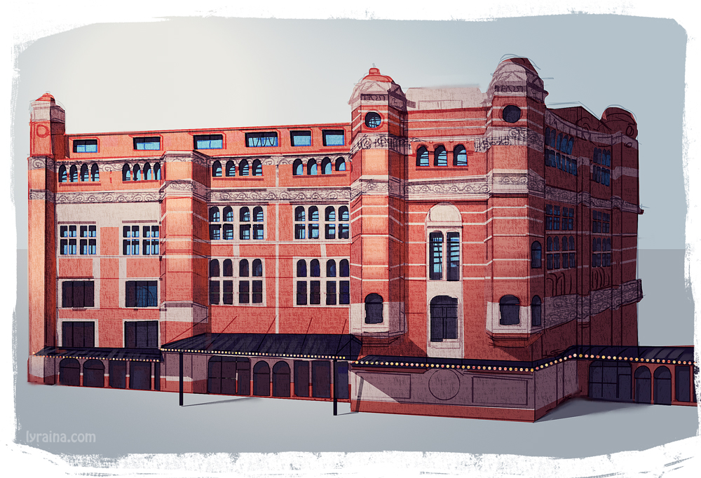 Challenging: - Getting proportions and initial drawing set up. I suppose this will be easier with more studies done beforehand, understanding subject matter better. - Lineart is sloppy, would have needed another lineart pass to get a cleaner, prettier result (+some hours). Drawing with tablet is a pain. More practice will cut down time needed in this area. - No actual stylization yet, 'cos I still struggle with the drawing itself. Notes: - flat colors under lineart with lasso tool, shadows etc on separate layer, then paint on top (or not) works well - Find out how necessary lineart step is. Maybe switch to shapes earlier, if lineart is no part of final product? - Have a purpose in mind - for simple concepts, frontal view is probably quicker - Try out a) work over 3d base or any base to speed up initial steps, b) same thing, more realistic/less cartoony 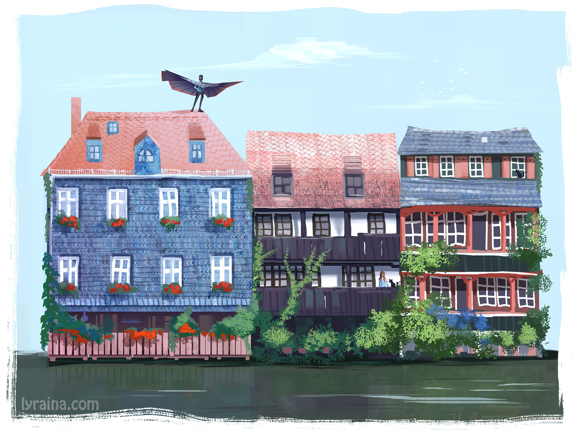 This one developed a life of its own. Tried to skip the lineart step completely, and worked directly in shapes. It probably has some advantages, but I am not yet sure what do do with this kind of workflow. I wonder if I can do this in more complex paintings, too, but I think that would be trying to tackle too many things at once. If I need to come up with design as well, preliminary (rough!) sketches might be a way to go. Thanks meat for helping me infuse some fun and story in this one instead of plain boringness!
05-16-2015, 07:47 AM
05-16-2015, 07:56 AM
Holy actual poop I'm in love with this fish-inspired metal piece! Super nicely rendered, I'm drooling!!
Wreck those weaknesses, Lyra you're getting better and better with every page-!
sketchbook | pg 52
"Not a single thing in this world isn't in the process of becoming something else." I'll be back - it's an odyssey, after all
05-16-2015, 08:29 AM
So ... much .... awesomeness.... ! I got nothing. You're blasting off to space.
05-16-2015, 04:26 PM
Where do you find your master studies all the time? I always struggle finding good people to study from.
Glad to see those supports on the subma-fish xP Something I just noticed now though.. what is the guy welding? |
|
« Next Oldest | Next Newest »
|