06-28-2015, 07:42 AM
Really thankful for that overpaint, its great! So helpfull, as much as your advices :).
Today's update, more fun with environments.
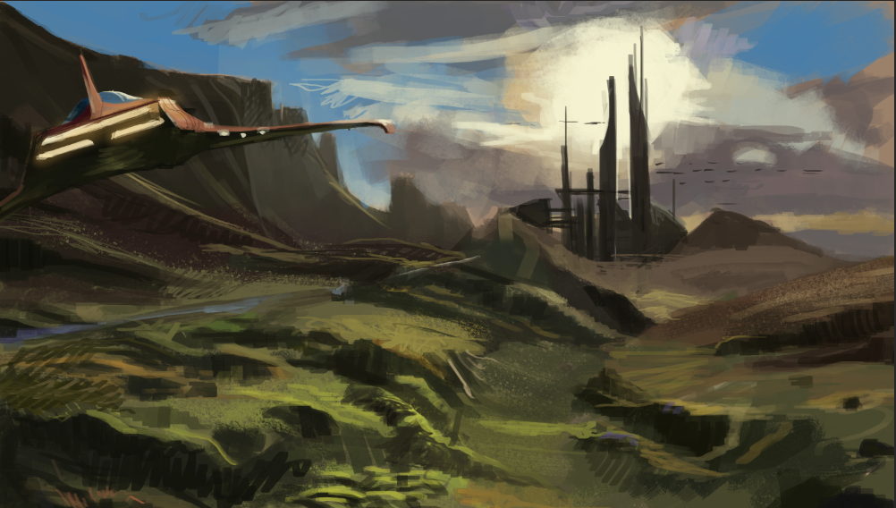
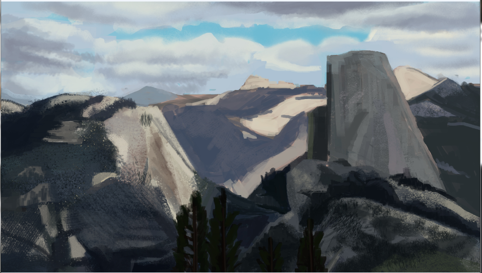
Today's update, more fun with environments.


|
ABANDONED HIDEOUT
|
|
06-28-2015, 07:42 AM
Really thankful for that overpaint, its great! So helpfull, as much as your advices :).
Today's update, more fun with environments.  
06-28-2015, 08:32 PM
Thanks guys, and Lol, here I am again. Seems I can't help myself. I started with a paintover for Algitru before I decided to ramp down on CD, but in the middle of that I got caught up and a bit inspired and basically did a quick painting (block in photobash) from scratch to do my own take on his idea. So I'm posting it here in the hope that it helps in some way. I will just leave it for you to look at without explanation. It isn't a finsihed polished thing, but I probably will polish it up.
I used your general comp and idea, but just re-imagined it to address any issues, most of which Caisne mentioned. If you want any additional notes on what and why and how I approached things feel free to ask me and I will do my best to explain. Hope it helps 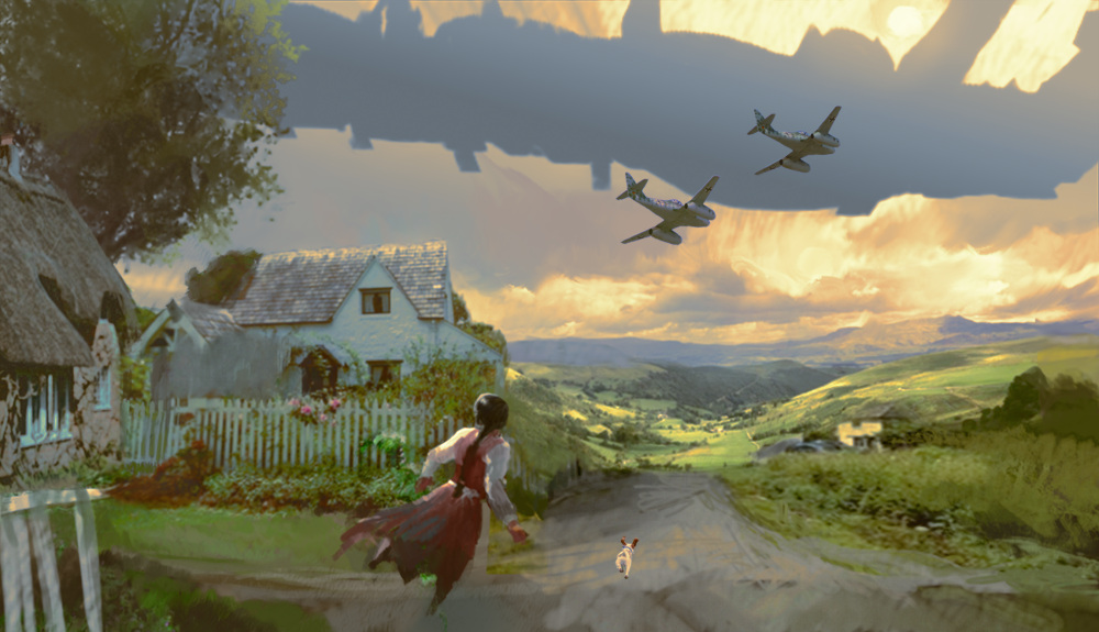
06-28-2015, 11:51 PM
Looks amazing! I can learn so much just by looking and comparing it to my work. I feel like i should spent more time on sketching phase, figure design and composition out more carefuly and do a lot more research on subject.it seems i dont have enough experience and knowledge to come up with such a scene just from my imagination.
I have one question about picture. How you figured out, that this spaceship should be presented only as a sillhouete without any detail. What atmospheric condition causes that? Also is this possible to show detail and ship design, only by adjusting atmospheric conditions (without changing distance and hight it is flying and not loosing realism of the work)?
06-29-2015, 06:38 AM
So , yes, definitely spend more time in sketching and composition phase. This is where you can iron out the major problems with the entire picture quickly and easily without having to deal with already rendered stuff.
It is all just practice so don't be disheartened, just realise that it will take time to get the results you might want now. I totally had details on the ship, I just left them out because they were placeholders and not thought out enough to be clear. I also think the silhouette of the ship will need much more work on design, but basically I started with a flat value that suggested the right scale within the distance I wanted it in. Once it started to read within the background sky plate I knew I was onto the right idea. I tend to always start with the sky, for environments because that is what determines the ambient light and the lighting conditions that will affect everything in general. It is quite easy to add detail after you nail the basic, and the ship should have some to give more context as to whether it is an alternate part of the WW2 era (like a secret german weapon) or an invading force from outerspace or something. The first thing to nail is whether the general value and shape is passable without any detail to get the idea across of the scale and distance. About your earlier questions, you shouldn't compare your work with other professionals right now (or ever) . Sure admire and be inspired, study their stuff and see what you need to work on but don't compare, that will just discourage you. I definitely recommend creating a folio now and then getting into the habit of working on finished pieces as you are studying and cycling them into and then out of your folio. Get upto 10-20 images only in there, then everytime you add one, remove the weakest link. This way you will have things to show people easily when you need to, and your folio will organically get better and better. It is actually kinda fun to cull what once might have been your best piece and pride and joy as the weakest link. I've done that many times. :) Remember there is a market and clients for almost any skill level really, just the more skilled you get, the more jobs and money come with it so just keep going and you will get there!
06-30-2015, 01:53 AM
Thanks for answering my questions, really helpful. Also idea of constantly changing portfolio is quite good , i have to try that with my current folio.
06-30-2015, 09:42 AM
My pleasure man. Btw I had a look at your folio; a lot of variety in there. Some nice work and there is definitely potential in there. If you want my two cents I definitely think that you could already cull out all the pieces there that are sketchy and unfinished (but not in a stylistic way), they aren't doing your work any favours.
Ones that showcase where you got anatomy and proportion very wrong should also be removed. You also might want to consider not showing any studies. Anybody who is going to hire you is't going to hire you to do studies. You can keep traditional figure work in there if you like, but maybe be more selective and only show your best handful? Don't be afraid to only have a handful of images in there to start with. Better to show 5 great pieces than 5 great ones and 20 mediocre ones. Always make sure your contact email is right up front on every page, and preferably always visible if you can swing it into a sidebar or something. Just a few thoughts
07-01-2015, 12:00 AM
Yea, i have to do little clean up on my portfolio. Also i will delete traditional works. They are so old, and photos are shoot with crappy camera in bad lightning. These works are 100x70cm big, and i have to make shure that all the detail is visible. So i think i will reupload some of them in better quality and add recent works. Thanks for advices :)
07-04-2015, 02:07 AM
Hey Amit, good to see that you've quit your job, launched yourself into freelance, and picked up an awesome award along the way since I'd interacted with you last. Sad to see you go, though I wish you the best of luck and great success! You deserve it. Thank you for sharing so much with the art community!
It took me until recently to realize there's a long road ahead for all aspiring artists, regardless of life circumstances, so we are all in this together. If you decide to return we'll all welcome you back with open arms. So forget about us--go out on your adventure and become the very best, like no one ever was! --- Here's some thumbnails I did, if anyone has feedback on which ones they prefer most that would be great. (The individual thumbnails themselves, not the 3 versions of color/shading I'm including in case they are hard to read) Ignore #5, I numbered that by accident. Color Version 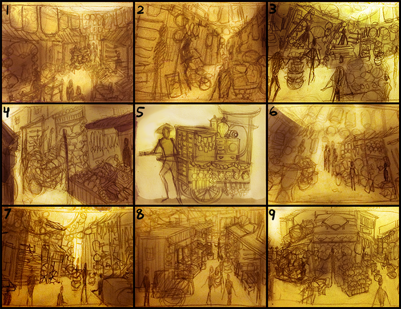 Black and White 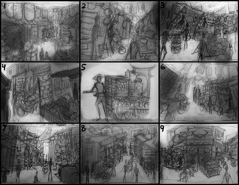 Lines 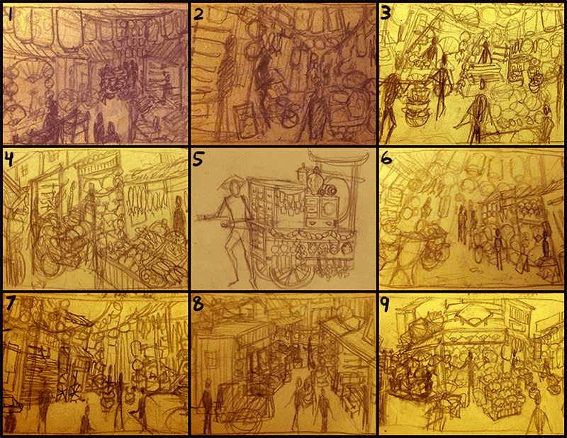
07-06-2015, 12:44 AM
hey guys.. I know I rarely post here but.. I'd like to ask some advice with these.
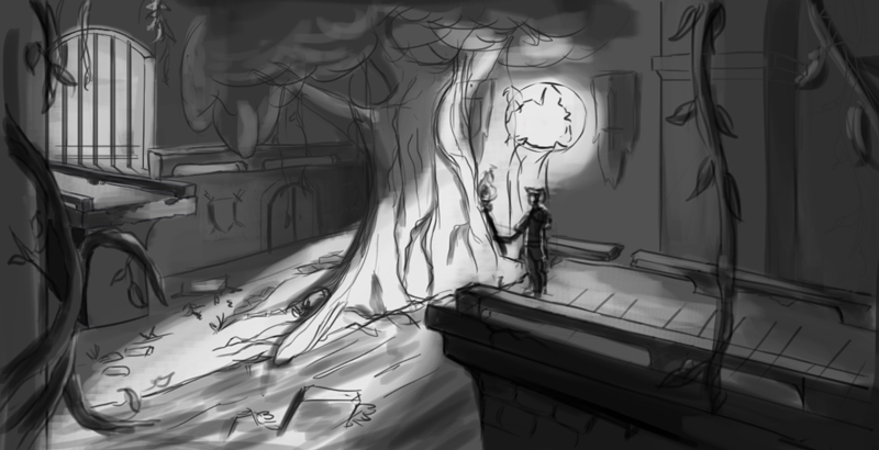 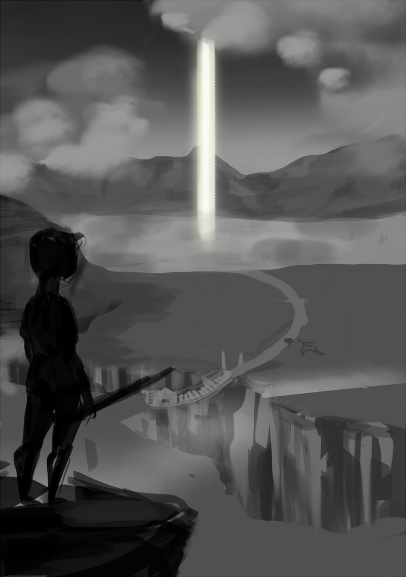 I want to get better with drawing backgrounds. What kind of studies do I need to make to get better at drawing/painting backgrounds? Thank you so much in advance!!
07-06-2015, 05:43 PM
(07-06-2015, 12:44 AM)Rshin Wrote: hey guys.. I know I rarely post here but.. I'd like to ask some advice with these.To answer your question to get better at backgrounds do thumbnails and draw from observation, and about the pieces themselves try make sure the drawings is good. The pieces don't have a light source try to imagine how the shadows would drop in those scenes maybe even grab a lamp and some stuff and try to look at lighting, also you can look at reference for trees and mountains etc. Keep it up work on these more and then post here again!
07-07-2015, 05:51 AM
@pandamonic hey man, id give a shot for the 7th one. it has nice composition, lightning and cool perspective to show the depth. Try work on it more ill be able to do a paintover and give you few tips later.
@Rshin Hey, thx for posting! Would you mind me doing a paint over with commentary for ya during a stream. Itll stay on demand you can check it whenever you want. I cant tell when exactly its gonna happen cause im kinda swarmed with shit, but ill announce at the skype group. Stop by if youll happen to be around.
07-07-2015, 12:20 PM
@Hobitt Yeah :( I really have big problems with lighting and getting forms right. But I will study some more. :)) so thank you
@Caisne Thank you so much! And no worries! I hope I'll be around to watch it.
07-07-2015, 07:02 PM
Hey folks!
First time posting for me so I'm just gonna say sorry for any issues with the posts, I haven't been very into forums. I actually started with landscape light and color studies yesterday in anticipation of joining the Abandoned Hideout: ![[Image: Landscape%20studies%202.jpg]](http://i1205.photobucket.com/albums/bb428/Core-Tech/Landscape%20studies%202.jpg) ![[Image: Landscape%20studies%2022.jpg]](http://i1205.photobucket.com/albums/bb428/Core-Tech/Landscape%20studies%2022.jpg) Now that I look at them they look very rough, but I'm aiming to get more patient as I go along. I'm also working on some sci-fi stuff at the moment. I've been doing fantasy for a long time so I decided to switch it around. It's gonna be some retro sci-fi set in the 70's. Atleast that's what I hope. I wanna learn to use a certain design elements to make imaginary things look as though they fit in in that era. This picture however is not meant to be influenced by the 70's. This is a building or vessel of some sort that has been left behind by whatever beings, that contains the technology used to create the 70's sci-fi stuff. I'm not sure if this representation is technically sound enough to have it's design commented, but if it does I would really appreciate some design feedback! ![[Image: Sci%20fi%20Project%20Ships.jpg]](http://i1205.photobucket.com/albums/bb428/Core-Tech/Sci%20fi%20Project%20Ships.jpg)
07-07-2015, 08:05 PM
@Rshin: Improving your environments, is like anything else a practice in fundamentals. I see these as the main fundamentals for enviros : Composition, Values, Perspective, Mood(Lighting, time of day, atmosphere) Scale. Thinking about how to solve all of these problems is required for each and every piece you do. If you don't really properly address even one of them, your painting will be lacking. Knowing about a fundamental isn't the same as actively thinking about and applying it to every stroke and decision you make.
So take some master painters, artists you admire, Photographs, movie screenshots within which you can identify and admire any one (or more) of those fundamentals in particular. Then do a quick study (or long depending on what you are trying to achieve) that aims to figure out what makes that particular fundamental work in the image. This way you have a focus to your study, you are actively thinking and learning, not just copying shapes on a plane. Repeat. For every two or three studies you do, apply to a personal piece. Repeat. I am thinking of putting together an environment design mentorship class here in the mentors thread in a month or two. Keep an eye out for it if you are interested. @Trinity, welcome, and great stuff! I think the studies you have done are good on level of detail. You nailed the generals very well, and the project looks really interesting
07-09-2015, 11:38 AM
@Amitt Thank you so much that helped me a lot and now i think i have a better sense of direction in what i wanna go for. (actually everyone's advice are really awesome, so thank you everyone!) I will definitely watch out for that environment mentorship. I'm so looking forward to it.
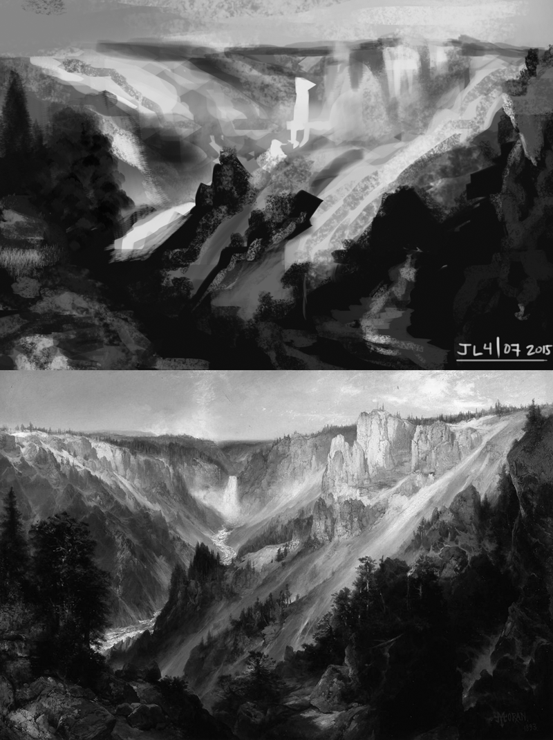 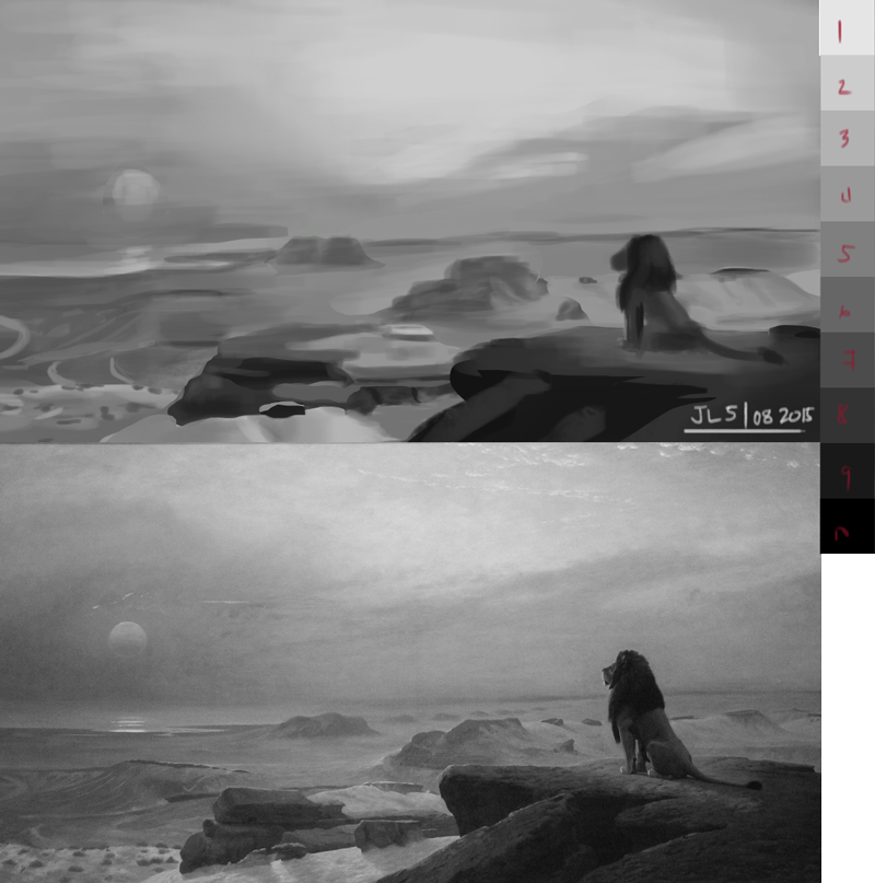 Though I'm not fully able to get 100% likeness, i just really tried to get the values right somehow (and looking at it from a thumbnail i nailed that part) though im still having a few difficulties when looking at things that are close in values. Like that one with the lion for example. It was hard for me to get the consistency of the values (or their blending) Also that one is the closest i could find that i want to apply to my painting last time (the one with a boy looking at a beam of light from a far)
07-09-2015, 12:57 PM
Awesome Rshin! You did a pretty good job of approximating the values in both, though perhaps more successful in the lion one because it is a lot simpler. Don't worry so much about nailing blended values...that does take work. I tend to use gradients a lot at the beginning to get the broad subtle value shifts, because it is easier to do that than try and paint it all as you go.
Keep it up! One thing you can do with these pieces, is to get the study and the original side by side and using the colour picker sample around the piece to see where you went wrong and by how much. This cann be very insightful.
07-09-2015, 06:37 PM
@amitt Thank you, much appreciated!
@Rshin to add on Amit's advice, I find it really helpful to "finish" a study without touching the color picker. When I feel finished I go over the original with the color picker and compare it to my version. If needed I correct the mistakes made and repeat that process as many times as I feel comfortable with :) But that's just how I do it hehe :D
07-13-2015, 12:18 PM
Hey folks! These are my digital studies of the week about values. (Film still, and masters paintings) mostly between 20 to 30 min, more or less. I'm thinking about make one of them a long-time study.
And my graphite studies from the last two weeks, mostly composition for a painting I want to make. 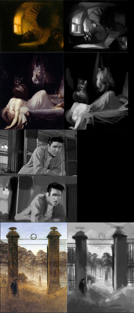 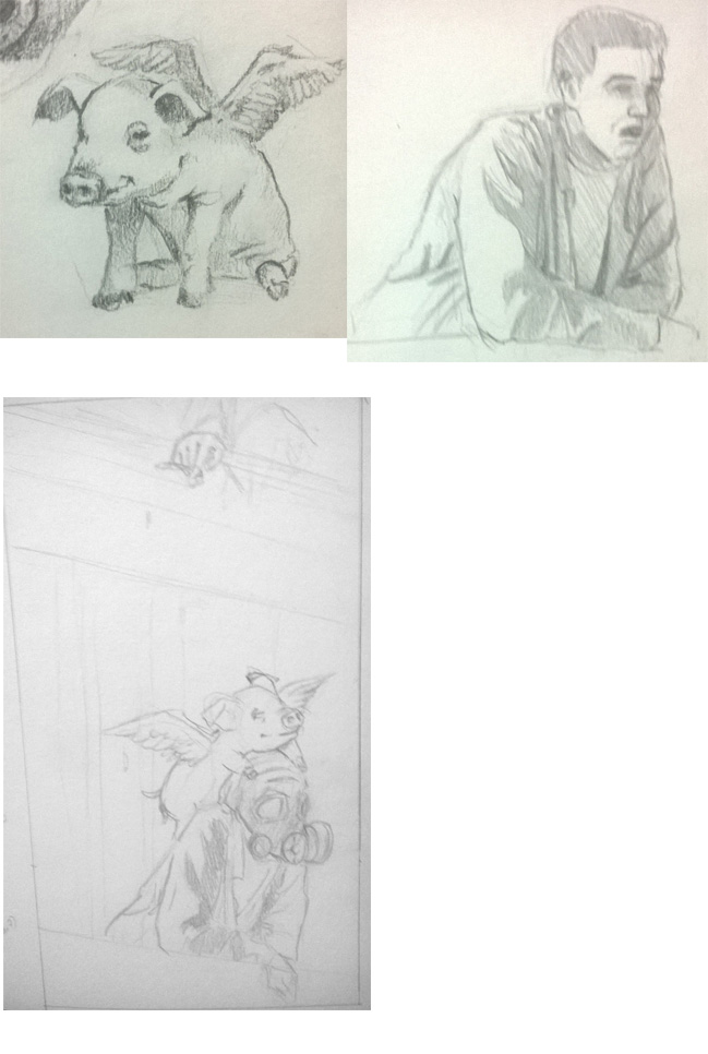 I found a rent job, so I'm developing a new study schedule to keep my hopes up.
07-13-2015, 12:44 PM
@Rshin Hi! Your painting/values studies of the light energy from sky to earth (of day five), you could make the with reflex in the clouds, earth and ocean bellow. It's a bright white line that out stand too much, maybe if you could bring more lights and deep the shadows of the abyss/ canyon.
@Caisne @Rshin I want to see this paintover 'cause the every one I've seen helped me a lot, before-after paintings are like we're learning magic powers, developing our attention skills. |
|
« Next Oldest | Next Newest »
|