Nemesis critique
#1
Hi guys!

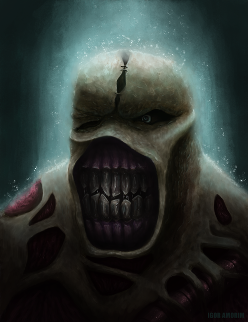
I started it as a sketch and now I'm trying to push this to a finished piece.

What do you think? How can I improve it? Is it very bad?

I appreciate any help ;)


Reply
#2
I tried to do a bit of paint over, not changing any of the designs, just some light and a bit of color tint. I basically darkened the figure a lot, and brightened a few small spots for higher contrast in terms of light. And also tried to keep that contrast area in a smaller ... area... around the top of the head. I also tinted the skin with some of that green light, and added the same tint to the eye. It's not a lot, but hopefully it's a start... I didn't have a lot of time before work, but wanted to give my 2 cents.


Attached Files Image(s)


Focus.
Reply
#3
Don't worry meat, you helped a lot with this.

It is looking better with your paint over. The points you mentioned are the ones I'm having a little hard time. The picture was brighter a few steps ago so I darkened a bit some parts mostly the botton part to make the face pop up a bit but I think it was not enough. And the teeth need more depth, like you did.

I'm going to do these changes and see what happens.

Thanks a lot man! ;)

Reply
#4
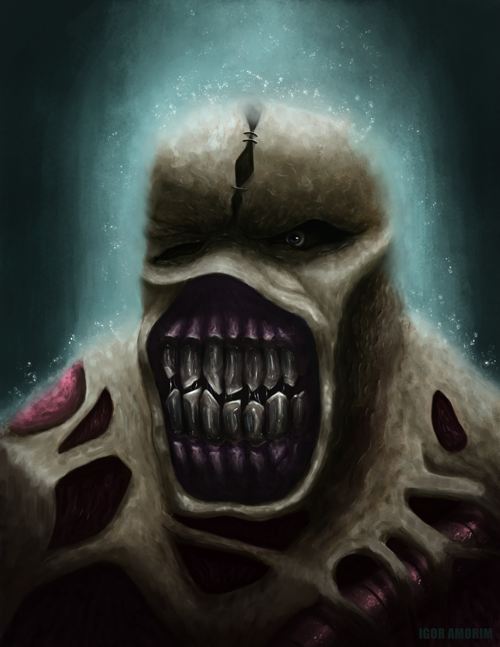
I came out with this after the changes. I think it is much better. His skin has more green, it is more balanced, there is less contrast in the teeth.

Always open to new critiques! 


Reply
#5
Heya,

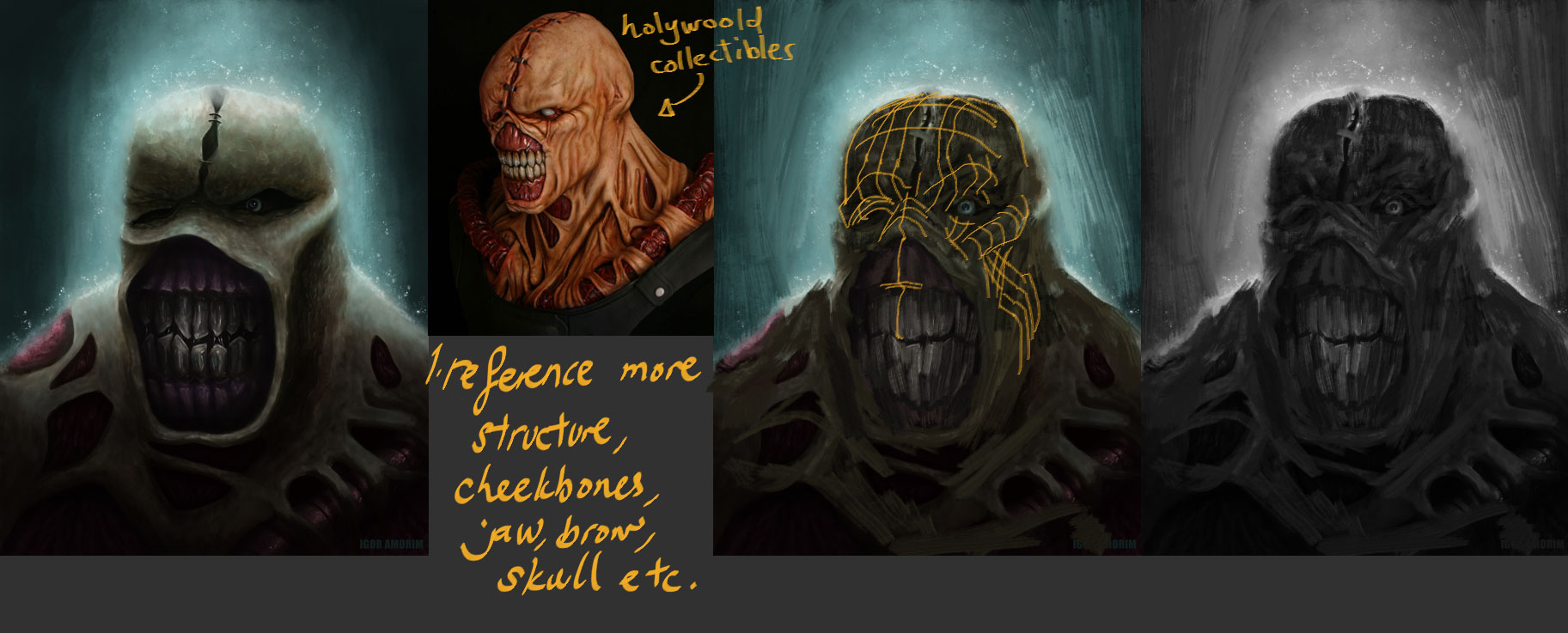
I like your version with the oversized teeth, you can try adding more bone structure to the character,


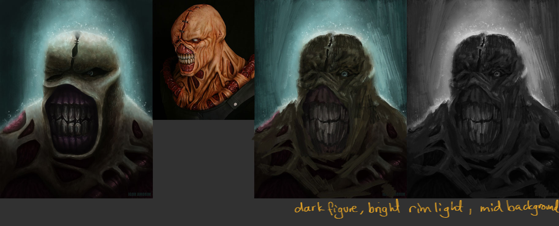
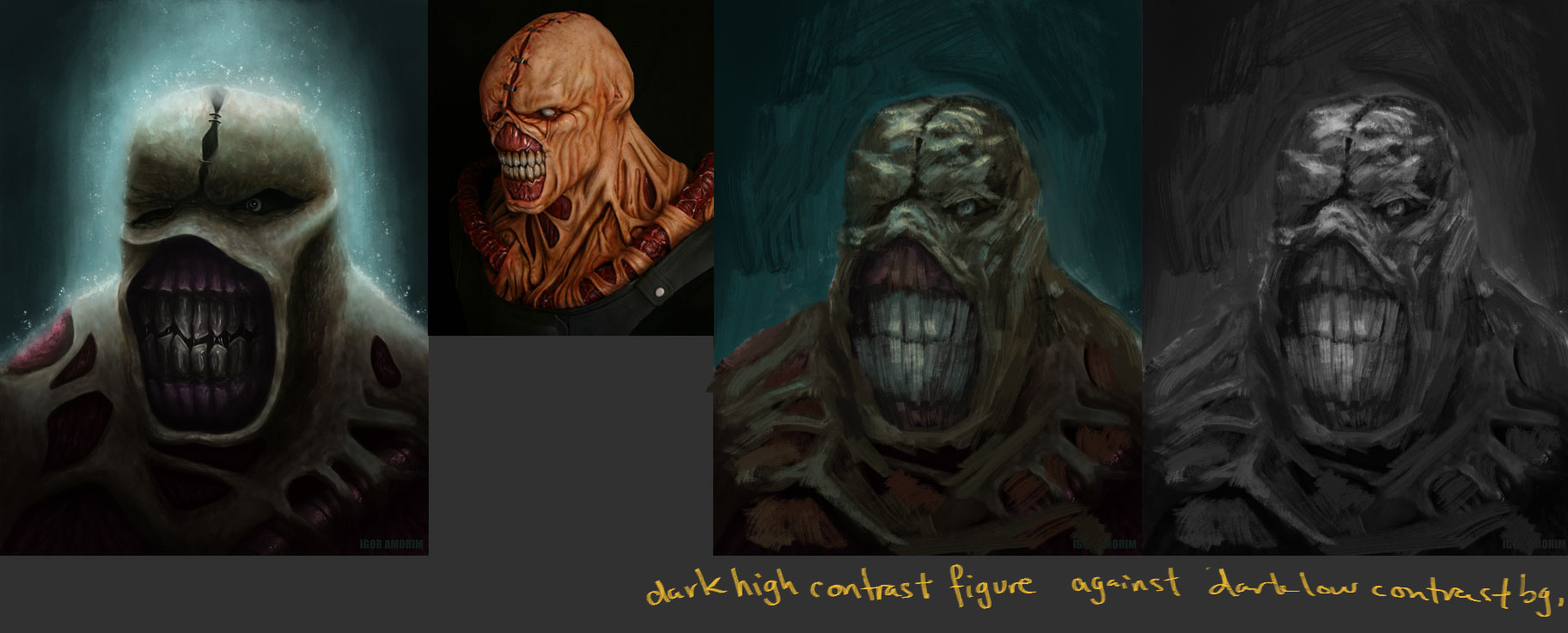
Here are also two possible value setups, you can consider. I find in the original, its hard to make the rim strong against a background that's too bright.


Hope it helps! Keep on truckin'
Reply
#6
Hey man,
meat and dodeqqa make some good points and this is more just reinforcing what they've said really.
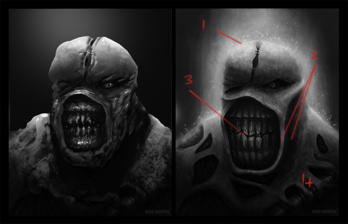
1, Like Dodeqqa said the lighting is very confused at the min and I'd say there's probably a bit too much white too. It looks like he's giving off light as apposed to it bouncing off him. Try and consider where your light is coming from, almost like the director of a film, and imagine how that light would effect your subject matter. For this paint over I chose a direct over the head light as I figured that was what you were going for.
Try to Keep a nice contrast, between lights and darks, like ive done on the top of his head if you want to describe forms better and make your dude pop.
2, The lighting on some of your forms seem a bit off and its making the head seem a little flat in places (like around that lip and cheek.) Still life studies with a lamp are great practice for this man and what dodeqqa did with the lines wrapping around the forms on the top image is a great way to imagine the thing your painting in 3D. Oh and if your struggling with forms try painting in black and white, it'll make life a lot easier, that's what I did here with your paint over ;)
3, Your interpretation of nemesis is cool, I like the overly large teeth. I remember seeing this dude back when I had a ps1 and shitting my pants. Now the trick, as a concept artist and illustrator is to take those things you think are cool and push them to a way which is unique to you. What is it that makes this dude so creepy? How could I make him scarier? That's basically what I did with his teeth here just to kinda show a point, what could be done, from a design perspective to make this better? If you saw this dude is a video game today, would you be scared? A bit of a random point but just something to bear in mind ;)
4, Be sure to study up on your textures mate, I can see you've already got some in there which is awesome but making him all gross looking and slimy would take this dude to a whole new level. Try finding things in real life (slugs maybe?) and paint them to work out how to capture that texture.

That's about it mate, you've got a great piece here with loads of potential and I hope this helps in some way. Sorry if it came across harsh in anyway or ive overloaded you with pointers, that was never my intention, I just want to help in the best way I can. All the best buddy.

Reply
#7
dodeqaa - yeah, it is lacking of structure and texture. I tried to paint all the textures by hand with the basic hard round brush but it seems I kind lost in the process. About the values setups I like the first more (dark figure, bright rim light and mid background) maybe the background is too bright yet.

Warburton - my idea was the light over his head, yes. I will try to darkened the bg a little more. I started with the values but I jumped to color too soon and I have big problems with colors. Thanks a lot man. I'll have all those points in mind when I come back to this piece and don't worry that wasn't harsh :D

Reply
#8
Oh, I didn't realize it's an existing character from.... a game? If you want more fleshy texture to him, try to keep 1 reference each of skin and flesh open at all times so you can see them while you paint. You can even create a grey "frame" around your current piece in Photoshop, and stick the reference there so you can see them much faster and easier. I would suggest look up pork for skin, and for exposed flesh.... well, lots of keyword you can search with to give you disturbing images of exposed, raw human flesh reference.

As for the light, I thought it was interesting to have this kind of calming shaft of sparkling light coming down on this horrifying creature's head, almost like some holy light. The sparkle also kind of looks like bouncing water droplets from a light drizzle.


Focus.
Reply
#9
lol yeah it is, meat! He is from Resident Evil. I'm gonna come back to him maybe this week and try to improve the points you guys talked about.

Thanks for coming back meat! :D

Reply
#10
warburton: great pointers and loving the mood in the paintover!

meat: pig skin is super reference for this, I second that!

iamorim: eagerly anticipating your update man!
Reply


Forum Jump:


Users browsing this thread: 16 Guest(s)