02-01-2018, 07:49 AM
Apologies for not posting in awhile, got really stressed out last week (think I've been pushing all my worries to the back of my mind) and decided to take the rest of the week off and try and relax, but I'm back now. :)
First thing are some drawings from my portrait class from last week and last night, first page was from last week and I don't know why I struggled so much with it seeing as it was a straight on view, think I was just stressed. I keep on getting caught up in the little details and not focusing on the drawing as a whole.
Drew some heads from imagination which didn't go too well, I keep making the features look cartoonish, especially the eyes and definitely drawing the mouth too big so I need to be aware of those mistakes next time.
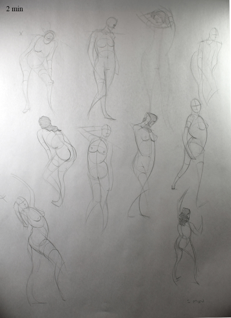
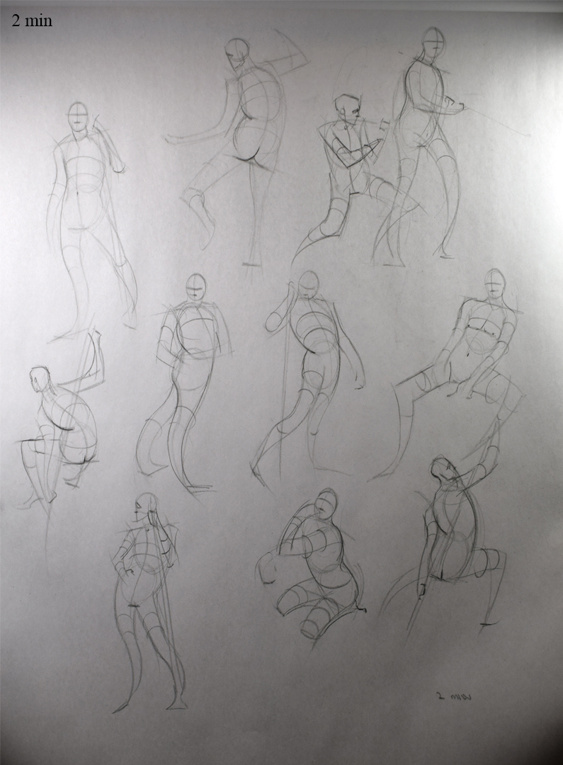
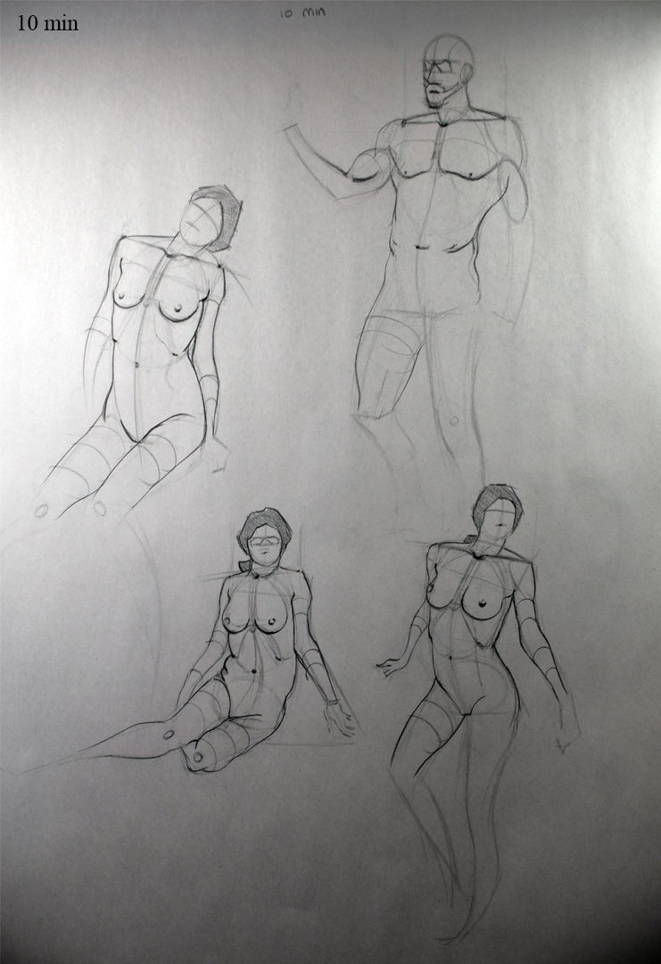
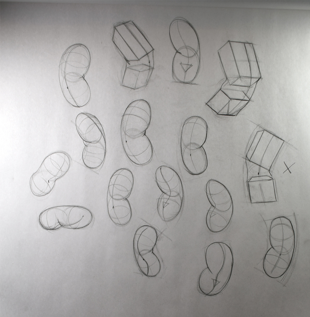
Starting this week I've been working through the Proko figure drawing series, attempted the robo bean but struggles with it so I thought maybe focusing on the regular bean might help me.
I've still been working on my poster design but I've hot a brick wall and was hoping someone here knew how to sort it out? I tried changing the line colour but as you can see in the picture it doesn't seem to do it well. I had my drawing on about 3 layers, I combined them to 1 layer and grouped all the paths together (using Illustrator btw) and when I changed the colour it became all butchered and distorted. I have no prior experience with Illustrator so I don't know how to fix it.

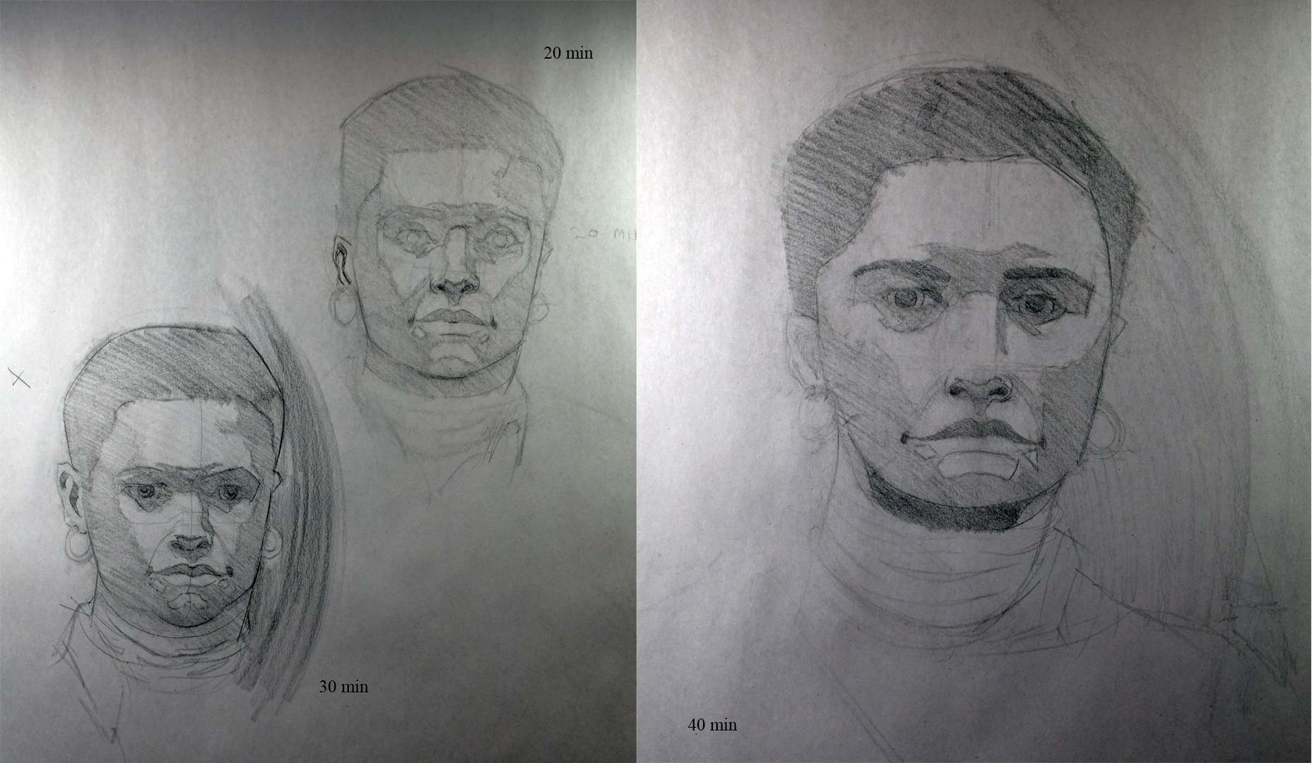
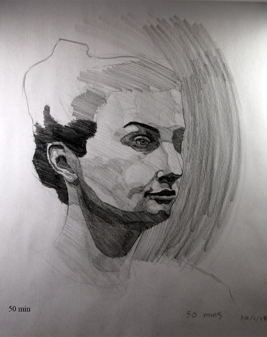
First thing are some drawings from my portrait class from last week and last night, first page was from last week and I don't know why I struggled so much with it seeing as it was a straight on view, think I was just stressed. I keep on getting caught up in the little details and not focusing on the drawing as a whole.
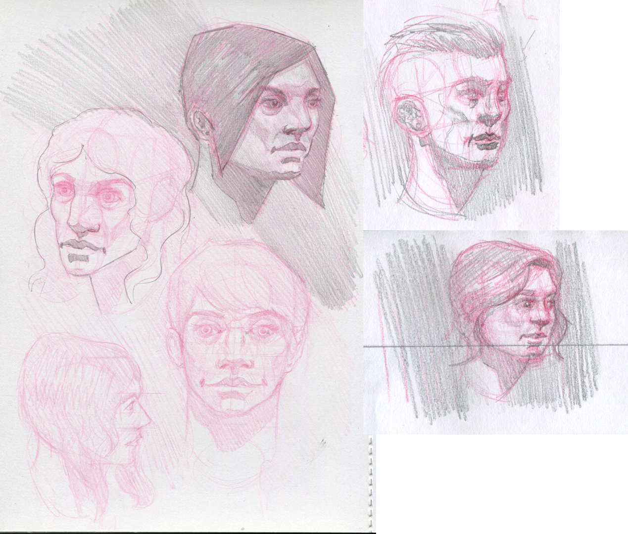
Drew some heads from imagination which didn't go too well, I keep making the features look cartoonish, especially the eyes and definitely drawing the mouth too big so I need to be aware of those mistakes next time.
Starting this week I've been working through the Proko figure drawing series, attempted the robo bean but struggles with it so I thought maybe focusing on the regular bean might help me.


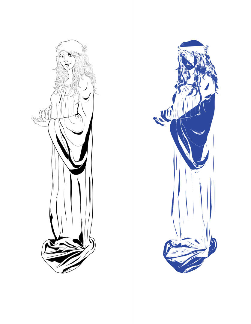
I've still been working on my poster design but I've hot a brick wall and was hoping someone here knew how to sort it out? I tried changing the line colour but as you can see in the picture it doesn't seem to do it well. I had my drawing on about 3 layers, I combined them to 1 layer and grouped all the paths together (using Illustrator btw) and when I changed the colour it became all butchered and distorted. I have no prior experience with Illustrator so I don't know how to fix it.

