04-19-2018, 06:42 AM
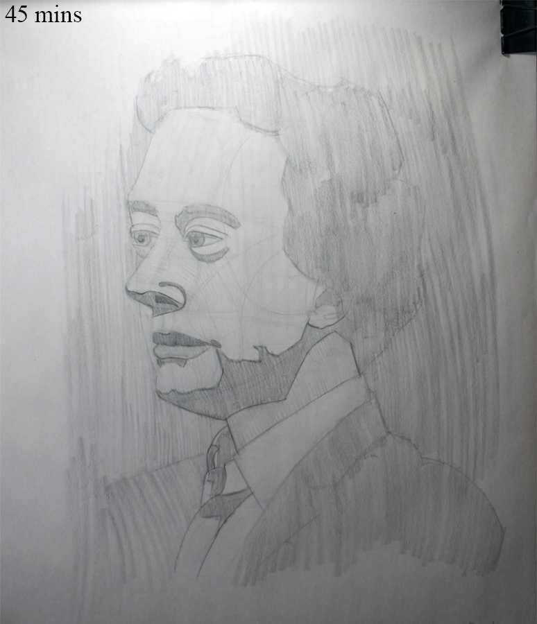
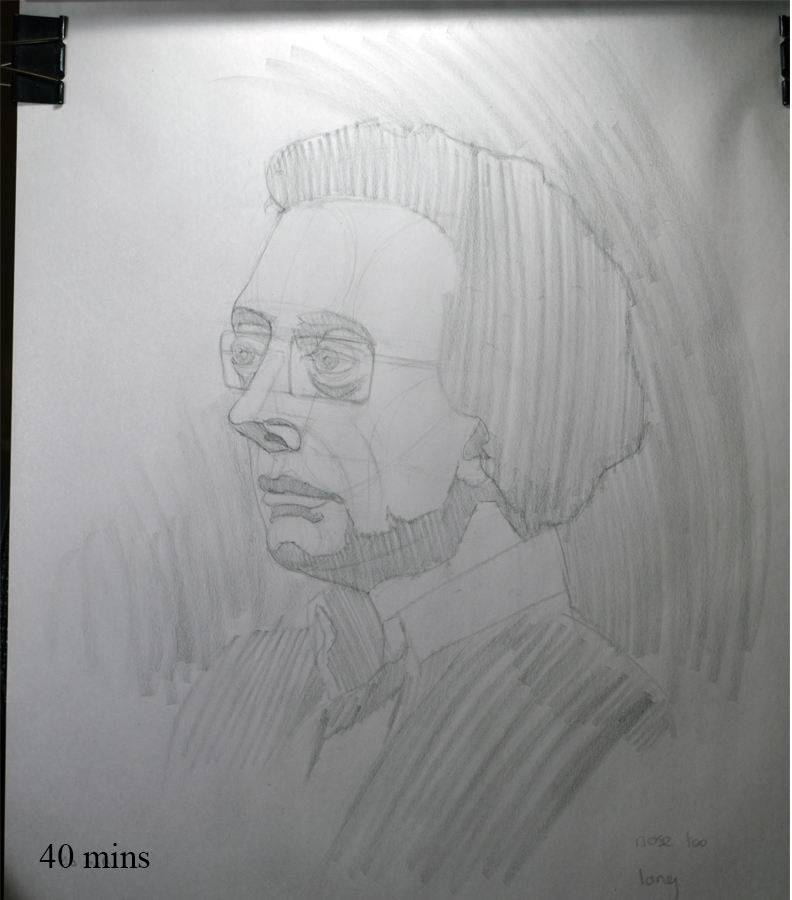
Model had to cancel last minute for my life drawing class on Monday so one of the regulars volunteered to sit for a portrait session instead so I stayed for that. Utilized the Reilly Method for the drawing and I think they turned out much better than my usual portraits from life (never again will I stray from this method). Only took them to the block in stage because I didn't have enough time to fully render them.
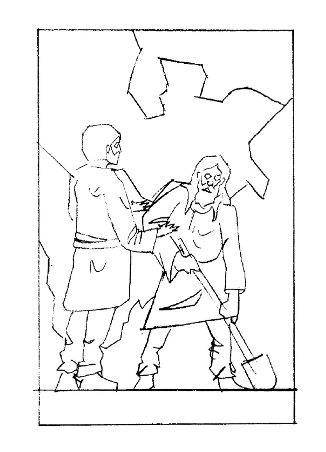
I've carried on with my illustration. Didn't like how my rough comps looked blown up and traced so instead of re drawing all 3 I selected the comp I liked best, put abit more time into making the drawing look nicer/correct.
From that I experimented with lighting, I was originally going to go with frontal lighting but I quite like how it looked lit from the front left and right so I might choose one of them instead.
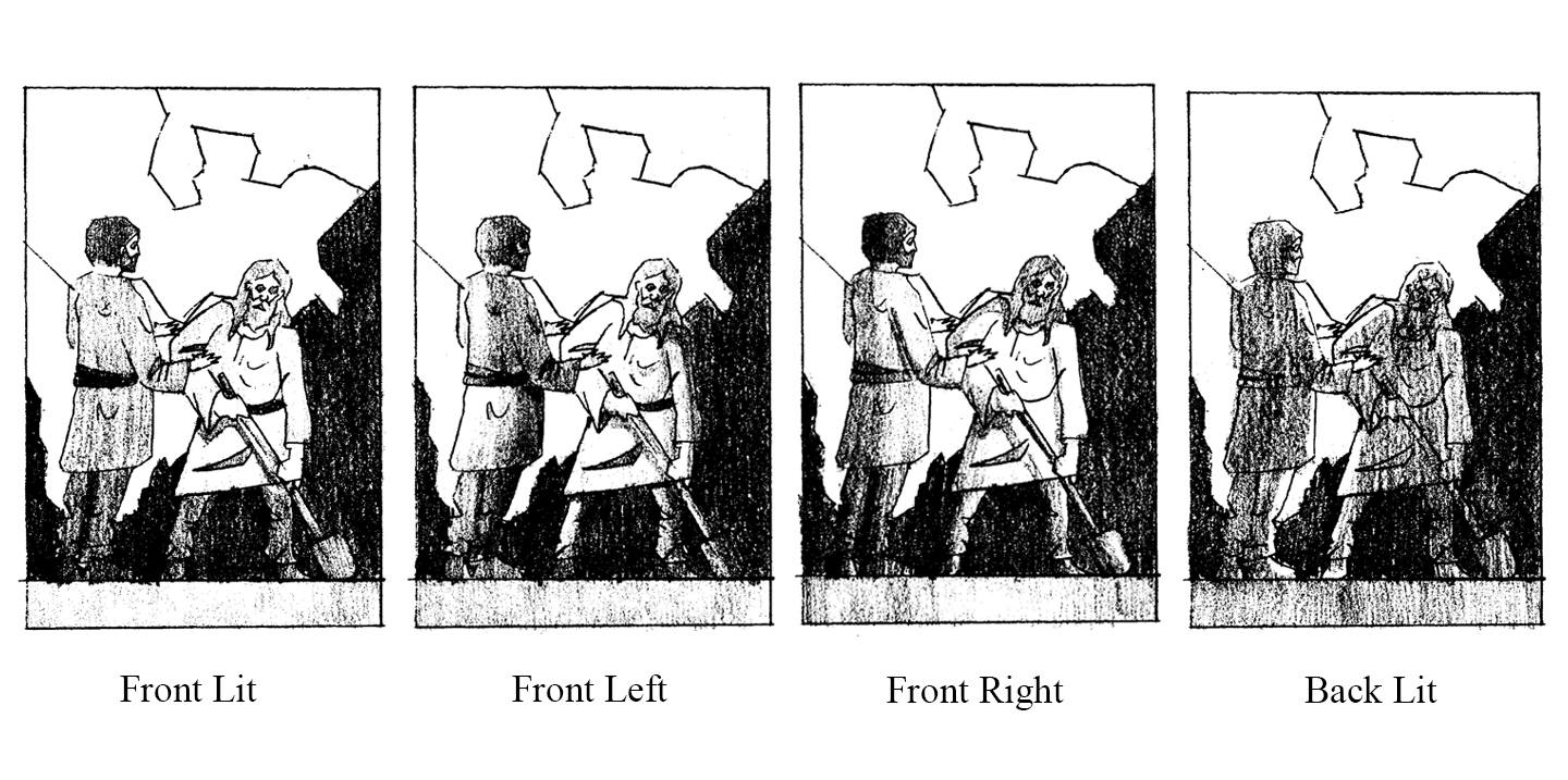
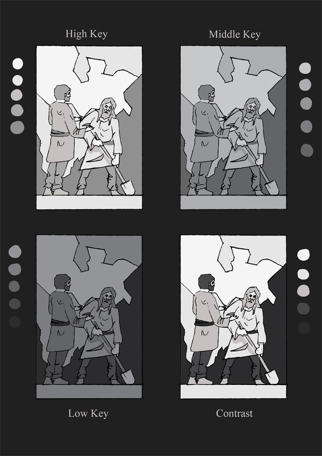
Then my next step was working out the value structure, again experimented with different ideas and I've settled on the "High Key" value structure.
My next step/s for the rest of the week was to re draw the comp on a larger scale and take it as much as I can without using reference, redo my value structure and blend it together to give definition to the forms, shoot my reference imagery and then start work on the final drawing.
However I'm abit stuck on the perspective for this piece, was hoping someone could help me out.
Model had to cancel last minute for my life drawing class on Monday so one of the regulars volunteered to sit for a portrait session instead so I stayed for that. Utilized the Reilly Method for the drawing and I think they turned out much better than my usual portraits from life (never again will I stray from this method). Only took them to the block in stage because I didn't have enough time to fully render them.
I've carried on with my illustration. Didn't like how my rough comps looked blown up and traced so instead of re drawing all 3 I selected the comp I liked best, put abit more time into making the drawing look nicer/correct.
From that I experimented with lighting, I was originally going to go with frontal lighting but I quite like how it looked lit from the front left and right so I might choose one of them instead.
Then my next step was working out the value structure, again experimented with different ideas and I've settled on the "High Key" value structure.
My next step/s for the rest of the week was to re draw the comp on a larger scale and take it as much as I can without using reference, redo my value structure and blend it together to give definition to the forms, shoot my reference imagery and then start work on the final drawing.
However I'm abit stuck on the perspective for this piece, was hoping someone could help me out.
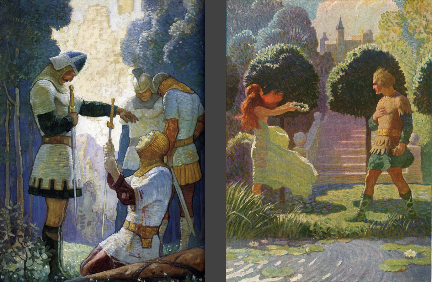
The scene will be in 1 point perspective and I was wondering about the figures and how to make sure they are also in perspective. The 2 images above by N.C Wyeth are similar to how I wanted my image to look. Wasn't sure from how my figures are indicated whether they would be in 1 point or 2 point.


I've carried on with my illustration. Didn't like how my rough comps looked blown up and traced so instead of re drawing all 3 I selected the comp I liked best, put abit more time into making the drawing look nicer/correct.

From that I experimented with lighting, I was originally going to go with frontal lighting but I quite like how it looked lit from the front left and right so I might choose one of them instead.


Then my next step was working out the value structure, again experimented with different ideas and I've settled on the "High Key" value structure.
My next step/s for the rest of the week was to re draw the comp on a larger scale and take it as much as I can without using reference, redo my value structure and blend it together to give definition to the forms, shoot my reference imagery and then start work on the final drawing.
However I'm abit stuck on the perspective for this piece, was hoping someone could help me out.
Model had to cancel last minute for my life drawing class on Monday so one of the regulars volunteered to sit for a portrait session instead so I stayed for that. Utilized the Reilly Method for the drawing and I think they turned out much better than my usual portraits from life (never again will I stray from this method). Only took them to the block in stage because I didn't have enough time to fully render them.
I've carried on with my illustration. Didn't like how my rough comps looked blown up and traced so instead of re drawing all 3 I selected the comp I liked best, put abit more time into making the drawing look nicer/correct.
From that I experimented with lighting, I was originally going to go with frontal lighting but I quite like how it looked lit from the front left and right so I might choose one of them instead.
Then my next step was working out the value structure, again experimented with different ideas and I've settled on the "High Key" value structure.
My next step/s for the rest of the week was to re draw the comp on a larger scale and take it as much as I can without using reference, redo my value structure and blend it together to give definition to the forms, shoot my reference imagery and then start work on the final drawing.
However I'm abit stuck on the perspective for this piece, was hoping someone could help me out.

The scene will be in 1 point perspective and I was wondering about the figures and how to make sure they are also in perspective. The 2 images above by N.C Wyeth are similar to how I wanted my image to look. Wasn't sure from how my figures are indicated whether they would be in 1 point or 2 point.


