04-11-2019, 05:39 AM
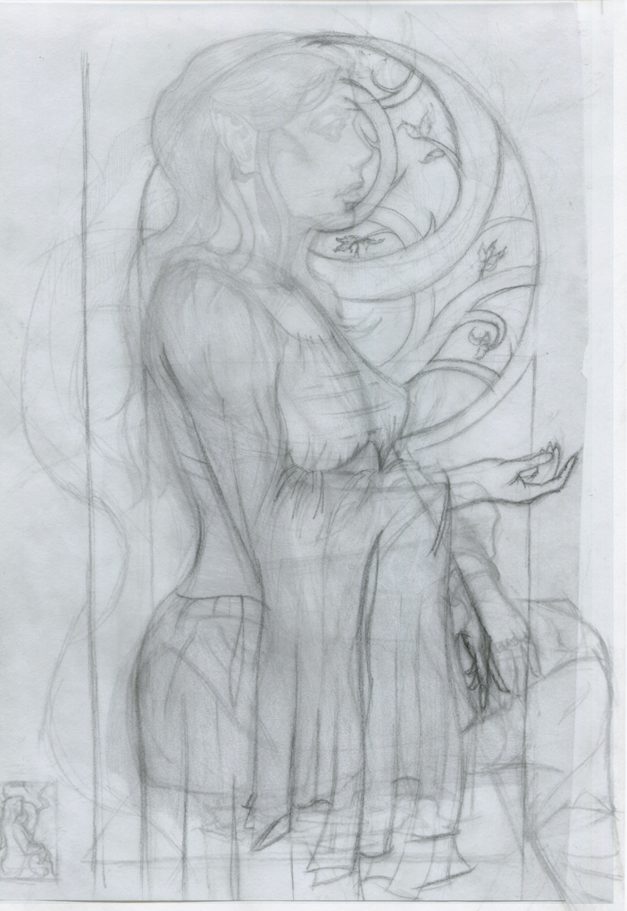
(04-09-2019, 11:36 AM)Fedodika Wrote: for the background just try a plain flat circle, keep it simple and dont get bogged down on other things while youre still trying to execute a nice figure. i also like the little tree or shape you have going behind her, just making that a flat graphic shape could look nice. you drew a nicer pose for the hand but now its too small, like a childs hand. Like if she were to put her hand on her chin, itd barely cover her nose. Put your own hand on your chin, it'll probably come up to your brow ridge.
the other resting hand looks weird, like it ends too abruptply like your hiding it intentionally. I didnt notice before she was sitting, i think it looks strange, itd probably be better if you just have her dress cut off and shes standing within the abstract shape. when someones sitting you have to like draw in other things in the scene to show they're sitting, but i feel that her doing that adds nothing to the scene but clutter. It wouldnt really affect the impact of the piece if she were doing either.
Its like i told chubby cat, dont hide those hands they are some of the biggest opportunities you have to show character. we as humans constantly look at hands, our own and others, they do everything we do, hiding them is nooby looking. her arm definitely looks better, her dress, its just too tight against the titties, if you google "medieval dress" you wont find one dress that is that tight against the breasts and shows a perfect outline of the nipple. Hell even Elviras dress isnt that tight! good job fixing the hair btw
If you even look at my raven piece i looked up body suits and found none of them perfectly outlined the breast, its quite unusual for that to happen unless the body suit has some kind of ringlet to split them like Taki from Soul Calibur (but even most cosplayers dont pull off that split.) theres always this wrinkle between the masses. you could probably get away with it in anime, but not in realism. I just cannot find a bodysuit or a dress that hugs bosoms that tight, its weird i know!
however! if your dress was like a really loose fabric, it might drape over like that if her arm was tucking under the middle its just the way youve drawn it, specially with the green the fabric looks thicker.
You did improve the image though, it is easier on the eyes, just has some goofy stuff, i believe in u!
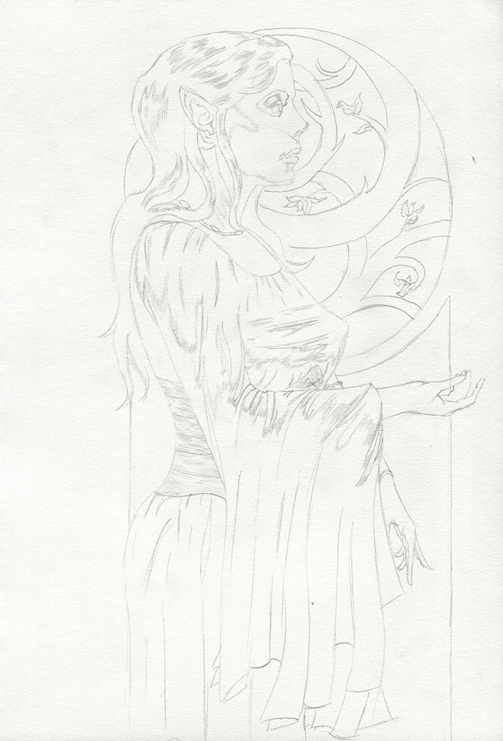
I've taken what you said into account and reworked it some more.
Used some ref for her right hand and invented her left but unsure about their sizes (particulary her left hand), and looked at some models in medievel clothing to help with re-working the breasts.
Traced over my layers to create a clean line drawing so if it all looks good I'll turn it into a value drawing and do some colour comps. I've also decided to paint it traditionally instead (oils) since I've got some panels I prepared ages ago. Got some time off during Easter so I'll paint it then, prob spend a few days on it and really push myself.


