07-01-2019, 05:46 AM
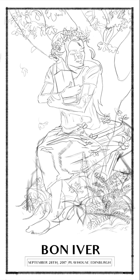
Update on the poster design.
Had my usual life classes this week (prob post them this week) so not a whole lot of time to work on the poster. I was planning on spending all weekend working on it and hopefully start inking but had some things come up last minute so haven't had as much time as I would of liked.
Got the final design complete, used the ref of myself that I shot to help me with designing the woman but tried sticking to my original design as much as possible and not just blindy copy the ref, basically using is as an aid. Shot some addiitonal ref in my garden to help with the plants aswell.

I'm still not completely happy with the design, see a few areas that could be improved upon such as her hands/feet, face, and the tree in the background doens't fit right with me (I wasn't sure if I should be using a perpective grid or not to stage the scene or not, since posters like Mucha's don't but I could be wrong). I've tried re-doing the sketch a few times now to fix these issues to no luck so i think this is just the best I can do skill wise right now so rather than just leaving it as this I want to take it to a finish regardless.
Got some plans tomorrow so I'll only have a few hours to get work done but I'll start inking this out in illustrator, hopefully get this done by next weekend.
Had my usual life classes this week (prob post them this week) so not a whole lot of time to work on the poster. I was planning on spending all weekend working on it and hopefully start inking but had some things come up last minute so haven't had as much time as I would of liked.
Got the final design complete, used the ref of myself that I shot to help me with designing the woman but tried sticking to my original design as much as possible and not just blindy copy the ref, basically using is as an aid. Shot some addiitonal ref in my garden to help with the plants aswell.

I'm still not completely happy with the design, see a few areas that could be improved upon such as her hands/feet, face, and the tree in the background doens't fit right with me (I wasn't sure if I should be using a perpective grid or not to stage the scene or not, since posters like Mucha's don't but I could be wrong). I've tried re-doing the sketch a few times now to fix these issues to no luck so i think this is just the best I can do skill wise right now so rather than just leaving it as this I want to take it to a finish regardless.
Got some plans tomorrow so I'll only have a few hours to get work done but I'll start inking this out in illustrator, hopefully get this done by next weekend.


