12-16-2019, 06:30 AM
Completely forgot I was covering some extra hours for my friend so again don't have as much work to show as I normally would.
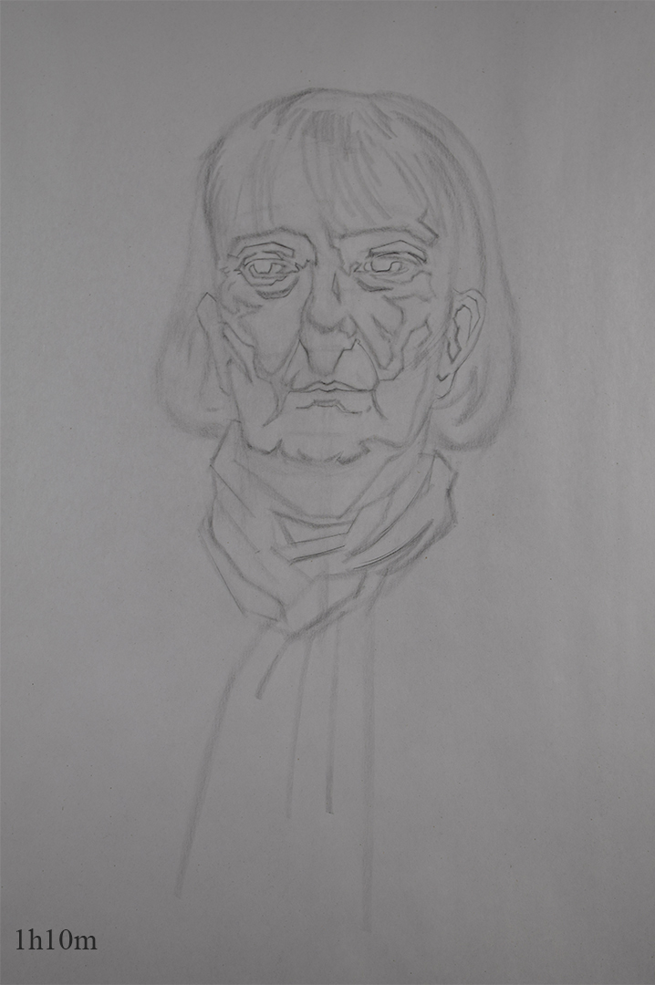
Portrait Class
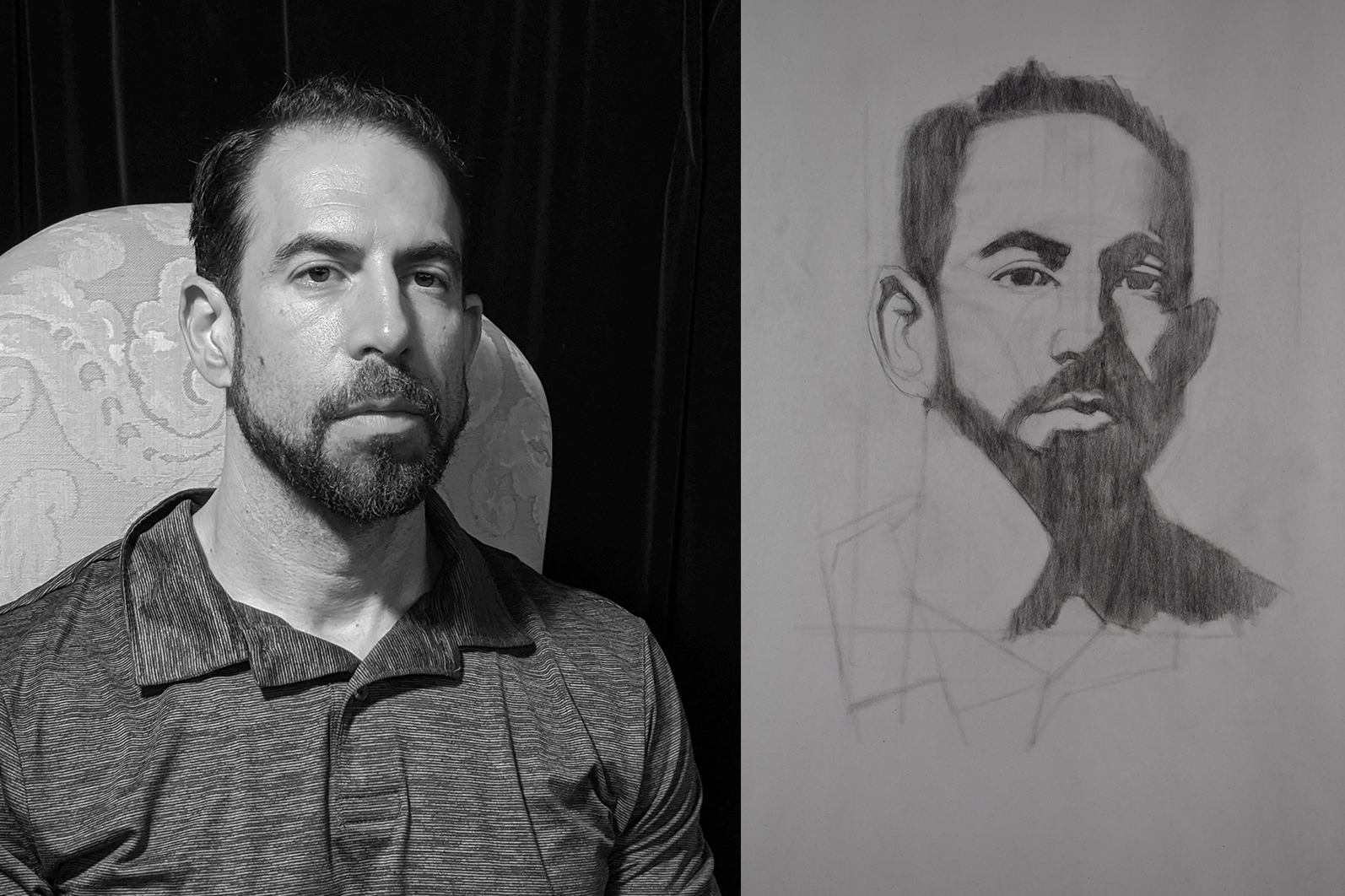
This was the 2nd drawing I did since I used the 1st one as a warm-up since I go to class straight from work. The bad lighting did not make her look attractive at all but perhaps if I got into rendering it would of tunred out ok? Can't really tell.
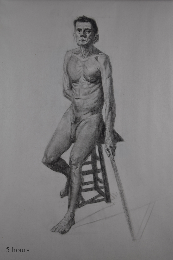
Life Class
Rendered the drawing from last week. Think it definitely looks better in person and definitely need to work on my anatomy/rendering. I beleive I'm going in the right direction so atleast that's something....
Live Streaming
Erik
H/W for week 9 - Still using the academic approach but want to try and inject more gesture into the poses, push the leg more etc make it look more dynamic.
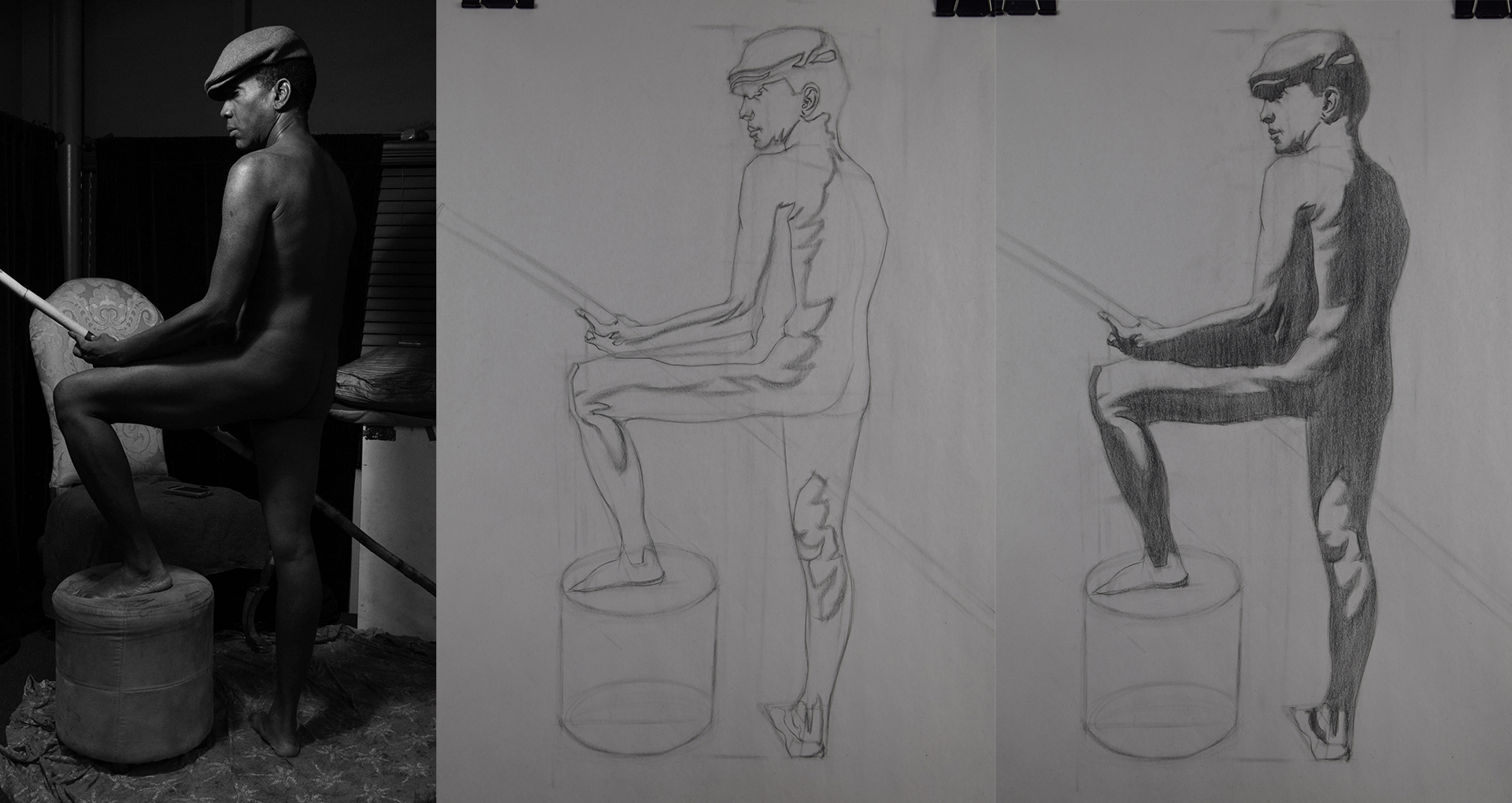
Brian
H/W for week 8 - I was having such a shitty night with this one. I was trying to do other work before this one but everything I was doing was just turning out crap. I know everyone has bad days but this felt like an extremely bad day for me where nothing was going right.
Poster
As I mentioned in one of previous posts I wanted to revisit an old poster idea I had and force myself to finish it over the winter break as I have 2 weeks off. Last time I tried inking it digitally and was struggling alot with it but this time I'm going to try and ink it by hand and then colour it digitally since it's meant to be a screen print. Going to so some reading up on how to create screen printed artwork digitally since I don't really have a clue on how to do it.
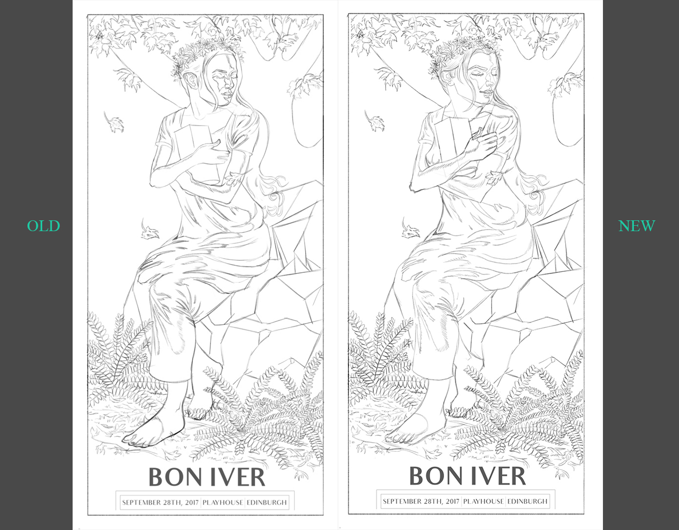
Tried to see if I could improve on what I had last time, mainly trying to fix the figure.
Old poster sketch
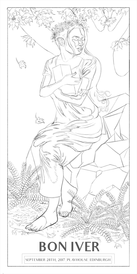
I noticed some proportional errors on my old drawing such as the width of the shoulders and her arms and hand so had a go at fixing those issues.
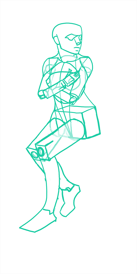
New poster sketch
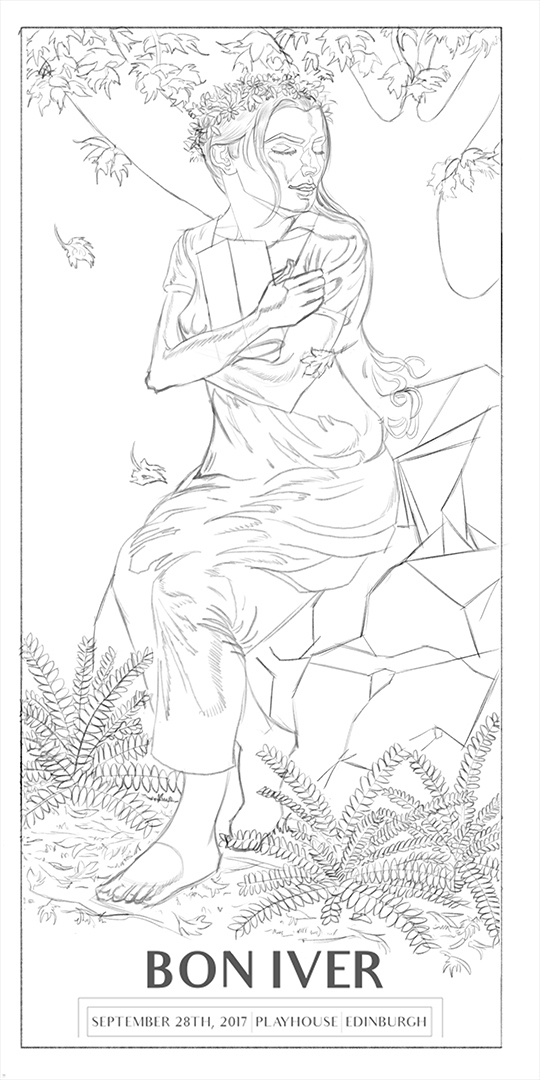
Heres where I'm at currently after attempting to fix the previous mistakes. Not really sure if eveything looks good proportionally now, (or if what I did was an improvement on the old sketch?) if there are any mistakes please let me know, if not I'm going to transfer this to my bristol board and start inking this later on in the week.
Comparison

Portrait Class
This was the 2nd drawing I did since I used the 1st one as a warm-up since I go to class straight from work. The bad lighting did not make her look attractive at all but perhaps if I got into rendering it would of tunred out ok? Can't really tell.

Life Class
Rendered the drawing from last week. Think it definitely looks better in person and definitely need to work on my anatomy/rendering. I beleive I'm going in the right direction so atleast that's something....

Live Streaming
Erik
H/W for week 9 - Still using the academic approach but want to try and inject more gesture into the poses, push the leg more etc make it look more dynamic.

Brian
H/W for week 8 - I was having such a shitty night with this one. I was trying to do other work before this one but everything I was doing was just turning out crap. I know everyone has bad days but this felt like an extremely bad day for me where nothing was going right.

Poster
As I mentioned in one of previous posts I wanted to revisit an old poster idea I had and force myself to finish it over the winter break as I have 2 weeks off. Last time I tried inking it digitally and was struggling alot with it but this time I'm going to try and ink it by hand and then colour it digitally since it's meant to be a screen print. Going to so some reading up on how to create screen printed artwork digitally since I don't really have a clue on how to do it.
Tried to see if I could improve on what I had last time, mainly trying to fix the figure.
Old poster sketch

I noticed some proportional errors on my old drawing such as the width of the shoulders and her arms and hand so had a go at fixing those issues.

New poster sketch

Heres where I'm at currently after attempting to fix the previous mistakes. Not really sure if eveything looks good proportionally now, (or if what I did was an improvement on the old sketch?) if there are any mistakes please let me know, if not I'm going to transfer this to my bristol board and start inking this later on in the week.
Comparison
