02-14-2020, 07:19 AM
- Fedodika: I was trying to go for a more youthful appearence but perhaps I went overboard. Yh I was toying with the idea of either seeing how far I could push myself without using reference or using reference. I see alot of artists who can go quite far without the need for reference but I think it's abit too sonn for myself haha.
I gave Daz3d ago in the end. It did help point out a few of the mistakes you mentioned such as the head being too big for the body. I was referring to myself in a mirror on my desk to give me an idea of proportions but I should of constructed the pose more before jumping in.
- chubby_cat: Thanks cat :) Yh after messing around with Daz3d I saw the proportional mistkaes I made. I should of construcuted the pose more like I did on my poster as that really helped me. Aatleast I know for next time :)
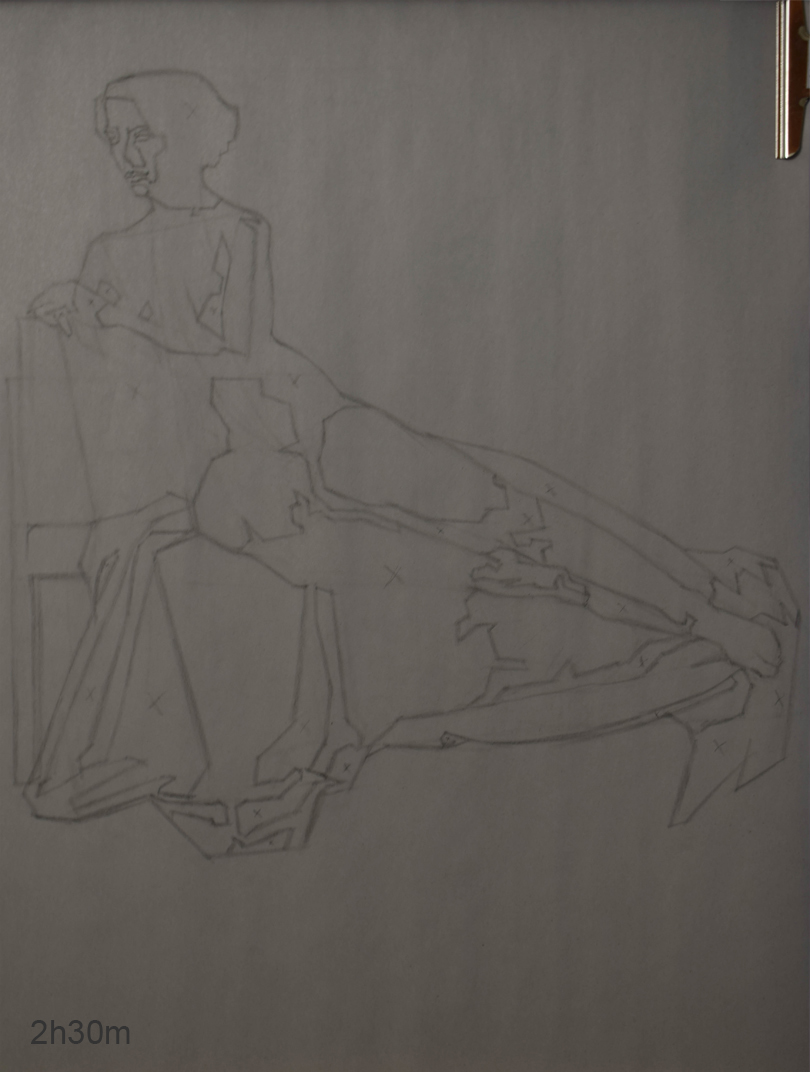
Thought I'd post some life work first. Aplogies for the quality of the photos. My rooms abit crowded atm so I couldn't set my lights up properly.
Life Drawing
Started another 3 week pose and spent the first week blocking in the figure. I started rendering this week and will continue doing the same next week so I'll post that on the weekend once I have some more space in my room.
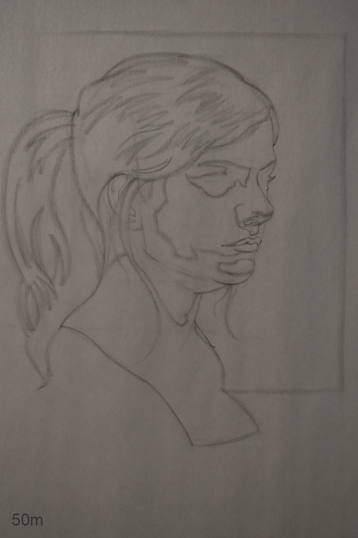
Portrait Class
Really wanted to dome construction drawing this week and take a break from how I;ve been working the past few months. This was my second attempt as my first was god awful. Once I start that anatomy course in April and dive back into figure drawing I plan on getting back into construction drawing aswell as quicksketch, and see if I can combine the way of working that I've been doing with construction drawing as I feel like I'm still copying what I see rather than anaylizing what I see and simplifying it into something easy to read.
Illustration
Played around with Daz3d which helped identify proportional mistakes that I had made but I decided to shoot some reference of my own in the end as I prefer that way of working. Not bashing Daz or anything but I find posing a model based on my sketch much easier.
This is my drawing based on my reference.
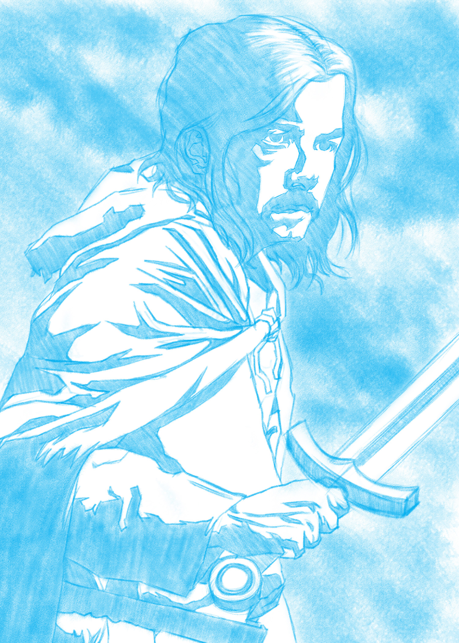
I then printed the drawing onto some bristol board and did a value comp.
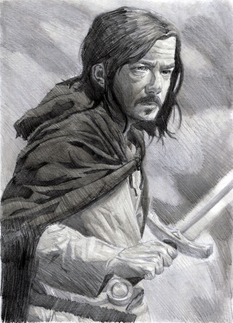
I've decided to complete this as a graphite drawing as I find working traditonally easier than digital. Plan on changing some things such as making him look younger and I want to group my values better as I feel like it's all over the place in some areas and try and design their shapes better.
If there are any proportional mistakes or any mistakes in general please let me know. I'm all ears :)
I gave Daz3d ago in the end. It did help point out a few of the mistakes you mentioned such as the head being too big for the body. I was referring to myself in a mirror on my desk to give me an idea of proportions but I should of constructed the pose more before jumping in.
- chubby_cat: Thanks cat :) Yh after messing around with Daz3d I saw the proportional mistkaes I made. I should of construcuted the pose more like I did on my poster as that really helped me. Aatleast I know for next time :)
Thought I'd post some life work first. Aplogies for the quality of the photos. My rooms abit crowded atm so I couldn't set my lights up properly.
Life Drawing
Started another 3 week pose and spent the first week blocking in the figure. I started rendering this week and will continue doing the same next week so I'll post that on the weekend once I have some more space in my room.

Portrait Class
Really wanted to dome construction drawing this week and take a break from how I;ve been working the past few months. This was my second attempt as my first was god awful. Once I start that anatomy course in April and dive back into figure drawing I plan on getting back into construction drawing aswell as quicksketch, and see if I can combine the way of working that I've been doing with construction drawing as I feel like I'm still copying what I see rather than anaylizing what I see and simplifying it into something easy to read.

Illustration
Played around with Daz3d which helped identify proportional mistakes that I had made but I decided to shoot some reference of my own in the end as I prefer that way of working. Not bashing Daz or anything but I find posing a model based on my sketch much easier.
This is my drawing based on my reference.

I then printed the drawing onto some bristol board and did a value comp.

I've decided to complete this as a graphite drawing as I find working traditonally easier than digital. Plan on changing some things such as making him look younger and I want to group my values better as I feel like it's all over the place in some areas and try and design their shapes better.
If there are any proportional mistakes or any mistakes in general please let me know. I'm all ears :)


