03-03-2020, 07:19 AM
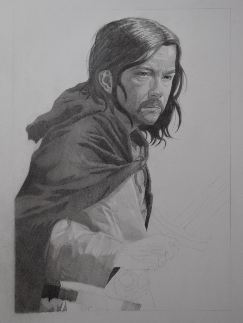
Wasn't really expecting to cause such a stir with this illustration tbh, rather than replying individually I think it will be better to respond as a whole.
I can understand where both Fedodika is coming from and where Joeseph/Who are coming from. I do agree that I struggle ALOT with making my figures/portraits look attractive which I think mainly comes down to my shape design and I understand where Fedodika is coming from in terms of illustrations being "sexy" or appealing, becuase otherwise why would you buy something that you don't find appelaing? But I do see where Who/Joespeh are coming from in terms of not every hero/heroine looking like hollywood hunks/babes.
I feel lke my answer lies in between these two points of view which as I said mainly seems to be a shape design issue. I feel like the only real fix/solution that i can do is by embarking on alot of master studies, seeing how artists I like design their shapes in an appelaing matter and how they simplify a portrait/figure into something easily readable. I feel like when I'm drawing form life or ref that I have a hard time knowing what to emphasize and what to downplay and not just simply "copy" the person in front of me. Hopefully what I'm saying makes any sense? I'm struggling atm to put what I want to say into writing.
Who - I was wondering if you could expand on my proportional issues that I'm consistently having so i know what I need to look out for. Truthfully I haven't been actively studying the Watts approach the last few months, I've been trying to follow the atelier approach of blocking-in. I understand the drawbacks of the Watts approach that you mentioned and how people from their tend to look the same. I suppose that can be said about any approach though really as I've though tthe same about some ateliers that I have seen. I'm trying to combine Watts approach with the atelier approach (if that makes any sense?), picking the best from both.
chubby_cat - Thanks. :) I feel like it might be too latre in the game to fix the ear, I'll give it ago but don't hold your breath. I've tried an Ipad in store a few months ago messing around with procreate trying to get a feel for it and I did like it. I didn't want to make it my primary source of creating art since I prefer working traditionally but use it as a study source for the reasons I mentioned. I think I'll more than likely get one, just waiting for the new ipads to be revealed which is meant to be this month, hopefully that drives the prices down of the current ones.
Update
Been working away on the illustration the past week. It is definitely taking much longer than I had anticipated, really wish I worked smaller as my arm is killing me but live and learn I guess? Planning on finishing it this week as I'm getting abit sick of it haha.

Btw I noticed the chin issue aswell. Weird becuase it looked ok to me in my sketch..... anyway I englarged his chin (hopefully) by enough but if not please let me know.
I can understand where both Fedodika is coming from and where Joeseph/Who are coming from. I do agree that I struggle ALOT with making my figures/portraits look attractive which I think mainly comes down to my shape design and I understand where Fedodika is coming from in terms of illustrations being "sexy" or appealing, becuase otherwise why would you buy something that you don't find appelaing? But I do see where Who/Joespeh are coming from in terms of not every hero/heroine looking like hollywood hunks/babes.
I feel lke my answer lies in between these two points of view which as I said mainly seems to be a shape design issue. I feel like the only real fix/solution that i can do is by embarking on alot of master studies, seeing how artists I like design their shapes in an appelaing matter and how they simplify a portrait/figure into something easily readable. I feel like when I'm drawing form life or ref that I have a hard time knowing what to emphasize and what to downplay and not just simply "copy" the person in front of me. Hopefully what I'm saying makes any sense? I'm struggling atm to put what I want to say into writing.
Who - I was wondering if you could expand on my proportional issues that I'm consistently having so i know what I need to look out for. Truthfully I haven't been actively studying the Watts approach the last few months, I've been trying to follow the atelier approach of blocking-in. I understand the drawbacks of the Watts approach that you mentioned and how people from their tend to look the same. I suppose that can be said about any approach though really as I've though tthe same about some ateliers that I have seen. I'm trying to combine Watts approach with the atelier approach (if that makes any sense?), picking the best from both.
chubby_cat - Thanks. :) I feel like it might be too latre in the game to fix the ear, I'll give it ago but don't hold your breath. I've tried an Ipad in store a few months ago messing around with procreate trying to get a feel for it and I did like it. I didn't want to make it my primary source of creating art since I prefer working traditionally but use it as a study source for the reasons I mentioned. I think I'll more than likely get one, just waiting for the new ipads to be revealed which is meant to be this month, hopefully that drives the prices down of the current ones.
Update
Been working away on the illustration the past week. It is definitely taking much longer than I had anticipated, really wish I worked smaller as my arm is killing me but live and learn I guess? Planning on finishing it this week as I'm getting abit sick of it haha.

Btw I noticed the chin issue aswell. Weird becuase it looked ok to me in my sketch..... anyway I englarged his chin (hopefully) by enough but if not please let me know.


