02-08-2022, 04:13 PM
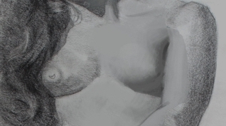
Yeah that's better for sure. There's a lot of good things. Rendering wise parts like the right arm and left leg are definitely softer. The right leg has like a flat shape for the shadow with no outline, and a pleasantly softer edge, however I still think there's not quite enough transition there, still too hard. You don't really need a lot of the shading across the legs, I would argue that is actually making it look flatter because it's not really going with the round form. The big gradation of light is what you really need to make it look round, just that transition really.
Studying drawings has been kind of confusing to me because there are dozens of ways that people have modeled form, and some, especially very old artists, barely even have real shapes of shadow, and others have hard shapes of shadow with no gradation at all. Some just line, obviously. But the expression of form is apparent across the board. So I hesitate to say you need to make your shadows a certain way, because i don't think that's really the point. But It's more looking at a certain form and just asking yourself like, what form is this reading as? What are you trying to say, versus what is your drawing actually serving up? That's how I tend to evaluate it, and it's easier to do that if you think of each part as an abstract form, like just a sculpture, or just something other than what it really is. If you think does this look like a boob, or an arm etc. you probably gonna be less critical of it. And you can express that any number of ways as long as it makes sense to the eye.
For example, her right breast, you still have that outline thing goin on. I don't doubt that there was a distinct shape of shadow. But a tone can be in a distinct shape, and yet have a soft edge. But in terms of that harsh, objective evaluation of what form you are serving up: It's a corner. I feel like it would be more like this with more transition. The tone is just bridging the shadow and light together:

I wish I could paint in a way that was more like drawing so it's a better comparison, but hopefully that made some kind of sense.
Studying drawings has been kind of confusing to me because there are dozens of ways that people have modeled form, and some, especially very old artists, barely even have real shapes of shadow, and others have hard shapes of shadow with no gradation at all. Some just line, obviously. But the expression of form is apparent across the board. So I hesitate to say you need to make your shadows a certain way, because i don't think that's really the point. But It's more looking at a certain form and just asking yourself like, what form is this reading as? What are you trying to say, versus what is your drawing actually serving up? That's how I tend to evaluate it, and it's easier to do that if you think of each part as an abstract form, like just a sculpture, or just something other than what it really is. If you think does this look like a boob, or an arm etc. you probably gonna be less critical of it. And you can express that any number of ways as long as it makes sense to the eye.
For example, her right breast, you still have that outline thing goin on. I don't doubt that there was a distinct shape of shadow. But a tone can be in a distinct shape, and yet have a soft edge. But in terms of that harsh, objective evaluation of what form you are serving up: It's a corner. I feel like it would be more like this with more transition. The tone is just bridging the shadow and light together:

I wish I could paint in a way that was more like drawing so it's a better comparison, but hopefully that made some kind of sense.


