04-10-2022, 04:55 AM
(04-02-2022, 07:57 PM)mixedmax Wrote: Really digging the illustration ideas as well. Sounds very promising!
I'm getting some old 50s radio show or Twilight Zone vibes.
Also really admiring your committment and all the thumbnails/roughs you did for this and I think the shifted perspective will go very well with your theme.
Thanks man! :) You are really gonna hate me since I went ahead and changed my rough comp to my second choice since I kept having so many issues with it.
Update
I was meant to post sooner but ended up being sick the past week and long story short I just tested positive for covid today..... Feeling much better now, thankfully haven't been too bad, it's pretty muich been the same as a mild cold that I can't quite shake. Mnaged to make some progress but I've had to take it slow.
Comp
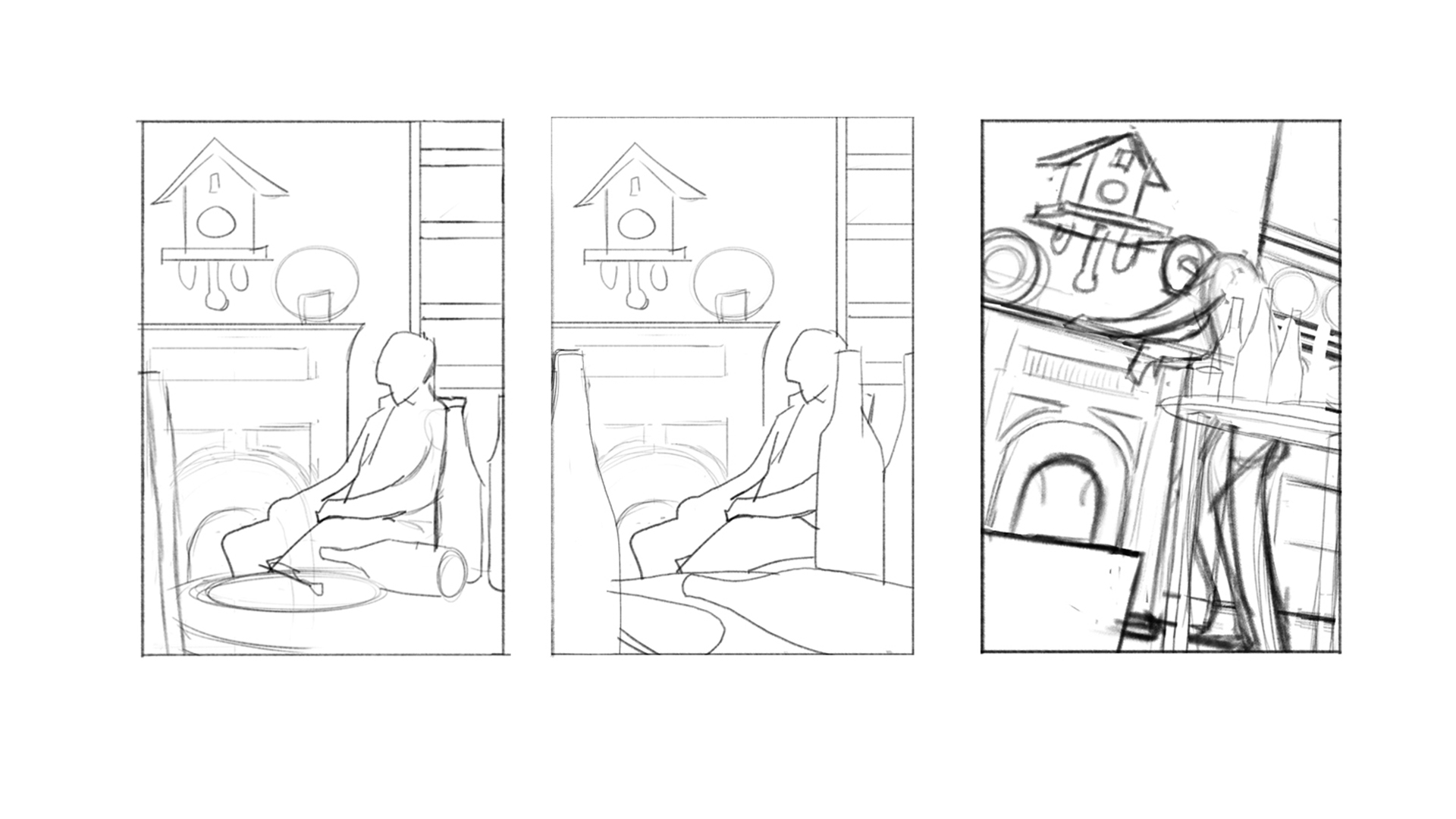
Initially I shot some reference to match my final comp above and started work on a more refined rough comp but I felt like I kept having issue after issue with it, mainly the perspective. I had to correct the perspective compared to my rough comp and rely on my phoot ref more and in the end I felt like my design had changed too much compared to my intial design and was more reliant on my reference which I didn't want. Guess 3 point perspective is something I need to revisit.
Decided to shoot some photo ref for my second idea and develop that some more with the design on the left being the one I ended up going with.

Value Comp
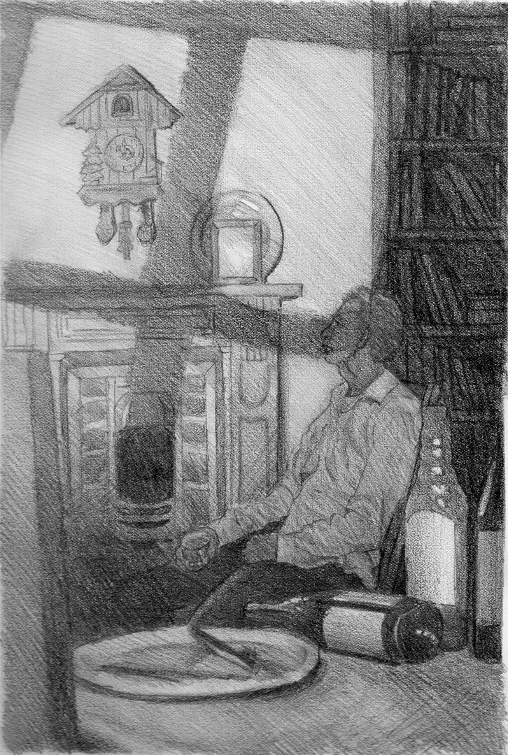
Spent around 2 evenings taking the idea above and settling on a value scheme to help aid the final painting.

Colour Comp
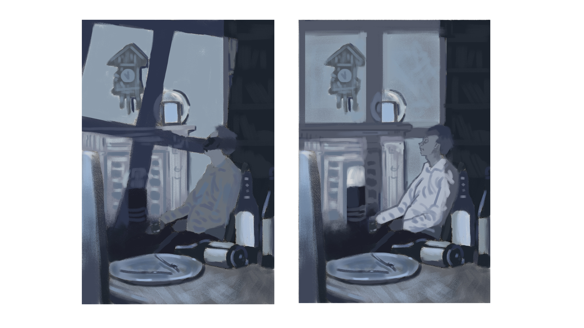
Spent some time last night aswell as this morning working on my colour comp for the piece. I liked the idea of the shadow from the window pane being angled like in the value comp but once I added some colour I wasn't as keen on it so in my second comp I thought I'd go with the shadow being straight which I think works alot better.
ATM I'm settlede on the second comp, might see if I can improve on it some more before I start painting it next week or if anyone here has any critiques? Please note the face is not final! :)


