02-21-2013, 12:57 AM
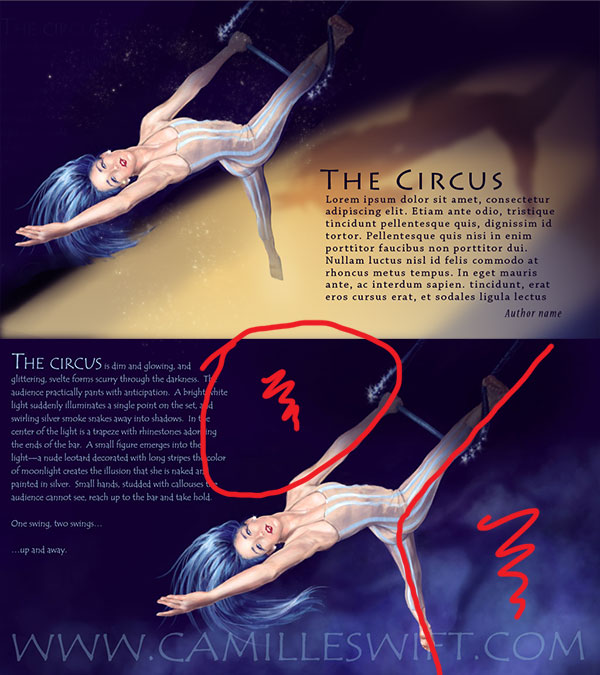
I love your painting! The one thing I do see in both the Turtle painting as well as Aerialist, compositionally you are leaving the text until last, it looks like you are creating negative space for the text and fitting the text in that space, rather than the text becoming part of the complete composition.
I have done a quick paint over to illustrate my thoughts, the text needs to be worked in better but we have eliminated several problem areas.
The light strength and color could use work but it is a nice jumping off point.
Hope this helps.

I have done a quick paint over to illustrate my thoughts, the text needs to be worked in better but we have eliminated several problem areas.
The light strength and color could use work but it is a nice jumping off point.
Hope this helps.

Eric
Elmstreetart.com
Elmstreetart.com


