Posts: 60
Threads: 15
Joined: Feb 2012
Reputation:
0
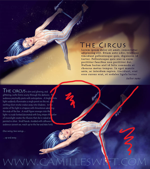
Ah, yes--I'm digging the partial shadow over her! Definitely makes it more dynamic like you said. I'll have to study my source photo some more--I think you're right in that top leg needs a wee bit more curvature, but now that I'm looking at it, I think the bottom leg might be a little too small/thin. I find the frame a little distracting--I'll have to mull that over. You do have a point about the font, though, I'm wondering if I can get it crisper if I add the text afterward in Indesign...
In any case--thank you so much for the feedback! Extremely helpful!
Posts: 60
Threads: 15
Joined: Feb 2012
Reputation:
0
A big thanks to you both! I actually had the ring in the painting from the very beginning, but I had it in the bottom right-corner, covering about a third of the area beneath her. I tried a few different things with it, but hated the way everything looked, so I took it out! I like how both of you have it actually more centered in the composition and the complimentary color is a great idea. I definitely like the re-positioning of the text--it makes the composition considerably less awkward. I'll update again as soon as I've tweaked it some more. Thanks again!
P.S. The reason I don't have the author's name for the text is because I wrote it. :)
![[Image: Dreamtime---Aerialist.jpg]](https://3.bp.blogspot.com/-c-UiaG9tY3c/URvirQVA5bI/AAAAAAAACKU/mFbCofiCg80/s1600/Dreamtime---Aerialist.jpg)
![[Image: Dreamtime---Aerialist.jpg]](https://3.bp.blogspot.com/-c-UiaG9tY3c/URvirQVA5bI/AAAAAAAACKU/mFbCofiCg80/s1600/Dreamtime---Aerialist.jpg)


![[Image: The+Aerialist_Final.jpg]](https://4.bp.blogspot.com/-bEBQ155YJl0/USQshRXD9FI/AAAAAAAACLA/bJkhN1GYclE/s1600/The+Aerialist_Final.jpg)

