07-19-2013, 07:19 AM
Looks to me like you really rushed this study.
First, the values.
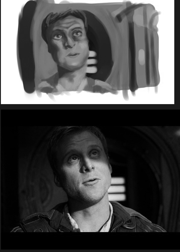
You cant think about colors without thinking about values too. Dont rush things, if you compare your painting with the reference, you should be able to see the huge difference in values and colors. You used a muddy yellow color for the skin, but cant you see how the yellow turns into a soft light rose skintone? and how the same rose skintone turns into a purpleish line when the light fades and enters the zone in shadows?
The background needs to be much darker, almost black in some areas (but dont use pure black). Also, looks like you just started painting the guy without doing any kind of previous preparation, hence all the problems with him. Maybe doing a portrait wasnt your objective with this study, but it wouldnt hurt to work on that too.
Now, i passed the pictures to grayscale so you can clearly see what i mean about values and color temperature.

Remember that often, values do all the work and colors get all the credit.
Cheers, hope you will find something useful here!
First, the values.
You cant think about colors without thinking about values too. Dont rush things, if you compare your painting with the reference, you should be able to see the huge difference in values and colors. You used a muddy yellow color for the skin, but cant you see how the yellow turns into a soft light rose skintone? and how the same rose skintone turns into a purpleish line when the light fades and enters the zone in shadows?
The background needs to be much darker, almost black in some areas (but dont use pure black). Also, looks like you just started painting the guy without doing any kind of previous preparation, hence all the problems with him. Maybe doing a portrait wasnt your objective with this study, but it wouldnt hurt to work on that too.
Now, i passed the pictures to grayscale so you can clearly see what i mean about values and color temperature.

Remember that often, values do all the work and colors get all the credit.
Cheers, hope you will find something useful here!
"Stand tall, and shake the Heavens!"
Tumblr for my comic!: http://rainfallcomic.tumblr.com/
Sketchbook: http://crimsondaggers.com/forum/thread-1227.html
Facebook: http://www.facebook.com/eduardogarayart
Deviantart: http://eduardogaray.deviantart.com/
Tumblr for my comic!: http://rainfallcomic.tumblr.com/
Sketchbook: http://crimsondaggers.com/forum/thread-1227.html
Facebook: http://www.facebook.com/eduardogarayart
Deviantart: http://eduardogaray.deviantart.com/


