12-07-2013, 07:49 PM
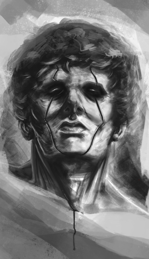
JJ is right there, the main problem IMO is that the ears-chin- mouth-nose area is drawn from a different viewing angle than the eyes-forehead area. Check the planes of the head, possibly on an asaro head, that always helps! I also think his ears are a bit too big.. On a composition level, his head being cut off is not a good idea, he is the main element of the picture after all, and though that blood-drip graphical element on the bottom is a good idea, it 1. brings the "gravity" of the picture way up 2. creates the biggest contrast which brings the eye off the focal point (eyes/face)
I did a quick overpaint if you don't mind, just to show you what I mean. Hope it helps :)

I did a quick overpaint if you don't mind, just to show you what I mean. Hope it helps :)


