12-05-2013, 09:23 PM
Can I vote tentacle monster instead? :) I like the last image, man, and using the crits from sula you can push this thing quite a bit ahead.
| Poll: ELVES or SPACE MARINES? You do not have permission to vote in this poll. |
|||
| Elves | 28 | 51.85% | |
| Space marines | 26 | 48.15% | |
| Total | 54 vote(s) | 100% | |
| * You voted for this item. | [Show Results] |
|
Ivan Ći's sketchbook
|
|
12-05-2013, 09:23 PM
Can I vote tentacle monster instead? :) I like the last image, man, and using the crits from sula you can push this thing quite a bit ahead.
12-13-2013, 02:35 AM
Wow, Sula, you are nailing the crits as usual <3
Tnx a lot guys, sadly barely have time to sleep these days, that should change around January and I'll start being a human being again :P Break at work, usual stress relief stuff 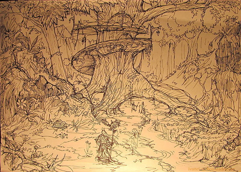
12-13-2013, 11:31 AM
do this. immediately lol
12-13-2013, 05:39 PM
Nice sketch. I agree with mr. toodles you should finish it =D
12-14-2013, 10:05 PM
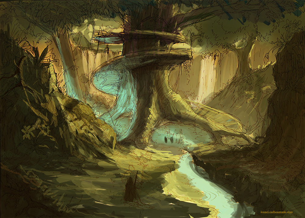
lolz ok, this is all had had time for today. blocked in basic palette
 and hey i made a hand cursor that we didnt use so im free to share it with the world. like it matters heh 
12-14-2013, 10:24 PM
Oooh loving the forest so far <3
12-15-2013, 08:49 AM
Woah the forest is great :) Love the palette. Maybe move the little guy off to the left a little, put him on a third, because right now the image is very centre heavy. Other than that, I like it a lot :D Keep up the good work!
01-02-2014, 12:34 AM
Ima lazy mofo these days , first of the year - here goes nothing!
:D
01-10-2014, 11:56 PM
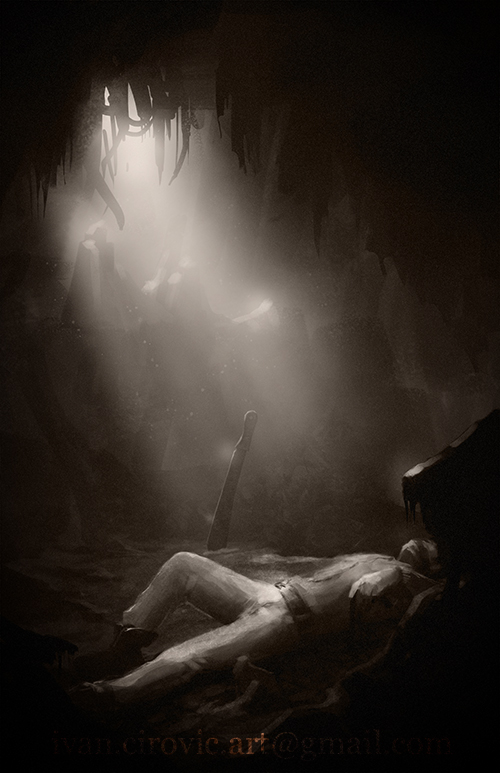
some work I did yesterday for some book. got creative with the watermark lol
01-11-2014, 10:47 AM
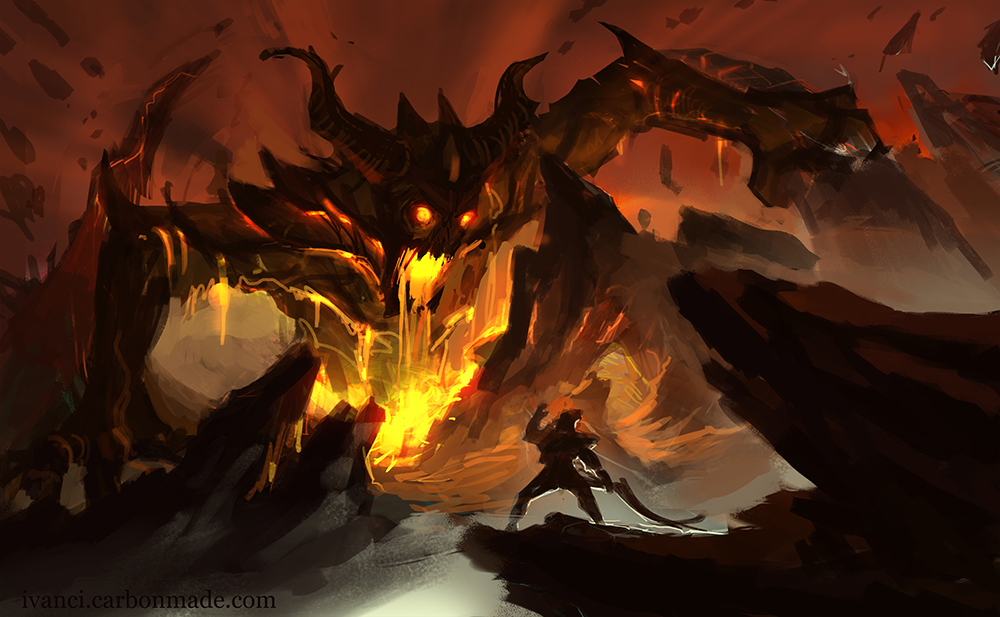 Tnx again Ursula, this piece has the potential to turn out ok thanks to your input :)
02-03-2014, 10:46 PM
Some of the stuff I worked on in 2013 finally came out
i am responsible for the lighting ,textures, colors on this one, 3d model was done by a colleague so, before 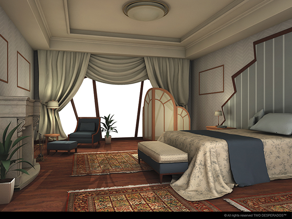 and after ![[Image: magnus2-mainimage.png]](http://www.twodesperados.com/wp-content/themes/TwoDesperados/images/games/magnus2-mainimage.png) its done for this game http://www.twodesperados.com/dreamatorim...-magnus-2/ also i did the same thing for the background picture. silly task.
02-04-2014, 05:57 AM
Man that background looks cool, great work.
03-15-2014, 02:24 AM
 messy superquick sketch for d3 contest i knew i couldnt finish. crit if you can, i'd like to push this further anyway. it's been a while :)
03-15-2014, 06:41 AM
one more step..

04-03-2014, 09:33 AM
I've been so lazy with the personal work last few months. Gonna finish some stuff for the portfolio update hopefully :)
+3hours into this one oh boy how i suck xD i still feel it has compositional flaws but i guess i just need to keep hammering it until it bends 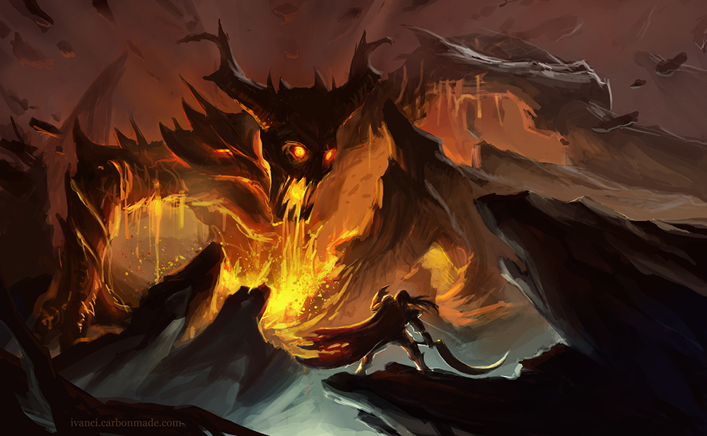
05-14-2014, 05:47 AM
Ill go ahead and call this done, though it could also be only 70% finished as well hehe
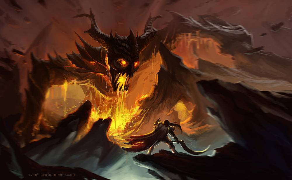 this one is still cookin
06-15-2014, 07:10 AM
Hey Ici,
it's been a while since I last posted here. I took the freedom and did an overpaint of the lava-monster piece, since I really like the feeling of the painting. I have 2 suggestions in order to increase the punch and the visual interest of the piece. 1. get the action closer to the viewer 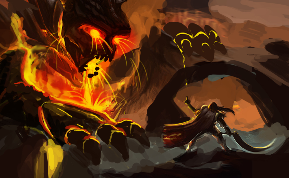 this way you decrease the emotional distance and have the viewer more engaged.. I gave the knight dude a more clear attitude towards the monster hehe but if you want to keep the "medieval-ness" it might be unappropriate :D 2. 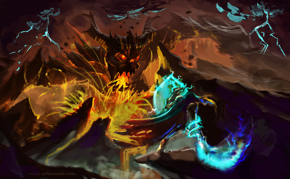 what I mostly did was pushing the contrasts everywhere. check every edge and see if you can have more contrast, without losing your focal points. for example the mountain right of the monsters face was a bit merging with its arm. also I looked at eruption volcanos and they have some pretty crazy looking stuff going on: http://climateviewer.com/wp-content/uplo...ptions.jpg http://images.nationalgeographic.com/wpf...00x450.jpg http://playrific.com/images/media/nation..._shots.png you can put stuff like that in your picture in order to make it more realistic and more entertaining to look at. I also pushed the pose of our hero by putting his sword arm more behind his back. also sorry for saying this, but the sword looks just weird to me. too large, too curvy and also too weak against such a great foe. I changed it into something more magical which also gives a greater color-contrast between the 2. in order to balance the blue in the foreground, I added some blue lightnings in the background. I also wanted to show that the knights magic is based on lightning so I added a lightning shield. in your picture the sky is really light, which makes it look a but cloudy but not really dramatic. so I pushed that too, which added a vignetting effect, that frames the monster. to increase the color variations I added purple in the shadows. the last thing, I don't know how many design-passes you did on the monster but it looks a bit rushed. I can't put my finger on it, but maybe look at really weird stuff in order to get cool ideas. maybe look at burnt victims or melted plastic toys. at the moment it looks mostly like a devil-ish creature. the cool thing with lava monsters is, that you can really go nuts with the design, they can be melting and cooling down here and there and just look asymetrical, for example look at the lava dude in Dark Souls: http://img4.wikia.nocookie.net/__cb20130...charge.png Great backstory btw, worth checking out. Actually I liked the older version of the piece more, it had more contrast and more dynamism imho. the cold light that comes in from the right wasn't really helping, I think I would have killed it. But man, the piece is great but like you said, could be pushed more. I can't wait to see if you take it on another time. I hope that helped :)
06-15-2014, 12:27 PM
Wow, tnx a lot man, I'll use the advice to push more :) ! Good points.
|
|
« Next Oldest | Next Newest »
|