12-19-2012, 10:58 AM
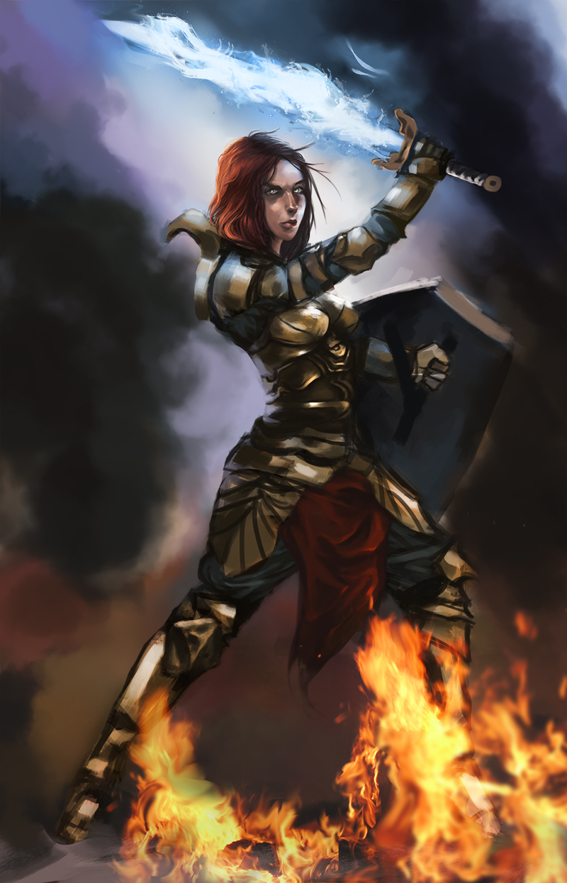
Nice comp on the last chick. Push her further if you have time, it has potential!
|
Eddy´s Sketchbook
|
|
12-19-2012, 10:58 AM
Nice comp on the last chick. Push her further if you have time, it has potential!
12-19-2012, 11:02 PM
Thanks guys! i´m still working on it, still mountains of work to do, also i like your suggestion atrenr, i will work on that too!
"Stand tall, and shake the Heavens!"
Tumblr for my comic!: http://rainfallcomic.tumblr.com/ Sketchbook: http://crimsondaggers.com/forum/thread-1227.html Facebook: http://www.facebook.com/eduardogarayart Deviantart: http://eduardogaray.deviantart.com/
12-27-2012, 03:54 AM
Hi guys and gals! i hope all of you are having a good holidays.
Even in this busy times i managed to work more on this. Nothing special, the concept itself is cheesy, but it was a fun picture to work on. :) 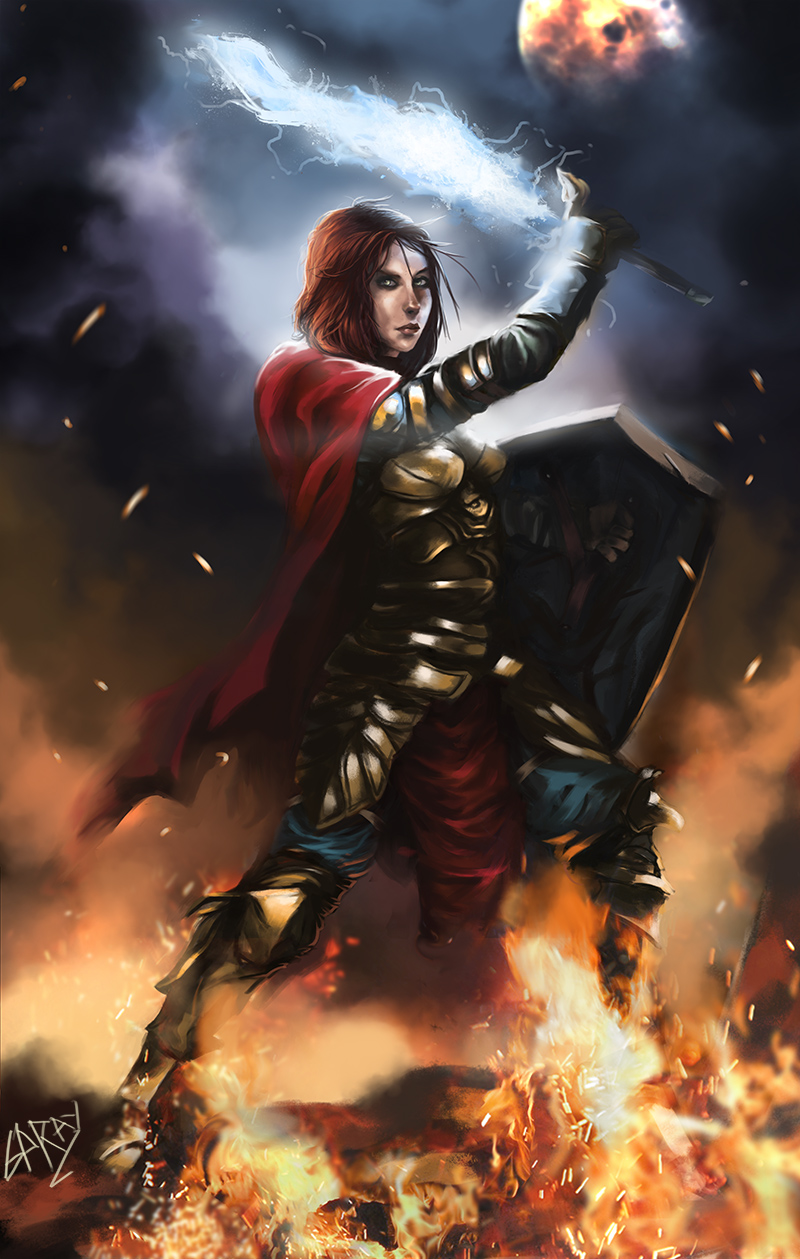 On a side note, i´m going to receive a copy Color and light by James Gurney for Christmas, niiice
"Stand tall, and shake the Heavens!"
Tumblr for my comic!: http://rainfallcomic.tumblr.com/ Sketchbook: http://crimsondaggers.com/forum/thread-1227.html Facebook: http://www.facebook.com/eduardogarayart Deviantart: http://eduardogaray.deviantart.com/
12-27-2012, 11:20 PM
New graphic novel stuff, this months i have been focusing too much on Rose, the main character. So for now i will focus on the rest of the cast.
Here is a sketch of his mentor, The master of the battlefield, The Hawk. 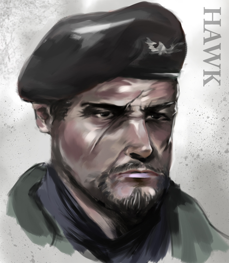
"Stand tall, and shake the Heavens!"
Tumblr for my comic!: http://rainfallcomic.tumblr.com/ Sketchbook: http://crimsondaggers.com/forum/thread-1227.html Facebook: http://www.facebook.com/eduardogarayart Deviantart: http://eduardogaray.deviantart.com/
12-29-2012, 12:03 PM
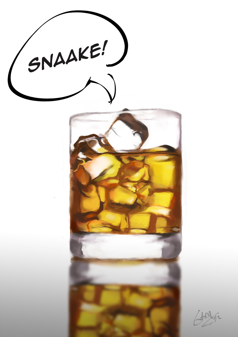
a late night study, lololol
"Stand tall, and shake the Heavens!"
Tumblr for my comic!: http://rainfallcomic.tumblr.com/ Sketchbook: http://crimsondaggers.com/forum/thread-1227.html Facebook: http://www.facebook.com/eduardogarayart Deviantart: http://eduardogaray.deviantart.com/
12-31-2012, 11:31 PM
Sketching some ideas for the graphic novel, this picture depicts three main characters of the novel in his first years on the military.
The prologue will have some flashbacks like this. And happy new year! 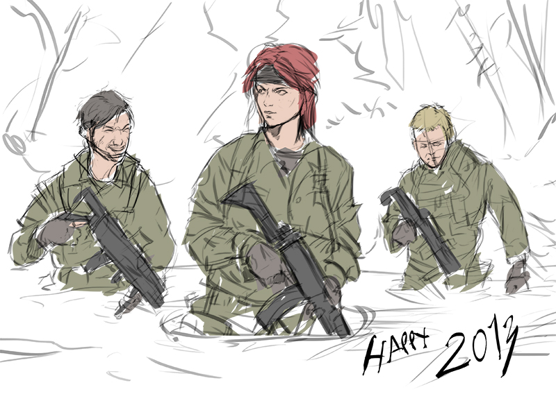
"Stand tall, and shake the Heavens!"
Tumblr for my comic!: http://rainfallcomic.tumblr.com/ Sketchbook: http://crimsondaggers.com/forum/thread-1227.html Facebook: http://www.facebook.com/eduardogarayart Deviantart: http://eduardogaray.deviantart.com/
01-04-2013, 03:02 AM
i´m trying to do a logo for my graphic novel project, and here is my initial idea, but since im clueless when it comes to graphic design, any advices or opinions would be greatly appreciated :)
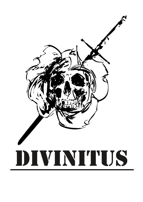
"Stand tall, and shake the Heavens!"
Tumblr for my comic!: http://rainfallcomic.tumblr.com/ Sketchbook: http://crimsondaggers.com/forum/thread-1227.html Facebook: http://www.facebook.com/eduardogarayart Deviantart: http://eduardogaray.deviantart.com/
01-04-2013, 08:24 AM
Still working on it, this is going to be fun.
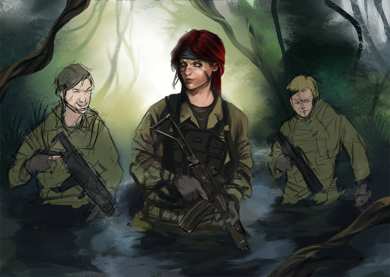
"Stand tall, and shake the Heavens!"
Tumblr for my comic!: http://rainfallcomic.tumblr.com/ Sketchbook: http://crimsondaggers.com/forum/thread-1227.html Facebook: http://www.facebook.com/eduardogarayart Deviantart: http://eduardogaray.deviantart.com/
01-05-2013, 10:35 AM
^ that logo could be a pretty cool tattoo design.
01-06-2013, 05:17 PM
Thanks for dropping by my sb,
Really liking all this art here! Knight lady turned out wicked :)
01-09-2013, 01:48 AM
Thanks Nazetta, Corza, also sorry for the late reply. ^^'
Today i started to work on this picture again, its taking form now, but i still i have tons of things to do. 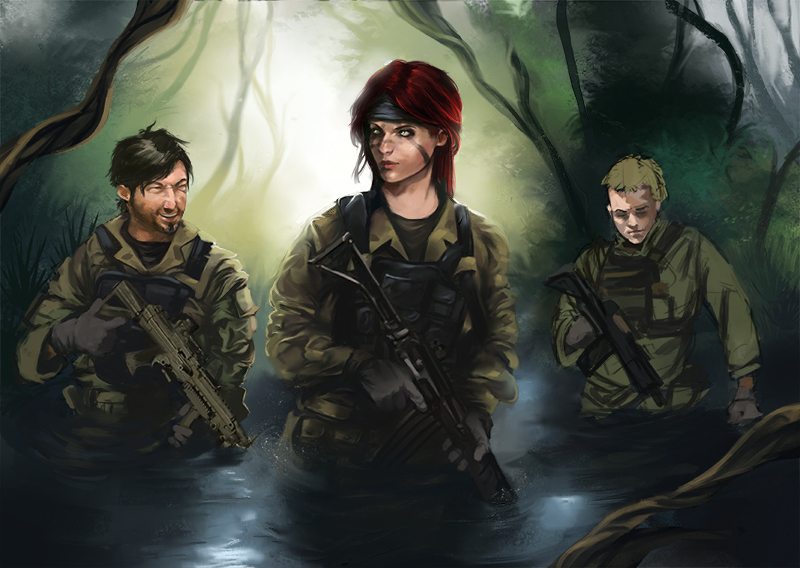
"Stand tall, and shake the Heavens!"
Tumblr for my comic!: http://rainfallcomic.tumblr.com/ Sketchbook: http://crimsondaggers.com/forum/thread-1227.html Facebook: http://www.facebook.com/eduardogarayart Deviantart: http://eduardogaray.deviantart.com/
01-10-2013, 07:51 AM
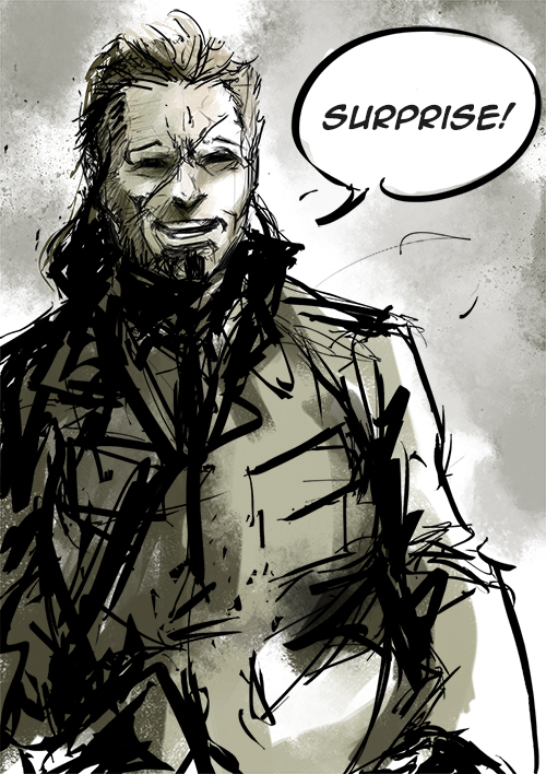
New divinitus sketch, the idea is to mix the style of the picture above with something like this:
"Stand tall, and shake the Heavens!"
Tumblr for my comic!: http://rainfallcomic.tumblr.com/ Sketchbook: http://crimsondaggers.com/forum/thread-1227.html Facebook: http://www.facebook.com/eduardogarayart Deviantart: http://eduardogaray.deviantart.com/
01-10-2013, 10:59 AM
Hey Eduardo, The graphic novel stuff is awesome. I cant wait to see that jungle scene with the protagonists done.
01-10-2013, 12:23 PM
Thanks a lot mate! :)
Another Sketch, just to try some things. This has nothing to do with the story of Divinitus. 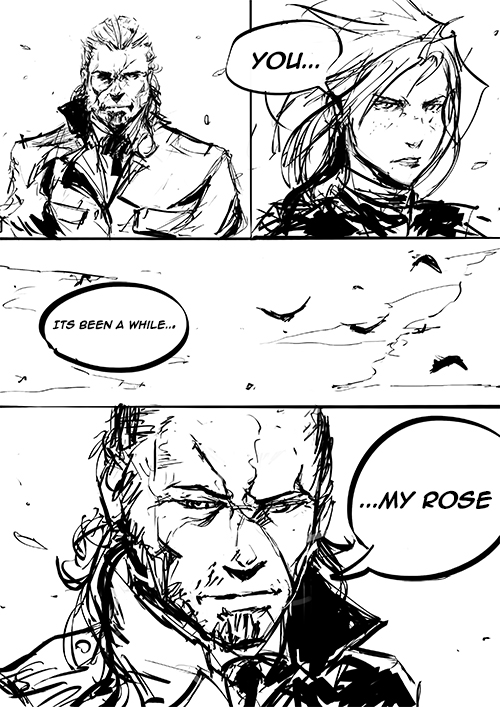
"Stand tall, and shake the Heavens!"
Tumblr for my comic!: http://rainfallcomic.tumblr.com/ Sketchbook: http://crimsondaggers.com/forum/thread-1227.html Facebook: http://www.facebook.com/eduardogarayart Deviantart: http://eduardogaray.deviantart.com/
01-11-2013, 10:36 AM
I Finished this style test.
I want something like this (obviously properly rendered and stuff) for the important scenes. Of course, critiques, suggestions, etc welcome! 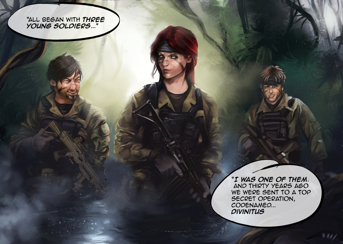
"Stand tall, and shake the Heavens!"
Tumblr for my comic!: http://rainfallcomic.tumblr.com/ Sketchbook: http://crimsondaggers.com/forum/thread-1227.html Facebook: http://www.facebook.com/eduardogarayart Deviantart: http://eduardogaray.deviantart.com/
01-11-2013, 11:45 AM
Wow ed this is awesome nice job on everything!
I would make the two characters behind her looking in the opposite direction to make her stand out as a more bold important character the way all three characters hold their guns in the exact same position seems a little stiff to me. I think the narrative and the uniforms of the characters are similar enough for you to animate the scene more.
01-11-2013, 12:23 PM
Ed, You have some great stuff here. My only suggestion for you is to maybe push your values a bit more! You have some nice lighting, take full effect of it and get your characters to really POP! Then again this could be the monitor I'm on right now :O
Blog | CD Sketchbook | dA | Facebook |
01-11-2013, 01:46 PM
I'm diggin' that line art man, and the renders are getting better and better. You've already been handed a few crits, but just to add one more, try varying up the skin tones. Right now I think you have a safety skin color that you tend to default to, push out some more!
01-11-2013, 10:28 PM
Thanks guys for the awesome critiques! i will take note of your comments for the next style test! :)
"Stand tall, and shake the Heavens!"
Tumblr for my comic!: http://rainfallcomic.tumblr.com/ Sketchbook: http://crimsondaggers.com/forum/thread-1227.html Facebook: http://www.facebook.com/eduardogarayart Deviantart: http://eduardogaray.deviantart.com/
01-12-2013, 04:49 AM
Warm up sketch before work.
Long time without drawing anything manga! It feels refreshing somehow. 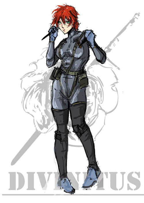
"Stand tall, and shake the Heavens!"
Tumblr for my comic!: http://rainfallcomic.tumblr.com/ Sketchbook: http://crimsondaggers.com/forum/thread-1227.html Facebook: http://www.facebook.com/eduardogarayart Deviantart: http://eduardogaray.deviantart.com/ |
|
« Next Oldest | Next Newest »
|