01-27-2013, 07:45 PM
wow you are a mind reader :D
|
Anatomy of a Pinup - Class Closed
|
|
01-31-2013, 07:31 PM
Hey there... I stumbled upon this class just a few weeks ago (this year) and I figured I should post my take on the assignments here too. I already did all of them to my best (although I tried to focus on not overdoing details too)... As for the last assignment, I went kind of ahead with it, since I thought this class was already way over, so I don´t have the sketchy versions. Sorry for that. Anyway any crit/comment will be still welcomed ^_^
Line skulls ![[Image: Untitled-1.jpg]](https://4.bp.blogspot.com/-Ap85cva4IsA/UOq8L-gk0tI/AAAAAAAAAfE/a2KQhfCDXDM/s1600/Untitled-1.jpg) Rendered skulls ![[Image: 2013_01_07_fem_skulls_render_1_fin.jpg]](https://3.bp.blogspot.com/-TZlGZRWUlqo/UPM3mJI89OI/AAAAAAAAAfg/jB1EWIiGAeI/s1600/2013_01_07_fem_skulls_render_1_fin.jpg) B&W Master Studies ![[Image: 2013_01_14_mas_study1.jpg]](https://3.bp.blogspot.com/-8FJz1xbOSVU/UPQMcTJWySI/AAAAAAAAAf8/ytTUXP9ZTz8/s1600/2013_01_14_mas_study1.jpg) ![[Image: 2013_01_14_mas_study2.jpg]](https://4.bp.blogspot.com/-9BNNzrLfzTc/UPR0mj2QZ8I/AAAAAAAAAgY/QB7pcfEld64/s1600/2013_01_14_mas_study2.jpg) ![[Image: 2013_01_15_mas_study3.jpg]](https://1.bp.blogspot.com/-PIAJOFuotug/UPZ5D6iIfiI/AAAAAAAAAg0/-NEy5XEDgKQ/s1600/2013_01_15_mas_study3.jpg) ![[Image: 2013_01_16_mas_study4.jpg]](https://2.bp.blogspot.com/-VAPBM2u_d4o/UPbOzTLC6gI/AAAAAAAAAhQ/0ZZ5ErdK0Q4/s1600/2013_01_16_mas_study4.jpg) ![[Image: 2013_01_16_mas_study5.jpg]](https://2.bp.blogspot.com/-qU2fY3c0osk/UPb_Hv2De1I/AAAAAAAAAhs/xHPItuMbD38/s1600/2013_01_16_mas_study5.jpg) Full master study ![[Image: 2013_01_16_master_study.jpg]](https://4.bp.blogspot.com/-zdVhDB10hPU/UPmu24quBJI/AAAAAAAAAiI/6seX6QMh3OM/s1600/2013_01_16_master_study.jpg) Line head studies ![[Image: 2013_01_20_study_heads_lines.jpg]](https://4.bp.blogspot.com/-nMYkD7lbLb4/UP3Z-dOibBI/AAAAAAAAAik/vkGX62X0MQM/s1600/2013_01_20_study_heads_lines.jpg) Rendered head studies ![[Image: 2013_01_22_study_heads_render_1.jpg]](https://1.bp.blogspot.com/-sozjkL0PZEo/UP8KS9Tsg6I/AAAAAAAAAjA/kynTa51qlks/s1600/2013_01_22_study_heads_render_1.jpg) ![[Image: 2013_01_23_study_heads_render_2.jpg]](https://2.bp.blogspot.com/-irnckfwt96Q/UQo5nQwa_0I/AAAAAAAAAms/XBVNiL8C0YY/s1600/2013_01_23_study_heads_render_2.jpg) ![[Image: 2013_01_23_study_heads_render_3.jpg]](https://1.bp.blogspot.com/-PT9S-bOMC0I/UP_OeybjgaI/AAAAAAAAAj4/W3jSH8aYTFA/s1600/2013_01_23_study_heads_render_3.jpg) ![[Image: 2013_01_23_study_heads_render_4.jpg]](https://2.bp.blogspot.com/-G_pFqHB4RbU/UQBrohoOUeI/AAAAAAAAAkU/OmiDmqw7DFM/s1600/2013_01_23_study_heads_render_4.jpg) ![[Image: 2013_01_23_study_heads_render_5.jpg]](https://3.bp.blogspot.com/-xz56RfQq7gA/UQCGPI0ToyI/AAAAAAAAAkw/7gwhI4btVFg/s1600/2013_01_23_study_heads_render_5.jpg) Full figure study ![[Image: 2013_01_24_study_figure.jpg]](https://2.bp.blogspot.com/-xH8allMQN4s/UQGykiOM56I/AAAAAAAAAlM/m9VMmb34e9o/s1600/2013_01_24_study_figure.jpg) And here are the results... the first one is not much of a pinup, I just tried to make kind of a look I like, just to try out, the second one could count for the pinup, I guess... Well, I hope... ![[Image: 2013_01_26_pinup1.jpg]](https://4.bp.blogspot.com/-eLpXscmztIM/UQbQ3D_4PCI/AAAAAAAAAlo/oCtOl70u3vs/s1600/2013_01_26_pinup1.jpg) ![[Image: 2013_01_26_pinup3.jpg]](https://3.bp.blogspot.com/-tqjiintnfOM/UQmDGcNBq4I/AAAAAAAAAmM/EWmfDu0l4Xw/s1600/2013_01_26_pinup3.jpg)
02-01-2013, 07:26 PM
Hey everyone. Well done Razvan! your pinup is looking really well polished.
Things have been crazy this month, so many things stopped me from doing what I planned to do. I'm really sorry for being inactive for so long. Here is where I am at with my pinup. I changed my idea to The Year of the Snake and making a sexy but fierce Human/Snake goddess. She's mostly human with parts of her skin changing to scales. I keep the costume minimal but will add some more elements ass I go such as bangles and chains etc. The idea is that The year of the snake is supposed to contain the elements of Fire (natural element of snake) and Water (element for the coming Lunar year). In Chinese astrology (based on what I've read), this means the year will be mixed with good and bad fortune. So, I made my girl fierce and powerful but countered it with flowing fabric, fairly relaxed pose (should read as a steady walk towards viewer) and softer features on certain parts of her body. I'll be working on her now until finished. Next I'm going to add extra costume elements and try out some lighting before moving on to colours if and when people think I'm ready. Idea's for new pinup 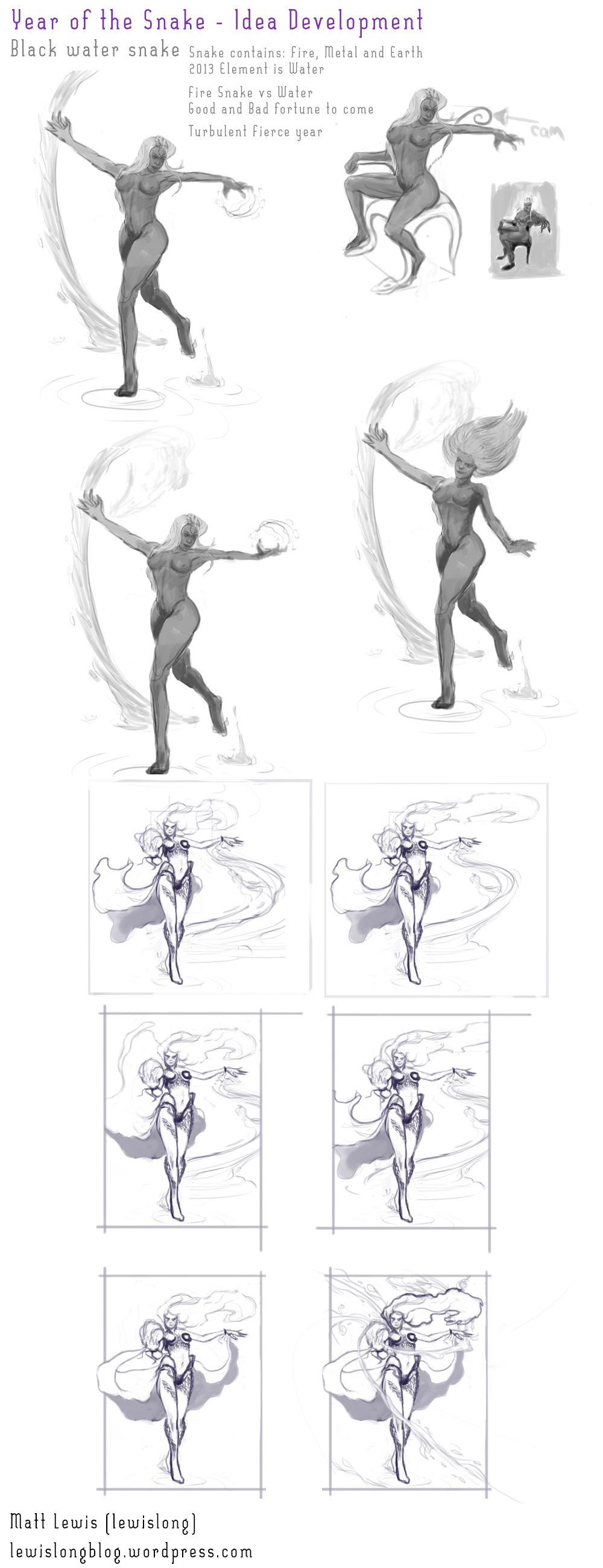  25% of original size 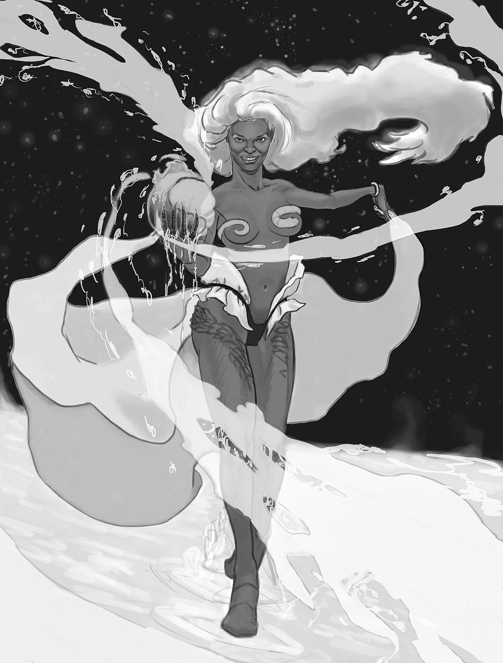 100% 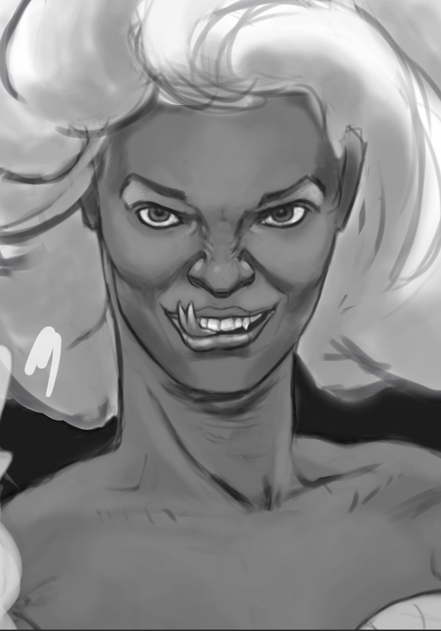
02-01-2013, 07:43 PM
Naevea - thanks for posting all those works, just one suggestion/critique..maybe you could spend more time on each of the assignment.
good to see your updates Matt, few things about your pinup -try to add more rhythm in her hair, figure and those smoke thingy -use some ref. for her face, as well as the whole figure she looks a bit manly, will discuss about the expressions later -i know its just a wip but still, try to minimize those smoke patches. -try to improvise her dress, that thong (not sure if thats the correct term) looks too modern..how about using some metal or organic material instead? just a suggestion.
02-02-2013, 06:50 PM
A bit o progress on the pinup. Got to maybe refine the clouds a little bit and tone down some reds in the face or maybe make it a bit twords orange ?
And to make a golden hour version :) 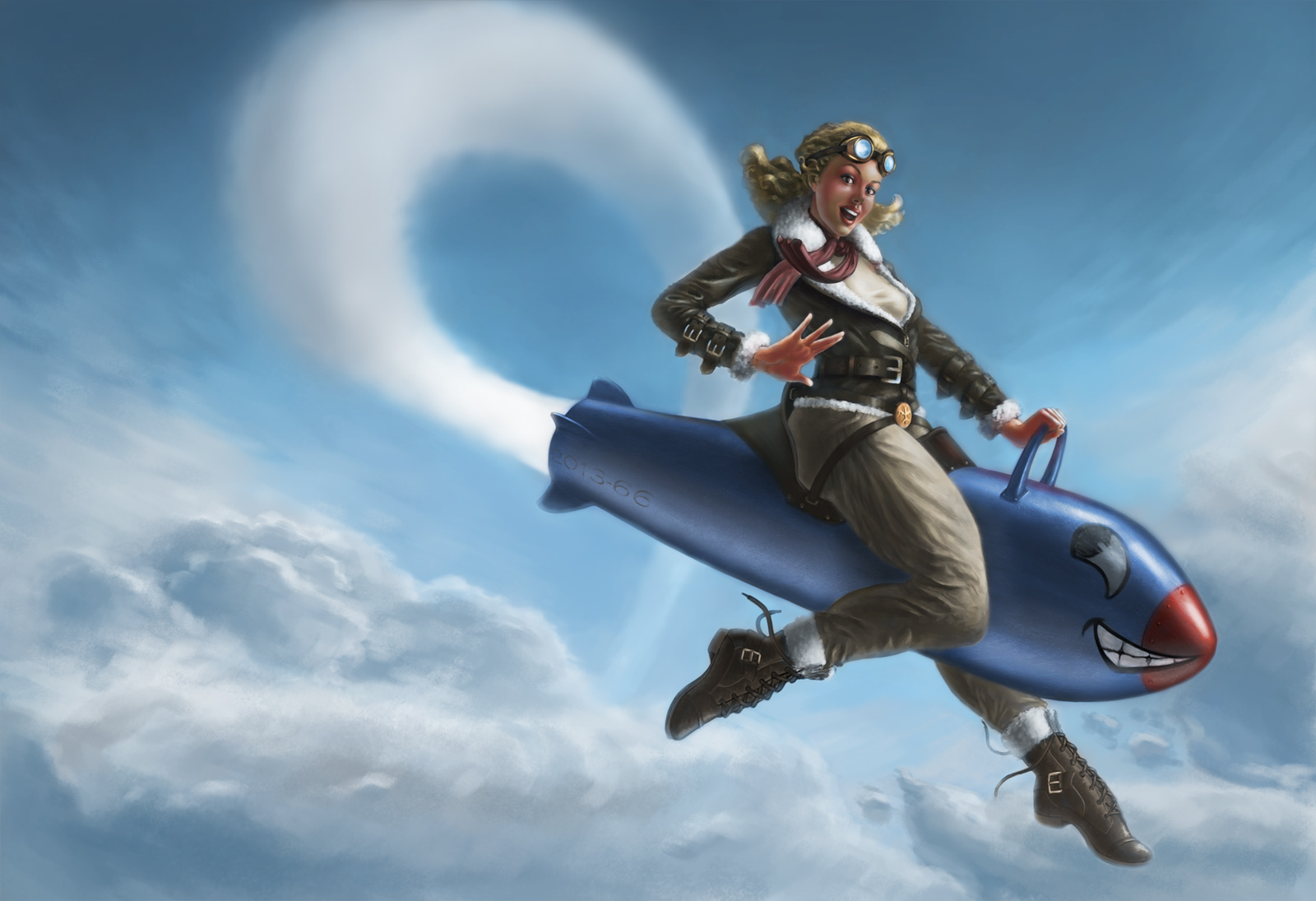
02-02-2013, 10:35 PM
You need to check the color zones of the face again, those green patches shouldn't be there..there are still dark tones around edges, check rocket edges..her breasts looks flat, some deep tones might help. Is it just me or her left shoe is bigger than the other one ?
Me and Toma is going to discuss his pinup today, do join if you can. EDIT : Hi Raz.sorry, have to cancel tonight's session..Toma cant join today..do post your updates if you have anything to show.
02-03-2013, 02:11 AM
Hello! Will try to work on it some more and i'll post when i'll have something. Wouldn't have made the session for today so i guess it's all good :)
ps: what green patches ?
02-03-2013, 01:44 PM
green patches on her face..around nose and cheeks.
02-05-2013, 04:33 AM
Im very behind. hope top catch up soon.
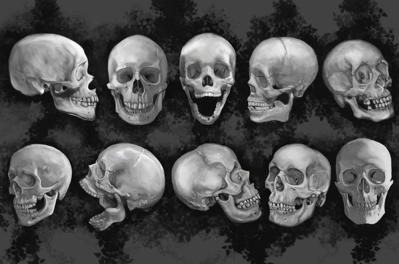 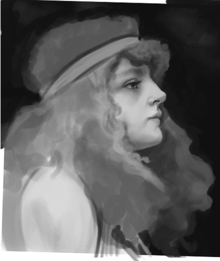
02-05-2013, 04:57 AM
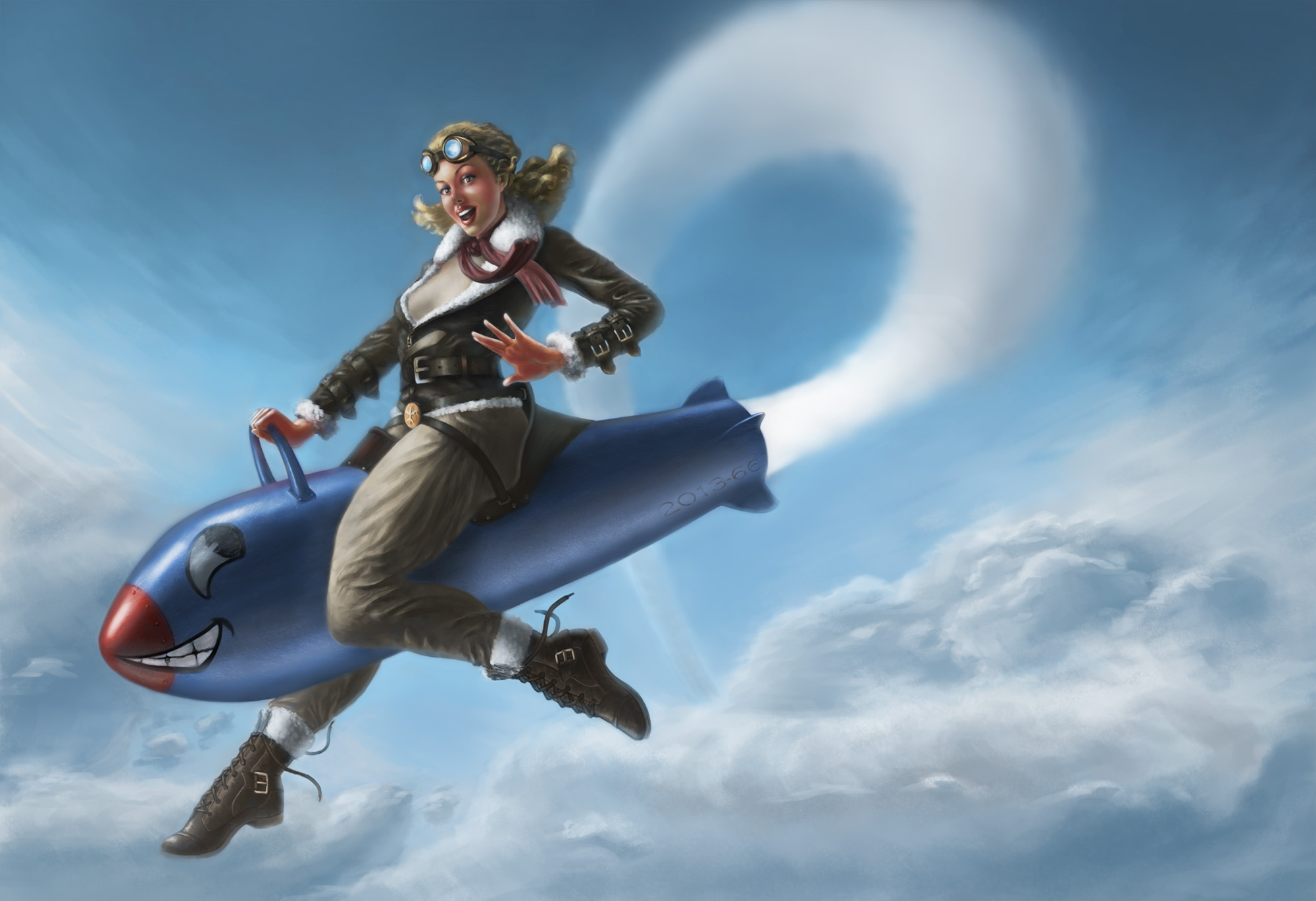
So i think I'm done with this version. I like it better flipped this way. What do you guys think?
02-07-2013, 12:01 AM
It's definitely a huge step from your previous "final" version. I like the feeling of the clouds now - has a much better sense of perspective. I like the previous composition direction though - this one feels more cramped this way. pushing us into the left corner much more.
Great job Raz! (02-05-2013, 04:57 AM)razvanb08 Wrote: So i think I'm done with this version. I like it better flipped this way. What do you guys think? Ok, so worked on this some more, and I think I made headway in creating a piece I'm getting happy with. I realised I was blocking while working because the changes I was trying to make were taking me too far away from the original feeling I was going for. So I tried to merge Shyam's suggestions into the elements that were key to keep it "feeling" like my original sketch. Changes: Character - lengthened her lower legs - smaller waist adjustment - rotated forward foot towards camera more (that's as far as I'll go cause anything more looks weird to me) - adjusted head, size a little, mostly position - still working final suit design elements, but getting close to done - adjusted values a little - will keep at it - locking in face & hair design - wasn't sure open mouth looked good Background - returned to original towering rock outcropping, adjusted weird shape per Shyam's suggestion - adjusted placement to not clutter foreground gun focus - created more interesting internal shapes with cut outs - creating better frame for character body - tilted ground plane, giving feeling of a hill - will create textured layer addition to give sense of depth & scale with receding elements - will adjust value (tone down) once design shapes locked in - make final design decision on her ship and on flying creatures So this is going to be the final composition crop - I had made it bigger before and as Shyam said it didn't work - this one keeps us focused on her. Thoughts & crits away! That means you too guys - all the mentees in Shaym's class! PS Shyam let me know if I didn't address something we talked about the previous week.
02-08-2013, 12:35 AM
Cricketts : nice studies..maybe spend more time on the master study..thanks for posting !
Raz : yea, clouds are looking better than the previous version..still that green/grey tones on her face bothering me…maybe its just me. Toma : good going..titling the ground is a good idea..is it just me or her head looks a bit bigger compared to her body? those knee pad/part of suit looks a bit too much..try to dominate it a bit. an open mouth might help to add the right mood/expression..how about not showing her lips that dark..i mean she's not the typical girl after all...
02-10-2013, 11:13 PM
Hey guys. I changed a few thing on the Pinup:
-moved the left hand , cause her shoulder looked like it was out too much -gave her boobs and no shirt :) -and changed the folds on the pants a bit. Hope it helps. About Toma's pinup I think the head is kinda big, but is hard to tell because of the armor, but if you compare it with the waist I think it looks a bit too big. 
02-19-2013, 12:01 PM
Hey Raz,
thanks for posting your pinup, this is your final pinup right? looks much better now..are you going to work on the golden color scheme as well? just curious. I hope to see more pinups as this the last month for this class.
02-19-2013, 07:34 PM
Yes it's the final. Hopefully I can work on the golden version too by the end of this month.
02-19-2013, 08:05 PM
cool, no worries..i was just curious..hope you had fun while working with me and others :)
02-20-2013, 05:34 PM
Yes it was a lot of fun :) and I want to thank you for giving me the oportunity to join this class and learn a lot from you and the others, and make a cool pinup :)
03-01-2013, 08:49 AM
Thanks everyone for showing so much interest in this class..hope everyone had lots of fun !
i wish you all the best for all your future artworks :) |
|
« Next Oldest | Next Newest »
|