Posts: 2,817
Threads: 15
Joined: Jun 2013
Reputation:
109
hey Bjulvar, thanks for the comment! I think you got a good thing going my dude, but if you came here obviously this is crit zone haha; I think the best thing you could do to push yourself is starting to develop stronger gesture for your figures. You have good features, design language, hands, presentation, etc. Also it probably would help to get into some longer observational studies. They're like magic really, you do them and your ability to see mistakes just shoots up on things that seem totally unrelated!
Good to see you back 
Posts: 656
Threads: 6
Joined: May 2013
Reputation:
12
Love the mass effect guy. You've really got the cute mini warrior thing down! Although he'd probably blast my head of without hesitation if he heard me say that.
Same goes for the imp. Kinda trying to be scary, but cute proportions. :)
_________________________________________________________________________
The best time to plant a tree was 20 years ago. The second best time is now.
-Chinese proverb
Sketchbook
Posts: 537
Threads: 1
Joined: May 2012
Reputation:
8
Thanks and of course Fedodika! Stepping into the crit zone on my own accord, ready for it!
Ah yeah definitely, I'm falling into a default concept art pose for them, other than not being dynamic, it usually says nothing about the character.
Will do, almost gave that up entirely when I started working. Bad habit.
Thank you Tygerson! I loooved working on Little Big Planet, had a blast trying to learn that cute stuff. I think if he's paragon enough you'll be spared.
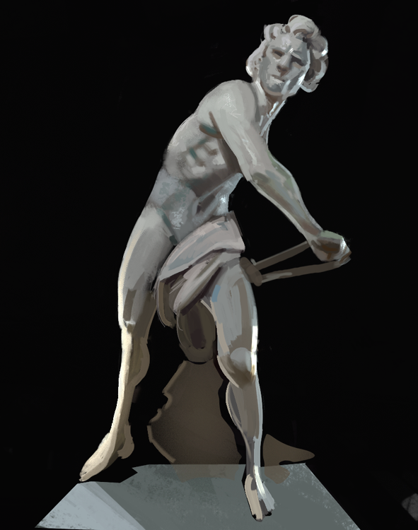
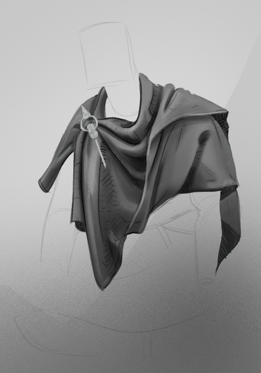
Got some new brushes and I'm trying to figure out which ones I like. A sketchy but longer study. Started off looking at the pose, but became more of a lighting-study after a while.

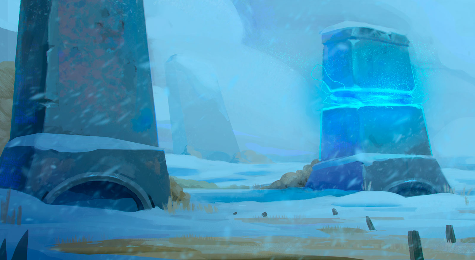
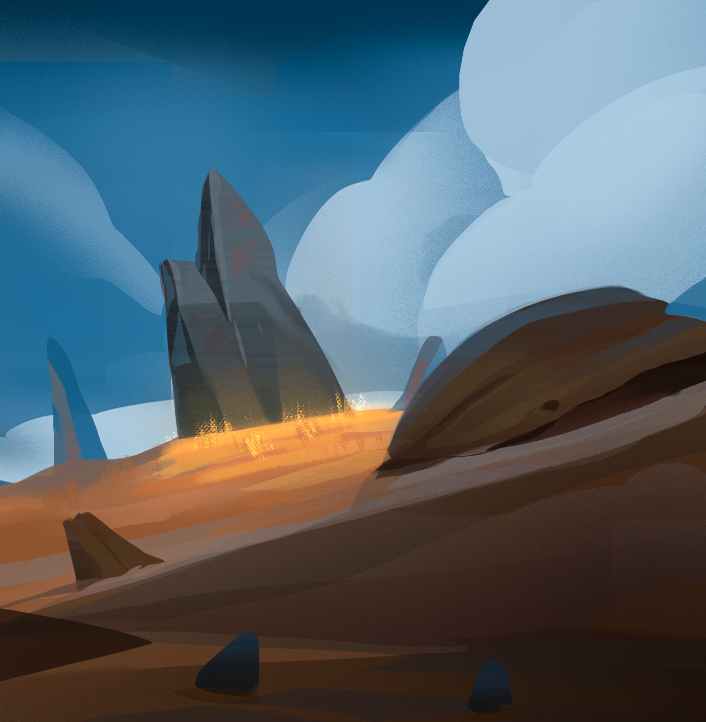
Quick environment to warm up

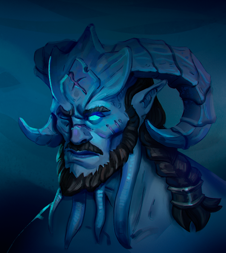
Two recent commissions I finished. The troll painting was sketched out 1,5 years ago, challenging opening up such an old file and trying to fix it.


Posts: 2,817
Threads: 15
Joined: Jun 2013
Reputation:
109
https://www.artble.com/imgs/1/7/2/724042/david.jpg Is this Bernini, the thing you studied above? probably not the same photo, but i recognize the pose
I think you'd really benefit from seeing just how accurate you can get with that pose; I'm not sure how much you learned or improved your observation with that little study. Theres so much super valuable information in that statue that would benefit any artist if they sat down and really took their time building those forms as tightly as possible. The fabric, the anatomy, the pose, all that. It goes beyond doing a study for a studies sake, but actually gaining that knowledge; Give it a shot if you can work it in ;)
It can count as doing 1000 quick studies if you were to spend a few days studying something like that, matching the forms in line as best as you can :)
Posts: 320
Threads: 2
Joined: Jul 2012
Reputation:
7
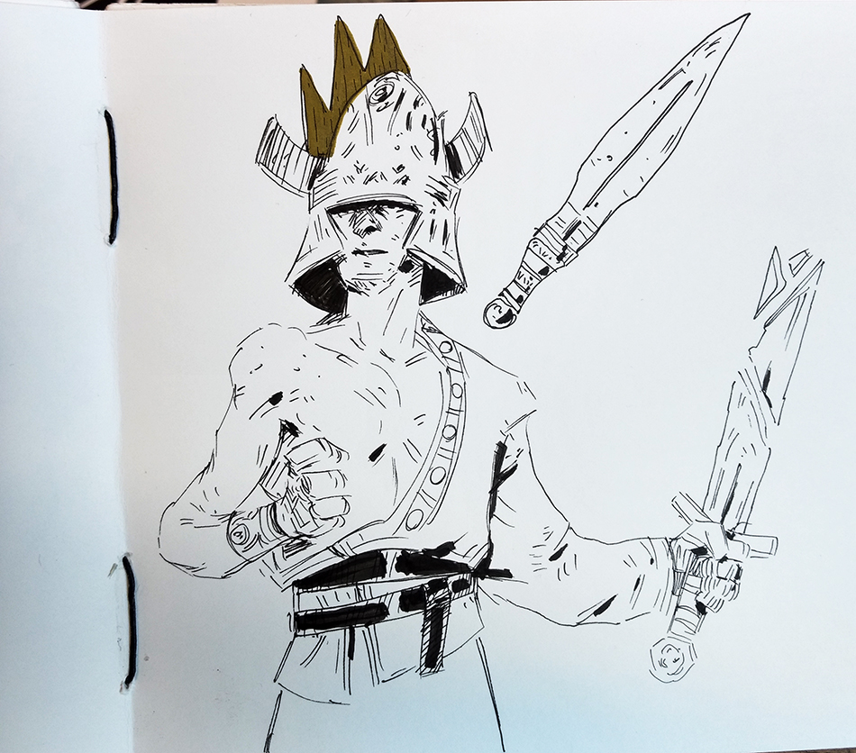
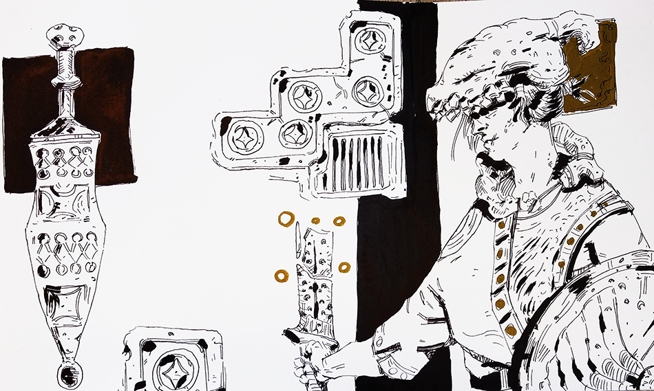
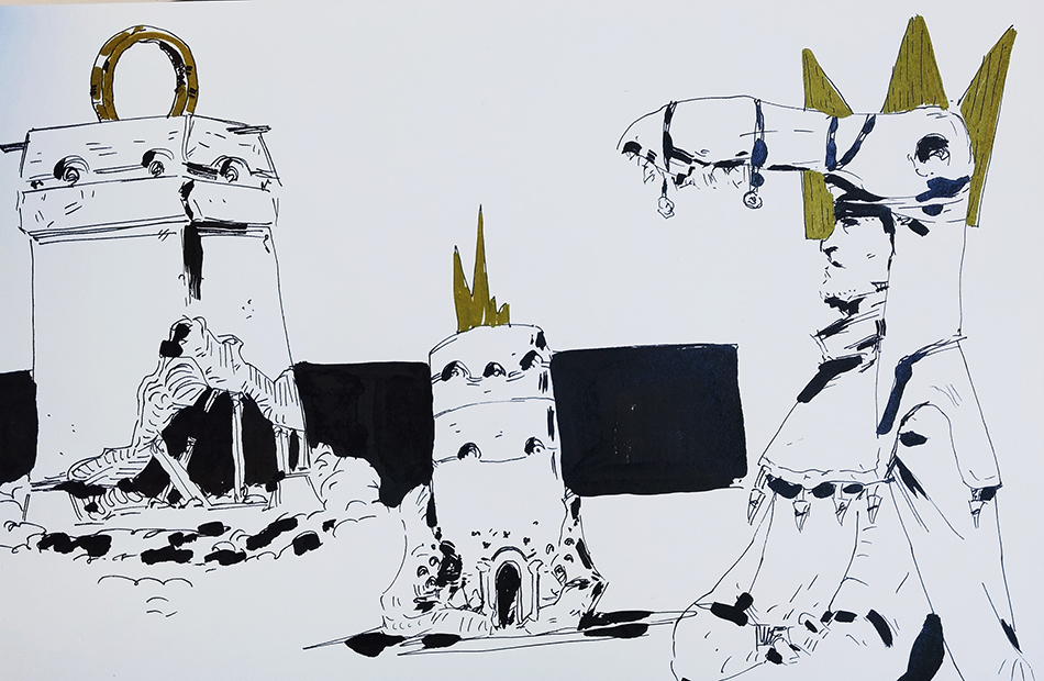
Whoooooa yeah! Welcome back friend, yer dagger be coated in crimson once again! Keeping me company and all too, heh. Sweet to here about the successful industry work, liking those designs. Also nice to see some linework from you, a rare treat ;)
As to finding something worthwhile to study, yea, that is the tricky part indeed. A prolonged study like Fedodika suggested there could always be good, training to observe and learning to push everything in your own art futher.
Posts: 537
Threads: 1
Joined: May 2012
Reputation:
8
Heey man! Thanks, it's good to be back among rogues and artbarians!
I'm glad you like the linework, I've wanted it to leak over into my digital work for quite some time.
Yeah, slowly coming back to me! Still agree wholeheartedly with doing longer studies. What Fedodika said about doing quicker studies, but more on the same subject seems smart.
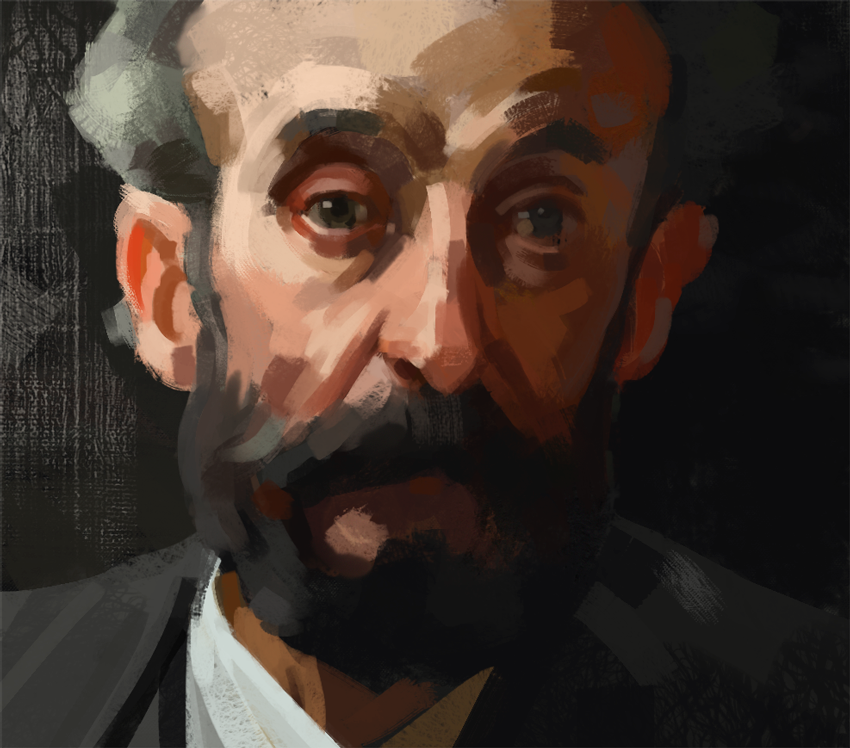
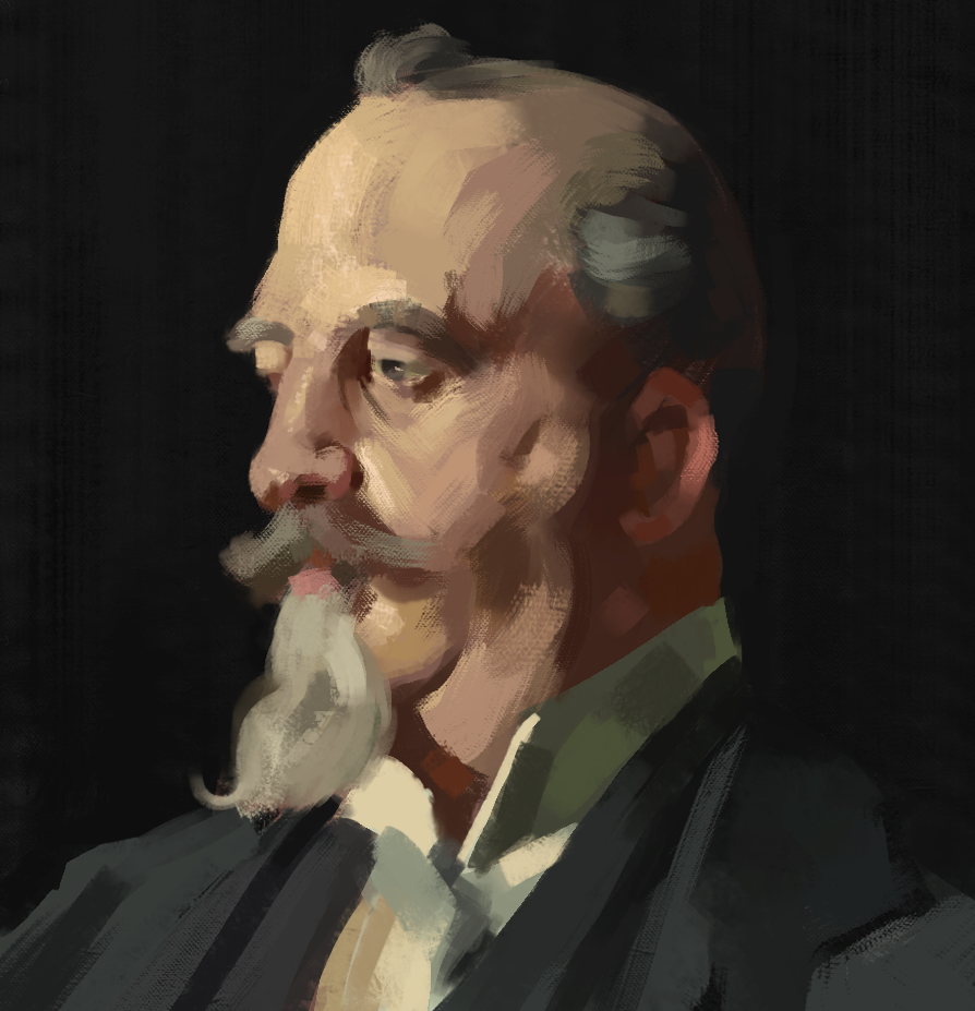
Here's two masterstudies of Zorn, practicing brush economy.


Warmup environment after Sea of Thieves dropped some art

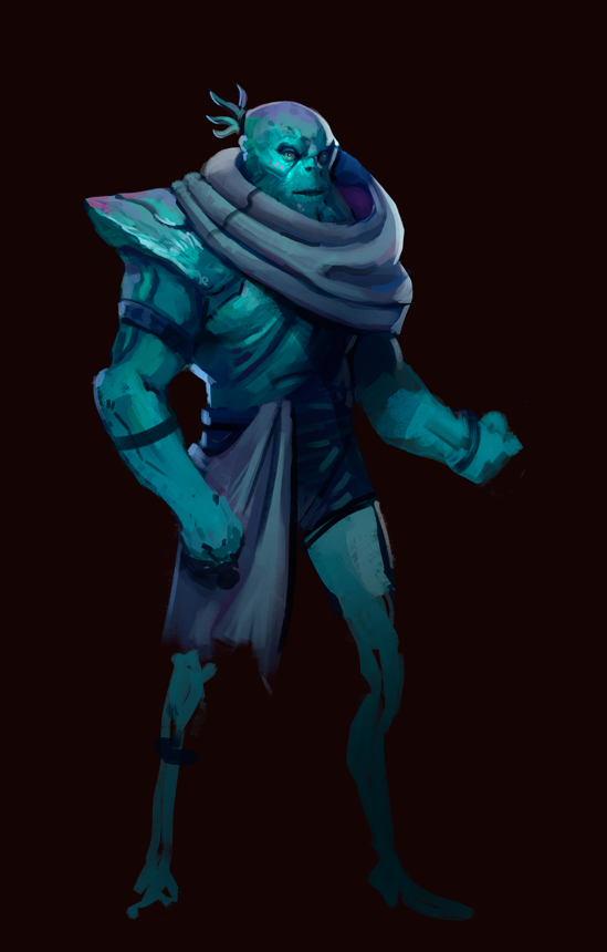
Character warmup just to swap out my workflow

Posts: 537
Threads: 1
Joined: May 2012
Reputation:
8
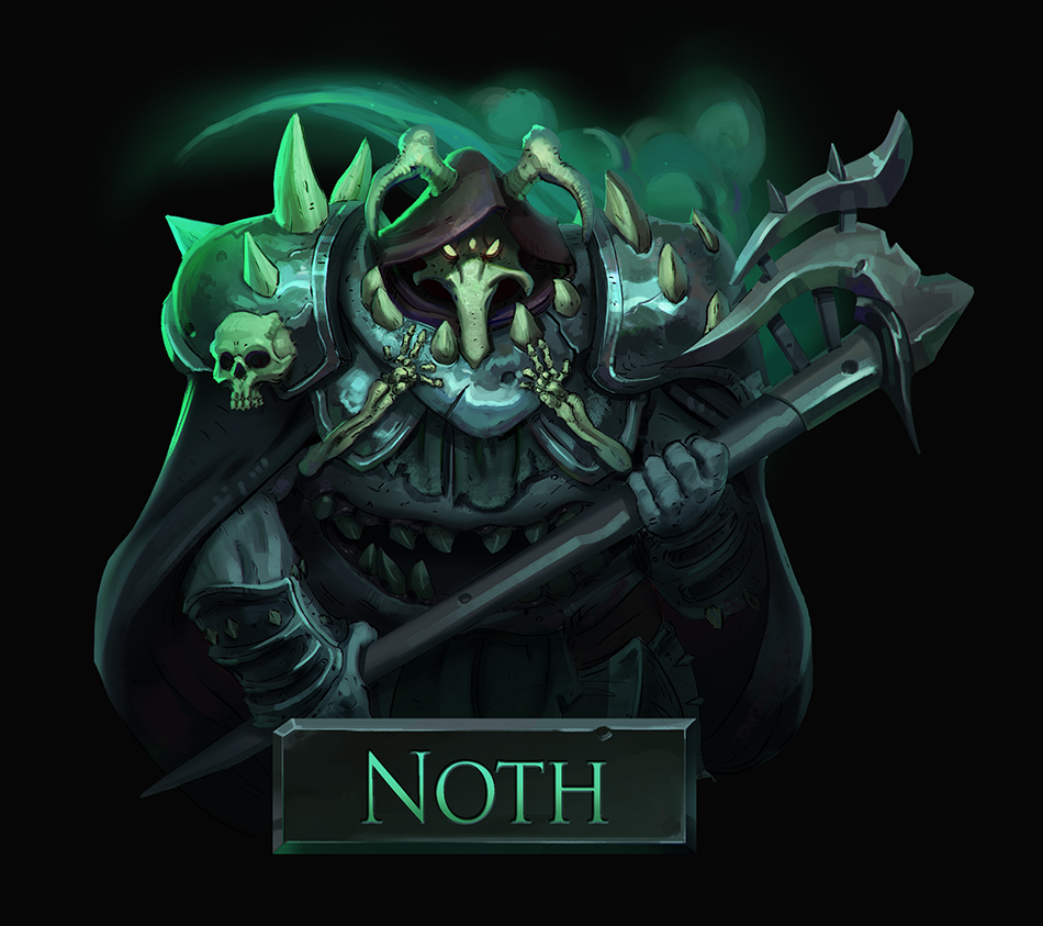
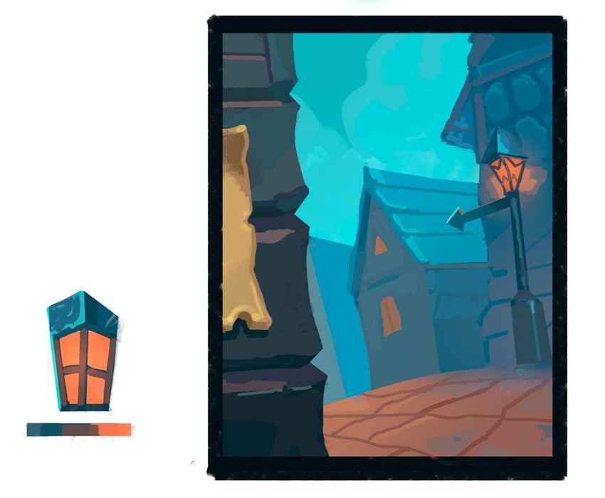
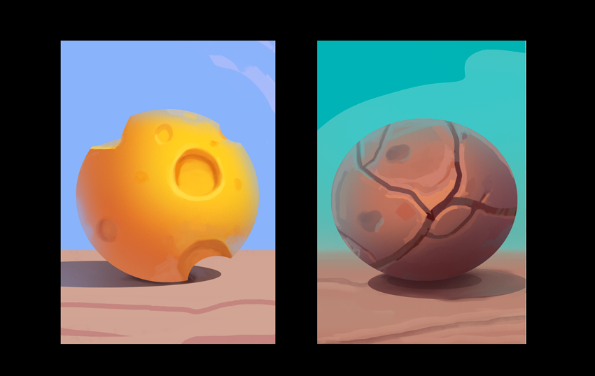
I like the setting of the new Hearthstone expansion and felt like doing some style studies. I might be applying these later.
I'm fascinated by these blueish tones, the way the desaturated blue looks like an orange hue and how that actually meets a saturated orange.


Posts: 537
Threads: 1
Joined: May 2012
Reputation:
8
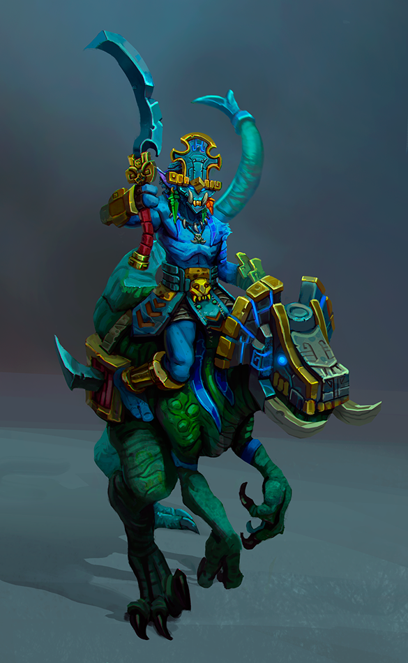
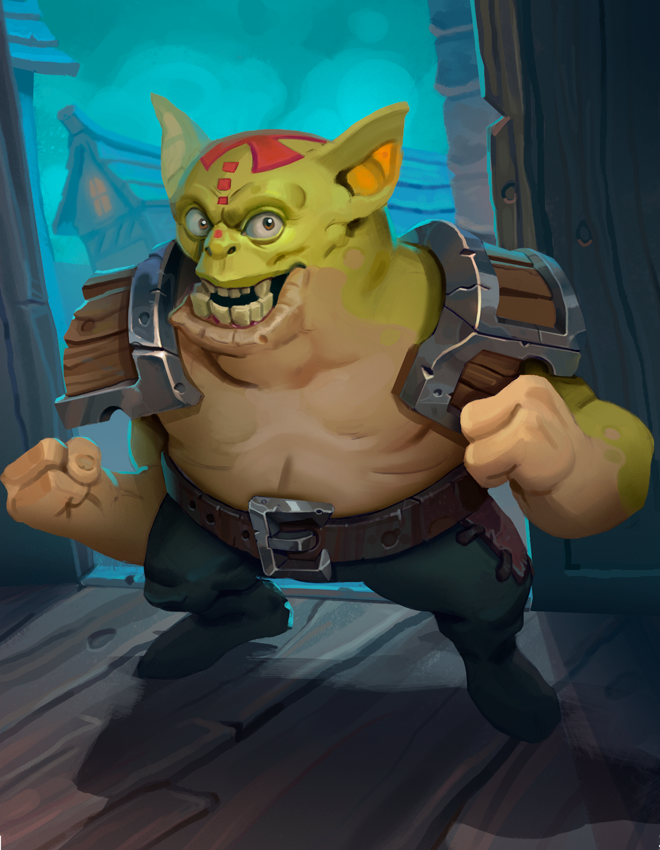
Working on that application

Posts: 320
Threads: 2
Joined: Jul 2012
Reputation:
7
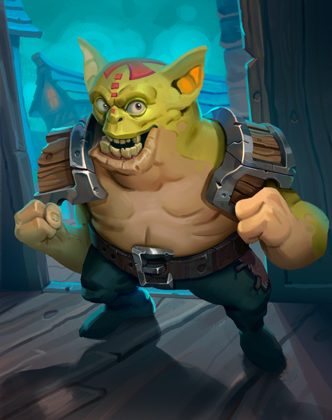
Yeeeessss! Man I like how clean that character looks, real nice style man!
Guess practicing brush economy really helps too, especially for those more painterly pieces where you want to get that chunky style.
Posts: 2,817
Threads: 15
Joined: Jun 2013
Reputation:
109
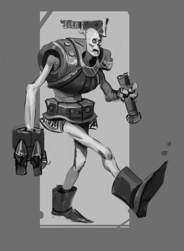
love the expressive face lol, maybe look at his right arm, i think you could raise it a bit to make it not look as if its slightly too long. You could probably even overlap the fist over the metal rim, that'd be a nice touch
Posts: 537
Threads: 1
Joined: May 2012
Reputation:
8
Thanks Adzerak!
I love working in this style, it's very reminiscent of the workflow I had for Little Big Planet.
Yeah it's gold for pieces that use more texture and at the same time seeing how masters prioritized their strokes. I try to translate that into stylized pieces as well.
Aah thanks Fedodika, I think it looks much better that way! It broke the stale twinning between the arms too. Tried pushing the expression a bit further :)

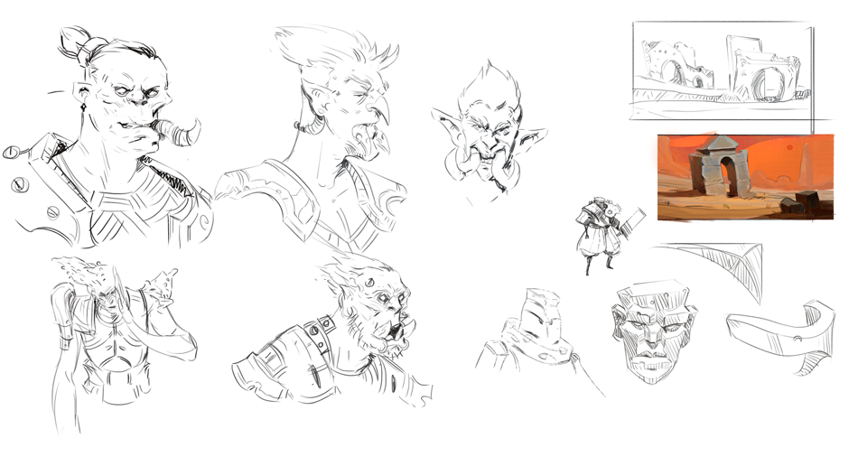
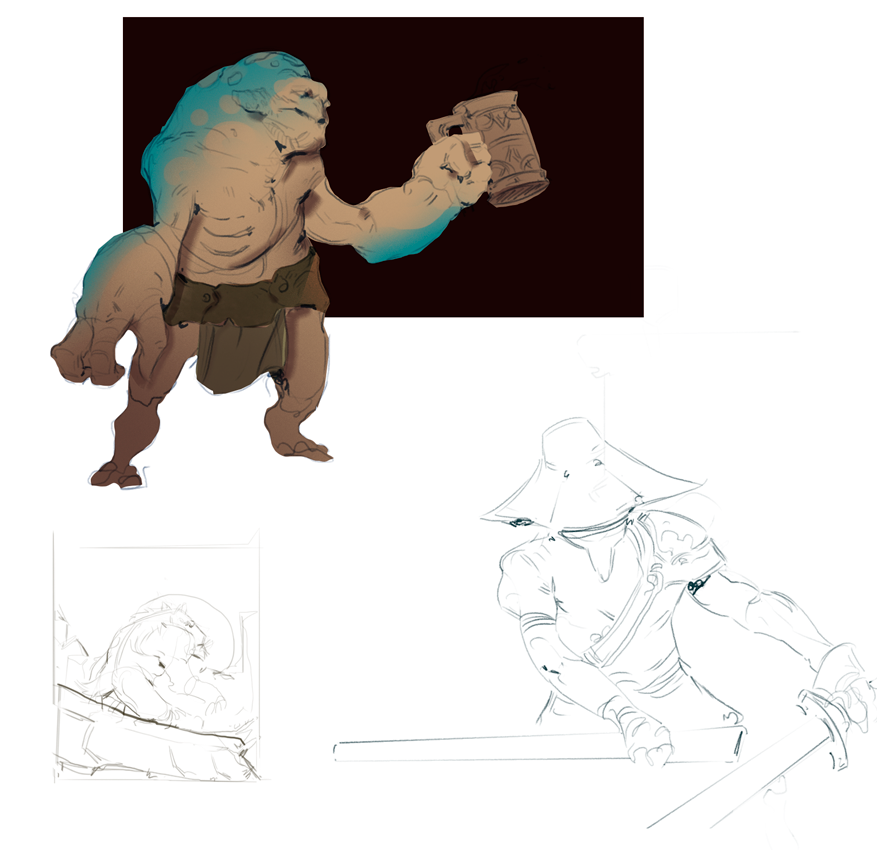
Sketchin

Posts: 2,817
Threads: 15
Joined: Jun 2013
Reputation:
109
|


