11-22-2012, 11:59 AM
Already really cool lighting and colors, only thing is maybe spice up the knight's armor design?
Other then that, I just wanna see it pushed!
Other then that, I just wanna see it pushed!
|
Lale's Traditional and Digital sketches!
|
|
11-22-2012, 11:59 AM
Already really cool lighting and colors, only thing is maybe spice up the knight's armor design?
Other then that, I just wanna see it pushed!
12-04-2012, 07:15 PM
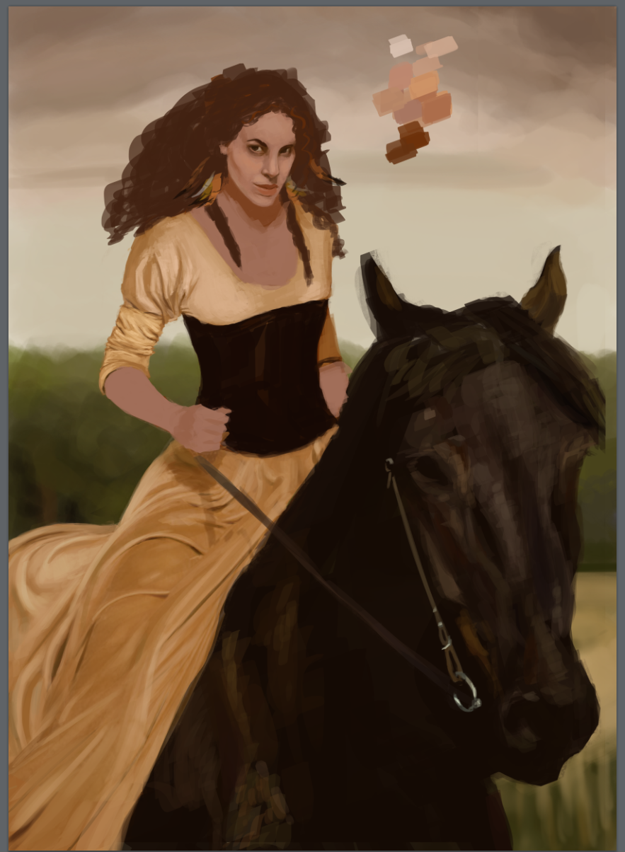
Spent too much time on my dragon/knight painting and so it ended up pretty far from what I wanted.. So I'm taking a break away from it and started this yesterday! Going to try to finish it today :)
12-04-2012, 09:25 PM
This looks cool Lale. I noticed some minor changes that you could make. I drew them up in photoshop -
![[Image: untitled_1_by_brainfruit-d5n45h8.jpg]](http://fc08.deviantart.net/fs71/f/2012/339/5/5/untitled_1_by_brainfruit-d5n45h8.jpg) I think it's a beautiful painting, and I love the rendering on dress folds. I will look forward to seeing the finished version :-)
12-05-2012, 10:39 AM
Hey thanks a lot Brainfruit! Well saw your comment too late! XD But still, here's the final version.
I'm so happy I finally managed to actually FINISH a whole painting and not just study/sketch :D 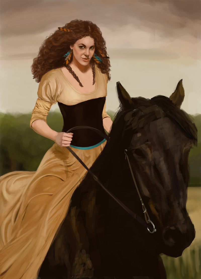
12-05-2012, 10:54 AM
Wow! Looks really cool :-) I like the changes you made to the face.
I think her chest is looking a little plain - it almost looks like one colour. There would be shapes there like her collarbones, and the shadow from hair etc. The lighting on her face and hair looks really good.
12-05-2012, 06:42 PM
Thanks Brainfruit! :) But I used a ref pic for this and as the bustier is (I guess) in velvet, it didnt reflect that much light. But I get your point!
12-05-2012, 09:46 PM
(12-05-2012, 06:42 PM)LaleAnn Wrote: Thanks Brainfruit! :) But I used a ref pic for this and as the bustier is (I guess) in velvet, it didnt reflect that much light. But I get your point! The velvet is good but the skin on her chest would be reflecting light. A 'Bustier' pushes up the cleavage so there would be light reflected from her boobs, and also from her collarbones. At the moment the chest area is all one shade of pink.
12-06-2012, 09:49 AM
Nice sketchbook :D really liking this last piece's face. Folds are looking nice too.
Now, something about the lightning is distracting - maybe its too diffuse? Like an overcast day? You may want to try some more direct light there and push some contrasts. Other idea would to make this lightning you have now the main one, but make it more contrast-y, and then add more light from the sky, or another light source so you can spice things up. If this doesnt make sense, drop me a line and I will try a paintover! Keep up the good work!
01-18-2013, 11:20 AM
Okay so it's been a while since my last update!! :s
I've been pretty busy with personal stuff and with the whole Christmas/New Year/ birthdays period and now I'm definitively back!!! :D So here are a few of the sketches and wips etc. I've been doing these past few weeks/days.. :) 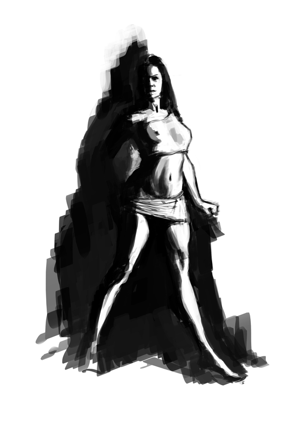 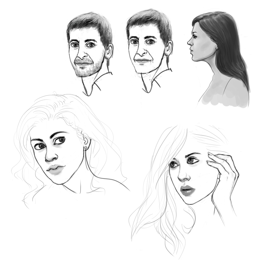 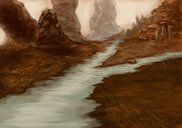 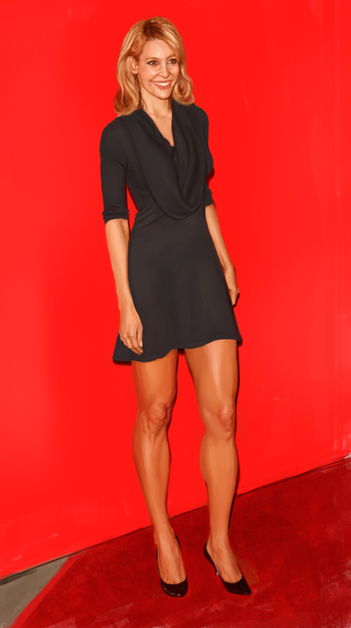 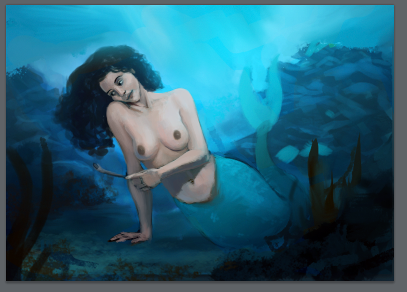 Feel free to crit on the mermaid WIP above! ;)
01-18-2013, 11:29 AM
(01-18-2013, 11:20 AM)LaleAnn Wrote: Quite nice, but beware of this trap (I've been there personally): the face is too big for the head - so eyes, nose, mouth looks nice between each other, but a bit awkward in comparison to the head. Its easy to fix :) Just something I took a while to notice on my own sketches... The mermaid one is pretty nice, but I'd recommend look for pictures of people underwater. You may be surprised about the skin tones there, its much more gray-er than expected!
01-18-2013, 09:06 PM
Congrats on the lady on a horse. Especially job well done on the face and the hair. Whatever You've done there, try to apply it on next pieces.
Now for the mermaid. As Ursula said, look up for refs how hair and light is behaving underwater. Probably her skintone should be more bluish than it is right now.
01-18-2013, 09:47 PM
James Gurney Color and light
Underwater caustics: Caustic patterns can occur when sunlight is refracted downward by the ripples at the water surface. The waves focus a network of dancing lines on the sea floor or on the backs of creatures below the surface. Underwater caustic effects don't occur much deeper than twenty or thirty feet. it would be inaccurate to include them in a deep sea picture. In addition, they only occur on sunny days and are visable only on the top surfaces of underwater forms. So what is refraction? When a drinking glass or water filled vase are hit by sunlight, the object will bend also known as refract the light, essentially acting as an imperfect lense. Gurney Imaginitive realism: painting a mermaid underwater, Skintones appear cooler in water than they do in the air, and the sideplanes of the figure fall away to a bluish tone, lit from all directions by scattered light in the water. Hope that helps in combination of looking at underwater pictures.
01-18-2013, 10:55 PM
Hey guys! Thanks a lot for the comments!
Well actually, don't worry, I know very well that skin tone gets very greenish/blueish underwater. I looked up for references and the first version of my mermaid was much blue/greener toned! But it was pretty lifeless and as I saw a few paintings done by amazing artists of mermaids where they don't bother with that (like Jason Chan) I thought I'd go for it, even though it's not "realistic". :) Ursula, thank you, and I do notice (and hate it) that the faces I draw (especially the bottom left, which is the only one done without reference) are most of the times a little weird but I can't seem to make them right.. I should shrink it down a bit more I guess! Lumens, thanks a lot but I'm not sure why you're talking about the sun refraction and caustic effect, as there's none used in the scene? Or not that I noticed/did on purpose.
01-18-2013, 11:25 PM
Well its a long and drawn out way of saying that caustics do not appear in deep water or with the absence of sunlight. Given how intense the blue hues are i thought it might be fairly close to the water surface.
And you're right both about taking artistic liberties and questioning critique which is always better than to go with the usual thanks for the feedback and proceed to do nothing with it. ( i've done that a fair share myself) Keep up the good work!
01-19-2013, 12:07 AM
Hahah! Yeah I have done that too! (still working on it!) ;)
I totally hear you, and as I said, that's what I went for at first, but right now I kinda have an idea in mind of what I want it to look like and so I really am trying to keep considering the critiques I get but without feeling like I have the obligation to apply them right away, to do it "right" or very realistic (and it's pretty hard to get that assertiveness). Thank you anyway because you're totally right! in theory that's how it should be and how water and light react. I'll see how seriously I'll apply those rules to this painting... :D I think it's always important to apply the rules (I ahve Gurney's book too ;) ) but as an artist you also have to be "true" to yourself, your art and vision of it.. The realism/lighting etc. rules are certainly a very important knowledge to have but always strictly following them is, I think (more and more lately) a great way to get completely stuck with your art and never doing anything "real" or truthful to yourself. :)
01-23-2013, 01:28 AM
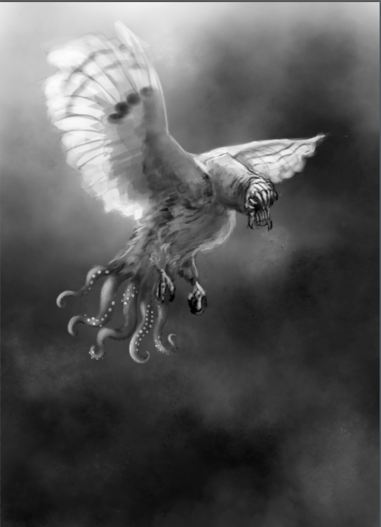
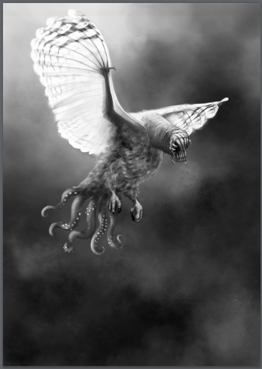
Here's my WIP for this week's ongoing COW contest on conceptart.org. :)
01-23-2013, 01:54 AM
I've played around with the body shape in photoshop a little (zip here with psd inside http://bit.ly/V4jnDs) - make the top layer visible. I assume you want critique from fools like me as you made a daggers sketchbook :-) Hope that's helpful. It looks cool by the way!
Dan.
01-23-2013, 08:16 PM
Hey Dan! Thanks for taking the time to do it! :D Well I might consider tweaking the wings a bit then, thanks! ;)
01-23-2013, 09:06 PM
that bird is so lovecraftian, i love the design.
My only advice is to push more the values so the picture doesnt look muddy
"Stand tall, and shake the Heavens!"
Tumblr for my comic!: http://rainfallcomic.tumblr.com/ Sketchbook: http://crimsondaggers.com/forum/thread-1227.html Facebook: http://www.facebook.com/eduardogarayart Deviantart: http://eduardogaray.deviantart.com/
01-24-2013, 03:49 AM
Thanks a lot Eduardo! That's such a compliment! :D Well here's the new version of it, think I pushed the values more... Now I'm hopefully going to add some color before the contest's deadline is up! :) i was thinking about a blue/grey/purple-ish background (toxic fumes) and the main body being brown/orange and that head's tip would be pinkish.. Maybe also gonna stretch out the claws forward, so it looks like he's about to catch his prey. :)
 |
|
« Next Oldest | Next Newest »
|