Posts: 274
Threads: 0
Joined: Feb 2014
Reputation:
3
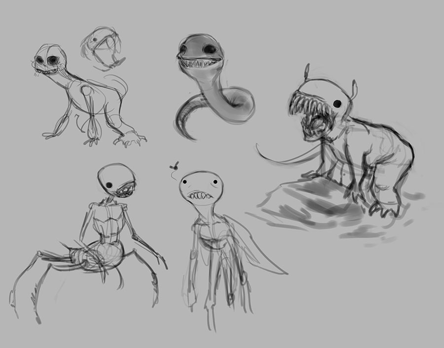
That WIP is great! I love the design of the monster, very Francis Bacon. Is there any intended symbolism behind it?
Also, to answer your previous question, The Holy Machine is dystopian future novel that involves a robot prostitute as the deuteragonist of the story, hence the reason it reminded me of that painting you did.
Posts: 402
Threads: 7
Joined: Oct 2012
Reputation:
9
Thanks a lot Stardust! Well, no nothing was intended there ^^ Alright, well must be an interesting story! :)
Posts: 402
Threads: 7
Joined: Oct 2012
Reputation:
9
Aww thank you! That's all I can ever aspire to! Inspire others around me! <3 And you should definetely do it! Why don't you go grab that pencil or that stylus?? :D Do it now ;)
Posts: 1,118
Threads: 12
Joined: Nov 2013
Reputation:
63
I think the bottom one seems to be a bit better. Im confused about what your intended focal point is for this piece. The forward claw is the area of most contrast so my eye wants to go there. But you seem to be adding things to the head to try and make it more of a focus? And the red leaves saturation makes my eye kind of conflicted between the foreground and the rest of the composition. Maybe if you incorporated more of the same red throughout the whole piece it would feel more unified. Like more red accents on the creatures body. Perhaps thats what you are doing with the red mark on the head but I think you could unify it more. Perhaps desaturate the foreground and push the red on his forehead as a secondary focus?
Posts: 903
Threads: 54
Joined: Feb 2012
Reputation:
18
I like the middle version of that creature the best! Even better, with some more giant warts going down his spine and around his arms :) Are you attending the Watts atelier? Or is it an online learning program?
Posts: 402
Threads: 7
Joined: Oct 2012
Reputation:
9
Hmm might be a good idea if I work again on it, thanks! ;)
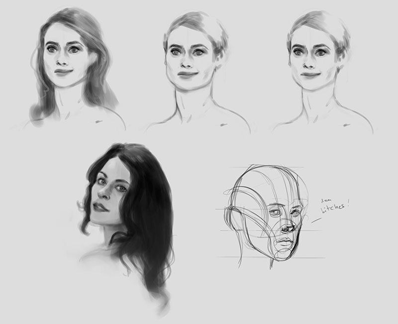
No, I'm not but I wish! :D I'm only studying files from his classes that a friend gave me online! Pretty neat I have to say.
Posts: 6
Threads: 1
Joined: Feb 2015
Reputation:
0
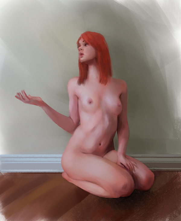
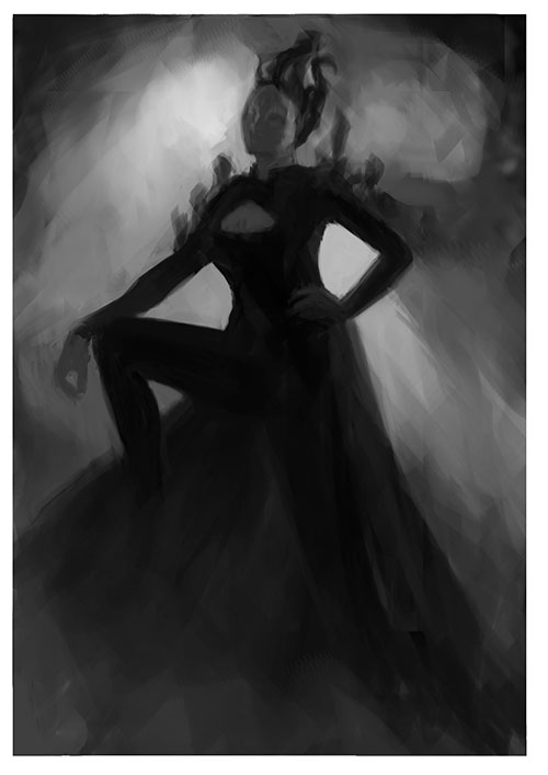
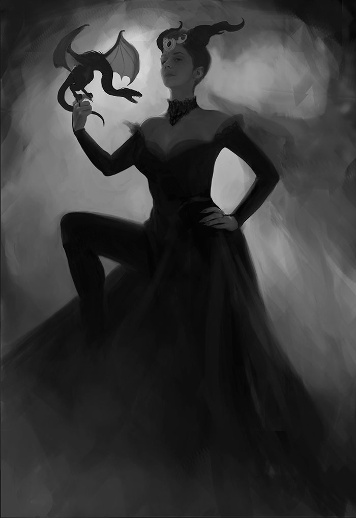
Hello, I really like a lot of stuff here ome really nice looking studies. The last pic looks promising too, one thing I was thinking about is that the figure could be to "dense" if you get what I mean. The siluette is really apparent but then inside of the figure is really downplayed contrastwise. But this could ofcourse be a thing you are going for and I think it works that way to =D nice work
and I hope you dont take offence that I give a crite without you asking for one
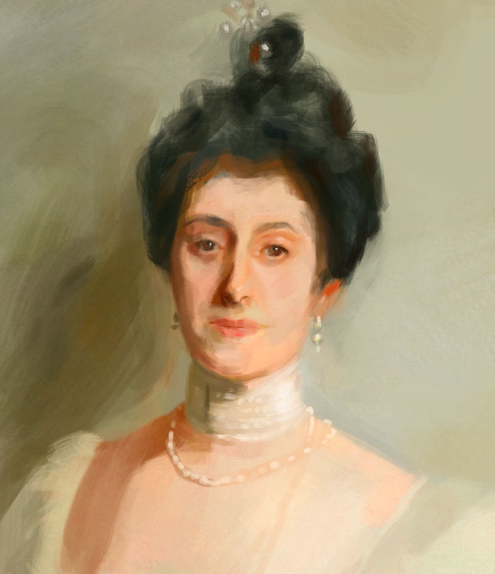
well painted
If you want pie come wisit my sketchbook -
crimsondaggers.com/forum/showthread.php?tid=6096
Posts: 402
Threads: 7
Joined: Oct 2012
Reputation:
9
Hey mate! Thanks a lot! Of course not, this forum is mainly here for people wanting crits and advice! :D Yeah you're right it might be a problem but I'm gonna have to do with it xD
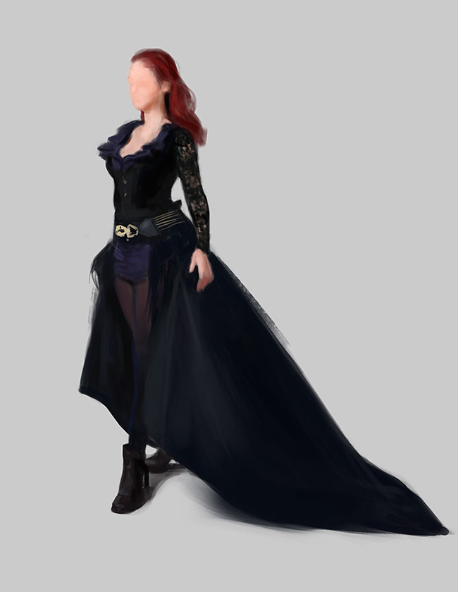
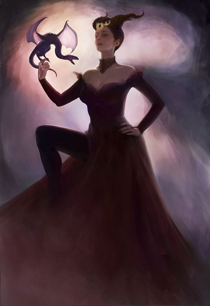
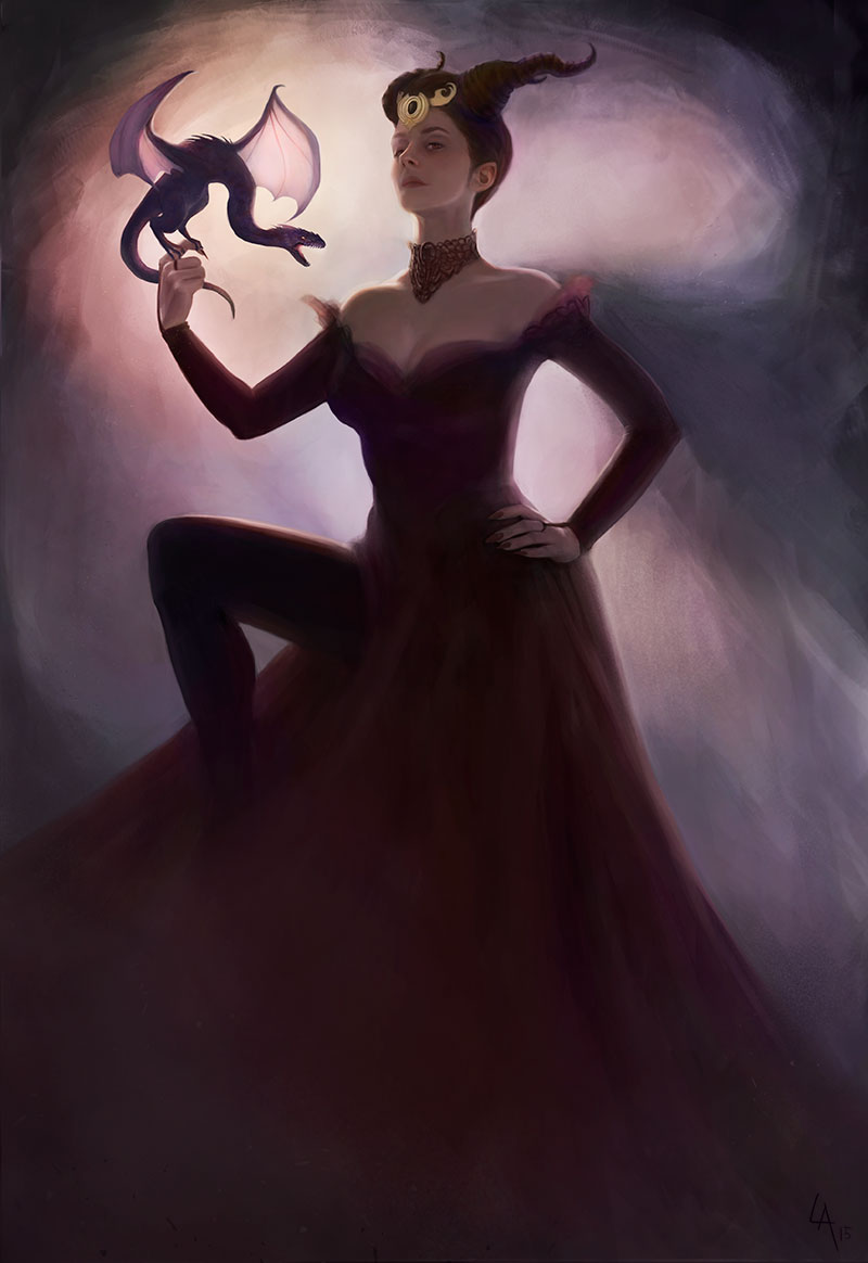
I figured her arm (on the left) was way too short and tweaked a few things. Started the colors today ^^ Thanks again!


 Makes me want to get that pencil back in hand again, haha.


