Posts: 1,342
Threads: 17
Joined: Jul 2013
Reputation:
45
Your last illustration looks very nice, I especially like the soft gradation of the garment at the bottom
The pose of the little dragon is awkward and out of balance, some of its proportions are wonky aswell.
You´ve done the character quite good, I can see that she is a noble, possible evil, the pose and the way she looks at you shows that she is in charge and powerful. It goes well with the "commanding dragons bit".
The headpieces color looks bland for some reason, I assume its a golden ornament. Gold can be hard to capture right, its advisable to do some studies from old masters or life (if you have some gold ornaments lying around) Same goes for gems. Skin tones are kind of wrong aswell in some parts, the strongest and best colored part is the nose and the right cheek/eye area. Again old master paintings are an excellent source to look at skin tones, since working digitally, they can get too desaturated at places. The garment she wears looks good, some edge lighting is the wrong color(maybe too desaturated) and the values might be too high, try finding reference of purple cloth in different environments, the study you did earlier seems to be in a white room, which in some cases doesnt depict the environment correctly, thus the reflected light is wrong. Lastly maybe render the garment more in some areas to show off the design more, perhaps add some kinda yellowish color illustrative pattern to the garment at some parts.
All in all Id say the weakest part of the image is the dragon and the strongest part is the upper face along with the ear.
Hope this makes sense and helps you.
If you have any questions or if anything is unclear PM me.
Posts: 402
Threads: 7
Joined: Oct 2012
Reputation:
9
Hey man! Woah, thanks a lot for that crit!!
I think the main problem here was that I went too far when I did the first black and white value painting and when I started adding color it got pretty hard to make it look good. It actualyl took me a very long time to make it look somehow right. Next time I won't go so far with the b&w painting or start with color right away and use a b&w layer mode to check my values.
i know what you mean about skin colors but I can assure you I've done my best, again, to keep a good range of colors in there using different layer modes. Maybe it would show better in a higher resolution..
When it comes to light (light color), I still have a LOT of trouble understanding and manipulating it properly. If you have more advice on that (though I guess practice makes perfect) I'd gladly take it! :D I try to challenge myself as much as possible but I feel that this is soemthing that realyl prevents me from going as far as I'd like...
Again, thank you very much for that insightful critique! :)
Posts: 402
Threads: 7
Joined: Oct 2012
Reputation:
9
Alright! Portfolio sent, time spent and now I'm back to serious business! :D
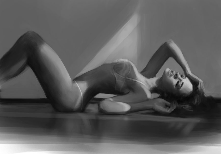
Here's today's "lunch" study. Approx. 2hours.
This one shall be called "Lyinginmyundiesonthefloorfornoreason".

Posts: 1,109
Threads: 18
Joined: Apr 2014
Reputation:
68
A lady like that doesn't need a reason to lie on the floor in her undies!
Great study, nice lighting : )
Posts: 291
Threads: 13
Joined: Dec 2013
Reputation:
5
shes torn XD
anyway awesome study do you do this on one layer only ? what are you looking for in this study specifically? i mean what do you want to get out of it after its done? brushwork , how light interacts with skin?
Posts: 402
Threads: 7
Joined: Oct 2012
Reputation:
9
Thanks Foxfire!
Worked on it with two layers the first half of the time until I merged them together and worked only on one. I find the less layers I use, the more it pushes to go ahead and not be scared to "ruin" the painting.
Well, main goal was simply practice! ^^ I've done a couple other studies today as well and this pic had been in my folder, unused, for too long so...
I didn't have a main focus. I worked on my values, my brushwork for sure, aaaand face, actually! Her face is certainly what took me most time! That angle was tricky!
I had to kick my brain that was trying to make sense of what it was seing and force it to "unfocus" from the subject to bring it back to seing shapes, lines, values etc. instead of "a face". It was fun and I think I learned a few things there :)
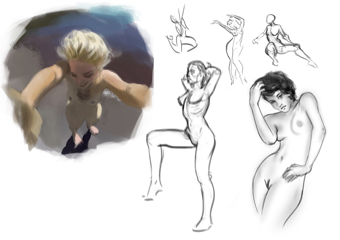
And a few others from today.. :)

Posts: 274
Threads: 0
Joined: Feb 2014
Reputation:
3
Those studies are looking great, I like the use of line weights. Indeed, trying to focus not on what the subject is but the basic forms its comprised of is a good technique. I need to try that myself, heh. Keep up the good work!
Posts: 131
Threads: 4
Joined: Jan 2012
Reputation:
3
dAAaaamnn!!!
Great stuff, youll be a trained killer in no time!
keep it coming :D!!.
Posts: 402
Threads: 7
Joined: Oct 2012
Reputation:
9
Hey thank you so much Iggytek, that's very cheerful of you
I'm sure you will too! Let's do thisss :P
Posts: 402
Threads: 7
Joined: Oct 2012
Reputation:
9
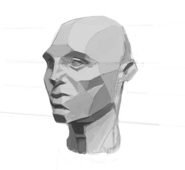
This afternoon's study. :)

Posts: 402
Threads: 7
Joined: Oct 2012
Reputation:
9
Figured I was completely lost when it comes to even sketching something that would look like a lion... tried to tackle that today.. Total a bit less than 2hours I think.

Posts: 402
Threads: 7
Joined: Oct 2012
Reputation:
9
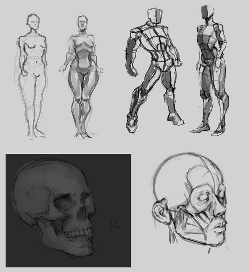
Today's studies..

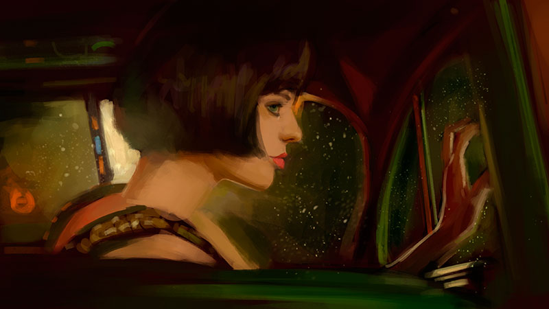
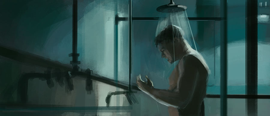
2hours movie still study

25 min gesture warmup


1hour movie still color study
Posts: 903
Threads: 54
Joined: Feb 2012
Reputation:
18
Lovely updates and studies! I know it's late, but as a crit for that lady with the maroon dress, if you had pushed the lighting behind her a little bit and rendered out her dress more, it would have pushed it farther imo. Nicely done nonetheless :)
Posts: 402
Threads: 7
Joined: Oct 2012
Reputation:
9
I think you've hit a right spot about dragon lady Nathan. Might revisit that piece later... Thank you ver much!
Posts: 402
Threads: 7
Joined: Oct 2012
Reputation:
9
Some pure late afternoon crap..


Posts: 402
Threads: 7
Joined: Oct 2012
Reputation:
9
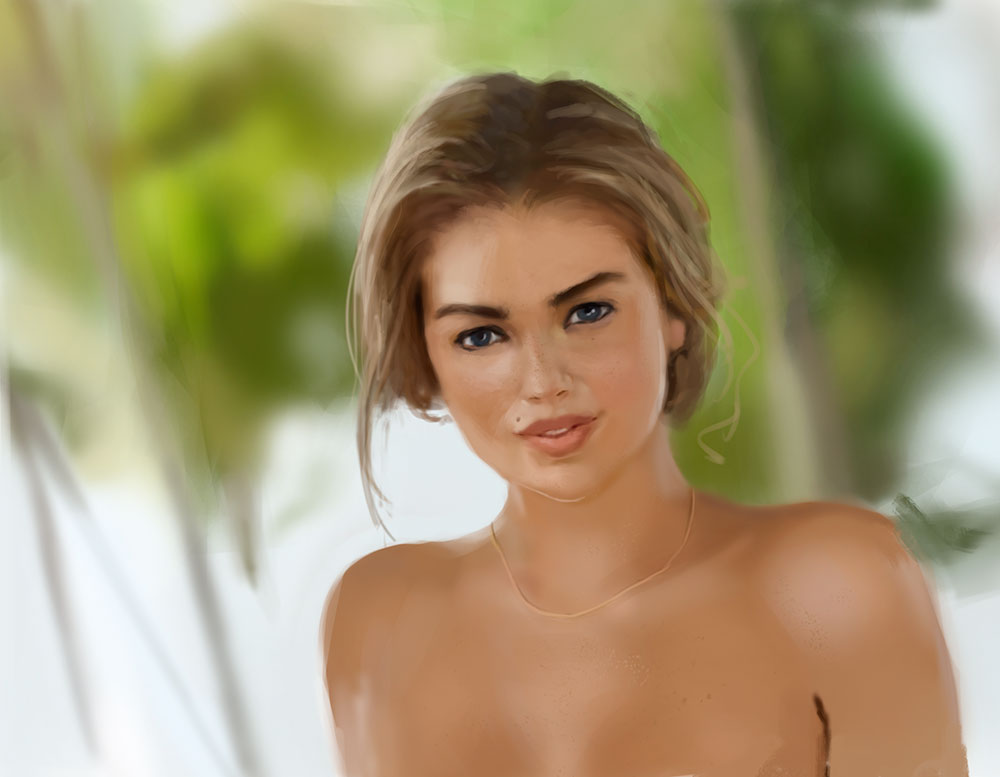
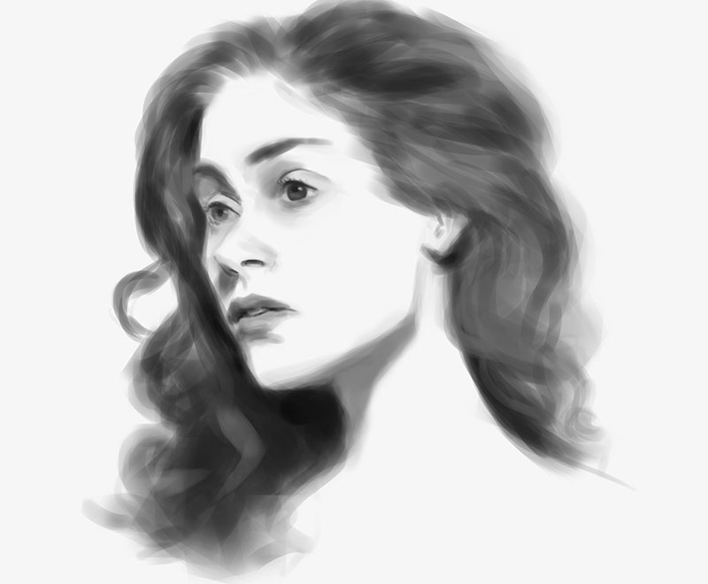
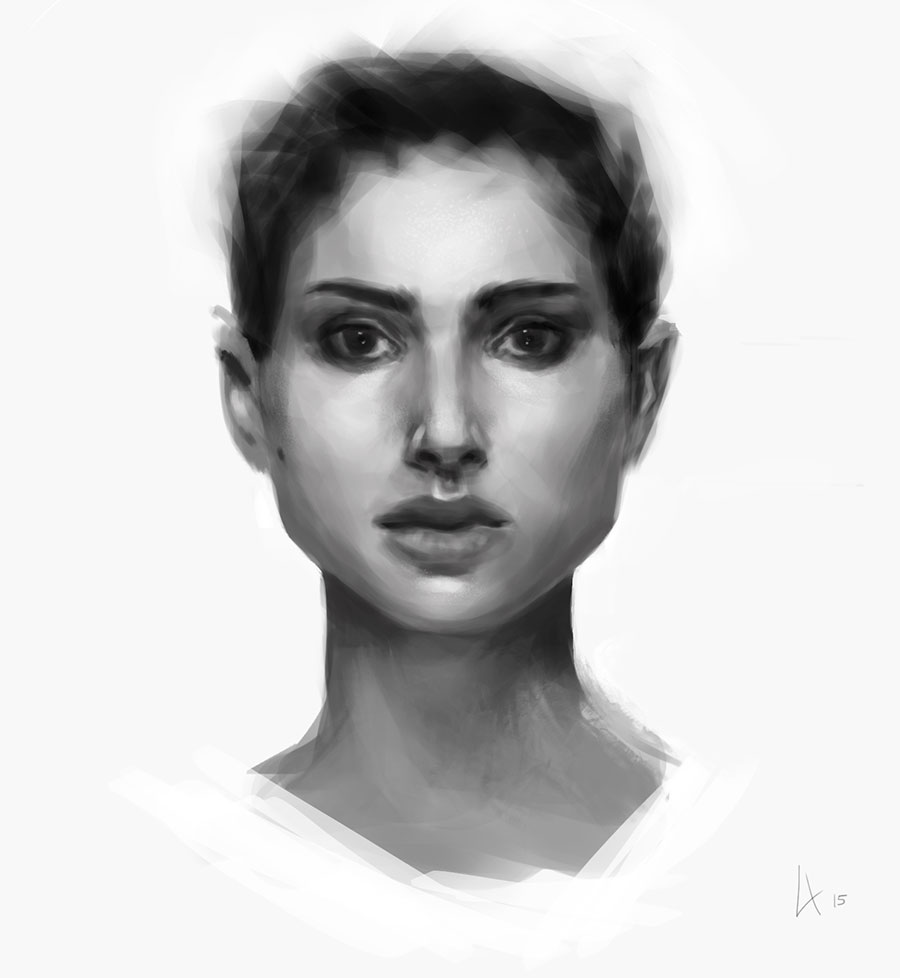
Afternoon's 1h30 portrait study.. Trying to apply what I've been trying to learn these past days about face planes, lighting etc.. Ooh skin tones are so hard!

Posts: 274
Threads: 0
Joined: Feb 2014
Reputation:
3
That portrait is looking great, Lale! I personally think the skin tones look convincing to me, though I haven't seen the reference so I can't really make a valid judgement. Still, if I have anything to suggest at all, it's that you could perhaps vary the textures between the skin and the hair a bit more. Still, great stuff, keep it up!
Posts: 402
Threads: 7
Joined: Oct 2012
Reputation:
9
Thank you buddy! yes you're absolutely right! I will keep that in mind next time...
Well actually I just did another trial! :) Still not perfect but I'm getting faster and slightly better (2weeks ago I was still unable to make a face look anything alike the image studied.


Posts: 1,118
Threads: 12
Joined: Nov 2013
Reputation:
63
Nice work on the portraits. I thought of a fun challenge a while back for practicing likenesses. Try to sketch people you know personally from memory. You could even draw yourself from memory and then check the mirror after. When you draw with no reference it really hones in on the areas that you dont pay as much attention to normally. So the next time you look at someone you notice that their brow ridge juts out more than you thought or an interesting angle of their nose you never picked up on. Its a nice way to warm up before doing longer studies from ref anyways.
Posts: 402
Threads: 7
Joined: Oct 2012
Reputation:
9
Thanks Adam! That's a great idea actually! I'll do that next time I go sketch in some bar ;)
Also got a bit bored and did this.. Nothing fancy or good really, but just wanted to relax..

|


