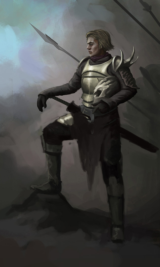
Critique/Paintover needed
#1
Hey guys, I really need help on this one,
Primarily about the legs and posture, it seems horribly wrong imo but I can't seem to solve the problem. Insights ?

Thanks a lot !

[Image: knightl_by_heavenwill-d5of7ed.jpg]

The journey of a thousand miles begins with one step.
-Lao Tzu

Blog | Sketchbook | dA
Reply
#2
Hey! Cool painting, I really recommend striking the pose yourself in front of a mirror if you have one large enough available, but even just trying out the pose without a mirror can give you a good idea of what will look natural. I did a messy paintover, the thing that made the pose look awkward was more about the guy's torso being too short I think, I extended it and changed the legs slightly. Also, the spears behind him were causing some problems for me, just almost touching his head, creating tension, and at first I didn't realise he was resting his arm on a sword, my eyes read the sword hilt as just another spear shaft! I hope this was helpful :-)


Reply
#3
Oh my Thanks a lot Simonarpalmer !

It really helps, I'll be studying what you did here, the akward pose just disappeared.
I'll show you the final result when I get there !

thank you !

The journey of a thousand miles begins with one step.
-Lao Tzu

Blog | Sketchbook | dA
Reply
#4
looks great indeed, at first reminded me of Jaime Lannister from the ASOIAF books.

I like the way you are rendering the armor, and i like the idea of a battalion of lancers behind him, maybe with some banners and ashes on the wind.
I will keep an eye on this. :)

Reply
#5
(12-19-2012, 04:34 AM)EduardoGaray Wrote: looks great indeed, at first reminded me of Jaime Lannister from the ASOIAF books.

I like the way you are rendering the armor, and i like the idea of a battalion of lancers behind him, maybe with some banners and ashes on the wind.
I will keep an eye on this. :)

Great thanks Eduardo !

Here is where I'm at guys, gimme your insights !
[Image: attachment.php?attachmentid=1665152&d=1356029144]

The journey of a thousand miles begins with one step.
-Lao Tzu

Blog | Sketchbook | dA
Reply
#6
Looks much better now man, I don't really have much in terms of critique but make sure you check the leg closest to us as to me it looks the same size as the one in the distance. Foreshortening will make the boot closer to us appear bigger.

I know you already know that but just saying. :)
Apart from that I love the concept and uuuuuuh, to the form on the helmet. Looks tight!

Live everyday like its your last one.
Facebook: http://www.facebook.com/gdsstudio
Twitter: https://twitter.com/gdsworld
Deviantart: http://gdsworld.deviantart.com/
Reply
#7
Hey Gd, thank you ! The latest version is on dA. I still think it's wrong so maybe I'll work on it later

The journey of a thousand miles begins with one step.
-Lao Tzu

Blog | Sketchbook | dA
Reply
#8
Hey man I did a very quick paintover I hope you don't mind.In my view, you did this piece thinking too much in 2D and this is the reason why you felt there is something wrong with it.If we find the horizon the boots don't follow the rule about ellipsis.Which is "The farther an ellipse goes from the horizon, the wider it gets".
There are some perspective problems in the armor and the legs.The face is 2D because it's in a complete profile and contradicts with the horizon.

Do to my personal taste :
I decidet to add fire for the sake of contrast, because the image was too dark.I also played with the light in order for the silhouette become more readable.In my opinion the detail in the knight draws to much attention in places where it is not needed so in the paintover I removed some of it.
I don't know perspective that well, but in my opinion the main problem in this piece is perspective.I apologize for my bad English :)
OFF : The left arm compared to the right is longer, it should be the other way around.
[Image: knightn1.jpg]
Reply
#9
Hey some good points in there, thanks a lot for taking some time to do this !

The journey of a thousand miles begins with one step.
-Lao Tzu

Blog | Sketchbook | dA
Reply
#10
I can't help but keep thinking it has two left feet..
I think that's mainly because of the back foot not being straight on towards us which would give you character a "Strong stance". If you've done martial arts before, then you might notice it too.

Maybe also have his head tilt up a little? There's almost an uncertainty that I can read in his face/pose (unless you're going for that?)

Hope this helps a little :x

Reply
#11
Here is my thinking on it.

First I adjusted the colours. The blue took away from the scene more than added. I defined the light source then began to paint more loosely. I thought about defining the silhouette, making the character and his armour stronger, and things like this. I felt that his head pose could mean a lot of things but it must mean hes in some kinda of thought on where he is. So I left it and made it more dramatic.

Let me know if you have any questions!


Attached Files Image(s)


Reply


Forum Jump:


Users browsing this thread: 6 Guest(s)