Posts: 87
Threads: 7
Joined: Oct 2012
Reputation:
2
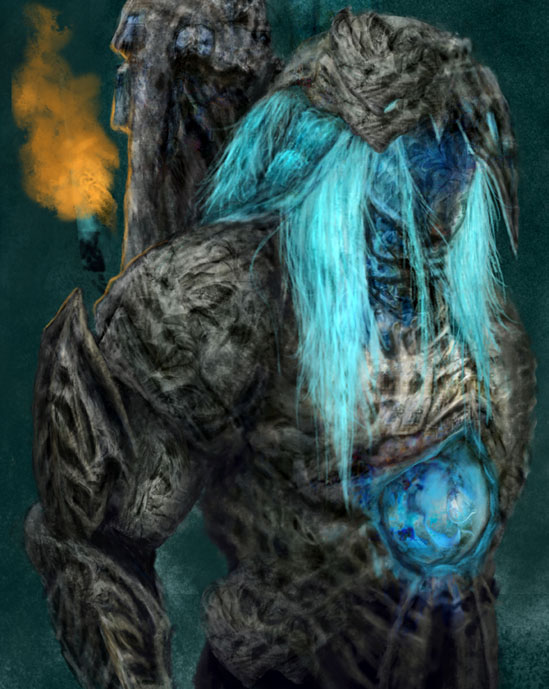
The basics of composition will answer that question for you, the top piece has the blue focal points running down the right hand side which destroys your composition. Try a middle ground between the two you have, use the rule of thirds to get started.
Hope this helps.
Posts: 72
Threads: 5
Joined: Jan 2013
Reputation:
1
well.. I think it really depends on what YOU are looking for lol. One way or another changes depending on the mood and reasoning of the piece.
What are you trying to convey to the audience?
What is the purpose of this character in particular?
Is this a Character design or a Portrait?
Is it a scene based image?
There is a lot of things to think about. In the mean time, I feel that maybe you are too eager to render your images.. Try blocking out what you want to do first. Just remember that you don't have to commit to every stroke :)


