Posts: 237
Threads: 3
Joined: Jan 2013
Reputation:
1
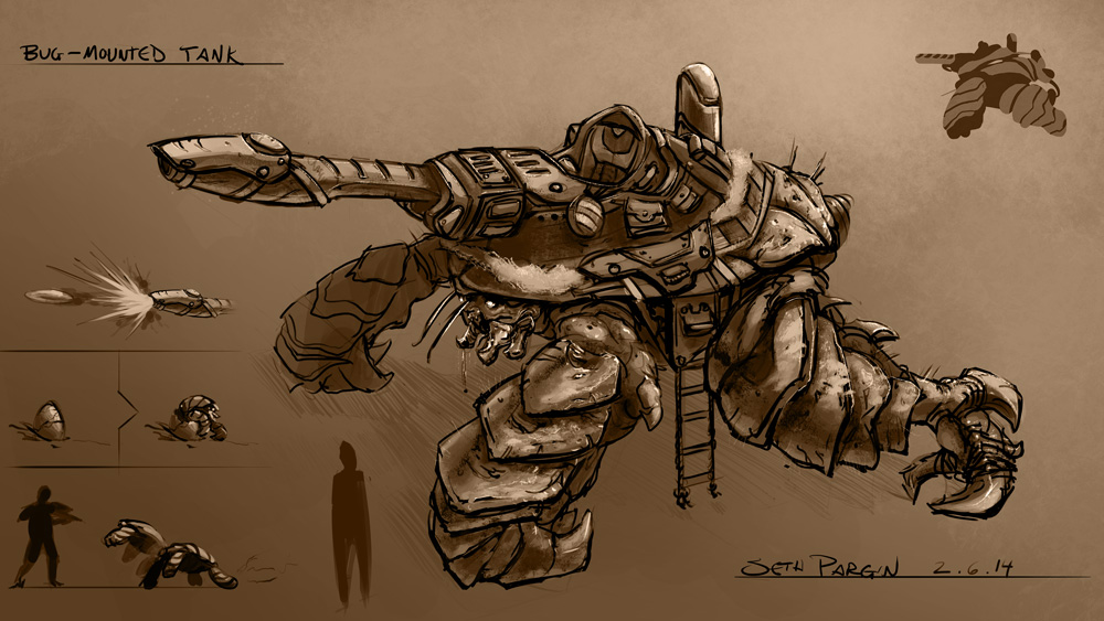
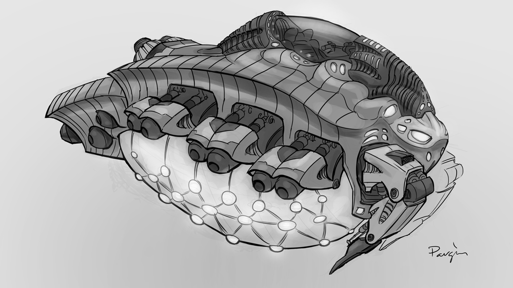
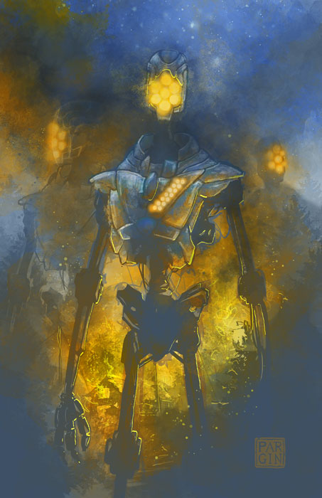
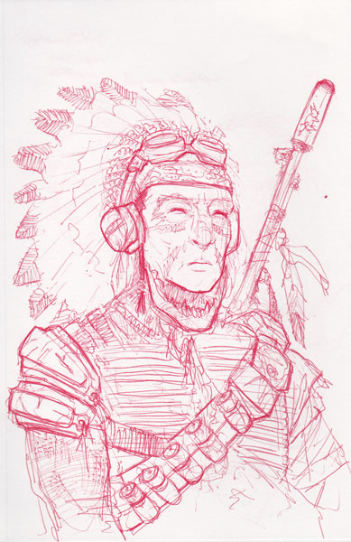
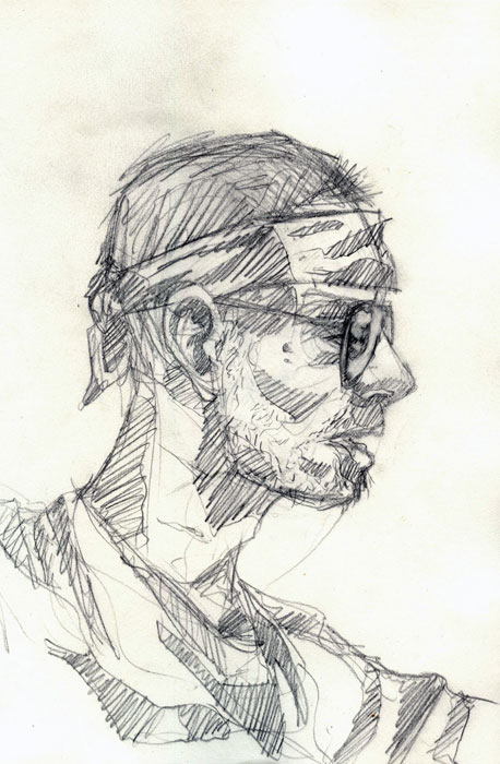
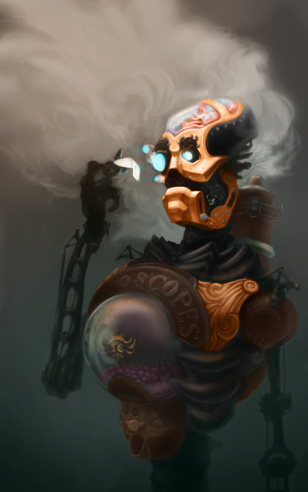
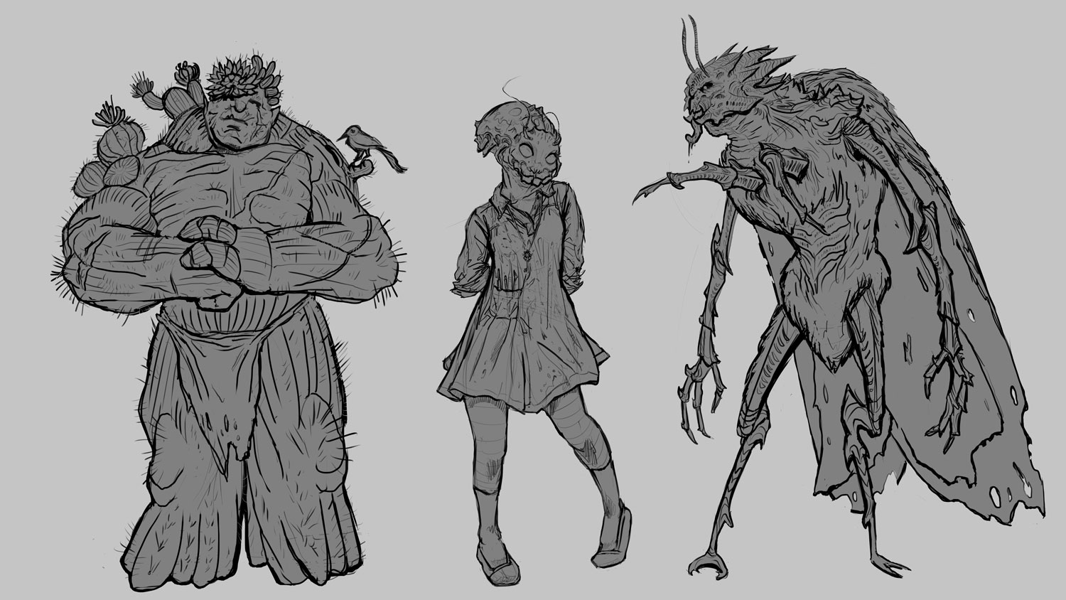
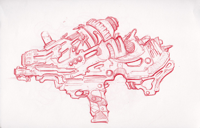
cool pencil sketches and awesome robots on the fifth image from the top)
Wow this is an amazing sketchbook!
Really like your creativeness and the details!
Gonna keep my eye on this SB ^^
Posts: 84
Threads: 6
Joined: Oct 2012
Reputation:
3
Wow, thanks, constructicon! I'm glad you like them!
Posts: 433
Threads: 2
Joined: Feb 2012
Reputation:
3
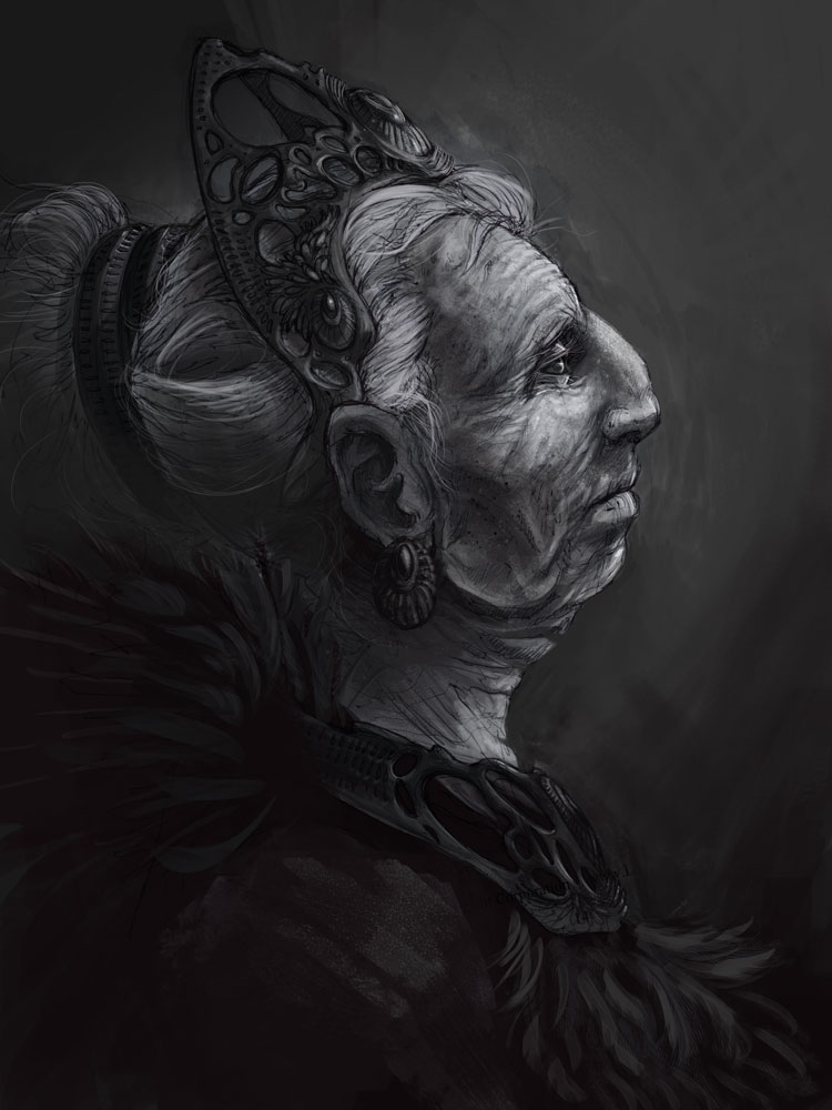
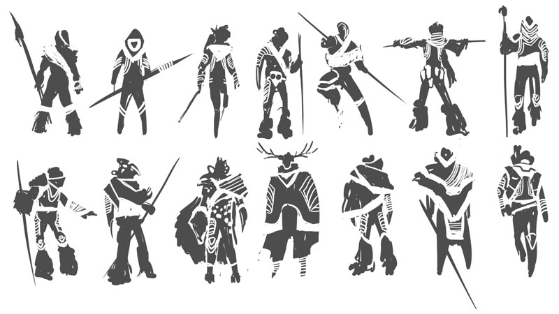
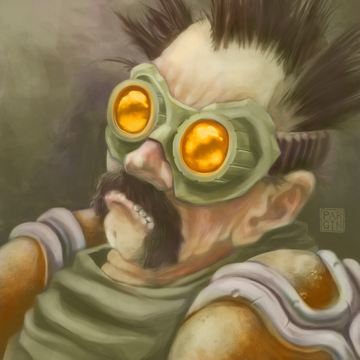
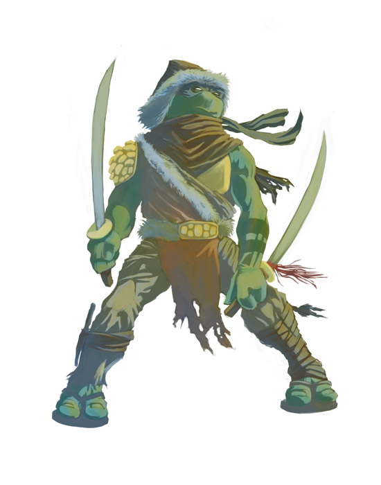
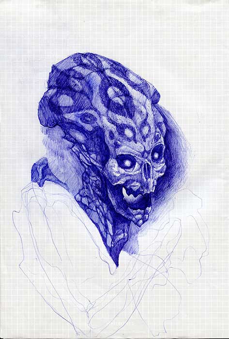
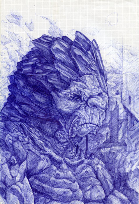
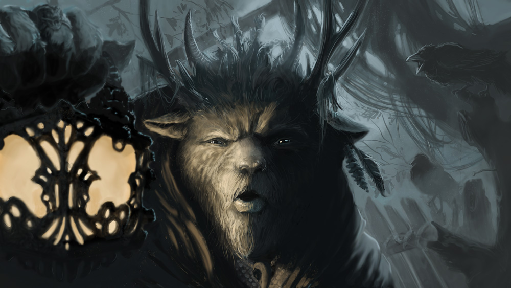
Woah your sketches are awesome!! I'm sure I'm not the only one to tell you this but there's a big difference in your drawing skills and your painting skills, but I can see you're already pushing yourself with the painting stuff. Keep at it man! You've got some crazy cool stuff!
Posts: 84
Threads: 6
Joined: Oct 2012
Reputation:
3
Thanks!
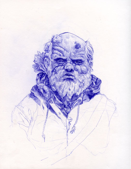
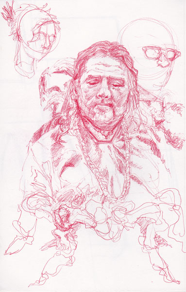
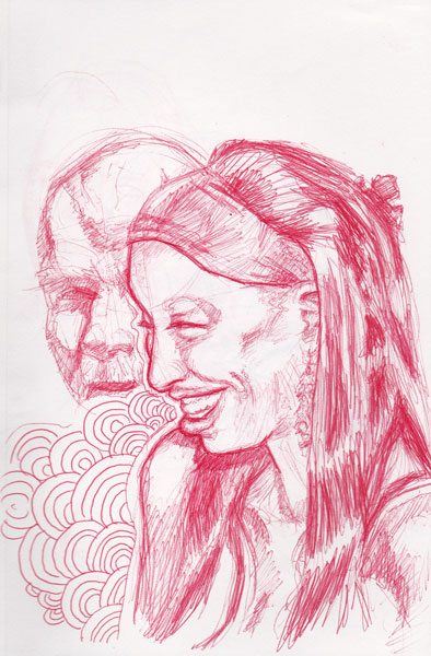
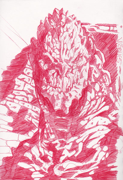
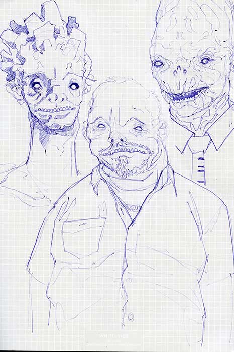
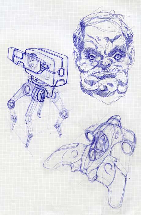
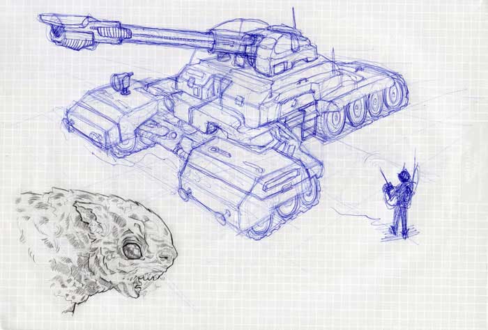
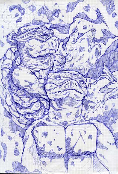
Yeah, I keep hearing people saying they like my ballpoint pen stuff, but not so much my paintings. I guess I just sketch more than I paint. Less fuss. It's hard to find the time to sit down at the computer sometimes, you know?
Posts: 116
Threads: 5
Joined: Jun 2013
Reputation:
6
Wow, so impressive! Loving all of it, really great work man! Everything is so creative, inspiring dude! And those ballpoint sketches.. just wow :P haha.. just going to leave this thread speechless now.
Posts: 84
Threads: 6
Joined: Oct 2012
Reputation:
3
Taking the pen ones down! Haha. Really, though, thanks!
Posts: 342
Threads: 37
Joined: Jan 2013
Reputation:
13
your linework is inspirational seriously, i need to learn to draw like that with a tablet. great job, keep going.
Posts: 116
Threads: 5
Joined: Jun 2013
Reputation:
6
Hey Par Gin, I thought I'd drop back in here for another drooling (and for some serious inspiration!) and I thought I could give a suggestion.
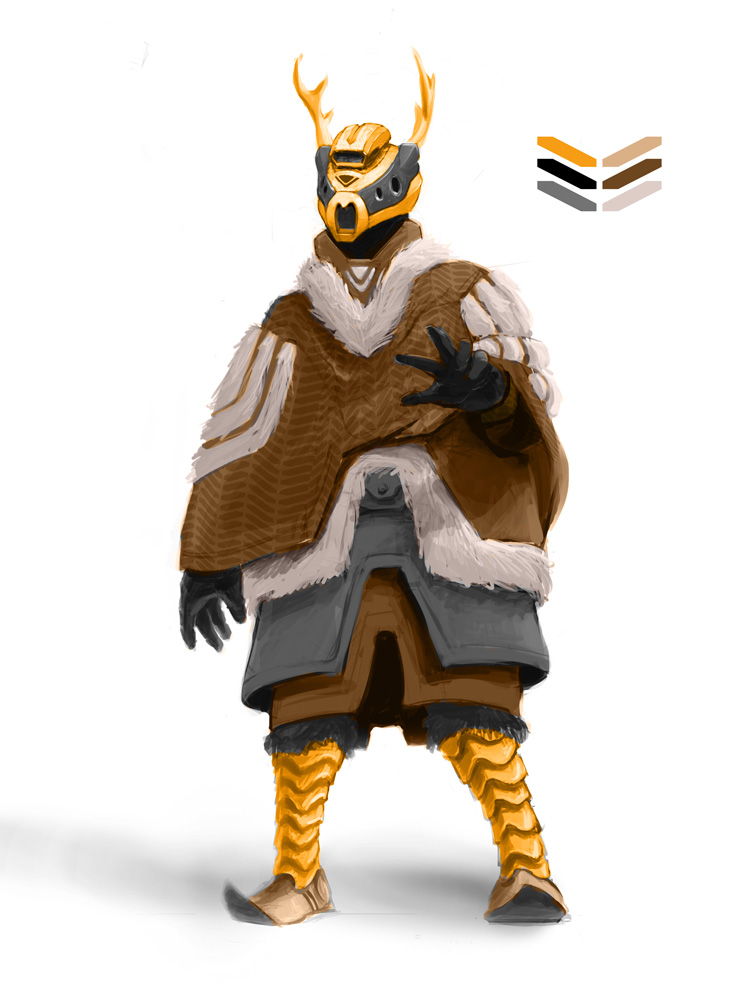
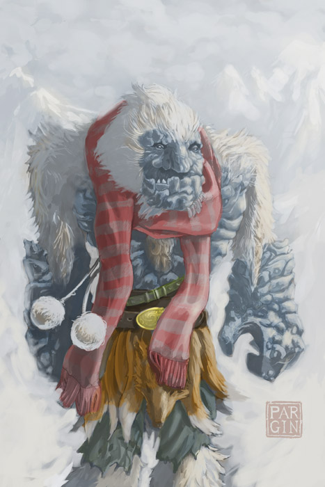
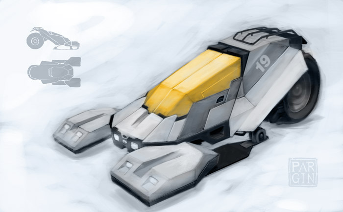
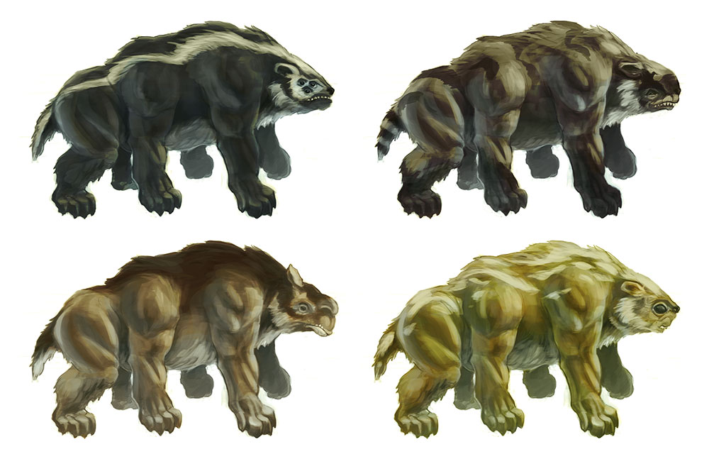
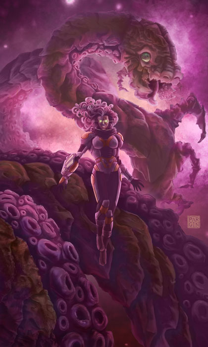
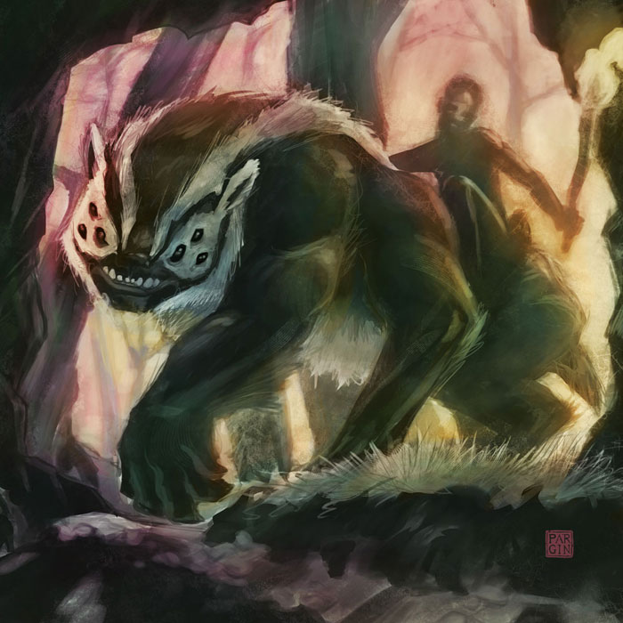
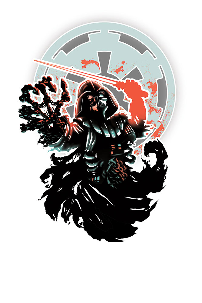
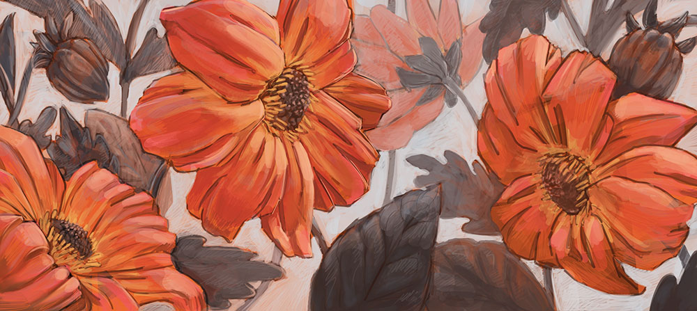
Take this with a grain of salt because you're clearly miles above me but your digital paintings (Snow Golem, TNMN, Robots, Alien piece, etc) all look a little washed out. Like there's not enough contrast between the values and saturation. I popped some of the images into Photoshop and hit the Levels modifier to increase the darks and lights. The first robot was a good example, the yellows and oranges really contrasted against the blues, instead of all looking a bit washed out and blended together.
Just an observation anyway man, love love love the work!
Posts: 84
Threads: 6
Joined: Oct 2012
Reputation:
3
Thanks for the critique! I know you're right. I just know I'm not happy with a lot of that earlier work. I just need to make new stuff that sucks less. Lol.




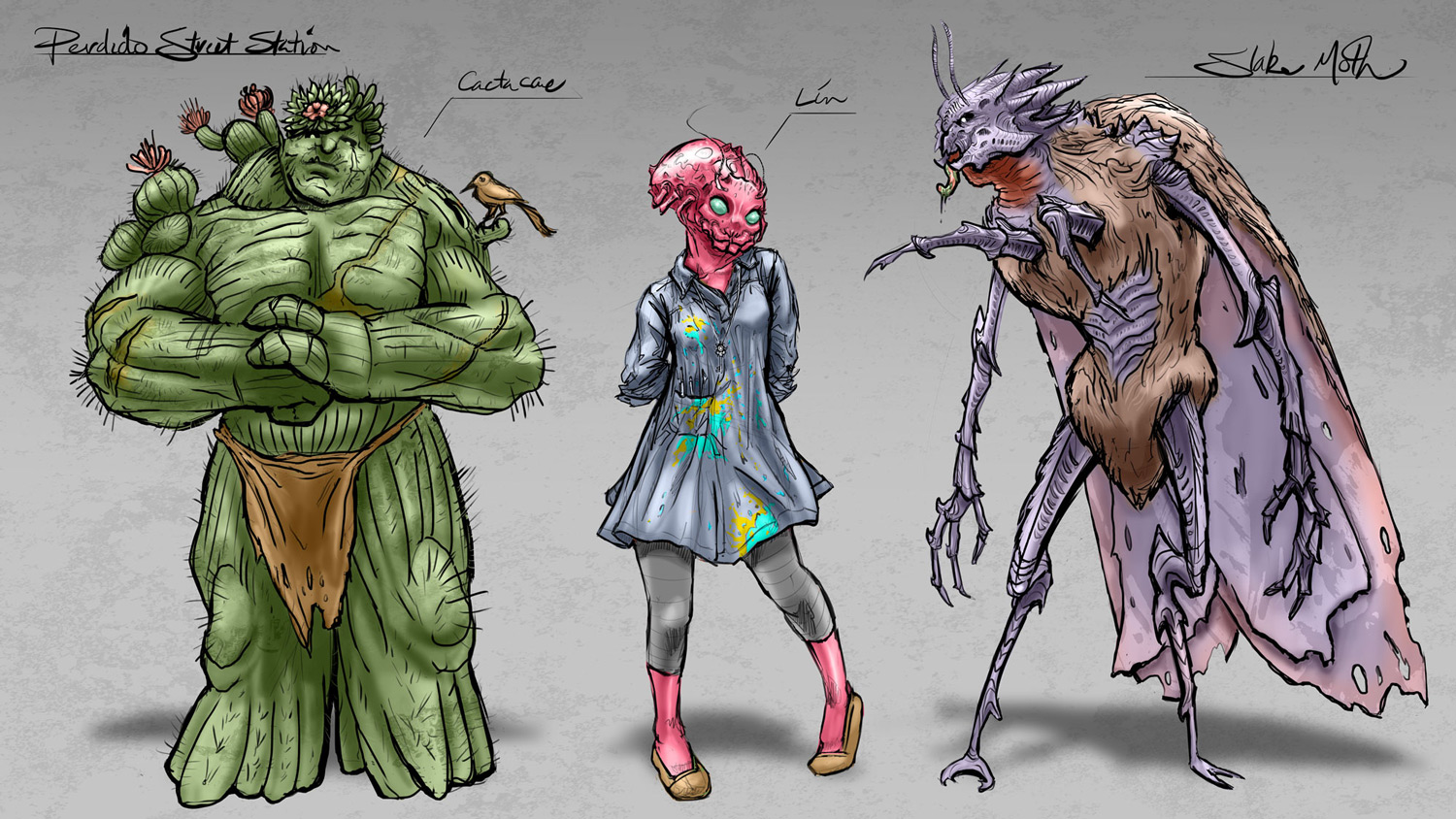
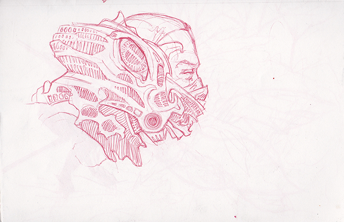
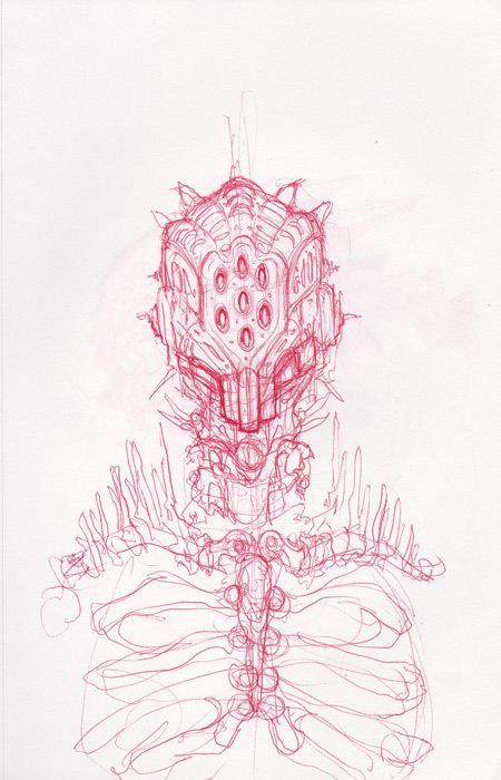
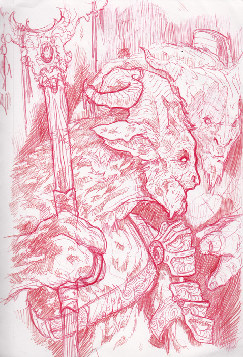
![[Image: tumblr_mrsghyZo121sfl5xpo1_1280.jpg]](https://24.media.tumblr.com/4cd563f5385bedd608fc99f5b03f250e/tumblr_mrsghyZo121sfl5xpo1_1280.jpg)
![[Image: tumblr_mrsg0izHsN1sfl5xpo1_1280.jpg]](https://31.media.tumblr.com/c7ea9f49581bc61e330a6deab005f0d4/tumblr_mrsg0izHsN1sfl5xpo1_1280.jpg)
![[Image: tumblr_mrzn9vEfOq1sfl5xpo1_1280.jpg]](https://31.media.tumblr.com/b429f844512f56d1bfd70ceeaeae2bad/tumblr_mrzn9vEfOq1sfl5xpo1_1280.jpg)
