01-21-2014, 07:59 AM
I'm loving this update, so much research and application mmmmm:D
|
Lyraina's sketchbook
|
|
01-21-2014, 07:59 AM
I'm loving this update, so much research and application mmmmm:D
01-21-2014, 02:40 PM
Awe-struck by how much work you're doing in a week! Standing at a good place without ref for your environments, keep going!
01-22-2014, 09:14 AM
Lots of new goodies in here...excellent work on Bloodsport! Love the dynamic pose from sketches, the line is so clean. Can't wait to see more!!!
01-22-2014, 12:05 PM
Your landscapes are great :) I was like :o after seeing your last color studies. How was your process doing the master studies? do you ever use the color picker, for example? I'm starting out with color and sometimes seems I can't get the right colors, and values.
01-23-2014, 08:20 AM
Bjulvar: Thank you! Yeah you should join us for the next round, we'll start in February and make a new thread for everybody who is interested :)
ramalooke: Haha thank you! Oh yes, I didn't do still lifes for quite a while. But I am moving in a few days and then I will have an unlimited amount of new objects to do still lifes from. Yay! :D Doolio: Thank you! :D meat: Well, just trying to get the most out of the time I have. This week is a bit slower though as life is going crazy on me right now. Thank you! Nika: Thank you Nika! alexfreitas: When I am doing color studies, I open a new document and throw in all images I want to study in that session.. then make a medium-grey box in the same size besides each image...that's the basic setup. Then I ask myself which color dominates the original painting, choose one from the color wheel which I think comes closest, and basically just try to recreate the image, color wise. I always choose the colors myself as this is the important part of the exercise - thinking about which hue and saturation the painter used to create the desired effect. It also helps to learn how colors look different depending on context - a grey placed beneath a strong orange will look really blue, even if it is not blue at all... sometimes even a desaturated orange will look blue in comparison to a strongly saturated orange. Those are the kinds of things I try to get from those exercises. When I am done with copying the painting/colors, then I will sometimes use the color picker to compare what I did (hue and saturation wise) to what the original painter did.. but only afterwards, to see how wrong I was. If you are struggling with color and value, I suggest starting with just value exercises - trying to break down master paintings into their main values (3-5 value steps), and do color exercises later. I find it too hard to concentrate on color AND value at once in the beginning. --- Life is going crazy on me right now so I will visit your sketchbooks later this week, when my head stops hurting and I can think clearly again, for now I will just dump some anatomy on you, before I box my scanner for moving! This week: Trying to exaggerate photo-referenced ladies which unfortunately ends in sexing them up, also don't know how to exaggerate guys. Some very painful sketches without ref, trying to put that foreshortening stuff to use. Some 15 (and 60) sec gestures. 15 seconds is crazy!! And some random anatomy things. 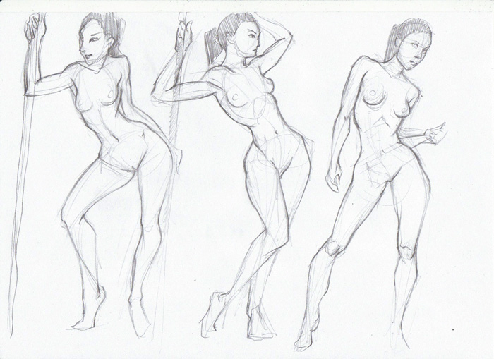 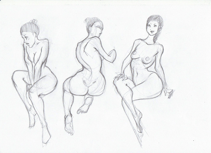 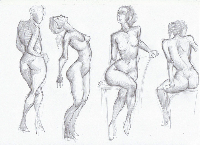 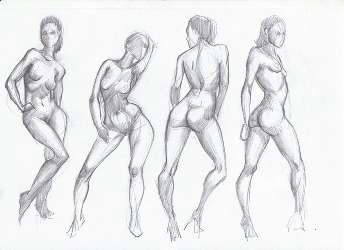 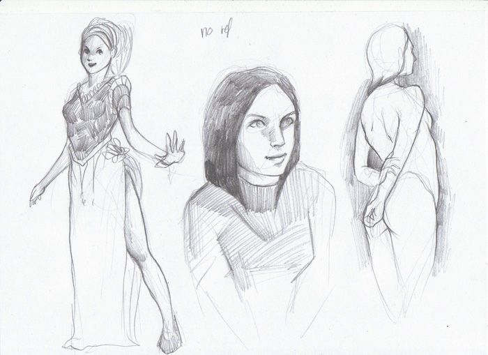 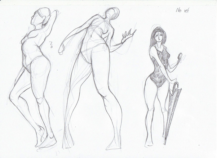 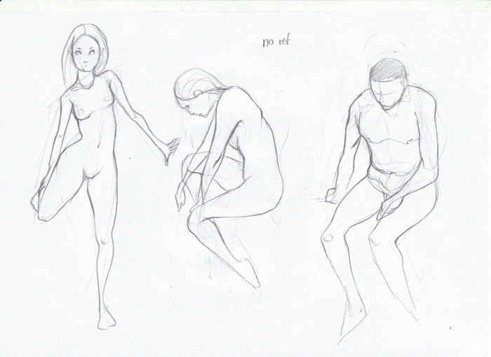 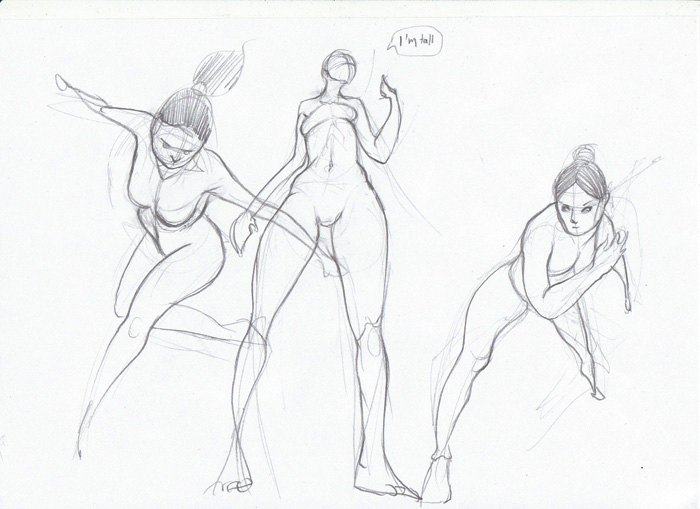 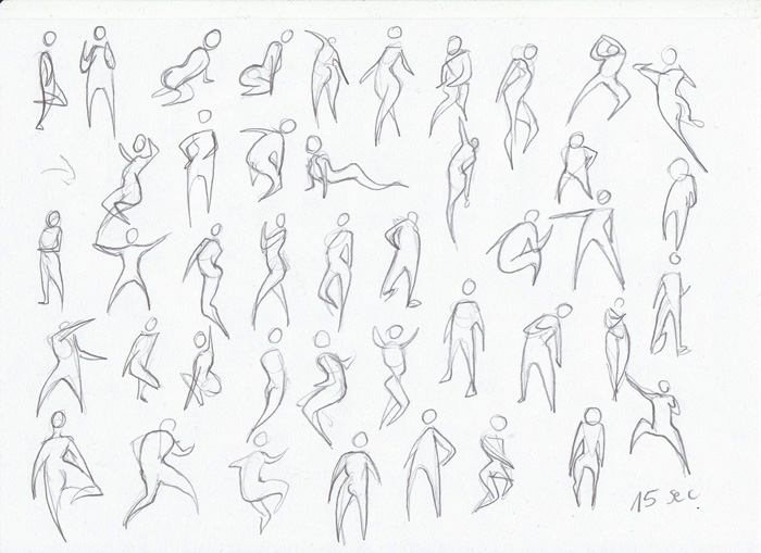 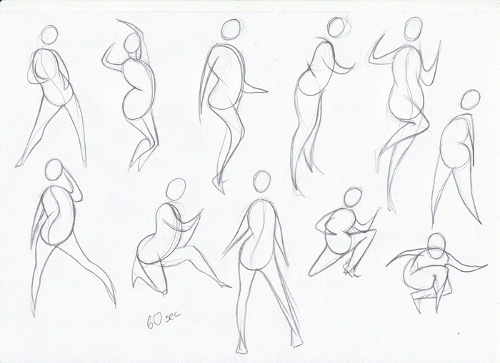 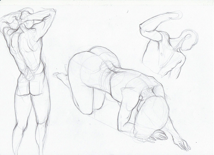 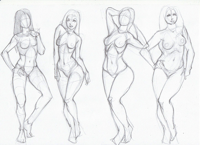 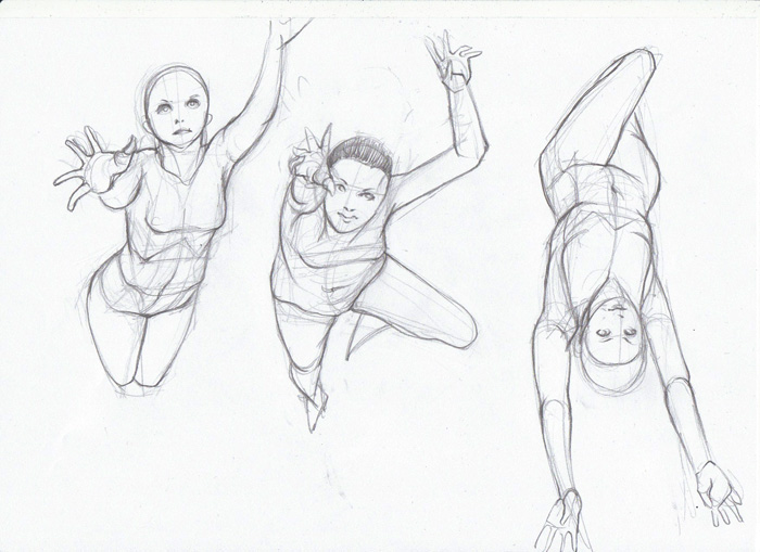 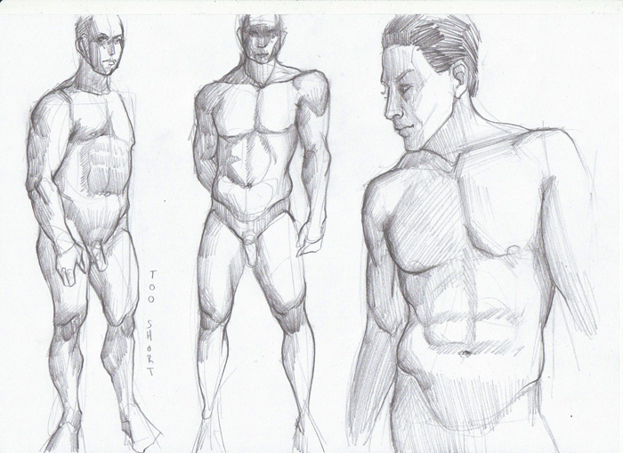 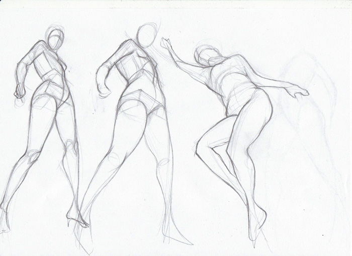 Oh and also, forgot these last time: Each thumb was supposed to reflect a certain mood/atmosphere through its use of color... not too happy with that, but it was an interesting challenge. 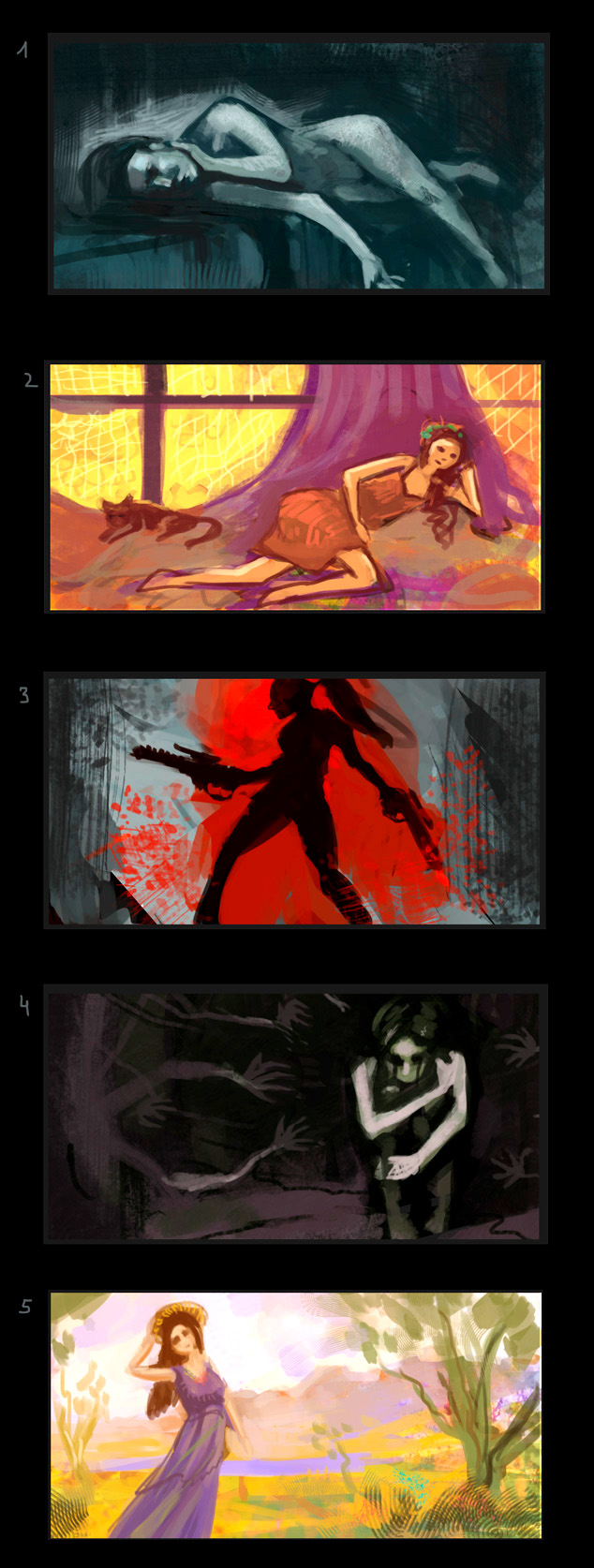 And a quick thing for fun and trying out a more graphic approach: 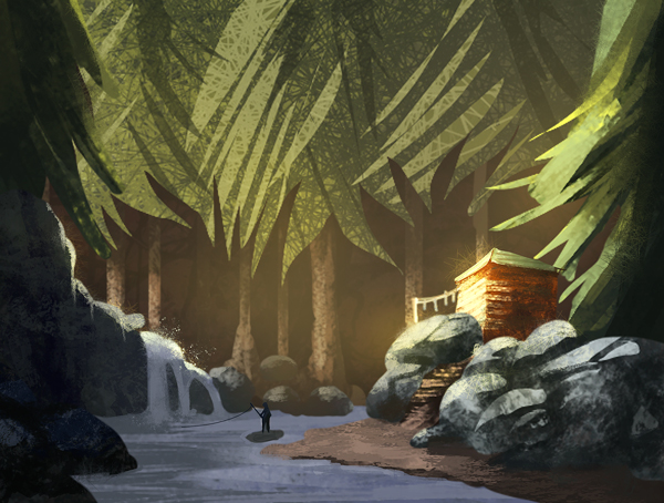
01-23-2014, 09:17 AM
Great gestures and exaggerated studies, you seem to have an interesting way of doing quick gestures aswell.
The quick nature painting kinda reminds me of some scene from a stop motion film, escpecially the trees.
01-24-2014, 07:17 PM
Those anatomy studies are coming ouy pretty sweet.
The weather condition studies from the previous post is something interesting to study and I like these last thumbs, the third one is cool. Take it easy sometimes we all need to rest and get away form the computer. ;)
01-25-2014, 02:47 AM
That "thing for fun" was really cool, you sure can translate what you learn from the studies to your own stuff :) By the way, thanks for answering my question, I'm going to follow your advices
01-25-2014, 04:59 AM
Cool stuff! How are you starting on those exaggerated photo-ref drawings? I think it'd be easier to figure out what direction you want to go with the pose if you start out with some smaller thumbnails like your 60 second sketches, and then do a more finished drawing after you've made your decisions. Since you were disappointment in how the female figures are all sexed up, maybe try and draw some female poses that are more threatening, or exhausted, or laughing. Try and make a whole bunch of different moods out of the same pose by varying the body language and what the limbs are doing!
Maybe do some studies of the clavicle+shoulder blade system, shoulders have a huge range of independent motion and the more aware of it you are the more expressive your drawings can be. color stuff's looking really cool, you're definitely working super hard! Keep it up :D
01-26-2014, 08:37 AM
Foreshortening is slowly coming under your control! Great to see!
For some of them, especially when creating them from memory, you should give this a try http://25.media.tumblr.com/tumblr_m6gffc...4_1280.png Its really good because it also forces you to think of a horizon line for your figures (something I find really difficult) Keep kicking arse. You are tackling so many different areas. It's great to see :D
01-27-2014, 11:05 AM
the exaggerate pose and the foreshortening pose is great, plus you do it without reference.
i agree with Samszym advice of creating various moods of the same pose, it can be a good practice for you because it also can improve your color thumbs. Keep work hard and play hard too, don't push yourself too much, know your limit so you don't get sick. Keep it up.
01-28-2014, 07:04 PM
Oo nice figures Lyraina! You might already be using these guys, but here are a few of my favorite stock photo pages that I use to study poses all the time: http://senshistock.deviantart.com/gallery/
http://jagged-eye.deviantart.com/gallery/ http://tasastock.deviantart.com/gallery/ And that mood painting idea seems like a great exercise. I'm going to steal that! Keep up the awesome, and don't burn yourself out :)
Sketchbook ~ Blog ~ Deviantart ~ Livestream
01-29-2014, 07:46 AM
crackedskull: Thanks! My quick gestures change all the time, never satisfied and always trying to make them more alive, better, quicker... :D
Blewzen: Yeah unfortunately rest is important, I've already learnt that >_< I should do more focused studies like the weather thing more often...! alexfreitas: Thank you! Let me know if you find a different/better way to study from the (old) masters! Samszym: Good point, I've sometimes done the 'do a small gesture first' approach, but not recently it seems. Basically, I try to very roughly sketch in the proportions (torso, leg, hip direction, like a huge gesture)... and then... well, resizing hips, waist, limbs and adding or substracting fat/muscle... in what manner I think might look appealing. Which ends up sexed up. But at the moment I am trying to work on your suggestions of more threatening poses and introducing mood to the poses. Thank you so much for all your advice! It helps tremendously to get pointed into new directions as I tend to get stuck in the same patterns of thought if I'm on my own. Jaik: Hah, I know that page - just didn't really put it to use. Which I changed as soon as I read your post, and did some experimentation. Thanks <3 rioriorio: Thank you! Will do that next :) I think I'm quite far away from my limits at the moment... need to sloowly see how far I can go next. pnate: Thank you, jagged-eye was new for me! No worries about me burning out, I'm just hyper-motivated atm :D --- Here's just a mini-update for now - but I am happy to say that I am now done with moving out (and also mostly with moving in - and didn't throw anything down in the process!). Last week I was returning THREE keys to their owners - the key to my lab/university, my apartment keys to the landlady, and (finally) my exes apartment key. This feels all very symbolical and meaningful and also painful and sad and exciting and confusing and... many things. (ref only used for the hand - wanted to put last week's portrait practice to use) 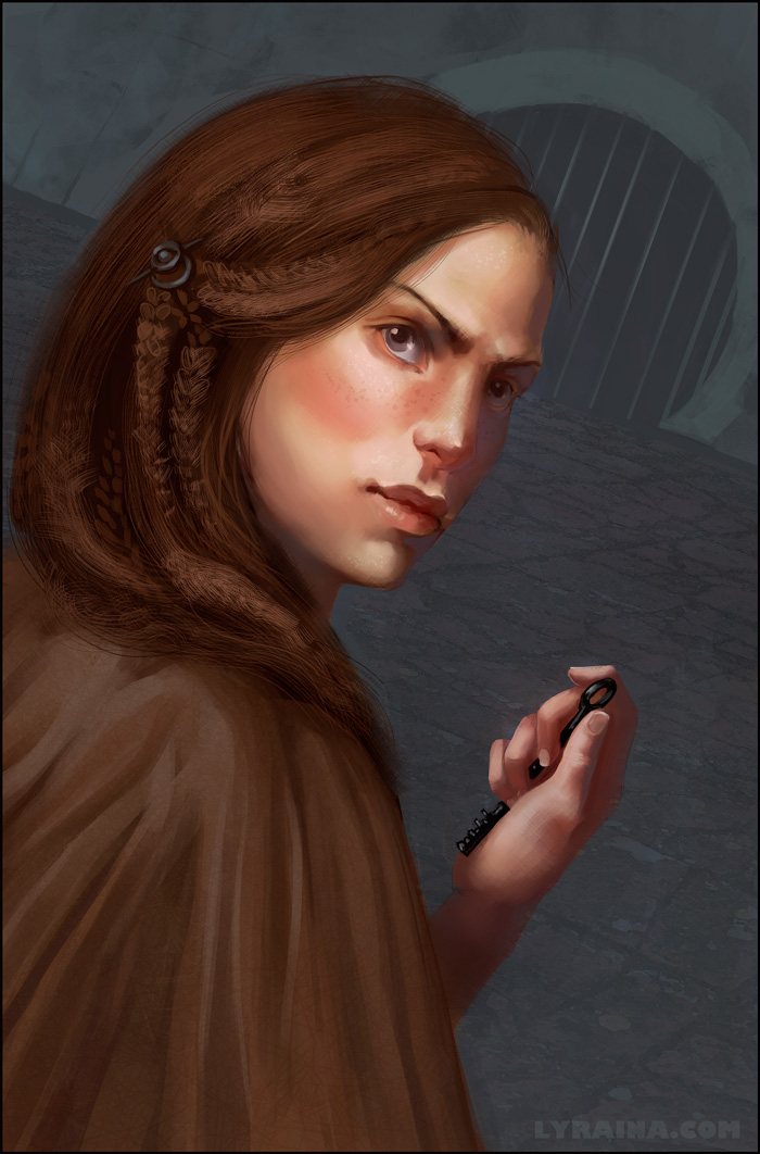 dull (?) cloth from life 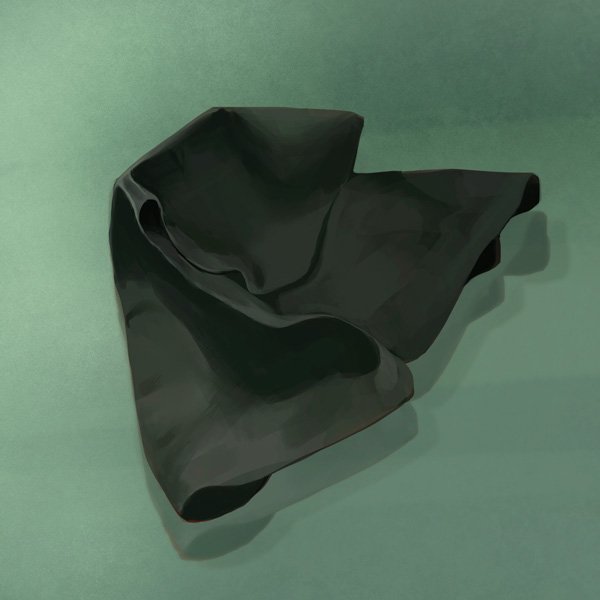
01-29-2014, 11:23 PM
You have a great sketchbook! I had a look at some of the pages and your hard work and improvement is really inspiring! I also admire that you are studying different body types, it's something I also have on my list.
Great colours in your last two works! I think the portrait from imagination came out well, except that I think the eye on the shadow side is a bit off. It looks to me like the iris and pupil and/or eyelids could need some adjustment. (This is probably not very helpful orz I'm sorry). Other than that I really like the nose and her lips! Keep up the great work!
01-30-2014, 07:28 AM
Cyprinus: Thank you! I think I redrew her eyes 300 times already, I think she might have looked in every possible direction and still it looks off :P
Sorry to torture you again with these failed attempts at perspective figures, but I feel like my brain really is working on that topic and I just need to push myself a bit more and then I might have a chance to really start understanding this. I drew from posemaniacs, trying to break down the figure and understand how the foreshortening reacts to how extreme the camera angle is. I also tried to rotate a previously referenced figure and change the angle. And some without reference. I also did some shoulder studies as suggested, but those consisted mostly of me touching myself while moving (at the clavicle of course. :P ) and reading Bammes. So this is how I tried to break down the figure, although I think I did a mistake placing the lowest mark on the toes.. should be on the heel instead... then the foreshortening might make more sense.  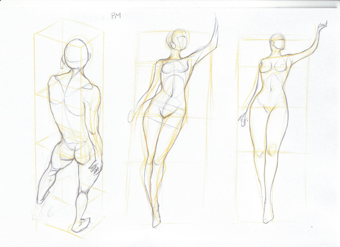 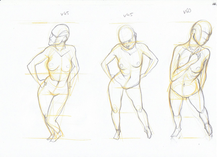 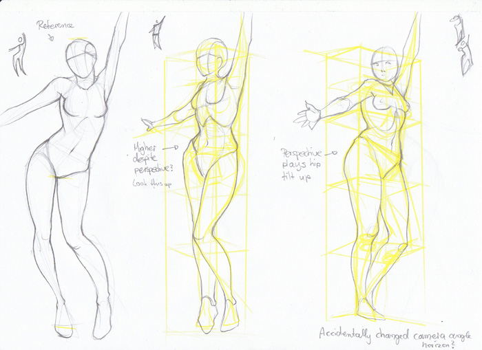 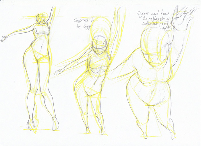  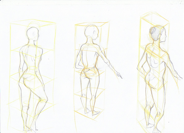 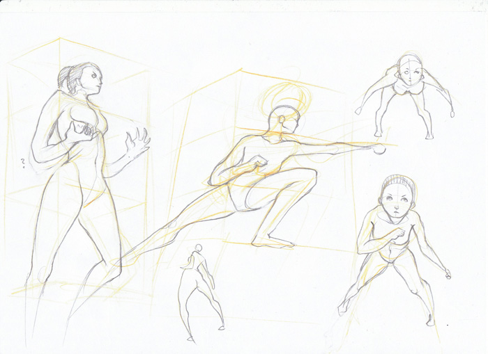 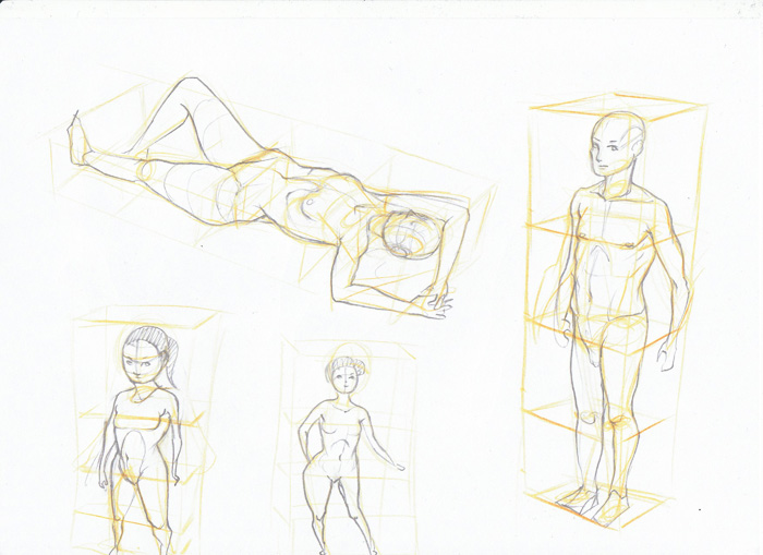 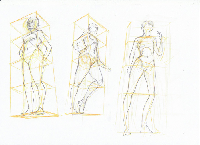 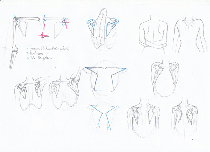 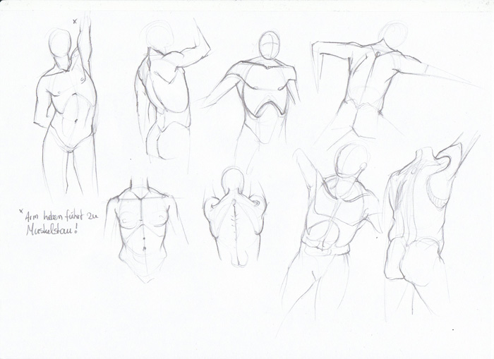
01-30-2014, 10:07 AM
Wowza! I think you should try drawing those perspective figures as simple boxes and cylinders instead of organic muscley forms for a while, it'd make it 10 times clearer and easier. Perspective's tough enough without anatomical details thrown in!
As for the eye placement thing, I think it would help a ton if you had a little hand mirror so you could look at your own face! When I get my head in that position, it seems like my iris area is right in the inside corner of my eye, it's actually overlapped by my nose a bit
01-31-2014, 11:22 AM
Wow, such forceful gesture in those top sets of sketches in 205!
Also, really like the lady with the curious black key. Lovely skin tones and expression!
_________________________________________________________________________
The best time to plant a tree was 20 years ago. The second best time is now. -Chinese proverb Sketchbook
02-02-2014, 04:56 PM
Looking good. So much work...
With the scapula, Ron Lemen had a really good diagram (which I basically just redrew when I was studying the scapula) which explains a really easy way of setting out the scapula. The width between is basically the width of the head. And the height of the scapula is 1/2 the rib cage. Its a pretty simple abstraction but one that helps a lot.
02-03-2014, 12:00 AM
Samszym: Thanks, you're right, as always! I have a mirror here now. ;)
Tygerson: Glad you like it, thank you :) Jaik: Thank you, I'll try to keep that in mind. Today: Focus on lines, focus on perspective figures (posemaniacs and constructed), and application pages without reference. Still struggling with overlap (and figuring out what part gets overlaped how much). What also confuses me is how to handle things that are tilted in perspective, like contrapposto (?) of hip and shoulders ... as seen from different angles from above, for example. Do I have to construct this more cleanly or how am I supposed to judge things like that? Another random question: I think to improve my art in general I need to focus more on my drawings, less painting, as much as I hate to admit that. Except for what I do so far (any line precision warmup stuff I could find, ellipses etc... and the anatomy I regularly post..and perspective hopefully soon), can anyone recommend what I should do? Things like line drawing environments, or pencil still lifes of objects that require perspective? What else? 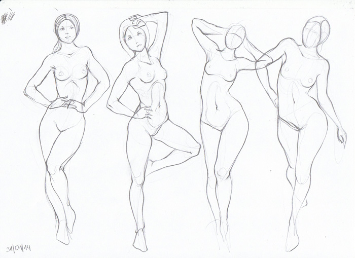 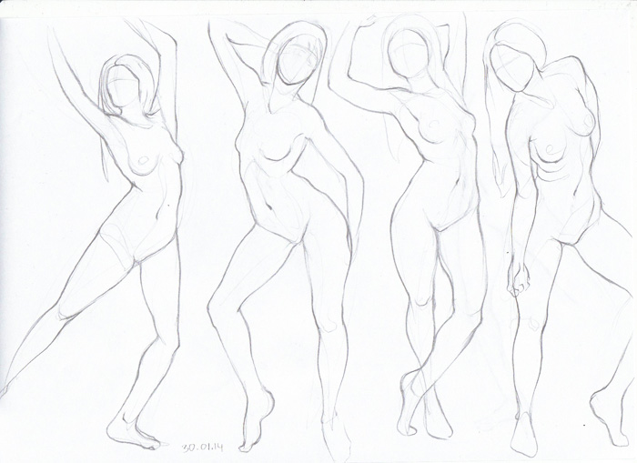 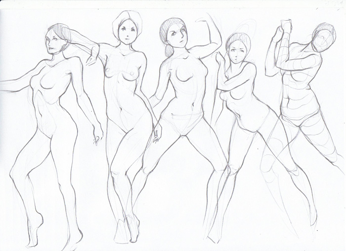 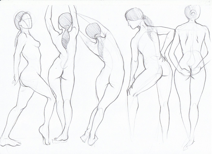 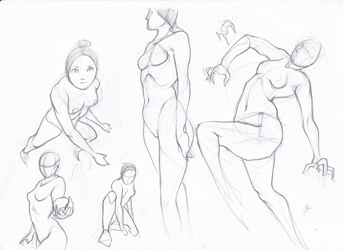 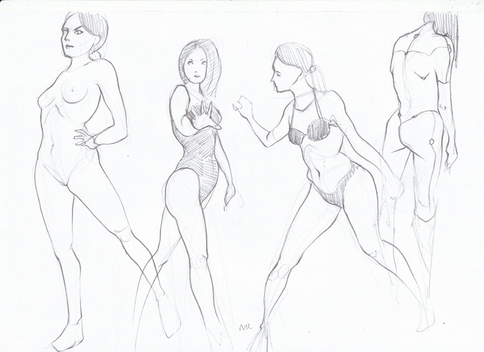 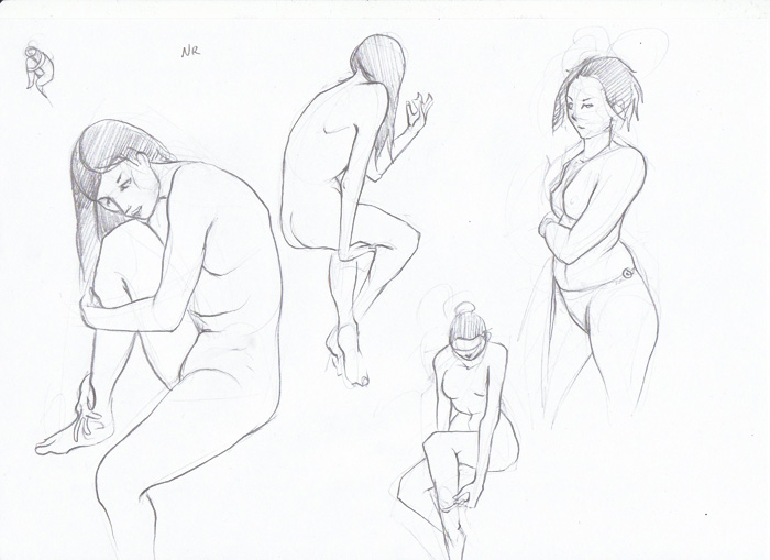 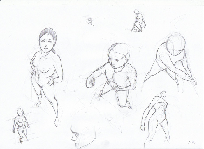 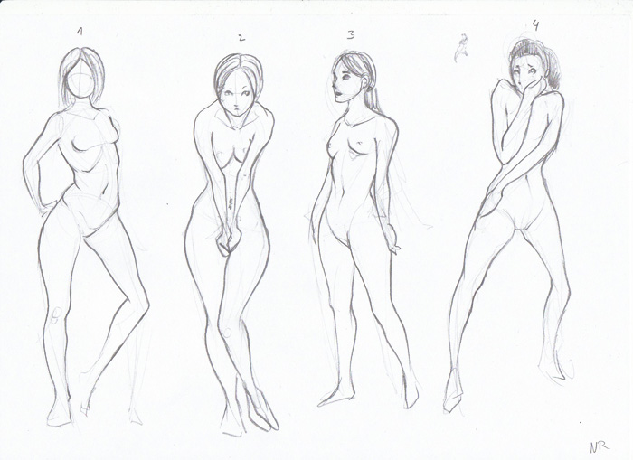 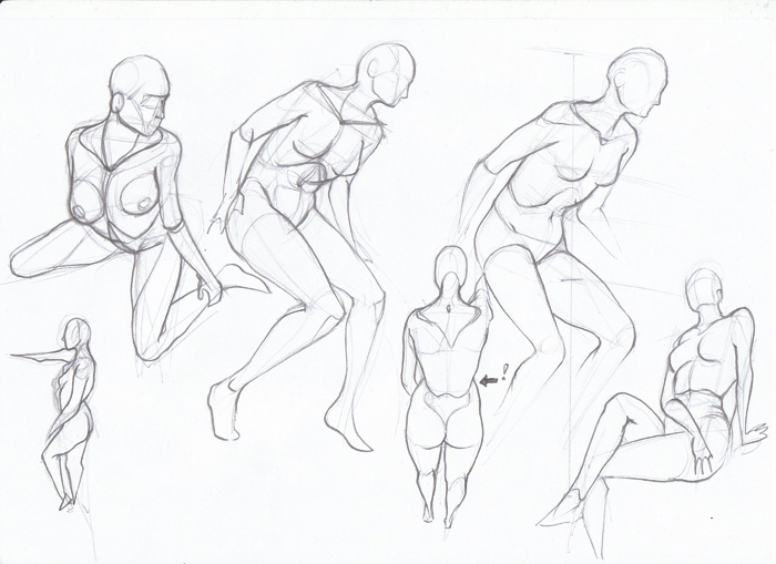 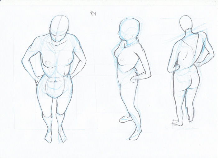 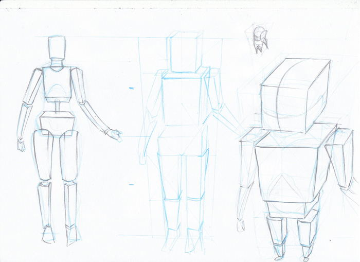 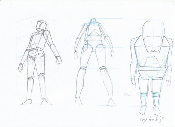 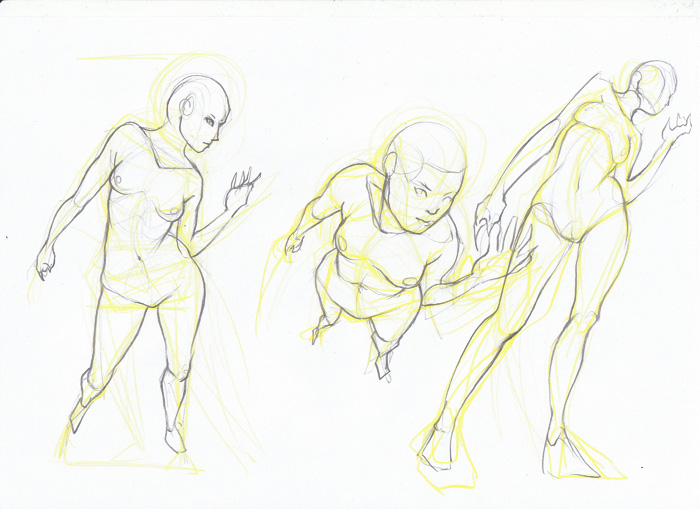 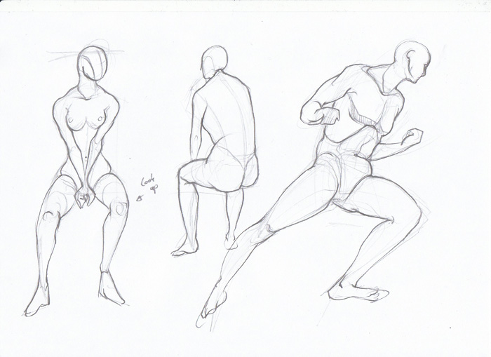 Digital update later!
02-03-2014, 12:51 AM
So much work in this sketchbook, so inspiring to see! I can't really help with the perspective thing, I'm pretty bad at that kind of thing myself :( . But I do have something else you can try to help drawing, other than your already great ideas. Something that helped me was picking up a different rendering style in drawing, specifically when I saw eyecager's life drawings http://eyecager.tumblr.com/post/56391979...e-practice . I think it's called the watt's method, you can also look up e.m gist's drawings http://deadoftheday.blogspot.com.au/sear...%20Drawing . Studying their drawings helped me out a bunch, hope you find it useful!
|
|
« Next Oldest | Next Newest »
|