Lyraina's sketchbook
Oh whoa, gorgeous Wip! Loving it :)

And yeah, well, two things - adding just enough of a compliment on your base pigment wouldn't violate the gamut mask, it would just make you walks towards the true-neutral-gray in the center of the color wheel, right? That is almost always there on the gamut mask anyway. But of course, you need to stay on your right amount of saturation indeed.

And yeah, James Gurney's methods were discussed extensively; The general consensus was that he could have more artful choices if he want on color schemes, not necessarily masking out colors but using anything on the extremes as an artful choice.
So james gurney is very realistic, but the same way you will almost always saturate/increase contrast on a raw photo, you could probably extrapolate the gamut masking technique to gain some depth and meaningful color choices for you to design with.
So we were mostly thinking on color schemes, and not masks. The key exercise, anyway, is to exercise restraint anyway - and you can achieve that by both methods :)

It's mostly a philosophy choice by this point anyway. The way I think about it, the more methods you know, the better - you can always chose the best method for each image/problem you have at hand :)

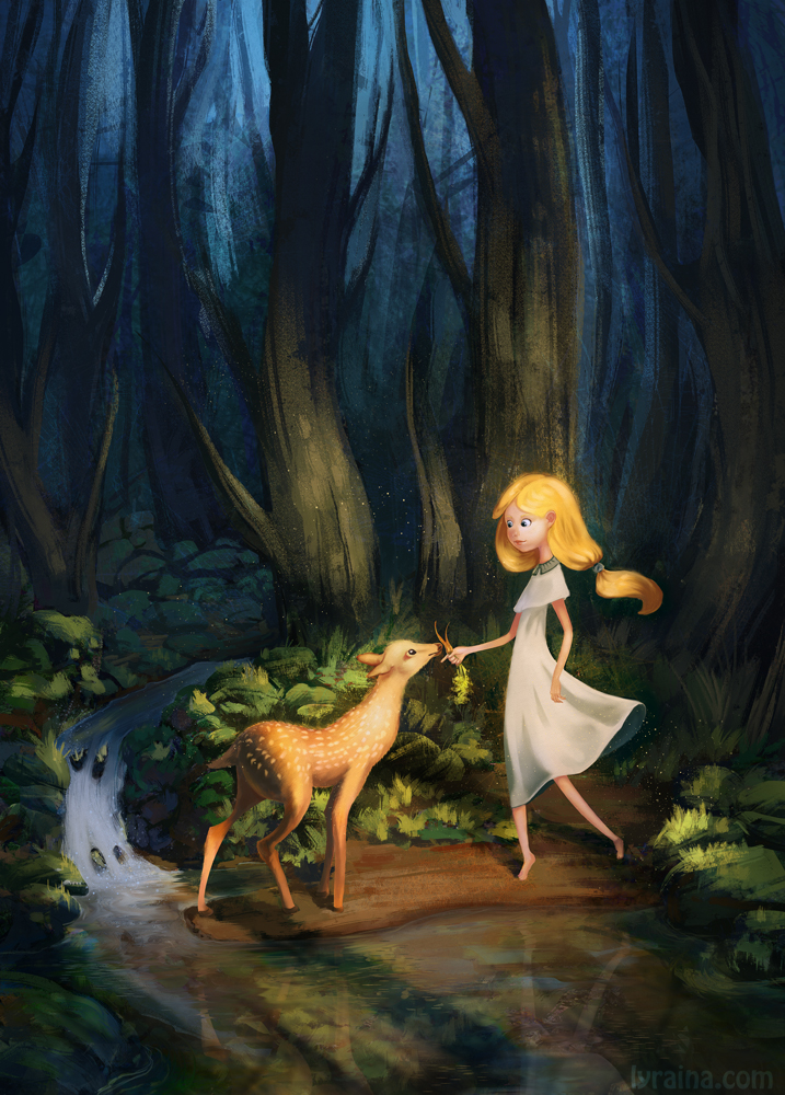
On the Wip: lovely <3 When it's time, give the characters some softer edges too <3 And I am not sure going that high in value on the blues behind of the trees is adding anything at the moment. You can probably lower the values there to keep the light mostly on the foreground, to help with focus. But amazing, coming really strong so far!

Reply
So much stuff and theory going over here, i really like it and the WIP is really cute.. :p

I'll definetly come back to check them out and hopefuly read everything~xD

Keep it up !

Shin's Sketchbook ▼ ▼ ▼Patreon ▼ ▼ ▼ dArt
Reply
okay so just spent an hour going over your stuff, you seem to grasp form, color, light and anatomy a bunch better than when you started off this sketch book, good job.


keep doing you

______________
Blogs CA|DA|CD
Reply
First: Congratz on the Arena-win .. all your hard work payed off!
Second: love that cute WIP. :D
Third: You totally should send your question to James Gurney himself. I bet he likes good questions and may give you the best answer to get.

Reply
loving that read head portrait in one of your last posts, and this last wip aswell.
I got really inspired everytime i come here and see your postS with all that information and theory.
I'm far too chaotic to do that haha.
Keep up the hard work!

Reply
Ursula, thank you! I tried to push the values back a bit, and blend the character edges better into the background. I hope one day I'll understand forests :D They always give me trouble.
Thanks for the insights on the masking and color scheming theory, I think it's slowly getting a bit clearer in my mind. And I agree, I think the best way to go is learn (most things, not just color) many techniques and different ways to work, and then choose what to do and apply according to personal taste, or what is neede for a certain project.

ShinOkami: Thank you! :)

MarkWester: Thank you! Good to hear that the exercises seem to work, then :)

Wolkenfels: Thank you very much! Haha, asking him didn't even cross my mind. I'm not really used to that concept of having a teacher (which his book basically is) I can actually ask stuff :P But I'll probably first work on the book a bit more to make sure I don't completely embarass myself because the question gets answered a page later :P

Eduardo: Thanks! Haha, I'm actually the opposite, I have to restraint myself so that I don't spend all my time planning, theorycrafting, researching, list-making instead of actually doing something XD

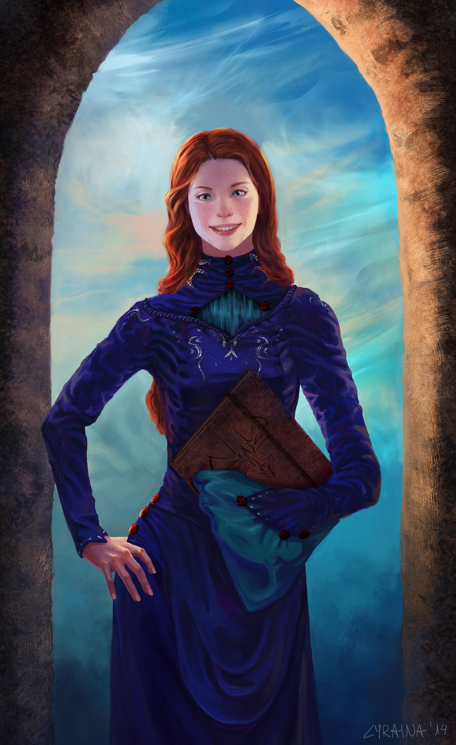
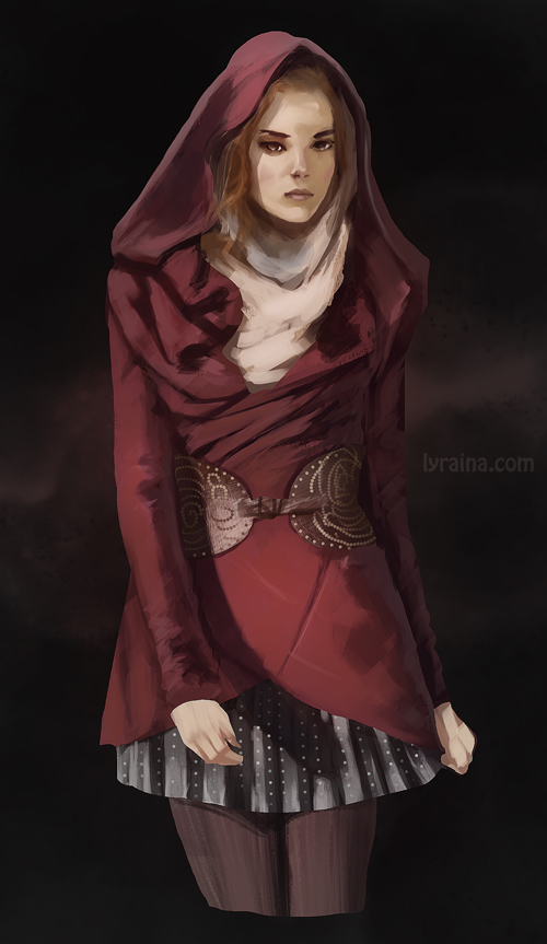
Okay, here is what I think is my last fix on Shallan, unless something very wrong springs into my eye. Have to move on eventually, still some more characters to paint :P And I seriously can't even see anything anymore on that image, not even if she's still crosseyed or not. I'm looking at it, flipped or not, and just can't tell anymore O_o Thank you for all the help on this one!


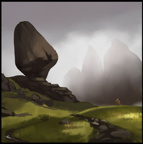
That's also finished. It was (comparably) quick & fun, although I do feel bad for using photobashing in the progress - probably shouldn't as I painted over everything in the end. But still feels dirty. Here's a progress gif.


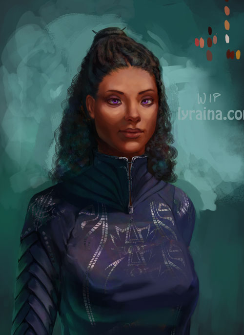
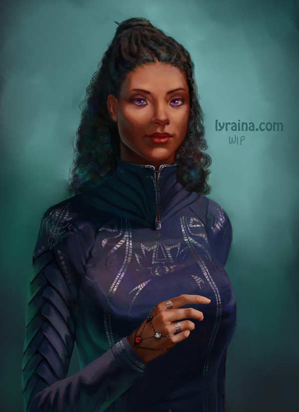
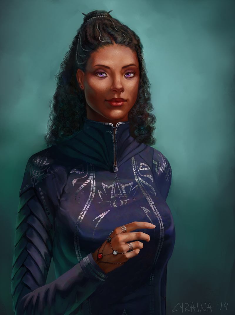
Also, more on Jasnah, not sure what the last step on this one was. I am thinking of cropping in closer, removing the issue with the jewelry stealing the attention from the face.


Hum... I am smelling a lack of studies in here... D:

SketchbookDeviantartArtblog | Portfolio
Every feedback is appreciated!
Reply
Wowie, I love that Shallan! Her smile is so warm and friendly, her dress is simple but elegant, the colors are vibrant...just lovely! I hate nitpick over it, but is her right eye perhaps a little too high?

Love the gesture and mood of the girl in the forest, and what a beautiful style.

I prefer the Jasnah with the hand up. It's a beautiful hand pose. In the cropped one, she looks like she doesn't know what to do with her hands. Some hair jewelry might draw the attention back up. (Google "hair jewelry" for a zillion examples that could work really well here.) Also maybe move the right iris to the right just a pixel or two. It's so hard to tread that fine line between eye contact and slightly cross eyed!

_________________________________________________________________________
The best time to plant a tree was 20 years ago.  The second best time is now.  
-Chinese proverb

Sketchbook

Reply
Very nice! I like the way the stylized painting came out, the process you used seems to work well, no need to feel dirty about it :) I think for that last portrait, a crop in between the two you have would work well. Or zoomed in more, if you want to emphasize just the face, but I think that hand, like Tygerson mentioned, has some good visual interest going.

Reply
I disagree, I think the hand looks awkward given her current facial expression... maybe if she was looking at her hand or something it would look better.

I really like that forest one though, it looks really nice. :)

Reply
Tygerson: Thank you! Especially for the feedback for Jasnah. Adding Jewelry is a good idea, I'll do that :)

pnate: Thank you :) Good idea to zoom in just a little more, I've tried that.

JJ Aaron: Thanks!

Update on Jasnah: I zoomed in a bit closer (not sure if that works with the elbow cut off?), and changed the hand to something more casual, which I think looks better. I suddenly wonder if her torso is too long though...


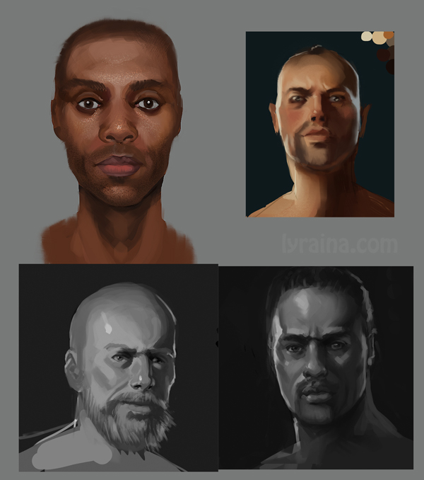
Study
- do not make (male) faces too broad
- do not place the eyes too far apart - this also helps with the "face too broad" problem
- men have beautiful lips, too
- place eyebrows lower on men


Application


Don't ask


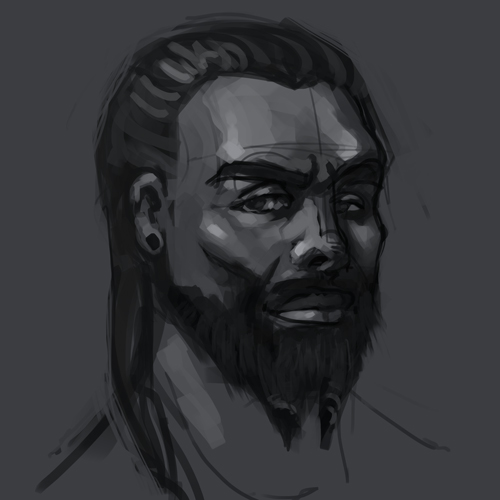
Next portrait: Kaladin. Having a bit of trouble seeing him clearly, as I normally don't imagine characters visually, but emotionally. Trying to go for "half-Hawaiian, half-Asian, which is kind of common in Hawaii" with a soldier's physique, but raggy (Aragorn like :P) and depressed.


SketchbookDeviantartArtblog | Portfolio
Every feedback is appreciated!
Reply
It's pretty incredible how productive you are lol. Not just with drawing and painting stuff, but typing everything down, even!

Quick note on your Jasnah portrait - her hand looks amazing! But maybe a little too amazing? It kinda pulls a lot of the focus (if you'd squint your eyes you'd see that it holds the most contrast and detail). Not sure if it's intentional but I feel like that hand might be taking too much attention from her face.

Doing great as usual! Keep going

Reply
LongJh: Ah well, typing helps me think, learn and remember :D Noooo, don't want to push back the hand now after fixing it x_x But I tried to pull the focus back to the face by putting more details and texture there. Unfortunately don't know how to push the contrast in the face and still keep her skintone 'tan'.

(Hopefully last) update on Jasnah:


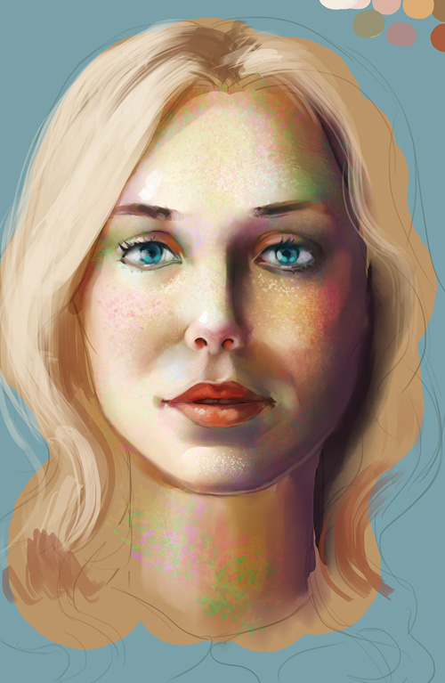
study


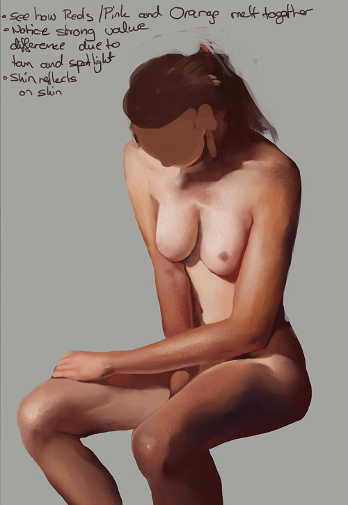
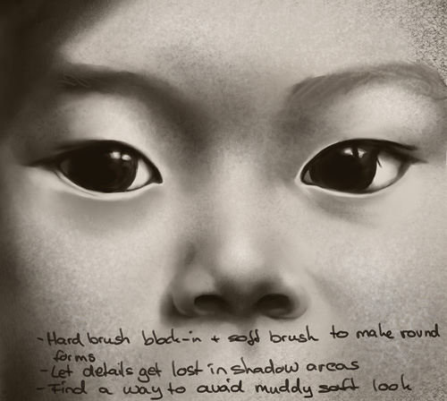
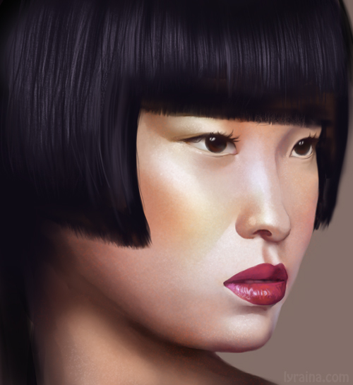
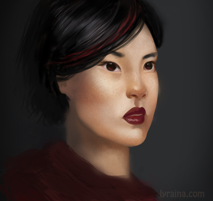
trying to push the realism a bit because I tend to go more and more stylized as if I forget how things look in reality... using softer brushes to avoid brush strokes etc, but not really satisfied so far. not sure how people get a smooth or 'real' look without brushstrokes, yet avoid the soft-muddy look coming from the airbrush or smudge tool


terrible application


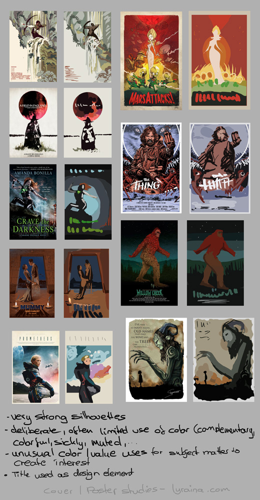
poster studies


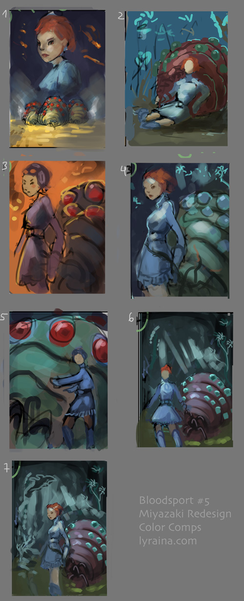
struggling with composition for bloodsport 5 (I started out with 30 thumbs)


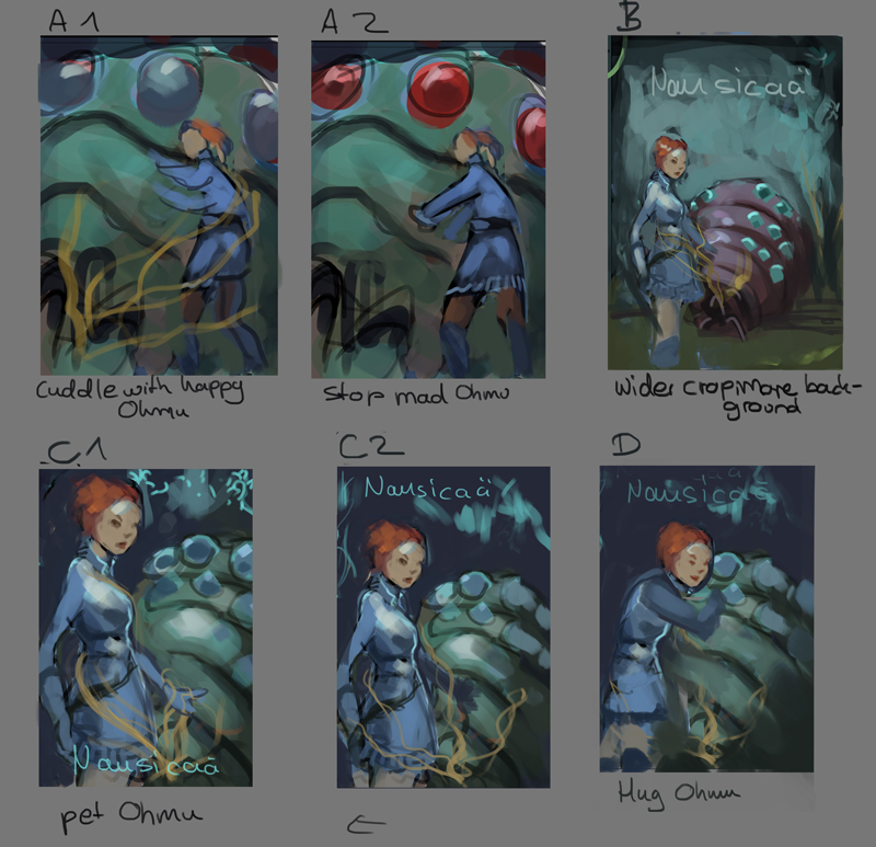
tweaking


SketchbookDeviantartArtblog | Portfolio
Every feedback is appreciated!
Reply
First off I haven't realised what changed in the portrait but it felt a lot better. Good job with the hair jewelry and details, now it's more visible but still natural.
It's beneficial you take notes during your studies - I should do more of that...
Also, I'm really curious about your next progress on Miyazaki :)

Reply
danikina: Thanks a lot :) And yes, taking notes is reeeally important for me. Study, write down the important parts, apply, write down what I observed, where I struggled etc.

Gurney Update: (falling behind with actually doing studies for that :/)
Moonlight
- light from the moon is slightly redder than direct sunlight
- color receptive cones barely function because it's so dim
- Purkinje Shift: rods (value seeing) are slightly more sensitive for greenish wavelengths ---> greens slightly brighter, red (roses) dark/black
- Khan/Pattanaik Hypothesis: neural activity of rods spills over to (blue) cones they touch, tricking the brain into thinking it sees blue (no physiological evidence for that though)

Color constancy
= automatic habit of interpreting local colors as stable and unchanging
- can be confusing to choose/mix the correct color without context
- isolate color in question by covering up the surroundings
- knowledge of this effect has to be applied at imaginative painting

Adaptation and Contrast
- colors and perception of those influence each other (afterimages, colors looking different depending on surrounding colors...)
- hue, saturation, brightness of background induces opposite qualities in objects
- looking at color influences color seen next
- visual system balanced color temperatures like a camera
- color constancy (see above)
- smaller object = less distinct color
---> enhance effects in painting, always look for those things in RL, always compare

Transmitted light
= sun travelling through thin, semitransparent material, i.e. leaves or stained glass
--> colorful
-Four types of light on surfaces like leaves:
1. Transmitted light (colored)
2. Shadow plane facing downward (darkest green, picks up reflected light from surroundings)
3. Shadow plane facing upward (slightly bluer because of the sky)
4. Directly lit area (high value and texture, low chroma)
- Same applies to (backlit) trees

Subsurface Scattering
- glowy, pretty, makes things look alive
- most visible: translucent flesh, small forms, backlit
- also present in other conditions (lit from the front), but less visible

Color zones of the face
- forehead: yellow/golden (bone)
- forehead to bottom of nose: red (blood)
- nose to chin: blue/green/grey (hair, deoxygenated blood)
- more pronounced in men
- accentuate this blue/green hue to accentuate red lip color

Hair
- big brushes
- simplify masses
- soften edges
- control highlights
- think of a ribbon: hightlight goes across, not along the curve

Caustics
= bands of light resulting from refraction or reflection from glass/waves of water
- "imperfect lenses"
- curvature determines shapes
- can be cast upwards from waves, reflecting on architecture

Reflections
- Specular reflection: Light rays bounce off surface at same relative angle as they approached it
- Diffuse reflection: Light rays bounce in different directions (=matte surface)
- Most surfaces are a combination
- More reflective = broader value range (metal!)
- Convex reflective surface reflects miniature view of scene around object
- specular pattern is to be considered when rendering

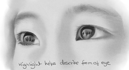
Highlights
= Specular reflection of light on wet or shiny surfaces
- How to place them: Imagine a mirrow placed in a way that the light source gets reflected to the eye --> highlights are exactly on planes parallel to that mirror
- help describe form
- annular (=ringförmige) highlights: highlights are not only found in the middle of objects, but also in a circular pattern made up from scratches etc (scratched metal on pot lid, icy tree branches)

Color Corona
- bright light source or highlight surrounded by colorful light (-> lensflare)
- sun, streetlight, car headlight, solar highlight
- glow color = source color

Motion Blur
1. motion blur: object moves (blurs), camera static
- any (fast) moving object has a blurred edge (think of animation)
- faster moving = more blurred
2. speed blur: camera moves with object, background blurs
- BG blurs radially from vanishing point, following the movement
- closer to camera = more blur

Photo vs. observation
- look out for these things:
Clipping = information loss in dark and light areas, which become more black/white than they appear to the eye
- Color shifts and chroma get lost, as well as weak sources (like reflected light)

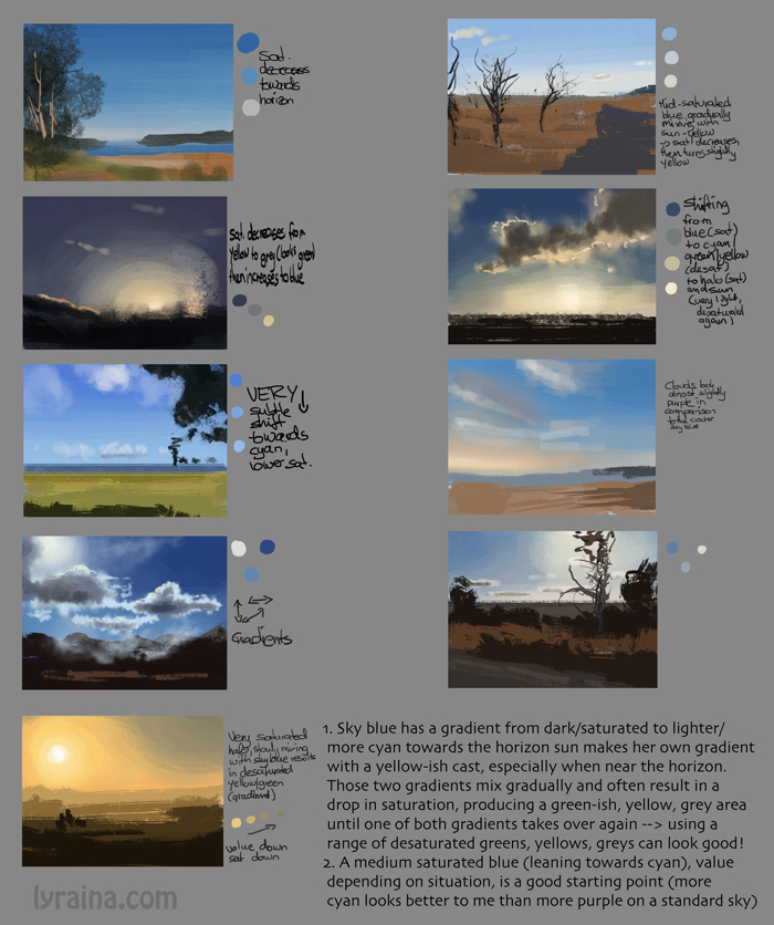
Sky blue
- sky = two gradients overlapping each other (changing in hue, value, chroma)
1. solar glare
2. horizon glow
- horizon = lighter than zenith (more atmosphere to look through)
- lighter, less saturated warmer towards the sun (away from sun: more violet)
- clouds: dark center, light edge (near the sun) vs. light at top/center, dark at side and base (sun behind the viewer)

Atmospheric perspective
- dark areas are affected first (lighter, bluer)
- white objects become warmer and stay visible longest
- only happens when air between viewer and object is illuminated!
- dust, moisture, haze, smog enhance effect


bloodsport update


SketchbookDeviantartArtblog | Portfolio
Every feedback is appreciated!
Reply
Impressive work! <3

Reply
duuude, really nailing those color studies! awesome stuff.

Reply
It's been a while again since I visited your sketchbook and then so much great stuff is going on! I really love the hands you paint, and your skintones are absolutely beautiful. Your studies are really paying off! Keep up the great work, I always feel inspired to work harder when I visit your sketchbook (now if I only could do it...)

SKY IS THE LIMIT

DeviantartSketchbook
Reply
Thank you Ursula <3

Samszym: Thanks!

Cyprinus: Glad you like the skintones. I always struggle so much with those! I think it's not always a matter of working 'harder'... most important is working 'smart'... so if you don't have as much time, just try to be really focused when you do your work :)

Please excuse me for just dumping my stuff without visiting sketchbooks in return, I've not been feeling too well those last days but hope I'll get to it this weekend.

Gurney
Reverse Atmospheric Perspective
- General: Warm colors advance, cool colors recede
- Sometimes this gets reversed:
- moist vapor or dust in the air near the sun, scatter sunlight, orange glare
- very rare -> feels strange
- Albert Bierstadt etc

Golden Hour
- sun is low -> travels through more atmosphere than usual
- sky above = more blue (shadows as well)
- remaining sunlight = weaker, more orange/red

Sunset
- more moisture/dust = more red/yellow clouds
- antisolar point = directly opposite the sun, followed by a gray layer after sunset (cast shadow of earth)
- mornings are often more pink because there's less dust in the air
- higher clouds are whiter than lower clouds
- ground silhouette is colored, not black as in photographs

Fog, Mist, Smoke, Dust
- contrast drops off quickly (see atmospheric perspective)
- no direct light source, but light kind of from everywhere
- play with different color schemes, light situations (light above fog etc) for interesting results

Rainbows
- full of symbolism in different cultures
- red, orange, yellow, green, blue, indigo, violet
- antilsolar point is at center of rainbow -> shadows point there!
- distance to viewer irrelevant (it's all about the relative angle)
- rainbow always a bit lighter in value than surroundings

Skyholes and foliage
- trees almost never form a completely solid silhouette
- small skyholes can be darker than the background(sky) behind because small (not neccessarily visible) branches etc block some light
- how transparent, dark, jagged etc a tree is depends on season and species
- try to paint variety

Sunbeams and Shadowbeams
1. clouds, foliage, architecture block light except for a few beams
2. air is dusty/foggy
3. viewing towards sun
--> columns of light can be visible against a darker background, mostly with uneven edges, thickness etc (depending on the aperture)
- the farther away the aperture, the softer the beam (like shadows)
- perspective makes the parallel sunrays converge towards the light source/sun

Dappled Light
- irregularly scattered spots of light, moving with the leaves
- size depends on height of canopy (high tree = larger, softer circles)

Cloud Shadows
- patches of light drift around
- use to lead the viewer's attention
- soft edges size and spacing of patches must match the visible clouds
- shadow area is darker and cooler, but less blue than on a clear day
- several ways to paint this, i.e. darkening down shadow areas at the end, or paint everything dark and later refine lighter parts

(still don't get trees)


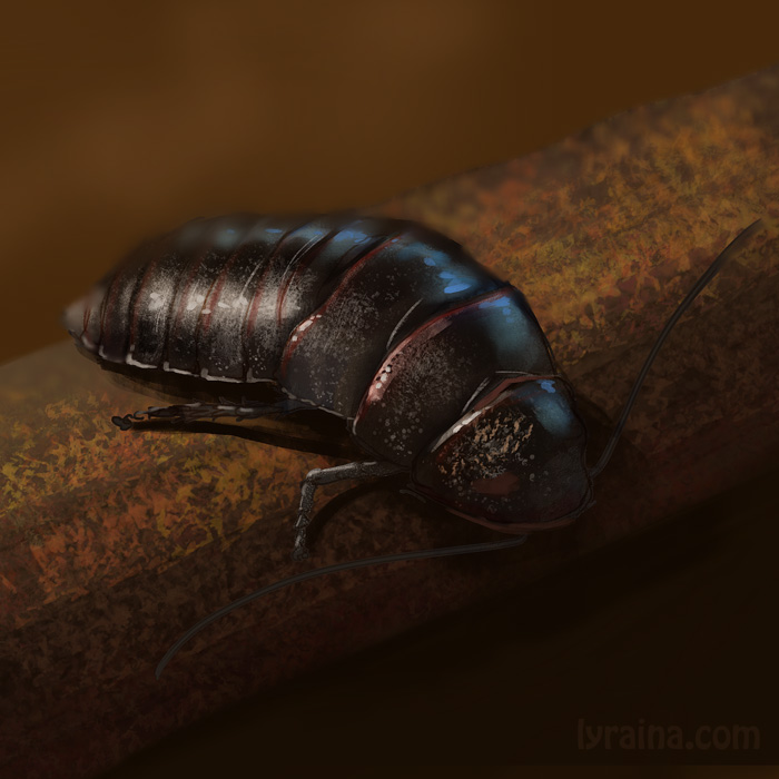
master study


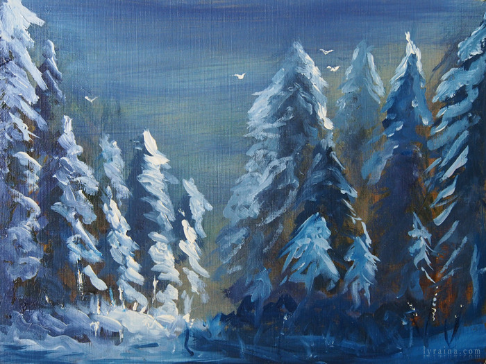
oil fail (actually painted the snow over a brown-ish painting of the same scene, which looked terrible)


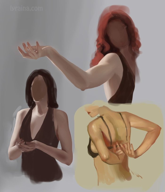
photo studies


those subtle curves in arms always give me trouble


my baby


SketchbookDeviantartArtblog | Portfolio
Every feedback is appreciated!
Reply
nice stuff; did you really paint the hand in your jasnah piece? if so, that is a perfect hand! just keep doin what you do :)

70+Page Koala Sketchbook: http://crimsondaggers.com/forum/thread-3465.html SB

Paintover thread, submit for crits! http://crimsondaggers.com/forum/thread-7879.html
[color=rgba(255, 255, 255, 0.882)]e owl sat on an oak. The more he saw, the less he spoke.[/color]
Reply
Totally loving those new studies! And wow, oil painting! I tried it once but I got really fed up soon because I couldn't stand the smell of the turpentine. I bought a medium to make them water soluble afterwards but never used it until now.
You're also totally right about the "working smart" part.

I'm sorry to read you're not feeling well, I hope you'll feel better soon!

SKY IS THE LIMIT

DeviantartSketchbook
Reply


Forum Jump:


Users browsing this thread: 84 Guest(s)