Posts: 850
Threads: 4
Joined: Mar 2013
Reputation:
21
crackedskull: Aah don’t worry, I’m sleeping enough ;) Most of the time. Just figuring out my limits a bit, which I suppose is a good thing.
LaleAnn: Thank you, thank you! :)
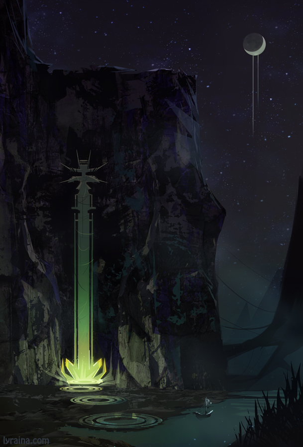
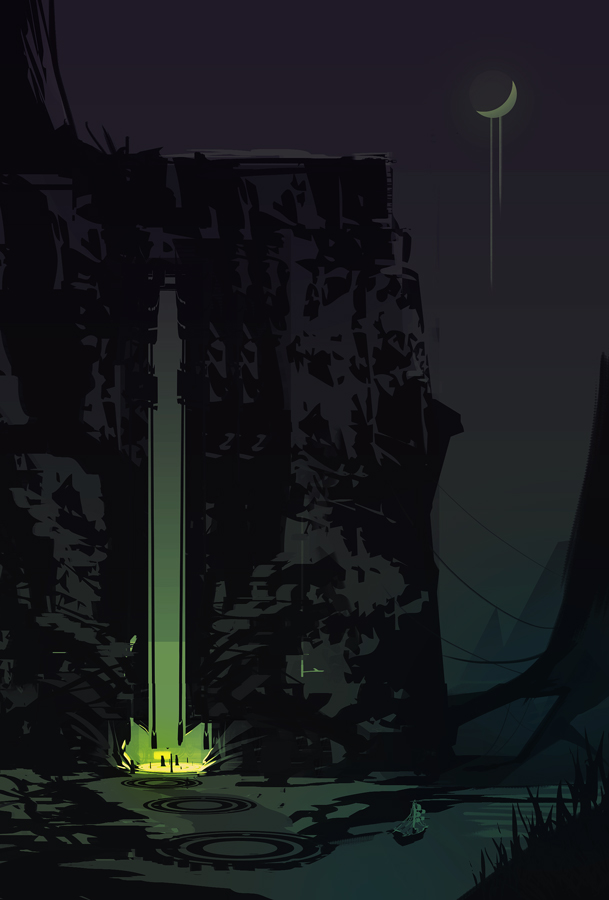
Here’s my CROW entry. I got annoyed at myself for not coming up with something cool, so I decided to throw all caution out of the window and just play a bit with shapes and stuff. The problem is, as it is so often - I like my initial „sketch“ (where I just played with shapes and stuff) better than the final „render“ - partly because I had to hurry, and partly because I like the simplicity and boldness. I may have to rethink my workflow, work slower and more clean right away, when attempting something like this next time - so that I can keep the sketch as a base to work with, and not start over for the final painting.


initial sketches

Posts: 24
Threads: 1
Joined: Feb 2015
Reputation:
0
wow your environments are breathtaking
Posts: 1,342
Threads: 17
Joined: Jul 2013
Reputation:
45
Very nice environment entry, I can see the boldness in shapes :)
Playing with shapes can lead to fun and interesting results. Also a good idea is to play around with some chaotic brushes and get good shapes and nuances in lighting with them. Always keep one eye on the thumbnail(the navigator part in PS if youre unfamiliar with it). Once you have that energetic sketch that looks good on thumbnail make another layer and start refining. Take care on noticing what exacly makes the sketch interesting and compare the work youve done periodically to the original sketch by turning the layer on and off. If you have gotten some refinements done and are happy with the result, start another layer and polish further, using the same logic. Also be sure to take a break before you start working on another layer, fresh eyes are a good to see things you missed.
If a layer doesnt turn out right you can always go back, or delete the portions, that are not up to expectations.
Have fun!
Posts: 61
Threads: 1
Joined: Jan 2015
Reputation:
2
Wow, great, great studies here! And might I add, your own stuff is great aswell.
That top view line drawing looked terrific. Nothing like good, clean, crisp linework, mhhh mhh!
Posts: 101
Threads: 0
Joined: Nov 2013
Reputation:
7
Yes, as agerkvist said: great improvement here.
I really admire your studies. My favourite piece is your three point top view study. Great work and
crisp lineart. keep it up.
Posts: 850
Threads: 4
Joined: Mar 2013
Reputation:
21
rork: Thank you!
cracked skull: Thank you! Yes, I really need to try working directly on the thumbnail next time. The way you described it might help preserve the initial idea, while still being able to refine it further. Thanks!
Agerkvist: Thanks a lot~
construction: Thank you :)
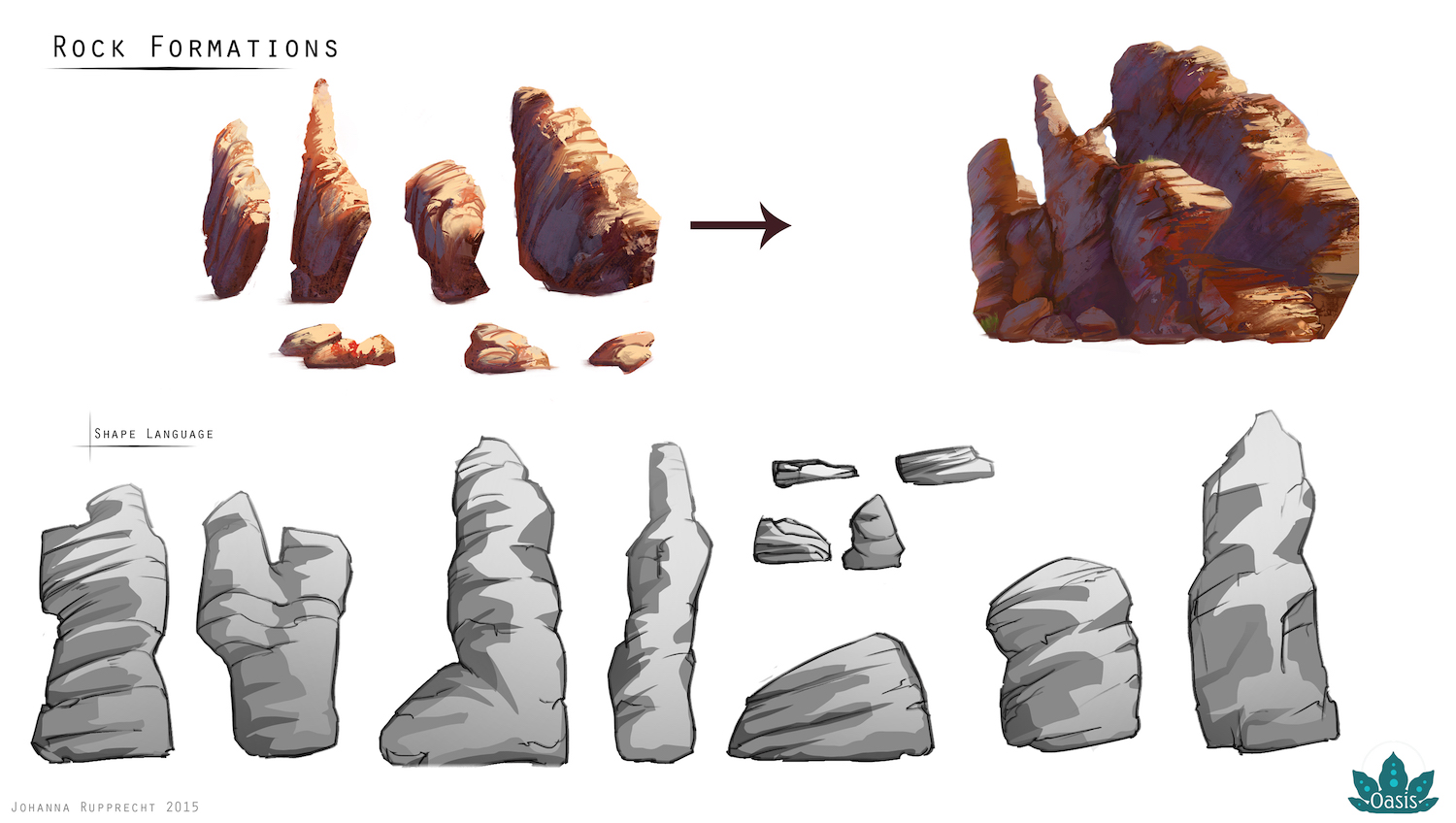
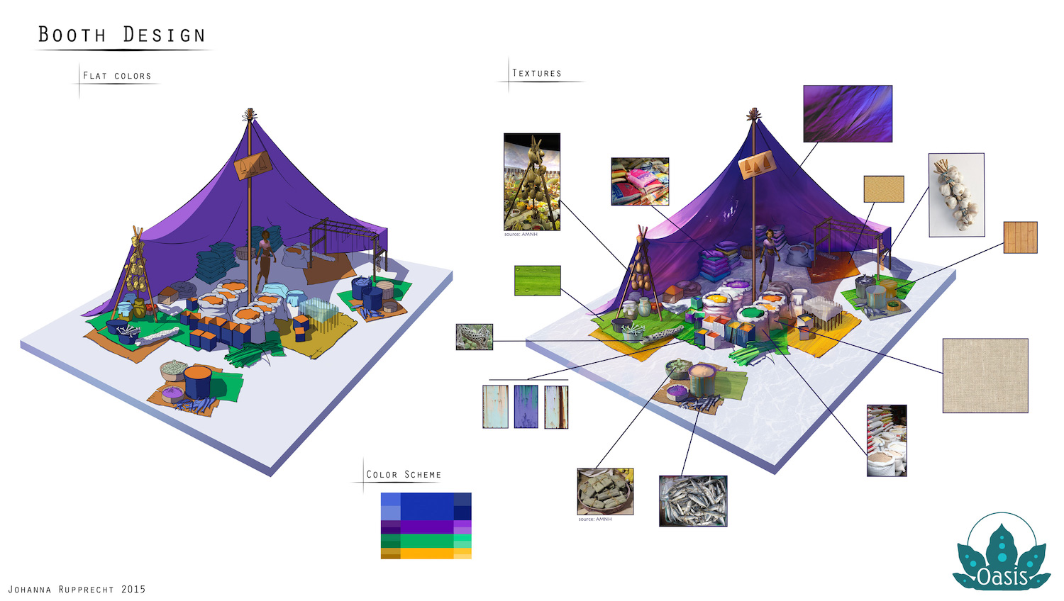
Ok. Finally time to update with part two of mentorship work.


Posts: 850
Threads: 4
Joined: Mar 2013
Reputation:
21
“I must not fear. Fear is the mind-killer. Fear is the little-death that brings total obliteration. I will face my fear. I will permit it to pass over me and through me. And when it has gone past I will turn the inner eye to see its path. Where the fear has gone there will be nothing. Only I will remain.”
― Frank Herbert, Dune
Anyone here reading Pat Rothfuss? Fanart for his newest book:

Posts: 198
Threads: 2
Joined: May 2013
Reputation:
5
DAYUM GUUUURRLLLLLLLLLL!!!!!!!!! Wha?? wha??? You da pro already! OMG!!
Seriously, awesome progress, I'm fucking tripping balls here, those enviros are looking juicy as fuck! and the studies, and the stuff from the mentorship and EVERYTHANG!!
Really insipring and impressive progress Lyra, I really like where you're headed artistically, you're gonna be a Naughty Dog environment lead or something in no time!
Now for some cheap crits xD:
"Dem peoples need some lovin' " , what I mean by that is that I feel your characters are way behind your environments, and I get it , that if you focus on environments it's pretty hard to also do tons of character studies ( I happen to have the same issue but the other way around) but sometimes the lack of understading in some characters kinda hurt the overall picture ( I sound like a jerk sorry :P) , like with the dude in the market scene:
The first thing that I saw was the wonky hands and the ultra stiff silouhette, and later on I realised about the great hues and the niceness of the mid and background. The foreground with the fruits seems very 2d because of the very huge contrast and the awkward way the oranges are setup in the scene. Overall there's an awkard feeling with the painting, and it all comes from the foreground and the character presented. It's in a situation like this where I think it's better to make very "fuzzy" characters so to speak. There was this guy on ca a long while ago that was great with enviros but he was terribad with characters ( and I mean TERRIBAD) but the dude just started doing enviros better and better and also started painting basic siouhettes of the characters that were fairly solid with some decent light on them, but none of them detailed to no extent. This allowed him to bring his enviros to fruition into a perfect level ( my opinion xD) and after that he started cleaning up with the characters since all he learned from enviros was very easy to apply to characters after a few studies.
Anyway, that's an idea, or you can just do more character studies hahaha, anyway, it's just a thought.
On the latest piece I gotta say I really like the idea nd the mood, I feel that the biggest issue it has right now would be:
A) the gyro thing she's holding has a really strange prespective and edge control and that takes off from the piece.
B) the neck of the girl is completely flat due to the lack of ambient occlussion and strange overlapping with the hair and the clavicules ( not sure if that's how you type it) are completely off, so that needs a fix.
That's about all the crits I can come up for ya, you're really doing an AWESOME JOB, please keep being awesome Lyra! :D
Posts: 850
Threads: 4
Joined: Mar 2013
Reputation:
21
Suira: Thanks a bunch!!! :) Both for all those kind words and also the crit. You’re totally right about my figurative work being kind of.. bad. I’ve stopped my anatomy/gesture drawings lately, but I want to pick it up again now - about time. Can’t let figures ruin my environments, and also I really want to be able to paint good humans! Fuzzy characters, that’s a think I’ll have to look into as well. Indicating things without them looking unfinished is an art in itself!
Thanks a lot man :)
So much going on lately… and I’m tired… though I shouldn’t complain, I think life is moving into the right direction. ….I hope.
LoL Splash Fanart

Started out as a material study (cloth) from life, ended up .. a bit more of a light study. I applied some artistic freedom with some parts of the doll...

Posts: 905
Threads: 39
Joined: Sep 2013
Reputation:
51
That doll... LOVE IT!!! Imagine it talking with a voice from The Exorcist... "[insert your line here]"
Although...material is light. We tell apart the material from how it reflects light. And by touch and smell too but that's not happening with a digital painting..... yet. Have you ever been to a leather workshop? The smell.... So next time you do material study, just think of it as light study on a small, small scale.
Posts: 118
Threads: 4
Joined: Mar 2013
Reputation:
4
Nice- your brushwork in that last study is lookin' good!
That's a problem I see with your other paintings- your brushwork tends to be all over the place. (graphic shapes, photographic elements, clean brushes, textured brushes)
Great progress by the way!
Posts: 850
Threads: 4
Joined: Mar 2013
Reputation:
21
meat, thank you. Glad at least someone likes the doll - my family was rather creeped out and now seems to be worried about either my perception, or my sanity. Or both. Good point about material study being light study…
The Aether Technician: Thank you… I agree on brush strokes, textures etc (still) being a mess issue… I’m not really sure how to solve this, or work on it. It seems to vary depending on what I attempt to do, more realism being tougher than stylized things.
Not-very-carefully-done master study. Mostly tried to figure out some things about trees and forest.

Posts: 850
Threads: 4
Joined: Mar 2013
Reputation:
21
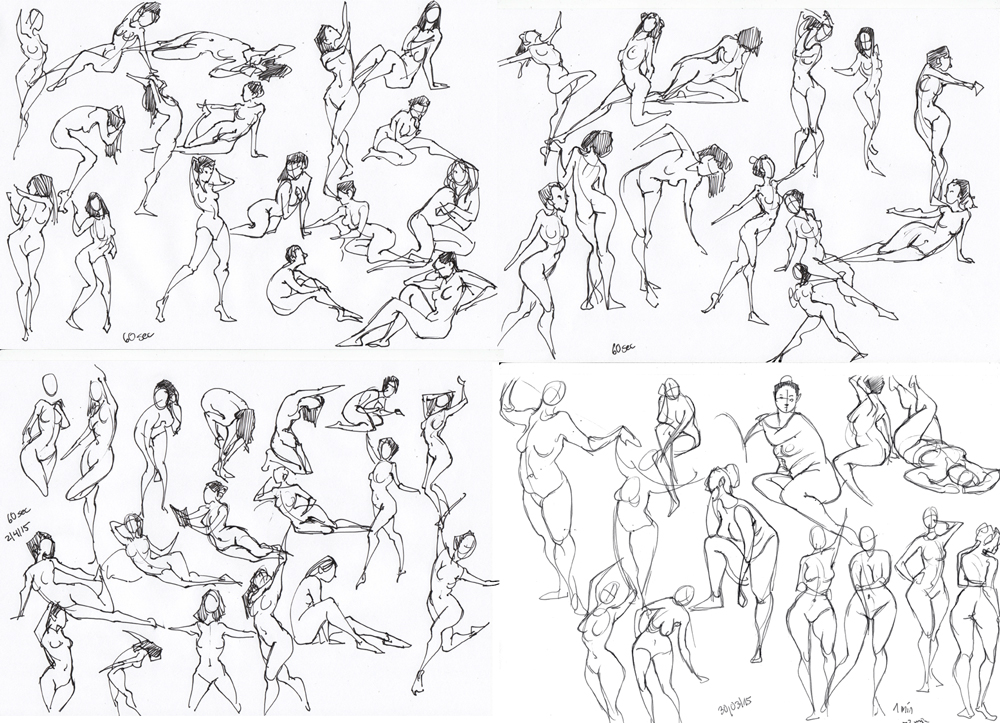
Getting back into gesture warmups. I’m rather rusty. I decided to still post a few of them because I like tracking how my gestures/drawings change over the months and years.
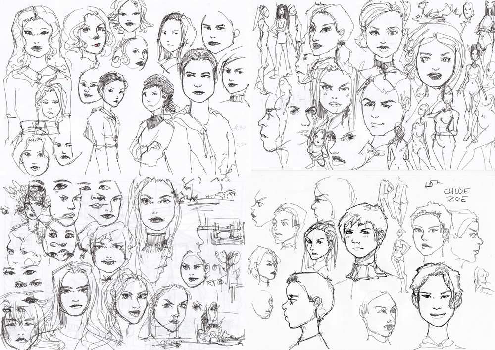
Also decided to scan some of my super-messy drawings - the reason why I’m always running out of pens/ink… usually those go straight into the trash after doing them. But sometimes one of those generic faces has „something“ that I like… so I keep those sheets.


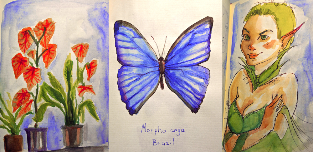
I did not get much done this easter weekend due to family visits etc, but brought my water pens.. quite fun. I also did some environments, but still don’t have a good way to do these from imagination, with traditional media unfortunately…

Posts: 40
Threads: 2
Joined: Apr 2014
Reputation:
4
Oh man, Lyraina! :o) Your sketchbook and those enviros!! I've been following your blog through feedly and it's so inspiring to look through your awesome work while commuting. I loved your pieces for Kalen's mentorship! Such great, amazing stuff! So great to see you on here, too! :o) Rock on and looking forward to seeing more of your stuff!!
Posts: 850
Threads: 4
Joined: Mar 2013
Reputation:
21
Minsky, thanks a lot! :)
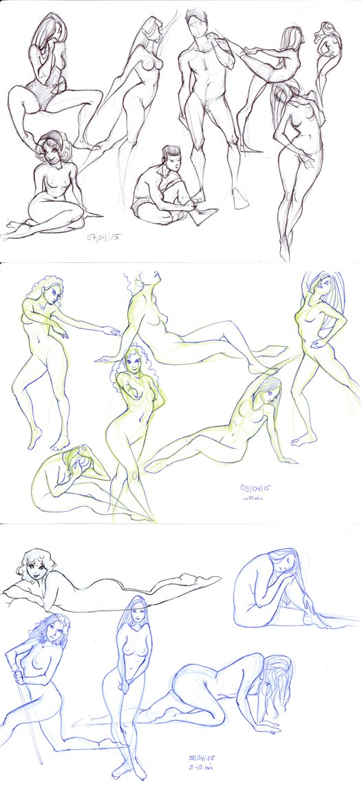
Mostly working on stuff I can't show right now ... so, just some sketches.
Still trying to figure out how to push and exaggerate poses without just sexing them up, or objectifying them. I feel like I’m improving on the females, still very clueless about male figures.
One interesting thing I discovered while painting the LoL fanart a while ago is that it can help me to redraw the same pose over and over and over again (after deciding on a pose, and maybe shot some reference), each time trying to enhance and push some element of the pose. Proportions, line of action, squash and stretch, muscle groups getting pushed, or affected by gravity… until I get something that feels right. Maybe even tracing some of these sketches again, pushing them further. Certainly not a ground-breaking or new method of working, but something I seem to have neglected so far.
Also, as much as I love digital painting - this kind of sketching still works better in pencil or pen, on real paper. Would be nice to eventually learn doing it in digital, too!

Posts: 905
Threads: 39
Joined: Sep 2013
Reputation:
51
It's like trimming a tree - a big, over-grown mess is easier to trim than a bare tree with few leaves..... *wanders off after leaving cryptic message*
Posts: 1,342
Threads: 17
Joined: Jul 2013
Reputation:
45
Posts: 850
Threads: 4
Joined: Mar 2013
Reputation:
21
meat: Or I'll just let the tree grow as it wants...!
crackedskull: Thank you! :)
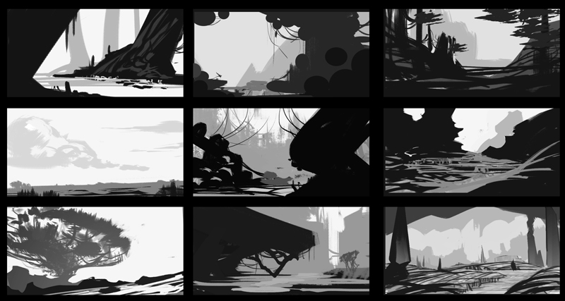
Some enviro/shape thumbnails, inspired by meat's creature designs, although I did a rather bad job at matching the designs to the creatures!


Color/light etc study from photo

Posts: 291
Threads: 13
Joined: Dec 2013
Reputation:
5
ok got to post here . your enviros particularly the colors boggles ones mind.
how do you come about painting the colors? for the life of me i just cant grasp it.
Posts: 850
Threads: 4
Joined: Mar 2013
Reputation:
21
foxfire1345 : If I want a piece to have really nice colors and mood, most of the time I start with a rough thumbnail sketch where I just focus on color/mood/light. Using every trick in the book - fancy layer/brush modes, over-doing saturation (or desaturation), in messy chaotic strokes, really just trying to nail the right „feeling“. I think of stuff like color contrasts, placing pleasing colors next to each other, making nice shadow/light patterns. Then, when painting the final thing (cleaner than the thumbnail version) I try to preserve this feeling - sometimes working on top of my color thumbnail to keep the colors, or color picking from it. At this stage I also try to include things like bounce light - light reflecting from one surface onto another, or temperature shifts. Playing with saturation, and sneaking in shifts in hue, sometimes not as much so that it becomes visible, just slightly.
But all that aside, just turn up saturation and you’re already halfway there, I think that’s the main thing why people seem to like my colors - they are very „in your face“ :P Something I need to work on …
Hope that helped - feel free to ask if I wasn't clear enough...
|
