Posts: 99
Threads: 1
Joined: Mar 2013
Reputation:
5
Hi Appeb,
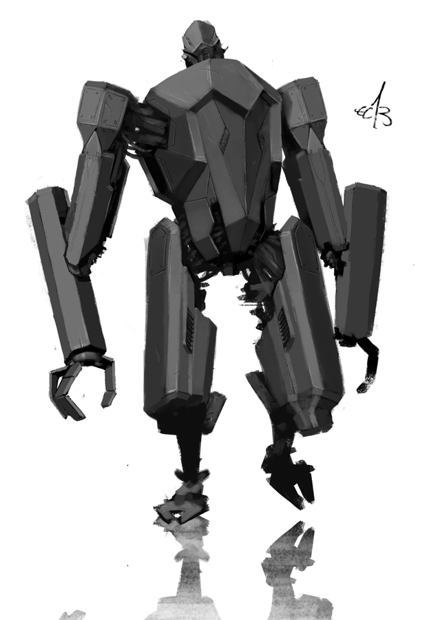
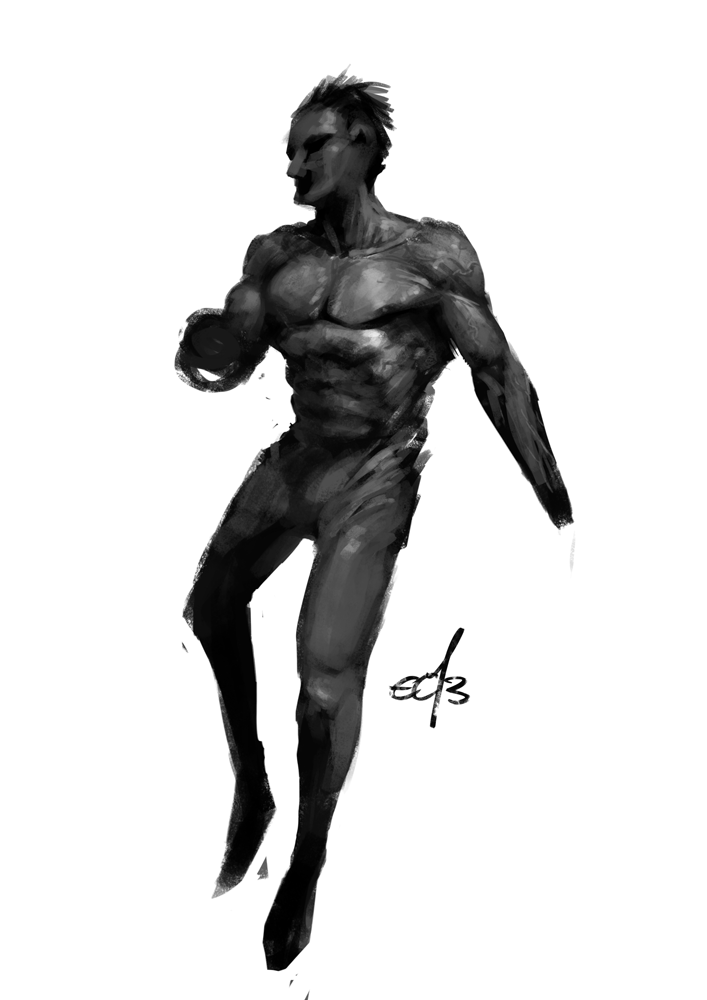
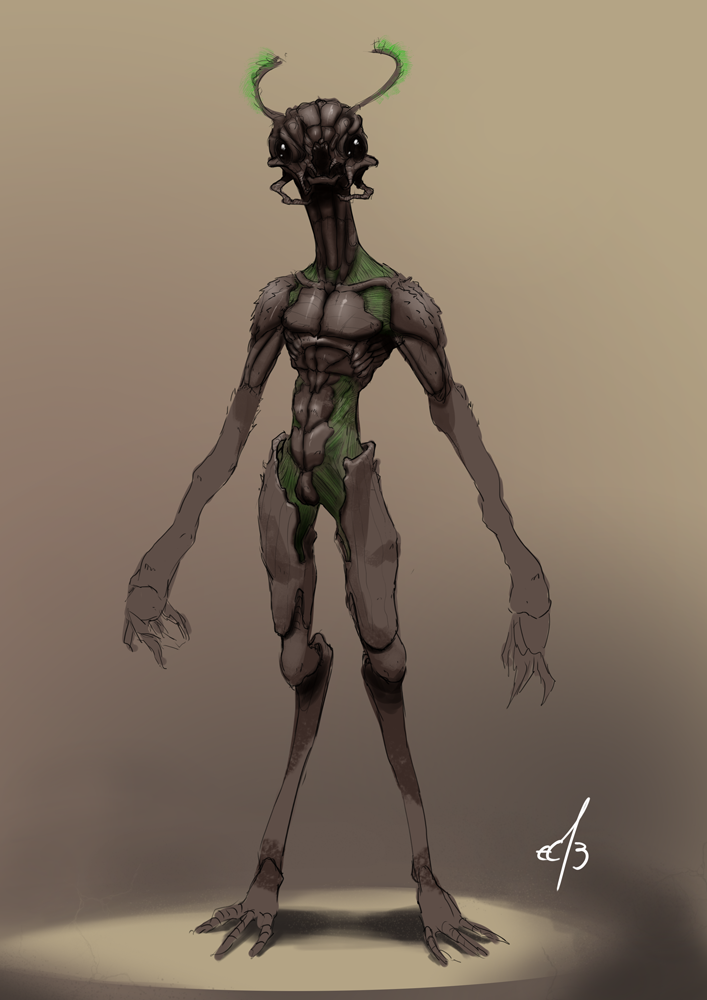
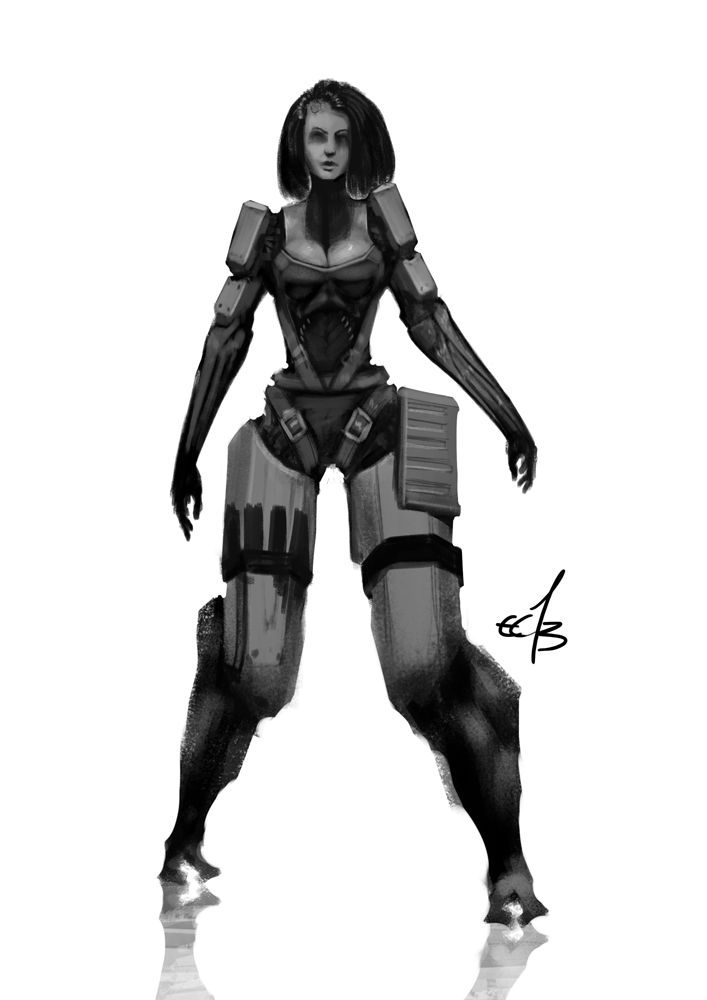
Nice work. My only criticism is that the lighting direction doesn't appear consistent. For example, on the left arm the planes look like they're lit more from the left, but the torso looks like it's lit from above front.
Thanks for the feedback Ignatz :)
Yeah, you're right about the light source. I tried having it from the top left side. But as you pointed out it's not consistent over the whole character. One thing I caught myself doing all the time on this one was zooming in a lot. I think - that, and flipping the canvas might hinder me from seeing the character, and lighting as a whole :P
Gotta keep on working!
Posts: 504
Threads: 9
Joined: Apr 2012
Reputation:
6
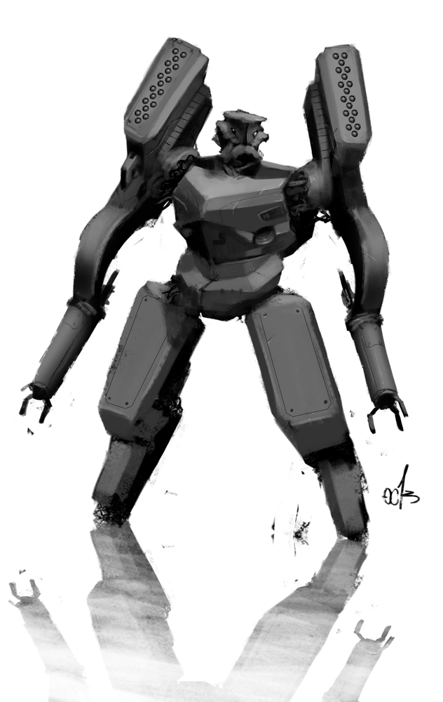
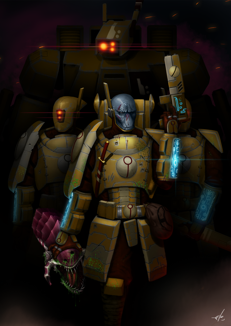
Welcome to the forums man! Glad we rounded up another mech dude. I can look at more robots that will haunt me in my dreams
Posts: 101
Threads: 3
Joined: Jan 2013
Reputation:
0
Great, a thread with mecha! Not sure about the design on some tho, can't seem to see the utility of some of the bots.
Keep it up
Posts: 91
Threads: 4
Joined: Sep 2012
Reputation:
2
Thanks for dropping by my SB!
Looking really good here, love the robots.
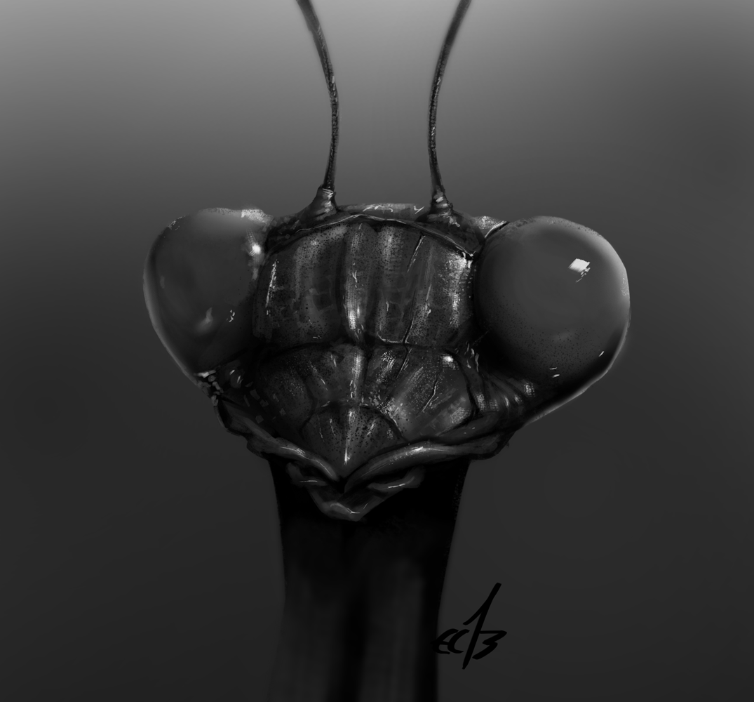
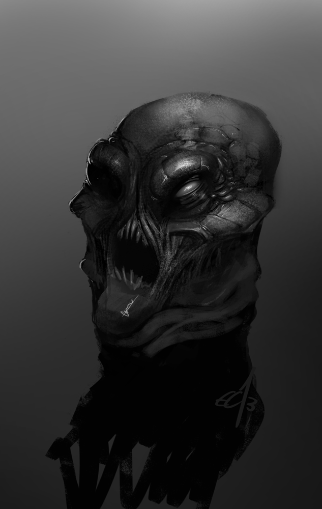
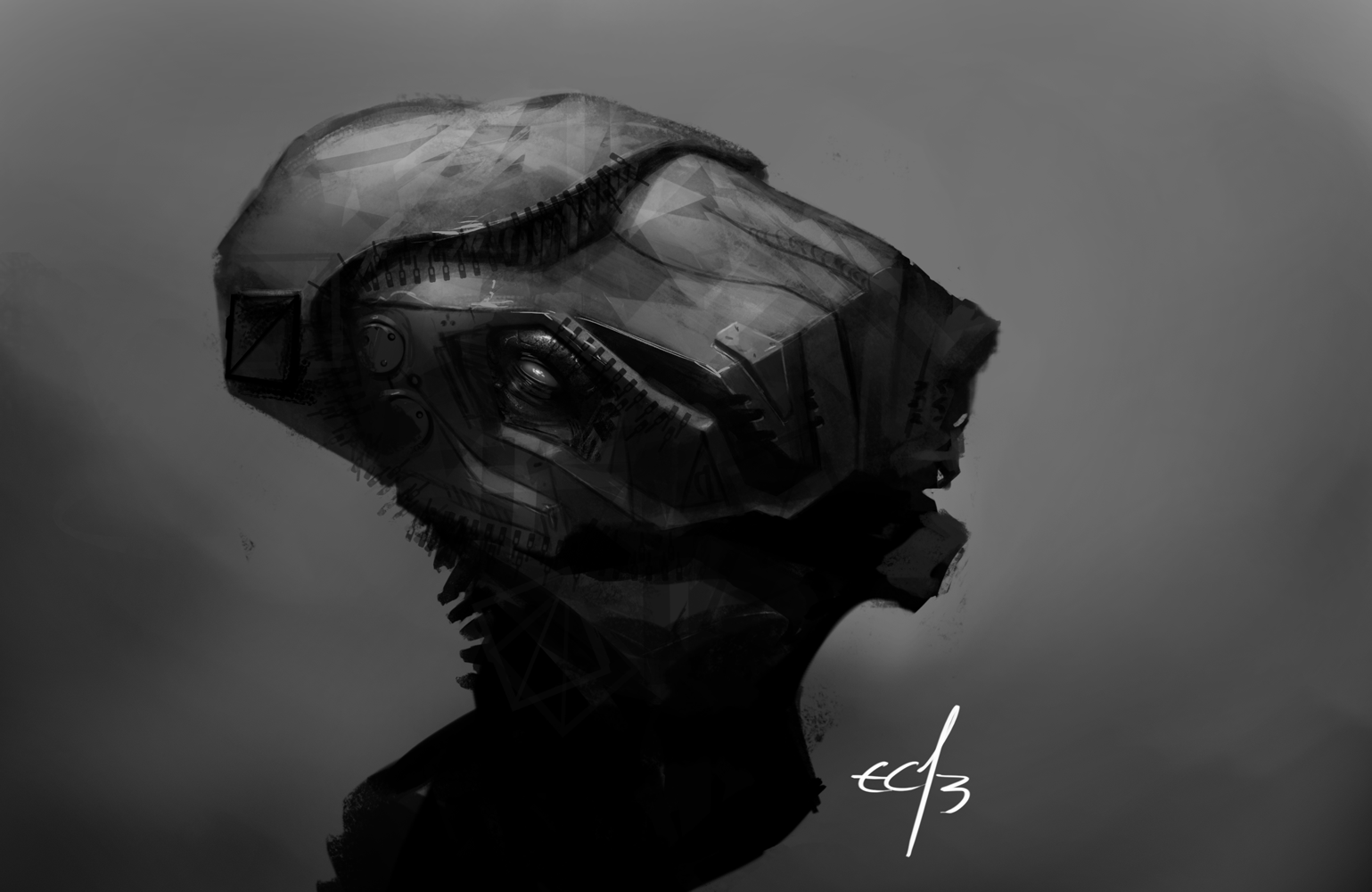
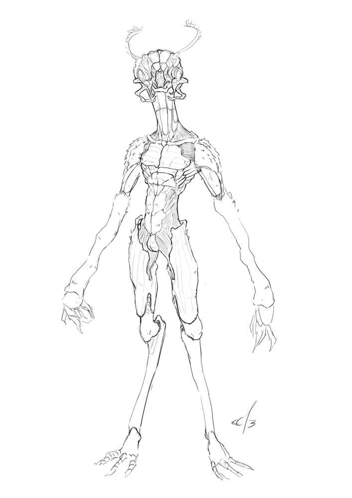
The insectoid also looks good. Keep an eye on structure and form.
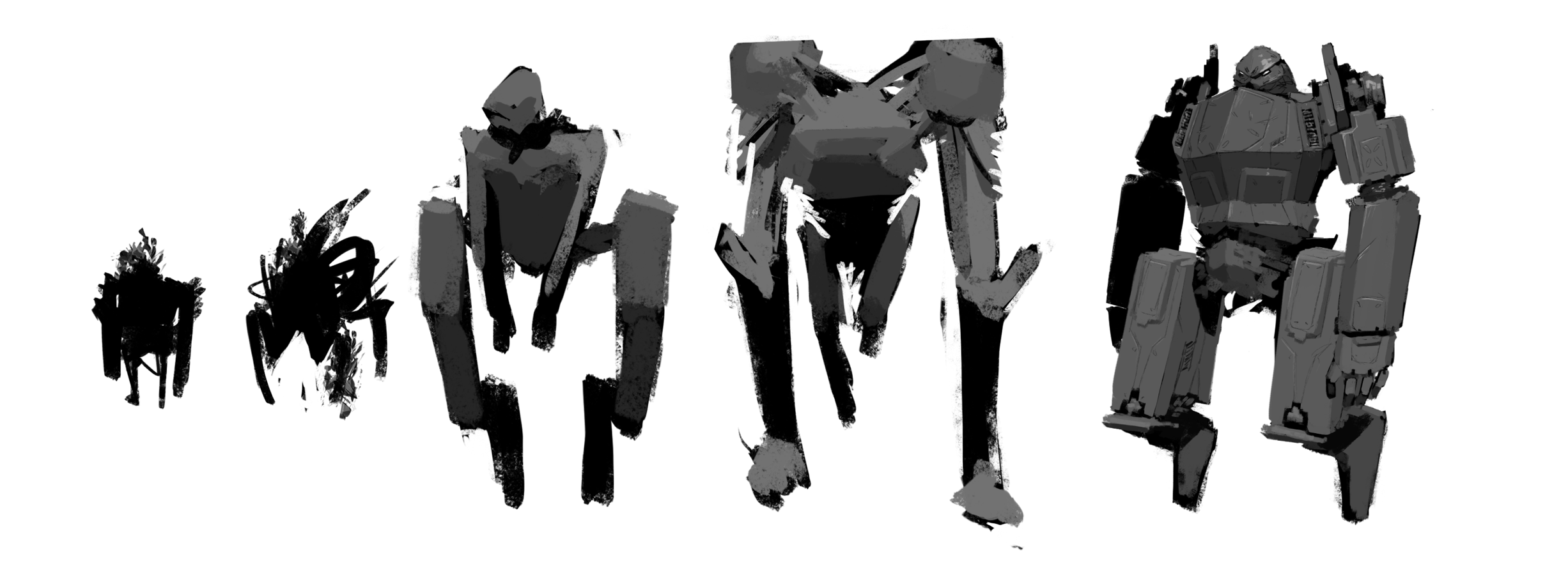
The grayscale studies are solid.
Keep it up!
"It's necessary to act against yourself or nothing will happen." -Phil Hale
Sketchbook|
Go Team!
