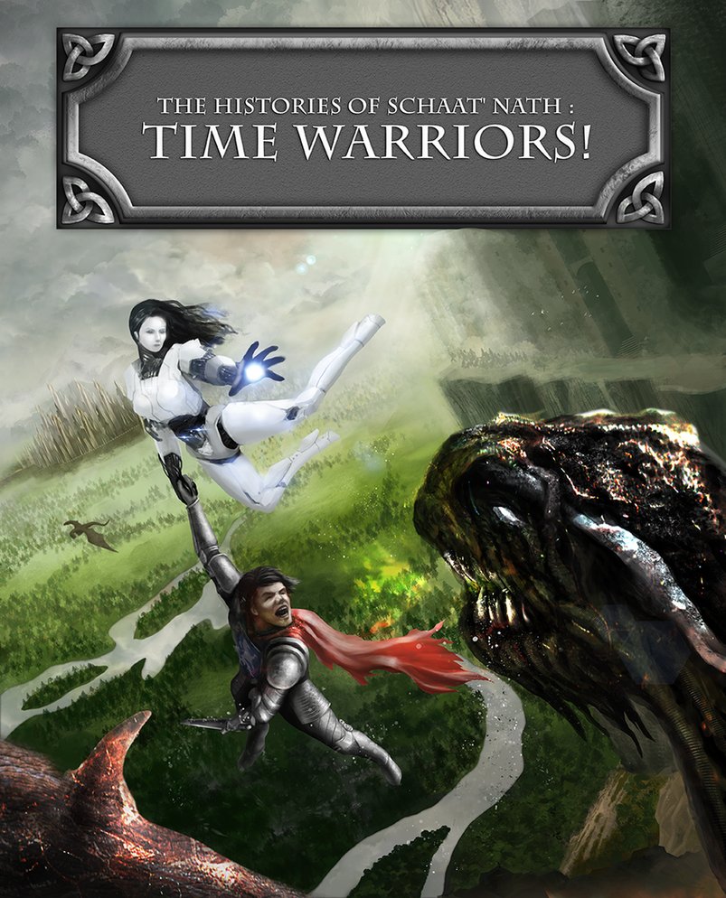
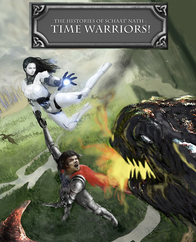
(04-28-2013, 10:13 AM)Mike086 Wrote: I Livestreamed a Critique and paintover for you. It's pretty long, but it was easy to address your requests.
Here at the altered pieces, but you'll need to watch to hear why I did what I did. (too much to type)
Hey Mike086
Thanks for taking time and doing the critts. In my post I was delibarately short on specifics about the focal points, composition and contrasts because I wanted to see if anyone would notice the dilema concerning them.
So to be more specific: I was aware of the tangents problem but sadly I didn't have enough time as I was doing some other projects at the same time and the time spent on this one had some other bigger issues that took most of my focus. So to explain what I mean.
Doing this piece I set myself some rules I wanted to follow. As it was ment to be a book cover I fixed the format and further more I wanted to have a big box with a title so the illustration would be a part of the whole composition. So when looking at it one would have the feeling that this particular illustration was made for this particular title with a particular book cover and not just like an illustration where you pop the title where it fits. Testing this: if I take out the title the illustration by itself wouldn't be in balance. The other thing that I wanted to incorporate was making sure the main character (the girl in this case) was in contrast with the environment which was one of the rules of Bloodsport 13. So having that in mind I wanted to show some forests, lakes, rocks and castle so you would get the feeling that she is out of place so bluring out the backgroud would not come in handy. So by composition I meant balancing the big title, 3 characters and the background. Also I would like to understand more how to balance more complex composition than just the basic rule of thirds. I watched the videos you made and I saw you basically had the same troubles as I did trying to fit all three in the basic focal point positions. I believe there must be something more.
Trying to balance those I had other issues. I made the girl white by design (and I wanted to keep her that way) so the problem I was facing here was how to make her stand out from the background if I know in the back of my head that the landscape that is the furthest needs to be lighter and less saturated. Trying to solve this I made the castle darker on purpose so she being white would contrast to the dark background even though I knew this was wrong in some way.
Also another issue I had was doing the blasts from the feet. In the concepts I had the idea of doing them but them being even whiter (in sense of lightnes not in sense of color) would draw the attention and thus would they become focal points which I didn't want so I decided not to draw them once again being aware it doesn't help the believability of the situation.
Yet another issue I had was how to establish the right balance of contrast between the girl with a boy and the dragon in the sense of Z-space. Once again the initial design of the girl was troublesome. Since she has blacks and whites on her design (which is the biggest contrast) she immediatelly draws attention. So the dilema here was how to keep a focus on her but still be able to show that the boy and the dragon are in front of her. That's why the dragon is so contrasty and dark. In your critt the girl and the boy do stand out against the title and the dragon which is good but the dragon actually looks behind the boy.
As I am trying to learn to paint more traditionaly I'm trying to avoid the special effects like zooms or blurs. Watching the others I know it can be done it's just that I'm not at the point where I would be able to draw and emphasize the movement without the motion or any other blurs. So this is what I ment to kick it up a notch. To be able to draw that kind of details that add to the believability and make the piece more realistic but still have the feeling it was painted.
As you can see there's a lot of issues with the piece. I really apreciate you taking time and pointing out the possible solutions. Some of them are quite good.


