Thumbnail Crit
#1
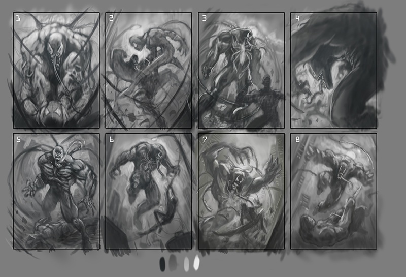
Would love your thoughts on these thumbnails. I have just completed a painting of Carnage and want to follow up that piece with a Venom piece.

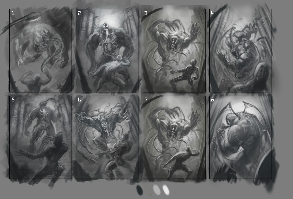
I believe thumbnail 7 and 4 are the strongest and want to take them to a more final comp stage. What are your thoughts?

To get a style idea you can view Carnage at www.elmstreetart.com.


Reply
#2
Personally I like 4 better and I think it's the strongest of the lot! 7 feels kind of hemmed in and constrained to me, I think because the comp is forming kind of a square shape which kills the dynamism. 4 has a cool triangle/swirl movement to it that is way more powerful, I think.

[Image: s07Yx9d.jpg]

Rad work man! :)
Reply
#3
Hey dude, to be perfectly honest, 2,3,4,5,6,7 look pretty much the same to me. the general arrangement of mass is the same, the comp is the same, the only marginal thing different is their pose. None of these really stand out to me as a striking comp atm so if it was me I'd go back and really try and push some different ideas out with your thumbs. Sorry if that wasn't helpful...just my opinion.

 YouTube free learnin! | DeviantArt | Old Folio | Insta
Reply
#4
Thanks for the crits! All crits area helpful. I am going to do a few more thumbnails and see what transpires.

Reply
#5
I did more thumbnails and choose the 8 that I like best. It is a cover design focusing on Venom, Spider-Man needs to be in the comp but does not hold the main focus of the piece. The first round Of thumbnails i stuck to the idea of the camera behind Spider-Man emphasizing the size difference between the two characters. In this next set of thumbnails I explored other ideas. I would love all thoughts.


Thanks so much for your time.

Reply
#6
Hell YES! These are great. And actually now that there is a wider variety of comps number 7 actually does seem pretty strong when it isn't amongst a bunch of similar. I really like 1 a lot it captures a lot more menace to the narrative than just a fight. 2 has the most dynamic composition but it does showcase spidey on equal terms as Venom so guess you have to decide if that's what you want. The other leaping ones are cool, but don't excite me that much. Hope that's useful I know I didn't pick one.

 YouTube free learnin! | DeviantArt | Old Folio | Insta
Reply
#7
Definitely digging 7 a lot more now that you've changed Spiderman's pose up! Better flow. 2 and 8 are exciting to look at but they're more pictures of Spiderman than they are of Venom and wouldn't pair up as well with the Carnage picture you've already done. Personally I'd go with 7 or maybe 6 if you could make Venom a bit more menacing.
Reply
#8
Thanks guys! I will post WIP as I go and would love your crits along the way.
Reply
#9
I am coming down to the wire and wanted to get another set of eyes on this before I upload the piece.

Thanks so much for your time.


Reply
#10
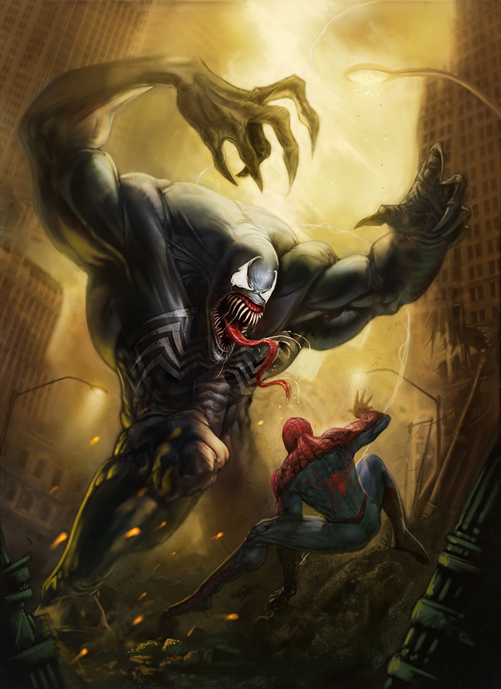
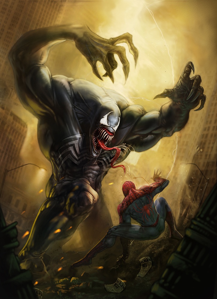
Made a few adjustments from some crits.

Let me know your thoughts.


Thanks for your time.

Reply
#11
absolutely amazing details and rendering you're making is great. Treat my critique as loose ideas :D

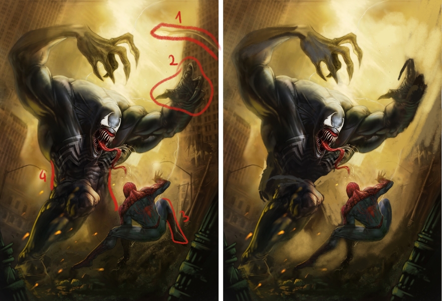
I suggest to remove lamp on right it messing up composition. For a better composition I would also change tilt of building on right so whole picture will be in diagonal lines(1). For the same reason I would moved spider-man leg to front(3). Rotate hand so silhouette is more readable(2). I also think hips area is now hard to read, when crouching whole body weight is based on leg in front so his hip should be probably rotated more to left (4)
Additional I think you should add more neutral color to his left hand cuz it look a somehow transparent.
cheers!


Reply
#12
Great crit Madzia!

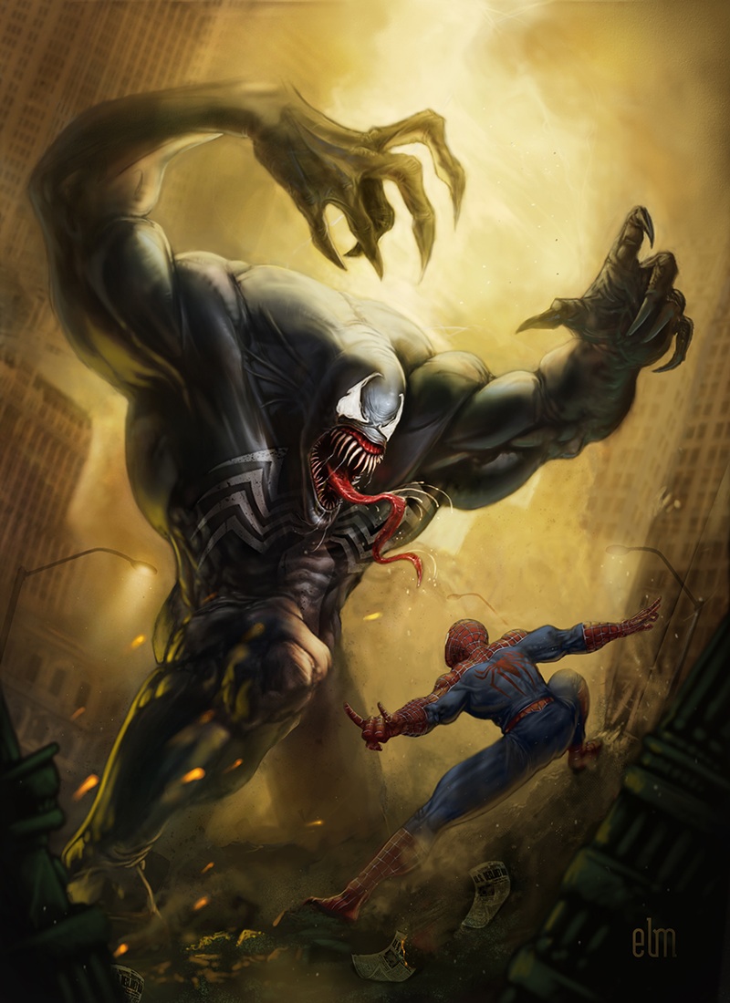
I made some modifications to the piece, Venom has a much stronger silhouette now, and the anatomy adjustments really made a big difference. I am going to work on the back light/smoke, move it around a little.

Thanks for you crit.

Eric


Reply
#13
I would have to agree about both lamp posts in the foreground. They are very distracting and take away from the main focus of the fight. An odd suggestion, but maybe take one of those pieces of paper that is on the ground under spidey and bring it to the extreme foreground like it is flying into the viewer from all the excitement.

Secondly the pose of spidey seems very awkward to me. My eye cannot discern the weight placement, even if he is moving/flying backwards pretty quickly. Is his right foot on the dirt mound? Or is it floating above the dirt mound. Is his left arm/hand in front of that right foot, and is it supporting weight or no? Perhaps put that arm behind the left leg like he is trying to gain his balance by supporting his weight on the left hand. His pose at the moment looks like he is doing an awkward forwards movement rather than a falling/jumping backwards movement. I would suggest for good reference try out the movement yourself and see how your weight feels...annnd check out come clips of capoeira practitioners or gymnasts to see how they mess with their weight on their hands.

Phew...long winded am I, yes, yes ;)

edit: this may help too (for the pose at least)

[Image: image-edit.jpg]

Keep your dream alive, feed it daily!

SB thread http://crimsondaggers.com/forum/thread-3551.html
Reply
#14
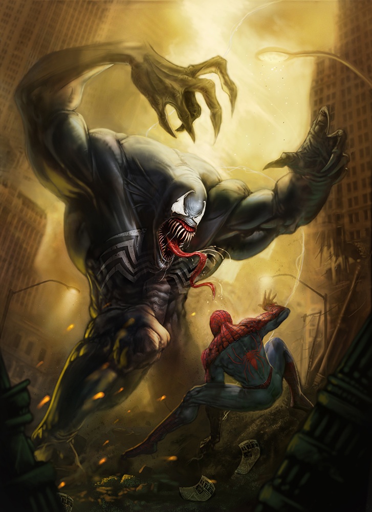
Thought I would post the finished piece. Thanks so much for your crits.


Reply


Forum Jump:


Users browsing this thread: 10 Guest(s)