11-29-2013, 07:21 AM
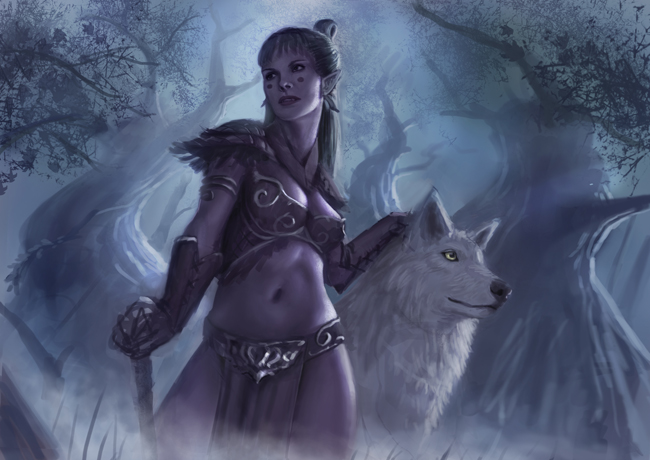
(11-25-2013, 01:45 PM)rioriorio Wrote: wow man...you have great improvement from the first page into the last page
thanks man! =)
|
Nimao's Sketchbook - things and stuff
|
|
11-29-2013, 07:21 AM
 (11-25-2013, 01:45 PM)rioriorio Wrote: wow man...you have great improvement from the first page into the last page thanks man! =)
11-29-2013, 07:28 AM
Oh my... your illustrations are awesome, i wish i could help you with some critique/tipps... but I´m too bad xD
I totally agree with rioriorio. Great progress! Keep it up
11-29-2013, 05:21 PM
That's what I like. New page opened with boobies. It should be a standard or something!
11-30-2013, 12:53 PM
 (11-29-2013, 07:28 AM)Sir-lex Wrote: Oh my... your illustrations are awesome, i wish i could help you with some critique/tipps... but I´m too bad xD thanks man =) (11-29-2013, 05:21 PM)ramalooke Wrote: That's what I like. New page opened with boobies. It should be a standard or something! hehe lets make it to one xD
11-30-2013, 08:55 PM
Looking awesome man :D Love it
12-02-2013, 07:00 AM
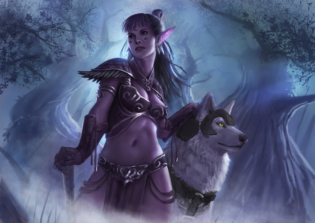 (11-30-2013, 08:55 PM)Ursula Dorada Wrote: Looking awesome man :D Love it thanks! ;O (11-30-2013, 04:12 PM)ramalooke Wrote: Yes! that gif made my morning XD
12-16-2013, 05:26 PM
Oh wow. I love your newest painting. It got nice mood and composition is very pleasing. Like wow. In my opinion it could use some tiny foreground element in bottom right cornet, to balance out tree branches in the top left corner. but that's only me nitpicking. Great piece. Keep it up!
12-16-2013, 06:15 PM
Inuyashaaaa

CD sketchbook:
http://crimsondaggers.com/forum/thread-1745.html blog: http://tikuuta.blogspot.hu/ Da: http://keltainen.deviantart.com/
12-16-2013, 06:49 PM
Hey man, some really good posts these last few pages! You're keeping it real! I like your latest painting, feels very old-school Warcraft. Good work on the atmosphere and materials, looks like you're getting better at it.
I agree with Ram about what he said, you could probably push more depth with some foreground stuff. One thing I noticed is that the trees in the background seem to be avoiding the lady. I'm wondering if the composition would benefit if they overlapped her back more, like if she wasn't there. Getting rid of some tangets! Awesome progress since first page, can't wait to see what you cook up next mate!
12-17-2013, 05:34 AM
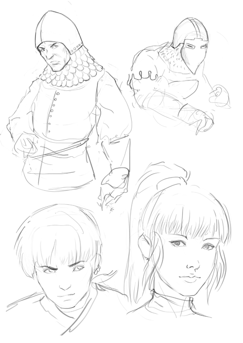 (12-16-2013, 05:26 PM)ramalooke Wrote: Oh wow. I love your newest painting. It got nice mood and composition is very pleasing. Like wow. In my opinion it could use some tiny foreground element in bottom right cornet, to balance out tree branches in the top left corner. but that's only me nitpicking. Great piece. Keep it up! yeah you are right. should have done that. and thanks! =) (12-16-2013, 06:15 PM)holdkocos Wrote: Inuyashaaaa hehe yeees ;O
12-27-2013, 01:27 AM
okay, i'm really frustrated right now.
so from now i want to post more again like i was in the beginning. i really want to get better now i'm so sick of it. i will start to draw more without trying to fix it the whole time because that's what i'm most afraid of. Also doing more studies. just do more and not watching on the same time to movies or shit. soo lets do this!!11!1! waaah 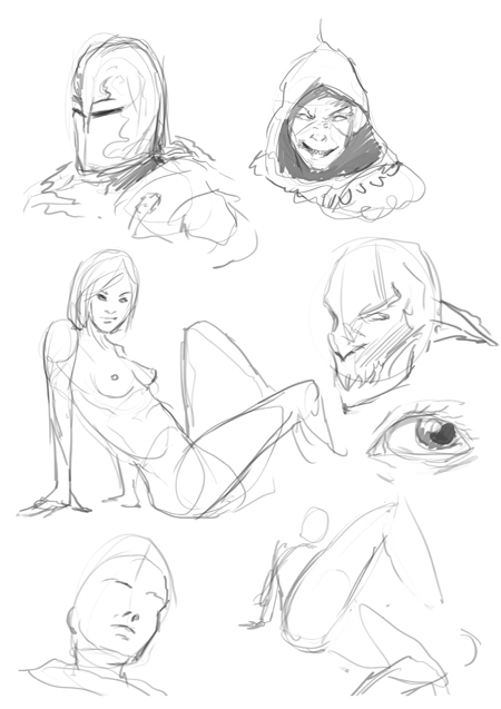 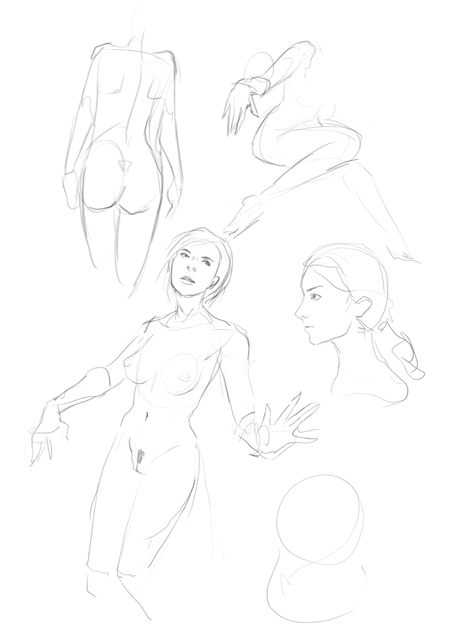 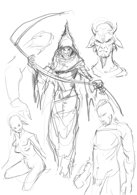 |
|
« Next Oldest | Next Newest »
|