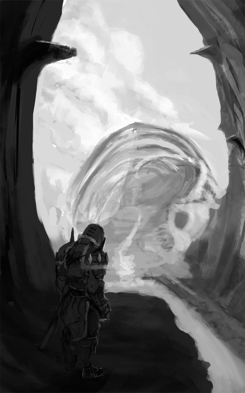
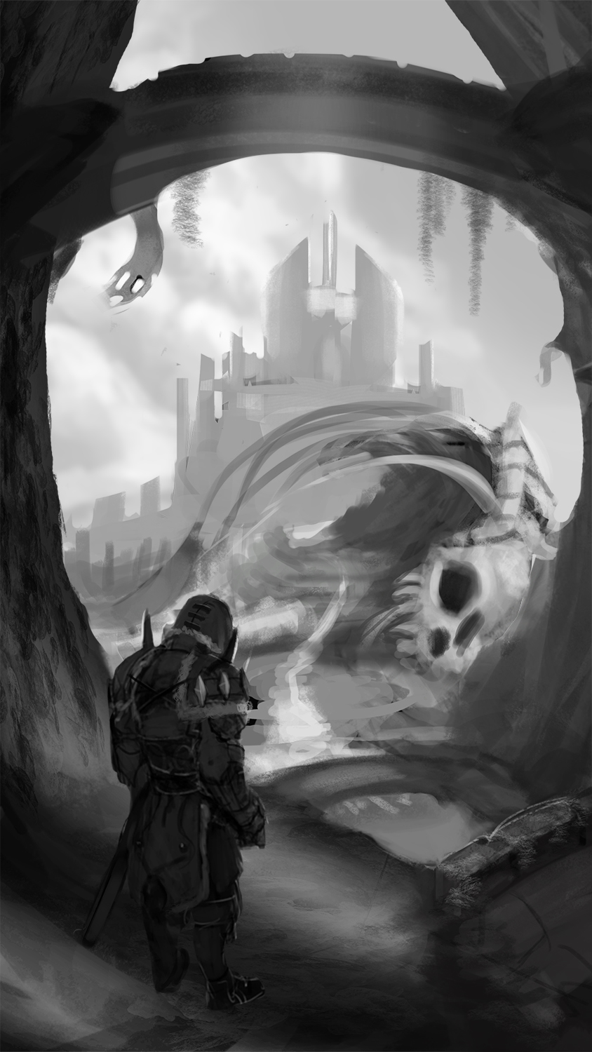
Wip help
#1
You know you're doing something dead wrong when even /ic/ can't comment on it.
I know it's on a very very early stage but I feel like there's something off going on,but I can't pinpoint it.


Reply
#2


Worked on it some more but I still seem to not be able to work it out.
Anyone ?

Reply
#3
Go back to thumbnails and try a 16:9 aspect ratio. Try to think of your comps in a minimum of three stages, fore ground, middle ground and back ground, I often add a fourth mid tone for more depth. Think Repetition, Emphasis, Movement and Balance. Find shapes you can replicate and decide on your focal points. Also make sure you tell a story or he will be just another guy looking at something cool. Is he a warrior coming home or is he rescuing a fare maiden from a dragon. The more narrative you have the better your painting will be.

It is looking good, I look forward to more updates. If you want an idea of how I approach thumbnails take a look at an earlier post I made here in the crit section.

Reply
#4
I think you need to tell us what the idea behind this is first before we can really help. Is it an illustration? environment piece, character concept...just because... Sometimes it's useful to go back to first principles and know why you're doing something, because that will help you figure out how to do it.

 YouTube free learnin! | DeviantArt | Old Folio | Insta
Reply
#5
Concerning the second upload: The perspective seems slightly off (being the cruel mistress she is), I think? It feels like the entire world is slightly warped/rounded, and the horizon line is out of place.

I may be wrong, though.
Reply
#6
Thanks everyone for the hints.I'll see what I can do with it

@Elmst - Do you mean 16:9 horizontal ? Since I really wanted to make this piece a letterbox rather than a widescreen spread

Reply
#7
A little update.Tried to incorporate repetitive elements like the bridges and added some highlights inside the cave for more dramatic/story telling effect,plus a castle in the back to add to the story telling aspect.


Reply
#8
So yeah you never really answered my question...is this an illustration or an environment piece? I'm going to guess environment because that's the focus for the most part even though you have such a large figure in there.

By adding that bridge at the top you made everything above it redundant, because the eye just moves around the circular comp in the middle third of the image. Think about placing at thirds your focal points, as well as focusing on values and composition. Elmst was correct...do lots of thumbnails and nail your values and composition first and pick the best one once all these issues are sorted out, or what happens is you get stuck with an image that you just keep tweaking and tweaking with a level of detail you don't really want to do large changes with. It will save you a lot of time.

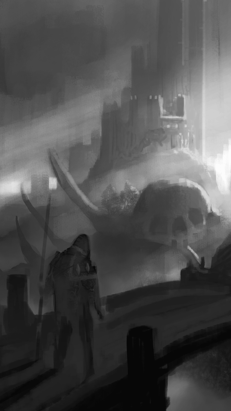
I did a repainting using the same format. Basically made sure the focal points were clear and had the most contrast and the most smaller shapes and detail. (though not much detail in the painting overall because you don't need it at this stage) . Separated values and made sure the compositional elements (bridges, bones) enhanced the composition rather than detracted from it.. I'd also say you need to make your character much less stiff.


 YouTube free learnin! | DeviantArt | Old Folio | Insta
Reply
#9
Why does the "illustration or environment" question matter ? Are there different ways to approach it ?I thought environment is just an element of illustration.

Reply
#10
(06-19-2013, 01:51 AM)Rindoukan Wrote: Why does the "illustration or environment" question matter ? Are there different ways to approach it ?I thought environment is just an element of illustration.

Illustration can be a general term for almost anything, but usually implies a focus on story telling. , if this was an environment concept you'd be focused more on the design of the environment. Because you had a character so large and detailed you might wanted to have focused on character design. So yes based on your focus we could have tailored advice to better help you. Fundamentals always apply in each case which is where you are having issues anyway so, guess it doesn't matter.

 YouTube free learnin! | DeviantArt | Old Folio | Insta
Reply
#11
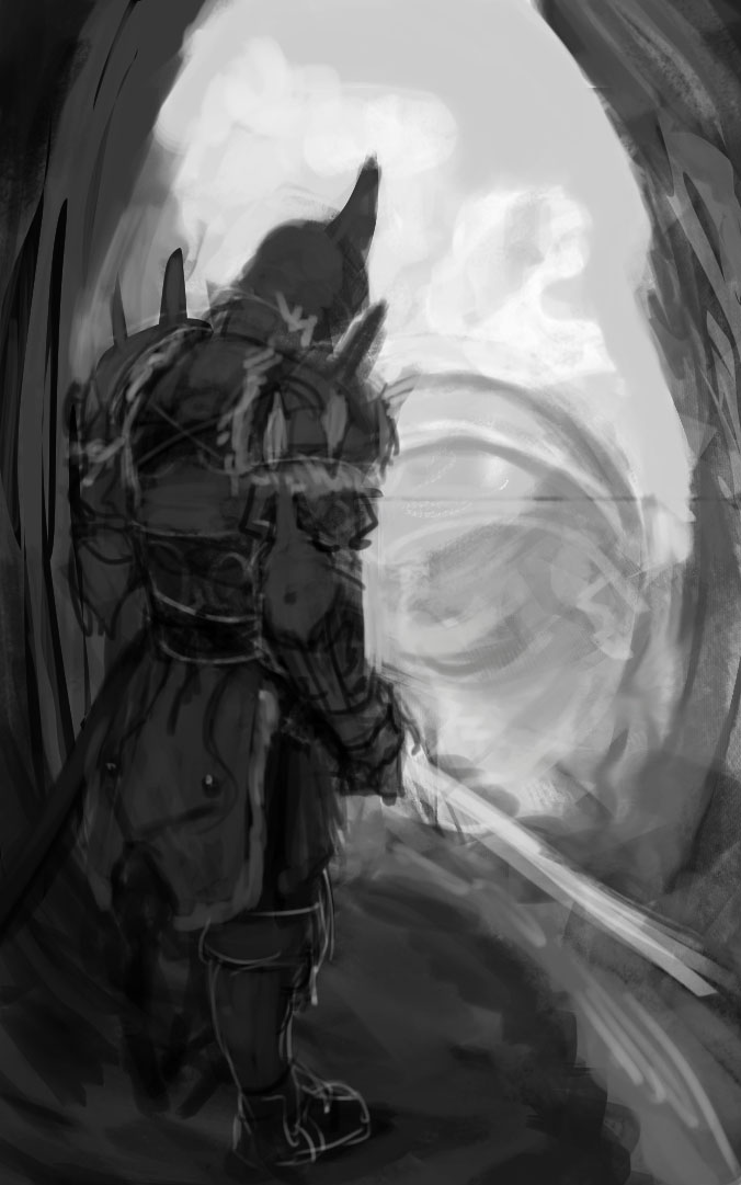
another thing i would add is that story telling is not just adding stuff in the background. it's adding stuff with intention. just putting a castle there does help, but i think it must be strategic: what kind of castle, is the character coming or going to it. why? is it an evil castle with some evil dude inside, or is it a good place where the end of the journey lies. all of this stuff you should have a notion of, even if the viewer is meant to be left in ambiguity.
Reply


Forum Jump:


Users browsing this thread: 3 Guest(s)